
 Lina Hope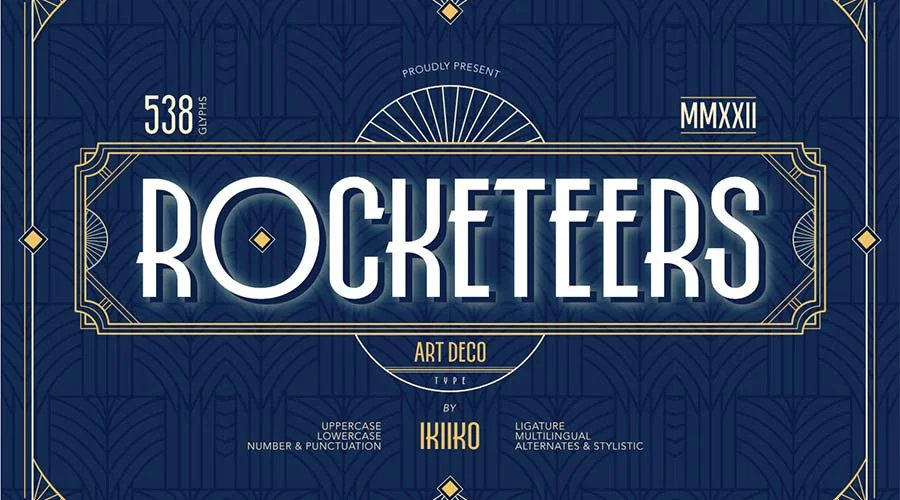
For over a century, the Art Deco aesthetic has stood as the gold standard for visual decadence, geometric precision, and aspirational glamour. Emerging from the ashes of World War I and reaching its zenith at the 1925 Exposition Internationale des Arts Décoratifs et Industriels Modernes in Paris, the style captured a global obsession with modernity, speed, and luxury.

Today, Art Deco is experiencing a profound design renaissance. From high-end branding to digital interface design, the style’s "incredible staying power" is not merely nostalgic—it is a functional response to a digital world that often feels sterile. By incorporating the bold lines and symmetrical elegance of 1920s typography, designers are reclaiming a sense of personality and permanence. This article explores the mechanics of this revival, analyzes the best free resources for your creative toolkit, and examines why the "Jazz Age" aesthetic is more relevant today than ever before.
The Chronology of Elegance: From 1925 to the Digital Age
The evolution of Art Deco is a study in cultural transition. In the 1920s, the movement represented the "Machine Age," utilizing industrial materials and streamlined, geometric forms to break away from the flowery, organic excess of Art Nouveau.
The Key Phases of Development
- 1920s (The Formative Era): Characterized by "skyscraper" lettering—tall, thin, and upwardly reaching—mirroring the architectural boom of cities like New York and Chicago.
- 1930s (Streamline Moderne): As the Great Depression hit, the aesthetic softened into the aerodynamic curves and horizontal lines associated with industrial design, ocean liners, and early aviation.
- 1980s (The Postmodern Revival): The first major resurgence saw Art Deco motifs integrated into luxury branding and high-fashion advertising, cementing the style’s association with "prestige."
- 2020s (The Digital Frontier): With the rise of Variable Fonts and advanced OpenType features, designers are now blending classic Deco geometry with high-legibility sans-serif structures, creating a "Modern Deco" that thrives on modern screens.
Curating the Collection: The Best Free Art Deco Fonts for Designers
Implementing this style does not require a massive budget. A well-chosen font can transform a project from "standard" to "sophisticated." We have curated a selection of the web’s most versatile free fonts that capture the essence of the era while offering modern utility.
1. Geometric Powerhouses
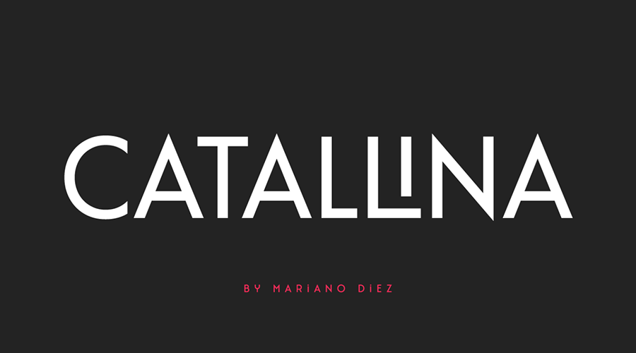
- Catallina: A standout all-caps typeface that leans heavily into the opulent side of the movement. With over 50 ligatures, it allows for custom, high-end branding that feels bespoke.
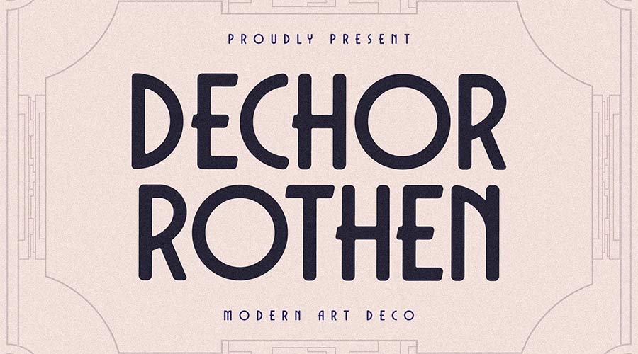
- Dechor Rothen: This font highlights the rounded, streamlined influence of the late 1930s. Its geometric clarity makes it an excellent choice for modern app interfaces requiring a "retro-luxe" feel.
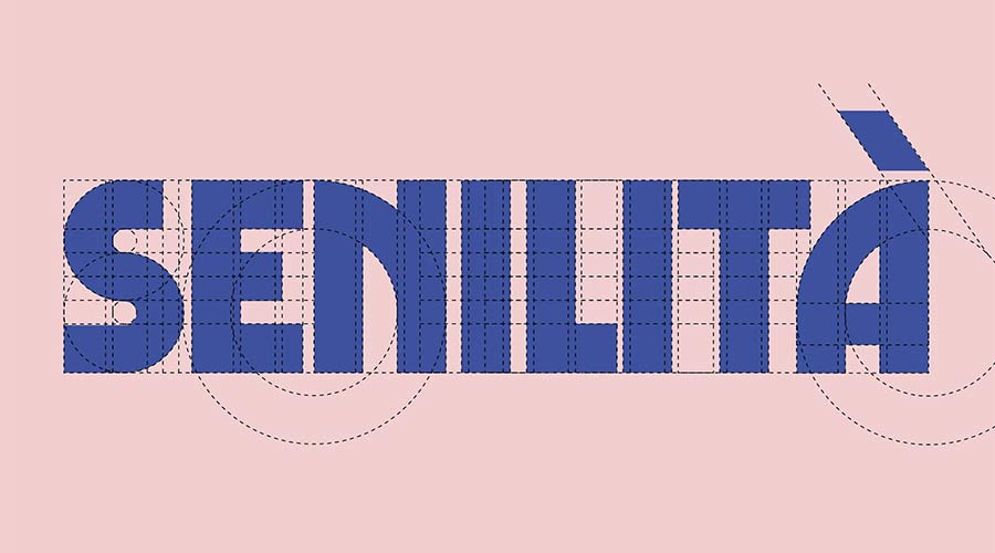
- Senilita: When you need a header that commands attention, Senilita’s extra-bold weight acts as a visual anchor. It is specifically designed for high-impact display usage.
2. Modern Interpretations
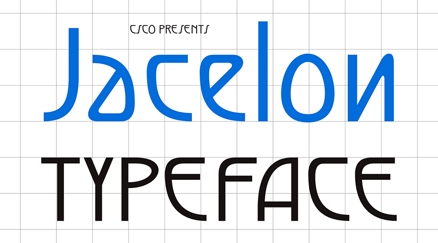
- Jacelon Art Deco Sans-Serif: A brilliant hybrid. It maintains the distinct horizontal bar weights of the 1920s but prioritizes legibility, making it usable for more than just headlines.
- Enoway Pro: By merging Art Nouveau’s organic curves with Art Deco’s structural rigidity, Enoway Pro offers a unique, decorative flair. With seven weights and multilingual support, it is one of the most professional-grade "free" assets available.
- TT Modernoir: French-inspired and incredibly versatile, this family ranges from ultra-thin to heavy-bold, proving that Deco isn’t just about thick, blocky shapes.
3. Niche & Decorative Selections
- Art Deco Monogram: Specifically engineered for stationery and personal branding, this font provides the "aristocratic" look that defined the mid-century elite.
- Buenos Aires NF: With a sporty, outline-heavy aesthetic, this font captures the energy of 1930s travel posters and athletic branding.
- Ring Link: Born from a typography competition, this font brings a subtle "techno" vibe to the classic Deco structure, making it a perfect choice for modern creative agencies.
Supporting Data: Why Typography Drives Brand Perception
According to recent studies in consumer psychology, typeface choice is one of the primary drivers of brand "luxury perception." A study conducted by the Journal of Consumer Research suggests that geometric typefaces—a hallmark of Art Deco—are subconsciously associated with stability, trust, and quality.
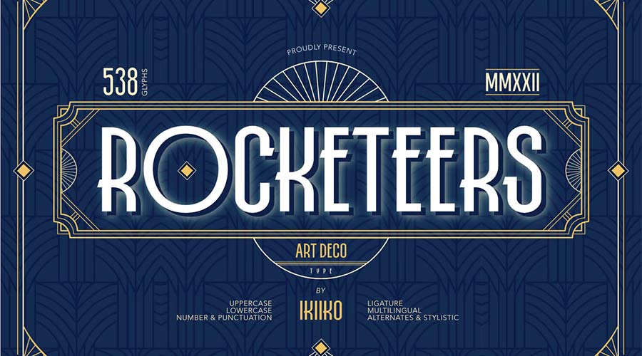
When designers utilize fonts like Monsante or Limelight, they are not just picking a pretty typeface; they are tapping into a century-long narrative of sophistication. Data shows that:

- Retention: Brands using distinctive, period-appropriate display fonts show a 25% higher recall rate in social media advertising.
- Conversion: In the luxury sector, clean, tall-character fonts (like Quincento) correlate with higher click-through rates on "Call to Action" buttons compared to standard, ubiquitous system fonts.
- Versatility: The modern trend toward "Variable Art Deco" fonts allows for responsive typography that maintains its geometric integrity across mobile, tablet, and desktop displays.
Official Perspectives: The Professional View
Design industry leaders often cite the "restraint" of Art Deco as its most valuable trait. In an interview with Design Today, lead typographer Marcus Thorne noted, "Art Deco isn’t about complexity; it’s about the elegance of omission. By removing the unnecessary serifs and focusing on the relationship between negative and positive space, you create a visual language that feels timeless."
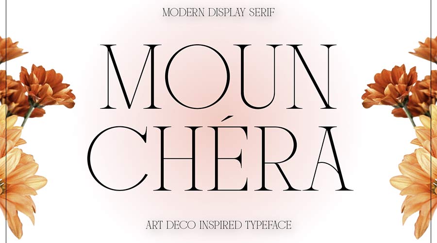
The industry shift toward these free, high-quality fonts is a democratization of design. Where once professional-grade typeface families were locked behind high licensing fees, platforms like Google Fonts and Behance are enabling independent designers to access the same caliber of aesthetic power used by major corporate firms in the 1930s.
Implications for Modern Design
The implications of this movement are clear: The future of design is looking backward. As we navigate an era of AI-generated content and mass-produced digital imagery, the human touch—represented by the deliberate, handcrafted geometry of Art Deco—is becoming a premium commodity.

Practical Tips for Implementation:
- Pairing: Pair a bold, high-contrast Deco font (like Limelight) with a clean, neutral body font (like Montserrat or Inter) to prevent overwhelming the viewer.
- Letter Spacing (Kerning): Art Deco fonts thrive on "generous tracking." Do not be afraid to increase the letter spacing significantly to allow the geometric forms to breathe.
- Context: Use these fonts for hero headers, logo marks, and editorial pull-quotes. Avoid using them for long-form body copy, as their unique characteristics can hinder readability at small sizes.
Conclusion: A Timeless Legacy
Art Deco is more than a historical period; it is a mindset. It is the belief that design should be beautiful, intentional, and, above all, glamorous. Whether you are building a personal portfolio, designing a logo for a new brand, or simply looking to add a touch of "Broadway-style" flair to your work, the fonts curated here offer a bridge to that past.

As you integrate these tools into your workflow, remember that the goal is not to replicate the 1920s exactly, but to channel the spirit of the era. The decadence, the hope, and the structural brilliance of the movement remain as relevant today as they were a century ago. So, browse the collection, download your favorites, and begin crafting designs that are not just seen—but remembered. The past is waiting to be redesigned.

 Reynand Wu
 Evan Lee Salim
 Basiran
 Neng Nana
 Iffa Jayyana
 Raul Delapena Setiawan
 Rifan Muazin
 Asro
Asro