
 Reynand Wu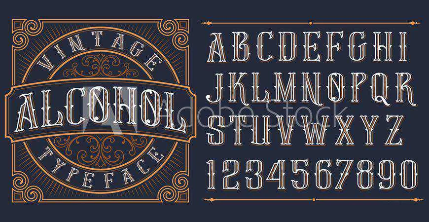
Every typeface carries a silent narrative. When a viewer encounters a brand, the font is often the first element to communicate the company’s values, industry, and personality before a single word is read. Serifs evoke tradition and authority, sans serifs project modern clarity, and scripts offer a personal, human connection. For designers, the process of selecting a logo font is not merely an aesthetic choice—it is a critical strategic decision.

A well-chosen font anchors a brand identity, ensuring it remains recognizable across various platforms, from smartphone screens to massive outdoor billboards. To assist creative professionals in navigating this landscape, we have curated a collection of over forty premium logo fonts designed to help you articulate your client’s vision with precision and style.
The Evolution of Branding: Why Font Selection Matters
The history of logo design is essentially a history of typography. In the early 20th century, brands relied on heavy, serif-laden typefaces to convey stability and industrial power. As the digital age dawned, the focus shifted toward scalability and legibility, leading to the rise of minimalist, geometric sans-serifs.
Today, we are in an era of "expressive branding." Modern logos must be as effective as a tiny social media favicon as they are on a high-resolution storefront sign. This transition necessitates fonts that are not only beautiful but also mathematically balanced and versatile. By choosing from a professional-grade library, designers can avoid the common pitfalls of "trendy" fonts that lose their impact as quickly as they emerge.
Strategic Checklist: How to Choose the Right Logo Font
Selecting the perfect typeface requires a rigorous evaluation process. A font that looks stunning in a portfolio might fail under the constraints of real-world application. Consider the following criteria:
- Brand Alignment: Does the personality of the font match the core message of the business?
- Legibility: Can the characters be distinguished at small sizes?
- Versatility: Does the font family offer multiple weights (Light, Regular, Bold, Black) to accommodate different hierarchy needs?
- Unique Character: Does the typeface possess subtle details that make the logo memorable without becoming distracting?
- Technical Integrity: Is the kerning and glyph construction high-quality?
Quick Recommendations: A Designer’s Starting Point
If you are facing a looming deadline, this summary provides a reliable starting point for various brand archetypes:
| Category | Recommended Font | Best For | Why Choose It |
|---|---|---|---|
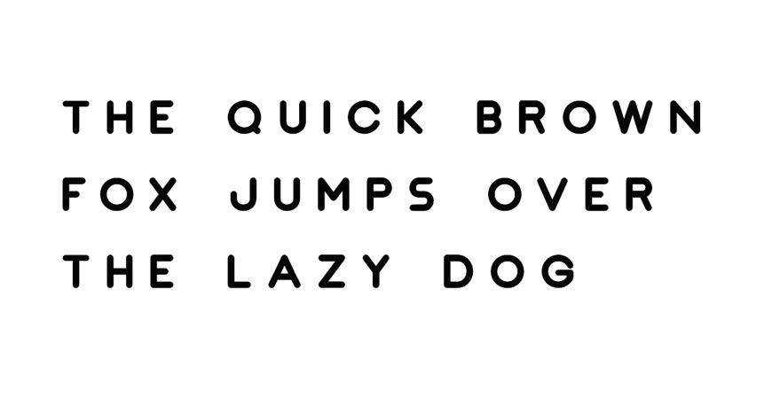
| Minimalist | Nord | Tech & Fashion | Seven weights allow for extreme design flexibility. |
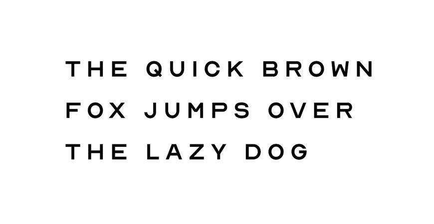
| Geometric | JUST Sans | Corporate/Architecture | Balanced, clean shapes suitable for complex systems. |
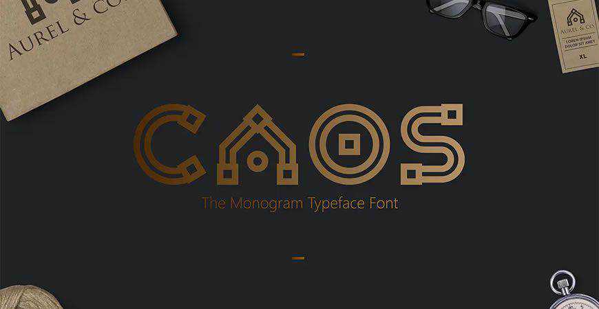
| Monogram | Augor | Luxury/Creative | Distinctive uppercase forms create instant impact. |
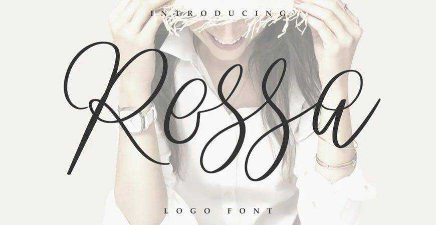
| Script | Rossa | Beauty/Hospitality | Refined, readable handwritten flow. |
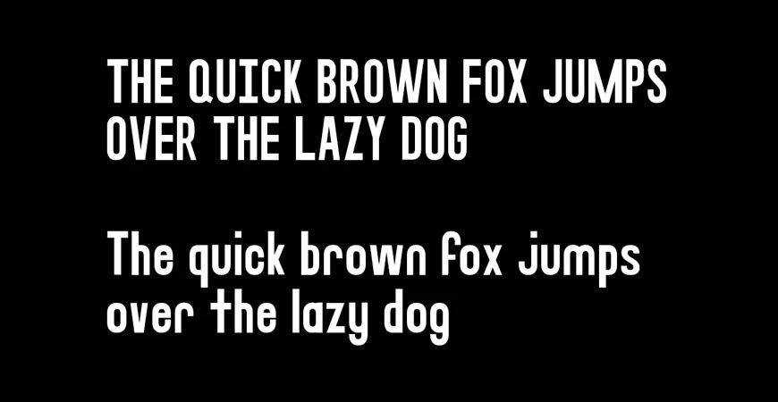
| All-Caps | Stag | Sports/Tech | High-impact, sturdy wordmarks. |
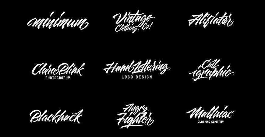
| Brush | Quick Silver | Streetwear/Music | High energy and hand-painted aesthetic. |
| Display | Fritz | Friendly/Consumer | Expressive rounded forms with high clarity. |
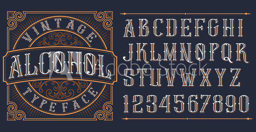
| Vintage | Brewisten | Food/Heritage | Retro character perfect for badge designs. |
| Handwritten | Southwave | Lifestyle/Cafes | Relaxed, approachable, and authentic. |
| Futuristic | Lequire | SaaS/Fintech | Modern, sharp aesthetic for innovative brands. |
Category Deep-Dive: From Minimalist to Abstract
Minimalist & Geometric Foundations
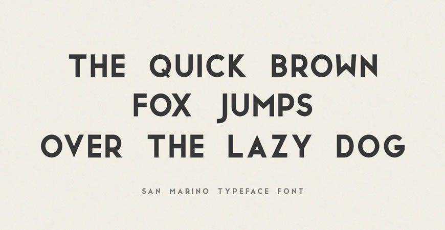
Minimalist fonts are the workhorses of the professional design world. For law firms, financial institutions, and healthcare providers, they convey a sense of order and reliability. Nord and Impulse stand out here, offering geometric precision that feels both contemporary and timeless. These fonts excel in "white-space-heavy" designs where the goal is to let the brand’s name do the heavy lifting without visual clutter.
The Power of the Monogram
Monograms are the ultimate expression of prestige. Brands like CAOS provide designers with the tools to create iconic symbols that represent heritage and exclusivity. By utilizing unique letterforms, a simple two-letter mark can become a recognizable hallmark of quality, essential for high-end fashion and boutique creative agencies.
The Personal Touch: Scripts and Handwritten Styles
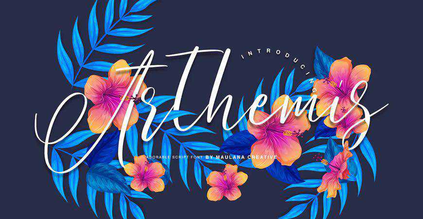
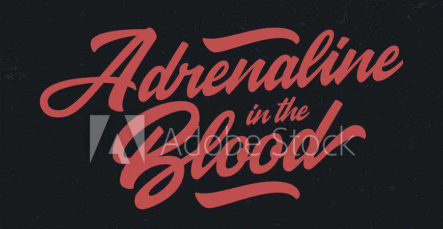
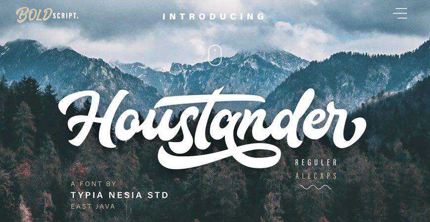
When a brand needs to feel human, a script font is the answer. Rossa and Arthemis provide a sophisticated, elegant flow that suggests a handcrafted approach. Conversely, markers and brush fonts like Quick Silver or Toothless tap into an urban, rebellious, or artisanal energy. These are increasingly popular for small-batch producers, coffee shops, and independent creators who want to build a community-driven brand.
Futuristic and Abstract Innovation
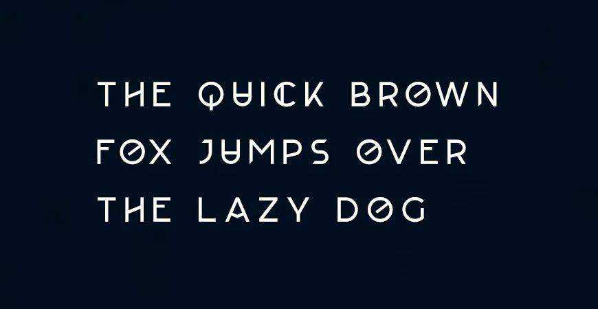
For startups in the fintech, gaming, or space-tech sectors, standard fonts often feel too "grounded." Designers should turn to Lequire or Aqume. These typefaces break the rules of traditional character construction, utilizing sharp angles, unconventional strokes, and experimental layouts to signal that a company is building the future, not just participating in the present.
Understanding the Legalities: Font Licensing
The most common mistake junior designers make is confusing "free to download" with "free to use." Many fonts available on the web are licensed strictly for personal projects. Using a personal-use font for a client’s logo—a commercial application—can result in severe legal and financial repercussions for both you and your client.
Always verify the End User License Agreement (EULA). Even paid licenses often come with restrictions, such as limits on how many devices can install the font or whether you can embed the font file in a digital application. Before finalizing a project, confirm that your license covers commercial use and keep a digital copy of the license in your project folder as a permanent record.
Implications for Future Design
As we look toward the future of branding, the role of typography is set to become even more vital. With the rise of AI-generated content, the "human" element of design—the specific, thoughtful choice of a font that captures an emotional nuance—is becoming a differentiator for high-end designers.
The ability to look at a brand brief and select the right typeface from a library of thousands is a skill that separates a technician from a brand strategist. By mastering these categories and understanding the technical requirements of logo design, you ensure that your work does not just exist in the marketplace—it leads it.
Conclusion: Making Your Mark
Your portfolio is the result of every choice you make, and the font is the most prominent of those choices. Whether you are creating a bold, all-caps wordmark for a sports brand or a delicate script for a wedding planner, remember that the goal is to create a first impression that lingers.
Bookmark this guide as your reference point for future brainstorming. By curating a selection of high-quality fonts and understanding the psychological impact of each style, you are better equipped to overcome creative blocks and deliver professional, high-impact results for every client. Your next project is an opportunity to define a brand’s future—make sure the typeface you choose is ready to carry the weight.

 Evan Lee Salim
 Nana
Nana
 Basiran
 Neng Nana
 Iffa Jayyana
 Raul Delapena Setiawan
 Rifan Muazin
 Asro
Asro