
 Evan Lee Salim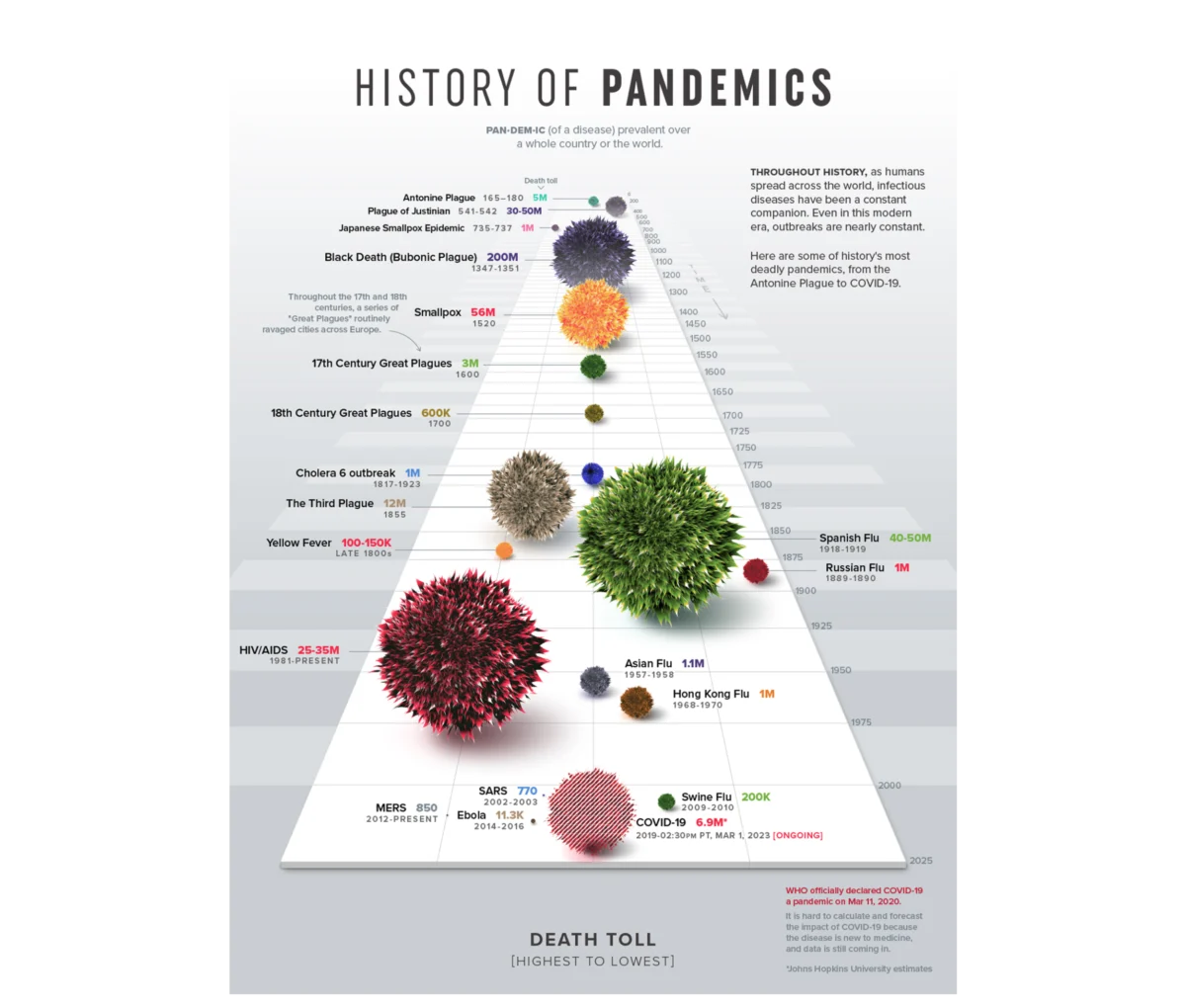
In the modern corporate landscape, data has become the new currency. Organizations are awash in information, with dashboards and performance decks tracking everything from sales funnels and product health to operational efficiency. Yet, in boardrooms and weekly standups across the globe, a familiar, frustrating scene plays out: a presenter clicks through a series of colorful charts, the room offers a polite nod, and the meeting concludes without a single concrete decision or a shift in strategic direction.
The problem is rarely the data itself. It is rarely a case of missing granularity or incomplete datasets. Instead, the failure lies in the disconnect between data science and design. Meriem Benhabiles, a leading voice in the intersection of these fields, argues that most dashboards are "technically correct but communicatively inert." To bridge this gap, we must stop viewing data visualisation as a downstream formatting task and start treating it as an upstream architectural challenge rooted in User Experience (UX) design.
The Anatomy of the Data-Design Divide
Data visualisation sits at the intersection of two disciplines that historically operate in silos. Analysts focus on the veracity and integrity of numbers, while designers focus on the aesthetics of the presentation. When these disciplines remain separate, the result is a "data graveyard"—a collection of charts that satisfy the requirements of a brief but fail to serve the needs of the human reader.

The core of the problem is that we often build charts based on what is available in our database, rather than the questions that need answering. When we assume an audience rather than understanding them, we lose the ability to influence behavior. True data UX is about solving a single, fundamental problem: moving the right information to the right person in a way that triggers action.
The Diagnostic Power of Visualisation
The historical precedent for the power of visual design in data is found in Francis Anscombe’s 1973 landmark paper. Anscombe famously constructed four datasets that were statistically identical—possessing the same mean, variance, correlation, and regression line. If you look only at the raw numbers, they are indistinguishable. However, when plotted on a graph, the four datasets reveal completely different patterns.
This is the "operational truth" that raw numbers often conceal. Visualisation acts as a diagnostic tool that identifies outliers and trends that spreadsheets simply cannot surface. But it is also a communicative tool. Consider Visual Capitalist’s History of Pandemics. By utilizing a proportional bubble layout, the designers allowed the human brain to grasp the sheer scale of the Black Death relative to other historical events before the reader even processed a single digit. This is the hallmark of effective data UX: making the narrative impossible to miss.

The 80% Rule: Upstream Architecture
In the world of UX, we often hear that 80% of a project’s success is determined before a single pixel is placed on the screen. The same applies to data dashboards. Before opening a business intelligence tool, designers must answer three foundational questions that dictate the outcome of the project.
1. Context: What is the Operational Question?
"Show me how the product is performing" is not a goal; it is an open-ended request that leads to a bloated, useless dashboard. A goal must define a metric, a target population, and an implied action. For instance, "Identify which features drive retention among Q1 sign-ups" is a designable problem. By defining the goal first, every element on the screen earns its place. If it doesn’t help answer the question, it doesn’t belong on the dashboard.
2. Audience: Accountability and Literacy
Designers must account for both the "familiarity" and the "accountability" of their audience. An analyst who navigates by raw data requires a different interface than an executive who navigates by strategic KPIs. The density of information must be adjusted accordingly. A high-density path-exploration graph is perfect for an analyst digging for diagnostic insights, while a highly synthesized, clean overview is necessary for an executive making budget decisions.

3. Insight: Defining the "So What?"
Information is what the data shows; insight is the decision that follows. If the intended business change is not defined at the outset, a dashboard will always default to passive reporting. A dashboard built for insight, rather than information, isolates variables to tell a story. When a business metric plummets, a "passive" dashboard triggers panic by simply showing the drop. An "insight-driven" dashboard compares that drop against traffic sources or marketing campaigns, allowing leadership to pause an underperforming ad rather than redesigning a perfectly functional product.
A Case Study in Enterprise Transformation
To understand the practical application of these principles, one can look at a recent project involving a B2B SaaS platform focused on enterprise talent management. The client possessed a massive archive of user activity but lacked the ability to present it in a way that drove behavior.
Chronology of the Redesign
- Defining Mechanics: The team moved beyond generic "time spent" metrics to focus on competency scores and certification trajectories.
- Segmented Narratives: The designers created two distinct interfaces. The individual contributor’s dashboard acted as a self-directed, granular mirror for professional growth, while the manager’s dashboard provided a macro "pulse check" to identify where team interventions were needed.
- Mental Model Design: The team utilized a radar chart to visualize multi-dimensional skills. This allowed for an immediate recognition of balanced vs. skewed proficiency, which a traditional bar chart would have obscured.
- Color-Coded Language: By integrating product branding into the data model from the start, users were already familiar with the "language" of the dashboard upon their first login.
The Impact
The result was a measurable increase in weekly active engagement. Managers shifted their behavior from reactive, monthly post-mortems to proactive, weekly coaching sessions. Churn rates fell to record lows, as the data provided the "early warning system" necessary to prevent skill gaps from becoming project failures.

Implications for the Future of Data Design
The shift toward a user-centric data strategy has profound implications for how organizations function. When data is designed to be actionable, it changes the internal culture. It moves teams away from "data theater"—the practice of presenting charts just to prove a point—and toward evidence-based decision-making.
Key Takeaways for Practitioners:
- Appropriate Complexity: Reject the notion that simplicity is always the goal. "Appropriate complexity" is the goal. Do not strip away the context that a decision-maker needs just to make a chart look "clean."
- The Death of the "One-Size-Fits-All" Dashboard: Personalization is not just about changing labels; it is about changing the narrative arc based on the user’s role and accountability.
- Proactive vs. Reactive: If your dashboard is not helping the user predict a future move, it is likely just a log of the past.
Closing Thoughts
Data visualisation is not a decorative layer added at the end of an analysis; it is a fundamental interface between complex reality and human action. By adopting the principles of UX—empathy for the user, clarity of purpose, and a focus on outcomes—we can transform dashboards from passive logs into powerful engines of organizational change.
The next time you are tasked with visualizing data, step away from the tools. Ignore the BI software and the standard chart templates. Start by asking what you want your audience to do differently the moment they finish looking at your work. Only when you have answered that question should you begin to design. The data you present will be more than just numbers; it will be the catalyst for the next big decision.


 Reynand Wu
 Nana
Nana
 Neng Nana
 Iffa Jayyana
 Raul Delapena Setiawan
 Rifan Muazin
 Asro
Asro