
 Sagoh
Sagoh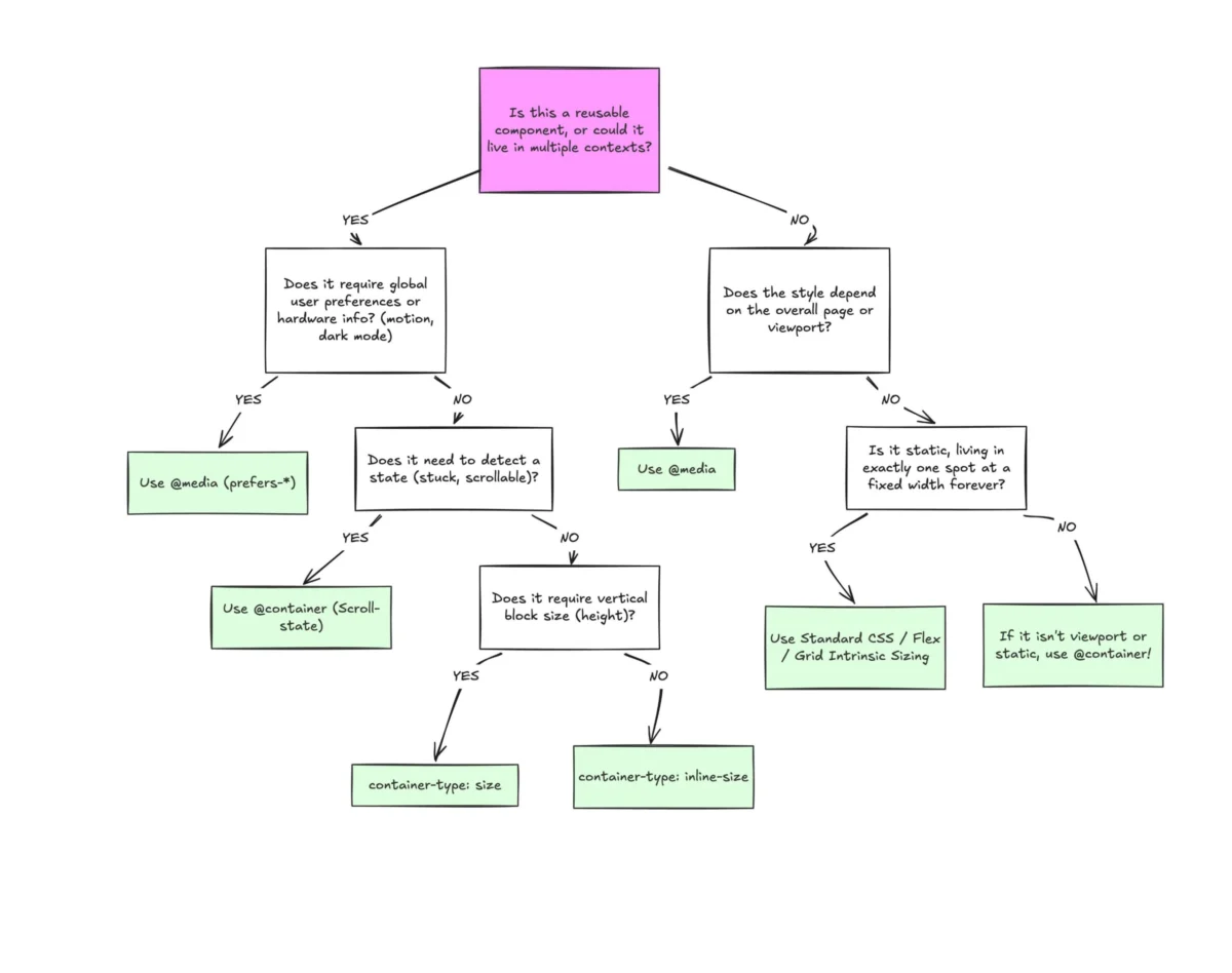
Despite widespread browser support and a collective industry sigh of relief when they finally arrived, CSS Container Queries remain one of the most underutilized and misunderstood tools in the modern front-end developer’s toolkit. While media queries have served as the backbone of responsive web design for nearly two decades, they are increasingly insufficient for the complex, modular, and highly component-driven web applications of 2026.
To move forward, we must stop treating container queries as a mere alternative to media queries. They are, in fact, an entirely different paradigm for layout logic.
The Evolution of Responsiveness: A Chronology of Constraint
The history of web design is a history of fighting against the limitations of the "viewport." In the early days of responsive design, popularized by Ethan Marcotte in 2010, the viewport was our only frame of reference. We asked the browser one simple, binary question: "How wide is the screen?"
For a long time, this was sufficient. We built websites that transitioned from desktop to tablet to mobile. However, as design systems matured, we shifted from building "pages" to building "components." A card component designed for a main content area might now be expected to function equally well in a narrow sidebar, a footer, or a dashboard widget.
When developers finally gained access to Container Queries, the initial reaction—even among seasoned experts—was confusion. "Why do I need this?" was the common refrain. The transition has been sluggish. According to the 2025 State of CSS survey, while 86% of developers are aware of the technology, fewer than half (41.4%) have integrated it into their production workflows. This inertia suggests that the industry is still stuck in a "viewport-first" mindset, struggling to unlearn the habits of the last fifteen years.

The Data: A Fragmented Web
The primary argument for the necessity of container queries lies in the sheer fragmentation of the modern web. Recent data indicates there are over 2,300 unique viewport sizes in active use today. Attempting to manage the layout of a complex application by tethering every component’s behavior to the width of the browser window is, mathematically speaking, a losing battle.
When a developer uses a media query—such as @media (min-width: 1024px)—they are making a global assumption about the environment. If that card component is placed inside a grid cell that is only 300px wide on a massive 1920px desktop monitor, the media query will trigger, forcing a "desktop" layout into a "mobile" space. The result is inevitably broken, cramped, or deformed UI.
Kevin Powell, a prominent voice in the CSS community, famously remarked at SmashingConf Amsterdam 2026 that "media queries are dumb." His critique is not of the technology itself, but of its limitations: media queries are structurally blind to the internal context of the elements they style. They lack the awareness to know how much space is actually available to a specific component.
Macro Layouts vs. Micro Layouts
The most effective way to understand the shift is to categorize design into "macro" and "micro" layouts.
Macro Layouts: The Viewport’s Domain
Media queries are, and will remain, the gold standard for "macro" layout decisions. These are the structural choices that affect the entire page:

- Global grid structures.
- System-wide preferences (e.g.,
prefers-color-scheme). - Device capabilities (e.g., touch input vs. mouse).
- Navigation bars that span the full width of the browser.
Micro Layouts: The Container’s Domain
Container queries, by contrast, excel at "micro" layouts—the individual components that live inside the macro structure. Cards, widgets, sidebars, and modular forms should not care about the size of the user’s monitor; they should only care about the space they have been allocated by their parent element. By shifting this logic to the container, we enable true component reusability. A card component can now be dropped into any parent element and automatically "negotiate" its own layout based on the space provided.
Technical Implementation: The Power of Self-Contained Logic
To implement a container query, one must first define a container. By setting container-type: inline-size on a wrapper, you register that element as a listener.
.card-wrapper
  container-name: card;
  container-type: inline-size;


@container card (min-width: 450px)
  .card
    display: flex;
    flex-direction: row;
This code snippet represents a fundamental shift. The .card component is now fully autonomous. It does not need to know if it is on a mobile device or a 4K display; it only needs to know if its parent has at least 450px of horizontal space.
Furthermore, container queries introduce new units—such as cqi (container query inline-size)—which allow for fluid typography that scales relative to the container. Unlike vw units, which scale based on the viewport and often cause text to become unreadably small in sidebars, cqi units ensure that font size remains proportional to the component’s actual dimensions.
Implications for Future Development
The shift toward container-based logic is not without its hurdles. Developers must be wary of "infinite loop" scenarios where a container attempts to query its own size to define its own styles. To avoid this, designers must ensure that the container and the target element maintain a clear parent-child relationship.

Additionally, there are current limitations, such as the inability to use CSS custom properties directly within a query condition. Because custom properties are dynamic and cascade, they could lead to circular logic that the browser cannot resolve. Despite these caveats, the architectural benefits are undeniable.
Breaking the "Flex-Wrap" Barrier
One of the most exciting implications of this technology is the ability to detect internal layout states. For years, developers have relied on JavaScript ResizeObserver instances to determine when a flexbox layout wraps its items. With container queries, we can now simulate this behavior in pure CSS. By nesting container queries within flex items, we can trigger re-styles precisely when the items shift, providing a high-performance alternative to JS-heavy solutions.
Conclusion: A New Standard of Professionalism
The hesitation to adopt container queries is largely born from the comfort of established workflows. However, the modern web demands a higher standard of component isolation. We are moving away from the era of "page-responsive design" and into the era of "component-responsive design."
By choosing the right tool for the job—media queries for the macro, container queries for the micro—developers can create interfaces that are more resilient, more reusable, and better adapted to the chaotic reality of modern screen sizes. The technology is not just ready for production; it is, for anyone serious about building scalable design systems, an absolute necessity.
As we look toward the future of web standards, the separation of concerns between the browser viewport and the component container will likely become the definitive hallmark of a sophisticated, professional front-end architecture. The transition is not just a trend; it is the logical maturation of CSS.


 Reynand Wu
 Evan Lee Salim
 Basiran
 Neng Nana
 Iffa Jayyana
 Raul Delapena Setiawan
 Rifan Muazin
 Asro
Asro