
 Muslim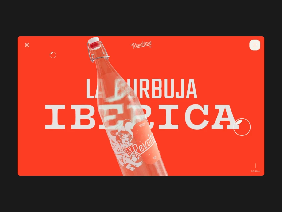
Introduction: The Resurrection of a Legacy
In the landscape of Spanish heritage brands, few names carry the nostalgic weight of La Revoltosa. Born in 1953, the soda brand was once a staple of the nation’s vibrant bar culture and family gatherings. However, like many historic brands, it eventually faded into the background, becoming a dormant memory. When the parent company, Refrescos del Atlántico, sought to bring the brand back into the contemporary limelight, they did not look for a radical reinvention. Instead, they sought an evolution—a way to reclaim the brand’s soul while ensuring its relevance for a digital-first generation.
The mission was entrusted to the Madrid-based branding and design studio, waka. The brief was refreshingly simple yet dauntingly complex: "Do not invent a new brand; bring the old one back to life." The resulting project is not merely a website; it is a masterclass in digital storytelling, technical engineering, and brand personality, proving that legacy brands can thrive when they embrace their own unique voice.
Chronology: From Archives to the Browser
The journey of the La Revoltosa digital relaunch began with a deep dive into the brand’s 1950s origins. Waka’s team opted against modernizing the brand into anonymity. Instead, they performed an "archaeological" branding exercise, recovering and redrawing the company’s original logo from the 1970s.
By mid-2026, the studio moved from identity development to the digital execution. The process was defined by an uncompromising commitment to in-house production. Unlike agencies that outsource illustration or 3D modeling, waka handled the iconography, packaging design, and web architecture internally. The collaboration with illustrator and tattoo artist Gonzalo (GL6RIA) bridged the gap between traditional Spanish aesthetics and a rebellious, modern edge. The final product, which launched in mid-2026, represents months of iterative design, technical R&D, and a refusal to rely on the standard "brochure-style" web templates that dominate the beverage industry.
The Concept: A Website That "Talks Back"
The most striking element of the La Revoltosa digital experience is its refusal to behave like a standard corporate website. Most beverage brands opt for safe, third-person descriptions and sterile product carousels. Waka flipped the script: the website does not introduce the brand; the brand introduces itself.
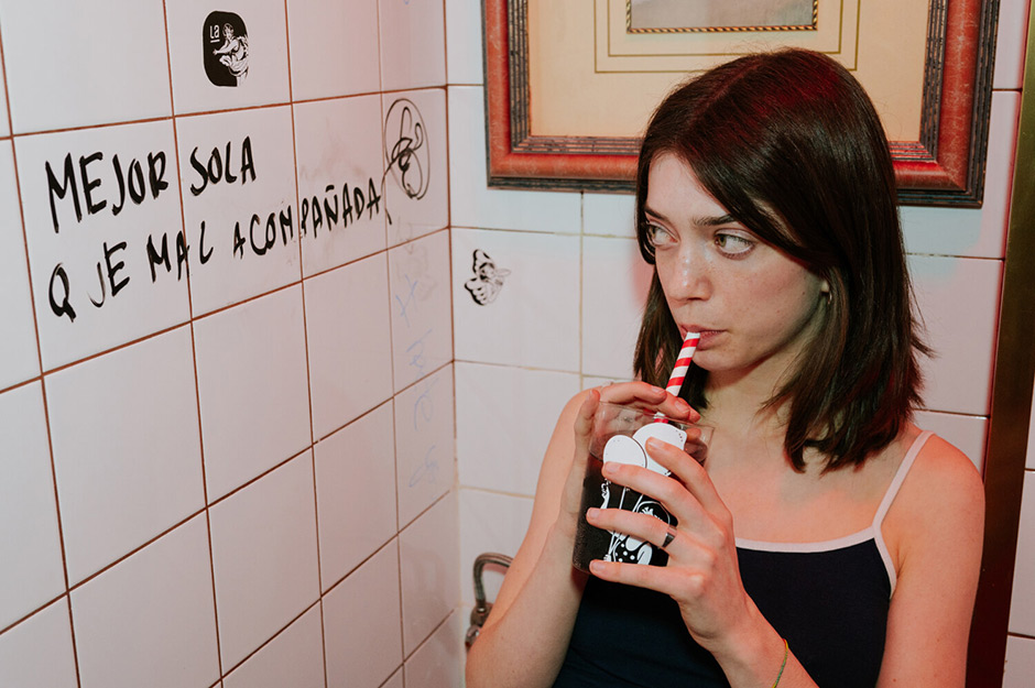
The site utilizes a "scrollytelling" architecture where the user engages in a first-person conversation with the brand. As the visitor scrolls, they are taken through chapters of a life story, moving from a casual acquaintance to a deeper connection. This aligns with the brand’s philosophy of "a nuestra manera" (in our own way). The site’s tone is intentionally familiar, echoing the "bar-counter" intimacy of Spanish social life—ironic, warm, and unapologetically bold.
Technical Execution: Pushing the Browser to the Brink
Behind the charming exterior lies a technical architecture that challenges the current capabilities of the modern browser. The site is built on a custom monolith WordPress core, eschewing off-the-shelf builders in favor of complete granular control.
The 3D Challenge
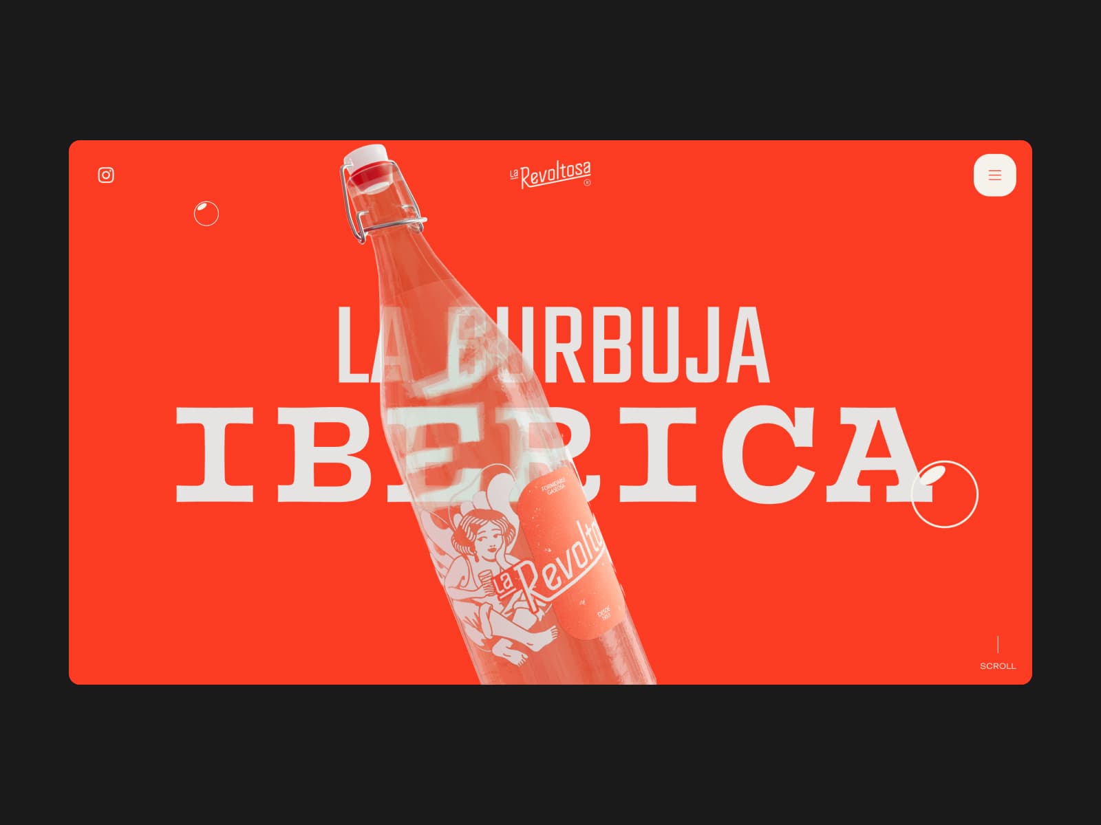
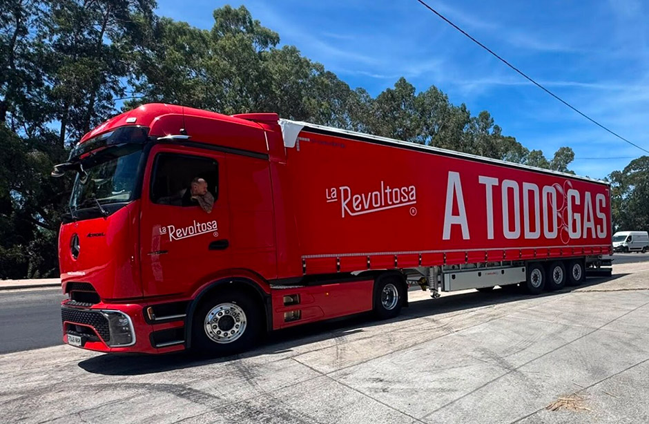
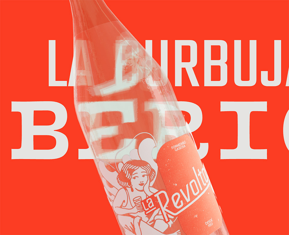
The centerpiece of the homepage is a 3D rendering of the La Revoltosa bottle. The studio’s developers, navigating their first major foray into WebGL and Three.js, treated the bottle as a complex light-refraction object. To achieve a high level of aesthetic immersion, they rendered the hero typography within the 3D scene itself, treating each letter as independent geometry. This allowed the text to distort realistically behind the bottle’s glass, a feat that requires significant GPU power.
DOM Synchronization
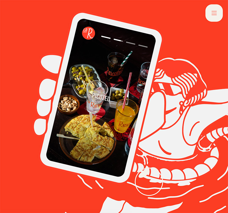
Beyond 3D, the site employs advanced SVG scaling. A background video loop plays while an SVG illustration of the brand’s icon scales across the viewport. Synchronizing these elements—while simultaneously managing a floating mobile-phone element that moves in perfect mathematical lockstep with the scroll position—required a sophisticated event-driven architecture powered by emitter.js.
Mobile Optimization
The team faced the "Mobile Reality Check": how to keep this heavy experience functional on mid-range smartphones. The solution was aggressive optimization. The team implemented polygon reduction, texture reuse, and a progressive loading strategy where only the active bottle model is held in memory, while others are released. While the studio acknowledges that achieving a flawless 60fps on every low-end device is a "beast" to tame, the final result stands as a testament to what is possible when design ambition meets rigorous technical management.
Supporting Data: Product Worlds
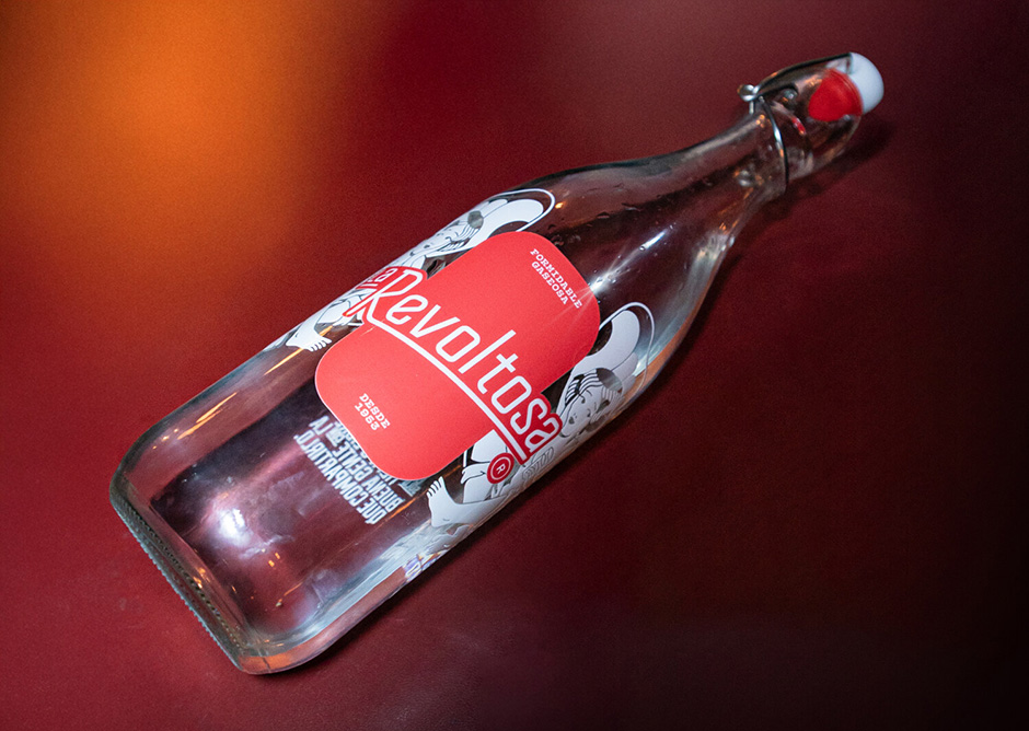
The "Mis Bebidas" (My Drinks) section of the website serves as the ultimate showcase for the studio’s narrative capabilities. Rather than a static product grid, each flavor—soda, seltzer, and tonic—is treated as a distinct character.
- The Soda: A playful, social character paired with a butterfly motif.
- The Seltzer: An adventurous spirit represented by a dragon.
- The Tonic: A sophisticated, nocturnal presence symbolized by a crocodile.
Each section triggers a complete transformation of the user environment: color palettes, background illustrations, and copy change in real-time as the user scrolls. This modular approach allows users to toggle between an immersive narrative mode and a standard grid view, satisfying both the brand-story enthusiasts and the utility-focused consumer.
Official Responses and Studio Philosophy
"We didn’t want to show the brand; we wanted it to speak," says the waka team. The project’s success is attributed to the client’s total trust. Refrescos del Atlántico provided the studio with the keys to the brand, allowing for the kind of technical risk-taking that is often stifled in corporate environments.
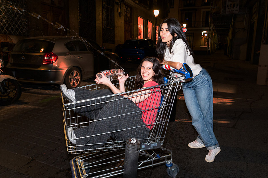
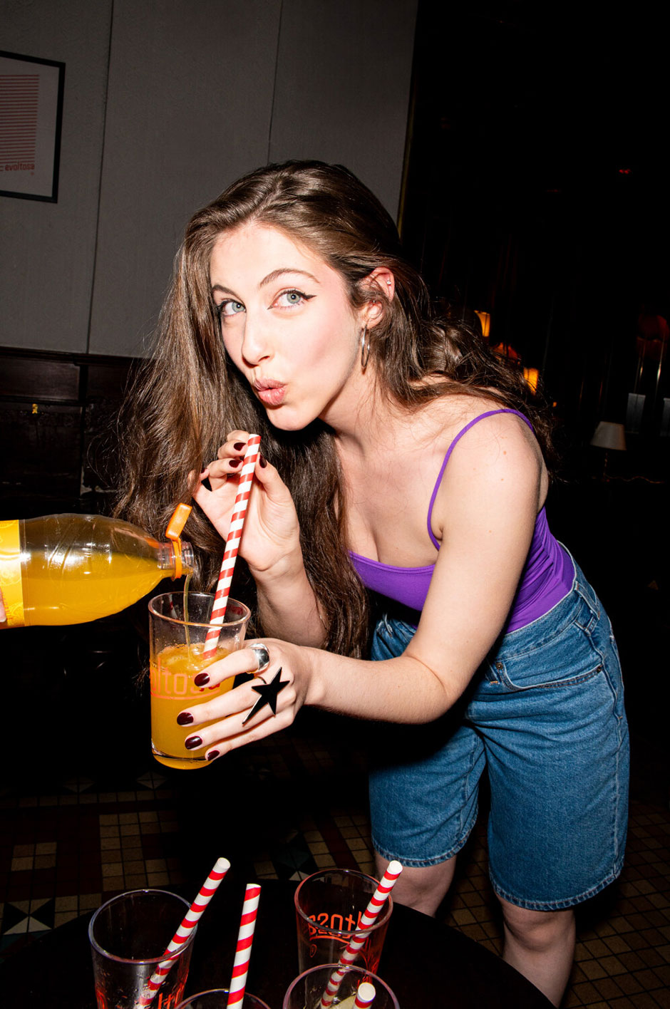
The studio’s reliance on the BEMIT methodology for CSS and the combination of GSAP and Lenis for interactions ensured that, despite the heavy 3D load, the site maintains a "fluid and pleasant" feel. The use of real people—the studio’s own team and the client’s friends—in the site’s video content rather than stock models reinforces the brand’s commitment to authenticity. There are no hired actors; the people toasting on screen are the very community members that support the brand.
Implications: The Future of Heritage Branding
The La Revoltosa project suggests a significant shift in how heritage brands should approach digital transformation. The era of the "corporate brochure" is ending; in its place, audiences are demanding experiential storytelling. By moving the brand from a static legacy product to a dynamic, interactive, and conversational digital presence, waka has set a new benchmark for the food and beverage industry.
This is not merely a digital project; it is the foundation for a physical relaunch. The brand is currently preparing to transition these digital narratives into the real world through street-level cultural events across Madrid. By bridging the gap between a high-tech website and grassroots community participation, La Revoltosa proves that a brand does not need to be new to be relevant. It simply needs to be honest, bold, and—most importantly—willing to tell its own story on its own terms.
As the digital landscape continues to evolve, the La Revoltosa case study serves as a reminder that the best way to honor the past is to build the future with the same spirit of rebellion that defined the original. Whether through the refraction of a 3D bottle or the invitation to a local street festival, the brand has successfully reclaimed its place in the Spanish collective consciousness.

 Reynand Wu
 Evan Lee Salim
 Basiran
 Neng Nana
 Iffa Jayyana
 Raul Delapena Setiawan
 Rifan Muazin
 Asro
Asro