
 Pevita Pearce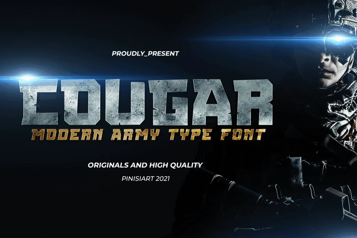
Chrome lettering is more than just a stylistic choice; it is a visual shorthand for speed, technological advancement, and the high-octane energy of futuristic worlds. From the polished emblems of 1950s classic cars to the neon-drenched aesthetics of modern cyberpunk, chrome has remained a cornerstone of graphic design. It evokes depth, weight, and a sense of precision that flat, minimalist design often fails to capture.
As digital design continues to push into the realms of augmented reality (AR) and hyper-realistic 3D, the demand for high-impact metallic typography has skyrocketed. This article explores the current landscape of chrome font design, analyzing the best tools for creators, the technical evolution of metallic type, and how you can leverage these assets to create designs that command attention.
The Evolution of Chrome in Visual Culture
The fascination with chrome began in the industrial age, where the material represented the peak of engineering and luxury. In typography, this translated into "metallic" effects—bold, high-contrast lettering that appeared to reflect light from multiple angles.
Throughout the late 20th century, chrome became synonymous with the "future." Science fiction cinema and heavy metal album art cemented the look, utilizing airbrushed metallic gradients to create a sense of artificial, manufactured power. Today, we have moved from manual airbrushing to sophisticated SVG color fonts and 3D rendering. This digital transition has made the "chrome look" accessible to designers who don’t necessarily have a background in complex 3D modeling software, allowing for a democratization of high-impact design.
Curating the Ultimate Chrome Font Collection
For designers seeking to infuse their projects with a metallic sheen, the following premium and free resources offer a blend of versatility, technical quality, and aesthetic impact.
Premium Selections for Professional Branding
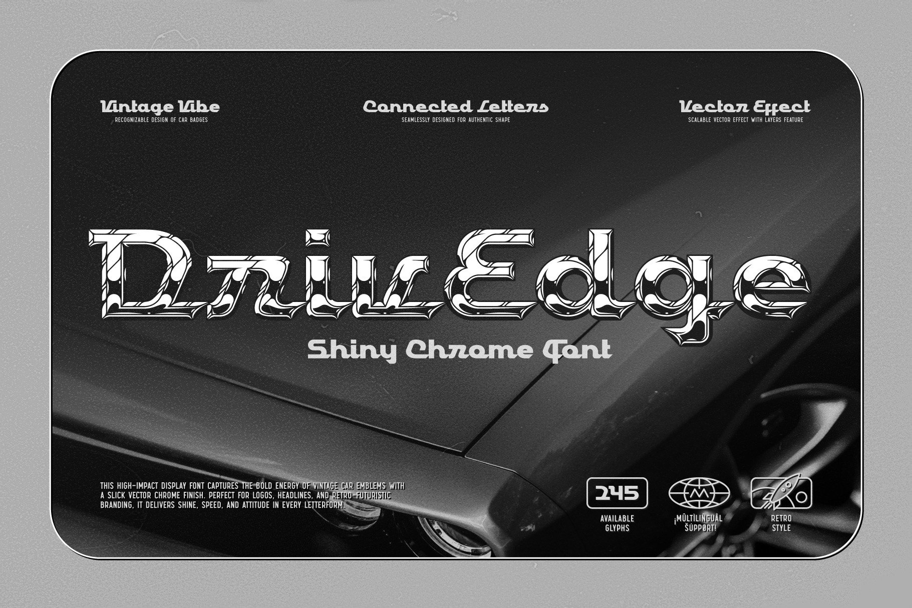
DrivEdge – Shiny Chrome Font
DrivEdge captures the essence of vintage automotive branding. Its design is engineered for impact, featuring a multi-layered system that includes a base shape and a specialized chrome effect layer. This allows for precise control over lighting and reflection, making it ideal for retro-futuristic logos.
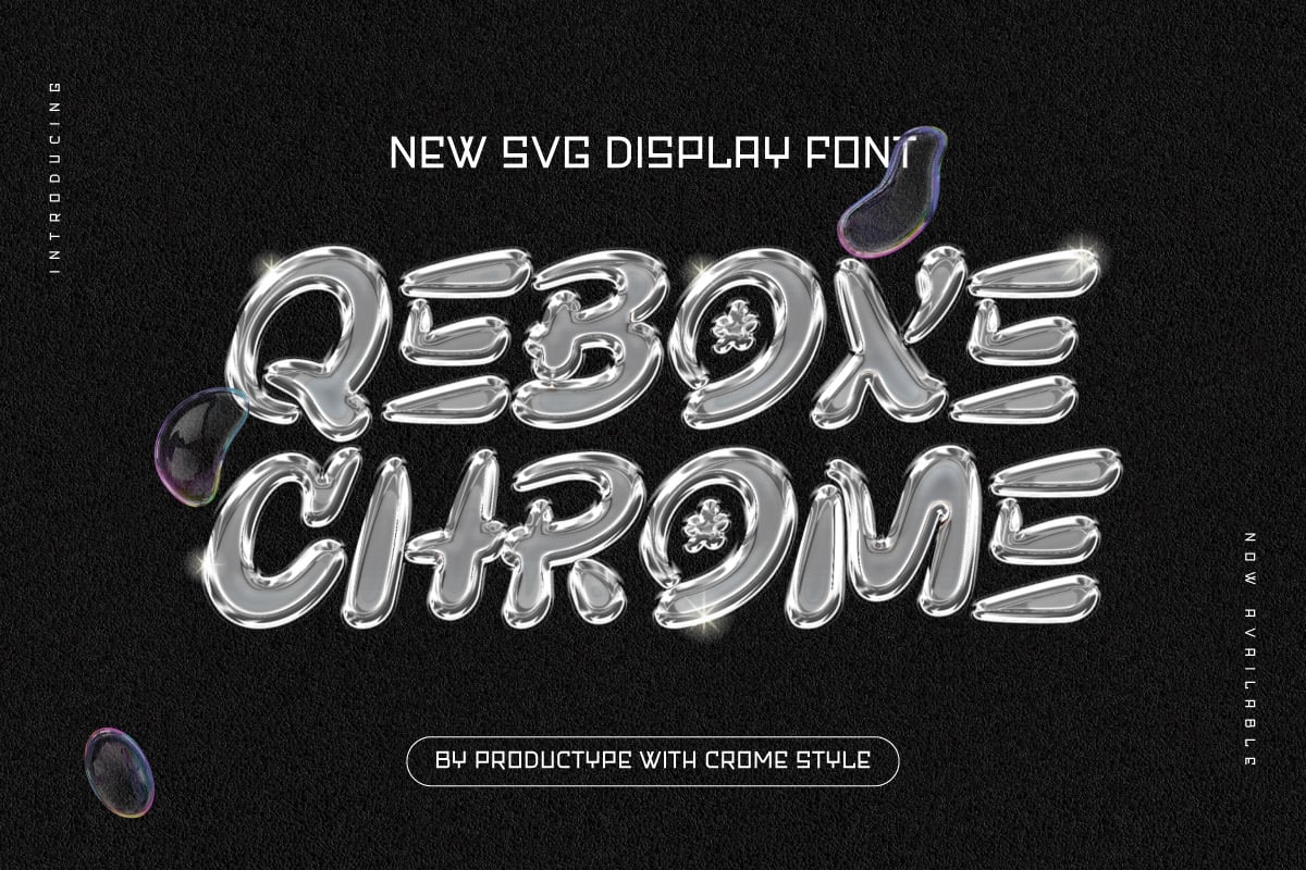
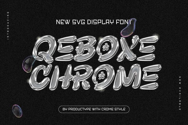
Qebox Chrome – 3D Style SVG Font
Qebox represents the pinnacle of modern font technology. As an SVG font, it contains embedded texture and lighting data, providing a realistic 3D appearance without the need for additional post-processing. It is particularly effective for tech branding and high-resolution digital displays.
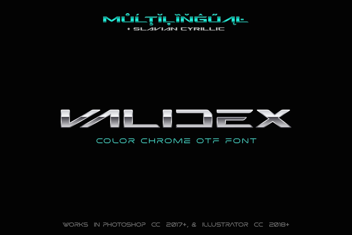
Validex – Color Metallic Font
Validex bridges the gap between static typography and interactive web design. By offering both standard OTF formats and color SVG variants, it allows designers to implement complex metallic gradients directly into websites and apps, ensuring brand consistency across platforms.
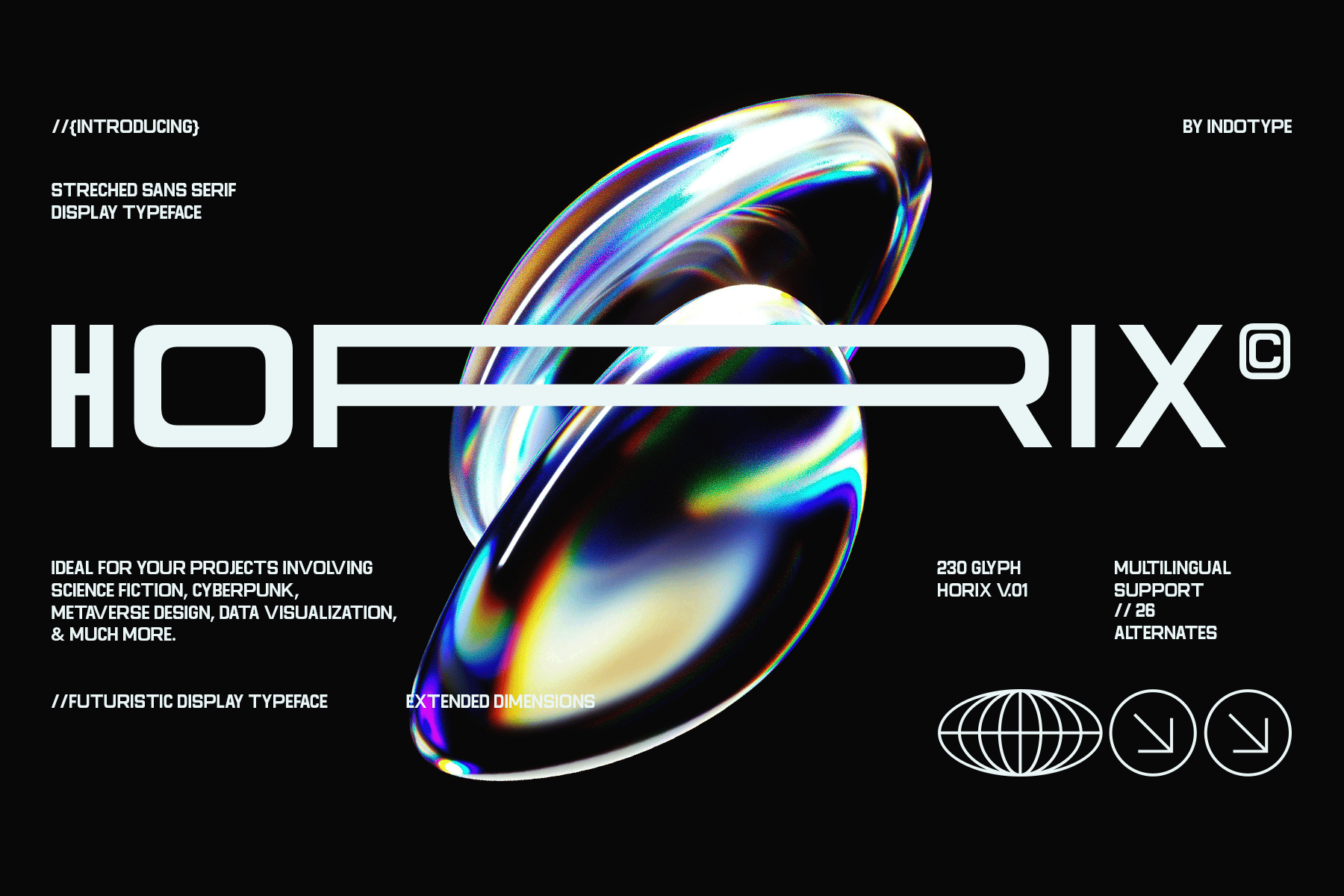
Horix – Modern Stretched Chrome Font
If your project requires a sleek, high-speed aesthetic, Horix is the industry standard. Its elongated letterforms evoke a sense of velocity. With over 230 glyphs and numerous stylistic alternates, it offers the flexibility required for complex layout work in cyberpunk or sci-fi projects.
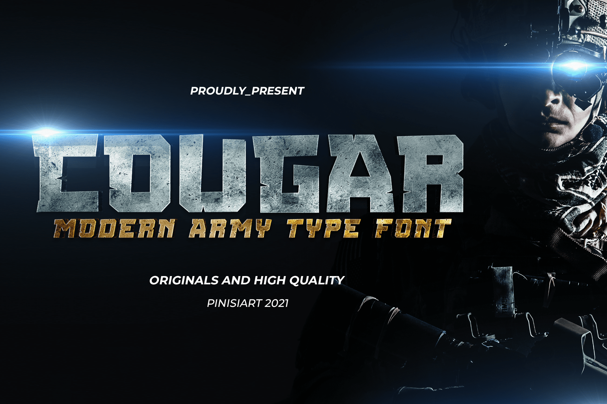
COUGAR – Chrome Military Font
Rugged, imposing, and undeniably bold, COUGAR is the go-to typeface for military-themed or industrial design. Its thick, sturdy construction makes it legible even when applied with heavy lighting effects, making it a favorite for social media headers and movie posters.
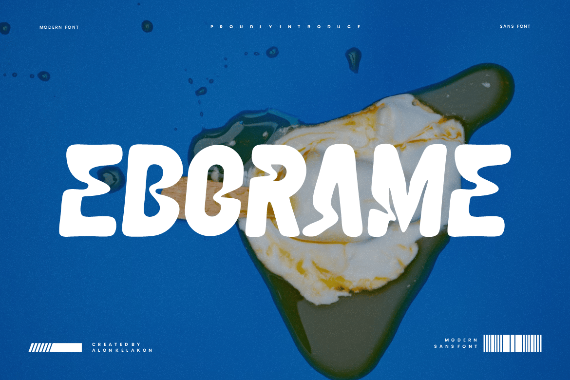
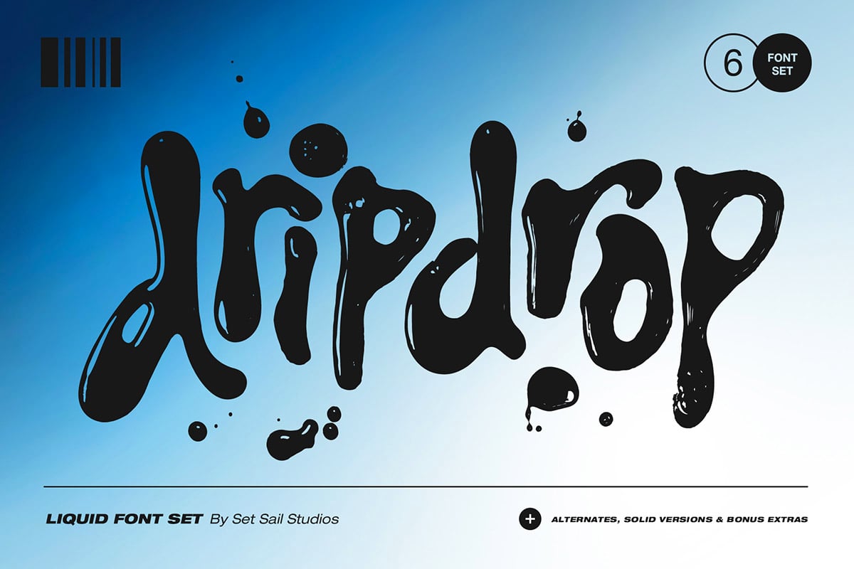
Eborame and Dripdrop – The Liquid Metal Aesthetic
For a more fluid, avant-garde approach, Eborame and Dripdrop offer a "molten" look. These fonts simulate the behavior of liquid metal, creating a surreal and organic appearance. Dripdrop, in particular, comes with a suite of extras, including additional splats and drizzles, allowing designers to create a fully customized, messy-yet-polished look.
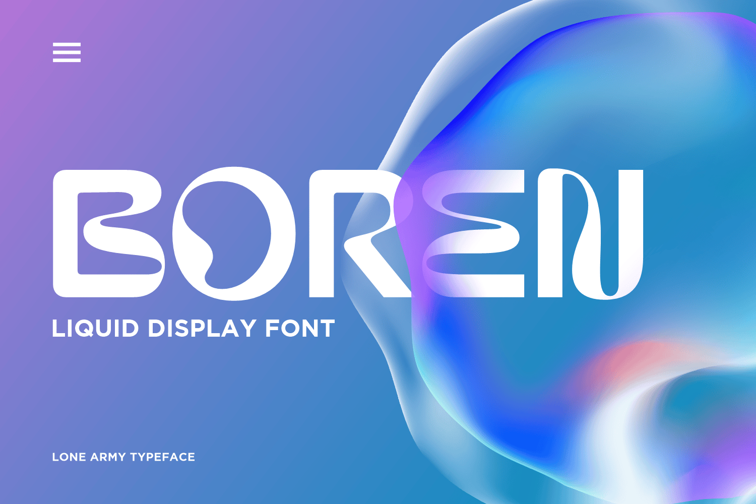
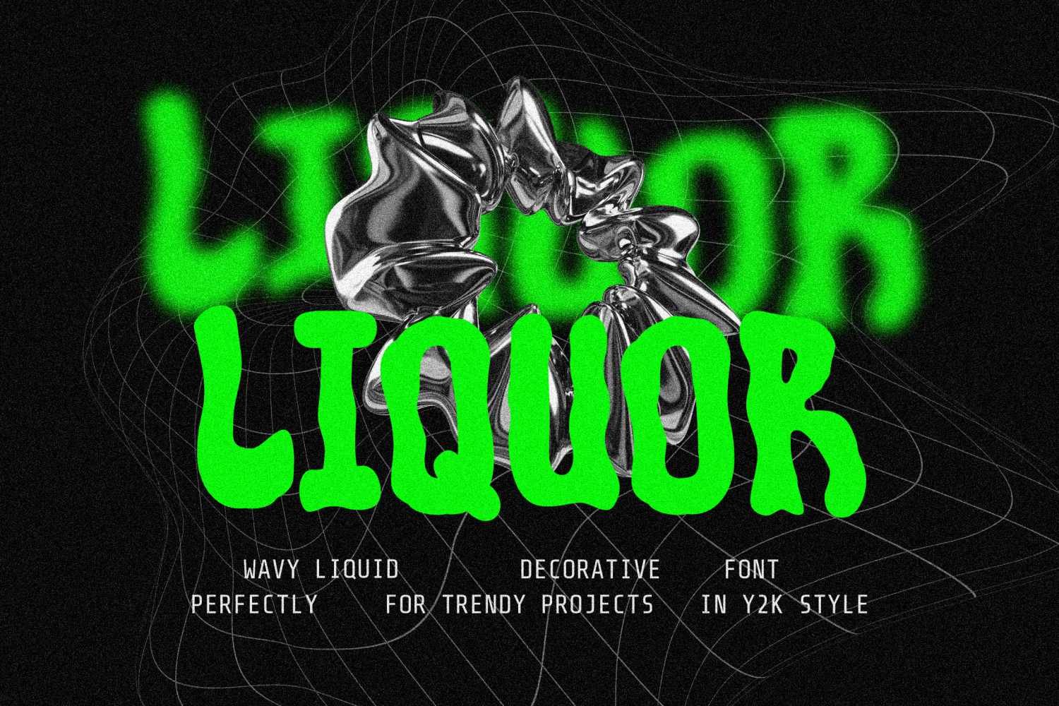
Boren and Liquor
These fonts prioritize the flow of chrome. Boren integrates architectural lines with liquid movement, while Liquor provides a wavy, grid-based system that ensures every word feels unique and custom-crafted.
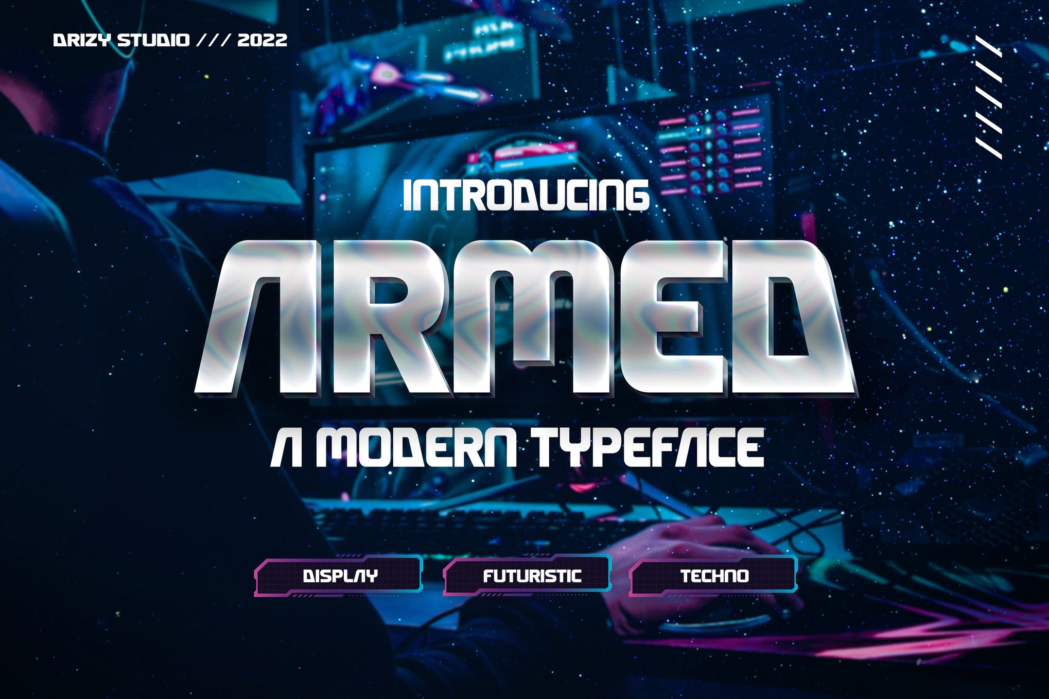
Armed and Gasterol
When the design requires raw industrial power, these fonts excel. Gasterol is designed to look like weathered steel, making it perfect for heavy-duty industrial branding, while Armed provides a clean, modern, and highly legible aesthetic suitable for a wider variety of corporate applications.
Steel Plate
Steel Plate is the literal interpretation of industrial chrome. Featuring geometric cuts and rivet-like details, this font is perfect for projects that need to convey structural integrity and raw strength.
Moran – Futuristic Chrome Font
Moran is the ultimate "clean" chrome. It is ultra-modern and highly readable, making it the perfect choice for tech-forward brands looking to balance a futuristic aesthetic with professional clarity.
The Best Free Chrome Fonts for Personal Projects
- Chrome Engine: A polished, high-contrast font perfect for those who need a "ready-to-use" metallic look for gaming or automotive projects.
- Metalia Script: A rare example of a metallic script font, combining the elegance of calligraphy with the hardness of steel.
- Aerologica: Known for its bold, 3D structure, this font shines when used in large display sizes for posters or title cards.
- Chell: A solid, industrial-style font that mimics the look of brushed chrome. It is exceptionally effective in high-contrast layouts.
Technical Breakdown: How to Create Your Own Chrome Effect
While pre-made fonts are powerful, mastering the technique behind them is essential for any serious designer. The "Chrome Effect" is essentially a study in light, shadow, and contrast.
1. The Foundation: Selecting the Right Type
Always start with a bold, sans-serif typeface. Chrome effects rely on large surface areas to display highlights and reflections. Thin or serif fonts often lose their detail when metallic gradients are applied.
2. The Gradient Strategy
The secret to "real" chrome is a high-contrast gradient. You want to mimic the reflection of the sky (light blue/white) and the horizon (dark gray/deep purple). Use tight, sharp transitions in your gradient editor to create the "shiny" edge effect.
3. Depth Through Bevel and Emboss
Use Photoshop’s "Bevel and Emboss" settings to give your text physical dimension. Set the technique to "Chisel Hard" for a sharp, metallic look, and adjust the "Gloss Contour" to create multiple highlights across the letter’s surface.
4. The Final Polish: Highlights and Glows
- Inner Glow: Use a dark color set to "Multiply" to deepen the shadows inside the letters.
- Outer Glow: A very subtle, soft white glow around the edges of the text can simulate the "bloom" effect seen in high-end photography.
- Tinting: Don’t forget to add a "Gradient Overlay" on top of everything, set to a low opacity, to tie the color palette of the chrome to the background of your design.
Implications for Modern Design
The widespread availability of these assets has significant implications for branding. In the past, achieving a high-quality chrome effect required expensive 3D software and hours of rendering. Today, a designer can achieve a professional-grade look in minutes. This has led to a "chrome renaissance" in streetwear, digital art, and UI/UX design.
However, with great power comes the risk of overuse. Because these fonts are visually "loud," they must be used sparingly. They are display fonts—meant to be the hero of the page, not the body text. When applied to a logo or a headline, they provide an instant sense of authority and innovation. When used for a paragraph of text, they become illegible.
Conclusion
Whether you are designing a logo for a futuristic game, a poster for a sci-fi film, or a bold header for a tech brand, chrome typography remains one of the most effective ways to capture the viewer’s eye. By selecting the right font from the curated list above—or by learning the fundamental techniques of lighting and contrast—you can transform ordinary text into a polished, metallic centerpiece.
As we move further into the digital age, the line between physical materials and digital renders will continue to blur. Mastering the "chrome look" is not just about nostalgia for the past; it is about embracing the visual language of the future. Whether you choose the ruggedness of Steel Plate or the sleekness of Moran, ensure your choice serves the brand story, and let the light hit your letters exactly where it matters most.

 Sagoh
Sagoh
 Nana Muazin
 Nila Kartika Wati
 Jia Lissa
 Basiran
 Lina Hope