
 Sagoh
Sagoh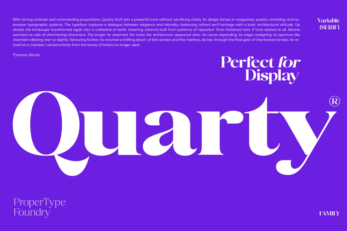
In the world of design, the most challenging canvas is often the smallest. Whether it is a footnote in a dense legal document, the navigational labels on a complex mobile dashboard, or the fine print in a luxury editorial layout, typography faces its ultimate test when scaled down. When text shrinks, the margin for error evaporates; character clarity, stroke weight, and letter spacing become the difference between a seamless user experience and a frustrating, illegible mess.
Selecting the right font for small text is not merely an aesthetic choice—it is a functional necessity. This article explores the essential criteria for choosing high-readability fonts, reviews top-tier typeface families designed for precision, and provides a comprehensive guide to mastering micro-typography.
The Core Principles of Micro-Typography: A Technical Overview
The primary challenge of small text is the physical limitation of the display medium or printing process. As font size decreases, the human eye struggles to differentiate between similar letterforms (such as ‘c’ and ‘e’ or ‘l’ and ‘I’).
The Science of Legibility
Legibility is defined by how easily a reader can distinguish one character from another. In micro-typography, this is governed by three critical factors:
- The x-height: A higher x-height (the height of the lowercase ‘x’ relative to the capital letters) ensures that lowercase characters appear larger and more open, which is essential for legibility at sizes below 10pt.
- Apertures and Counters: Open apertures (the gaps in letters like ‘c’, ‘e’, and ‘s’) and large counters (the enclosed spaces in ‘o’, ‘p’, or ‘a’) prevent characters from "filling in" or blurring together.
- Stroke Uniformity: Excessive contrast between thick and thin strokes can lead to "dithering" or vanishing strokes on low-resolution screens. Consistent, monolinear weights generally perform better at reduced scales.
Curated Selection: Premium Font Families for Small Text
When designing for professional environments, standard system fonts often fall short. The following families have been engineered to maintain structural integrity and character distinction at smaller sizes.
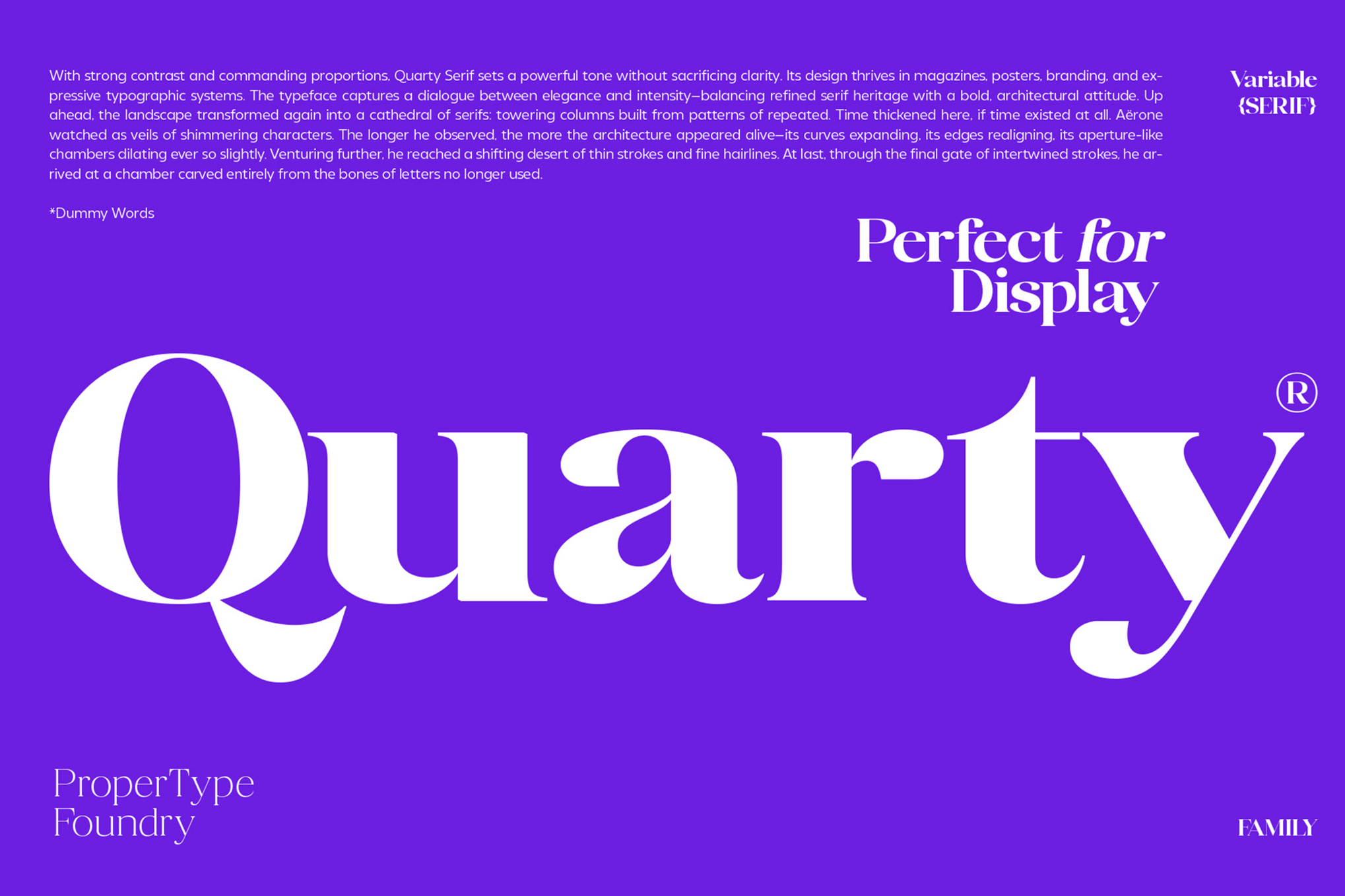
1. Quarty: The Serif Specialist
Quarty is a refined serif family that masterfully balances geometric structure with graceful, organic curves. Unlike many serifs that lose their detail at small sizes, Quarty retains its personality. Its expansive character set, including ligatures and swashes, makes it an excellent choice for print documents that require a sophisticated, high-end feel without sacrificing legibility.
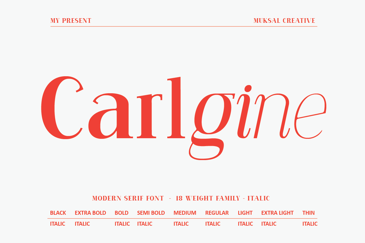
2. Carlgine: The Editorial Workhorse
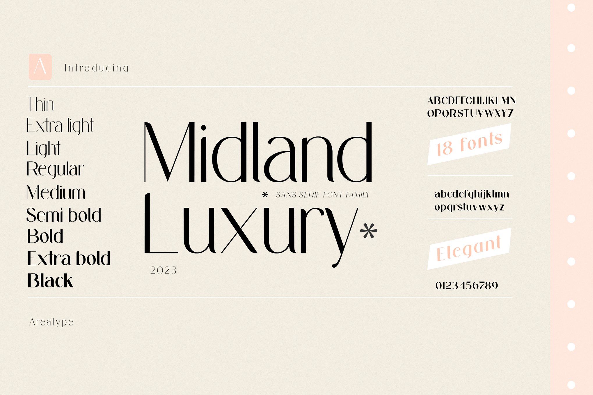
With 18 distinct weights, Carlgine provides the typographic flexibility required for complex editorial layouts. From its "Thin" weight for elegant headers to its "Black" weight for high-impact labels, it maintains consistent readability. Its inclusion of stylistic glyphs allows designers to tailor the look to specific brand identities while relying on its rock-solid legibility.
3. Pripun: Precision Sans-Serif
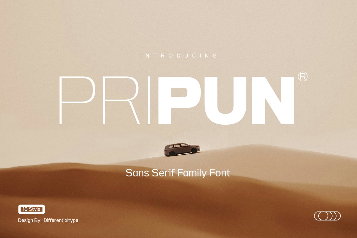
Pripun stands out as a "clean" powerhouse. By stripping away unnecessary flourish, it focuses on the geometry of the letterforms. It is particularly effective for digital interfaces where clarity is the highest priority. The inclusion of WOFF2 support ensures that this font loads efficiently on web platforms, maintaining sharp rendering on high-DPI screens.
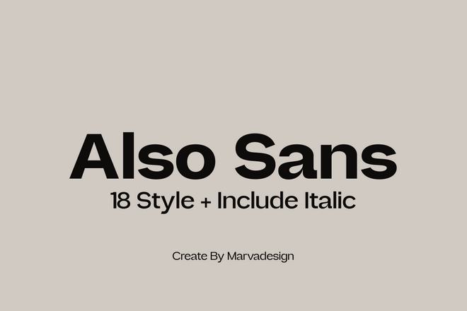
4. Also Sans & Glonimove: The Geometric Contenders
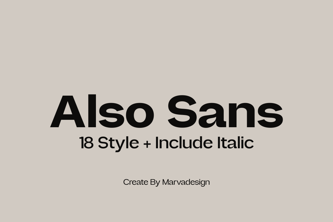
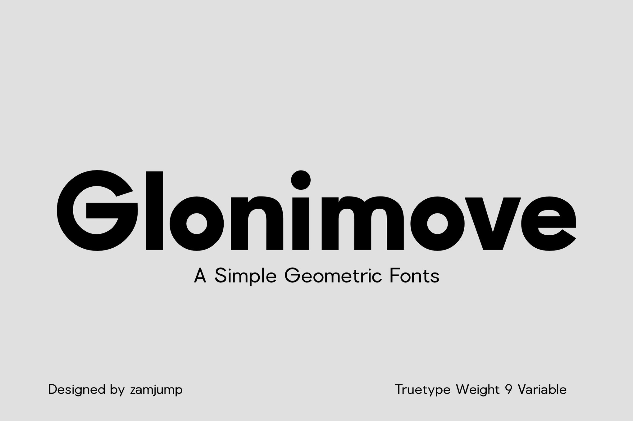
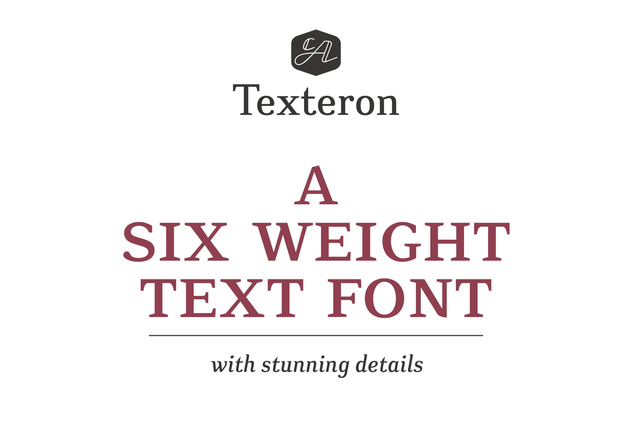
Both Also Sans and Glonimove leverage the popularity of modern geometric design. Also Sans relies on open counters to ensure that even at ultra-thin weights, the text remains readable. Glonimove, conversely, offers 9 variable weights, providing designers with granular control over how the font sits against a background, making it ideal for signage and mobile UI.
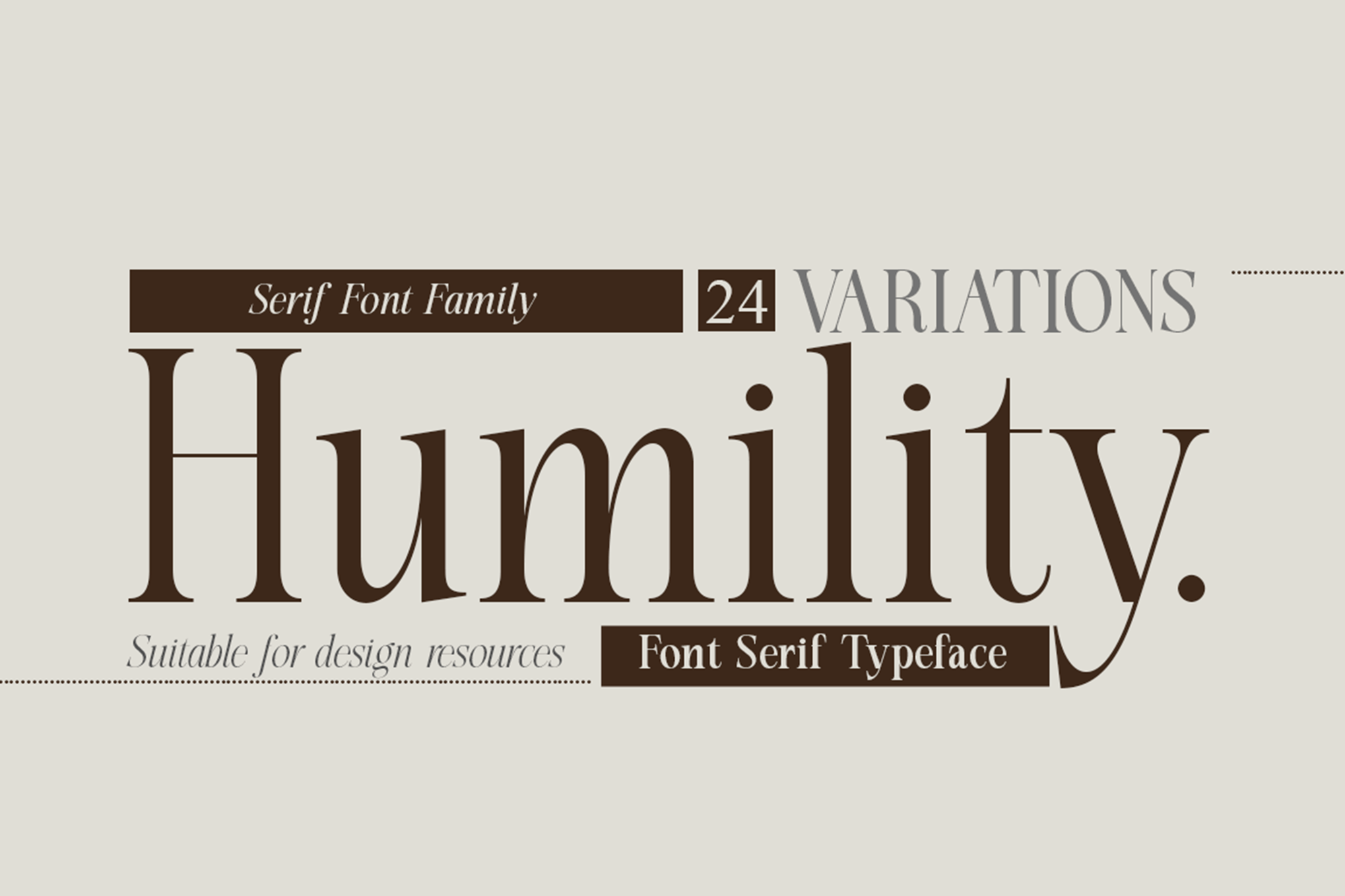
5. Humility and Texteron: Bridging Tradition and Modernity
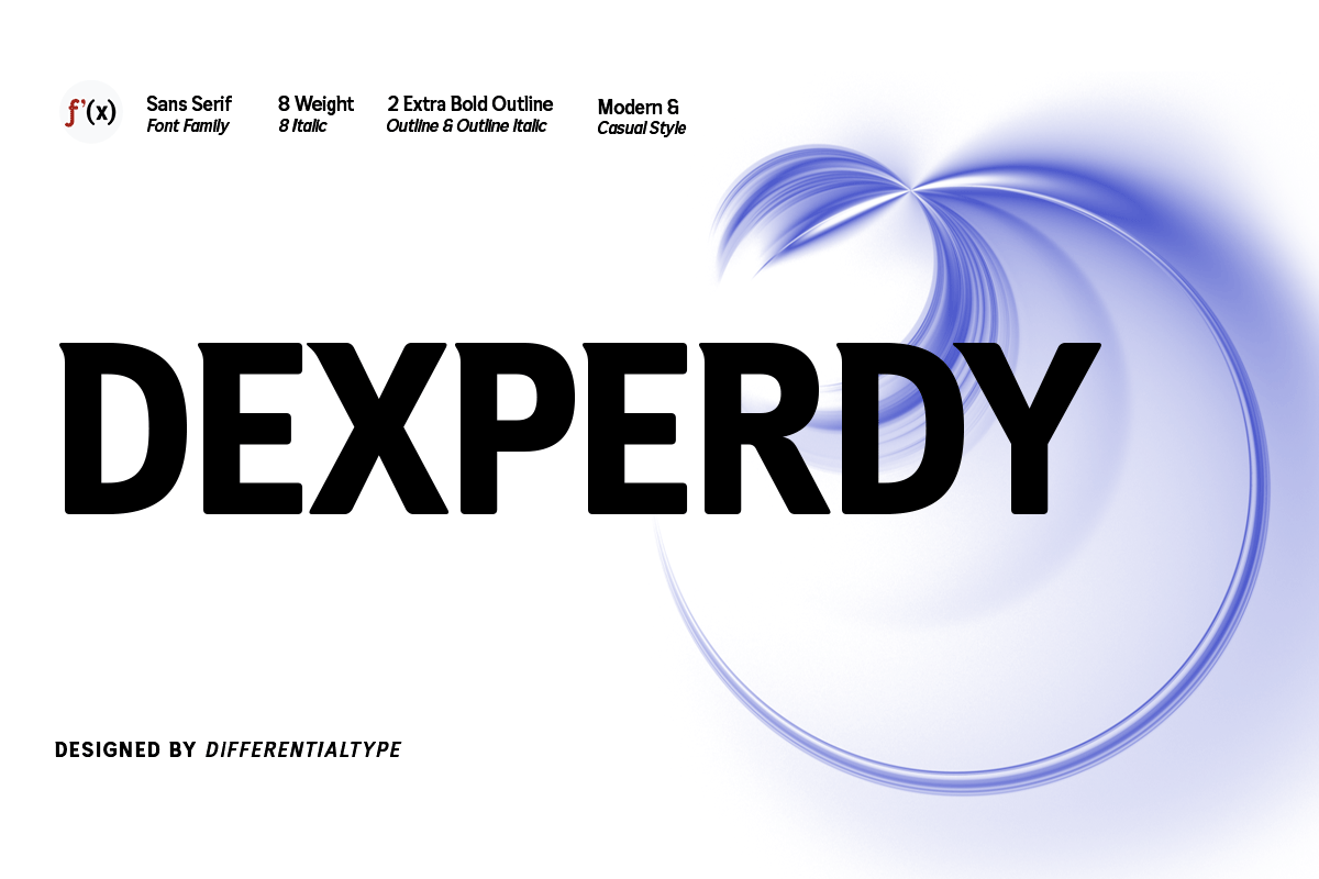
For those who prefer a classic, academic, or professional aesthetic, Humility and Texteron offer a bridge between traditional serif heritage and modern readability requirements. Humility, in particular, is noted for its expressive characters, making it a favorite for fashion publications where the fine print must still carry a sense of style.
The Professional Toolkit: Free Resources for Designers
High-quality typography does not always require a massive budget. Several foundries and designers provide exceptional, free-to-use fonts that are highly optimized for small-scale applications.
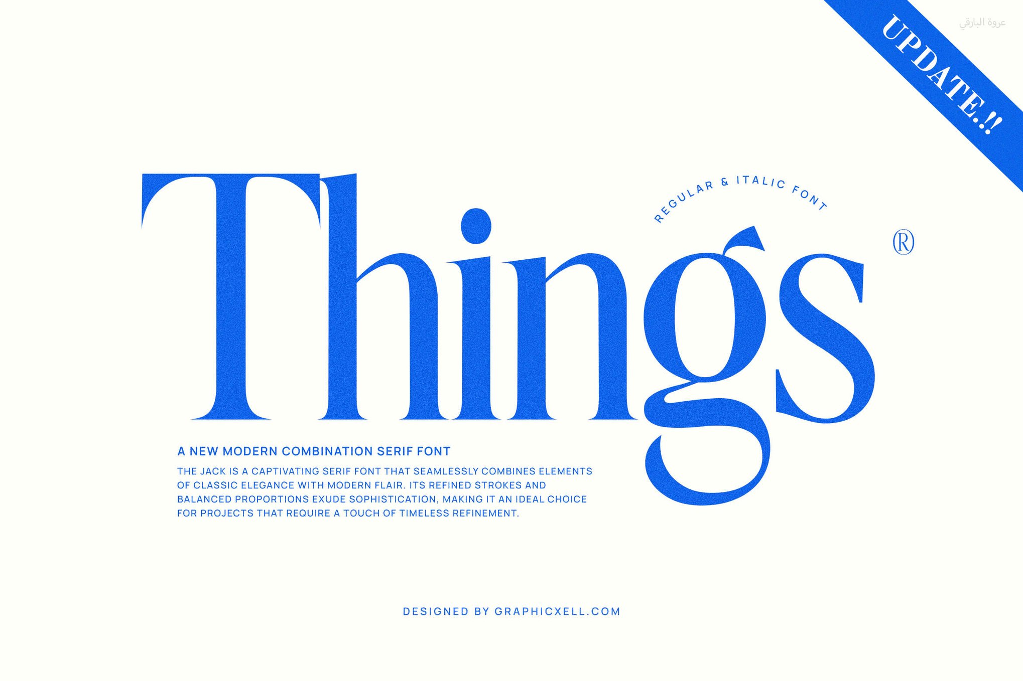
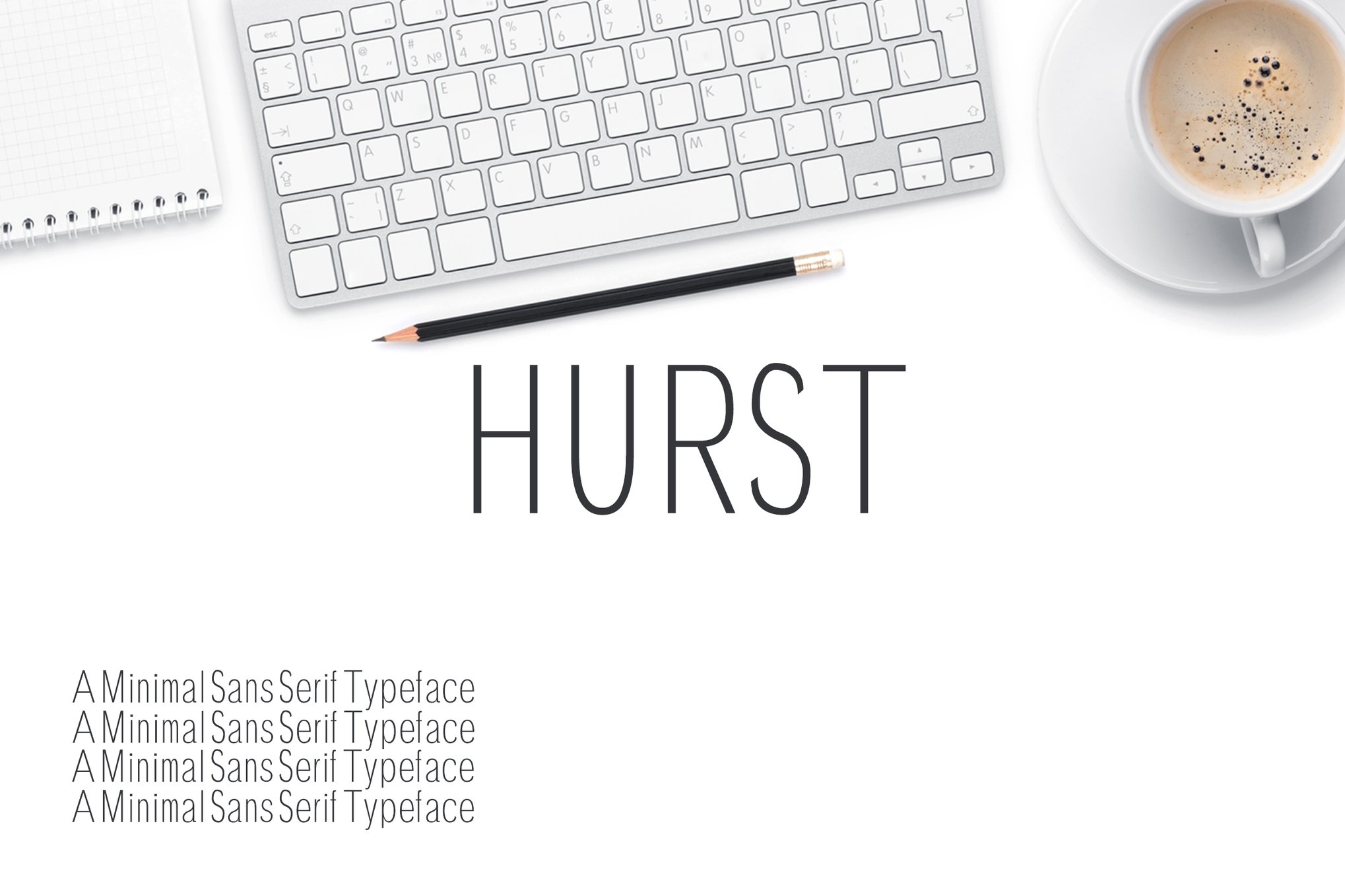
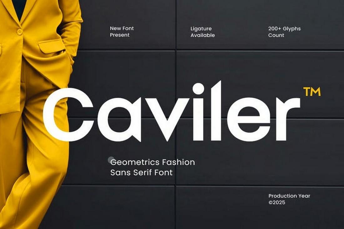
- Caviler: A narrow, high-density sans-serif. Its steady spacing is a blessing for designers working with limited horizontal screen real estate.
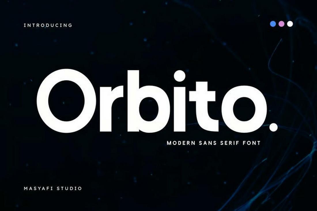
- Orbito: A friendly, rounded typeface that reduces the "harshness" of small text, making it perfect for long-form reading on mobile apps.
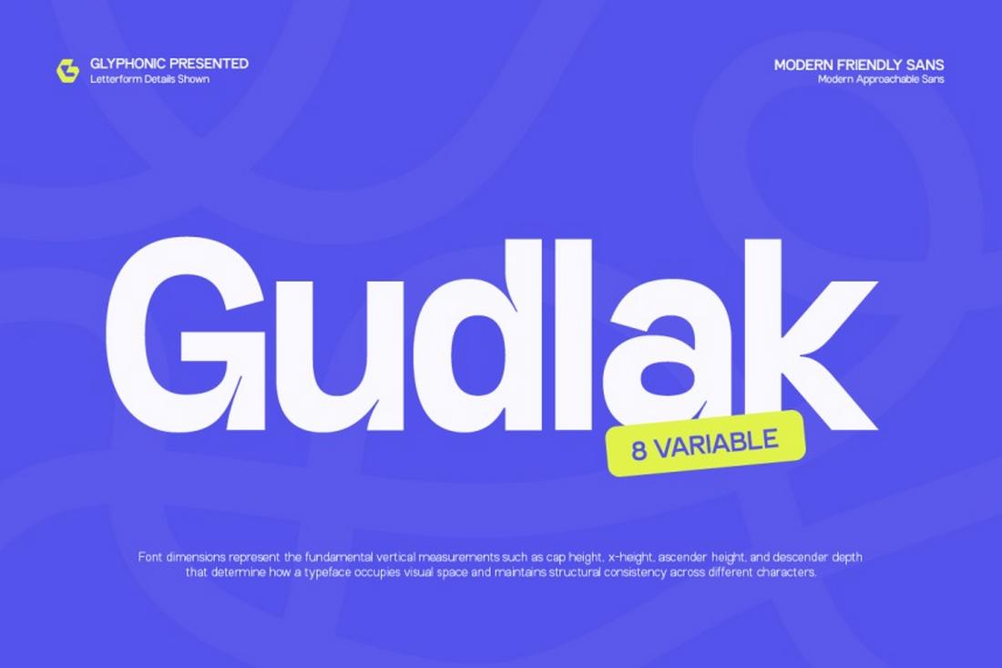
- Gudlak: Excellent for dense data tables or lists where maintaining a clear visual hierarchy is paramount.
- Groza: Its low-contrast design ensures that even on cheaper print paper or lower-quality screens, the ink or pixels do not bleed, keeping the text sharp.
8 Essential Rules for Selecting Small-Scale Typefaces
When evaluating a new font for a project, designers should adhere to a strict vetting process. Based on industry standards, here are eight actionable tips:
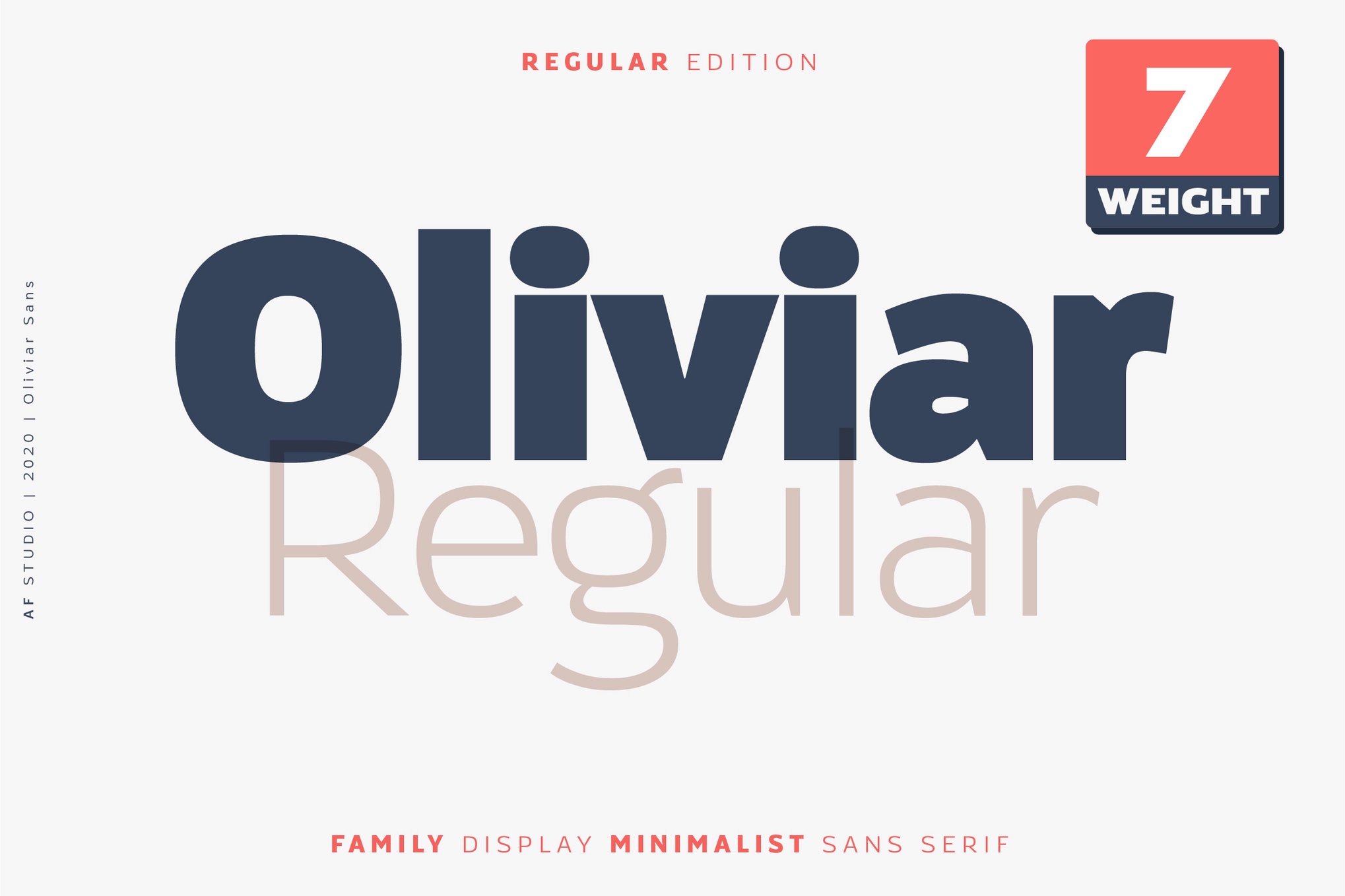
1. Prioritize Clarity Over Personality
While a unique typeface can define a brand, it can destroy a user experience. If the reader has to squint, the font has failed. Always select fonts with standard, recognizable letterforms.
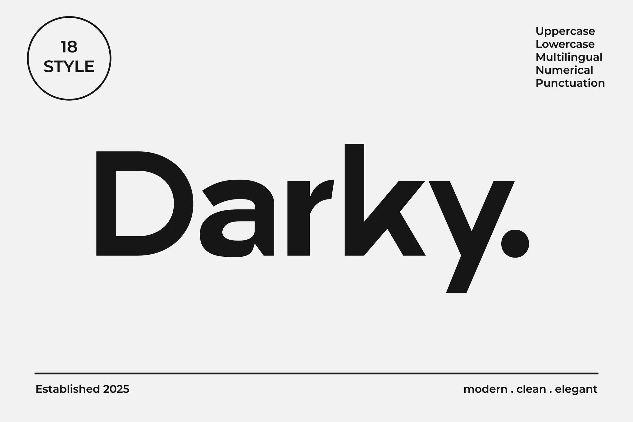
2. Seek Out Large x-Heights
Always compare the x-height of your candidate font against a standard like Helvetica or Arial. A larger x-height is almost always the safer, more legible choice for body copy.
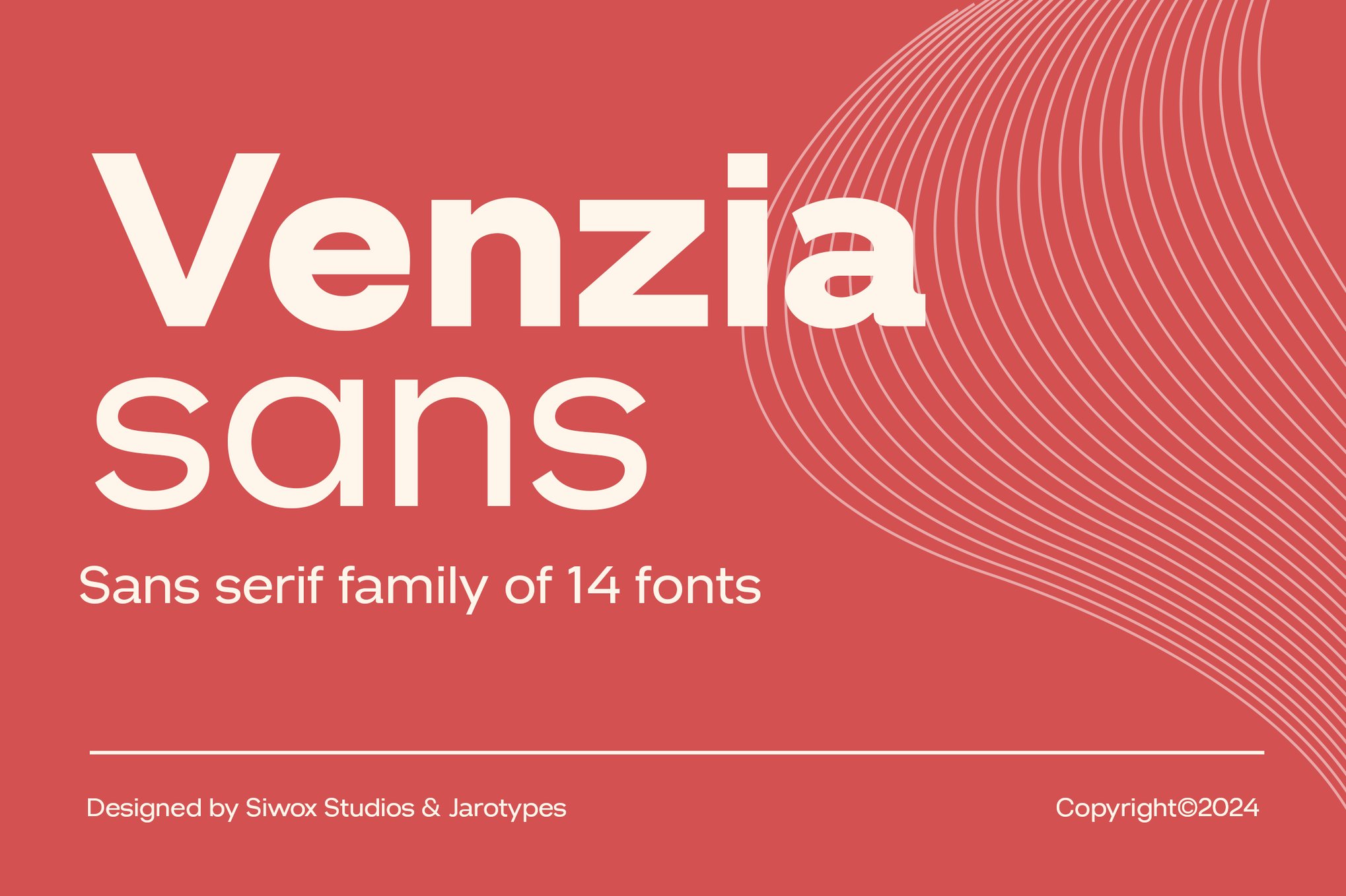
3. Avoid Extreme Stroke Contrast
Avoid "Didone" style fonts (like Bodoni or Didot) for small text. The hairline serifs and thin strokes will disappear in print and pixelate on screens.
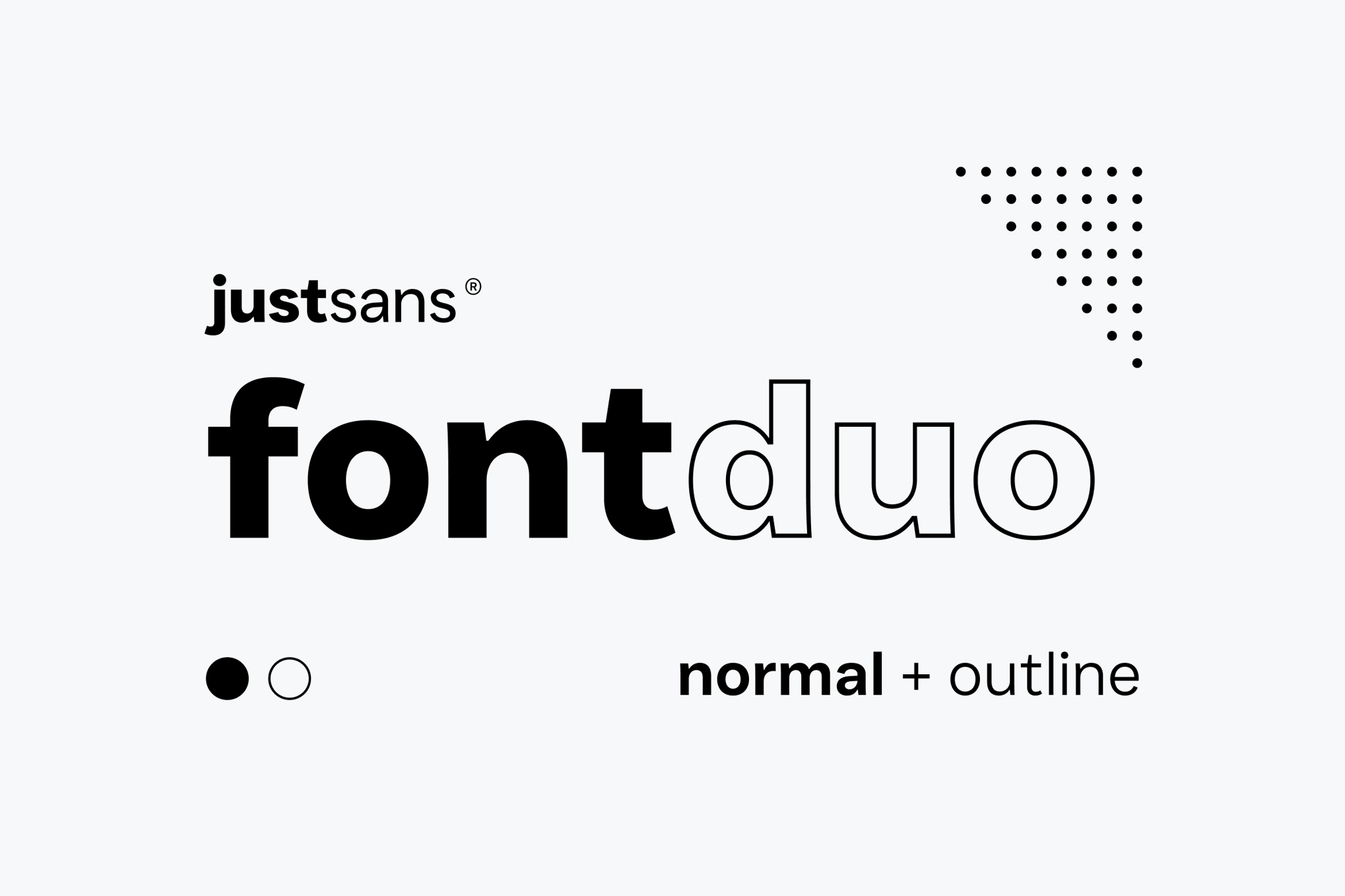
4. Evaluate Counters and Apertures
Perform a "blur test." Zoom your screen out until the text is barely readable. If the letters merge into blocks of gray, the counters are too small.
5. Test at Real-World Sizes
Never evaluate a font at 48pt in your design software. Set your type to 8pt, 10pt, and 12pt. This is where you will discover if the font truly works.
6. Optimize for Screen (Hinting)
If your work is primarily digital, ensure the font family includes "hinting." This is a set of instructions that tells the screen exactly which pixels to light up, preventing the jagged edges common in small-scale rendering.
7. Resist Decorative Flourishes
Swashes, ligatures, and extended tails are beautiful at large sizes but can lead to confusion at smaller scales. Keep the design minimalist.
8. Consider Weight-Background Contrast
A font that looks perfect on white may fail on a dark background due to light bleed. Always test your font weight against the actual background color of your interface or print stock.
The Implications of Bad Typography
The choice of font is not merely a design detail; it is a business decision. Research into user behavior consistently shows that poor legibility leads to increased "bounce rates" on websites and lower comprehension rates in print. When a user struggles to read a label, a button, or a paragraph, they lose trust in the source of that information.
Conversely, intentional typography enhances the perceived quality of the content. By choosing fonts with high legibility—like those discussed in this guide—designers signal to their audience that they value the user’s time and experience.
Conclusion: The Future of Micro-Typography
As display technologies evolve—moving toward higher pixel density and more complex rendering engines—the need for high-quality, readable fonts only grows. The fonts highlighted here represent the current gold standard for balancing the tension between artistic expression and the cold, hard requirements of legibility.
Whether you are crafting the next great mobile application or designing a printed journal, remember that your reader’s journey begins at the smallest detail. Choose your fonts wisely, test them rigorously, and never underestimate the power of a perfectly rendered character.

 Nana Muazin
 Muslim
 Nila Kartika Wati
 Jia Lissa
 Basiran


 Lina Hope