At 72, I have become intimately familiar with the endless cycle of medical health checks. As each birthday passes, the tedium of waiting rooms and diagnostic testing grows, yet I am constantly reminded that early detection and the recognition of subtle health patterns are the keys to longevity. In the corporate world, supply chain management is no different. Companies spend billions on incremental improvements, yet many remain fundamentally lost, lacking a clear definition of what constitutes a "healthy" supply chain and failing to conduct the diagnostic "check-ups" necessary to identify systemic rot.
To improve performance, one must first be able to diagnose it. This requires moving beyond static reporting and embracing dynamic visualization tools, specifically the "orbit chart." As we approach the June 23rd release of our annual Supply Chains to Admire report, it is time to peel back the curtain on why this diagnostic technique is the most powerful weapon in the modern supply chain arsenal.
The Anatomy of an Orbit Chart
An orbit chart is a visual representation of the relationships, influence, and movement of a system around a central point. In physics or astronomy, it describes the path of a celestial body; in supply chain management, it tracks the non-linear relationship between key performance trade-offs—such as operating margins versus inventory turns—over an extended period.

A supply chain is not a simple, linear machine; it is a complex, adaptive ecosystem. Because every industry has a different "potential" based on regional, structural, and market-driven factors, we must analyze companies within defined peer groups. Simply put: you cannot judge a pharmaceutical giant by the same yardstick as a consumer electronics manufacturer.
Our analysis spans a ten-year window. Why a decade? Because in the world of large-scale multinational corporations, turning a ship of that magnitude takes time. While a startup might transform its operations in three to four years, a global enterprise with deep-seated traditional silos requires six to ten years to successfully pivot.
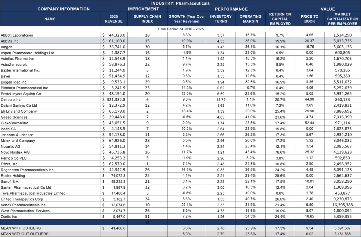
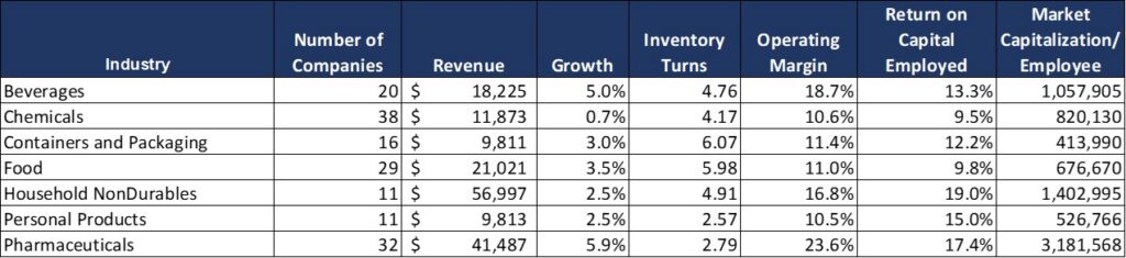
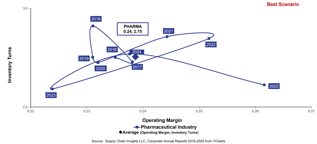
The Pharmaceutical Paradox: High Margins, Low Resilience
To illustrate the diagnostic power of the orbit chart, we look at the pharmaceutical industry—a sector characterized by high operating margins (averaging 24% between 2016 and 2025) and modest inventory turns (2.75). Despite these enviable margins, the industry is perpetually hamstrung by conventional, outdated thinking.

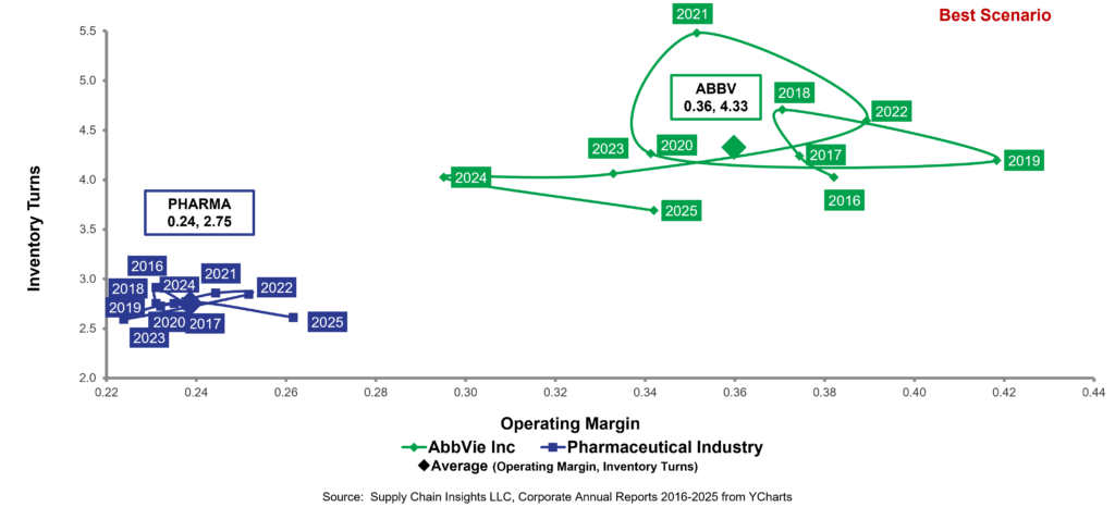
The Success Story: AbbVie
The clear standout in our current analysis is AbbVie. Since its 2012 spin-off from Abbott Laboratories, AbbVie has redefined its supply chain strategy. Navigating the "Humira patent cliff" while simultaneously scaling blockbuster therapies like Skyrizi and Rinvoq, the company has outperformed its peers by building a network based on physician-patient connectivity, manufacturing redundancy, and, crucially, the use of "outside-in" market data. Their orbit chart demonstrates a disciplined, controlled trajectory that reflects resilience.
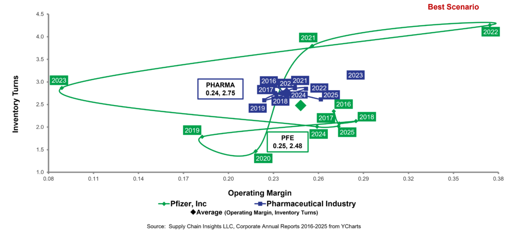
The Warning Signs: Pfizer and BMS
In contrast, consider industry stalwarts like Pfizer and Bristol Myers Squibb (BMS). Pfizer, often lauded in industry rankings, displays an orbit chart defined by erratic, violent "gyrations." These large swings in the data indicate a reactive supply chain—one that is struggling to buffer against the 30-to-90-day latency between customer orders and actual consumption.
Despite heavy investment in AI-enabled forecasting, advanced planning systems, and manufacturing analytics, the fundamental "shape" of their orbit chart suggests a lack of true resiliency. The same pattern holds true across the board for major players like AstraZeneca, Eli Lilly, and Novartis. The industry is trapped in a loop of functional optimization, chasing efficiency at the expense of agility.
The Fallacy of Functional Optimization
The prevailing executive philosophy in Big Pharma is that "efficiency equals excellence." There is a pervasive, and ultimately dangerous, belief that if a company squeezes every cent of cost out of the back office and redirects that capital into the front office, profitable growth will naturally follow.
However, our data suggests this is a categorical error. Functional excellence does not equate to systemic health. When risk management is focused purely on supply-side efficiency rather than the ability to sense and translate demand, the company becomes fragile. The "swings" seen in the orbit charts of companies like BMS are the fingerprints of a reactive organization. They are not built to flow; they are built to fight fires.
Implications: The Dangers of "Autonomous" Hype
We currently live in an era where consultants and software vendors are aggressively pushing the concept of the "autonomous supply chain." I find this trend deeply unsettling. We have all seen the viral footage of autonomous vehicles—like Waymo—driving directly into flooded roads or navigating poorly through hazards.
When you apply this "black box" automation to a pharmaceutical supply chain, you are not just risking efficiency; you are risking human lives. A supply chain cannot be "Waymo-ed." It requires human-in-the-loop intelligence that understands flow, recognizes patterns, and aligns cycles.
Moving Toward First-Principles Redesign
The solution is not more traditional Enterprise Resource Planning (ERP) or Advanced Planning Systems (APS) deployments. The answer lies in:
- Redefining Demand Management: Shifting focus from static forecasting to flow-based management.
- Semantic Layer Development: Rebuilding how we define data to ensure that market signals are the primary driver of the planning master data layer.
- Bi-directional Orchestration: Moving away from top-down directives toward a network that can communicate and adjust in real-time.
Chronology of Our Diagnostic Methodology
Our process for the Supply Chains to Admire report is rigorous and time-consuming, ensuring that our diagnostics are based on objective reality rather than marketing fluff.
- March: We begin pulling public market reporting data. We utilize a syndicated data feed (YCharts) to normalize currency fluctuations, restatements, and the complex aggregation of global entities (e.g., Unilever reporting across 24 different public markets).
- April–May: The process of eliminating statistical outliers begins. This is a critical phase where we filter out "noise" to ensure the orbit charts reflect the true operational performance of the core business.
- June 23rd: The official publication of the annual report.
A Call for Systemic Change
The frustrations I feel with the U.S. home insurance industry—which, as I have learned during my two years displaced by a house fire, has been largely hijacked by financial firms prioritizing the balance sheet over the actual delivery of services—are the same frustrations I feel when looking at the boardrooms of modern corporations.
When financial performance becomes the only metric, the "customer" or the "patient" becomes an afterthought. We must return to a focus on responsiveness. A responsive supply chain is not one that merely cuts costs; it is one that flows in alignment with the actual, real-world needs of the people it serves.
As I look ahead to upcoming industry events—Kinexions 2026 and Opticon 2026—I am hopeful. We will be engaging in deep discussions regarding the semantic layer of planning and the promise of AI-native network design. These technologies hold the potential to break the cycle of "swinging" performance. But let us be clear: technology is only a tool. Without a first-principles redefinition of how we design, measure, and manage these systems, we are simply automating our own obsolescence.
If you are attending these events, I invite you to connect. Let’s discuss how we can move away from the "efficiency trap" and toward a more resilient, human-centered approach to supply chain health. But remember: keep the autonomous, "black-box" systems at arm’s length. We need wisdom, not just algorithms.