
 Dwi Wanna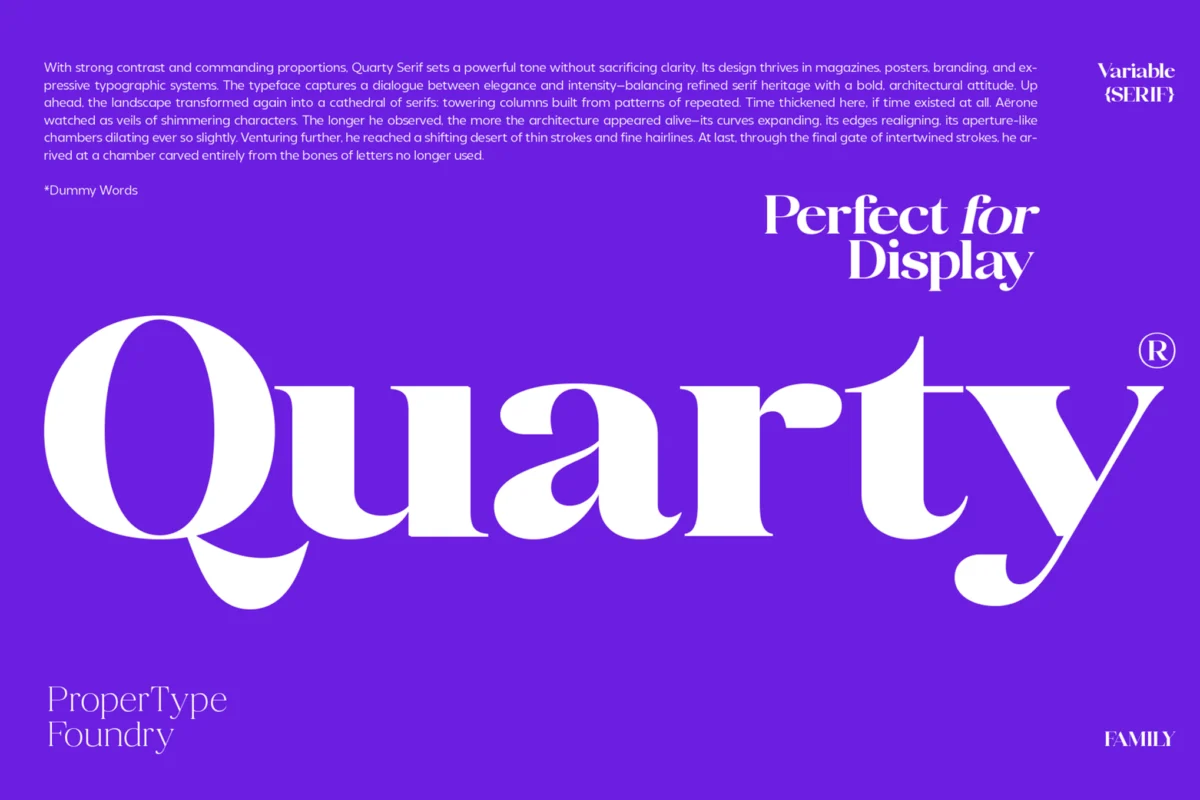
In the world of digital and print design, the most difficult challenge is often not the grand, oversized headline, but the humble, small-scale body copy. Whether you are crafting a dense dashboard for a data analytics platform, designing the fine print of a luxury brochure, or ensuring that mobile app navigation remains accessible, readability is the primary metric of success. When text is reduced to small sizes, the physical limitations of our eyes and the technical limitations of pixel displays come into play, making the choice of typeface not just an aesthetic decision, but a fundamental functional one.
The Core Principles of Micro-Typography
Readability at reduced sizes is governed by specific physiological and design-based laws. When a font is scaled down, subtle artistic flourishes often vanish, while stroke contrast can become a liability. To maintain a smooth, professional reading experience, designers must prioritize function over form.
The Science of Small Text
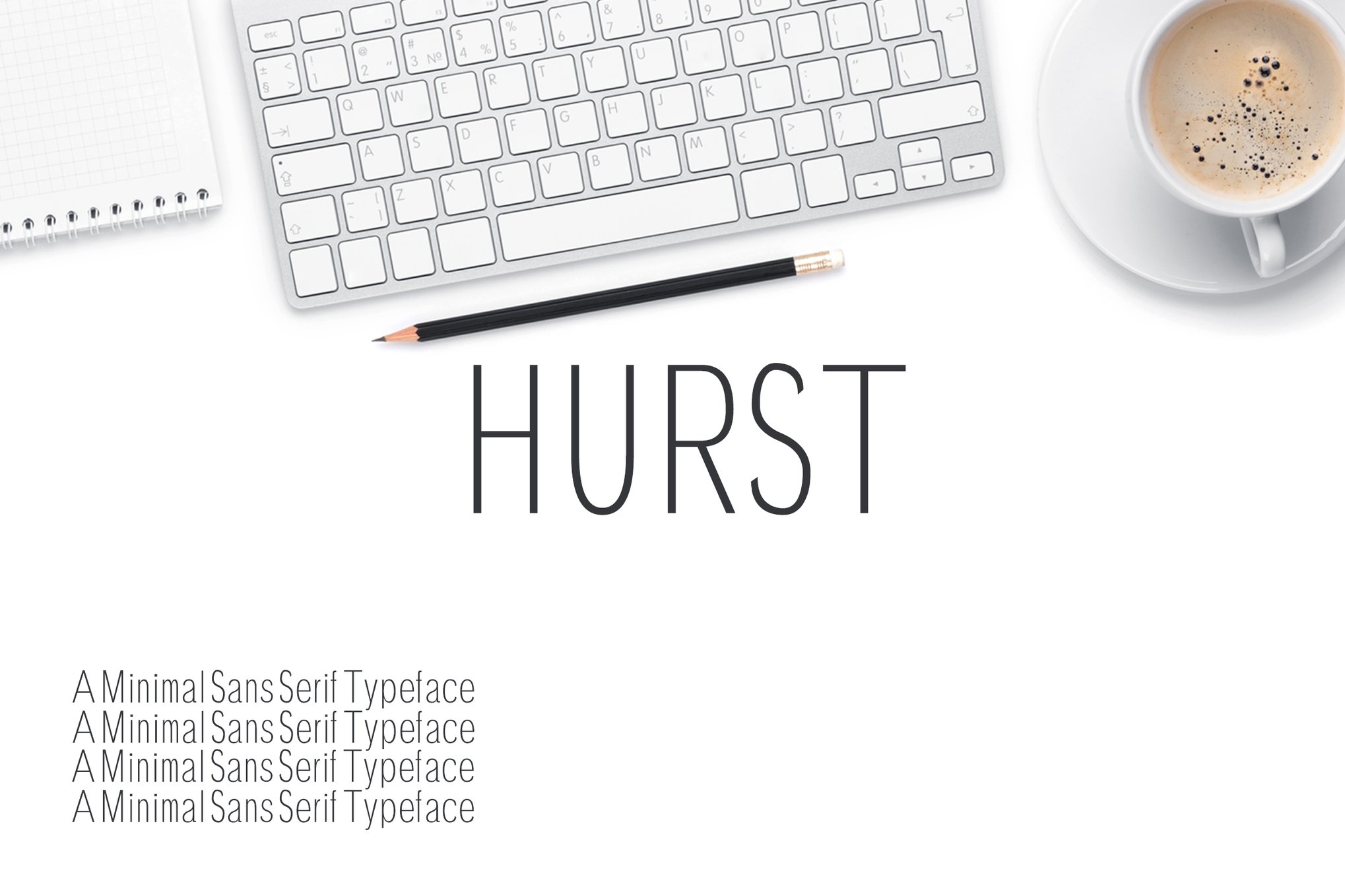
At smaller point sizes, the human eye struggles to distinguish between characters with high stroke contrast. A font that looks elegant at 72pt might become illegible at 8pt because the thin hairlines disappear, leaving only the heavier stems, which distorts the letterforms. Furthermore, "x-height"—the height of lowercase letters relative to uppercase—is critical. A larger x-height ensures that characters remain open and distinguishable even when pixels are scarce or ink spreads slightly on paper.
A Curated Selection of High-Legibility Typefaces
To assist designers in navigating this complex landscape, we have curated a selection of premium and free fonts that excel in small-scale environments.
Premium Selections for Professional Layouts
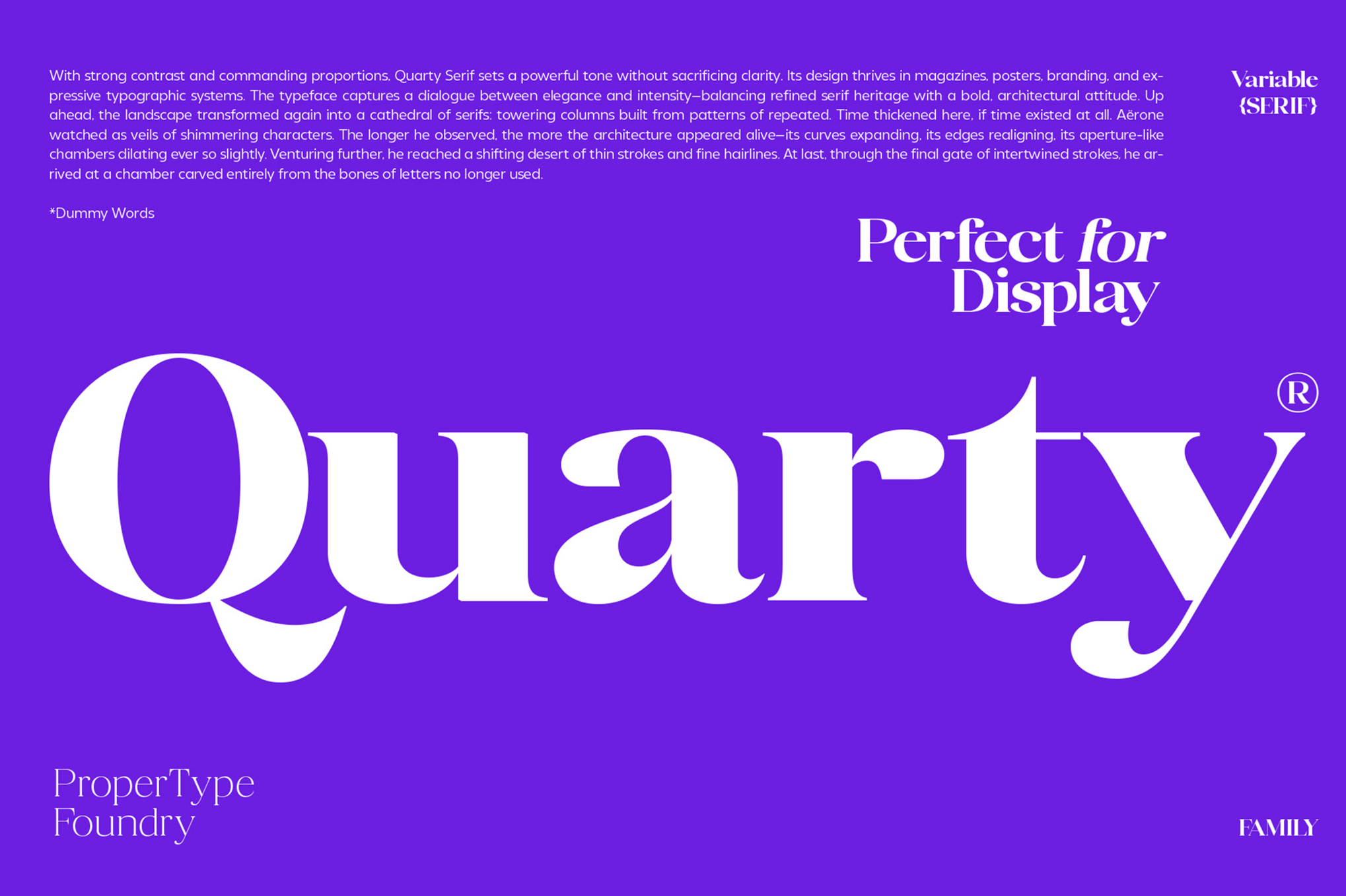
Quarty – The Refined Serif
Quarty is a masterpiece of balance. By blending geometric precision with graceful, calculated curves, it offers a sophisticated aesthetic without sacrificing clarity. It is particularly well-suited for editorial layouts where personality is required but space is limited.
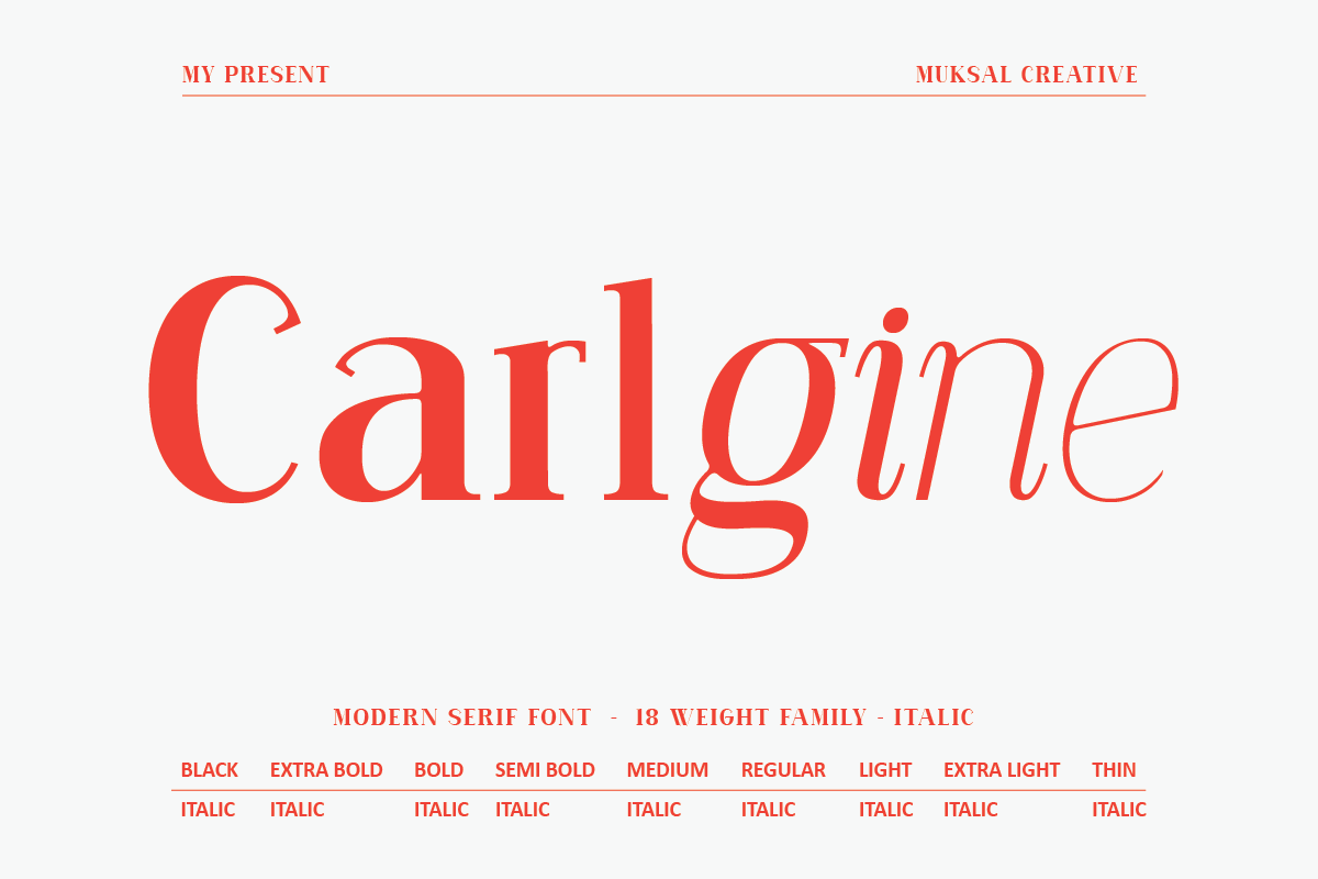
Carlgine – The Versatile Workhorse
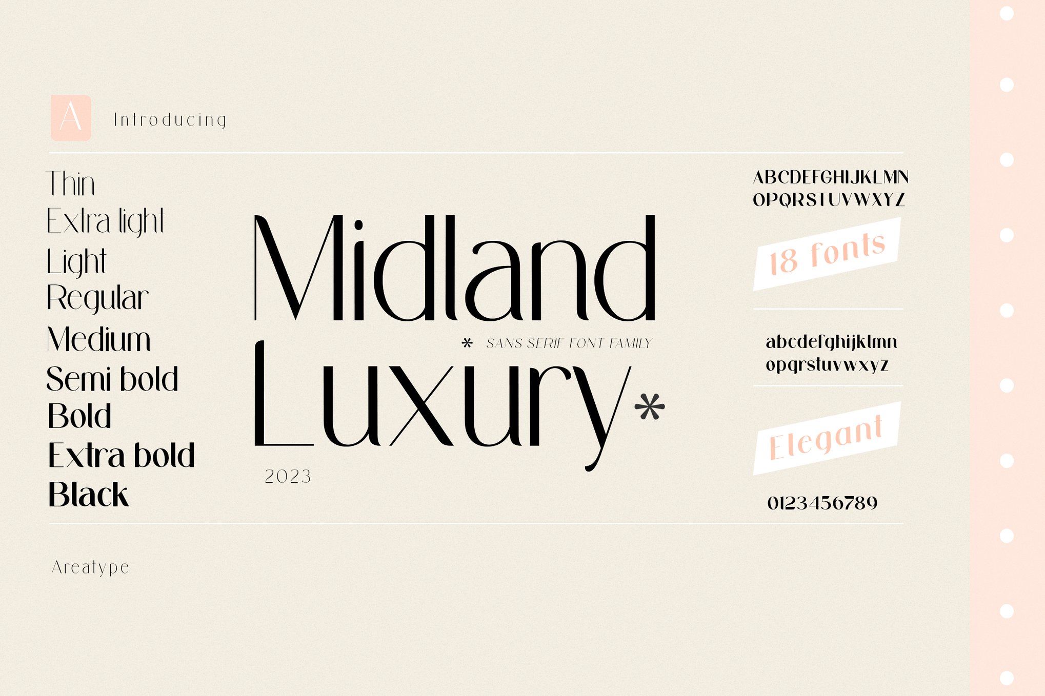
With 18 distinct weights, Carlgine is a typographic chameleon. Its ability to maintain structural integrity from its "Thin" weight to its "Black" weight makes it a powerhouse for complex branding projects that require consistency across varying scales.
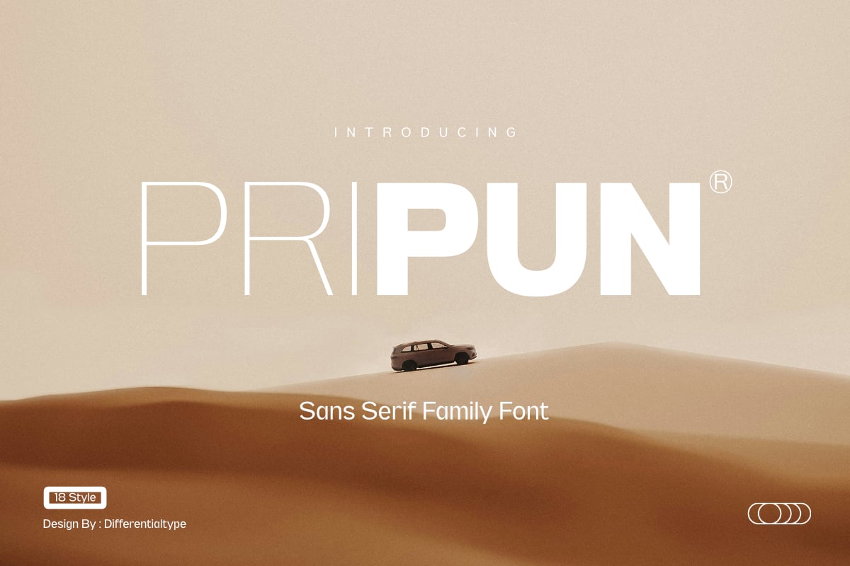
Pripun – Precision Sans Serif
Pripun is designed for the modern interface. Its letterforms are constructed with mathematical precision, ensuring that whether it is being read on a high-resolution retina display or a standard office printer, the text remains crisp and approachable.
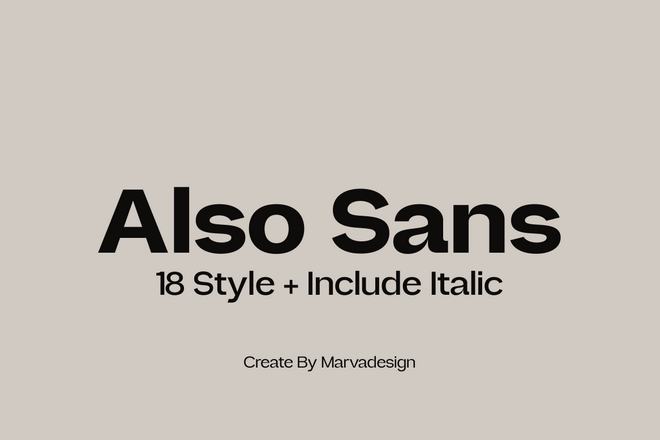
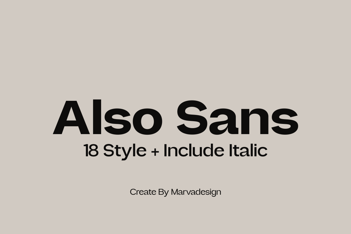
Also Sans – The Master of Open Counters
The hallmark of a great small-text font is its open counters—the white space inside letters like ‘o’, ‘a’, and ‘e’. Also Sans excels here, providing a breathability that prevents the text from blurring together during long-form reading.
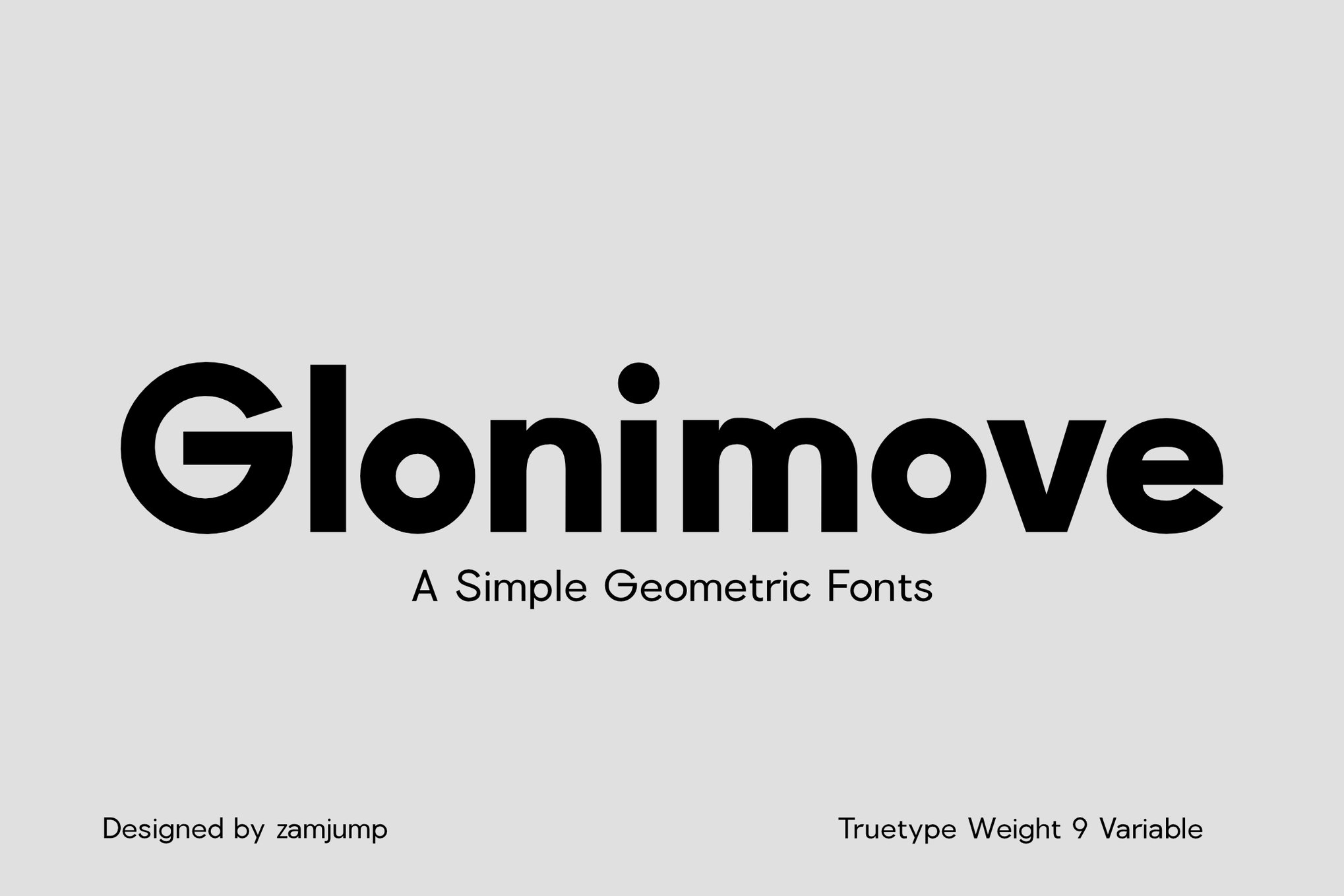
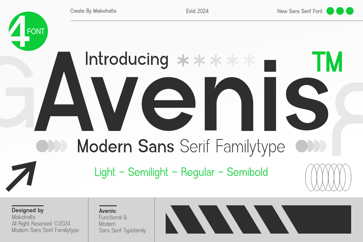
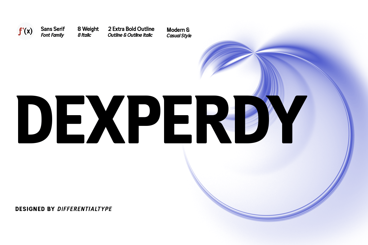
Glonimove & Avenis
These modern sans-serifs lean into the geometric trend. By utilizing clean, unadorned lines, they remove the visual noise that often hinders the reader’s eye, making them excellent choices for signage and dense digital documentation.
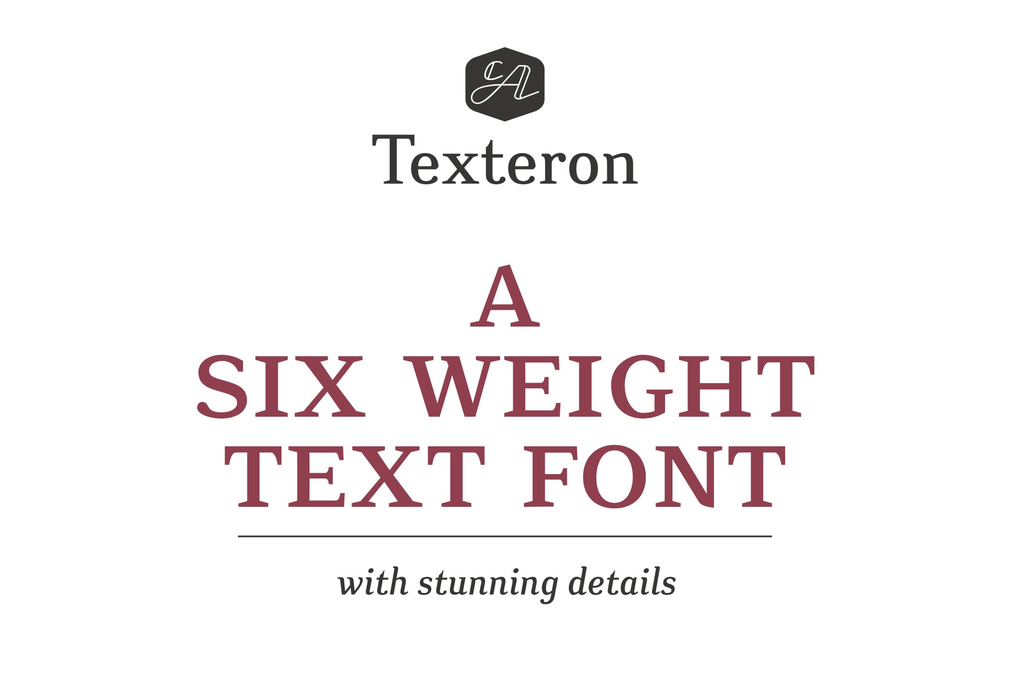
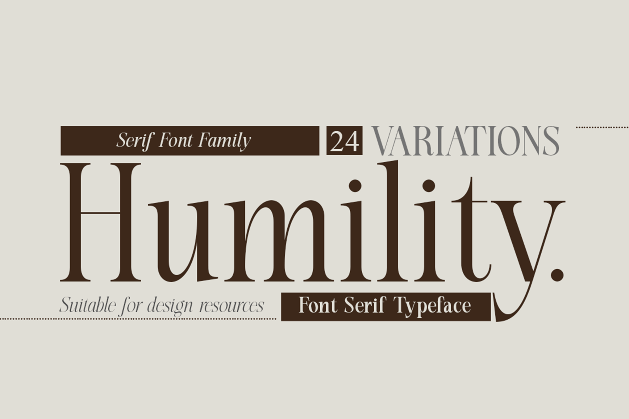
Humility & Texteron
For those who prefer the traditional, these serif families offer a nod to classic typography while utilizing modern rendering techniques to ensure they don’t lose their "vintage" charm when scaled down.
Chronology of Typography Evolution
The history of typography for small sizes is a trajectory toward optimization. In the mid-20th century, Swiss design emphasized the "International Typographic Style," which pushed for grid-based clarity. This paved the way for modern, low-contrast sans-serifs. With the advent of the digital age in the 1980s and 90s, the "pixel font" movement emerged, where type designers manually mapped letters to pixel grids. Today, we are in the era of "Variable Fonts," which allow a single file to adjust its weight and width seamlessly, providing the ultimate solution for responsive web design.
Supporting Data: Why Font Choice Impacts User Retention
User experience (UX) research consistently demonstrates that typography is a silent influencer of user behavior. Studies have shown that users spend approximately 20% more time on pages with highly legible, well-spaced typography compared to those using decorative or overly compact fonts.
When a user encounters "micro-text" that is difficult to decipher, the cognitive load increases. This leads to "reading fatigue," causing the user to abandon the task—be it reading an article, filling out a form, or navigating an app. By choosing fonts with high-legibility ratings, companies can reduce bounce rates and increase task completion efficiency by significant margins.
Official Perspectives: The Designer’s Responsibility
Industry experts and leading UX designers argue that "accessibility is the new aesthetic." The consensus is that a beautiful font is worthless if it cannot be read by the end-user, regardless of their visual acuity or the device they are using.
"Designers must stop viewing fonts as art pieces and start viewing them as engineering tools," says one leading design advocate. "When you are working at 8pt or 10pt, you are not decorating a page; you are building a communication pipeline. If that pipe is clogged with unnecessary decorative flourishes, the message doesn’t arrive."
Implications for Future Design Trends
As we move toward a world dominated by augmented reality (AR) and smart-watch interfaces, the demand for high-legibility small-scale fonts will only grow.
- Accessibility Compliance: Global regulations (such as WCAG) are becoming stricter regarding text contrast and legibility. Choosing the right font is now a legal consideration as much as a design one.
- The Death of Over-Stylization: The trend toward minimalism is not just a stylistic choice; it is a necessity for the multi-platform ecosystem. Fonts that look good on a 6-inch phone screen and a 30-inch desktop monitor are winning the market share.
- Variable Font Dominance: We expect to see a shift away from static font files toward variable fonts that automatically adjust their weight based on the user’s screen density and ambient lighting conditions.
Best Practices: 8 Tips for Selecting Your Next Small-Text Font
To ensure your projects remain functional and professional, adhere to these eight foundational rules:
- Clarity Over Personality: If a font looks "cool" but requires effort to read, discard it. Your reader’s comfort is the priority.
- Prioritize Large x-Heights: Tall lowercase letters allow for easier recognition at a distance or at small sizes.
- Avoid Extreme Contrast: Stay away from fonts where the difference between the thick and thin parts of the letter is extreme, as these will fail in print or on low-res screens.
- Optimize for Open Counters: Ensure the negative space inside letters is generous enough to prevent clogging.
- Real-Size Testing: Always test your font at the exact size it will appear in the final output. Never rely on 100% zoom on a large monitor to judge 8pt text.
- Digital Optimization: For web and app projects, choose fonts specifically hinted for screen rendering.
- Eliminate Decorative Distractions: Avoid ligatures or excessive swashes in body text. Save these for headlines where they can be appreciated.
- Weight and Contrast Synergy: Test your font against your background color. Sometimes, a slightly heavier font weight is needed to maintain legibility against a low-contrast background.
Conclusion
The selection of a font for small text is a testament to a designer’s technical skill and empathy for the user. By focusing on the structural integrity of letterforms, prioritizing open counters, and testing rigorously at target sizes, you can create designs that are not only visually balanced but functionally superior. In an era where information density is higher than ever, the fonts that remain clear, clean, and legible are the ones that will truly stand the test of time. Whether you choose the geometric reliability of Raela Pro or the classic, refined air of Humility, remember that your ultimate goal is to facilitate the flow of information, not to obstruct it.

 Neng Nana
 Asep Darmawan
 Reynand Wu
 Nila Kartika Wati
 Raul Delapena Setiawan

 Muslim
 Nana Wu