
 Raul Delapena Setiawan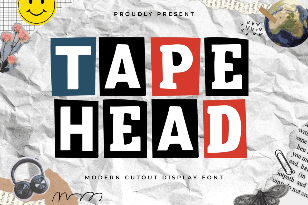
In an era dominated by the pixel-perfect precision of vector graphics and minimalist sans-serifs, a growing counter-movement has emerged in the design world: the return to the tactile, the imperfect, and the raw. Cut-out and collage fonts have transcended their humble origins as DIY zine aesthetics to become a dominant force in modern editorial, branding, and motion design. By mimicking the chaotic, layered beauty of scissors-and-glue artistry, these typefaces inject a sense of humanity and rebellion into an increasingly sanitized digital landscape.
The Evolution of the "Ransom Note" Aesthetic
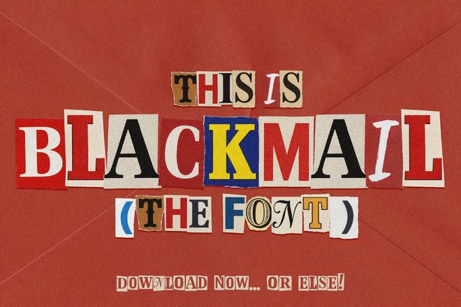
The history of cut-out typography is deeply rooted in the punk subculture of the 1970s and 80s. When resources were scarce and the desire for social commentary was high, designers turned to the "ransom note" aesthetic—a method of composing text using letters clipped from magazines and newspapers. This was not merely an aesthetic choice; it was a form of visual protest, emphasizing that information could be repurposed, dismantled, and rearranged to challenge the status quo.
Today, this "deconstructed" style has been professionalized. Type designers are now utilizing high-fidelity scanning and OpenType SVG technology to capture the authentic grit of paper edges, ink bleeds, and uneven letterforms. What began as a tool for underground zines has now been embraced by luxury fashion houses, music labels, and digital media giants to evoke a sense of immediacy, spontaneity, and "unfiltered" creativity.
Curated Collection: The Leading Collage Fonts
For designers looking to bridge the gap between digital efficiency and analog charm, the following fonts represent the current gold standard in the collage genre:
Premium Selections for Professional Impact
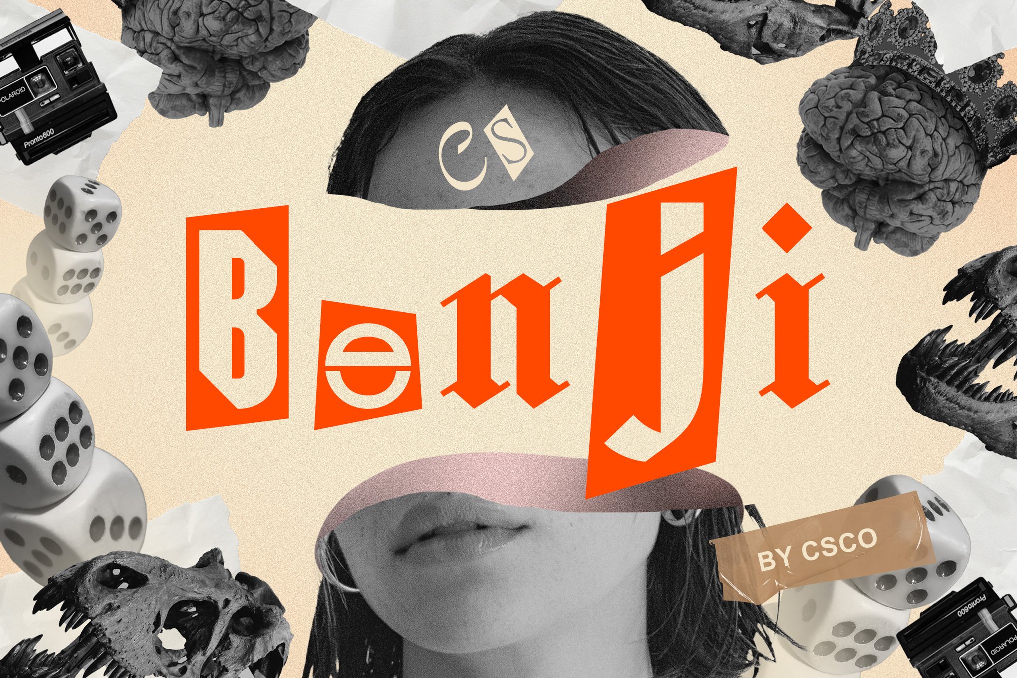
- Benji (Modern Collage Font): A masterclass in "chaotic beauty." Benji leans heavily into the ransom-note aesthetic, offering bold, unconventional forms that are perfect for high-energy music posters and rebellious brand identities.
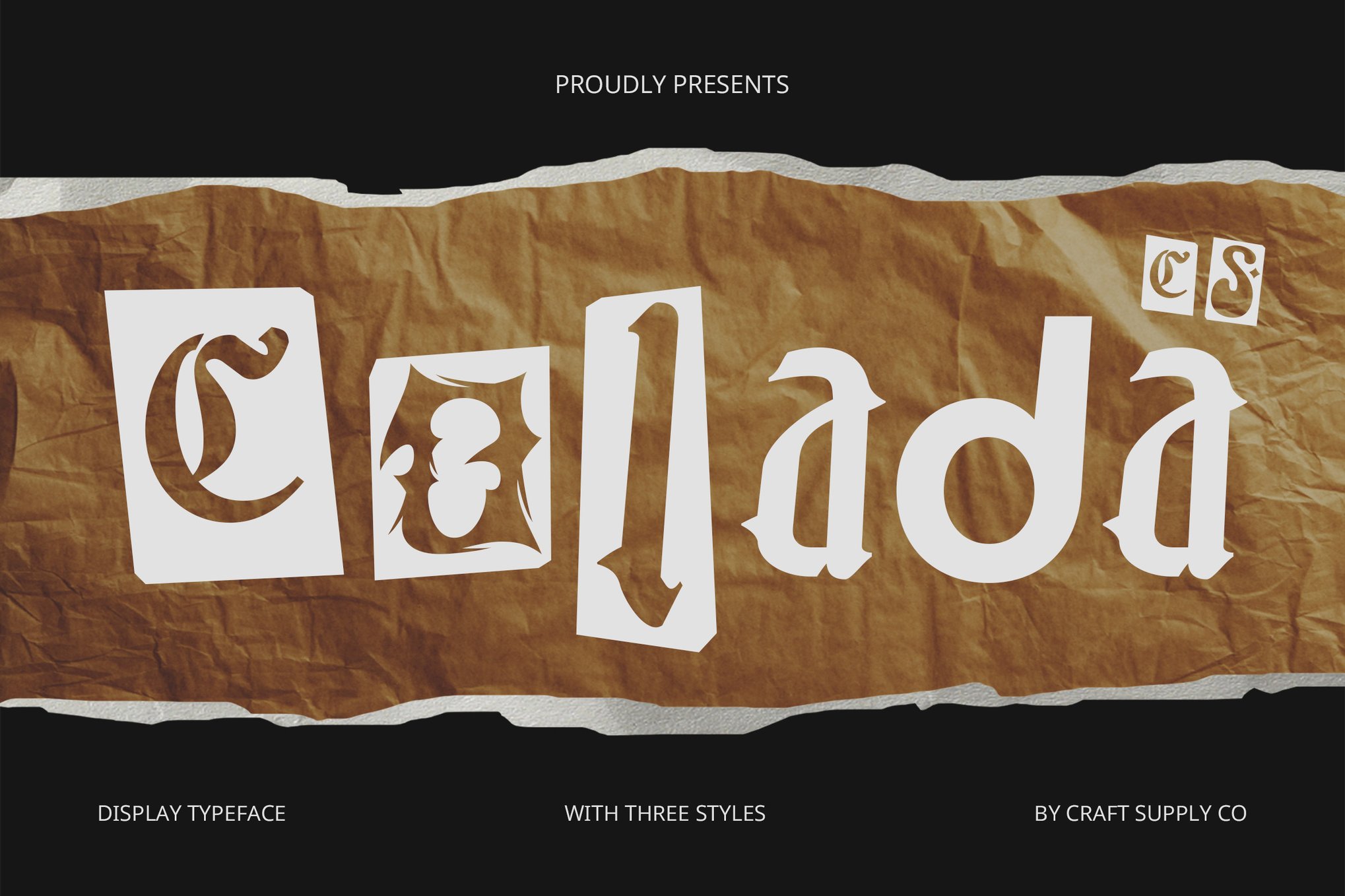
- Colada (Creative Collage Font): This typeface offers a lively rhythm of varying letter shapes. It excels in children’s branding and event marketing, where a sense of joy and kinetic energy is required.
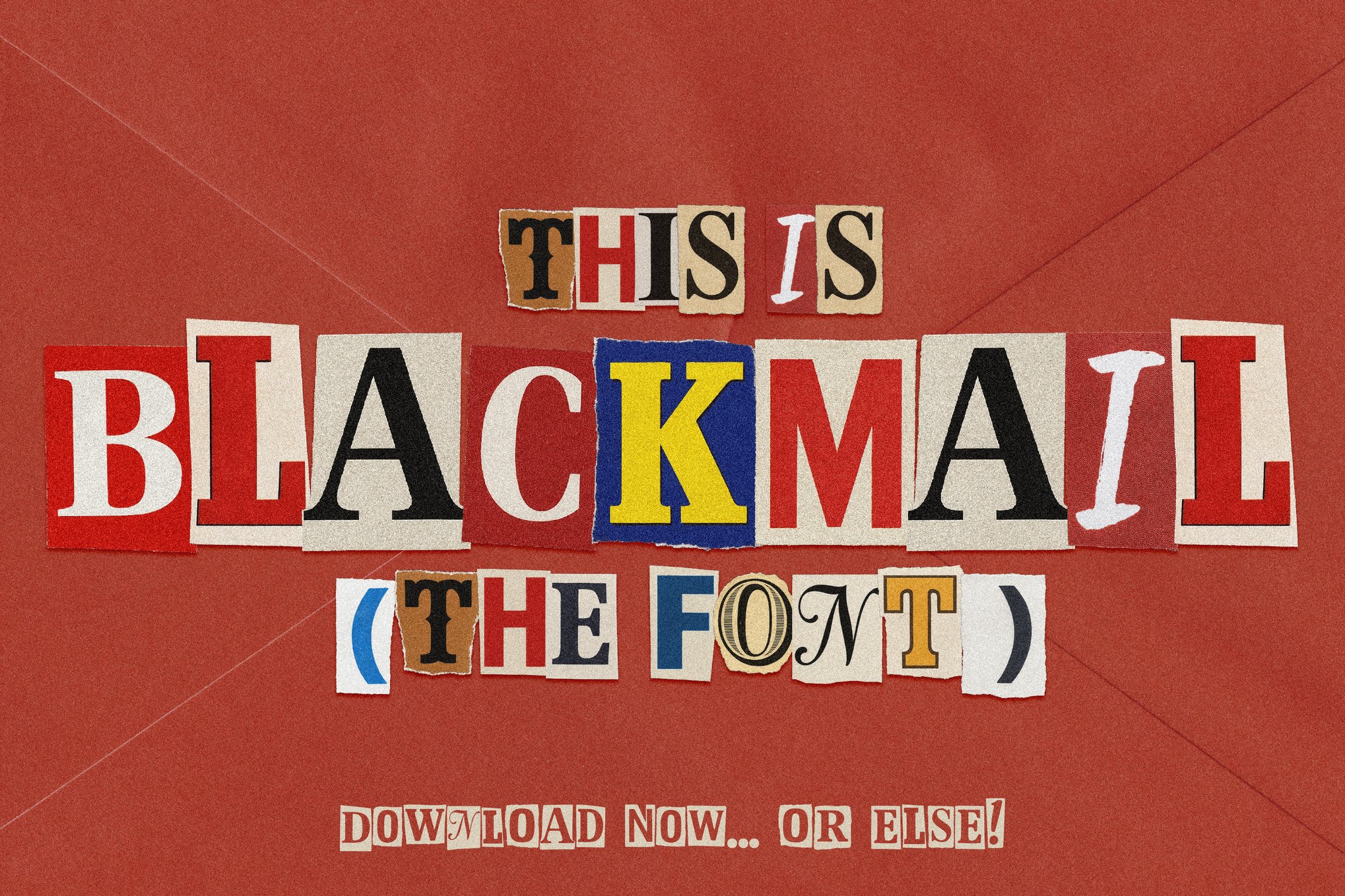
- Blackmail (Ransom Style Duo): A versatile powerhouse that provides both a bitmap color version and a vector standard. It is the go-to for thriller book covers and crime-themed editorial spreads.
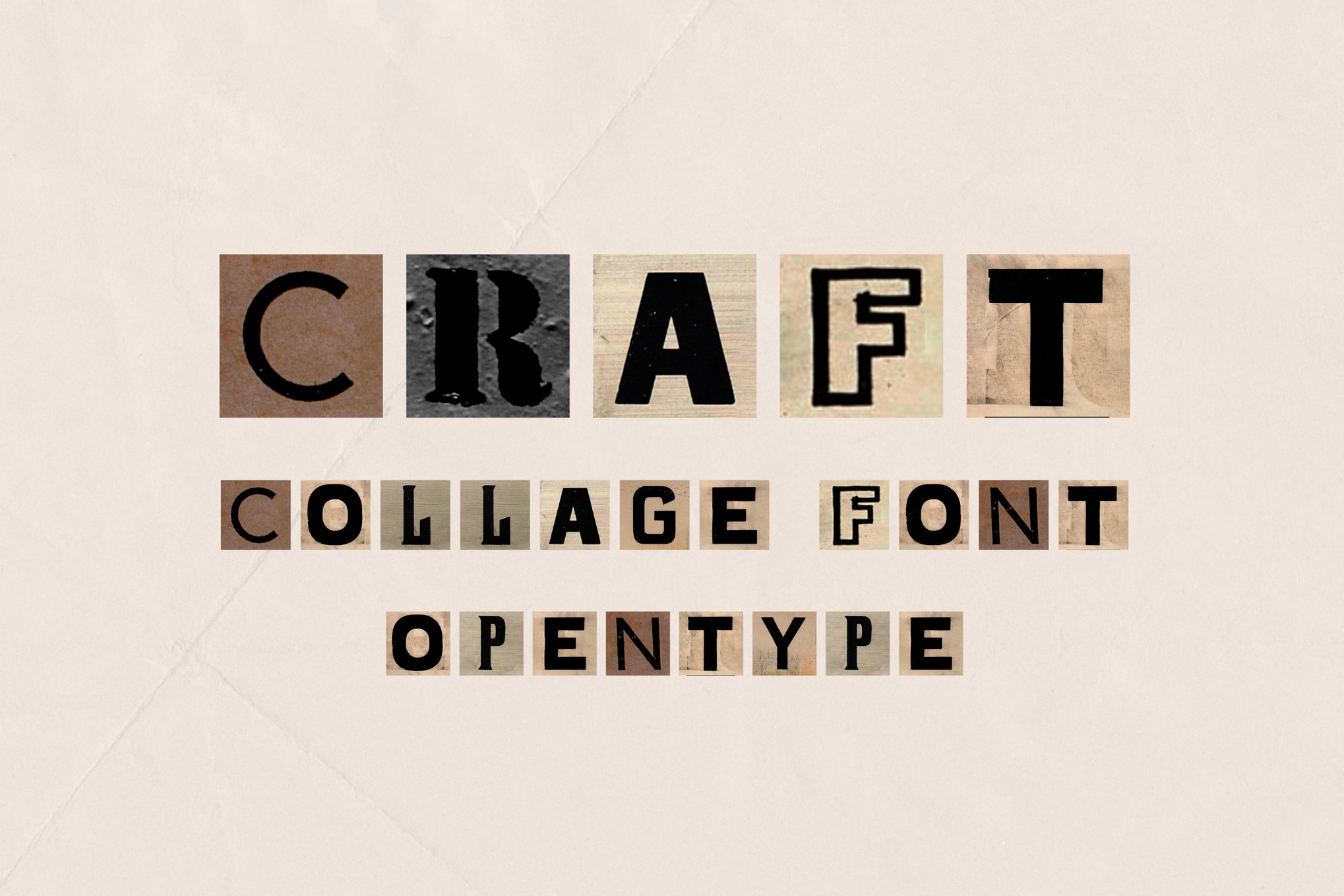
- Craft (Bitmap Font): Designed for the Adobe Creative Cloud workflow, Craft mimics the exact aesthetic of old newspaper clippings. It is highly effective for high-fashion spreads that require a vintage, "found object" look.
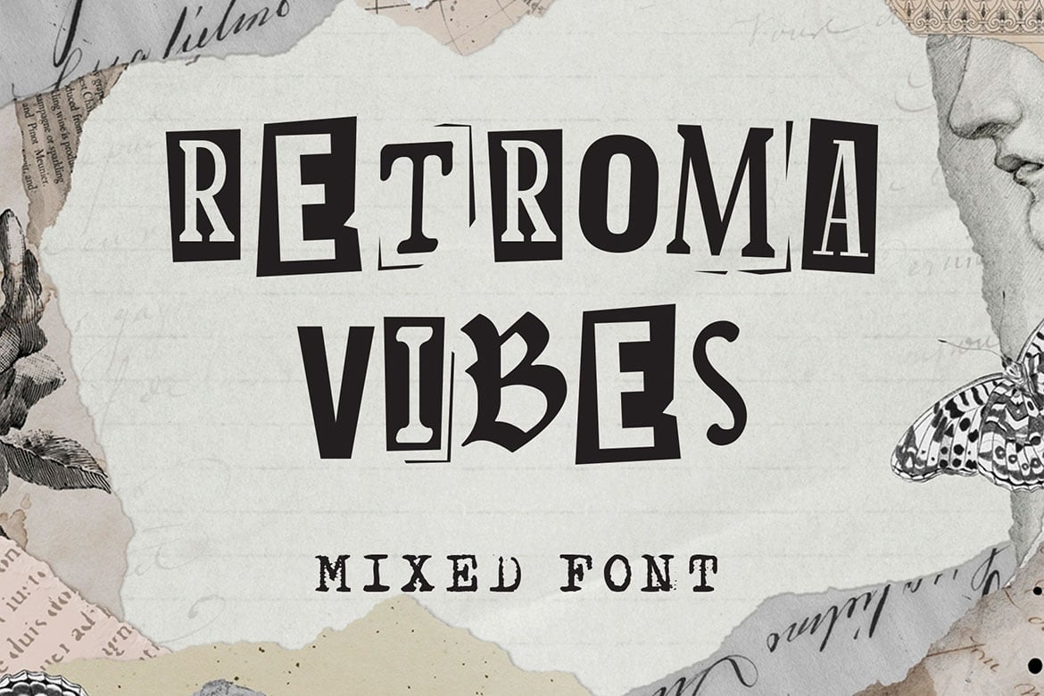
- Retroma Vibes: This font challenges the notion of stylistic uniformity. By blending blackletter, sans-serif, and handwritten styles, it allows designers to create highly customized, eclectic headlines.
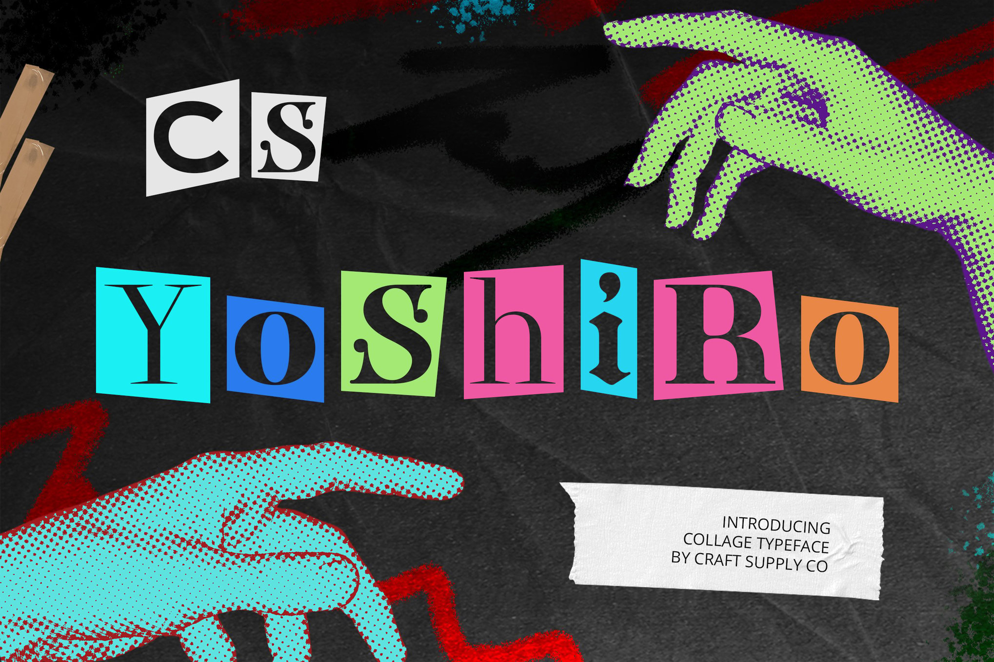
- Yoshiro: Designed for the experimentalist, Yoshiro uses extreme variations in scale and shade to turn simple text into an unpolished, raw piece of art.
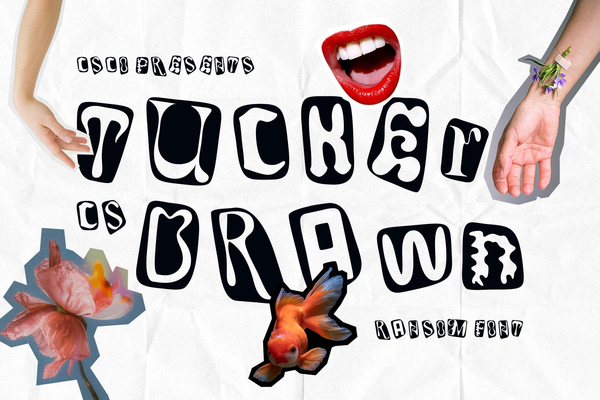
- Tucker Drawn: A sketch-like, rough-hewn font that captures the "hand-cut" vibe. It is essential for designers aiming to project a sense of authenticity and DIY ethos.
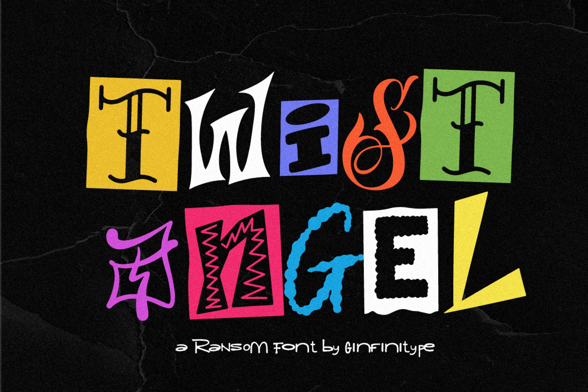
- Twist Angel: An individually crafted typeface that treats every letter as a unique work of art. It is best suited for album covers and high-impact editorial features.
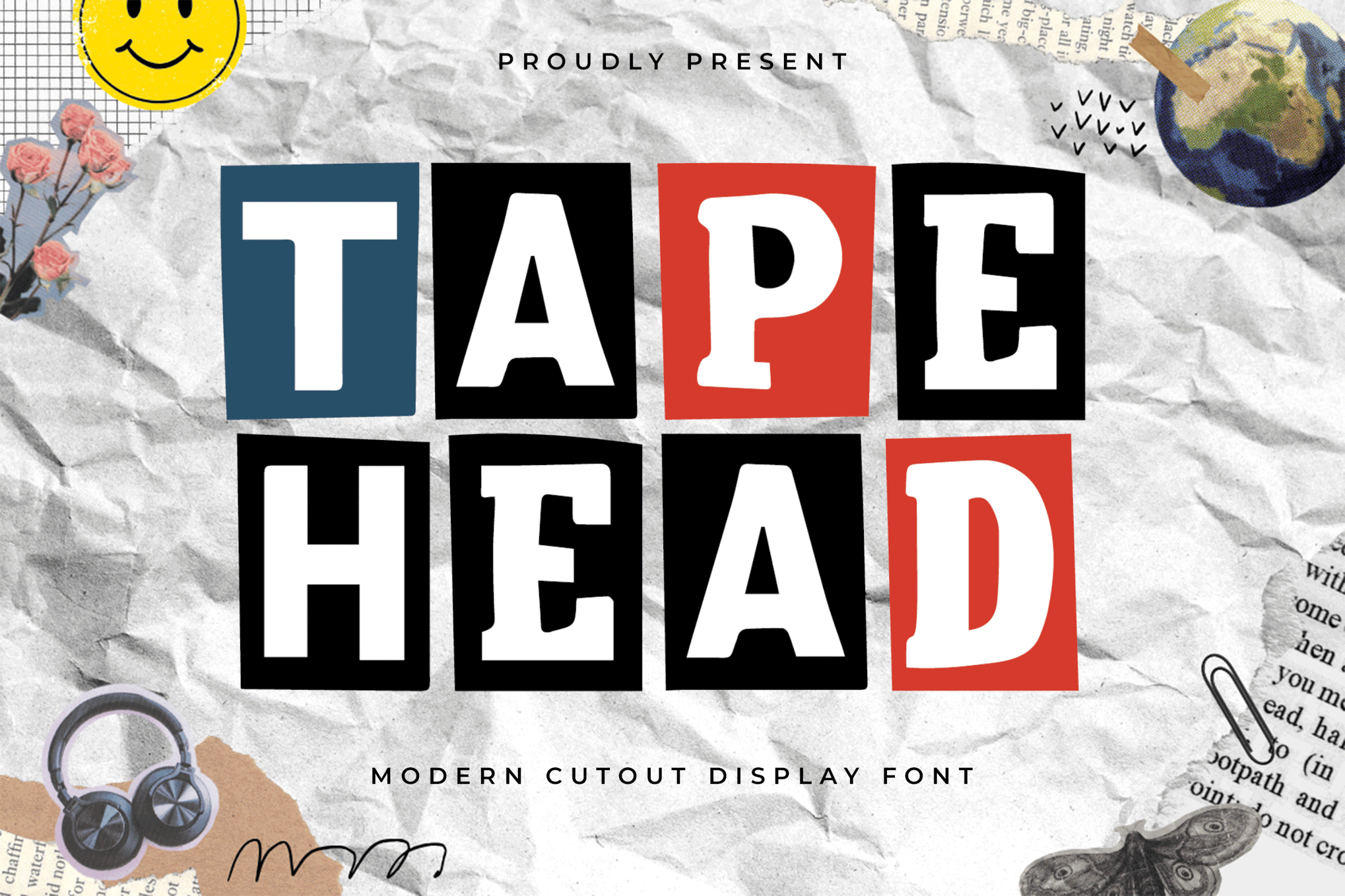
- Tapehead: By focusing on jagged edges and mismatched, modern shapes, Tapehead is the premier choice for punk-inspired layouts and urban street culture branding.
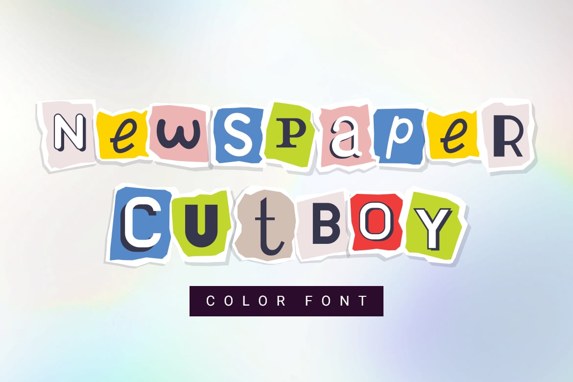
- Newspaper Cutboy: A sophisticated color font that offers multiple alternates for each character, ensuring that no two words look the same—a crucial requirement for convincing collage typography.
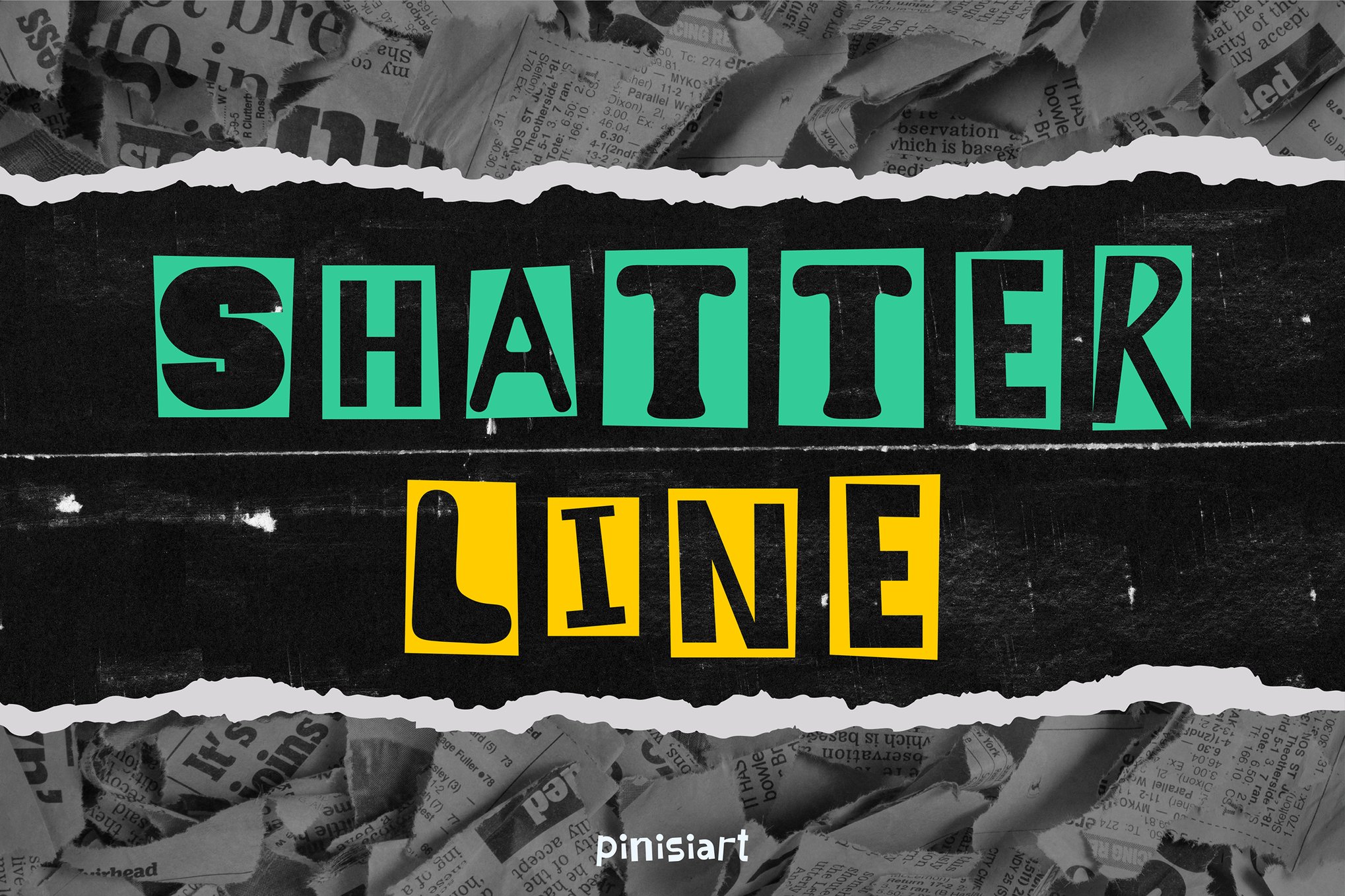
- Shatter Line: This font brings a gritty, urban feel. It is specifically engineered to handle the demands of festival posters and apparel design, where clarity must survive high-impact visual distortion.
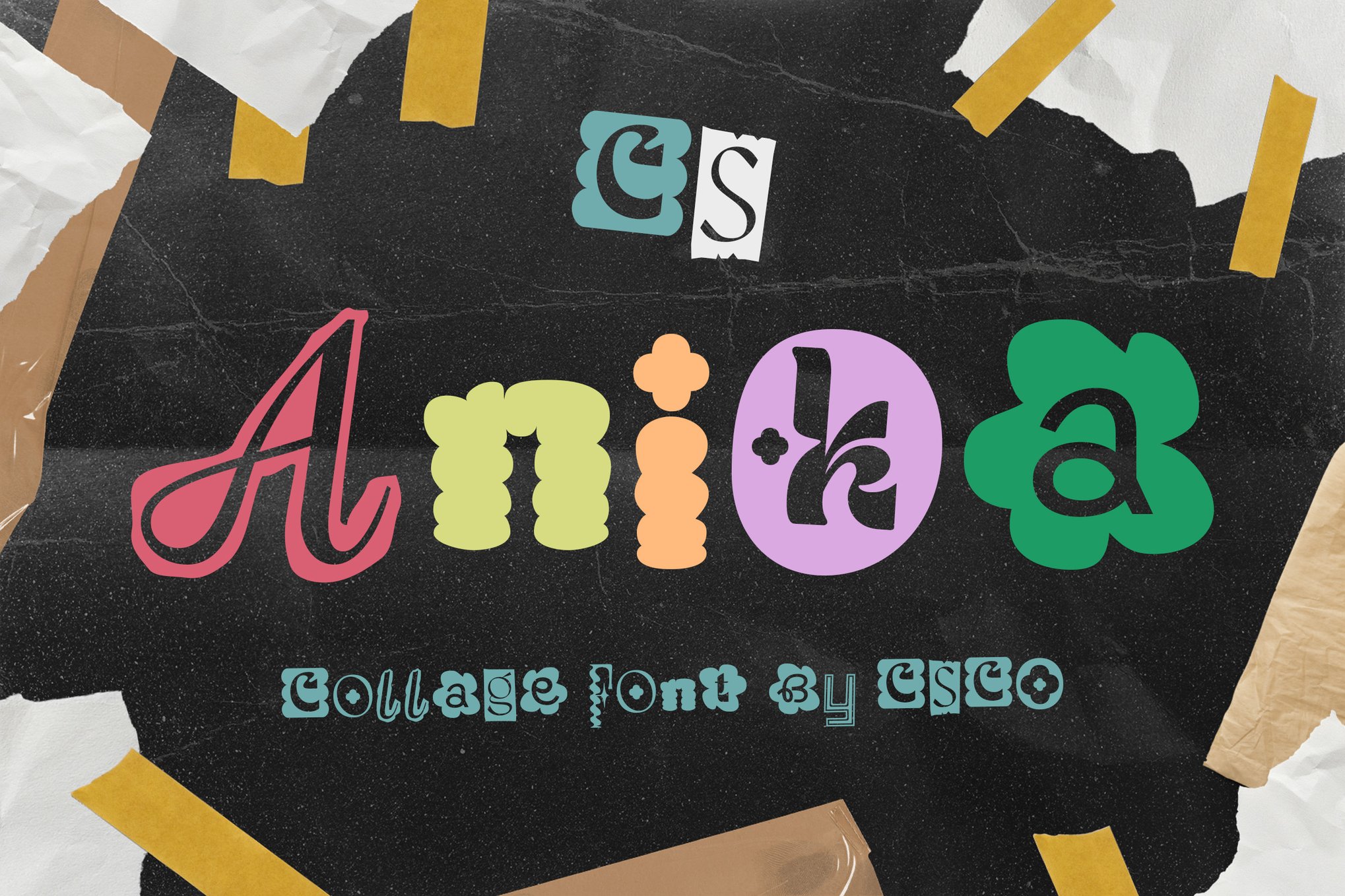
- Anika: A whimsical and energetic font that excels at making a loud, creative statement in any project, from web headers to print advertisements.
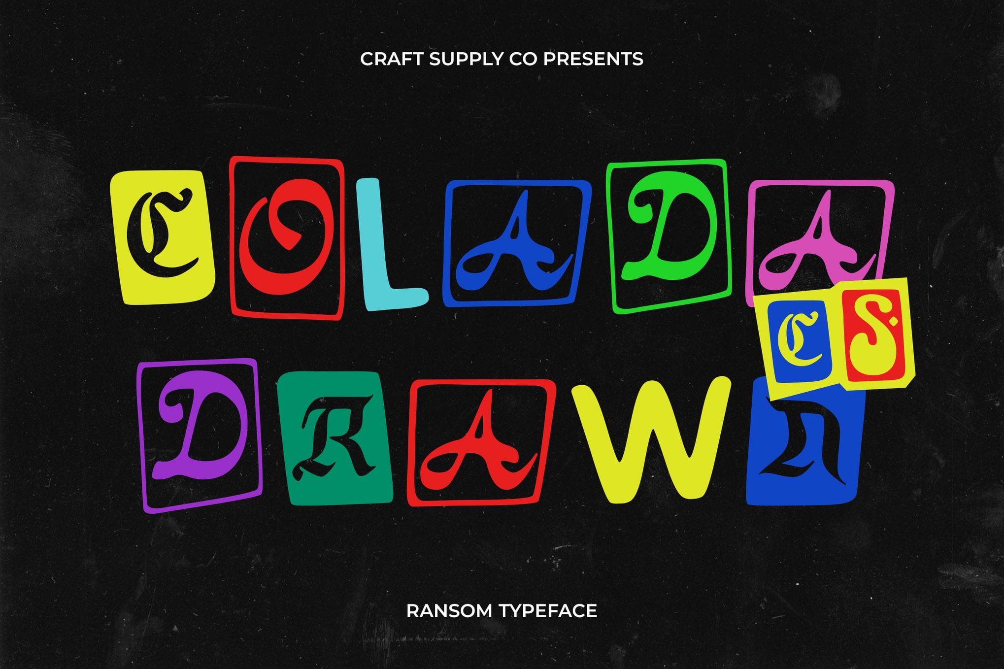
- Colada Drawn: A hand-sketched sibling to the standard Colada, this version provides a more organic, pencil-and-paper feel that works exceptionally well for boutique zine design.
Accessible Alternatives: Free Fonts for Personal Exploration
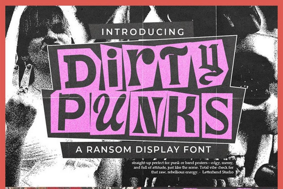
For students and hobbyists, the landscape of free fonts has expanded significantly. Dirty Punk remains a staple for youth-focused projects, while Ranger Drawn offers a unique, alternative take on the cut-out genre. CS Libra and Goenka Drawn round out the list, providing accessible entry points for those who want to experiment with color and vibrant, ransom-inspired headlines without the initial investment of a commercial license.
Technical Implementation and Best Practices
While these fonts are visually stunning, they require a disciplined hand to ensure they do not collapse into visual noise. Based on current design standards, here are the eight essential pillars for using collage fonts effectively:
1. The Power of "Strategic Flaw"
The value of a collage font lies in its imperfection. Designers should avoid the temptation to "clean up" the nodes or smooth out the edges of a typeface like Tapehead or Shatter Line. Those subtle irregularities are what prevent the design from looking like a sterile digital simulation.
2. Achieving Typographic Balance
Collage fonts are inherently heavy and complex. To prevent reader fatigue, pair them with highly legible, minimal sans-serif body copy. The collage font should be the "shout" in the design, while the supporting font provides the "whisper."
3. Palette Control
Chaos should be managed, not absolute. When using fonts that include color bitmaps (like Newspaper Cutboy), limit the supporting design elements to two or three complementary tones. This creates a cohesive "curated" look rather than a cluttered, unintentional mess.
4. Bridging Physical and Digital Realities
To truly sell the "collage" effect, designers should layer these fonts over high-resolution, scanned textures. Adding grain, paper folds, or digital tape overlays behind the typography creates a depth of field that makes the text feel like a tangible element of the layout.
5. Hierarchy through Scale
Do not be afraid to break the grid. Collage typography is meant to feel kinetic. By dramatically varying the scale of individual letters or words within a headline, you can guide the viewer’s eye across the page in a deliberate, rhythmic fashion.
6. The Contextual Filter
Not every project calls for a rebellious aesthetic. Collage fonts are best suited for projects that demand high personality—magazines, music events, street art, and independent fashion branding. Before selecting a font, ensure that the "messy" aesthetic supports the brand narrative rather than detracting from it.
7. Motion Graphics Integration
In digital applications, static collage text can be elevated through motion. Using keyframes to subtly "flicker" letters or animate them as if they are being shuffled into place on a screen adds a layer of professionalism and narrative depth that static print cannot match.
8. Mastering Software Compatibility
As many of these fonts (like Craft or Newspaper Cutboy) rely on OpenType SVG technology, they are best optimized for modern design suites like Adobe Photoshop CC, Illustrator CC, and Procreate 5. Always verify the font format—TTF, OTF, or WOFF—to ensure the best results for your specific output medium, whether that be print-ready PDFs or responsive web interfaces.
Implications for the Future of Design
The proliferation of these fonts signals a shift in consumer expectations. Audiences are becoming increasingly weary of the "perfect" digital aesthetic. They are gravitating toward brands and designers who show their work, who embrace the "hand-made" feel, and who are not afraid to use typography to inject grit and reality into a polished world.
By utilizing collage and cut-out fonts, designers are doing more than just choosing a style; they are adopting a philosophy of re-appropriation. They are proving that in a world of infinite digital possibility, the most powerful tool a designer has is still the ability to make something look like it was touched by human hands. Whether you are designing a high-end fashion magazine or a local music festival poster, these typefaces provide the necessary tools to turn a standard layout into a memorable, artistic statement.

 Reynand Wu
 Evan Lee Salim
 Basiran
 Neng Nana
 Iffa Jayyana

 Rifan Muazin
 Asro
Asro