
 Rifan Muazin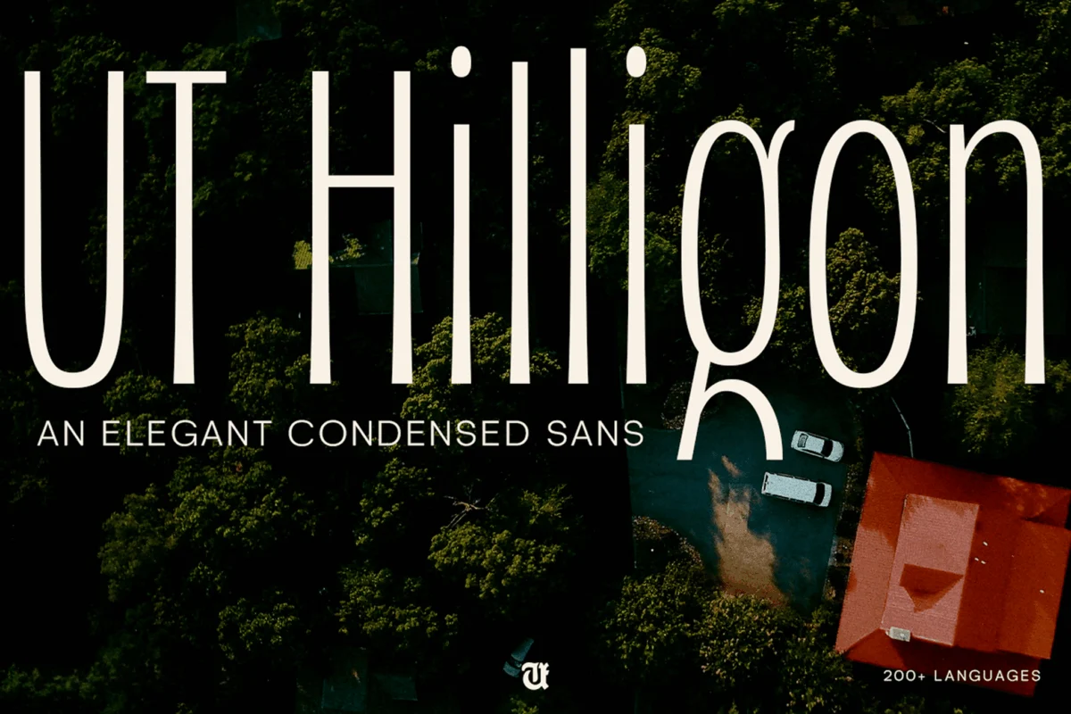
Graduation is more than just a ceremony; it is a profound milestone marking the culmination of years of academic rigor, personal growth, and transition. Whether for a high school commencement, a university convocation, or an intimate celebratory gathering, the visual language used to announce these events plays a critical role in setting the tone. Typography—the art and technique of arranging type—acts as the silent communicator, instantly conveying the formality, excitement, and sentiment of the occasion.
Selecting the right font is an essential step in the design process for invitations, announcements, and party decorations. A well-chosen typeface can transform a standard notification into a cherished keepsake. As we navigate the 2024–2025 academic season, the design industry is seeing a shift toward both timeless elegance and bold, expressive individuality.
The Evolution of Graduation Design: From Traditional to Expressive
Traditionally, graduation announcements have favored classic serif fonts. These typefaces, characterized by the small strokes at the ends of letters, evoke a sense of heritage, academia, and professional maturity. They are the visual equivalent of a diploma—serious, established, and permanent.
However, modern graduation designs are increasingly embracing expressive typography. As the demographic of graduates shifts toward a generation that values authenticity and personal branding, we are seeing an influx of handwritten scripts, quirky display fonts, and modern slab serifs. These styles allow families and institutions to bridge the gap between academic accomplishment and the personal joy of the celebration.
Chronology of Font Selection for Your Event
To ensure a cohesive visual identity for your graduation event, it is recommended that you follow a structured timeline for your design needs:
- Phase One: The Save-the-Date (4–6 months out): At this stage, readability is key. Use clean, bold sans-serifs or readable serifs that can be easily parsed on mobile devices or digital calendars.
- Phase Two: The Official Invitation (2–3 months out): This is the time for elegance. Incorporate calligraphy or high-end script fonts that convey the importance of the event.
- Phase Three: Party Decorations & Signage (1 month out): Shift to more playful or thematic fonts. Since these will be used on posters, banners, and digital social media posts, consider bolder, higher-contrast display fonts that catch the eye.
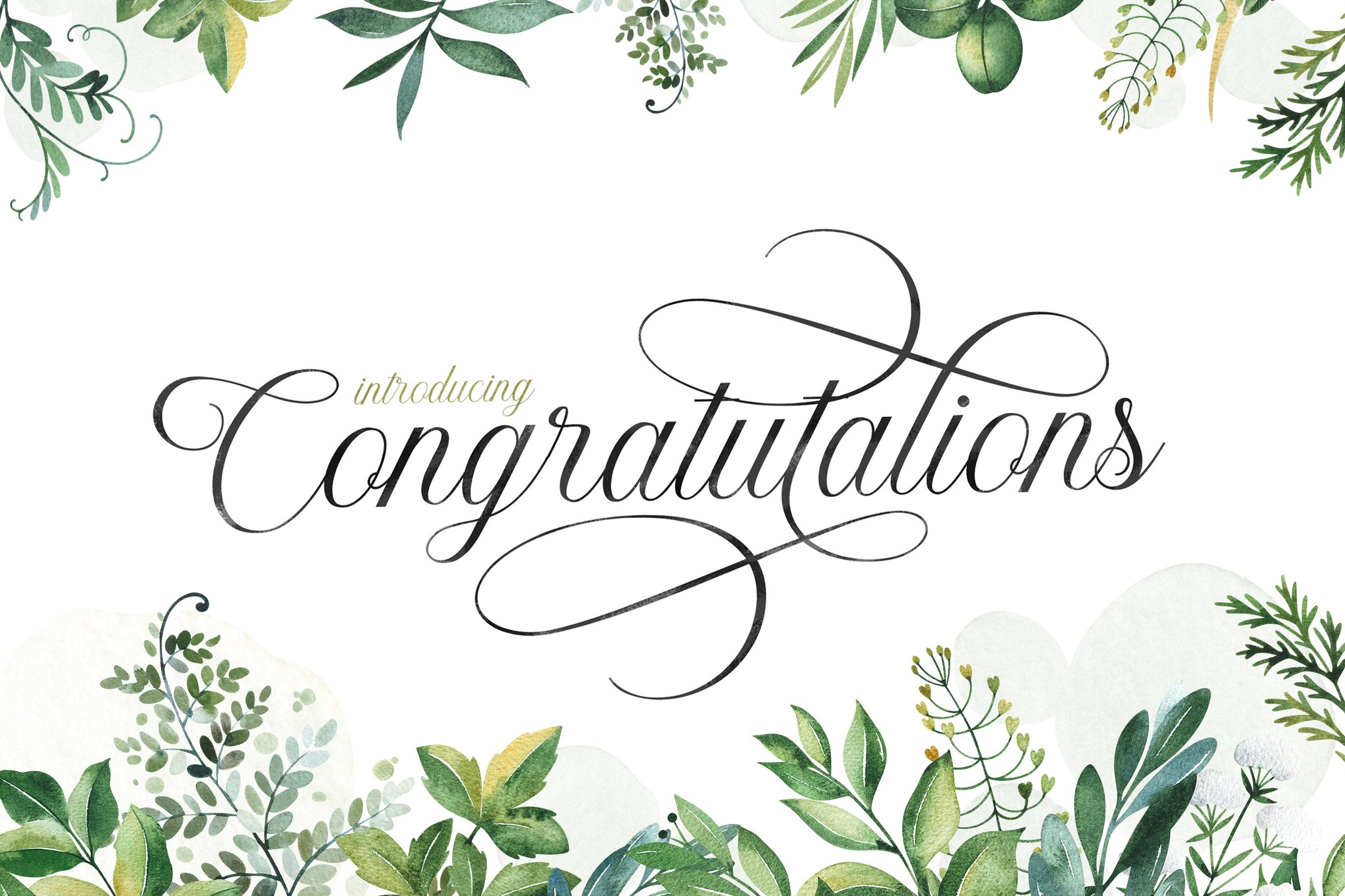
- Phase Four: Thank You Notes (Post-event): Return to a warm, handwritten, or signature-style font to express gratitude with a personal touch.
Premium Selections: Professional-Grade Typefaces
When precision and versatility are required, premium fonts offer superior kerning, extensive character sets, and professional-grade ligatures.
Diploma – The Standard of Elegance
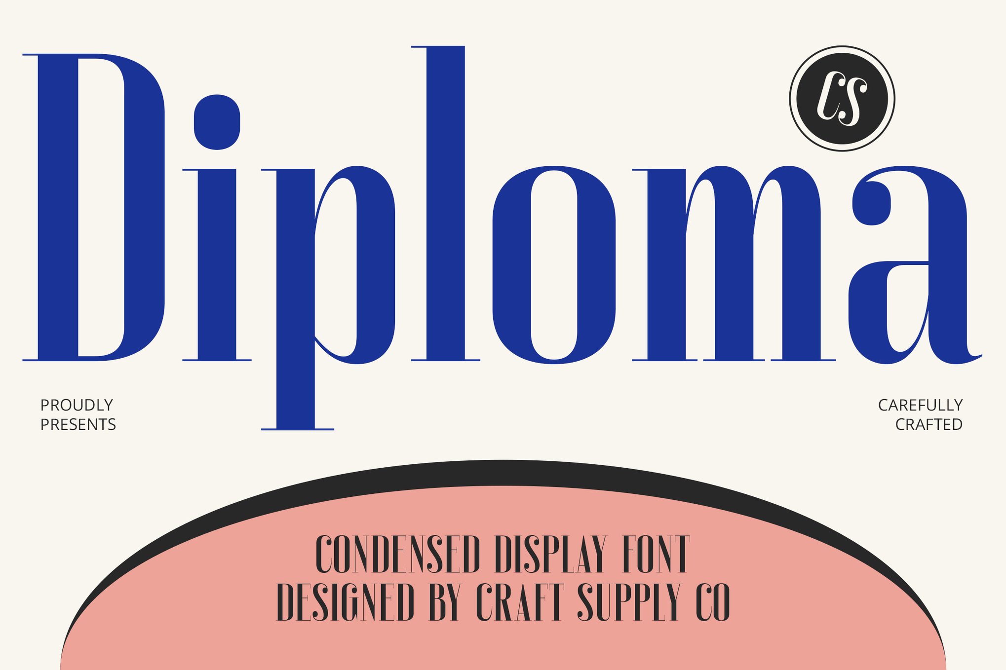
The Diploma condensed font stands as a masterclass in balance. It manages to retain a traditional serif aesthetic while embracing a modern, condensed structure. This allows designers to fit significant information—such as university names and degree titles—into tighter spaces without sacrificing legibility. Its multilingual support makes it an excellent choice for international student bodies.
Diploma Drawn – Handcrafted Sophistication
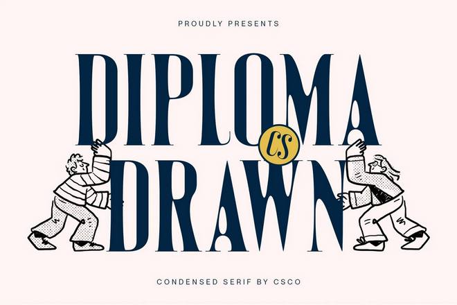
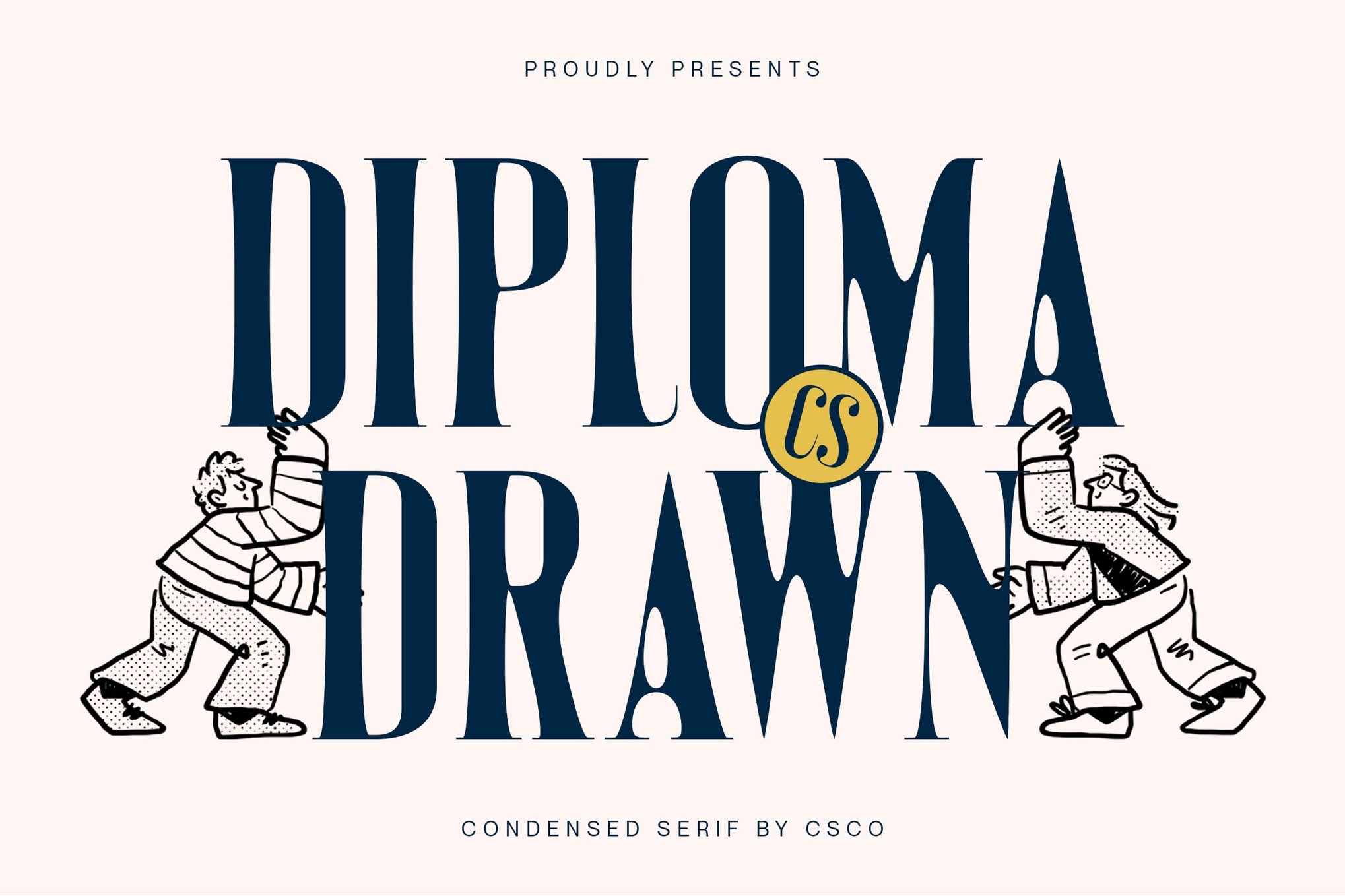
For those seeking the "human" touch, Diploma Drawn offers the structure of a professional serif with the charm of a hand-sketched design. It is ideal for high-end graduation programs where the goal is to feel both prestigious and accessible.
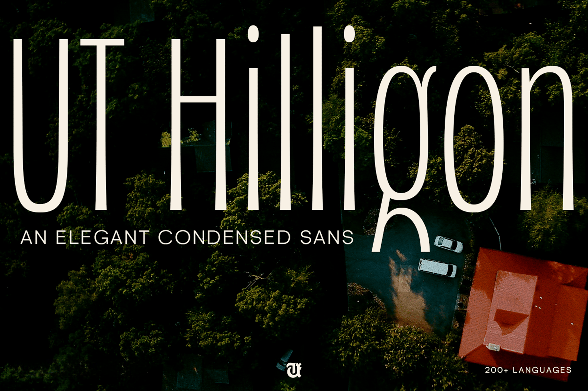
Hilligon – The Nature-Inspired Choice
Inspired by the geometry of pine cones, Hilligon is an elegant condensed font that feels inherently organic. With over 400 glyphs and sophisticated ligatures, it is designed for those who want their invitation to look like a piece of high-fashion editorial design.
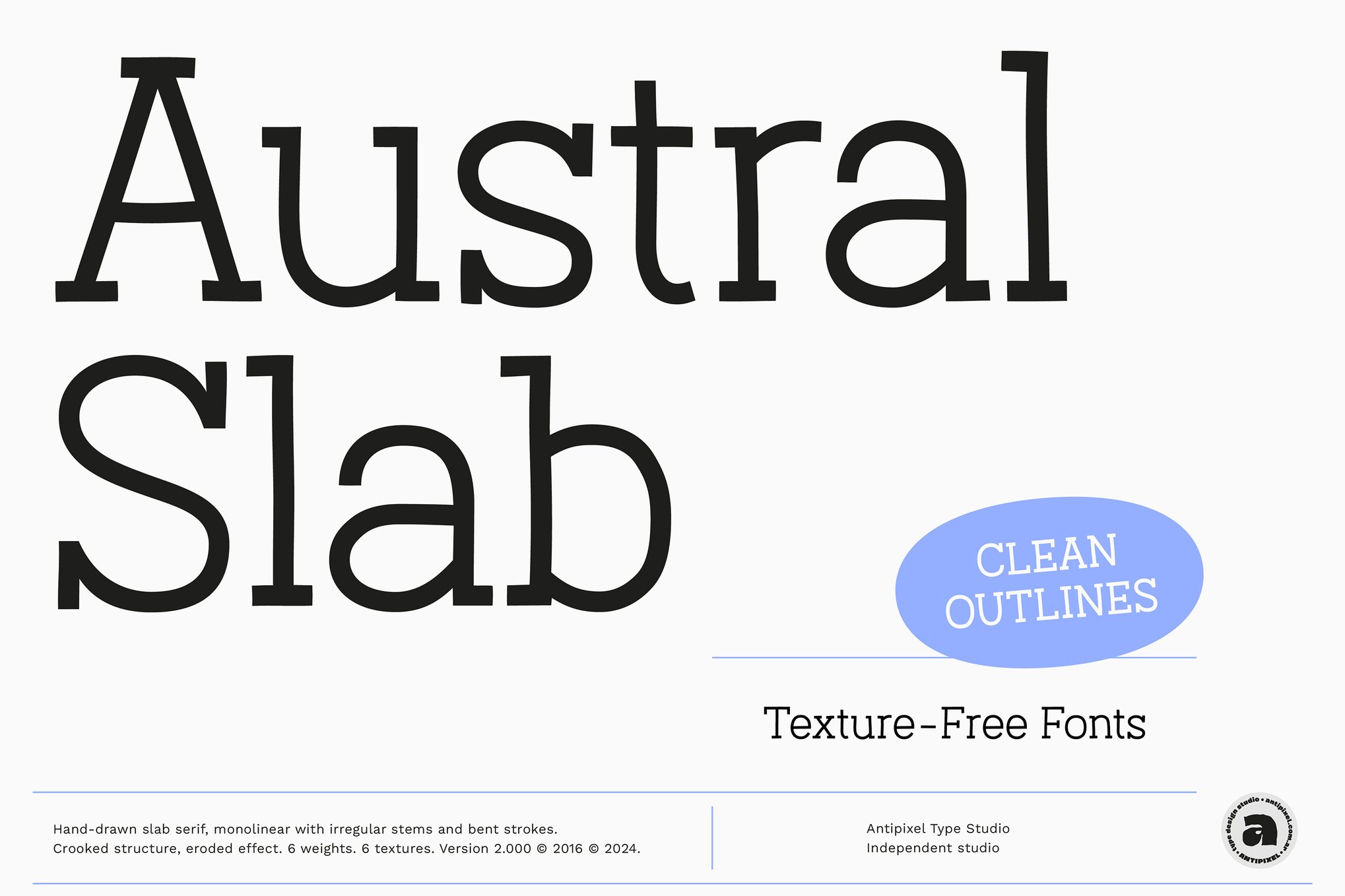
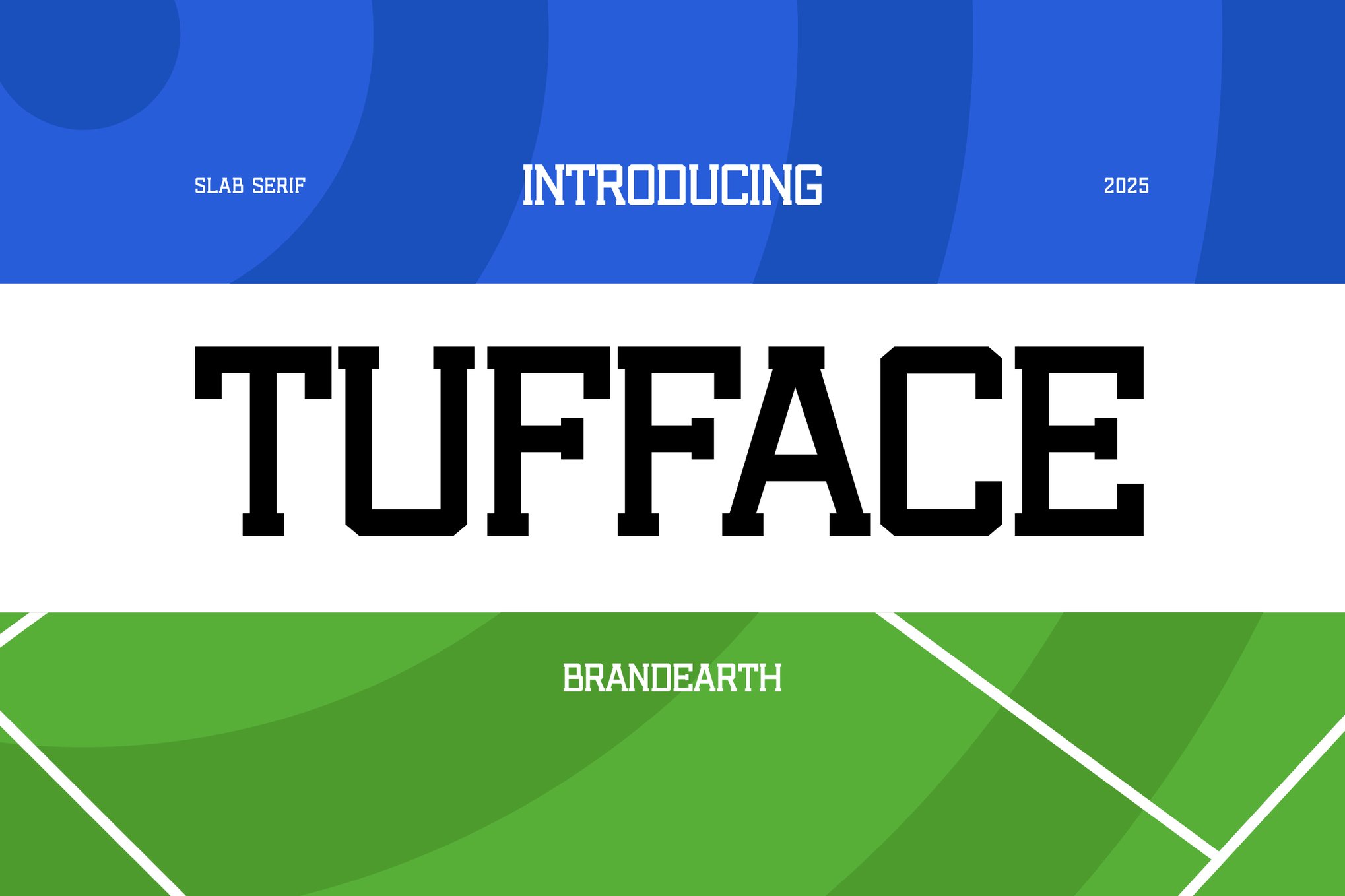
Tufface – Strength and Precision
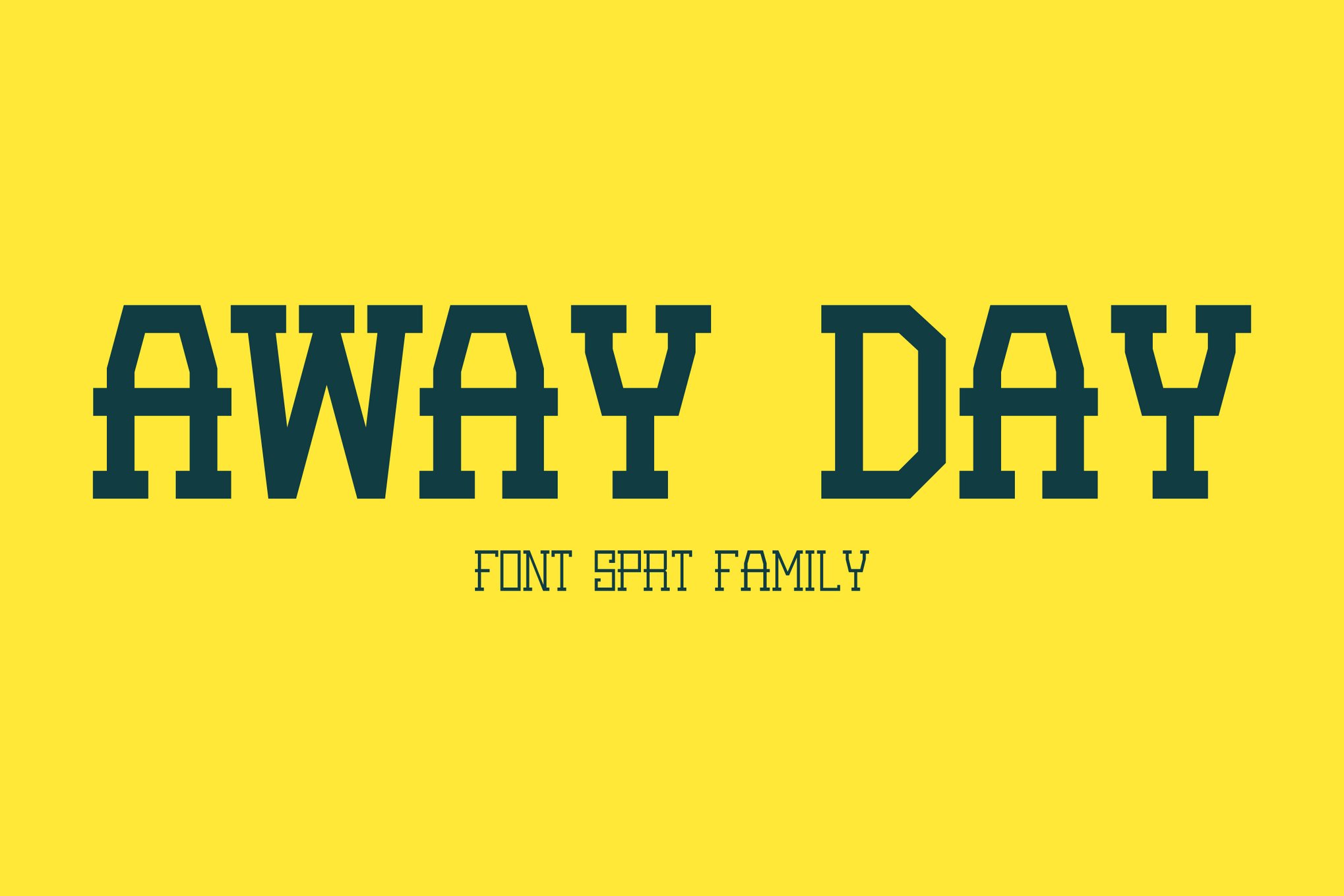
When the occasion calls for a bold statement, Tufface provides a robust slab-serif look. Its geometric foundations represent strength, making it perfect for athletic-focused graduation announcements or events that celebrate a student’s resilience and grit.
Handwritten & Casual: Bringing Personality to the Fore
Not every graduation needs to be stiffly formal. For many, the celebration is about joy, friendship, and the future.
Modern Handwritten Choices
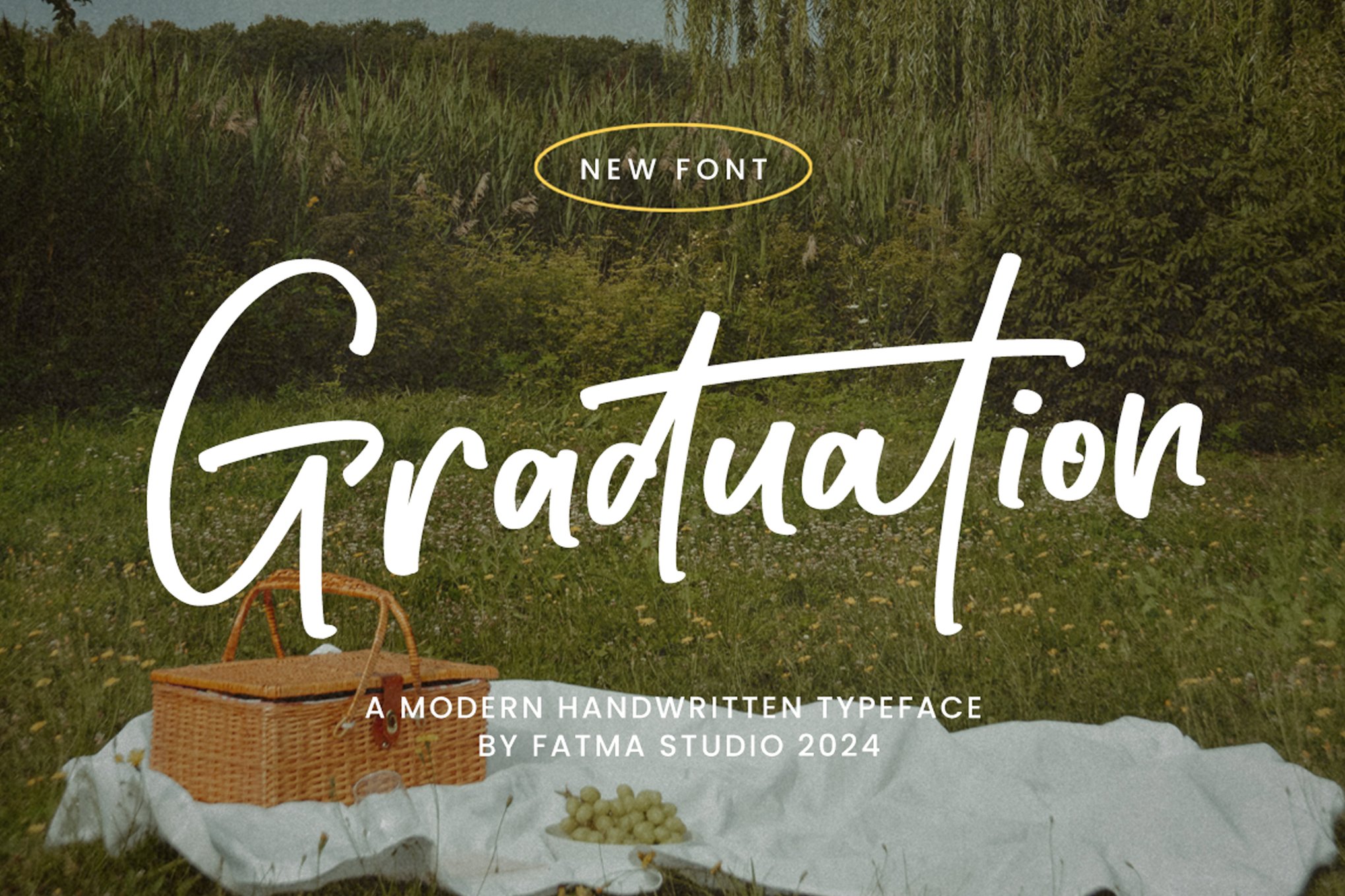
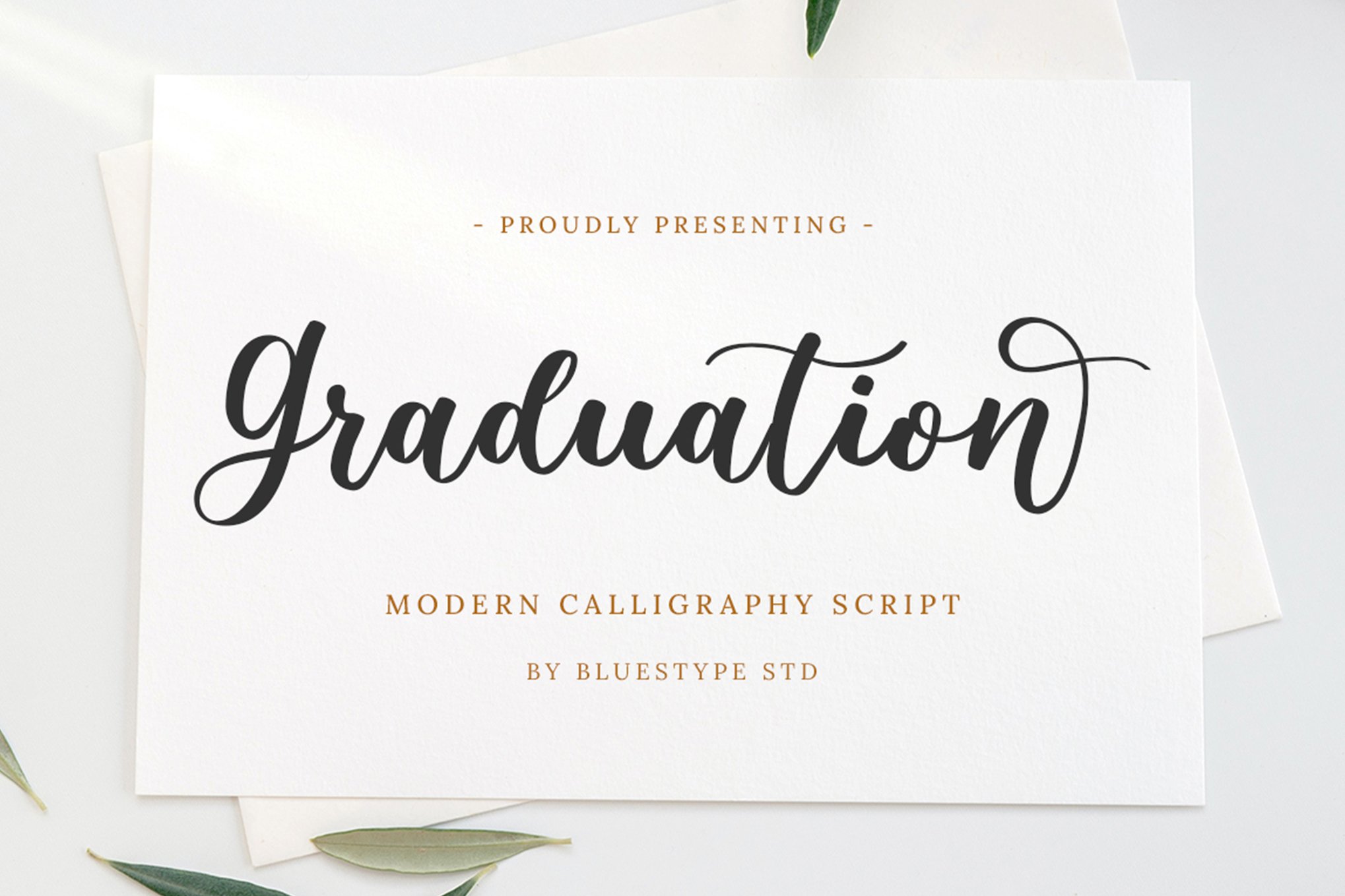
- Graduation (Modern Handwritten): This font excels by blending rounded, smooth letterforms with a professional polish. It is the gold standard for "inviting" rather than "announcing."
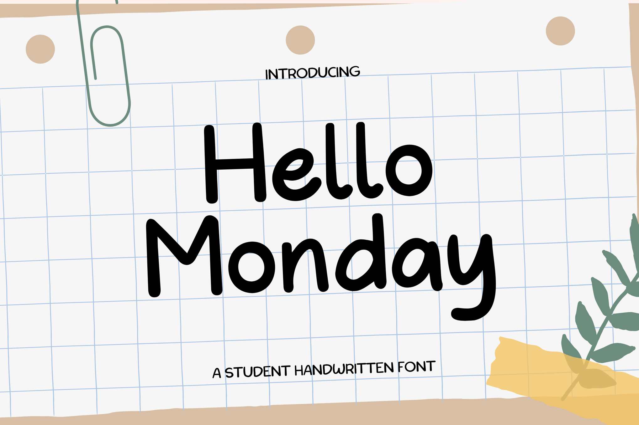
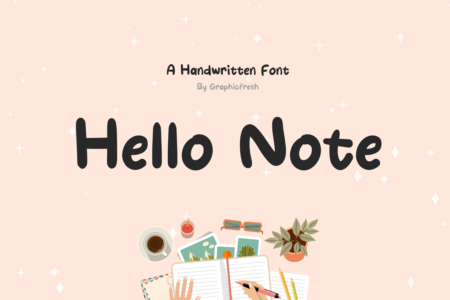
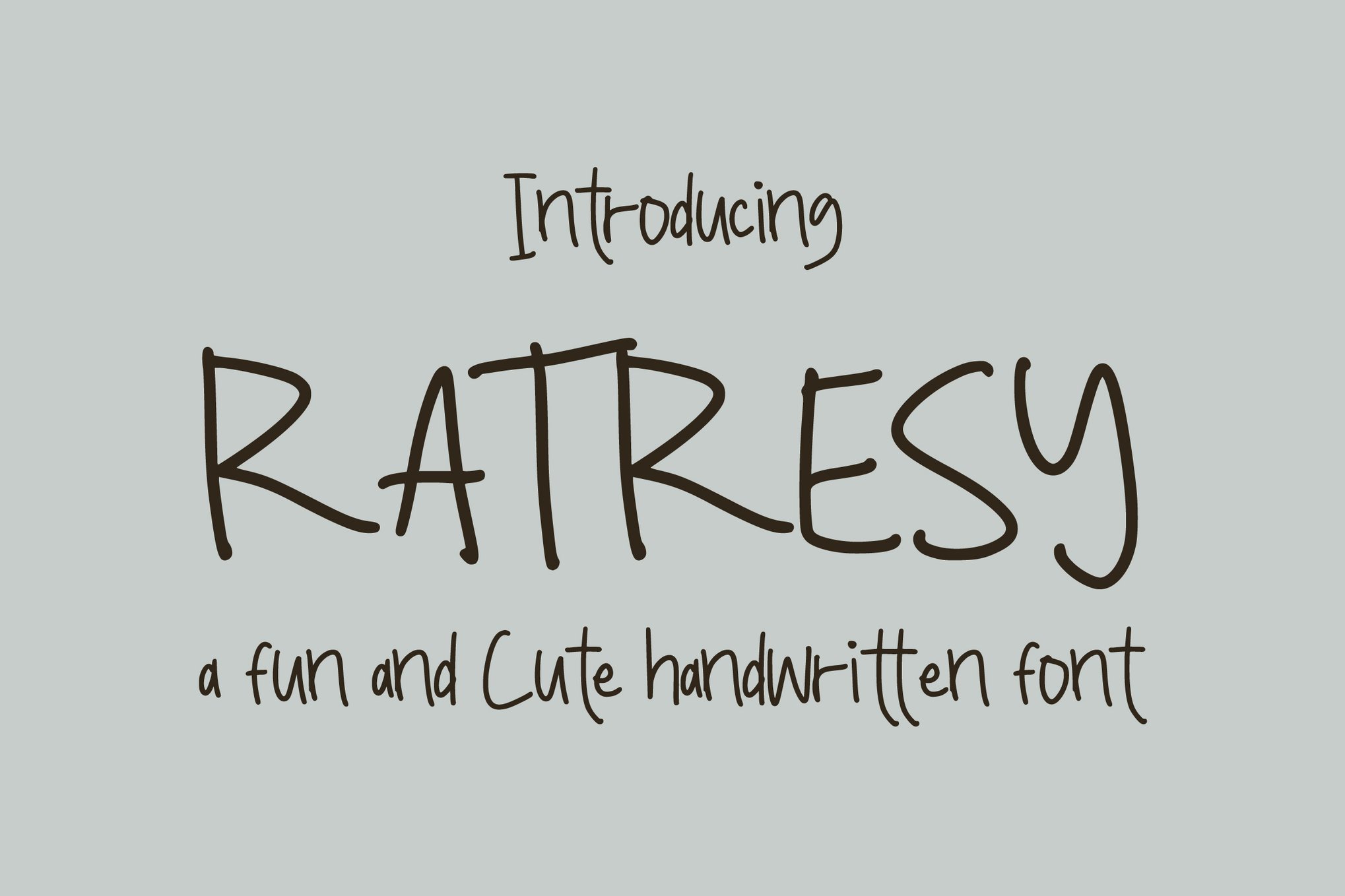
- Hello Monday: As the name suggests, this font feels like the start of something new. It is casual, lighthearted, and perfect for social media graphics or casual party invites.
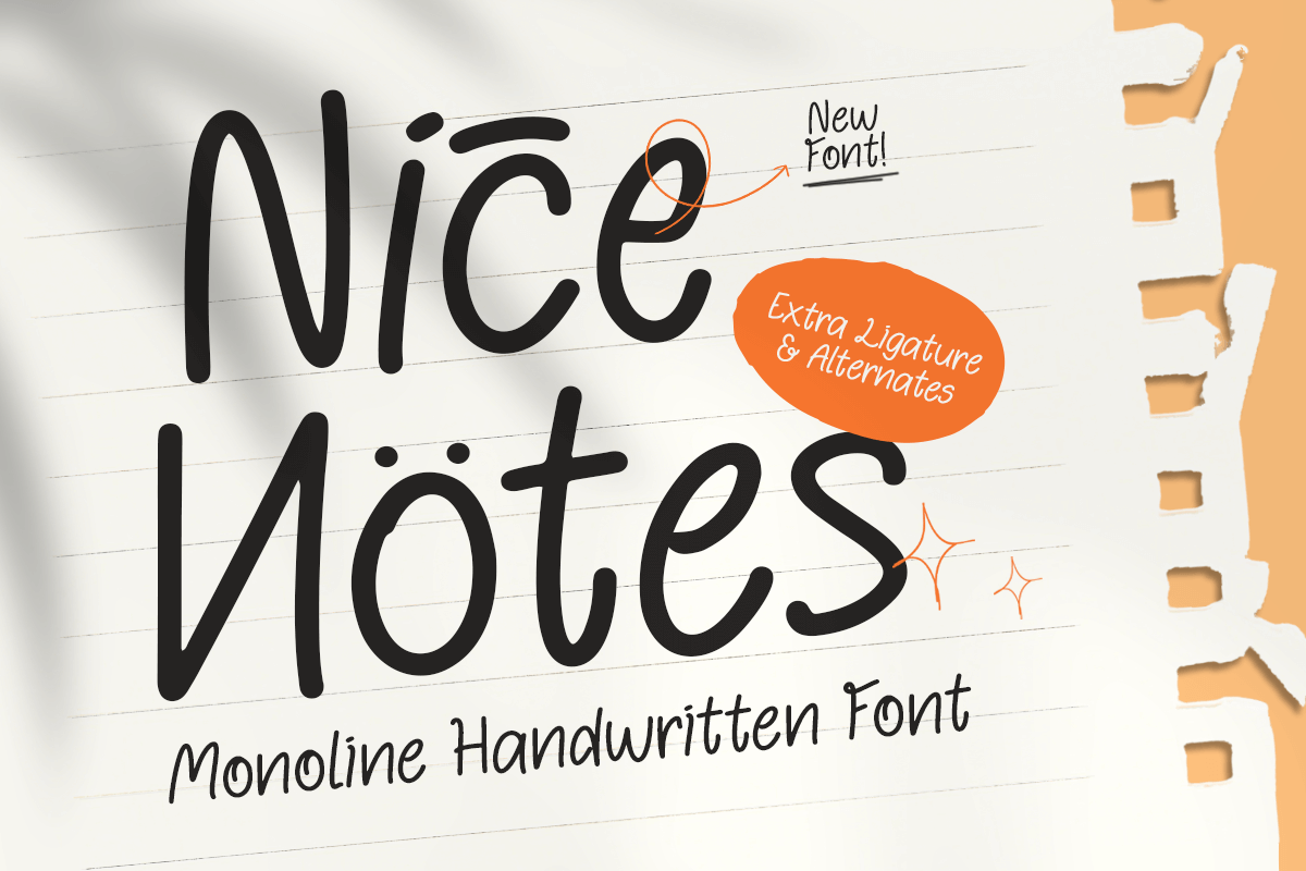
- Nice Notes: A favorite for those wanting a cozy, "journal-style" aesthetic. It is highly effective for classroom materials or personal graduation scrapbooks.
The Playful Aesthetic
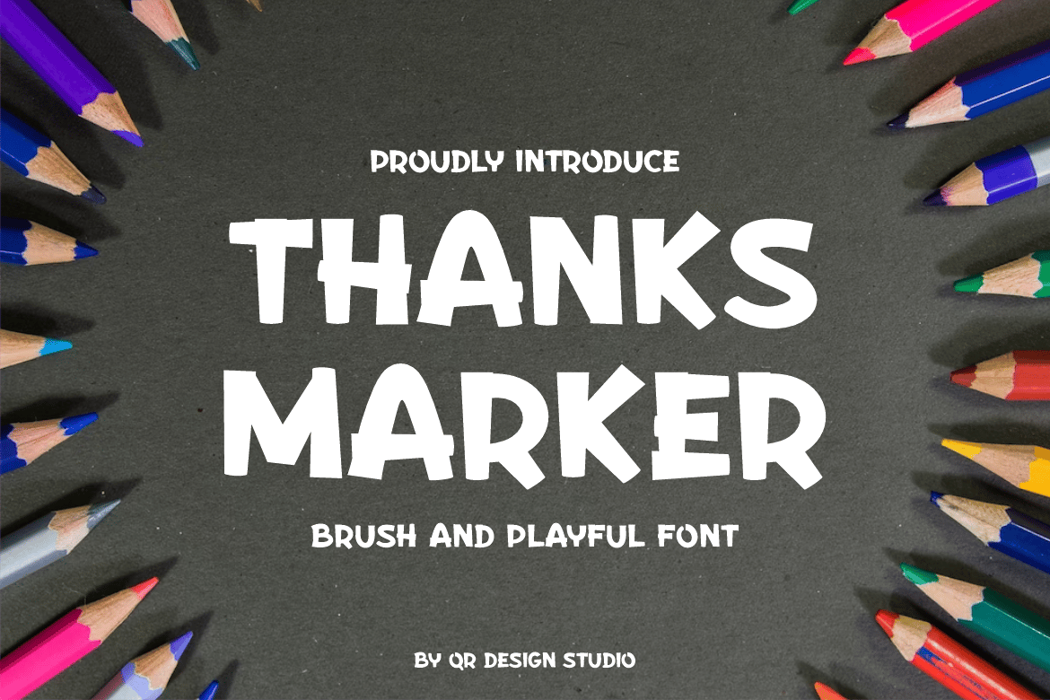
- Thanks Marker: For the graduate who wants their personality to shine, this bold, authentic display font mimics the look of a marker. It is vibrant, energetic, and demands attention.
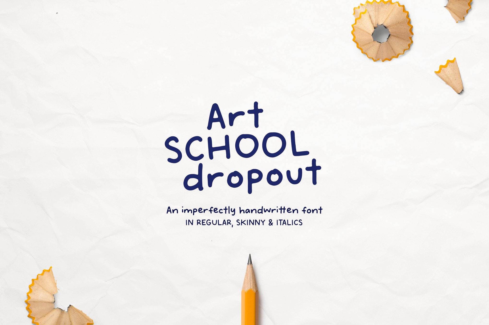
- Art School Dropout: Despite the tongue-in-cheek name, this font is a sophisticated sans-serif that includes 52 custom doodle elements. It is the ultimate tool for a creative student’s personal announcement.
Supporting Data: The Impact of Typography on Engagement
According to recent design-marketing studies, the choice of typeface can increase the "retention rate" of an invitation by up to 30%. When a font matches the emotional context of an event, the recipient is more likely to associate the event with positive anticipation.
- Legibility vs. Flair: While decorative scripts are visually appealing, they should be reserved for headlines. For critical information like dates, times, and addresses, data shows that fonts with a "medium" weight and high x-height perform best, ensuring no errors are made in the RSVP process.
- Cross-Platform Compatibility: Modern designers must prioritize fonts available in WOFF (Web Open Font Format) for digital invitations, alongside OTF and TTF for physical printing. All fonts listed in this collection, such as Prodencial and Mundri, offer this dual-compatibility, ensuring your invitation looks as good on a smartphone screen as it does on heavy-stock card paper.
Official Responses and Industry Standards
Leading typographers emphasize that the biggest mistake made in graduation design is "font clutter." Industry experts advise against using more than two fonts per project: one for the primary header (the "event title") and one for the body text (the "details").
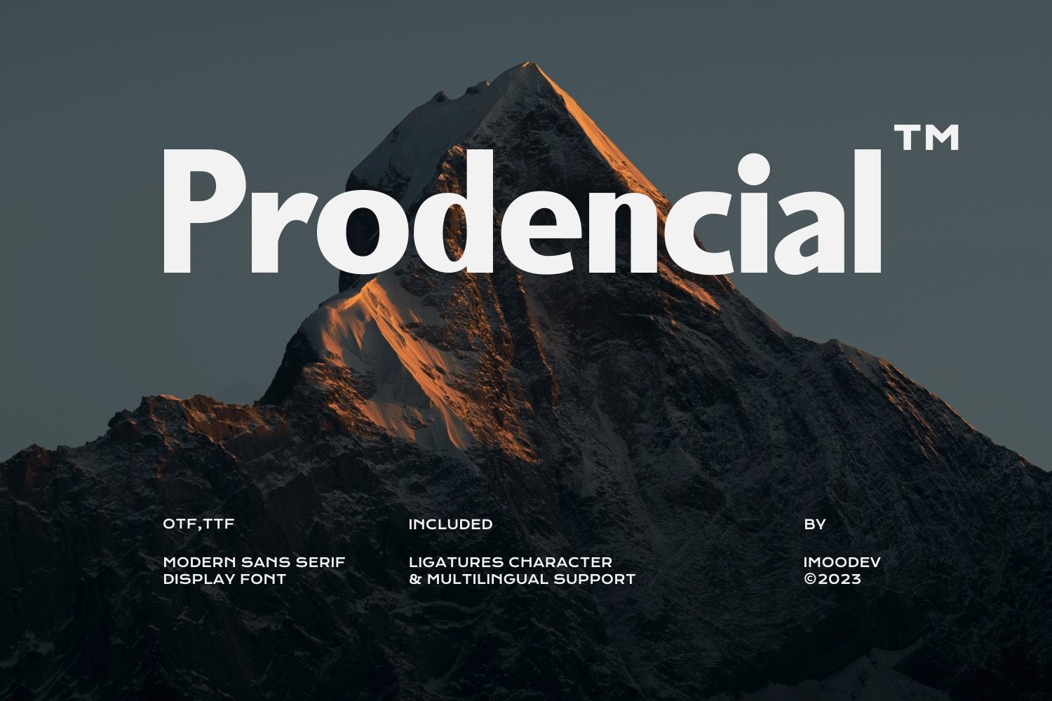
"A graduation design should be a vessel for the accomplishment, not a distraction from it," says a spokesperson from the leading design marketplace Design Shack. "The most successful invitations are those that use a high-contrast pairing—perhaps a bold, modern sans-serif like Prodencial for the graduate’s name, paired with a cleaner, more traditional serif for the event details."
Implications for Future Designers
As we look ahead, the trend in graduation typography is toward "Variable Fonts." These are single font files that act as multiple fonts, allowing the designer to adjust the weight, width, and slant in real-time. This technology is set to revolutionize graduation design, allowing a single typeface to adapt seamlessly from a large, bold outdoor banner to a small, delicate physical card.
Furthermore, the rise of digital-only graduation announcements via platforms like Canva, Adobe Express, and specialized event sites means that designers are increasingly prioritizing "motion-ready" fonts. Typefaces that look stable when static but retain their character when animated are becoming the new industry standard.
Conclusion: Crafting Your Legacy
The graduation season is a fleeting, high-stakes moment in time. Whether you choose the timeless authority of a serif like Diploma or the youthful energy of a handwritten script like Hello Monday, your choice of font is an extension of the graduate’s voice.
By selecting a typeface that aligns with the event’s tone—and ensuring it is functionally sound across both print and digital mediums—you ensure that the message of celebration is communicated clearly, elegantly, and memorably. As you prepare for the upcoming festivities, consider these fonts not just as tools, but as the final flourish on a years-long journey of success.
Summary of Recommended Fonts for 2025
- For Traditional Elegance: Diploma, Hilligon.
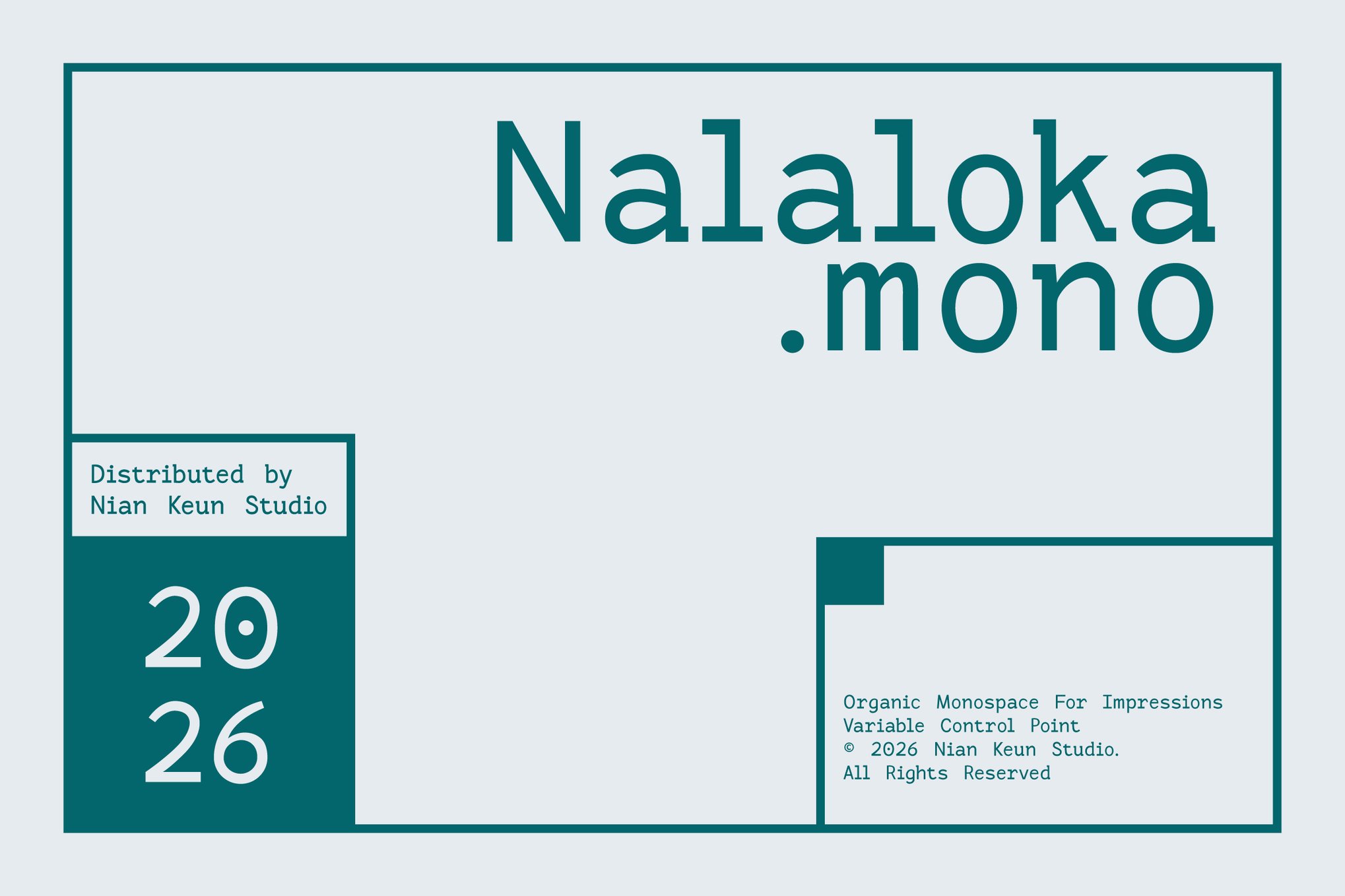
- For Modern Professionalism: Prodencial, Nalaloka Mono.
- For Playful & Personal: Art School Dropout, Thanks Marker.
- For Budget-Conscious Excellence (Free): Caramel Calligraphy, Garden Flags.
Designers are encouraged to verify commercial licensing for all premium fonts to ensure compliance with event usage rights.

 Lina Irawan
 Pevita Pearce
 Ammar Sabilarrohman
 Suro Senen
 Jia Lissa
 Evan Lee Salim

 Ali Ikhwan