
 Lina Irawan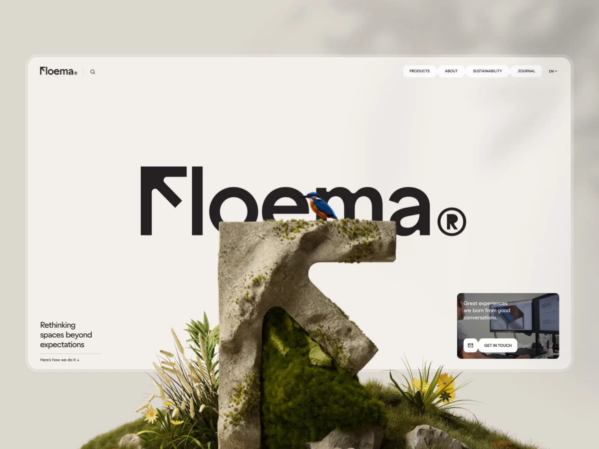
In the modern urban landscape, the line between public utility and natural integration is becoming increasingly thin. Floema, a visionary design and manufacturing firm, has spent years redefining how we interact with our environment through sustainable urban furniture and signage. Recently, the company completed a transformative two-year collaboration with the renowned Portuguese design studio Burocratik. The result is not merely a website, but a comprehensive digital ecosystem that elevates Floema to the ranks of Europe’s premier product manufacturers, blending high-end B2B functionality with a profound, emotional narrative of sustainability.
A Two-Year Odyssey: From Rebranding to Digital Transformation
The partnership between Floema and Burocratik was born from a singular ambition: to communicate the true scale, quality, and evolutionary trajectory of Floema’s product catalogue. Recognizing that their digital presence did not reflect the prestige of their physical offerings, Floema sought a partner capable of aligning their brand identity with their craftsmanship.
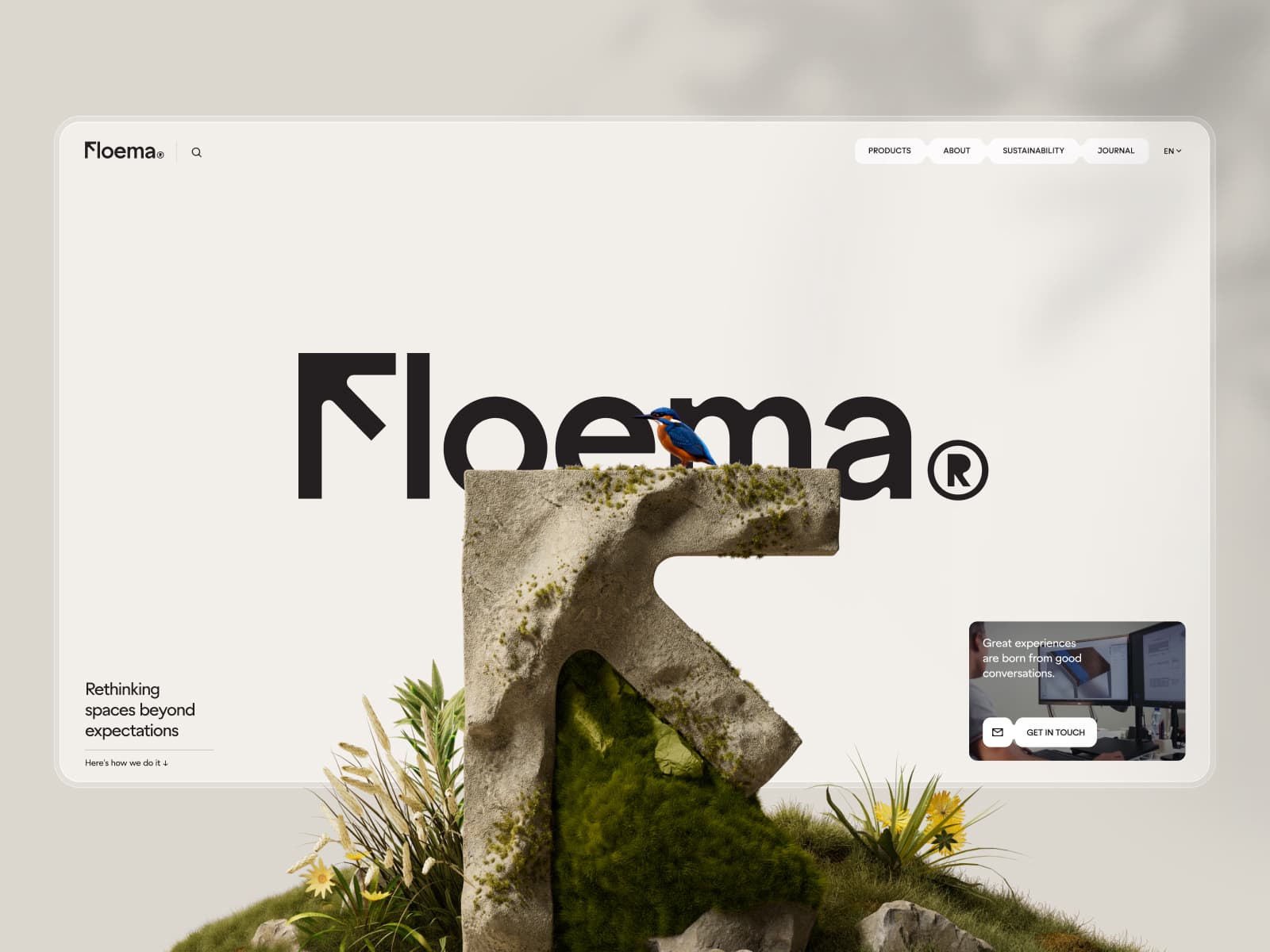
The collaboration unfolded in two distinct phases. The first year was dedicated to the foundational work—rebranding, restructuring, and redesigning the physical product catalogues. This period served as a crucible for the brand’s visual language, ensuring that the physical and digital worlds would eventually exist in perfect harmony. The second year culminated in the launch of the new Floema.com, a platform that functions simultaneously as a robust B2B resource and an immersive storytelling medium.
By prioritizing a "product-first" experience, the website bridges the gap between the pragmatic needs of architects and urban planners—who require rigorous technical specifications—and the emotional narrative of how these products inhabit and enhance the natural world.
The Architecture of Identity: The "F" as a Directional Compass
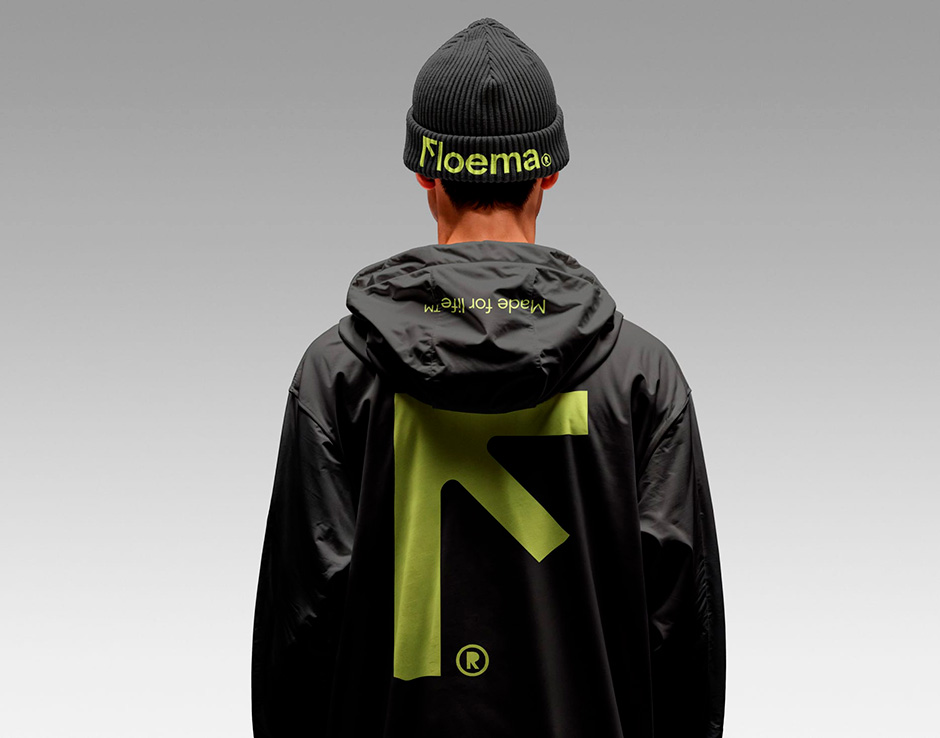
At the core of the new brand identity is a logo that challenges convention. Floema, deeply rooted in its legacy of signage, required a mark that was both legible and characterful. The resulting "F" is more than a letter; it is a functional graphic element. Designed with a distinct twist, the logo behaves like an arrow, pointing upward with intent.
The design process was not without friction. As the studio noted, the initial reaction was, "That’s not an F." Yet, this resistance is precisely what the designers intended. It is an "F" that guides, a visual embodiment of the company’s dedication to nature’s signage.
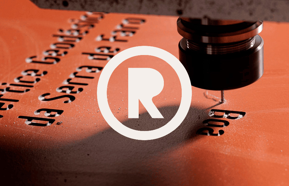
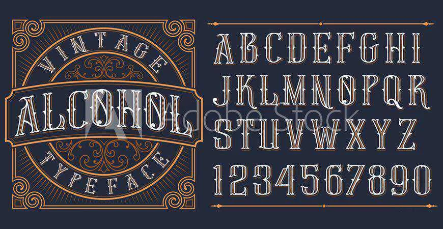
This directional logic extended to the choice of typography. The team opted for La Bolde Vita’s Zimula, a contemporary geometric typeface featuring prominent, rounded ink traps. These details were specifically chosen to mirror the realities of CNC manufacturing—the process used to create Floema’s metal and recycled plastic products. By removing the "R" counter (the inner shape of the letter), the studio embraced the constraints of production, transforming them into a hallmark of intent rather than an error.
Materiality and the Synchronicity of Form
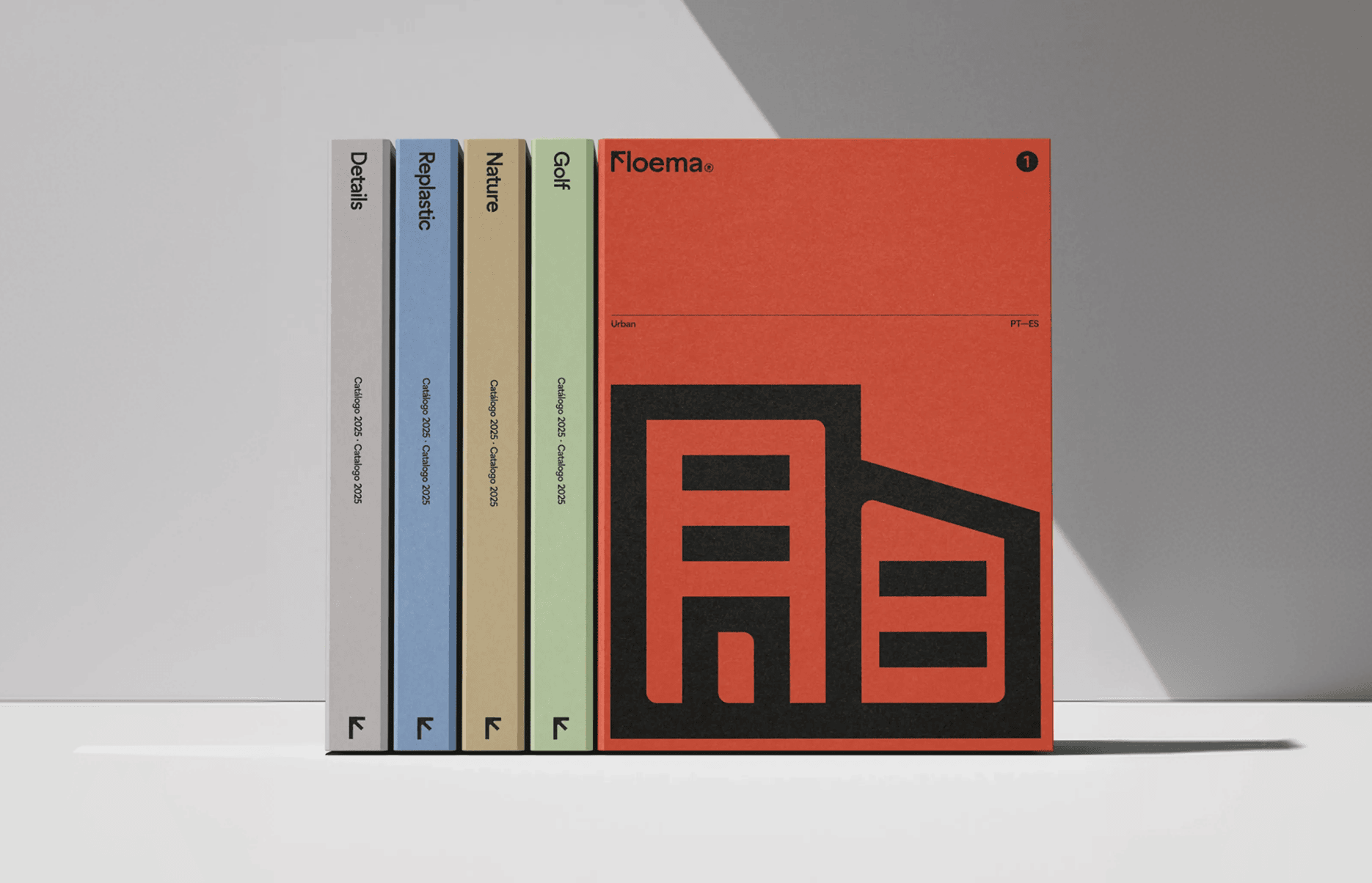
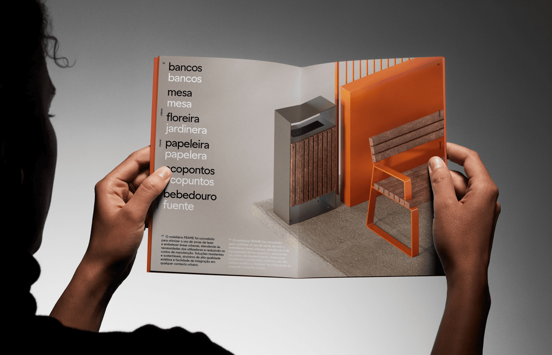
The project’s dedication to materiality extended beyond the screen. The studio sought a tangible connection between the brand’s identity and its products. This was achieved through the use of innovative, environmentally conscious materials for the physical catalogues.
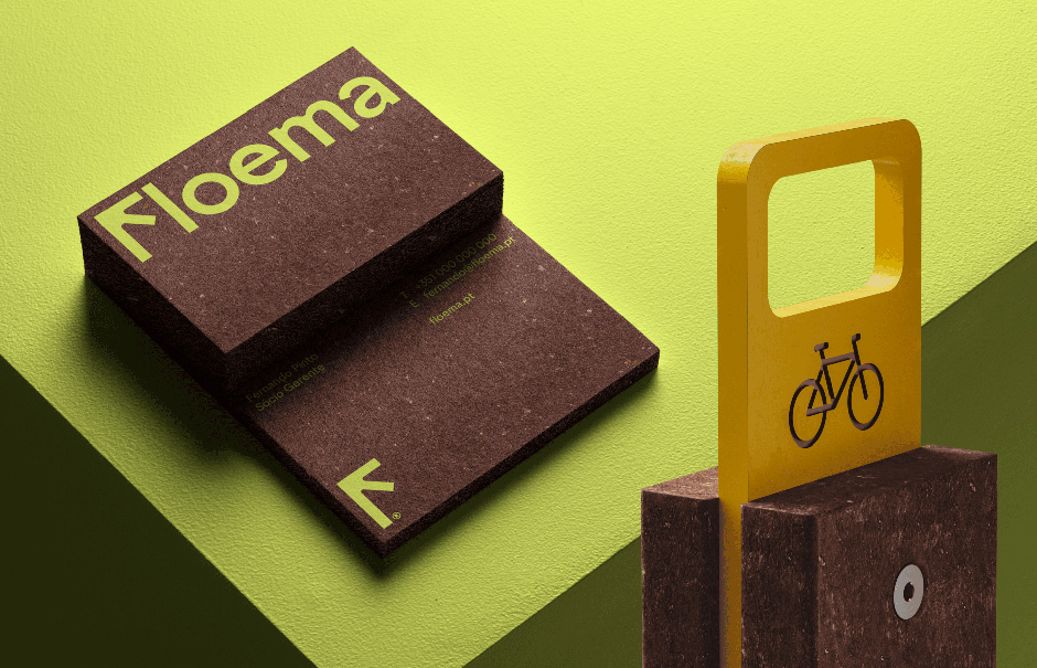
For example, business cards were printed on Gmund Beer Ale—a textured paper made from hops, malt, and pulp—which provides a visual and tactile match to the recycled plastics used in Floema’s urban furniture. Meanwhile, the main brochures utilize Fedrigoni Materica, a paper chosen for its mineral-like finish. These sensory choices ensure that the brand’s philosophy of "Spaces for people, made for life" is felt as much as it is seen.
Engineering the Digital Experience: 3D Optimization at Scale
A central challenge of the project was the integration of over 230 individual products into a seamless, interactive 3D environment. To ensure high-performance mobile interaction, the team implemented a rigorous processing pipeline. Every 3D model, regardless of its source, is processed through a sequence of compression tools—including glTF Transform, Meshoptimizer, and Draco—to ensure the geometry, textures, and materials remain sharp without sacrificing load times.
The team also developed a sophisticated CMS-integrated 3D viewer. This allows editors to adjust lighting, camera angles, and rotation, ensuring that every product, whether a chair or a light fixture, appears as if it were photographed in the same professional studio. To save on rendering costs, the system uses an intelligent shadow-caching mechanism: shadows are calculated during the initial load and animation phases, then fixed once the model is stationary, maintaining a smooth, high-quality visual experience without overburdening the user’s browser.
The Strategic Role of AI in Creative Exploration
While the project is defined by meticulous craftsmanship, the team was candid about the role of Artificial Intelligence in the workflow. AI was not used as a shortcut, but as an accelerant for creative exploration.
During the visual conceptualization phase, Midjourney was employed to rapidly generate variations of the "F" logo and seasonal brand assets. Once a direction was finalized, the AI-generated concepts were rebuilt in 3D, allowing for custom materials and lighting that traditional AI tools cannot yet replicate.
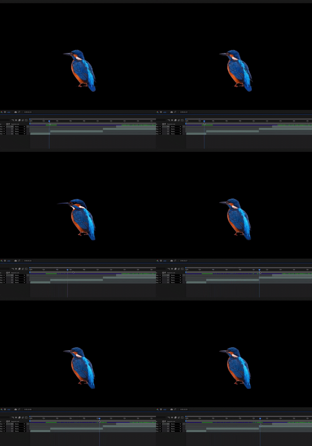
Most notably, the team pushed the boundaries of digital narrative by incorporating animated wildlife—a kingfisher and an owl—into the "About" page. These creatures, designed to inhabit the digital space, react to user interaction, flying in and out of the frame based on scroll behavior. Through the integration of high-fidelity audio design and interactive 3D layering, the website creates a "breathing" environment that feels alive.
Implications for B2B Digital Design
The success of the Floema platform serves as a powerful case study for the B2B sector. It proves that technical, sales-driven websites do not have to be dry or sterile. By balancing utility with evocative brand storytelling, Burocratik has created a digital flagship that justifies its presence in a competitive market.
The project highlights a crucial lesson for modern design: "Sort the foundations before the design." By integrating branding, content strategy, and technical architecture from day one, the team avoided the common trap of treating a website as a mere wrapper. The result is a platform that feels like an organic extension of the brand itself.
Technical Specifications and Studio Pedigree
The technical stack is a testament to modern web performance:
- Framework: Vue/Nuxt.js
- CMS: Sanity (Headless)
- Hosting: Vercel
- Interaction: GSAP, Lenis (smooth scrolling), and Rive
- 3D Engine: Three.js
Burocratik, the studio behind the project, is a Porto-based firm with two decades of experience and is currently ranked as Europe’s #1 Digital Design Studio by the European Design Agencies League. Their work on Floema is a definitive example of how deep technical expertise, when paired with a bold creative vision, can transform a company’s entire market position.
As the industry looks forward, the Floema project stands as a benchmark for how sustainable manufacturing can be translated into a digital experience that is as durable and thoughtful as the physical spaces it helps to shape. "Made for life" is not just a tagline for Floema’s furniture; it is the ethos that now defines their entire digital existence.

 Reynand Wu
 Evan Lee Salim
 Basiran
 Neng Nana
 Iffa Jayyana
 Raul Delapena Setiawan
 Rifan Muazin
 Asro
Asro