
 Asro
Asro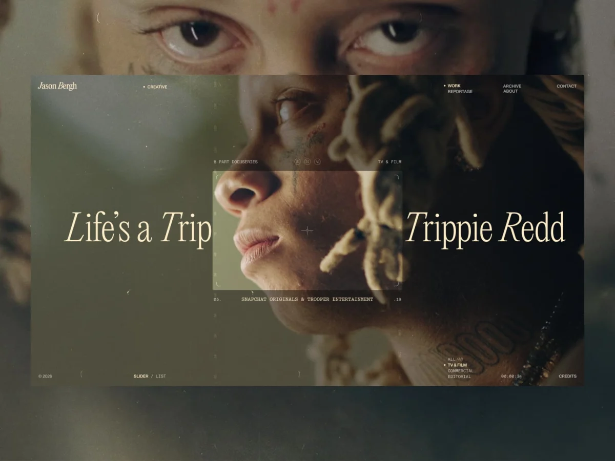
In the contemporary digital landscape, the portfolio website has become a standardized commodity. We have become conditioned to expect a predictable choreography of hamburger menus, sticky headers, and structured user flows. However, for director Jason Bergh, the conventional approach to web design felt like an aesthetic betrayal of his craft. His work is built on the language of rhythm, tension, release, and the deliberate pacing of visual storytelling. To frame such work within a static, grid-based interface was, in his view, a fundamental misunderstanding of the medium.
The result of this realization is a radical departure from standard web practices. Developed in collaboration with the creative studio BL/S®, the new digital presence for Jason Bergh is not merely a website; it is an immersive environment designed to translate a cinematic sensibility into a scrollable, visceral experience.
The Philosophy of Presence: A Chronology of Departure
The project began with a singular, disruptive question: What happens when you strip away the UI?
The Initial Assessment
Jason Bergh already possessed a functional website. By all industry standards, it was "correct"—it presented his filmography, provided professional context, and adhered to established UX heuristics. Yet, it failed the "vibe check" of his own artistic identity. The existing site felt like noise. Every tooltip, button, and navigation label acted as a barrier between the viewer and the director’s work.
The Shift to "Anti-Interface"
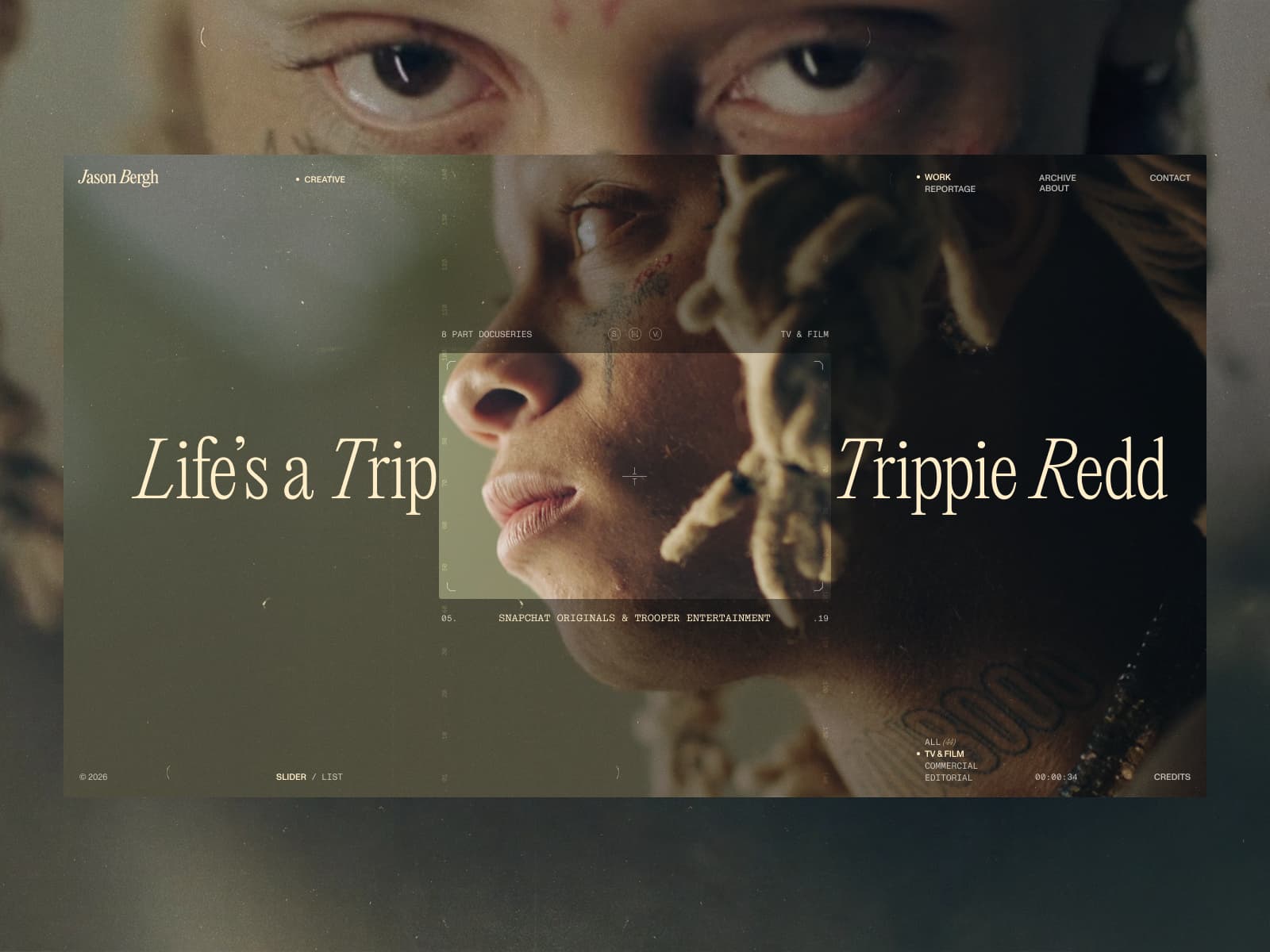
The development team at BL/S® decided that improving the existing structure was a futile endeavor. Instead, they embarked on a process of subtraction. This phase was defined by the systematic removal of traditional navigational signifiers. If a menu could be hidden, it was. If a transition could be handled by the flow of the content rather than a button, it was. The goal shifted from "guiding the user" to "creating a space for the user to exist."
The Rhythmic Build
The team moved away from the concept of "pages" and toward the concept of "sequences." Borrowing from the editorial pacing of a film, they treated the act of scrolling as a cinematic cut. This meant that the timing of every interaction—how an element appears, the duration of a pause, the acceleration of a scroll—was calibrated to mimic the intentionality of a film director’s edit.
Supporting Data and Technical Execution
To achieve this level of fluid, uninterrupted presence, the technical architecture had to be as invisible as the interface itself. The project demanded a departure from traditional "off-the-shelf" web solutions, focusing instead on high-fidelity performance.
Precision Engineering
The backbone of the project relies on a sophisticated integration of JavaScript and the GSAP (GreenSock Animation Platform) library. GSAP was used not merely for decorative motion, but as the primary engine for controlling the narrative pacing. The engineers treated animation as an editorial tool, ensuring that the browser’s rendering speed was perfectly synced with the user’s scroll velocity.
Performance as Design
In most web projects, performance optimization is an afterthought—a "cleanup" phase performed before launch. In this project, performance was identified as the primary design constraint. Because the site relies on high-resolution motion assets, the backend was architected to ensure near-instantaneous content delivery. By minimizing the weight of the interface, the team allowed the hardware to dedicate its resources to the seamless display of the video work.
The Toolkit
The project utilized a highly specific, lean tech stack:
- Frontend: Custom JavaScript, GSAP for choreography and sequencing.
- Backend: A stripped-down, high-performance content delivery framework.
- Design Tools: Figma for prototyping motion states, alongside rigorous video processing workflows to maintain visual fidelity during browser-based playback.
The Director’s Perspective: "We Had to Step Away from Structure"
When asked about the philosophy behind the project, the consensus was clear: the traditional role of a website is to serve information, but the role of an artist’s portfolio is to communicate an atmosphere.
"We had to step away from the idea of structure altogether and rethink what a digital presence for a director could feel like," the team noted during the post-mortem. This was not a move toward minimalism for the sake of empty space; it was an attempt to remove the ‘noise’ that often accompanies digital interfaces.
By removing the "how-to" elements—the breadcrumbs, the labels, the intrusive overlays—the site invites the audience to stop "operating" the website and start "experiencing" the director’s world. The team embraced the risk that this would be a polarizing choice. By intentionally limiting the user’s control and forcing a more intuitive navigation style, they prioritized the integrity of the artistic message over the efficiency of the user journey.
Implications: The Death of the "Standard" Portfolio
The success of the Jason Bergh site serves as a potential inflection point for the creative industry. It raises critical questions about the future of professional portfolios.
1. The Rise of the "Environment"
We are moving toward an era where the portfolio is no longer a document of work, but an extension of the creator’s medium. If a photographer’s site doesn’t feel like a gallery, or a director’s site doesn’t feel like a film, it is failing to communicate the creator’s unique language.
2. The Trust-Based UX
Traditional UX design is rooted in a lack of trust; it assumes the user is impatient and needs to be guided by the hand. This project proves that there is an audience for a more trust-based experience—one that assumes the user is curious and capable of finding their own way through a, perhaps, less "efficient" but more emotionally resonant space.
3. Precision Over Complexity
The most significant lesson for the digital design community is that complexity is not the same as depth. It is significantly harder to build a site that feels complete with almost no UI than it is to build a feature-rich site. Every single element, transition, and pause in the Bergh project carries the weight of the entire experience. There is no "filler" to hide behind.
Final Reflections
The final output is an experience that does not beg for engagement. It doesn’t use pop-ups to solicit contact, nor does it use hover effects to demand attention. It simply exists, waiting for the user to settle into its pace.
The project concludes that not every digital product needs to solve a logistical problem. Sometimes, the goal of a digital interface is to create a specific, sustained feeling. For Jason Bergh, that feeling is one of cinematic focus. By choosing to prioritize the "how" of the viewing experience over the "what" of the portfolio information, he has created a site that doesn’t just show his work—it acts as a testament to his process.
In the words of the team at BL/S®, "The result is a system where movement doesn’t explain the experience—it carries it."
As we look toward the future of the web, this project stands as a bold reminder: in a world saturated with digital noise, the most powerful thing a designer can do is sometimes to simply get out of the way.
About the Creators
BL/S® is a boutique creative studio specializing in high-concept web experiences for brands that reject the mundane. Known for their work that blends luxury aesthetics with rebellious, non-linear UX, the studio has become a fixture in the digital design world, earning recognition from industry leaders such as Awwwards and The Lovie Awards. Their ethos is simple: no templates, no compromises, only digital excellence.
For more information on their methodology, visit blacklead.studio.

 Sagoh
Sagoh
 Nana Muazin
 Nila Kartika Wati
 Jia Lissa
 Basiran


 Lina Hope