
 Neng Nana
In the high-stakes world of professional sports marketing, visual identity is everything. A logo is not merely a brand asset; it is a rallying cry for a city, a symbol of heritage, and a point of pride for millions of fans. However, for the Atlanta Falcons, a recent attempt to lean into their history has resulted in a public relations firestorm. By reviving a vintage aesthetic for a series of throwback-themed games, the NFL franchise has inadvertently triggered a wave of intense online backlash, with critics drawing alarming comparisons between the team’s new promotional imagery and the iconography of the Third Reich.
The controversy centers on a visual redesign that, while intended to evoke the nostalgia of the 1960s, has instead been dubbed the “Bird Reich” by social media users. As the franchise prepares for a high-profile matchup against the San Francisco 49ers, the discourse has shifted away from the gridiron and toward the nuances of graphic design, semiotics, and the dangers of historical blind spots in corporate branding.
A Chronology of Controversy: From Retro to Regressive
The current debacle is not the first time the Atlanta Falcons have faced scrutiny regarding their branding. Two years ago, the team introduced a throwback design that echoed the aesthetic of their inaugural 1966 season. At the time, design critics and eagle-eyed fans noted that the hard-edged, angular depiction of the bird of prey, combined with a stark black-and-red color palette, bore an uncomfortable resemblance to the graphic standards of mid-20th-century fascist regimes.
Despite the initial wave of social media commentary—which included memes and pointed questions regarding the design’s origins—the franchise appeared unfazed. Rather than distancing themselves from the aesthetic, the Falcons chose to double down.
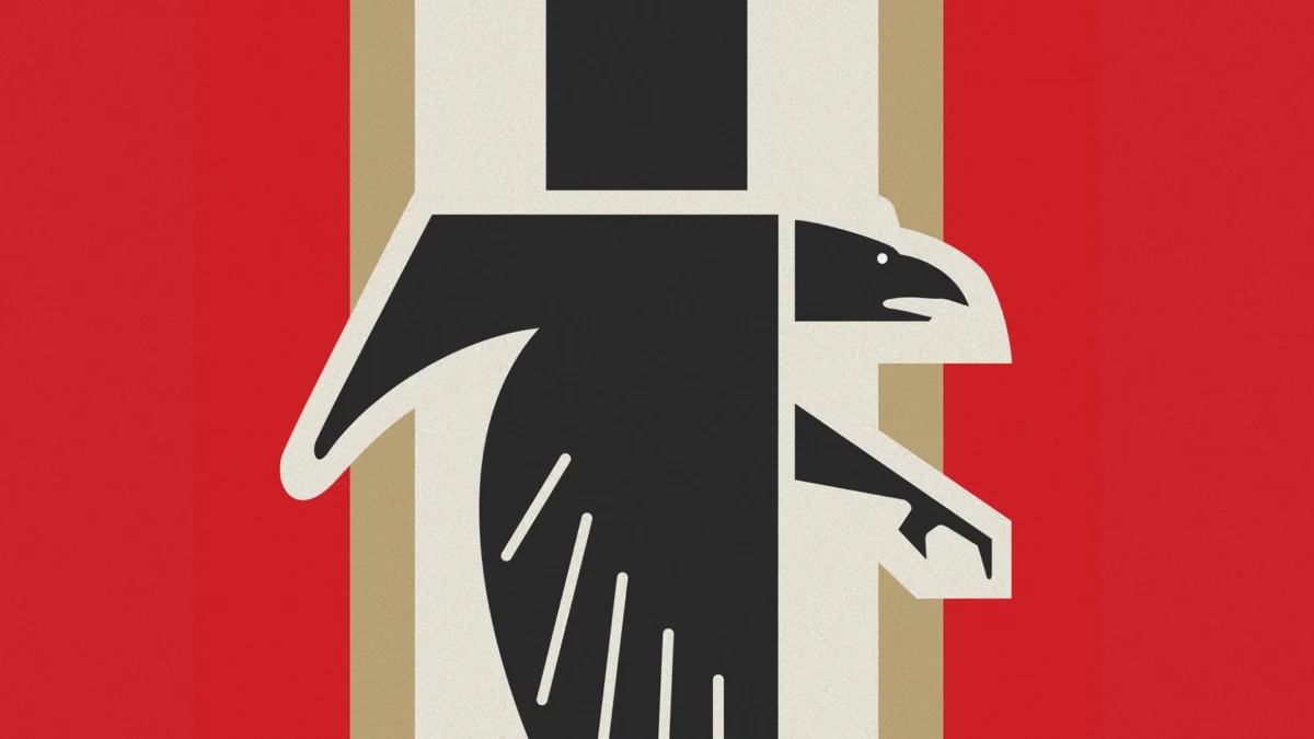
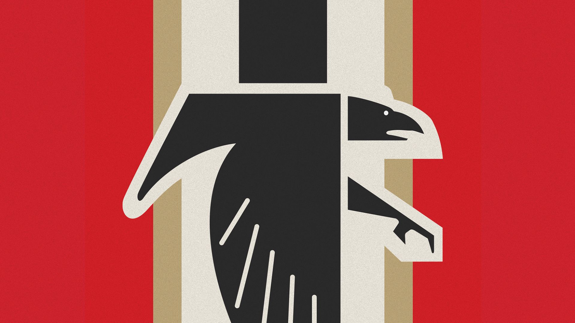
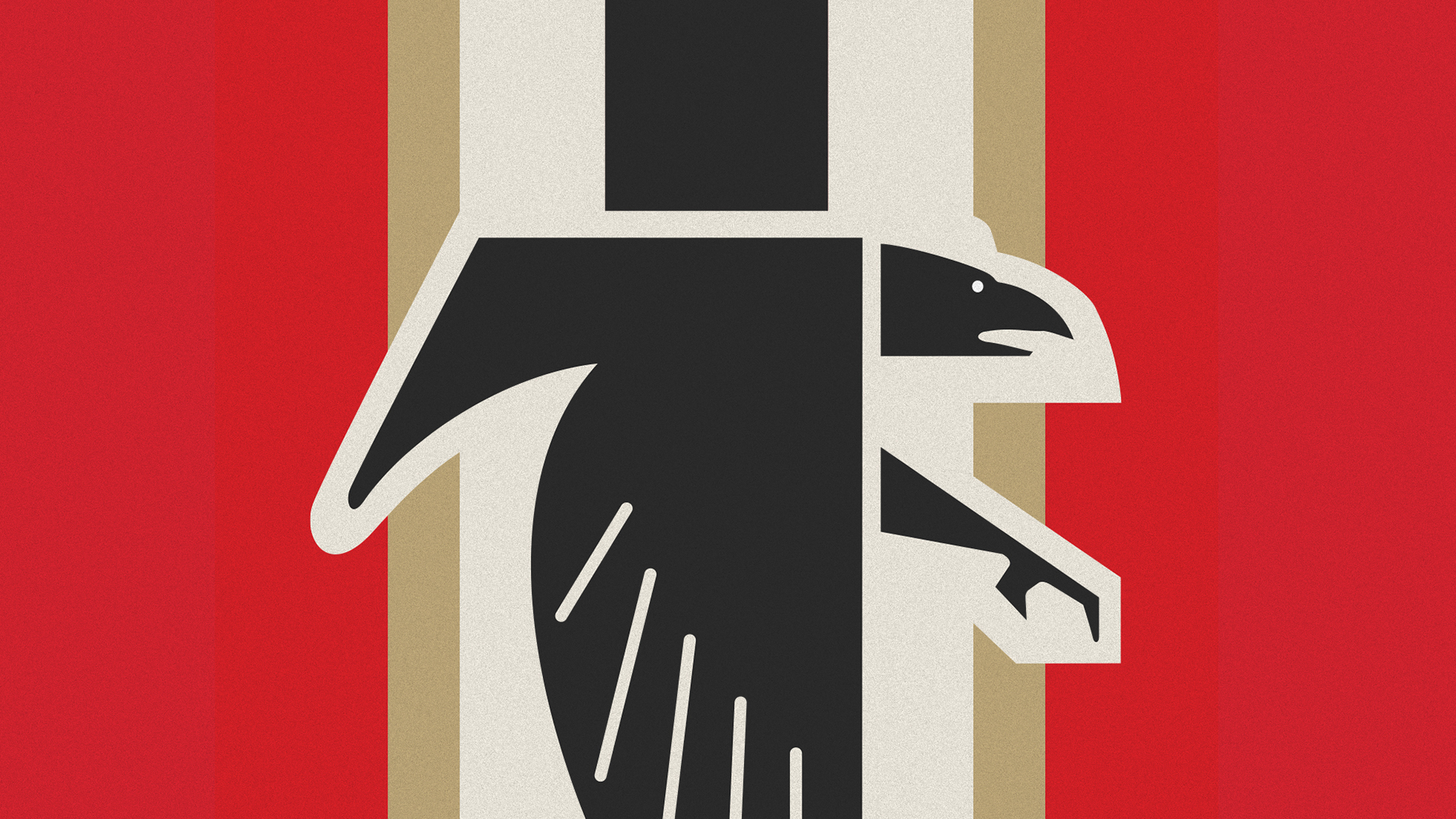
In October 2026, the team unveiled a "remixed" version of this retro look to coincide with a weekend of 1966-inspired uniforms. The new design features the familiar angular black falcon, now positioned to form an ‘F’ shape, layered over a backdrop of vertical stripes in shades of red, beige, black, and cream. The moment this graphic hit the team’s official social media profiles, the reaction was immediate and overwhelmingly negative. Within hours, the term "Bird Reich" began trending, and the logo was mockingly labeled the "gridiron cross."
The rapid speed at which the internet identified these parallels highlights a modern sensitivity to visual rhetoric. While the team likely viewed the project as an exercise in historical tribute, the digital age demands a higher level of scrutiny for any imagery that might be misinterpreted, especially when the iconography shares structural similarities with historical hate symbols.
The Design Perspective: Why Symbols Matter
From a purely design-centric viewpoint, the Atlanta Falcons’ choice is baffling. The principles of visual communication dictate that designers must be aware of the "cultural baggage" attached to certain geometric arrangements.
The use of vertical bars and sharp, angular, eagle-like motifs (the Reichsadler or "Imperial Eagle") is deeply ingrained in the collective global consciousness as a hallmark of Nazi Germany’s aesthetic dominance. When a contemporary sports team adopts similar aggressive geometry, the resulting tension is inevitable.
"The issue isn’t just the bird," says a brand identity consultant familiar with NFL design standards. "It is the combination of the rigid, block-like ‘F’—which mimics the visual weight of Germanic typography—and the high-contrast vertical striping. In branding, you have to account for how a mark interacts with its context. By stripping away the nuance of the modern, sleek Falcon logo and replacing it with a ‘harder,’ more archaic form, the designers inadvertently walked right into a visual minefield."
It is important to note that birds of prey have been used in heraldry and iconography for centuries, long before the rise of the Third Reich. The bald eagle, of course, is a central figure in American symbolism. However, in the realm of modern communication, context is king. The Falcons failed to account for how the "retro" look would be filtered through a 21st-century lens that is hyper-vigilant toward extremist aesthetics.
The Digital Echo Chamber: Memes and Public Reaction
The backlash on platforms such as X (formerly Twitter) has been unrelenting. Fans and casual observers alike have taken to the comment sections of the team’s posts to express their disbelief.
One user wrote, "I read that the NFL wanted to conquer the world, but I didn’t think they meant it so literally," a comment that garnered thousands of likes and reposts. Another user pointedly remarked, "Not a good look, meinami," a play on the term "Miami" and the German "mein."
These comments represent the "meme-ification" of the scandal. By mocking the team, the public is essentially performing a public audit of the franchise’s decision-making process. The primary question remains: How did this pass through multiple layers of executive approval without anyone flagging the potential for a PR nightmare?
In the modern corporate world, "brand safety" is usually the highest priority. Large organizations typically employ teams of marketing experts, legal consultants, and social media managers specifically tasked with preventing this exact scenario. The fact that the Falcons proceeded with this design after the warnings they received two years ago suggests a level of corporate hubris—a belief that they could "own" the aesthetic and redefine it, regardless of the historical baggage it carries.
Official Responses and Internal Silence
To date, the Atlanta Falcons organization has remained largely silent on the specific accusations regarding the logo’s resemblance to Nazi-era imagery. When the throwback uniforms were announced, the team framed them exclusively as a celebration of the 1966 season—a year that represents the franchise’s birth.
By keeping the focus on the "heritage" of the team, the organization is likely attempting to avoid giving oxygen to the controversy. In crisis management, this is often a calculated strategy: acknowledge the nostalgia, celebrate the history, and wait for the news cycle to move on. However, this silence has only served to fuel the curiosity of fans who are now diving into the history of the 1960s logo itself.
Some long-term fans have begun to ask if the original 1966 logo received similar criticism during its debut. In the pre-internet era, visual design critiques were relegated to local newspapers and water-cooler talk, meaning that if there was backlash in the 60s, it was never archived or amplified on a global scale. Today, the team does not have the luxury of that anonymity. Every pixel is scrutinized, and every design choice is subject to a global referendum.
The Implications: A Lesson in Brand Stewardship
The Atlanta Falcons’ current predicament serves as a potent case study in the risks of nostalgia-driven marketing. While "retro" is a perennial favorite in the sports apparel industry—driving massive jersey sales and merchandise revenue—it comes with a responsibility to audit the past.
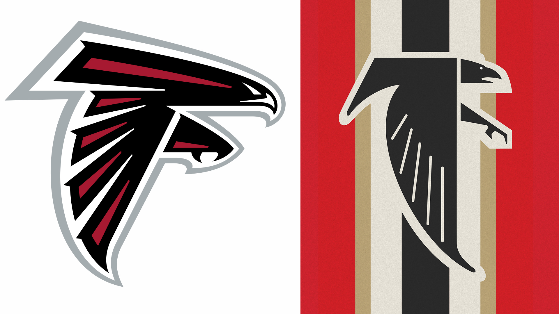
If a design is being brought back from a time when cultural sensitivities were different, it must be updated to ensure it aligns with modern values. This does not mean abandoning the design entirely, but rather modifying the elements that could be misconstrued.
The implications for the NFL as a whole are also significant. As the league continues to expand its international footprint, the brand’s image is scrutinized by audiences in Europe, South America, and beyond—regions where the historical memory of 1930s Europe is far more acute than it is in many parts of the United States. A logo that might be dismissed as "edgy" by a local fan in Georgia could be interpreted as a grave insult to a fan in Germany or Poland.
Ultimately, this controversy is a reminder that in the age of viral media, no brand exists in a vacuum. Symbols are fluid; they gather meaning over time, and they are shaped by the society that views them. By failing to account for the dark history associated with their "throwback" aesthetic, the Atlanta Falcons have learned a difficult lesson: sometimes, the past is best left in the archives.
Whether the team will pivot and retire the logo remains to be seen. However, one thing is certain: for the Atlanta Falcons, this weekend’s game against the 49ers will be remembered for much more than the score on the board. It will be remembered as the moment the franchise learned that when it comes to branding, history is not just a source of inspiration—it is a minefield.


 Sagoh

 Nana Muazin

 Nila Kartika Wati


 Layla Zulfa

 Jia Lissa

 Nana

 Rifan Muazin
