
 Nana Wu
There is something undeniably magnetic about the bold, blocky typography that defined the 80s and 90s gaming era. Whether it is the high-contrast glowing neon hues of a Pac-Man cabinet or the gritty, distinct pixelated edges of early console hits, these fonts act as a cultural shorthand for a golden age of digital entertainment. Today, this aesthetic has transcended its origins in coin-operated machines, finding a permanent home in modern branding, UI/UX design, and creative content creation.
As designers look to inject their projects with authentic, nostalgic energy, the demand for high-quality arcade typography has surged. This article explores the evolution of these fonts, their impact on contemporary visual communication, and provides a curated collection of both premium and free typefaces to help you master the "coin-operated" vibe in your next project.
The Chronology of Digital Text: From 8-Bit to Modern Retro
To understand why these fonts remain so popular, we must look at the technological limitations that birthed them. In the late 1970s and throughout the 1980s, game developers were constrained by extremely limited memory and low-resolution hardware. Every single pixel counted. Designers had to create legible characters using a grid of squares, which resulted in the iconic, jagged aesthetics we now recognize as "pixel art."
As technology evolved into the 16-bit and 32-bit eras, typography became more sophisticated, yet the "blocky" charm persisted as a stylistic choice rather than a necessity. By the early 2000s, the "Game Over" screen became a design motif—a symbol of a simpler, more tactile time. Today, we are in the midst of a "Neo-Retro" movement where designers utilize modern font-rendering engines to recreate these vintage looks with vector-based precision, allowing for scalable, high-resolution applications that were impossible forty years ago.
The Psychological Impact of Arcade Aesthetics
Why do we find these fonts so compelling? Psychology plays a significant role. Arcade typography triggers a sensory memory of the physical environment—the hum of the machine, the tactile click of the joystick, and the competitive thrill of high-score hunting. When a brand uses an arcade-style font, they aren’t just communicating text; they are communicating an identity associated with youth, playfulness, and subversion.
Recent market data suggests that "nostalgia marketing" is one of the most effective tools for engagement. By tapping into the visual language of the 80s and 90s, designers can immediately establish an emotional connection with an audience that grew up in the arcades, while simultaneously appealing to a younger demographic that finds the "glitch" and "pixel" aesthetics inherently cool and fashionable.
Curated Selection: Premium Arcade Fonts
For designers looking for versatility and professional-grade features—such as multilingual support, extensive glyph sets, and multiple weights—the premium market offers exceptional value. Here are some of the most prominent selections currently shaping the design landscape:
1. Game Paused: The Versatile Classic
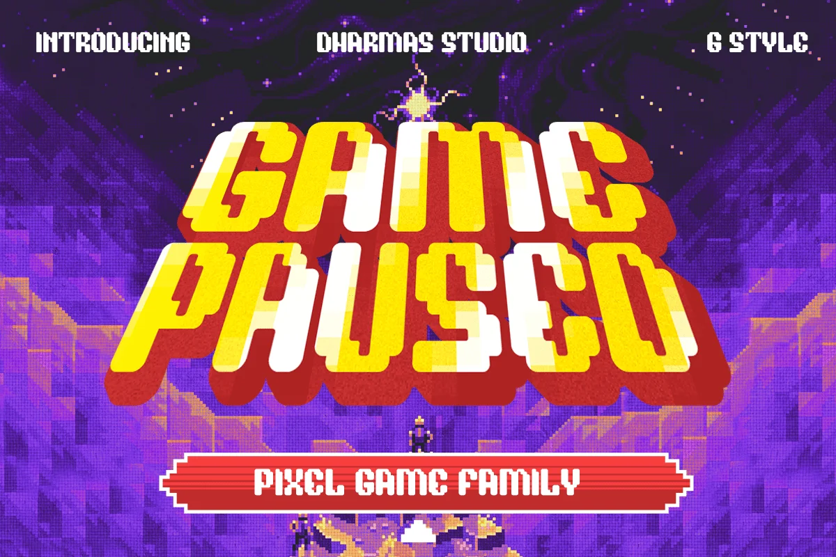
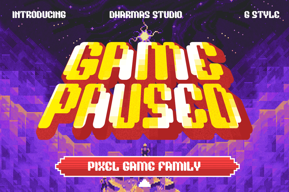
Game Paused is a masterclass in flexibility. It offers six distinct styles, including Regular, Slant, and Extrude. By allowing for layered effects, this font is perfect for high-impact game titles and YouTube thumbnails. It bridges the gap between the 90s aesthetic and modern, sharp-edged typography.
2. Arcade Zone: The Bold Display Choice
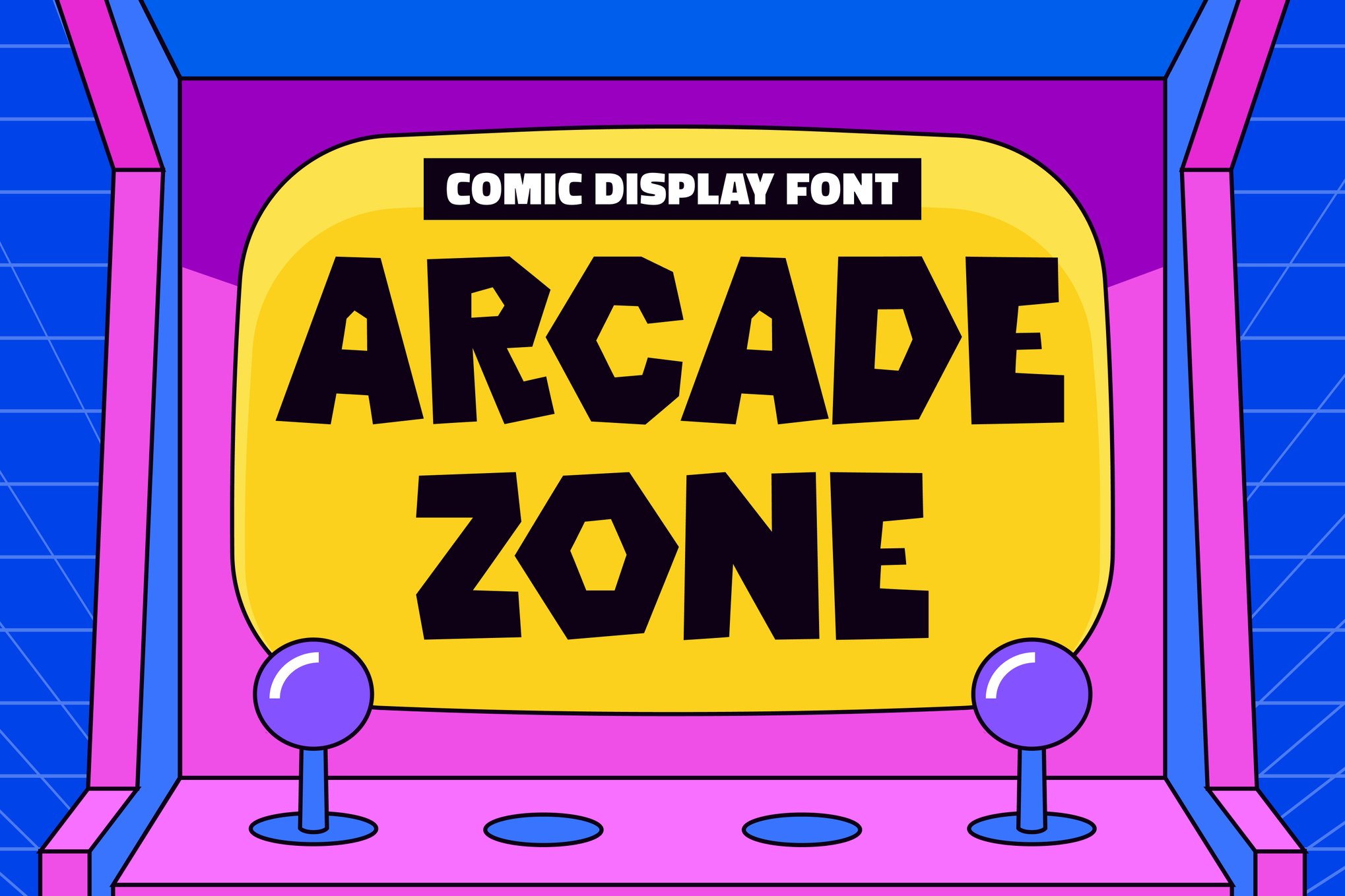
Inspired by the high-energy, chunky shapes of comic-style arcade games, Arcade Zone is built for visibility. Its thick lines and rounded corners make it ideal for branding and posters where legibility from a distance is a priority. It includes both OTF and TTF formats, ensuring it functions across all major design platforms.
3. Arcade Pixel & Game Stage: The Authentic Experience
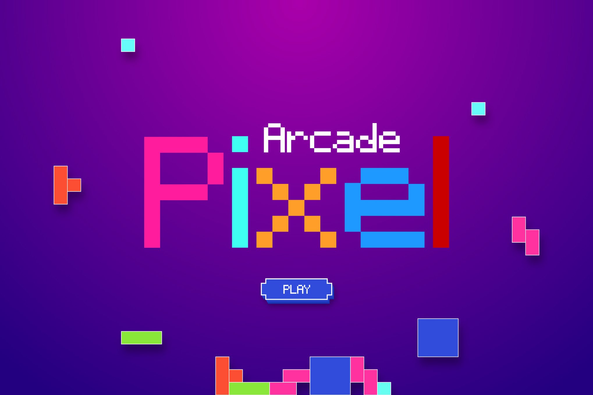
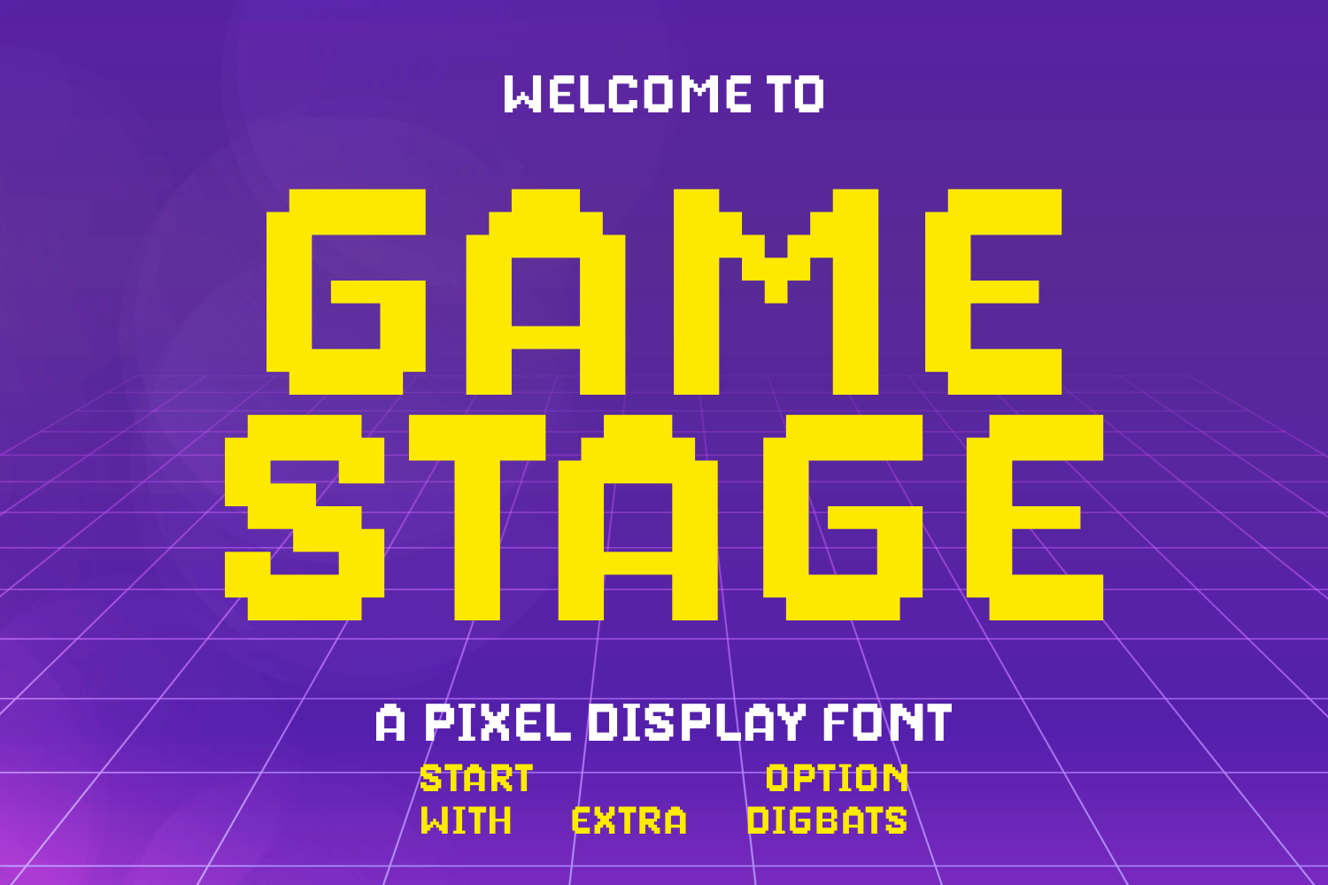
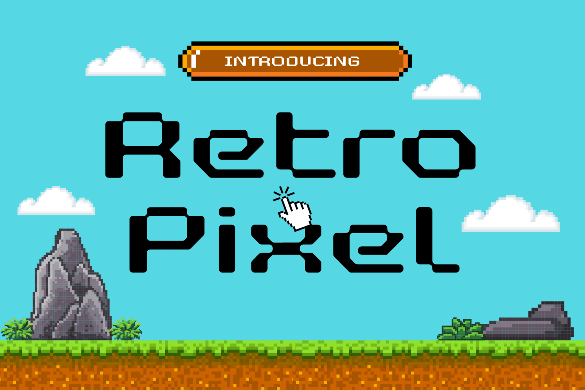
For those seeking the "pure" pixelated look, Arcade Pixel and Game Stage are essential. Game Stage is particularly noteworthy for its inclusion of stylistic doodles, which add a layer of personality that standard fonts often lack. These are ideal for indie game developers who need a font that feels like a native part of the game environment.
4. Rocabe, Arcade Quest, and Retroid
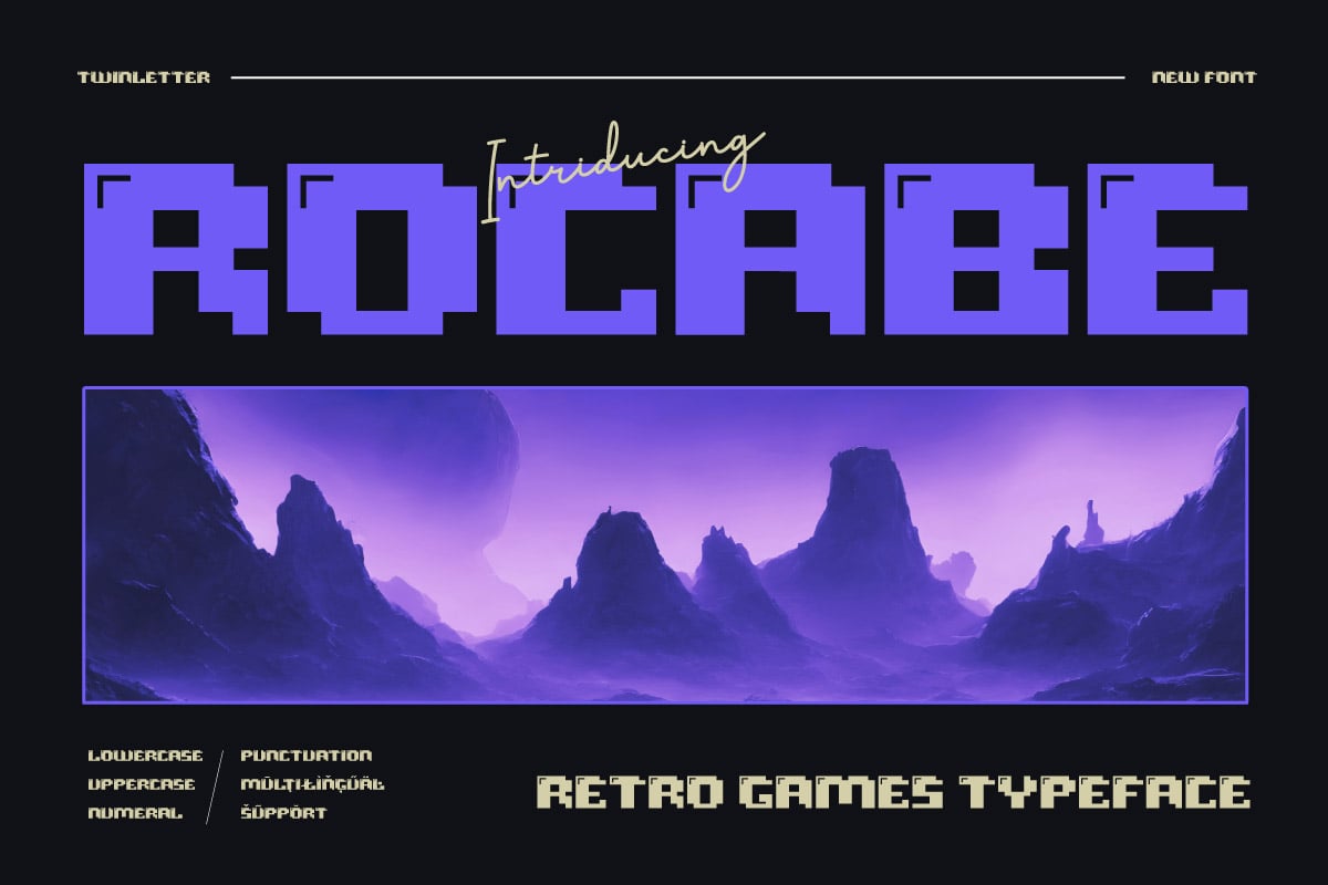
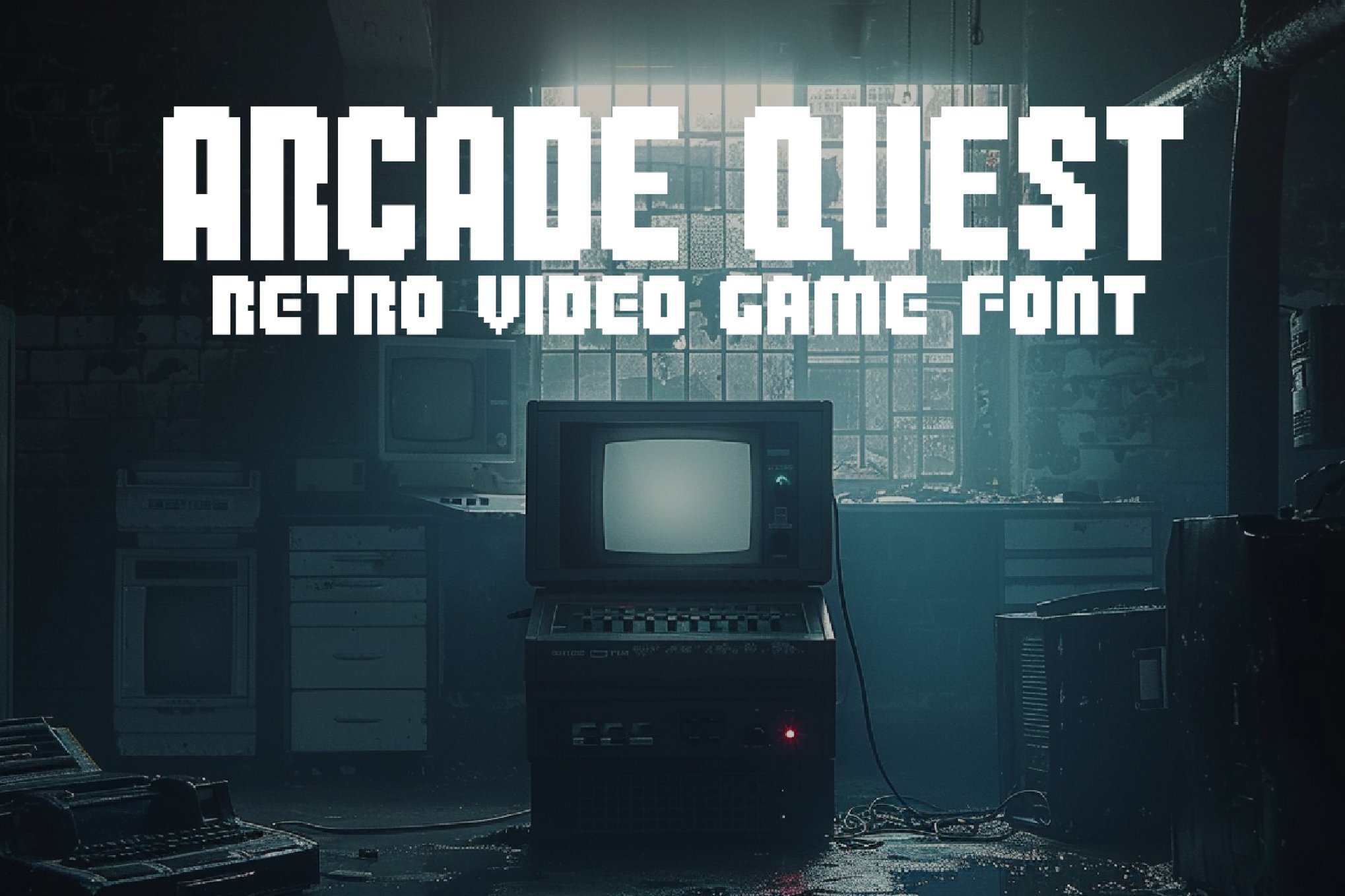
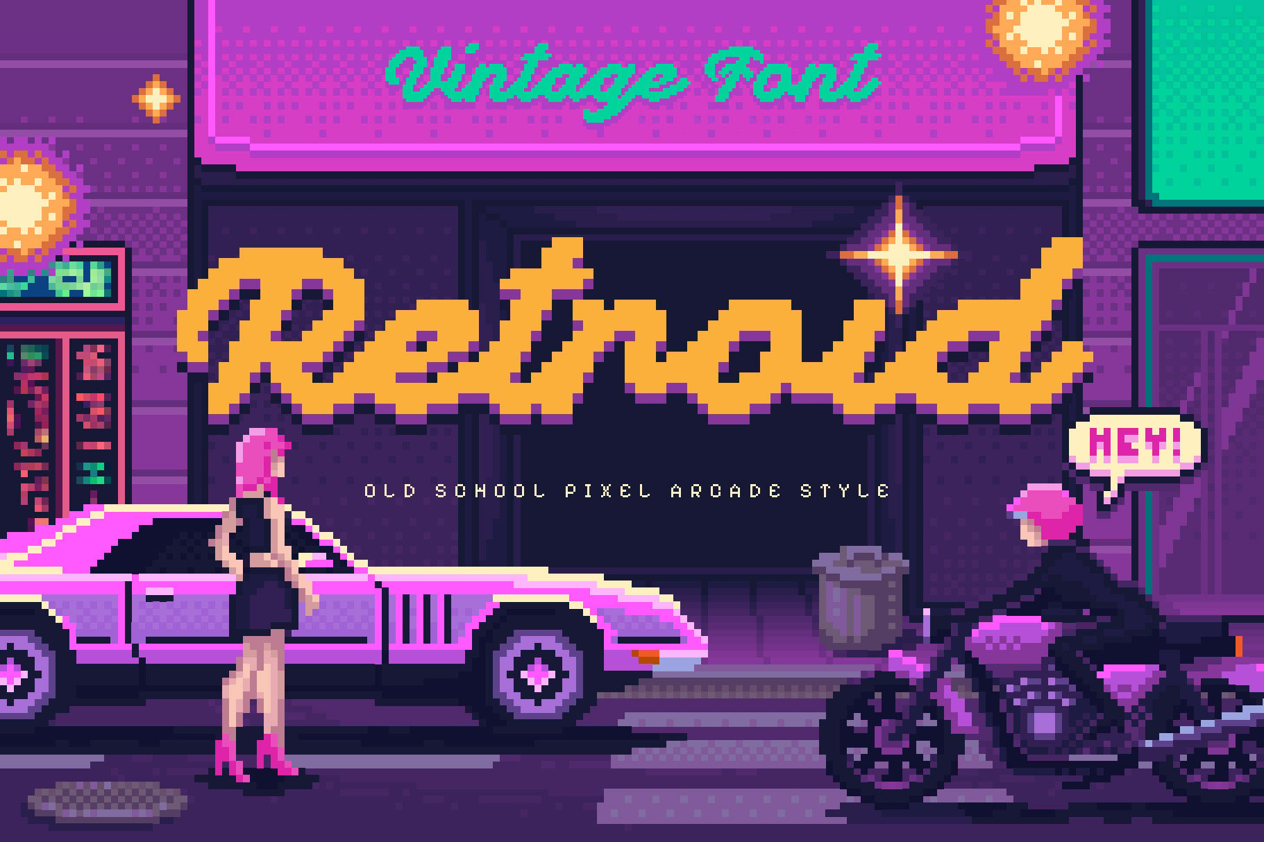
These three fonts represent the mid-range of the "retro-gaming" spectrum. Rocabe offers a sophisticated balance between readability and charm, while Arcade Quest leans into the 8-bit heritage. Retroid is the go-to for designers wanting that specific 8-bit console aesthetic that defined the home gaming revolution.
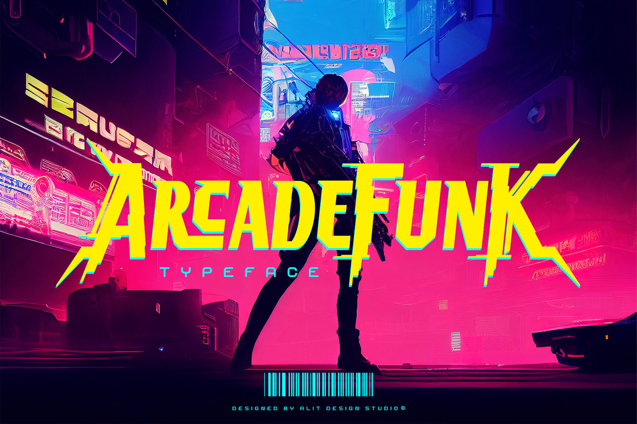
5. Specialized Aesthetics: Oldbitz, Warnet Crime, and Arcade Funk
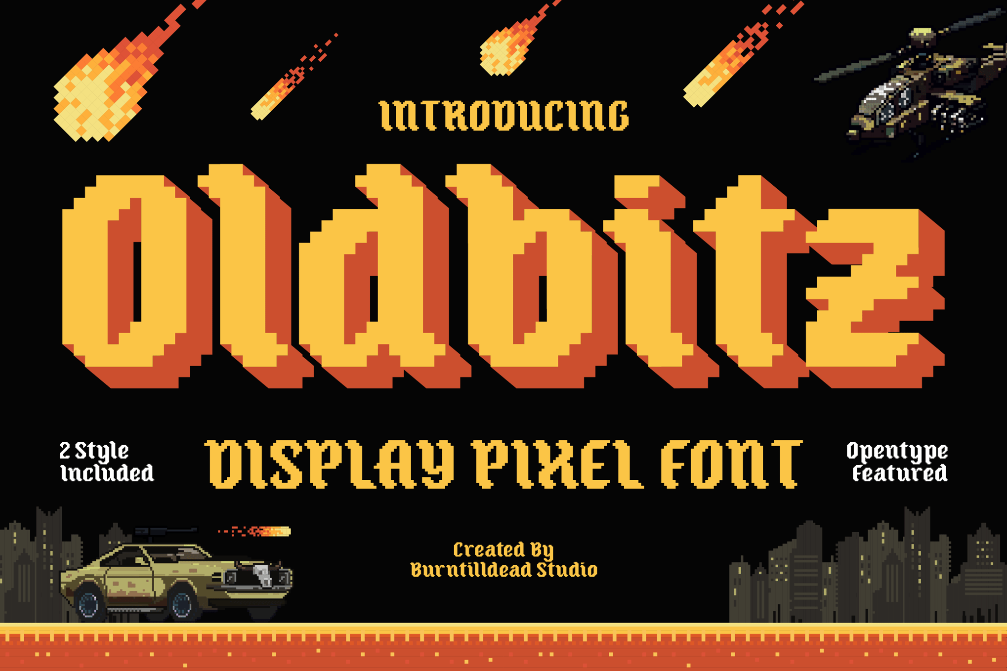
- Oldbitz: Blends pixel art with a "gothic" flair, perfect for dark, atmospheric game designs.
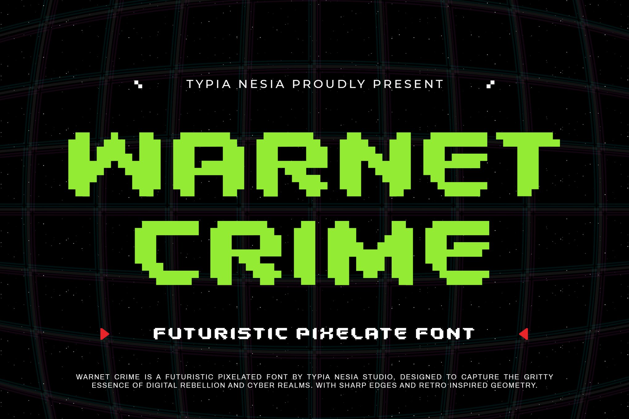
- Warnet Crime: A bold, futuristic, and sharp typeface that works excellently for cyberpunk or tech-heavy branding.
- Arcade Funk: A testament to the "Brutalist" design movement. It is loud, rebellious, and perfect for promotional material that needs to grab attention immediately.
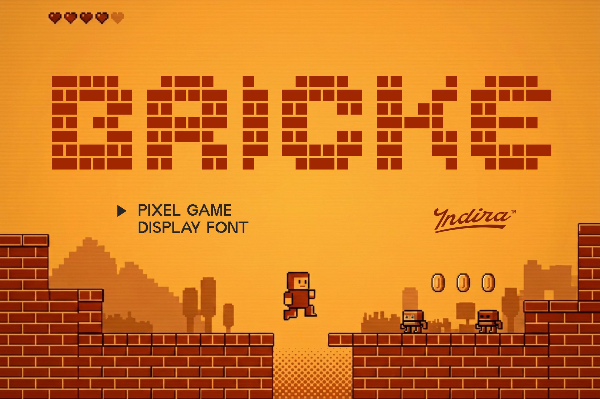
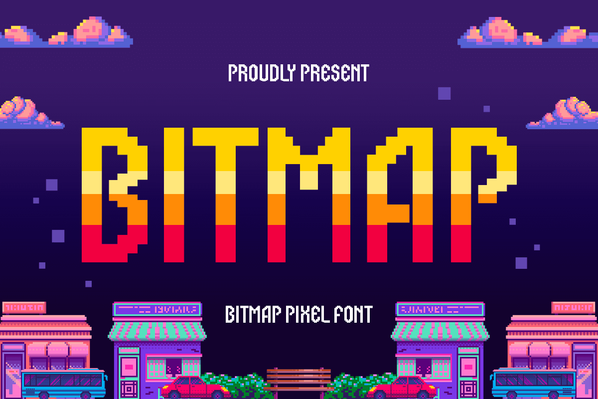
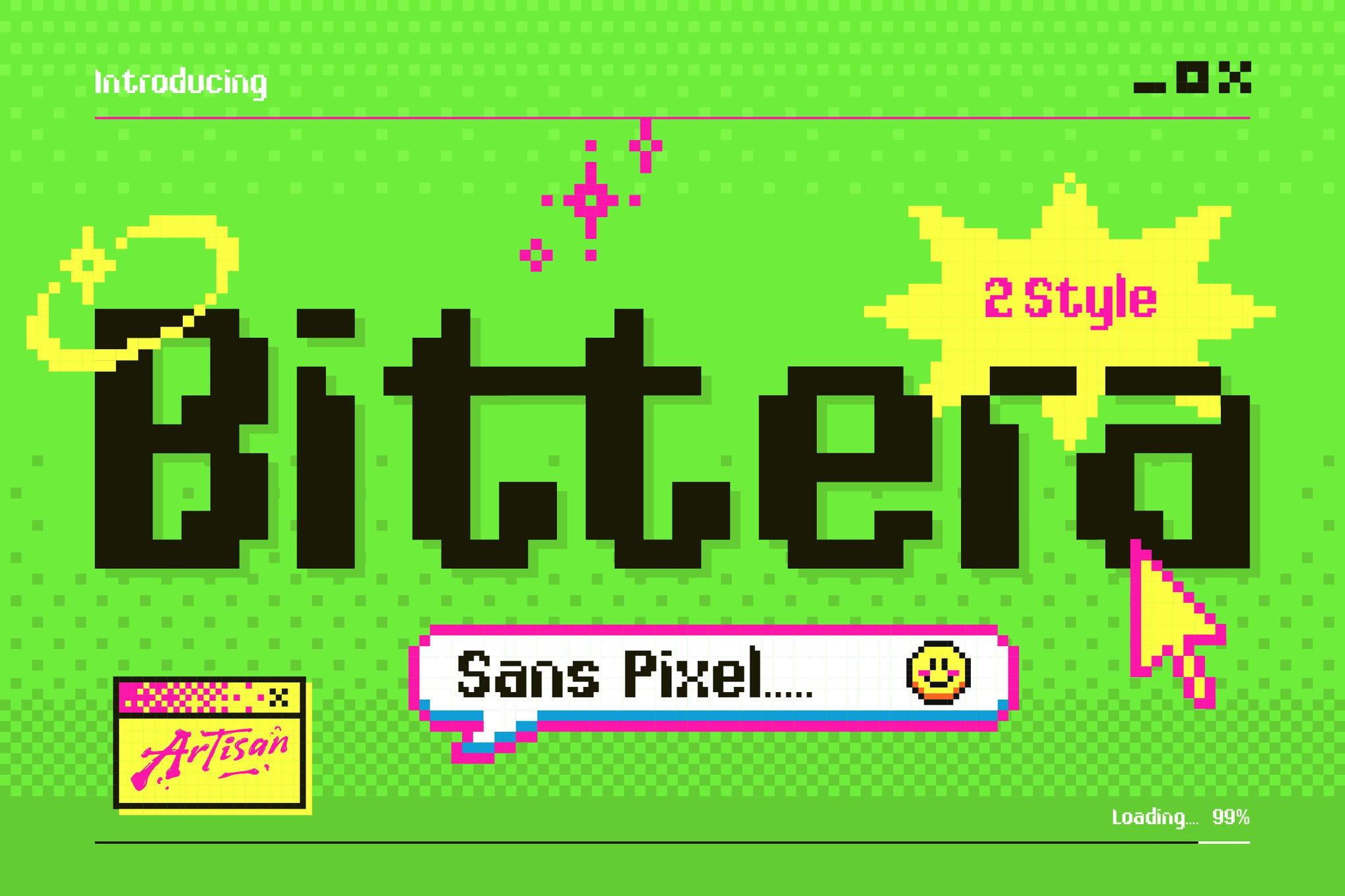
6. Unique Creative Solutions: Valmeria, Pixel Bricke, Bitmap, Bittera, Alpharush, Pixel Bots, and Arteche
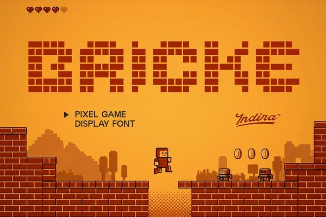
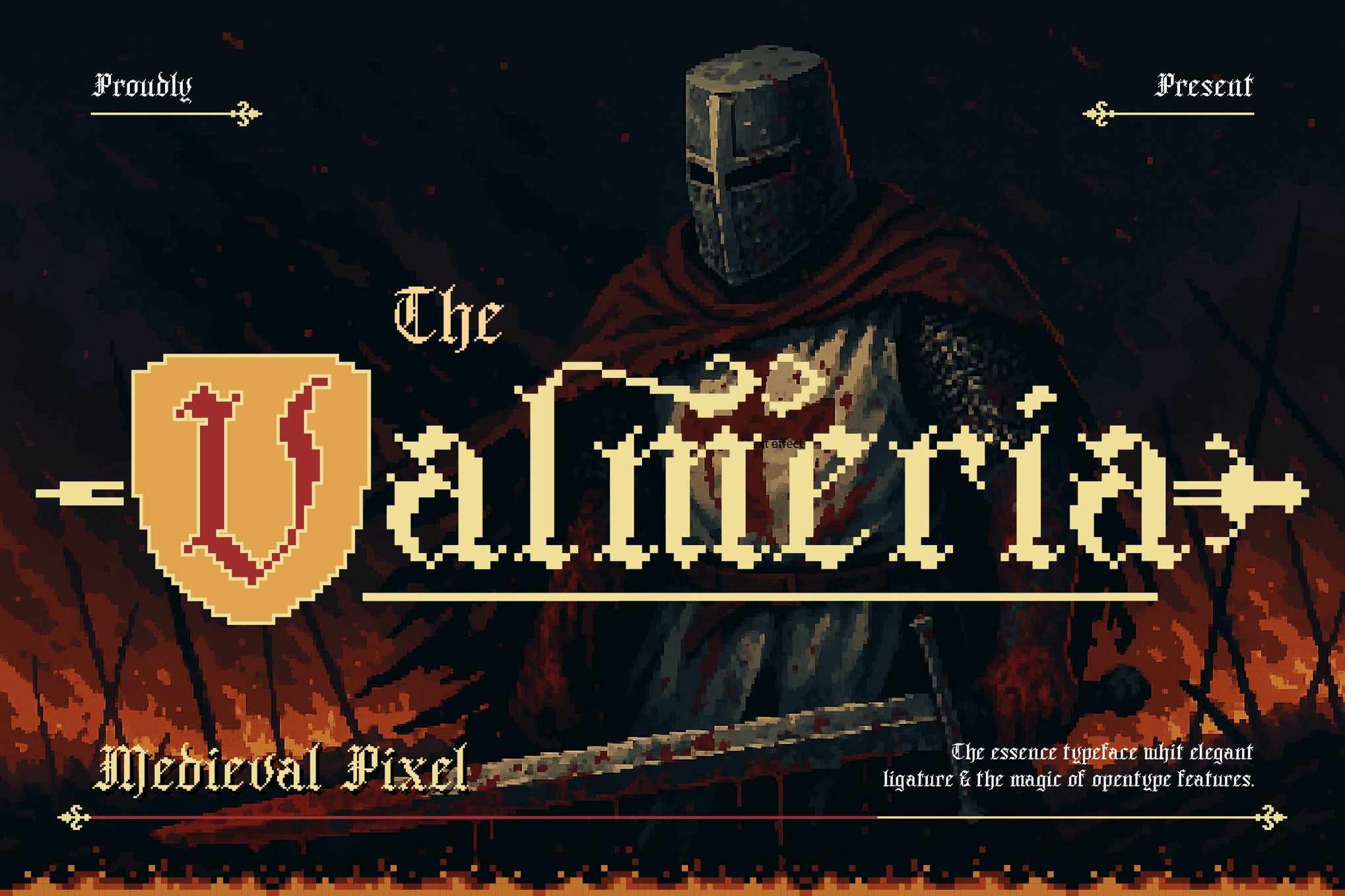
The sheer variety in this category demonstrates how far pixel typography has come. Valmeria stands out for its unique blend of blackletter (gothic) style and pixels, while Arteche perfectly captures the Y2K digital transition—a style currently seeing a massive resurgence in fashion and web design.
The Best Free Arcade Fonts for Indie Projects
Budget constraints should never prevent a designer from achieving a high-quality look. Several high-quality free fonts capture the spirit of the arcade without the licensing costs associated with commercial fonts:
- Cyber Bytes: A sharp, futuristic typeface perfect for esports overlays and modern, tech-focused digital content.
- Digital 808: This font mimics the aesthetic of the glowing LED displays found on early arcade cabinets. It is exceptionally clean, making it a favorite for modern UI/UX design.
- Game City: With its fun, chunky characters, this is the definitive font for projects aimed at younger audiences or vibrant, colorful social media graphics.
- Start Signal: This font feels like the literal start of an adventure. It is energetic and highly legible, making it an excellent choice for headers and sub-headers.
Practical Implications for Modern Designers
Incorporating these fonts requires a nuanced approach. While the temptation is to use them everywhere, the most successful designers treat them as "accent" typography.
Best Practices for Implementation:
- Hierarchy: Use an arcade font for your primary headline or logo to establish the "vibe," but pair it with a clean, modern sans-serif (like Inter or Roboto) for body text to ensure readability.
- Color Theory: Arcade fonts often look best with high-contrast color palettes. Think neon pinks, cyans, and electric yellows against dark, matte backgrounds.
- Layering Effects: Many of the premium fonts mentioned—such as Game Paused—are designed to be layered. Using an "Outline" style on top of an "Extrude" style can create a 3D effect that mimics the physical signage of a 1980s arcade.
- Licensing Awareness: Always verify the license for your specific project. While free fonts like Cyber Bytes are great for personal work, always check if they allow for commercial usage if you are creating assets for a client or a paid product.
Future Outlook: Where Arcade Typography is Heading
As we move deeper into the era of Web3, virtual reality, and the metaverse, the aesthetic of the past is being reimagined for the future. We are already seeing "Pixel-Glitch" typography that animates, shifts, and warps in real-time, pushing the boundaries of what these classic fonts can do.
The "Arcade" look is no longer just a reference to the past; it is becoming a foundational element of the digital language. As long as there is a desire for play, creativity, and a touch of human imperfection in an increasingly automated world, the pixelated, bold, and blocky letters of the arcade will continue to command the spotlight.
Whether you are a seasoned art director or a student beginning your design journey, the fonts listed in this guide provide a robust toolkit to experiment with. By mixing the nostalgia of yesterday with the tools of today, you can create visual narratives that are not only memorable but truly timeless.


 Sagoh
 Nana Muazin

 Nila Kartika Wati
 Layla Zulfa
 Jia Lissa
 Nana
 Rifan Muazin
