Muslim
In the increasingly polished world of digital design, where pixel-perfect precision and sleek, minimalist sans-serifs have dominated the visual landscape for a decade, a counter-movement has emerged. Designers are turning away from the clinical perfection of modern software and embracing the tactile, messy, and infinitely expressive world of cut-out and collage typography. By mimicking the aesthetic of hand-snipped paper, mismatched ransom notes, and DIY zine culture, these fonts inject a sense of humanity and rebellion into modern creative projects.
Whether you are crafting an edgy magazine spread, a high-octane music poster, or a bold social media campaign, collage-style typefaces offer a shortcut to "originality." They break the rules of traditional typesetting, opting for rhythm, texture, and visual chaos over uniform kerning and balanced weight.
The Evolution of the Collage Aesthetic
The roots of the collage font trace back to the early 20th-century Dadaist movement, where artists like Hannah Höch and Tristan Tzara used fragmented text to challenge the social and political norms of their time. This "ransom note" aesthetic—born from necessity and protest—was later co-opted by the 1970s punk rock scene. Think of the iconic Sex Pistols album art: disjointed, mismatched, and loud. It was a visual language that screamed, "We aren’t asking for permission."
Today, this aesthetic has been distilled into high-quality digital assets. Modern font foundries have spent years capturing the nuance of a physical X-Acto knife slice on a piece of newsprint, translating those physical imperfections into versatile, high-resolution OpenType files. This fusion of analog nostalgia and digital convenience has made the "cut-out" look one of the most sought-after trends in contemporary graphic design.
Spotlight: Premium Collage Typefaces
The current market for collage typography is rich, offering everything from subtle, paper-textured serifs to aggressive, chaotic display fonts. Below is a breakdown of the leading contenders currently shaping the industry.
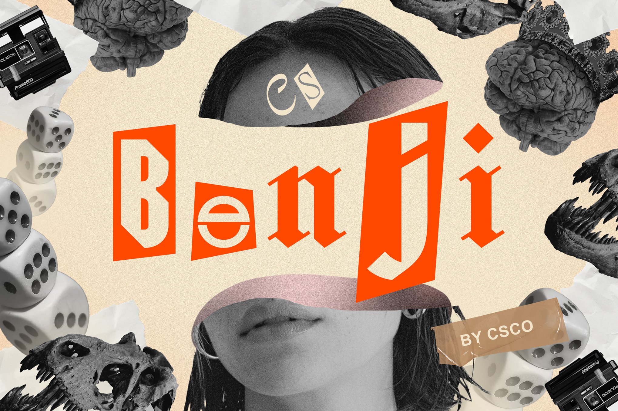
1. Benji: The Modern Cutout
Benji is a masterclass in controlled chaos. It leans heavily into the ransom note aesthetic but maintains enough structural integrity to be used in professional branding. Its unconventional letterforms and deep, grainy textures make it an ideal choice for art exhibitions and high-energy music marketing where the goal is to stop the viewer in their tracks.
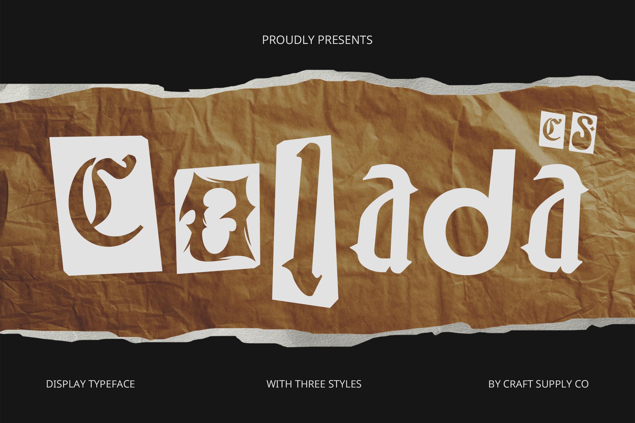
2. Colada: The Dynamic Choice
If your project requires a sense of joy and movement, Colada is the go-to. It rejects the "uniformity" trap entirely, offering a lively mix of disparate shapes and sizes. It is particularly effective for event posters or youth-oriented branding, where the goal is to capture attention through sheer personality.
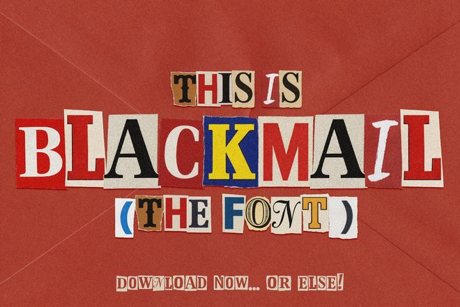
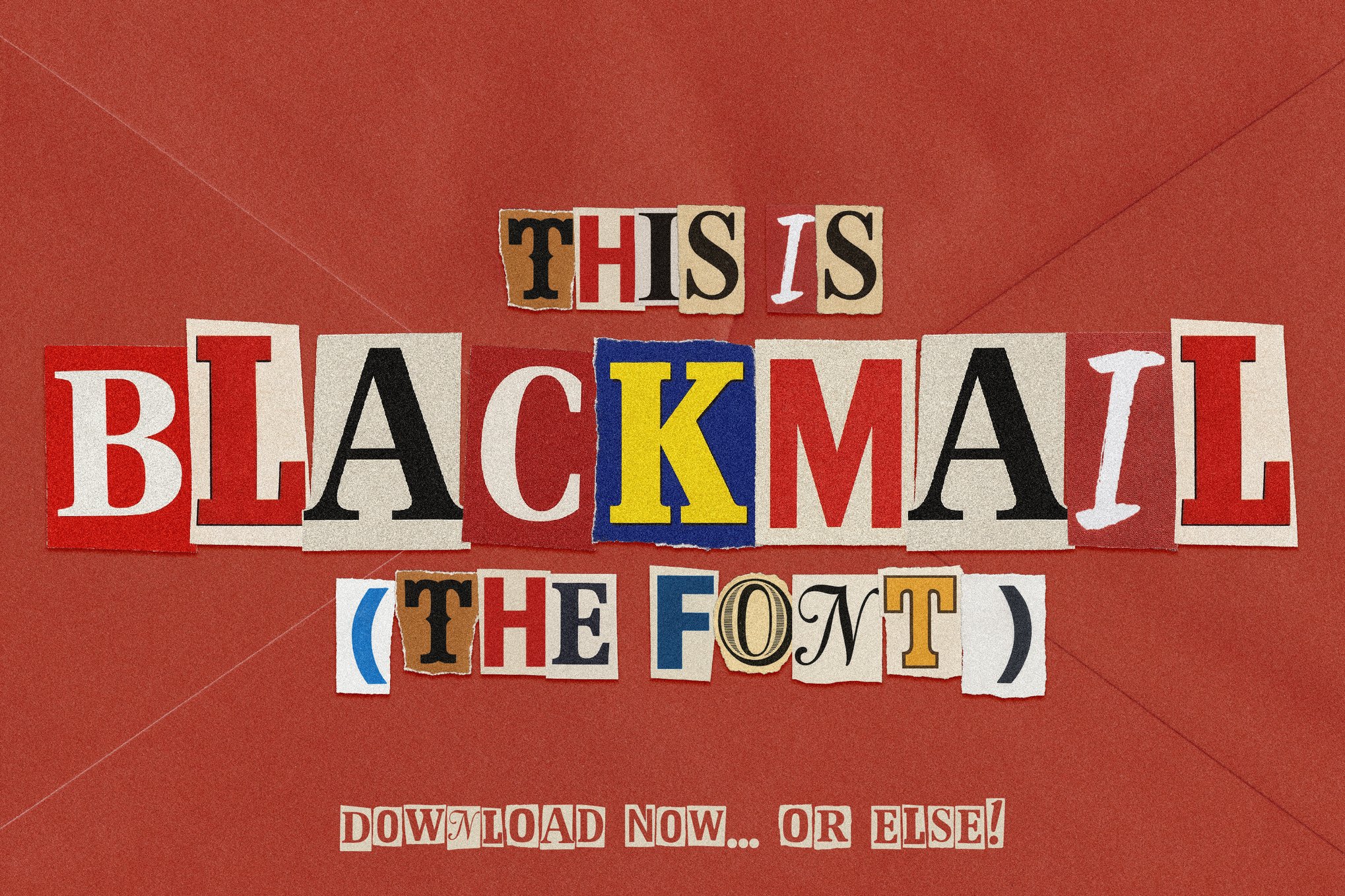
3. Blackmail: The Edgy Duo
Blackmail is a versatile toolkit. It offers two distinct experiences: a bitmap version that captures the raw, color-soaked reality of physical paper, and a clean, vector version for more traditional applications. It is the premier choice for thriller book covers, crime-themed media, or Halloween-inspired campaigns.
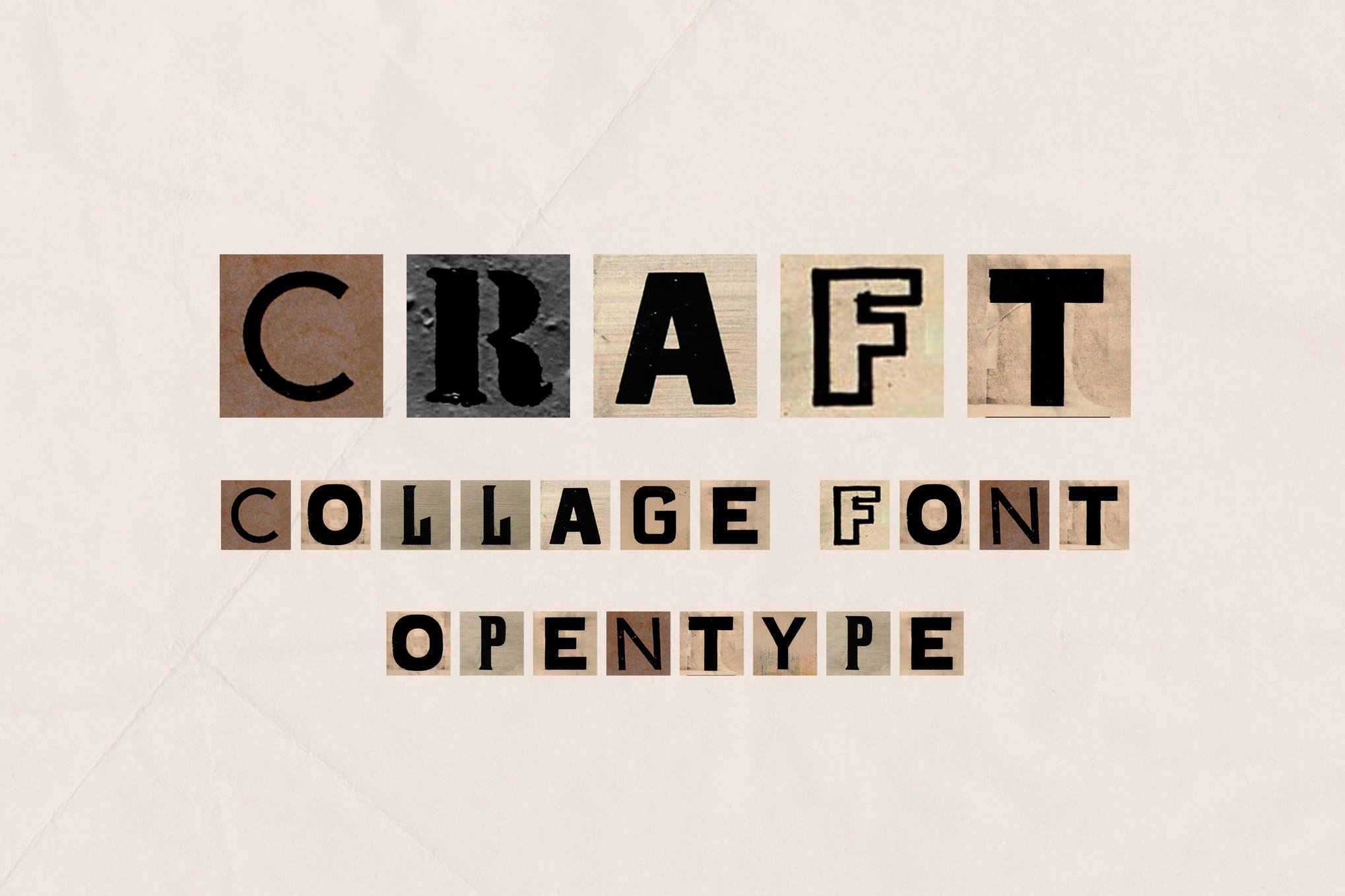
4. Craft & Retroma Vibes
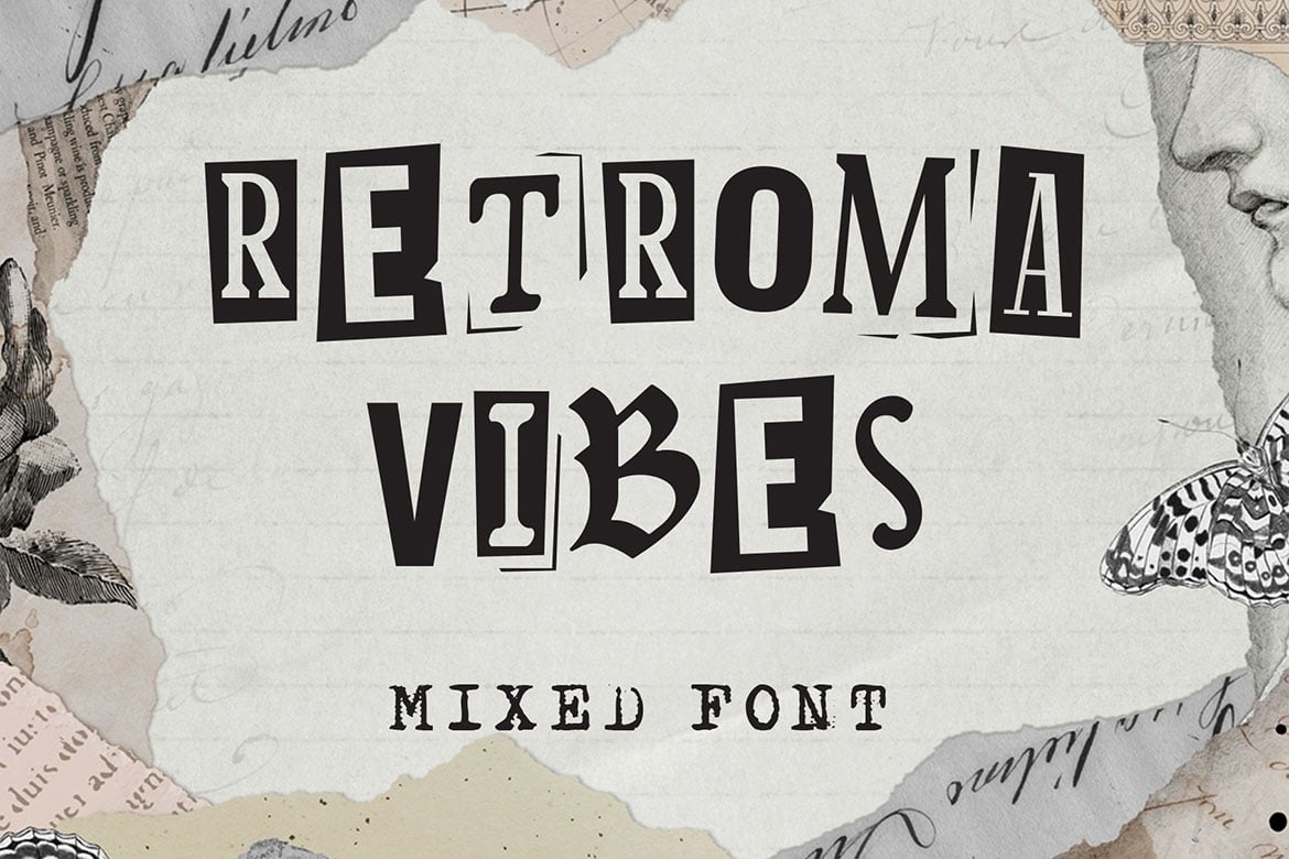
For those who prefer a "newspaper clipping" aesthetic, Craft and Retroma Vibes stand out. Craft functions as an OpenType SVG, allowing for deep integration into modern workflows like Photoshop CC and Procreate. Retroma Vibes, meanwhile, offers a masterclass in eclecticism, blending blackletter, sans-serif, and handwriting styles into a single cohesive, if erratic, package.
5. Yoshiro, Tucker Drawn, and Twist Angel
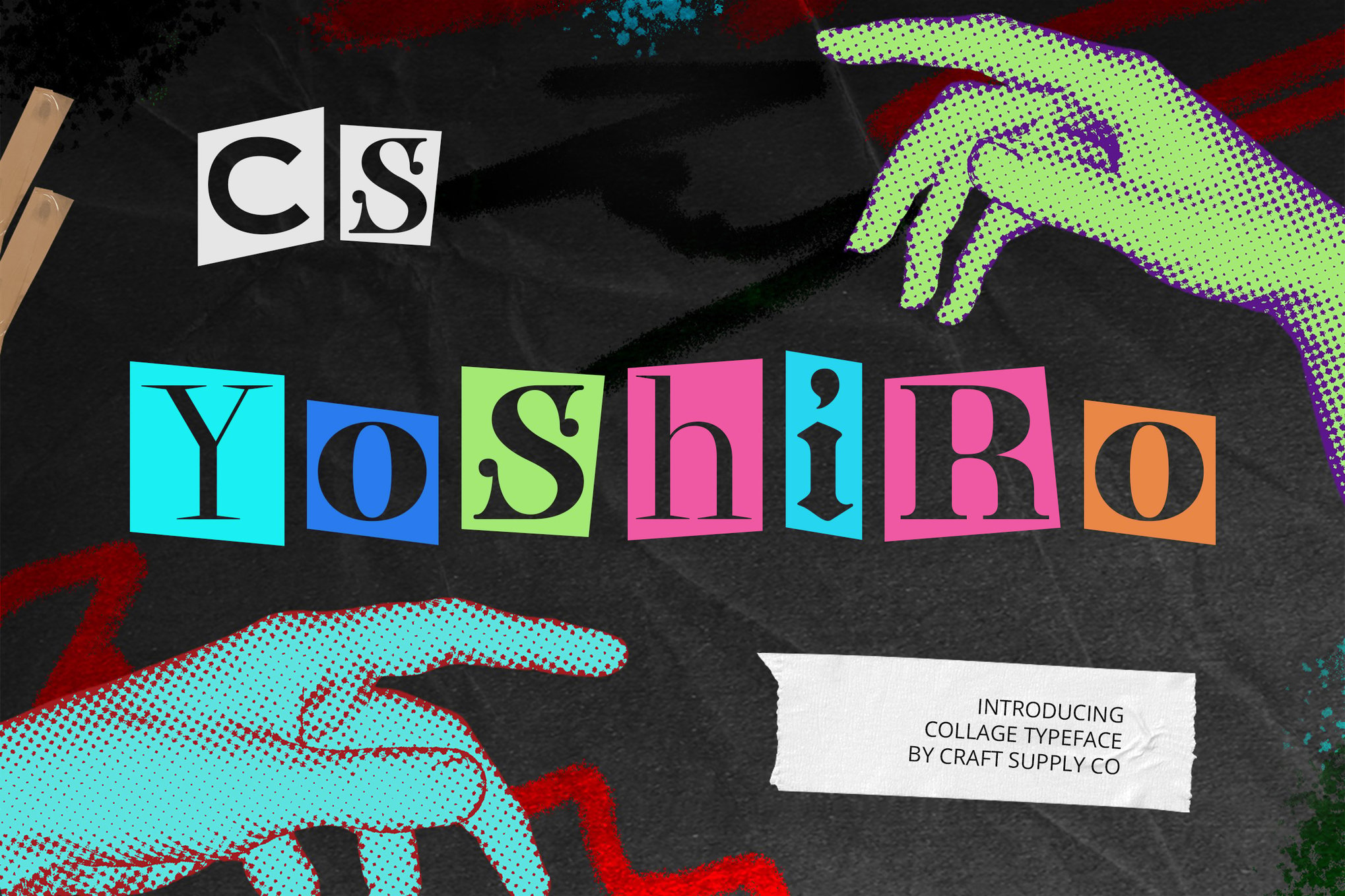
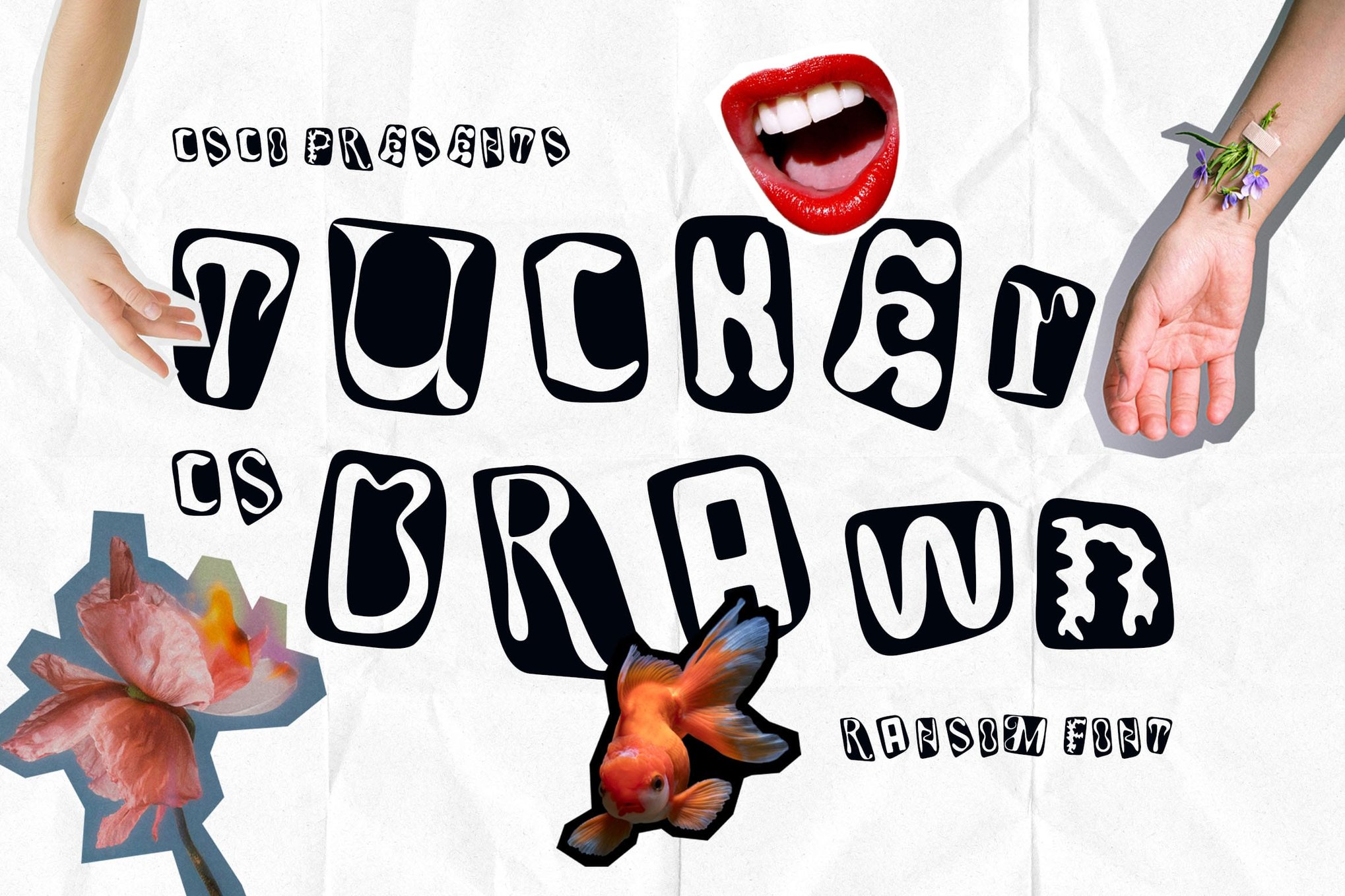
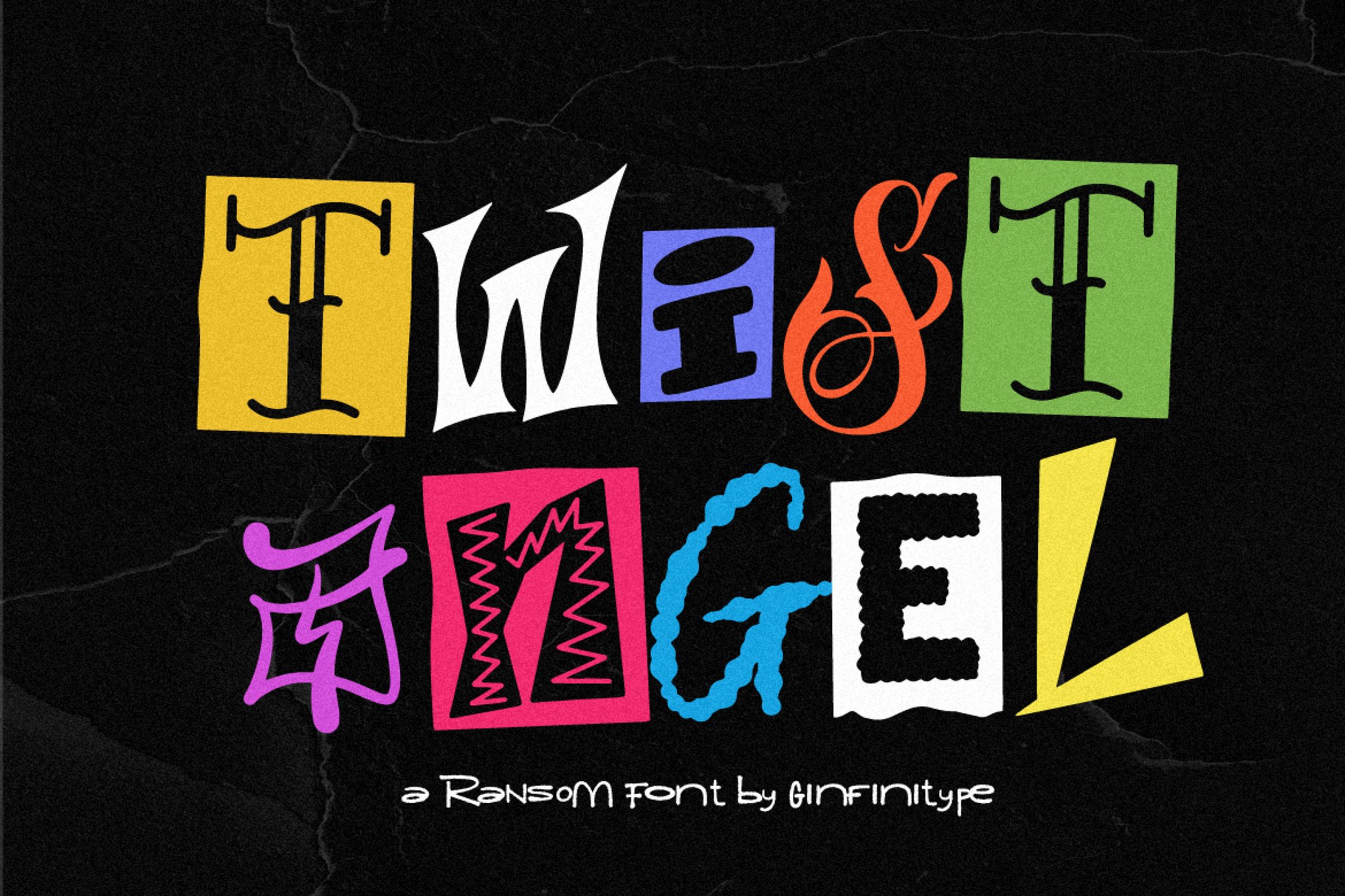
These three typefaces represent the "rebellious" end of the spectrum. Yoshiro is unpolished and raw; Tucker Drawn feels like a series of sketches stolen from an artist’s notebook; and Twist Angel provides a hand-crafted, DIY feel that feels both intimate and aggressive. Each is designed to ensure that no two lines of text look identical, effectively mimicking the human error that machines usually seek to "fix."
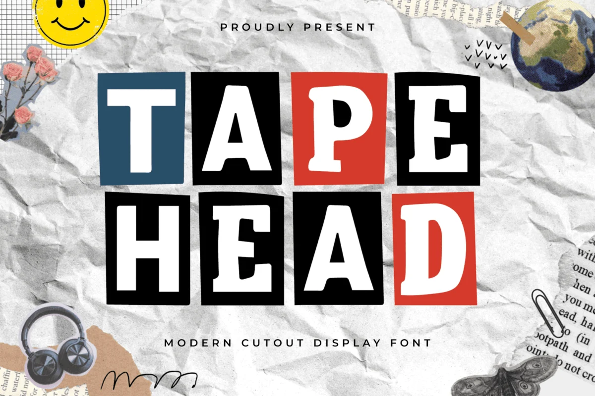
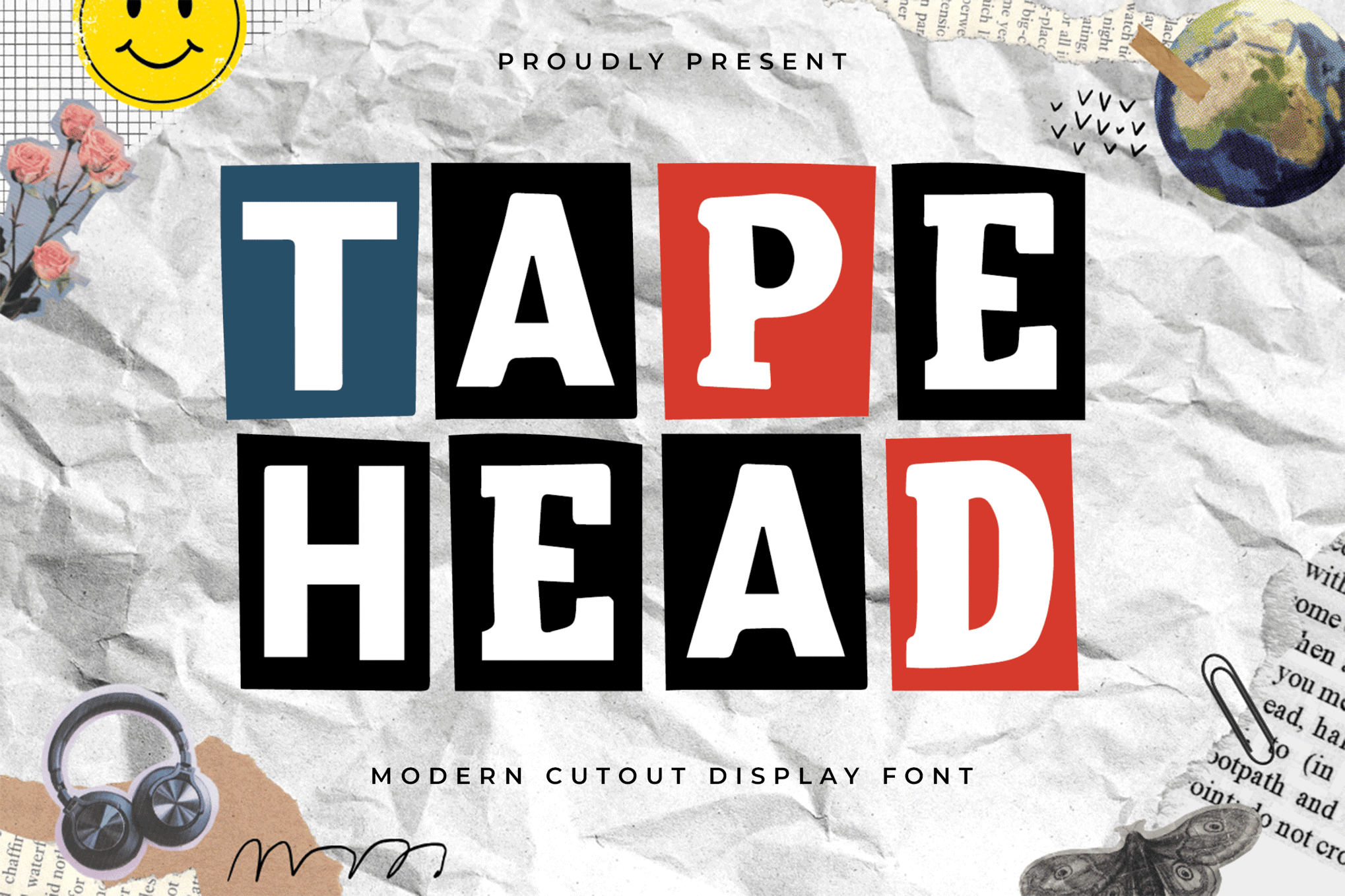
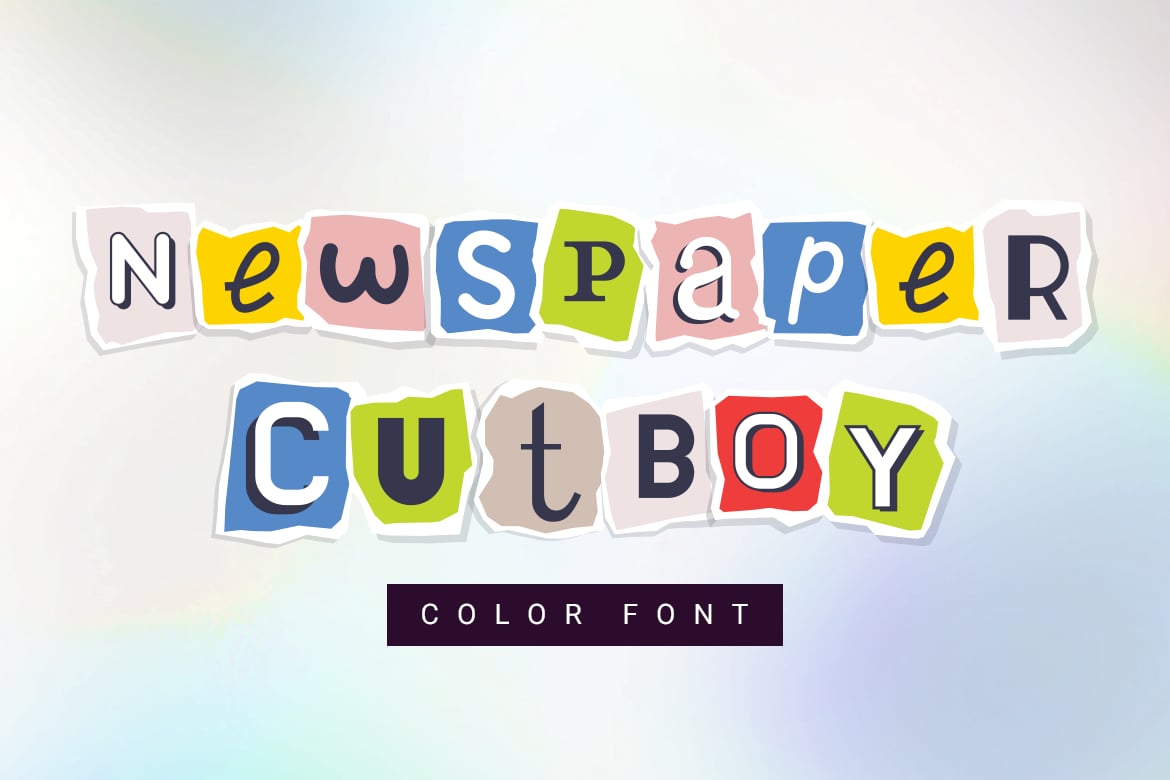
6. Tapehead, Newspaper Cutboy, and Shatter Line
These fonts push the boundaries of what a font can be. Tapehead utilizes jagged edges to suggest a punk-rock origin, while Newspaper Cutboy brings the color-rich, pop-art sensibilities of comic books and tabloids to the screen. Shatter Line, true to its name, is designed for high-impact, disruptive layouts that demand to be seen.
7. Anika and Colada Drawn
Rounding out the premium selection, Anika and Colada Drawn focus on the "whimsical" side of the spectrum. They are less about the "ransom" threat and more about the "scrapbook" charm. They work exceptionally well for editorial design where the text needs to feel like a decorative element rather than just a vehicle for information.
The Open-Source Movement: Best Free Alternatives
Not every design project has the budget for premium fonts, and fortunately, the free-font community has responded to the demand for collage aesthetics with vigor.
- Dirty Punk: A quintessential, high-energy typeface that excels in small, punchy titles. It is a staple for hobbyist zine creators.
- Ranger Drawn: A more "sketchy" take on the genre, offering a softer, more organic feel than the sharp, aggressive ransom-note fonts.
- CS Libra: An essential for those who want a balanced, readable, yet undeniably "cut-out" aesthetic.
- Goenka Drawn: A vibrant, playful option that is specifically optimized for creative projects involving children or light-hearted themes.
Eight Pillars of Effective Collage Design
Using a collage font requires more than just picking a cool typeface; it requires a deep understanding of composition and balance. Follow these professional guidelines to ensure your designs remain effective.
1. Embrace the "Happy Accident"
The primary reason to use these fonts is to escape the "perfection" of standard typography. Do not try to clean up the kerning or smooth out the rough edges. These imperfections are the "soul" of the design. Let the letters sit slightly off-baseline if the font allows for it.
2. The Rule of Contrast
Collage fonts are, by nature, "noisy." If you use them for body copy, you will quickly lose your audience. Use these fonts exclusively for headlines, hero sections, and posters. Pair them with a clean, highly legible sans-serif for any necessary secondary information. This establishes a hierarchy that guides the eye through the layout.
3. Curate Your Palette
Because these fonts often contain their own "internal" texture or color noise, they can clash with complex backgrounds. Limit your color palette to two or three bold, high-contrast colors. A monochrome layout with a splash of red or yellow often works best to highlight the unique shapes of the letterforms.
4. Hybridization (Physical + Digital)
The most successful designs often combine digital fonts with real-world assets. Don’t be afraid to overlay your text with scanned textures of crumpled paper, duct tape, or ink blots. This adds a layer of depth that makes the design feel like it could be touched.
5. Hierarchy as Artwork
Treat your typography as an illustration. In a poster layout, the headline should be the focal point. Use scale to create a visual "beat." A massive, distorted "A" next to a smaller, tighter "B" creates a rhythm that mimics the way a human hand would arrange physical letters on a page.
6. Managing Rhythm through Scale
Don’t be afraid of the "bouncing" text effect. If a font has alternate characters, rotate through them. Using the same "E" five times in a row will make the collage effect look like a digital repeat pattern. By using alternate glyphs and varying the font size, you create a dynamic, organic flow.
7. Contextual Appropriateness
There is a time and a place for the "ransom note" look. It is perfect for underground music, avant-garde art, and counter-culture lifestyle brands. However, it may not be appropriate for corporate law or medical branding. Always ensure the "messiness" of the font aligns with the brand identity.
8. Digital Motion and Interactivity
If your project is destined for the web or social media, take it a step further. Use CSS or animation software to make the letters "flicker" or shift slightly in place. This mimics the feeling of physical cutouts being moved around on a desk, which is a powerful way to engage users on a mobile device.
Implications for Future Design
As AI-generated content becomes more prevalent, the value of the "handmade" aesthetic will only rise. Cut-out and collage fonts offer a necessary human counter-balance to the sterility of machine-made art. They represent the "maker" culture—a movement that celebrates the act of creation, the mess of the process, and the beauty found in the discarded.
Designers who master these tools are not just choosing a typeface; they are adopting a visual language of rebellion and authenticity. In a world saturated with AI-perfect imagery, the rough, jagged edge of a cut-out letter might just be the most "human" thing on the page. By carefully applying these fonts and respecting the principles of balance and hierarchy, designers can create work that feels not just seen, but felt.

 Nila Kartika Wati
 Iffa Jayyana
 Ammar Sabilarrohman
 Asep Darmawan
 Asro

 Layla Zulfa