
 Sagoh
Every font carries a narrative. A serif typeface whispers of tradition and timeless elegance; a crisp sans-serif screams of efficiency and modern clarity; a fluid script suggests human touch and bespoke craftsmanship. In the competitive arena of brand identity, the logo serves as the primary touchpoint between a business and its audience. Choosing the right typeface is not merely an aesthetic decision—it is a strategic investment in how a brand is perceived, remembered, and trusted.

To assist designers in navigating this vast typographic landscape, we have curated a definitive collection of over forty premium logo fonts. Whether you are building a identity from the ground up or refreshing a legacy brand, this guide provides the resources to ensure your work resonates with the target market.
The Evolution of Logo Typography: A Chronology
The history of logo design is inextricably linked to the evolution of type. In the early 20th century, brands relied on hand-lettered calligraphy to establish authority and trust. As the mid-century modern movement took hold, the focus shifted toward geometric purity and the "less is more" philosophy, popularized by icons like Paul Rand.
The 1980s and 90s saw the democratization of digital type, allowing for an explosion of experimental, graffiti-inspired, and decorative styles. Today, we exist in a post-digital era where "variable fonts" and high-legibility minimalist typefaces dominate the tech landscape, while a counter-movement of artisanal, "imperfect" handwritten fonts seeks to humanize brands in an increasingly automated world. Understanding this timeline is crucial for designers: knowing where a font style originates helps you decide whether it will appear "timeless" or "dated" to your client.
Strategic Selection: How to Choose the Perfect Logo Font
Selecting a logo font requires a rigorous evaluation process that transcends personal preference. A typeface must survive the "stress test"—it must remain legible when shrunk to the size of a social media avatar, and retain its character when blown up for a billboard.
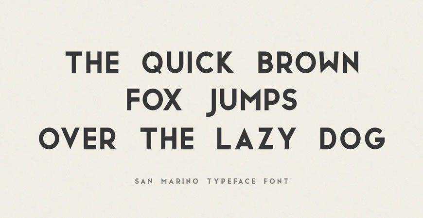
The Professional’s Checklist:
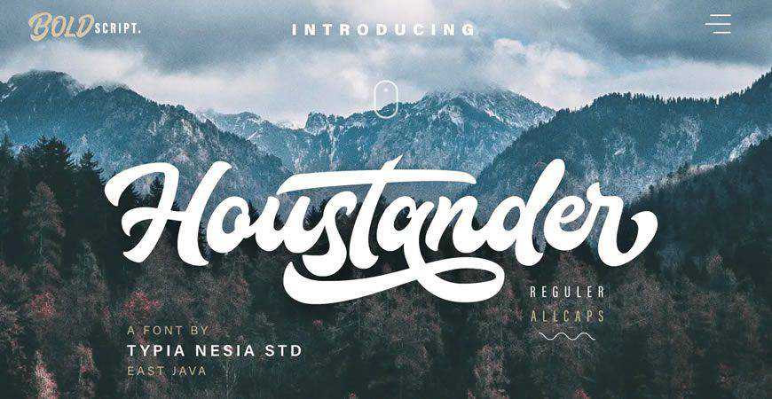
- Brand Alignment: Does the personality of the font match the core values of the brand? (e.g., A law firm likely requires a stable, high-contrast serif, whereas a skate brand thrives on aggressive, high-energy brush fonts).
- Scalability: Does the font maintain its structure at small sizes? Avoid fonts with overly intricate details if the logo will be used in mobile app icons.
- Versatility: Does the font family include enough weights (Light, Regular, Bold, Black) to allow for a full brand system?
- Readability: Can the brand name be deciphered at a glance by a first-time viewer?
Quick Recommendations: The Designer’s Cheat Sheet
If you are facing a looming deadline, use this reference table to find the right category for your project.
| Category | Recommended Font | Best For | Why It Works |
|---|---|---|---|
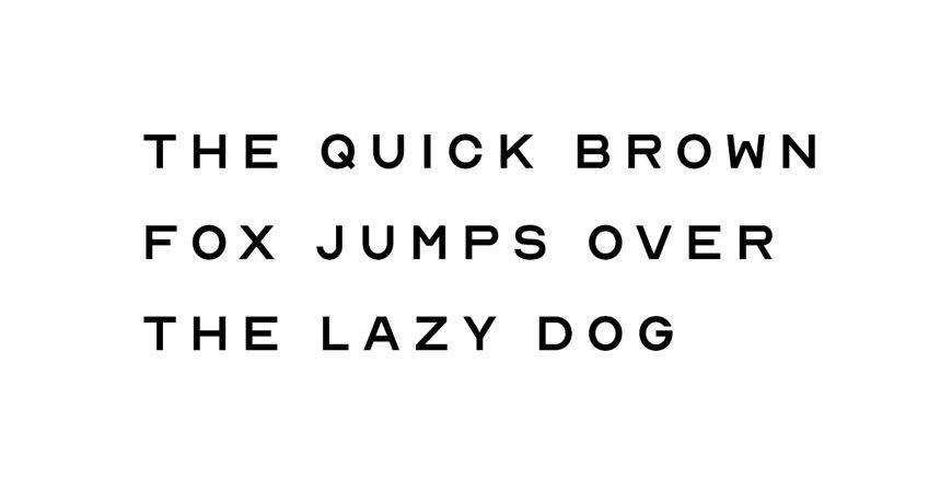
| Minimalist | Nord | Tech/Fashion | Clean geometric forms allow for high flexibility. |
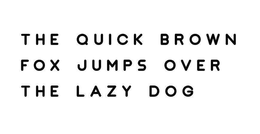
| Geometric | JUST Sans | Corporate/Arch | Balanced, broad character set for complex systems. |
| Monogram | Augor | Luxury/Creative | Distinctive uppercase shapes create iconic marks. |
| Script | Rossa | Beauty/Hospitality | Refined, humanistic, and highly readable. |
| All-Caps | Stag | Sports/Tech | Provides a strong, grounded visual anchor. |
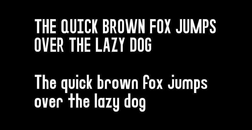
| Brush | Quick Silver | Streetwear/Youth | High energy and hand-painted aesthetic. |
| Display | Fritz | Friendly/Consumer | Expressive, rounded forms for high engagement. |
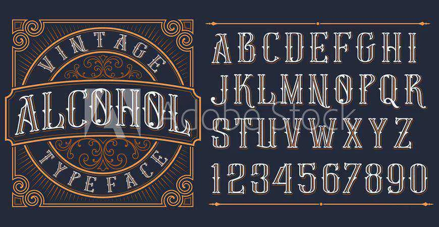
| Vintage | Brewisten | Heritage/Retail | Retro character ideal for packaging and badges. |
| Handwritten | Southwave | Lifestyle/Cafe | Casual, approachable, and intimate feel. |
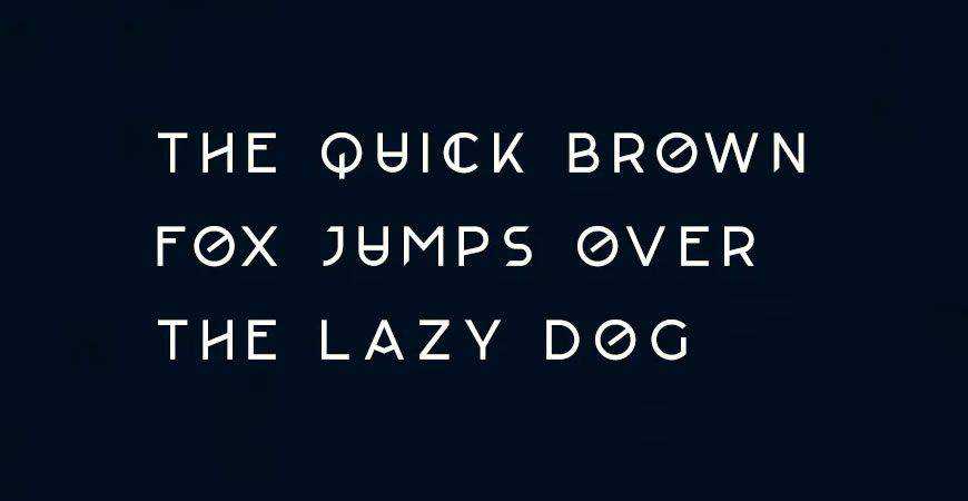
| Futuristic | Lequire | SaaS/Fintech | Modern, unconventional lines for innovation. |
Category Spotlight: Industry-Specific Applications
Minimalist & Geometric Foundations
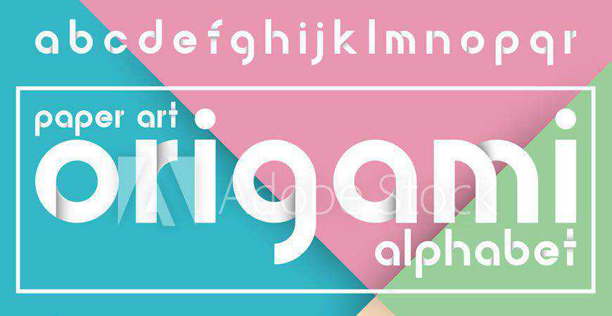
For law firms, financial institutions, and healthcare providers, professionalism is the currency of choice. Minimalist fonts like Jaquel and Impulse rely on geometric precision to convey trust. These typefaces avoid unnecessary flourishes, ensuring that the brand’s message is delivered with clinical, modern efficiency.
The Power of Monograms
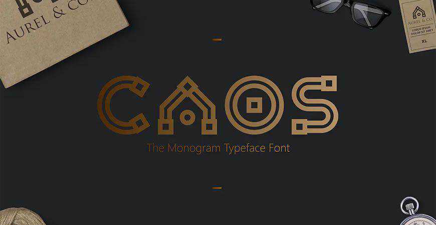
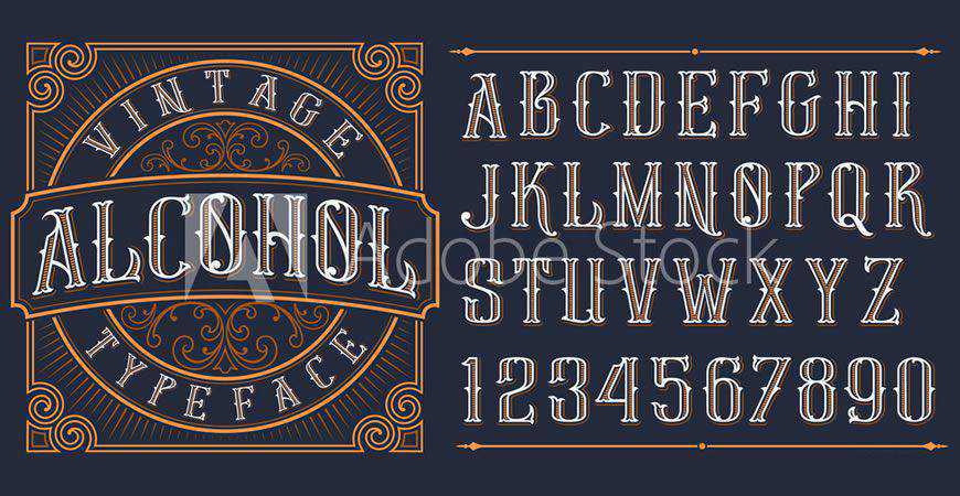
Monogram logos, such as those created with CAOS or Augor, are the hallmark of legacy and luxury. By isolating initials, a brand can create a symbol that is as recognizable as it is sophisticated. This approach is highly effective for creative studios and boutique consultancies that want to emphasize the "personality" of the founder or the brand name itself.
Script and Handwritten Authenticity
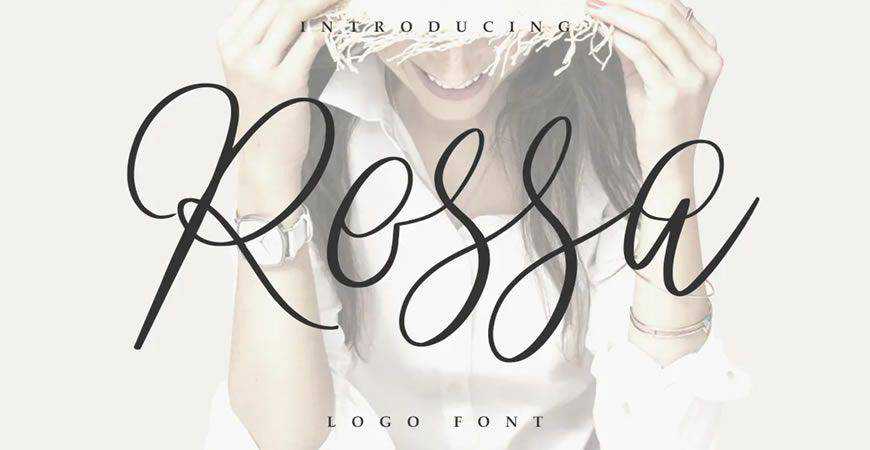
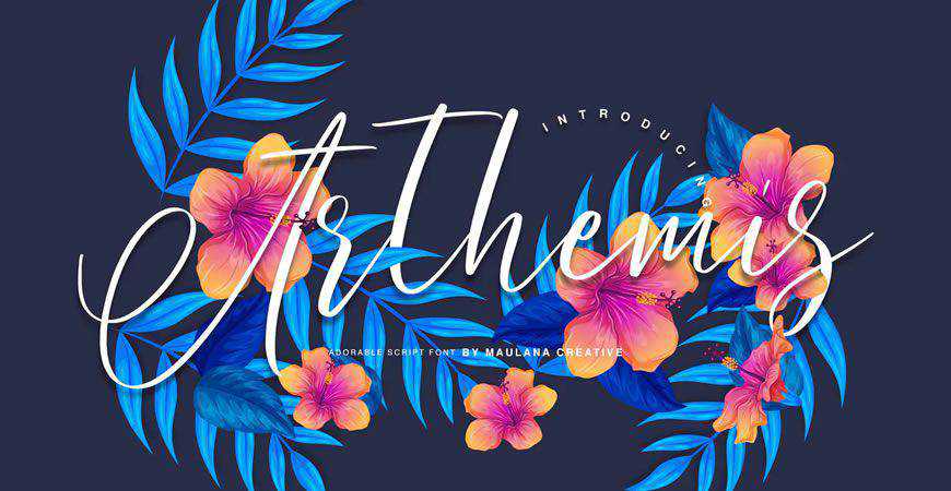
In an era dominated by digital interfaces, the "human touch" is a premium commodity. Script fonts like Rossa and Arthemis provide an emotional connection that rigid sans-serifs cannot. These are ideal for lifestyle brands, wedding planners, and artisanal shops where the brand’s "story" is as important as the product.
Urban and Graffiti Aesthetics
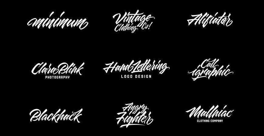
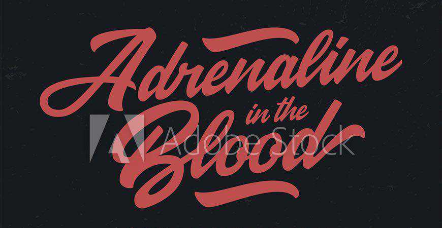
For streetwear brands and music festivals, conformity is the enemy. Graffiti-inspired fonts like Quick Silver and Rich Ganbatte inject a sense of movement, rebellion, and street-level authenticity. These fonts are loud by design; they demand attention and are meant to disrupt the visual noise of the urban environment.
The Legal Landscape: Licensing for Commercial Success
One of the most critical aspects of professional logo design is the licensing of intellectual property. A common misconception is that a "free" font is free for all uses. Designers must be vigilant:
- Personal vs. Commercial: Many fonts are free for hobbyist projects but require a commercial license for corporate use.
- Redistribution: Even if you purchase a font, you generally cannot distribute the font file itself to your client. The client should either purchase their own license or the design should be delivered as a flattened vector graphic.
- Future-Proofing: Always document the license type and the purchase date. Should the client be audited, they will look to you for proof of rights.
Implications for Brand Identity
The choice of a logo font ripples through the entire brand ecosystem. If you choose a font with a distinct "personality," that personality must carry over into the supporting typography used for websites, marketing collateral, and packaging. A mismatch—such as a rigid, corporate-looking website paired with a wild, graffiti-style logo—creates cognitive dissonance, weakening the brand’s perceived authority.
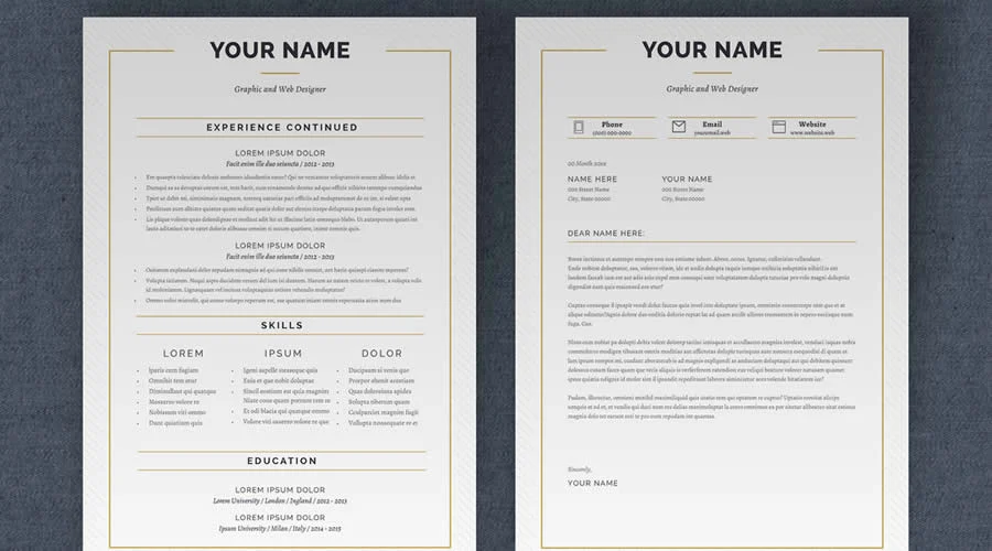
Consistency is the ultimate goal. When you pair a bold, custom-lettered logo with a clean, legible body font from the same family or a complementary pairing, you build a cohesive visual identity that speaks to the consumer on a subconscious level.
Final Thoughts: The Path Forward
Typography is the voice of your brand. As we have explored, whether you are utilizing the retro-futurism of Artis, the hand-drawn charm of Squiborn, or the modern geometric rigor of JUST Sans, your font choice dictates the first impression you make on the world.
The next time you face a creative block, revisit this collection. Don’t simply pick what looks "cool"—pick what communicates the essence of your client’s business. By mastering the nuance of font selection, you move from being a designer who "makes things look nice" to a brand strategist who builds lasting value. Your logo is the anchor of the brand—make sure it is set in a typeface that can withstand the test of time.

 Asep Darmawan

 Raul Delapena Setiawan

 Reynand Wu

 Azzam Bilal Chamdy

 Ali Ikhwan
