Neng Nana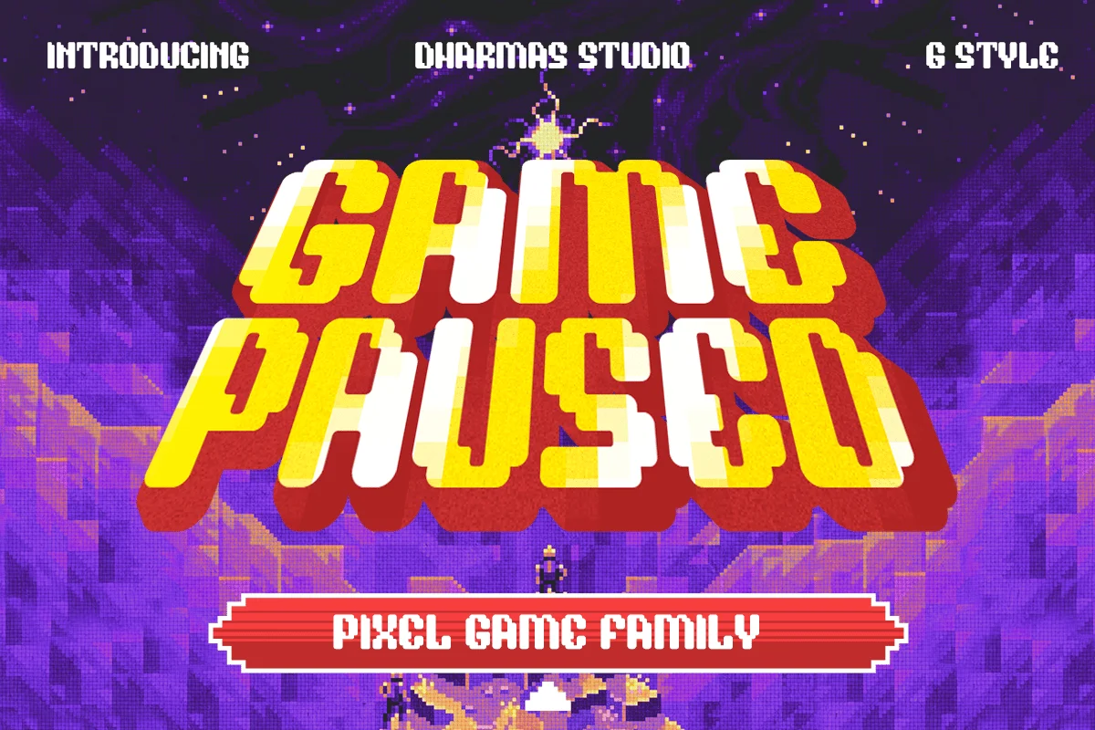
There is an undeniable, magnetic pull to the bold, blocky typography of 80s and 90s arcade games. For those who grew up in the golden age of coin-operated entertainment, these fonts represent far more than simple legibility; they are the visual shorthand for an era of neon-drenched cabinets, high-score battles, and the tactile clack of joysticks. Today, these pixelated aesthetics have transcended their humble origins, finding a new, permanent home in modern graphic design, branding, and indie game development.
Whether it is the vibrant, glowing neon hues or the precise, rigid edges of a bitmap grid, these fonts act as a temporal bridge, instantly transporting the viewer back to the late 20th century. In this comprehensive guide, we explore the best arcade fonts currently available, examining how designers are utilizing these assets to inject authentic, nostalgic energy into contemporary projects.
The Evolution of Arcade Typography: A Brief Chronology
To understand why these fonts remain relevant, one must look at their origin. In the late 1970s and throughout the 1980s, hardware constraints necessitated the use of low-resolution, grid-based fonts.
- The 8-Bit Foundation (1978–1985): Early arcade cabinets like Space Invaders and Pac-Man relied on extremely limited memory. Fonts were essentially composed of individual blocks. Every letter had to fit into a specific pixel matrix, resulting in a stark, utilitarian, yet highly readable aesthetic.
- The 16-Bit Expansion (1986–1995): As hardware evolved, fonts became more expressive. Developers began adding shadows, outlines, and bolder, chunkier shapes to make text pop against increasingly complex background sprites. This is the era that birthed the "chunky display" font styles we see in modern retro-inspired headers.
- The Digital Renaissance (2010–Present): With the rise of indie gaming and the "lo-fi" aesthetic movement, pixel art transitioned from a technical limitation to a deliberate stylistic choice. Designers now treat arcade typography as a refined art form, blending traditional 8-bit constraints with modern, high-definition versatility.
Why Arcade Fonts Matter in Contemporary Design
Beyond simple nostalgia, arcade fonts offer a unique set of benefits for modern designers.
High Impact, High Legibility
Because these fonts were designed for low-resolution screens, they possess an inherent, high-contrast clarity. In an age where digital content is consumed rapidly on mobile devices, the bold, blocky shapes of an arcade font ensure that titles and headlines remain readable even at small sizes or on cluttered backgrounds.
The "Coin-Op" Vibe
Typography is the voice of a design. Using a font like Game Paused or Arcade Zone immediately signals to the audience that the content is playful, energetic, and perhaps a bit rebellious. It is a powerful tool for branding, especially for products aimed at the gaming community, youth culture, or tech-centric startups looking to add a layer of human, "human-computer" interaction.
Curated Selection: Premium Arcade Fonts
For designers looking to invest in high-quality, professional-grade assets, the following fonts provide extensive character sets, multilingual support, and varied stylistic alternatives.
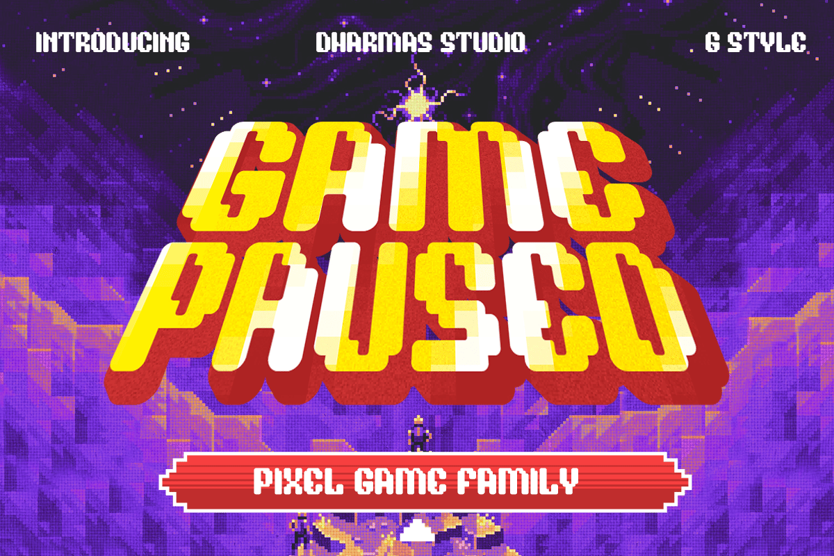
Game Paused
Perfect for any pixel game project, this font is highly versatile. It offers six distinct styles, ranging from Regular to Extrude and Slant. Its ability to shift between a standard pixel look and an extruded, 3D-effect style makes it a "Swiss Army Knife" for UI designers.
Arcade Zone
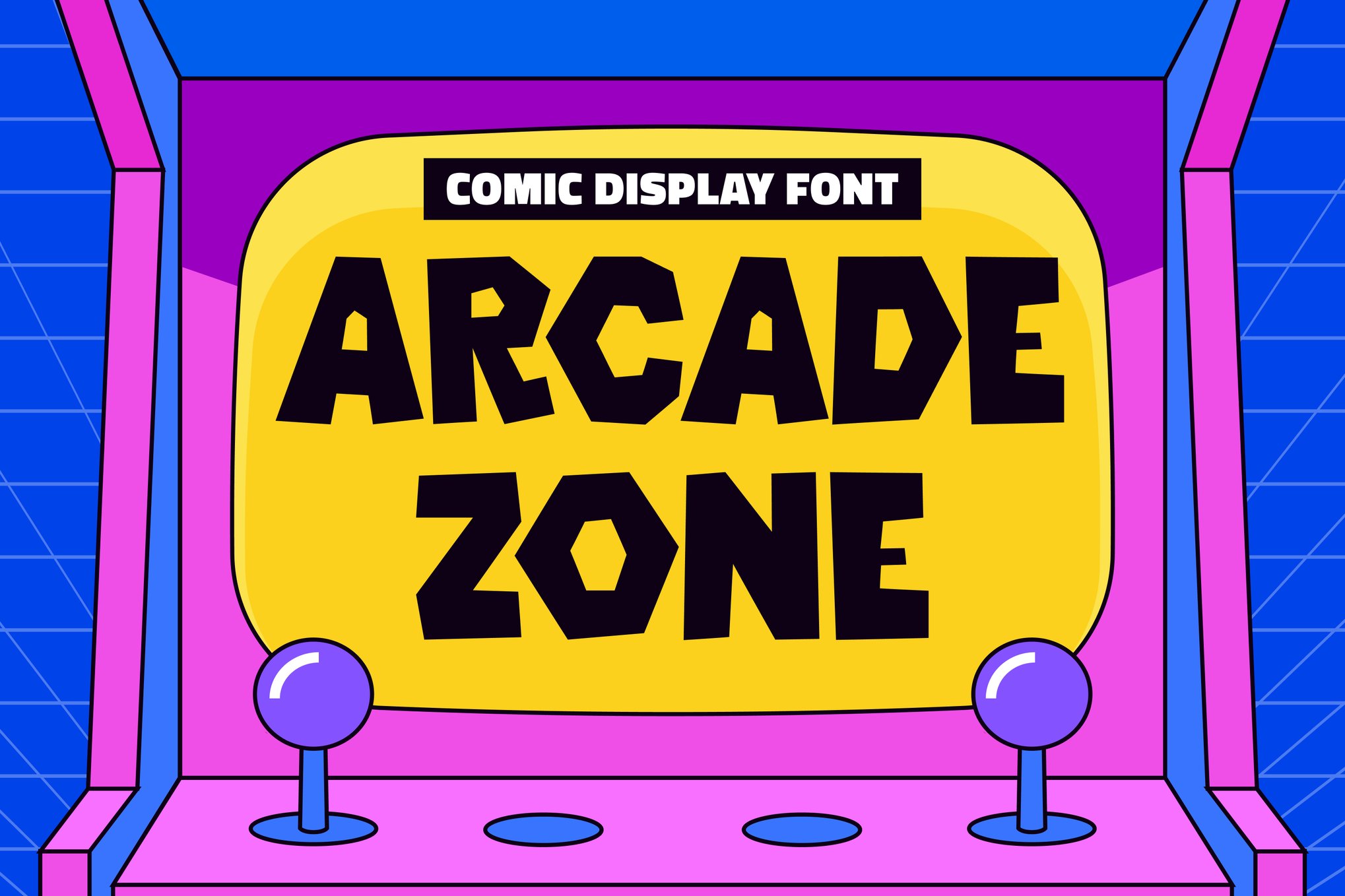
A bold, comic-inspired display font. Arcade Zone excels in applications where you need to convey high energy. Its thick, rounded character shapes make it ideal for children’s products, YouTube thumbnails, and marketing materials that require a "fun" factor.
Arcade Pixel & Game Stage
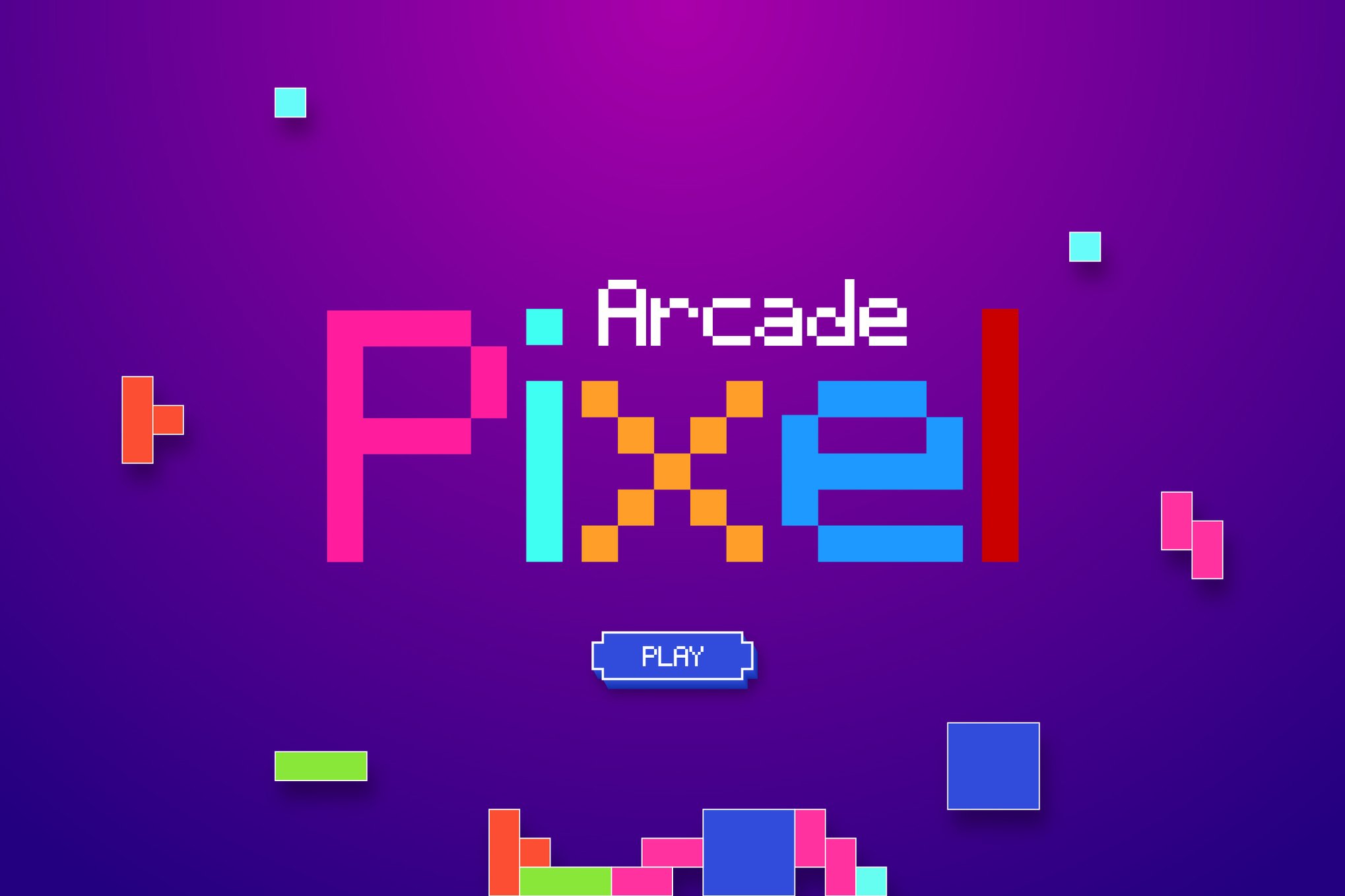
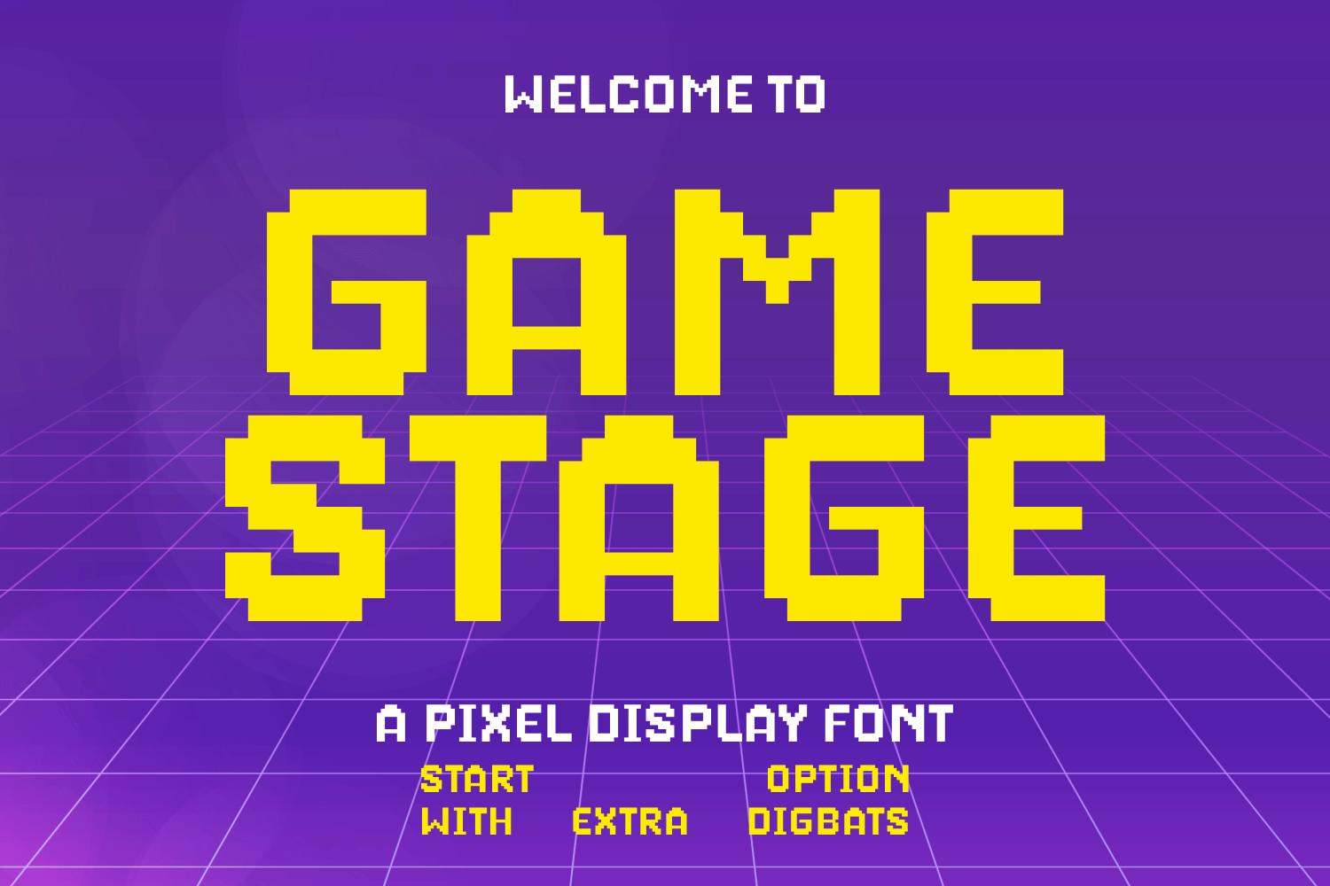
These typefaces are the gold standard for those seeking that "authentic" 8-bit experience. While Arcade Pixel leans into the modern, clean side of the aesthetic, Game Stage offers a more playful, organic feel, complete with stylistic doodles that add a hand-drawn quality to the grid-based foundation.
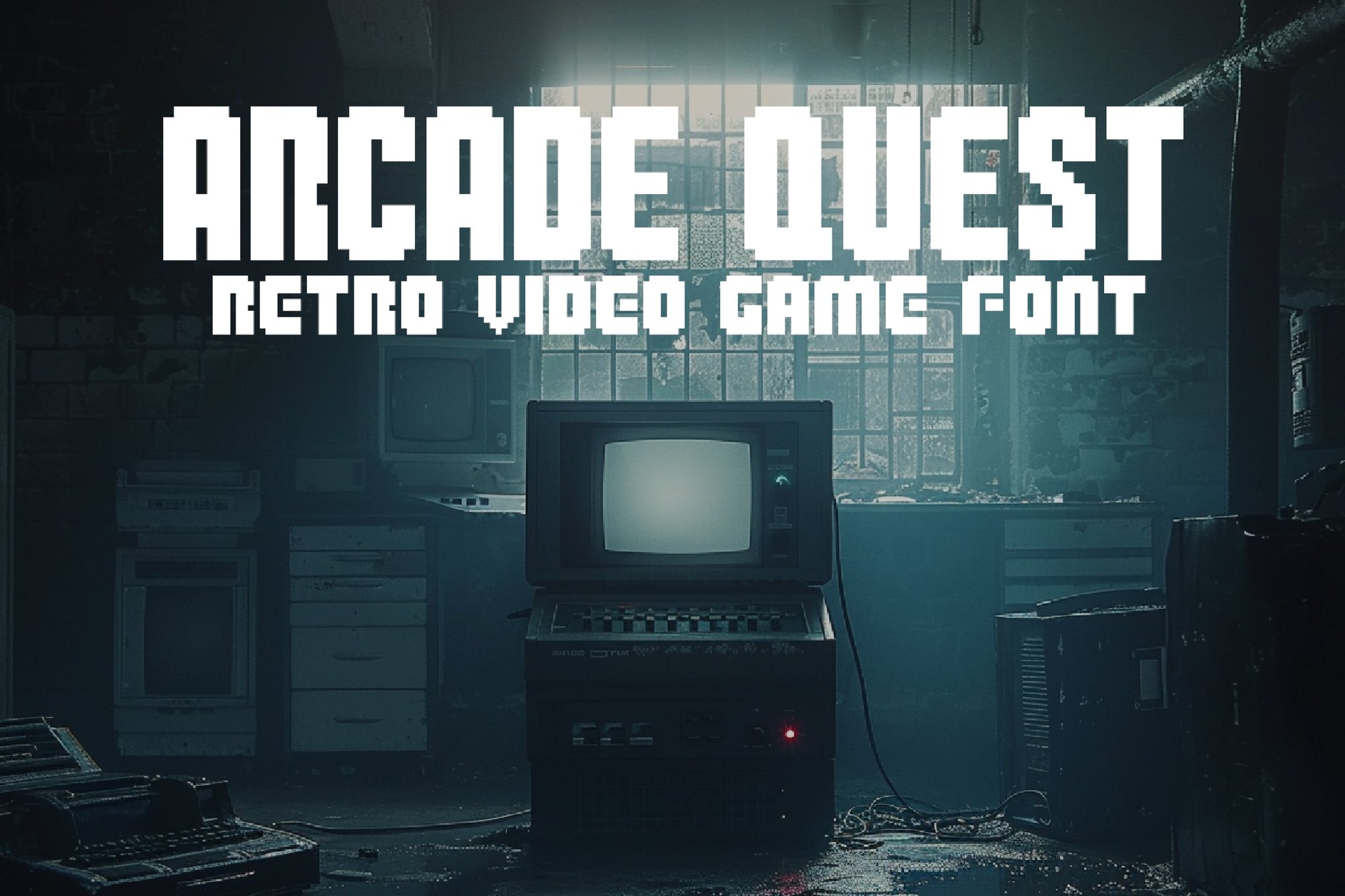
Rocabe & Arcade Quest
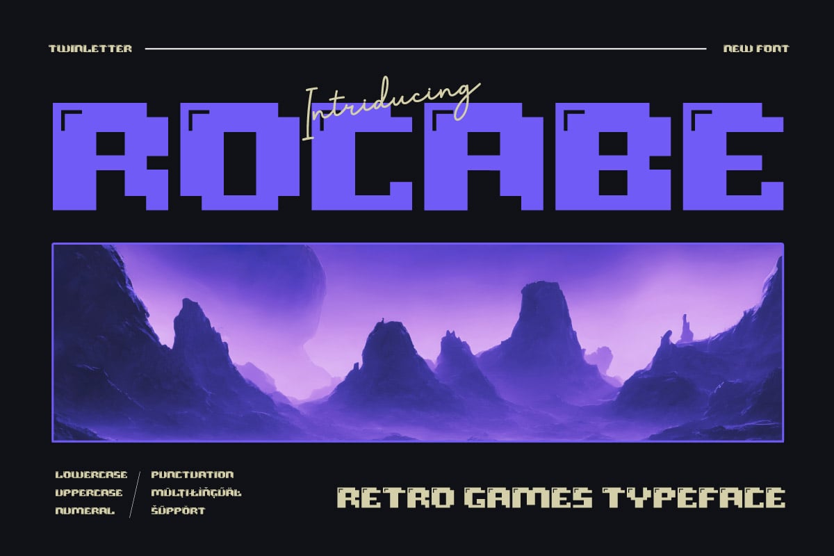
For designers working on darker or more cinematic projects, these fonts offer a slightly more serious, "quest-based" tone. They are particularly effective for titles or intro sequences where you want to evoke the feeling of a classic RPG or adventure game.
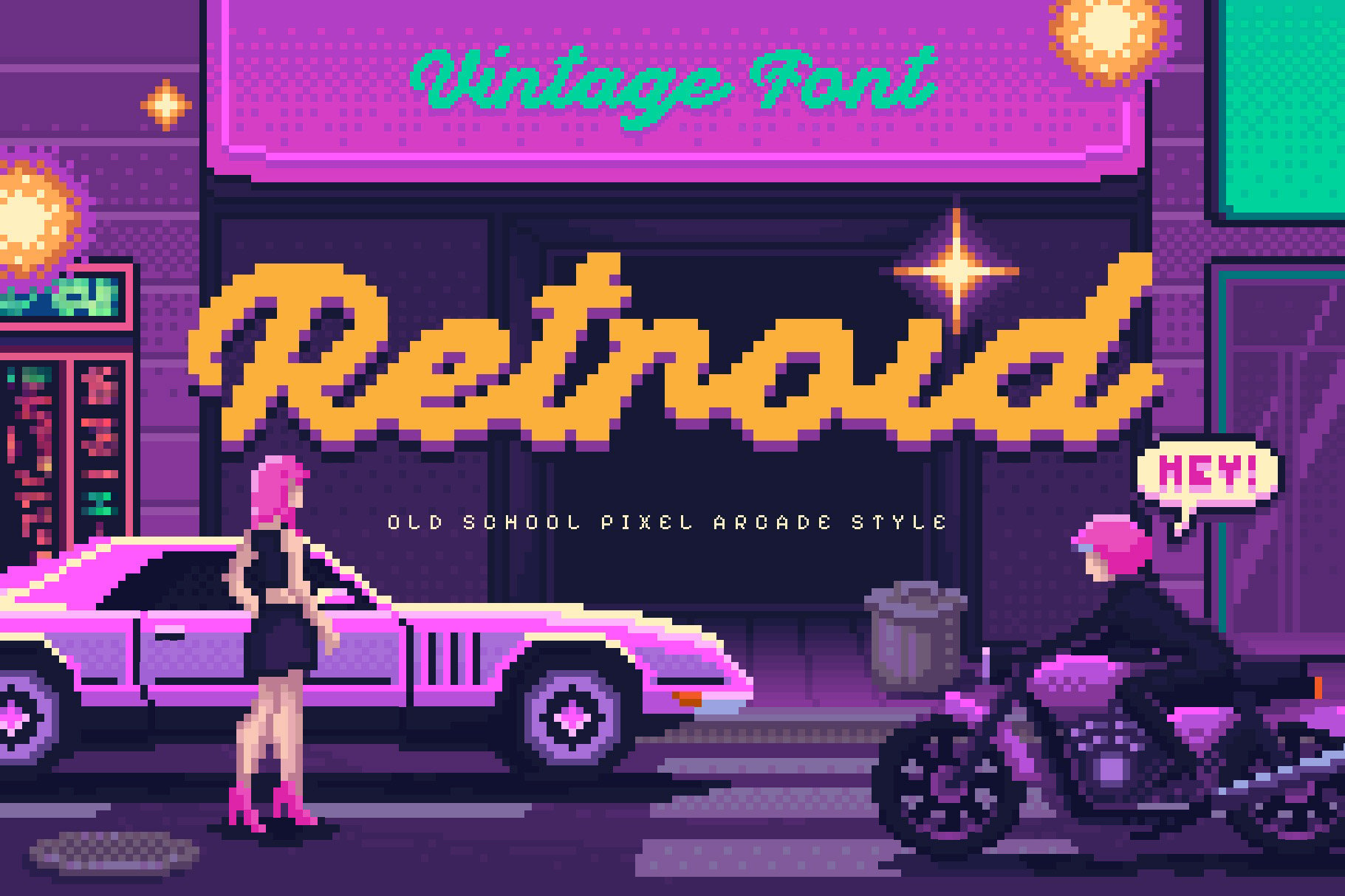
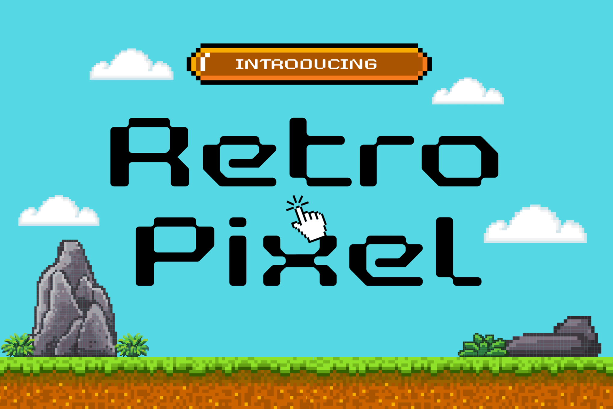
Retroid & Retro Pixel
These fonts bridge the gap between classic console graphics and modern vector design. They are particularly effective for branding, as they maintain a professional, sharp edge while still clearly referencing the 8-bit era.
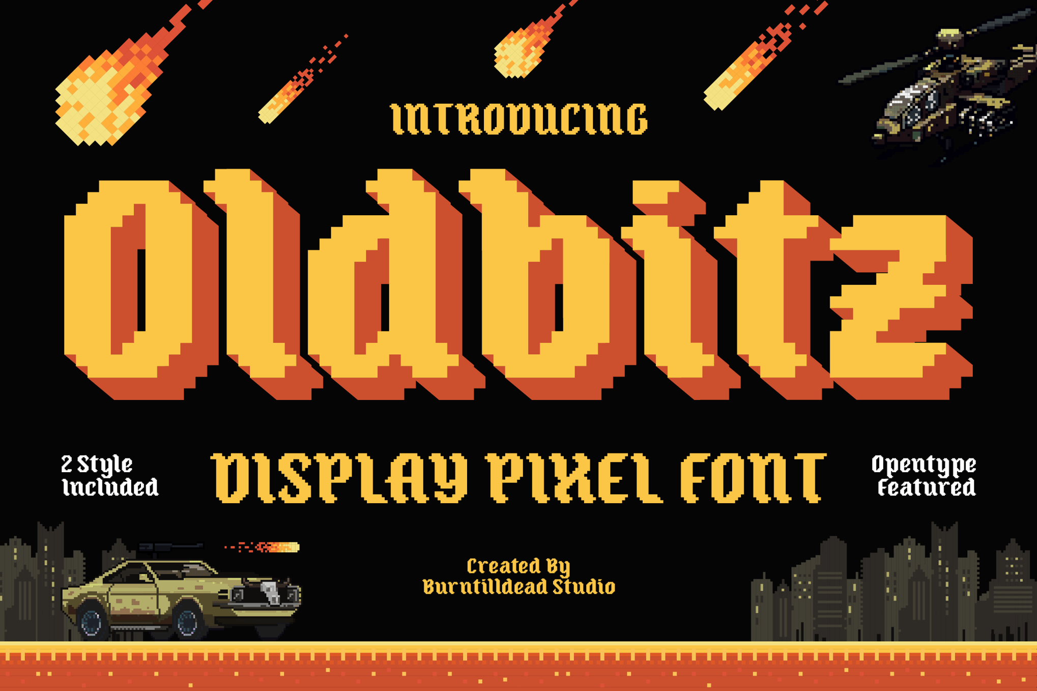
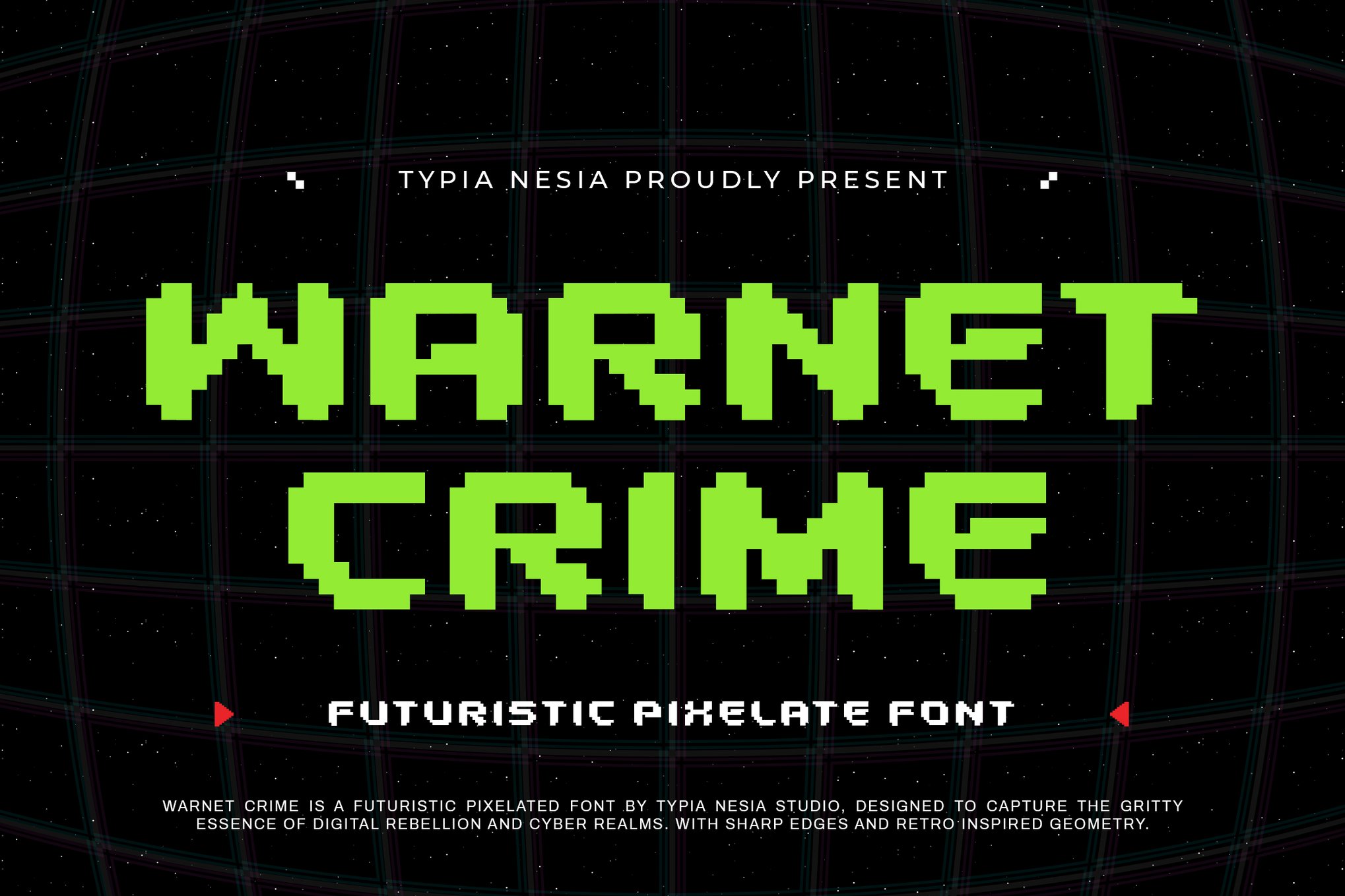
Oldbitz & Warnet Crime
If your project requires a bit more "grit," look no further. Oldbitz incorporates a gothic-inspired twist on the standard pixel look, while Warnet Crime offers a sharp, futuristic, and somewhat aggressive geometry—perfect for sci-fi or cyberpunk-themed UI elements.
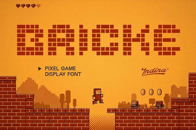
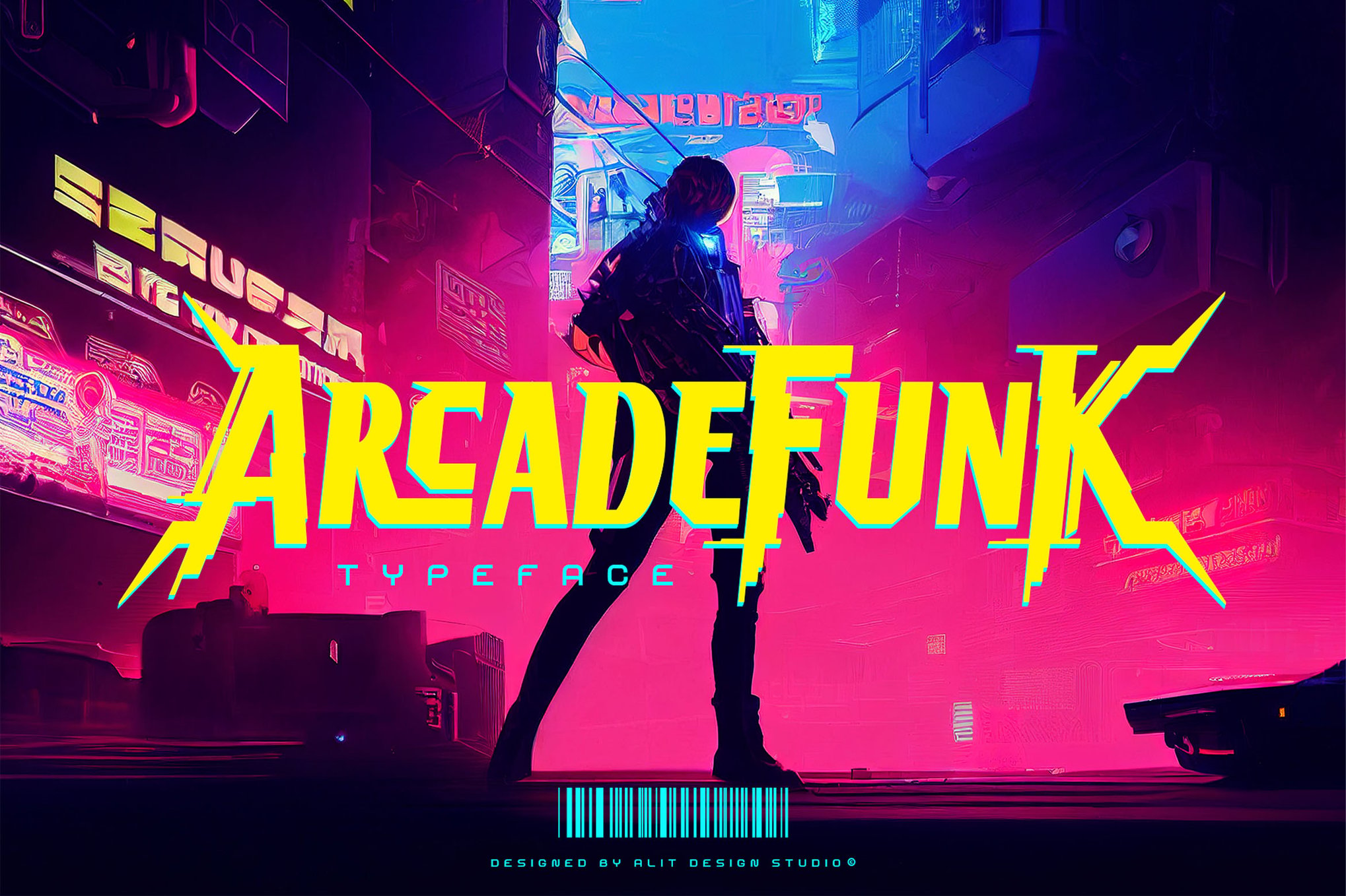
Arcade Funk, Valmeria, & Pixel Bricke
These selections represent the "experimental" side of the genre. Arcade Funk leans into brutalism and punk aesthetics, while Valmeria uniquely blends blackletter medieval styles with 8-bit blocks. Pixel Bricke focuses on the physical, structural look of blocks, adding a tactile element to your typography.
Bitmap & Bittera
For those who prefer a more modular, monospaced look, Bitmap offers unmatched precision. Bittera provides the flexibility of both a "Regular" and "Rounded" style, allowing designers to toggle between a sharp, retro look and a softer, more modern aesthetic within the same project.
Alpharush & Pixel Bots
These are your go-to options for that classic 80s arcade feel. They are straightforward, reliable, and carry the unmistakable visual weight of a high-score screen.
Arteche: The Y2K Revival
As Y2K aesthetics continue to trend, Arteche stands out as a bridge between the 8-bit past and the early digital culture of the late 90s and early 2000s. It is an essential tool for any project aiming to tap into that specific turn-of-the-century digital nostalgia.
Essential Free Arcade Fonts
Not every project requires a premium budget, and luckily, the design community has provided several high-quality free alternatives.
- Cyber Bytes: A sharp, futuristic typeface perfect for esports branding and sci-fi posters.
- Digital 808: This font mimics the look of classic LED segments and arcade machine counters. It is exceptionally clean and professional.
- Game City: A bold, display-heavy font that is excellent for large-scale headlines and children’s media.
- Start Signal: With a modern, clean approach to pixel geometry, this font is a favorite for streamers and content creators who need a font that looks great on Twitch overlays.
Supporting Data and Technical Implementation
When integrating these fonts into your design workflow, there are several technical considerations to ensure professional results.
File Formats and Compatibility
Most modern arcade fonts are provided in a variety of formats, including OTF (OpenType Font), TTF (TrueType Font), and WOFF (Web Open Font Format).
- OTF is generally preferred for print and high-end design software like Adobe Illustrator or Photoshop due to its support for advanced features like ligatures and stylistic sets.
- WOFF/WOFF2 is essential for web development, ensuring that your retro typography loads quickly and renders correctly across all browsers.
The "Anti-Aliasing" Dilemma
A common mistake when using pixel fonts is allowing the software to "smooth" or "anti-alias" the edges. To achieve the crisp, authentic arcade look, you must set your text rendering to "None" or "Sharp" in your design software. This forces the pixels to align perfectly with the grid, preventing the blurry, "muddy" edges that ruin the retro effect.
Official Industry Perspective: The Future of Retro Design
Industry experts point to the current obsession with "Newstalgia"—the blending of new, modern design trends with nostalgic elements—as a key driver for the continued popularity of arcade fonts.
"We are seeing a move away from the overly polished, sterile minimalism that dominated the 2010s," notes one lead UI designer at a major gaming studio. "Designers want character. They want their interfaces to feel like they have a soul. Arcade fonts provide that instant connection. They are inherently human, imperfect, and incredibly fun to work with."
Implications for Your Next Creative Project
As you consider which font to select for your next project, keep the following in mind:
- Audience Alignment: Is your target demographic likely to recognize these fonts? If you are aiming for a younger audience, keep the font usage modern and clean (like Arcade Pixel). If you are targeting an older, nostalgic audience, lean into the more traditional, blocky designs (like Bitmap).
- Visual Hierarchy: Don’t overuse pixel fonts. Because they are so bold and visually loud, they work best as headers, logos, or primary UI elements. Pair them with clean, sans-serif body fonts to maintain balance.
- Color Palette: Arcade fonts live and die by their colors. Don’t be afraid to use bright, saturated neon colors—electric blues, hot pinks, and lime greens—to really sell the 80s aesthetic.
In conclusion, the resurgence of arcade typography is more than just a fleeting trend. It is a testament to the power of iconic design. These fonts serve as a reminder that even within the strictest of constraints, creativity can flourish. By choosing the right typeface and applying it with an eye for both history and modern utility, you can ensure that your creative projects not only stand out but also resonate with the enduring, timeless energy of the arcade.

 Asep Darmawan
 Nila Kartika Wati
 Raul Delapena Setiawan
 Dwi Wanna
 Muslim
 Nana Wu