
 Layla Zulfa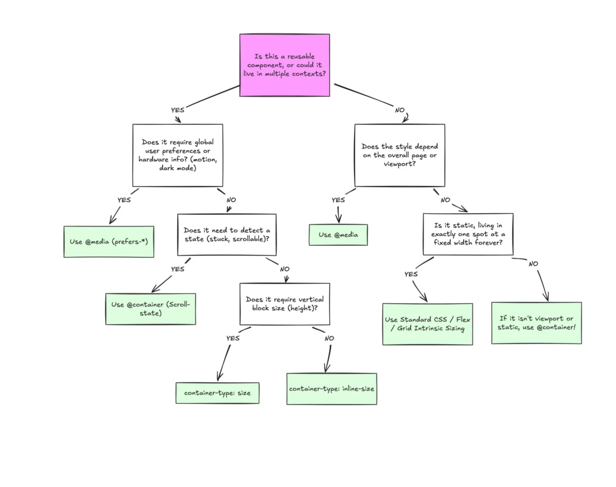
Despite enjoying widespread browser support—hovering at an impressive 94%—CSS Container Queries remain one of the most underutilized and misunderstood tools in the modern web developer’s arsenal. While they were long hailed as the "holy grail" of the CSS community, actual adoption rates tell a sobering story: according to the 2025 State of CSS survey, while 86% of developers are aware of the feature, only 41.4% have integrated them into their workflows.
This disparity between expectation and reality stems from a fundamental misconception: that Container Queries are merely a syntactic variation of the familiar media query. By examining the shift from "viewport-centric" design to "context-aware" components, we can better understand why this transition is essential for building truly resilient, modular web interfaces.
The Chronology of a CSS Revolution
For nearly two decades, the responsive web was synonymous with Media Queries. Introduced to solve the problem of a fractured device landscape, Media Queries allowed developers to toggle styles based on the width of the user’s browser window. It was a revolutionary approach that defined the "mobile-first" era.
However, as component-driven development (CDD) rose to prominence with the advent of frameworks like React, Vue, and Web Components, the limitations of Media Queries became glaring. A component designed to look perfect in a 1024px-wide page layout might be placed into a 300px-wide sidebar, causing it to break, cramp, or overflow.
The CSS community spent years calling for a solution, with "Container Queries" consistently topping the CSS-Tricks "CSS Wishlist" year after year. When the feature finally arrived in stable browser releases, the excitement was palpable. Yet, as noted by CSS advocate Kevin Powell at SmashingConf Amsterdam 2026, the adoption curve has been alarmingly flat. Many developers, initially confused by the syntax, reverted to the "viewport as a proxy" mindset, failing to realize that Container Queries represent a paradigm shift in how we define layout logic.
Supporting Data: Why the Viewport is No Longer Enough
The persistent reliance on min-width and max-width media queries is increasingly untenable. Modern web applications are no longer static pages; they are dynamic ecosystems of nested components.

Consider the sheer fragmentation of the modern web. Recent data shows there are over 2,300 unique viewport sizes currently in use by global internet traffic. Relying on hard-coded breakpoints—like the industry-standard 768px for tablets—is an exercise in futility. When you write @media (min-width: 1024px), you are asking the browser a singular question: How wide is the screen?
The browser does not know that your card component has been relegated to a narrow column. It only knows the browser window is large. Consequently, the component remains in its "desktop" state, leading to broken UI. Container Queries change the question entirely. By using container-type: inline-size, the developer asks: How much horizontal space is available for this specific component right now? The answer is no longer dependent on the user’s device, but on the component’s immediate parent.
Macro vs. Micro: Defining the New Layout Architecture
To effectively implement Container Queries, developers must adopt a distinction between "Macro" and "Micro" layouts.
Macro Layouts (The Global Canvas)
Media Queries remain the gold standard for global page structure. When determining the overall scaffolding of a site—such as shifting from a single-column mobile view to a multi-column desktop grid, or responding to system-wide settings like prefers-color-scheme—the viewport is the correct reference point. These are "Macro" decisions; they affect the entire document flow.
Micro Layouts (The Component Context)
Container Queries are the domain of "Micro" layouts. These include cards, widgets, navigation menus, and form elements. These components should be agnostic of their placement. A well-designed card should be able to transition from a vertical "stacked" view to a horizontal "wide" view based on its container’s width, regardless of whether that container is a full-width main section or a narrow side-nav.
Technical Implications: Fluidity and Logic
The power of Container Queries extends beyond simple layout toggling. It enables a more nuanced approach to typography and state management.

Fluid Typography
Traditionally, developers used clamp() with viewport-relative units (vw, vh). This often leads to text becoming unreadably small on desktop sidebars or massive on mobile viewports. By using container-relative units like cqi (container query inline-size), typography can scale fluidly relative to the component itself:
.card-title
  font-size: clamp(1rem, .5rem + 3cqi, 2rem);
This ensures that the text hierarchy remains balanced regardless of the component’s context, maintaining visual integrity throughout the application.
Solving the "Flex-Wrap" Dilemma
One of the most persistent issues in CSS is detecting when items in a flex container have wrapped. Standard CSS lacks a :wrapped pseudo-class. Previously, this required JavaScript ResizeObserver logic. With Container Queries, we can register a flex item as a container, allowing it to respond to its own width changes as it wraps. This allows for purely CSS-based transitions between stacked and side-by-side configurations, eliminating the need for heavy scripting.
Navigating the Caveats: What to Watch For
While powerful, Container Queries are not a drop-in replacement for all layout needs. Understanding their architectural limitations is critical for professional implementation.
The Self-Referential Trap
A container cannot query itself. If you define an element as a container and then use a @container rule to style that same element, you risk an infinite loop. Developers must implement a parent-child relationship:
- The Container: The wrapper element (e.g.,
.card-wrapper). - The Target: The child element that reacts to the container’s size (e.g.,
.card).
The "Size" Collapse
Using container-type: size requires the developer to define the container’s height explicitly. Because the browser calculates the container’s dimensions without looking at its children, an unstyled container will collapse to 0px height. In most practical applications, inline-size is the safer, more robust choice, as it respects the content’s natural height.

The Custom Property Constraint
Currently, Container Queries cannot reference CSS custom properties (variables) for breakpoints. This is a design choice to prevent circular dependencies in the cascade. While this may feel restrictive, it forces developers to move away from rigid, global "breakpoint constants" and toward more fluid, content-driven design thresholds.
The Path Forward: A Strategic Framework
The transition to Container Queries represents the maturation of responsive design. It is no longer about forcing content to fit a device; it is about empowering components to adapt to their environment.
For the modern professional, the strategy is clear:
- Use Media Queries for the Page: Manage top-level grid systems, global navigation, and device-specific preferences.
- Use Container Queries for the Component: Build self-contained modules that manage their own internal responsiveness.
- Embrace Content-Driven Design: Stop asking, "What does this look like on a phone?" and start asking, "How does this component behave when it has 300px of space?"
As we move toward a future where the web is viewed on everything from smartwatches to ultra-wide monitors, the reliance on the viewport as a single source of truth is becoming a liability. Container Queries provide the surgical precision required to build interfaces that are as flexible as the devices they inhabit. By mastering this shift, developers can move beyond the "one-size-fits-all" approach to responsive design and deliver truly adaptive, component-first experiences.

 Sagoh
Sagoh
 Nana Muazin
 Nila Kartika Wati
 Jia Lissa
 Basiran

 Lina Hope