
 Jia Lissa
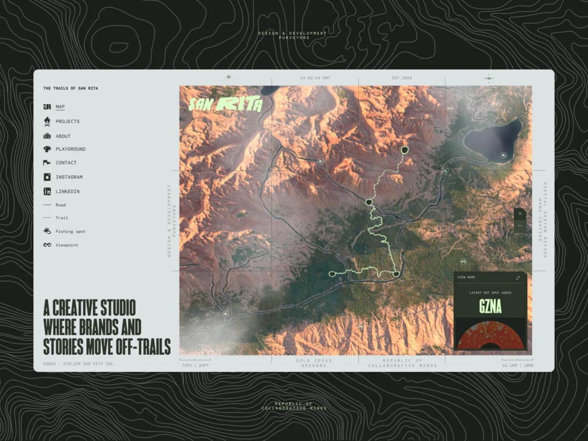
In an era of homogenized web design—where minimalist grids, stock photography, and template-driven layouts dominate the digital landscape—the Montreal-based studio Atelier San Rita has chosen a different path. Their newly launched website, sanrita.ca, serves as more than a standard portfolio; it is a meticulously crafted 3D landscape that bridges the gap between high-performance technical engineering and the raw, nostalgic aesthetic of mid-century National Park topography.
By rejecting the "sterile" conventions of the industry, San Rita has turned its digital flagship into a living, breathing territory. This article explores the year-long development of the site, the technical hurdles of bringing high-fidelity 3D into the browser, and what this project signifies for the future of digital craft.
The Philosophy: Rejecting the "Default" Web
For years, the creative industry has trended toward a standardized "clean" aesthetic. While functional, this approach often leaves portfolios feeling cold, clinical, and interchangeable. For Julien Sister, Alexis Malin, and Martin Thienpont, the founders of Atelier San Rita, the goal was to create a space that felt less like a directory of services and more like a home.
"We wanted our site to be a real territory," the team explains. "We wanted to capture both the technical precision of our craft and our deep-rooted love for the outdoors."
The studio, which splits its inspiration between the creative grit of Montreal and the vast, untamed wilderness of the Canadian landscape, sought to infuse that contrast into their UI. They looked to the 1950s—the era of sun-faded topographic maps, hand-drawn elevations, and tactile paper textures—to find a "soul" they felt was missing from modern web design. This became the North Star for the project: using code not just for functionality, but as a medium for atmospheric storytelling.
Chronology of a Digital Expedition
The development of sanrita.ca was not a linear sprint but a year-long evolution of trial, error, and refinement.
Phase 1: Conceptualization and Prototyping
The project began with a fundamental question: How can we translate the tactile, nostalgic charm of vintage cartography into a living 3D experience? The team spent the early months defining "Digital Craft." They moved away from the idea of listing services and toward the concept of an interactive, exploratory map.
Phase 2: Building the Terrain
To ensure the map felt authentic, the team bypassed generic 3D modeling. They utilized real-world GPS data and heightmaps to generate the initial topography. These were imported into Blender, where the team meticulously sculpted the terrain to ensure it felt intentional and organic.
Phase 3: The Performance Tug-of-War
As the models grew in detail, the project hit a technical wall. High-poly meshes were beautiful but rendered the site unusable on mobile devices. The team entered a "tug-of-war" phase between aesthetic desire and technical feasibility. They were forced to "kill their darlings," moving from high-resolution sculpts to optimized, low-poly meshes, utilizing Adobe Substance 3D Painter to bake intricate textures into the surface.
Phase 4: Refinement and Shaders
In the final months, the focus shifted to the "paper" feel. The team spent weeks writing custom GLSL shaders to inject noise, grain, and specific light-reactive materials into the 3D environment. The objective was to make the digital space feel like it could be touched, moving away from the "plastic" sheen often associated with WebGL projects.
Supporting Data: Technical Specifications and Optimization
The performance of sanrita.ca is a masterclass in modern web engineering. Managing a persistent 3D world alongside a high-performance HTML layer requires a complex orchestration of assets.
- Global Canvas Architecture: Unlike traditional sites that unmount and remount 3D scenes during navigation, San Rita implemented a "global" canvas. By keeping the canvas mounted outside the main Next.js App Router, the terrain remains active, allowing the camera to dive into specific coordinates seamlessly.
- Compression and Loading: The team leveraged Draco compression for 3D assets and KTX2 for textures, significantly reducing the GPU memory footprint compared to standard JPEGs.
- Adaptive Quality Systems: To ensure fluidity, the site features an adaptive system that monitors frame rates. If the system detects a drop in performance, it subtly reduces shadow resolution or grain density, ensuring the user experience remains stable across various hardware tiers.
- Navigation Logic: The interaction between the user’s scroll and the camera is handled through a combination of Lenis (for smooth scroll) and GSAP (for animation timing). This creates a "cinematic glide" that keeps the 3D world feeling responsive yet deliberate.
Official Perspective: The "Digital Carpenter"
When asked about the lessons learned during the build, the team at Atelier San Rita speaks with the measured tone of artisans. They note that the project’s greatest challenge was restraint.
"We had versions with birds flying over the map, interactive weather systems, and full day-night cycles," the studio notes. "We realized those features were distractions from the core story. We had to learn that the most powerful digital experiences aren’t the ones with the most features, but the ones with the most cohesive atmosphere."
This ethos extends to their view on the current state of the industry. Amidst the rise of AI-generated layouts, the studio argues that human intuition is becoming a premium commodity. Their approach to "Digital Craft"—obsessing over the shade of a specific green or the intensity of a grainy overlay—is, in their words, "the digital equivalent of a carpenter obsessing over the grain of a piece of wood."
Implications: A New Standard for Portfolios?
The success of sanrita.ca suggests a potential shift in how creative agencies will present themselves in the coming years. By moving away from the static "grid of thumbnails" and toward an immersive "narrative space," San Rita has raised the bar for what a portfolio can achieve.
1. The Death of the "Gimmick"
Many 3D sites fall into the trap of gimmicky navigation where the user feels they are fighting the UI. San Rita proves that when the technology disappears behind the experience, the 3D elements become a bridge rather than a barrier.
2. Living Documentation
The studio’s vision for "Version 2"—where their headless CMS (DatoCMS) automatically populates the map with new landmarks as projects are added—points toward a future of "living" portfolios. This creates a direct, visual link between the studio’s output and its digital identity.
3. Humanizing the Digital
In an era where the web is becoming increasingly automated, San Rita’s work stands out because of its inherent "imperfections." The intentional inclusion of grain, tactile paper textures, and organic topographic shapes serves as a reminder that the web is a creative medium, not just a delivery system for information.
Conclusion: An Invitation to Explore
San Rita is more than a destination; it is an evolving product that mirrors the growth of the studio itself. For Julien Sister, Alexis Malin, and Martin Thienpont, the site is an invitation to step off the beaten path. By blending deep technical mastery with a raw, creative soul, they have created a space that demands attention—not because it is flashy, but because it feels authentic.
As the industry continues to grapple with the tension between automation and artistry, Atelier San Rita’s work provides a compelling answer: digital craft is not about the newest tech, but about how that tech is used to tell a story. Whether it is the subtle movement of the camera or the hand-drawn feel of the terrain, the site is a testament to the power of a small, dedicated team choosing to build a home rather than a portfolio.
For those looking to understand the future of digital storytelling, sanrita.ca is not just a site to visit—it is a map to be followed.


 Evan Lee Salim
 Rifan Muazin

 Lina Irawan

 Pevita Pearce

 Suro Senen

 Muslim

 Ammar Sabilarrohman

 Raul Delapena Setiawan
