
 Suro Senen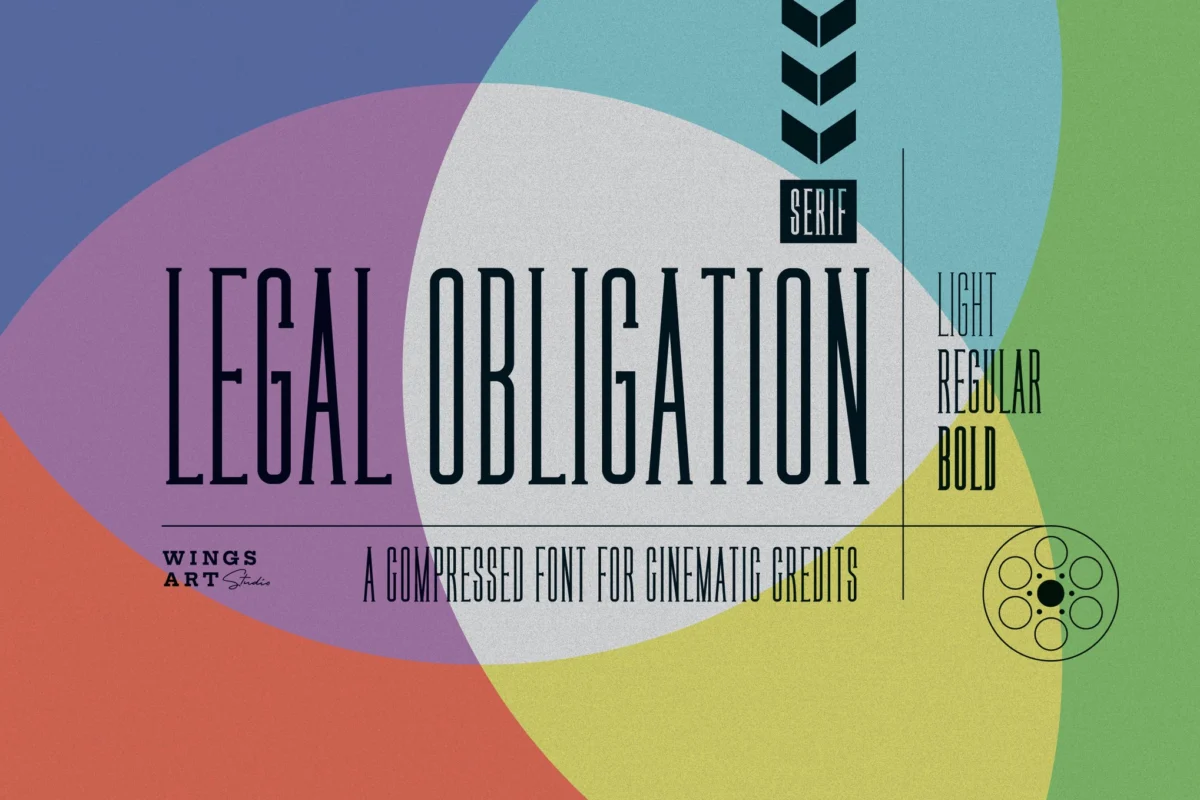
In the high-stakes world of real estate, the first impression is rarely made by a handshake or a physical walkthrough; it is made by the visual identity of a brand. Whether it is a luxury property listing, a corporate prospectus, or an agent’s digital business card, the typeface chosen is the silent ambassador of a company’s values. Good design acts as an immediate signal of professionalism, and in an industry built on the foundation of trust, your choice of font plays a pivotal role in establishing that connection.
This comprehensive guide explores how to elevate your visual identity through curated typography. From bold, authoritative logos that demand attention to clean, readable layouts for property flyers, the right typeface ensures your message is not only seen but felt.
The Psychology of Real Estate Typography
Typography is more than just the aesthetic arrangement of letters; it is a psychological tool. In real estate, the target audience is diverse—ranging from first-time homebuyers seeking clarity and warmth, to high-net-worth investors looking for stability and institutional-grade sophistication.
Classic serifs often evoke a sense of heritage, reliability, and timelessness, making them ideal for established luxury brokerages. Conversely, geometric sans-serifs convey modernism, efficiency, and a forward-thinking attitude, which resonates well with urban developers and tech-driven startups. By selecting a font that aligns with your brand personality, you create a cohesive visual language that guides the consumer’s emotional response before they even read a single word of your copy.
Premium Typefaces for Modern Real Estate Branding
To maintain a competitive edge, many agencies turn to premium typefaces that offer unique character sets and multilingual support. Below is an analysis of top-tier fonts that define contemporary real estate design.
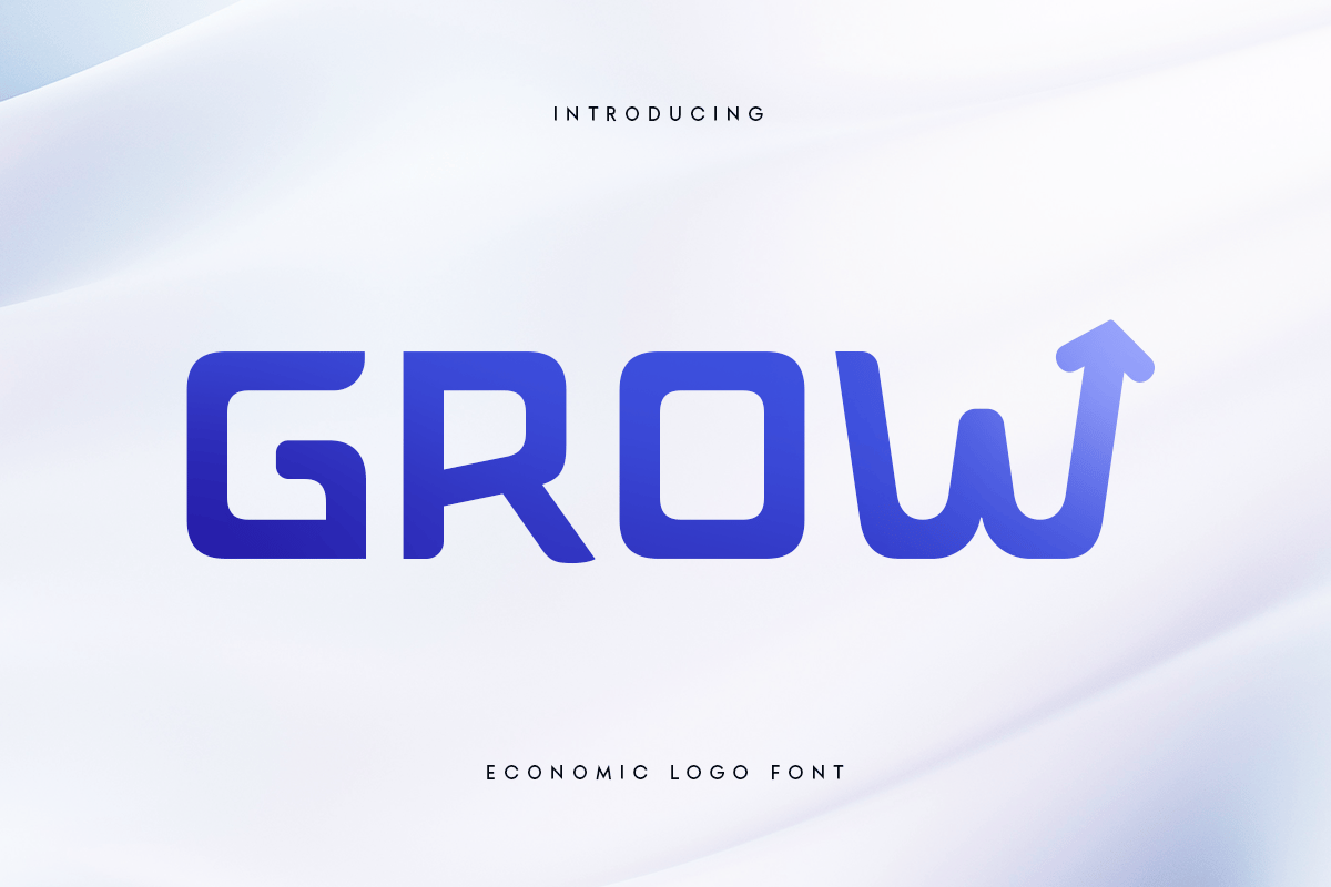
1. Grow: The Economic Logo Powerhouse
Grow is designed for the modern business world, balancing elegance with structural efficiency. Its unique character set makes it a formidable choice for logos and corporate headers. It provides a polished, innovative image for companies looking to signal growth and stability.
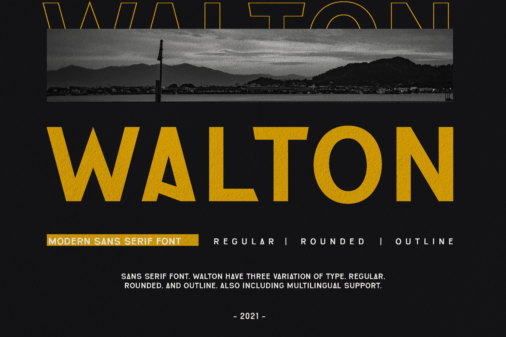
2. WALTON: The Sophisticated Sans-Serif
WALTON is a masterclass in modern sans-serif design. It is highly versatile, pairing effortlessly with minimalist layouts to add a touch of "quiet luxury." Its clean lines make it an excellent choice for brochures that feature high-end photography, as it provides information without distracting from the visual assets.
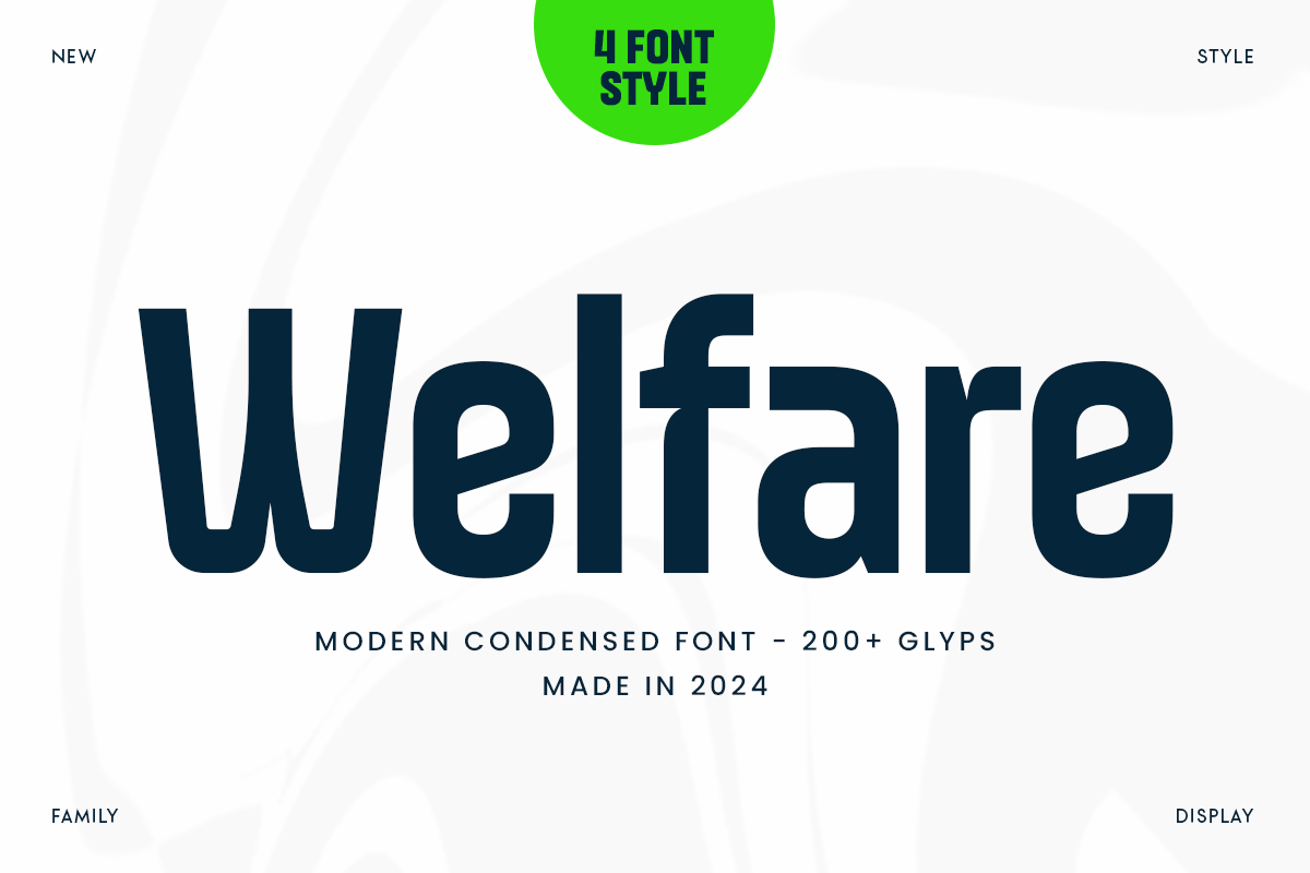
3. Welfare: The Condensed Authority
For agencies that require impactful messaging in limited space, Welfare offers a condensed, sleek profile. Available in four styles, it is perfect for project-specific branding, such as new residential developments where the name needs to be bold, readable, and distinctly modern.
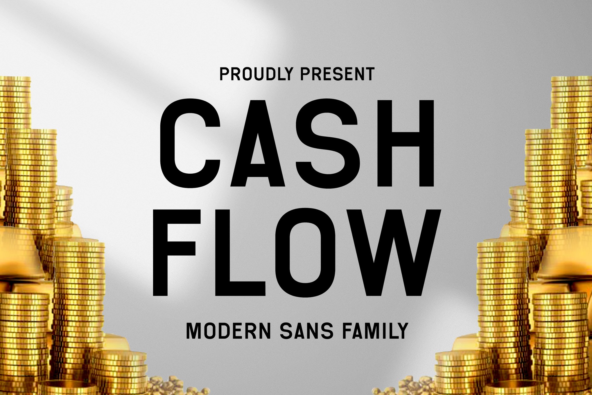
4. Cash Flow: The Elegant Standard
True to its name, Cash Flow brings an element of refined professionalism to the table. Its high-contrast letterforms are ideal for magazines and high-end advertising, where the goal is to make the reader feel they are engaging with a premium, well-established firm.
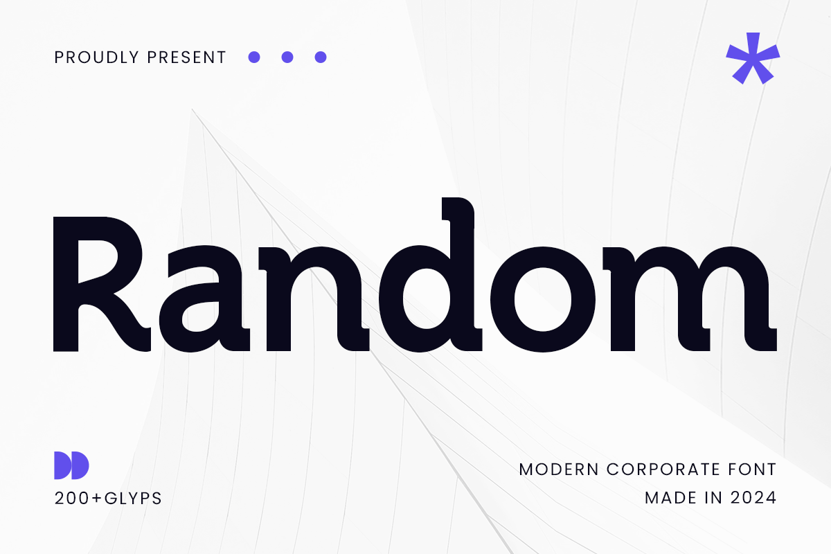
5. Random: The Modern Corporate Choice
Random excels in the corporate arena. Its design imparts a sense of authority, making it a reliable choice for long-form presentations and digital media. It supports a wide array of languages, ensuring that global real estate firms can maintain a consistent brand identity across international markets.
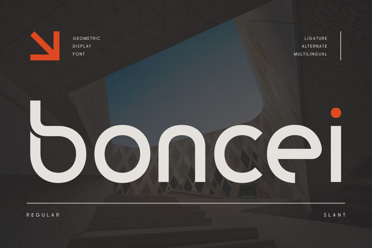
6. Boncei: The Geometric Precisionist
Boncei is a geometric powerhouse. Its balanced shapes and clean lines are particularly well-suited for tech-focused real estate startups or firms specializing in modern, sustainable architecture. With support for 85 languages, it is built for scalability.
Technical Specifications and Design Implications
When selecting a typeface for real estate, you must consider the technical environment. A font that looks stunning on a high-resolution billboard may lose its integrity when shrunk to fit a mobile-optimized property listing.
The Role of Legibility
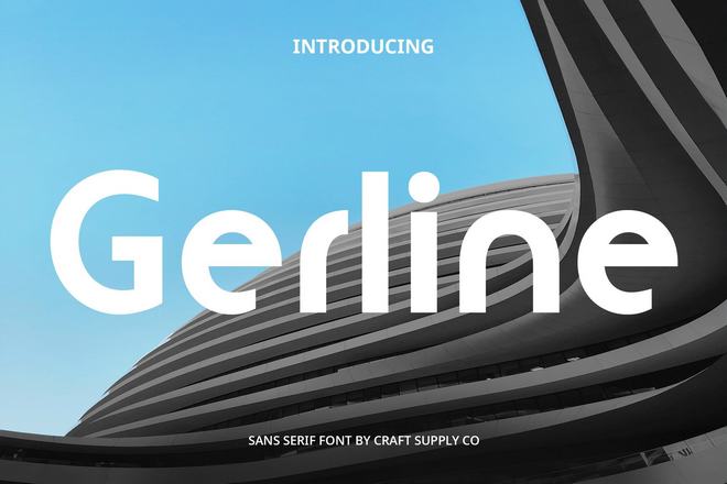
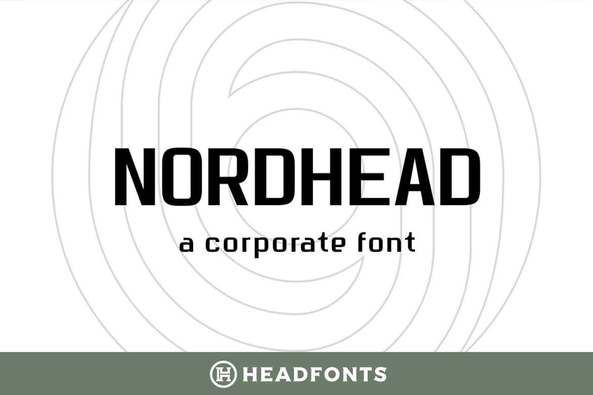
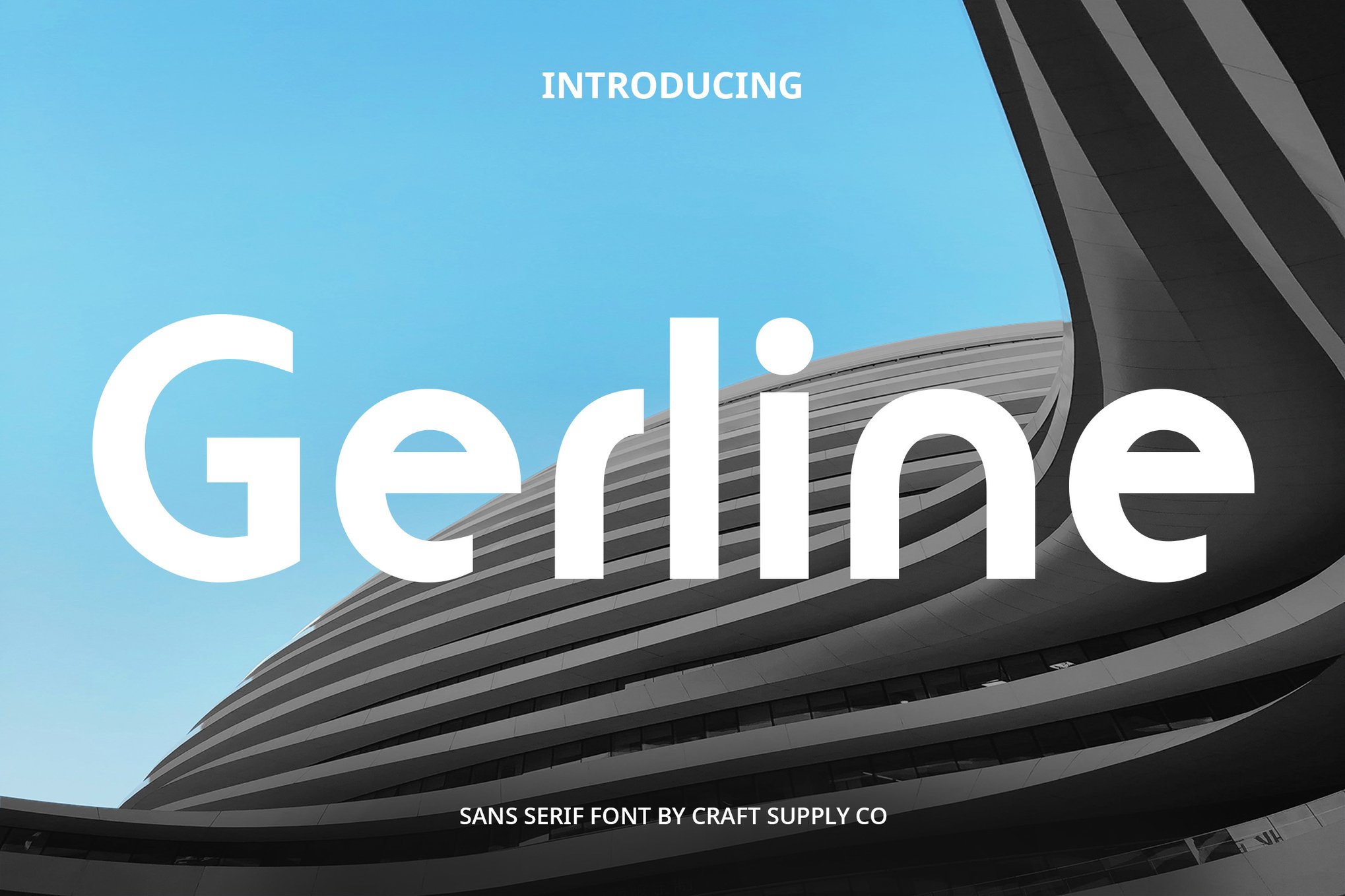
The primary function of a font in real estate is communication. Property descriptions often contain dense data—square footage, zoning regulations, and legal disclosures. Typefaces like Nordhead and Gerline are designed with a focus on legibility. Nordhead, with its 258 glyphs and clean, gentle curves, remains readable at small sizes, making it perfect for printed flyers and posters.
Cross-Platform Versatility
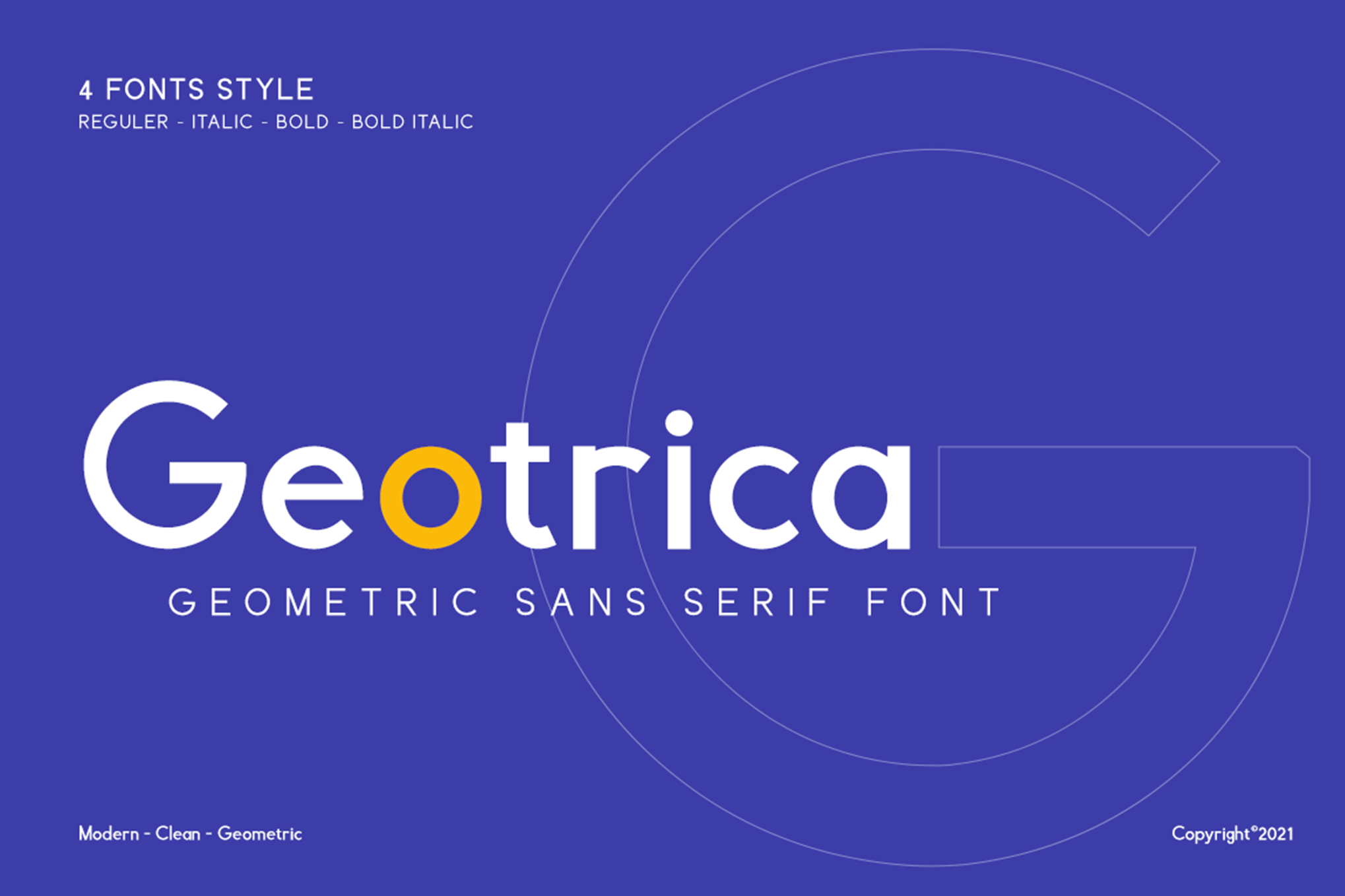
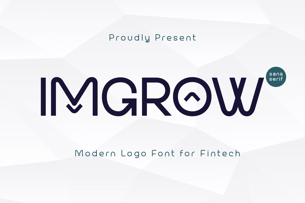
Modern real estate is a digital-first industry. Files must be accessible in formats like OTF, WOFF, and TTF to ensure consistency across websites, email marketing, and social media platforms. Fonts such as Geotrica and Imgrow offer this cross-platform flexibility. Geotrica is PUA encoded and provides both light and bold weights, allowing designers to create a clear visual hierarchy between headlines and body text.
The Strategic Advantage of Font Pairing
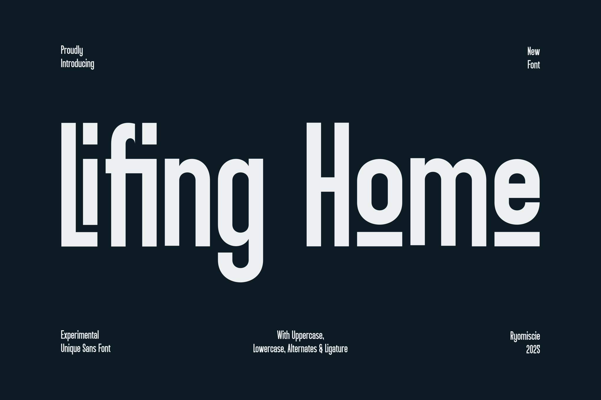
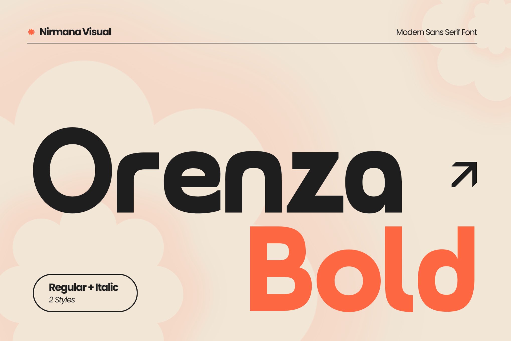
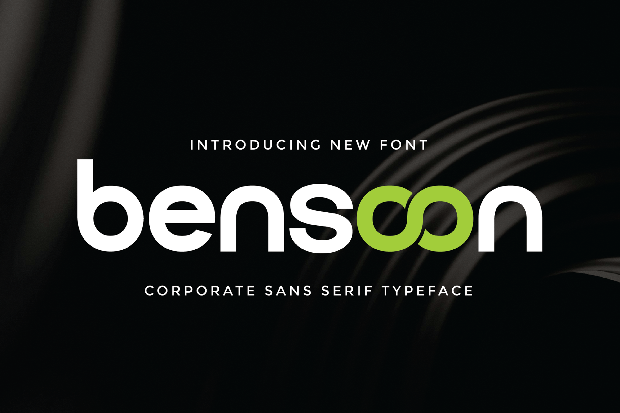
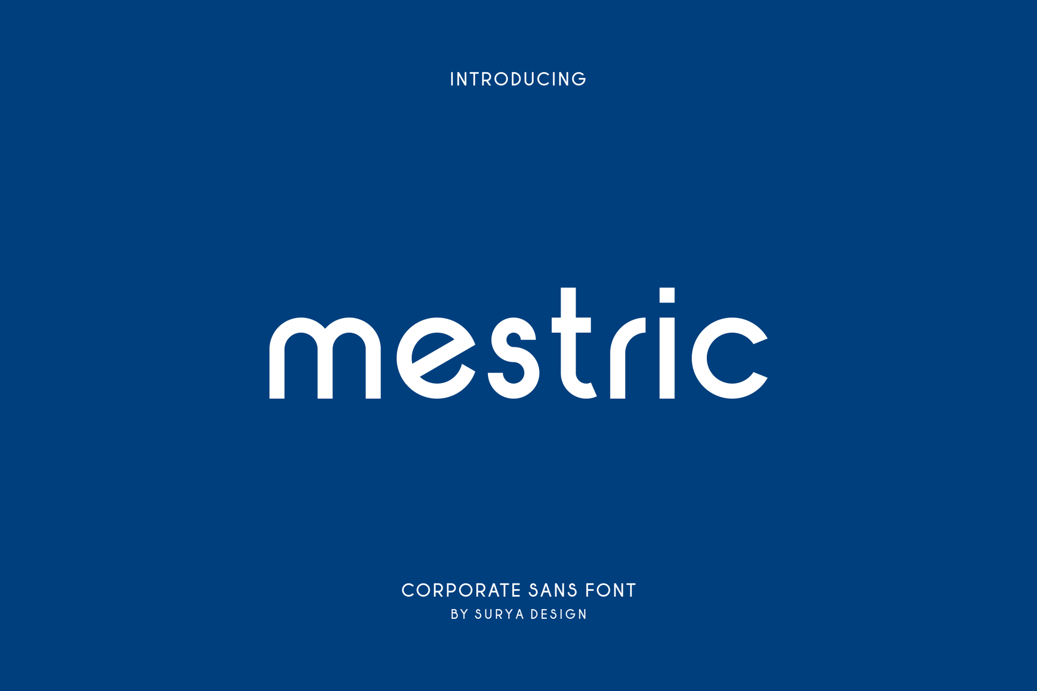
A common mistake in real estate branding is the overuse of a single font. Professional designers often utilize "font pairing" to create a balanced narrative. A strong, distinctive display font like Lifing Home or Orenza Bold can serve as the "voice" of your brand in a logo, while a highly legible, neutral sans-serif like Bensoon or Mestric handles the functional requirements of your website or brochure.
- Professionalism: Use serif fonts for high-end, historical property marketing.
- Innovation: Use geometric sans-serifs for new builds and urban developments.
- Trust: Use clean, balanced, and open fonts for legal and financial documentation.
Accessible Excellence: The Best Free Fonts
Not all high-quality branding requires a premium budget. The open-source and free-to-use font market has matured significantly, providing professional-grade tools for independent agents and boutique agencies.
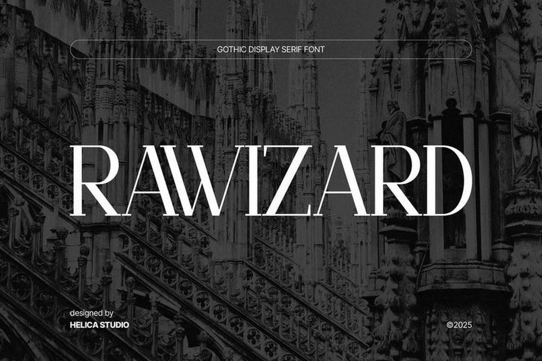
Rawizard: Architectural Elegance
Rawizard features strong, structural letterforms that mirror the lines of modern architecture. It is an excellent free option for agencies that want a high-end look without the licensing costs associated with premium foundries.
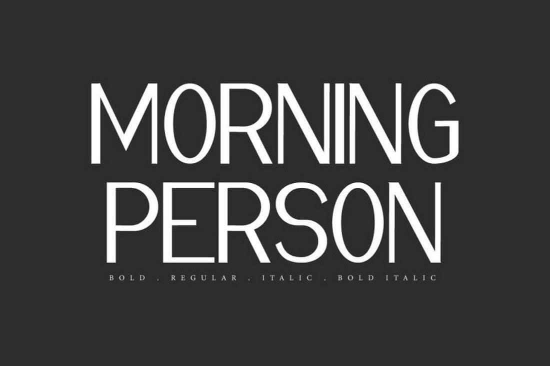
Morning Person: The Welcoming Touch
Real estate is ultimately about people. Morning Person offers warm, approachable, and open shapes. It is ideal for marketing materials targeting first-time buyers, as it removes the "stiff" corporate feel and replaces it with a welcoming, human-centric tone.
Mirano: The Contemporary Classic
Mirano bridges the gap between traditional serif elegance and modern sans-serif utility. It is incredibly versatile, working just as well in a luxury brochure header as it does in the body text of an email campaign.
PT Sans: The Industry Standard
If you need a reliable workhorse, PT Sans is the gold standard. It is clean, legible, and neutral. Its design is unobtrusive, allowing the property images to take center stage—which is often the most critical requirement in real estate marketing.
Conclusion: The Long-Term Impact of Good Typography
Typography is a long-term investment in your brand’s equity. As the real estate market continues to shift toward digital-first interactions, the consistency and quality of your visual identity will dictate how your brand is perceived by potential clients.
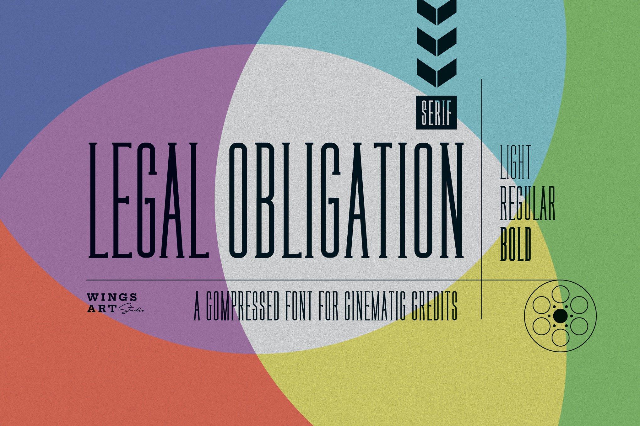
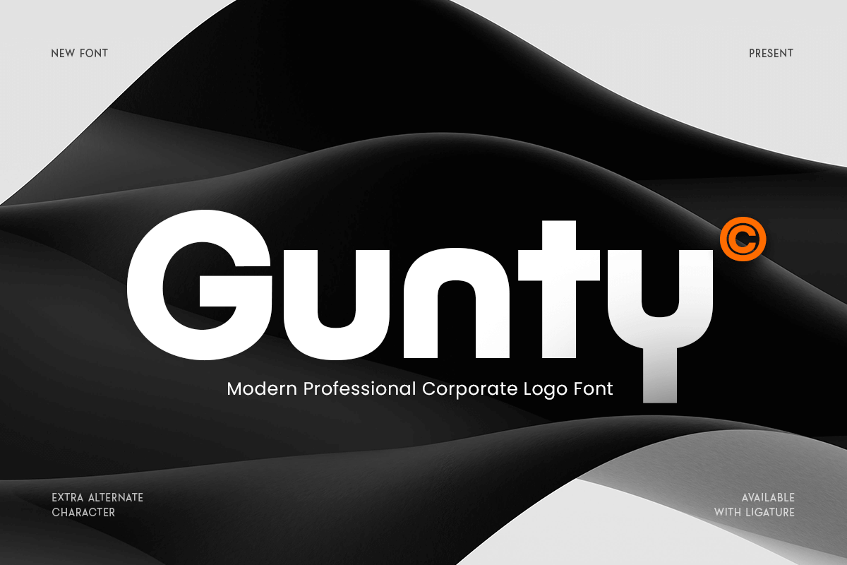
By moving beyond default fonts and selecting typefaces that reflect the specific ethos of your business—whether that is the sleek, tech-forward nature of Gunty or the refined, classic appeal of Legal Obligation—you are building a visual shorthand for quality.
Remember, in a crowded market, your font is the first thing a client sees and the last thing they remember. Choose wisely, prioritize legibility, and ensure that your typography communicates the professionalism and reliability that your clients demand. Whether you choose to invest in premium typefaces or leverage the power of high-quality free fonts, the goal remains the same: to create a visual experience that is as enduring as the properties you represent.

 Reynand Wu
 Evan Lee Salim
 Basiran
 Neng Nana
 Iffa Jayyana
 Raul Delapena Setiawan
 Rifan Muazin
 Asro
Asro