
 Iffa Jayyana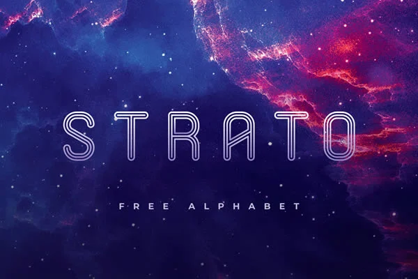
In the rapidly evolving landscape of digital design, the tools we use to convey information are as vital as the information itself. Among these tools, typography stands as the silent communicator, setting the tone for every interaction between a brand and its audience. In recent years, a specific aesthetic has risen to the forefront of modern design: the futuristic font. Characterized by geometric precision, minimalist sensibilities, and an almost architectural approach to letterforms, these typefaces are no longer confined to the realms of science fiction. They are now foundational elements in contemporary visual identity, serving as the bridge between current innovation and future-thinking creative work.
The Evolution of the Modern Aesthetic: A Chronology of Style
The history of futuristic typography is intrinsically linked to the technological advancements of the 20th and 21st centuries.
- The Early Modernist Influence (1920s–1950s): The roots of modern, "futuristic" design can be traced back to the Bauhaus movement. By stripping away ornamentation in favor of geometric purity, designers began to view letters as shapes rather than just symbols.
- The Sci-Fi Boom (1960s–1980s): As cinema began to explore space travel and dystopian futures, type designers experimented with "techno" fonts. These were often characterized by heavy weights, stencil-like cuts, and wide tracking, reflecting the hardware-centric view of the future.
- The Digital Revolution (1990s–2010s): With the rise of home computing and gaming, fonts became more experimental. The advent of vector software allowed for the creation of complex, high-precision typefaces that mirrored the digital environments of video games and early internet interfaces.
- The Contemporary Era (2020–Present): Today, we are seeing a synthesis. Current futuristic fonts balance the "high-tech" look of the past with a newfound focus on legibility and versatility. They are no longer just for posters; they are optimized for UI/UX, responsive web design, and high-resolution mobile interfaces.
Supporting Data: Why Geometry Commands Attention
Psychological studies in visual perception consistently show that our brains favor geometric order. Futuristic fonts capitalize on this by utilizing:
- Uniform Stroke Widths: This creates a sense of consistency and balance, which viewers subconsciously associate with stability and technological reliability.
- Negative Space Management: Many futuristic typefaces use tight or deliberate spacing to emphasize the "digital" nature of the text, forcing the eye to engage more actively with the characters.
- Angular vs. Rounded Tension: By mixing sharp, aggressive angles with soft, futuristic curves, designers can create visual "friction" that makes a brand mark or headline more memorable.
Market research indicates that brands utilizing "innovative" or "minimalist" typography often report higher engagement rates in tech-heavy sectors. When a company adopts a sleek, sans-serif, geometric font, it signals to the consumer that the brand is forward-thinking, efficient, and, most importantly, current.
Strategic Implications: Brand Perception and Authority
The selection of a typeface is not a purely aesthetic choice; it is a strategic business decision. In a saturated digital market, a company’s font choice is often the first "non-verbal" cue a consumer receives.
When a brand shifts from a traditional serif to a futuristic geometric font, the implication is clear: we are evolving. This is why tech startups, gaming studios, and modern advertising agencies rely so heavily on this aesthetic. It creates an aura of sophistication. A brand that uses a font reminiscent of a HUD (Heads-Up Display) in a sci-fi film is immediately associated with the precision of coding, the mystery of space, and the promise of tomorrow.
A Curated Selection: High-Quality Futuristic Fonts
To assist designers in achieving this aesthetic, we have compiled a selection of the most effective, free-to-access, and professionally designed futuristic typefaces available today.
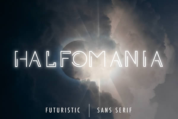
1. Halfomania Sans-Serif
Halfomania is a masterclass in balance. By pairing sharp, authoritative uppercase characters with softer, rounded lowercase letters, it offers a dual personality. It is the ideal choice for projects that require a modern, innovative edge without sacrificing readability.
2. Science Modern Futuristic Font
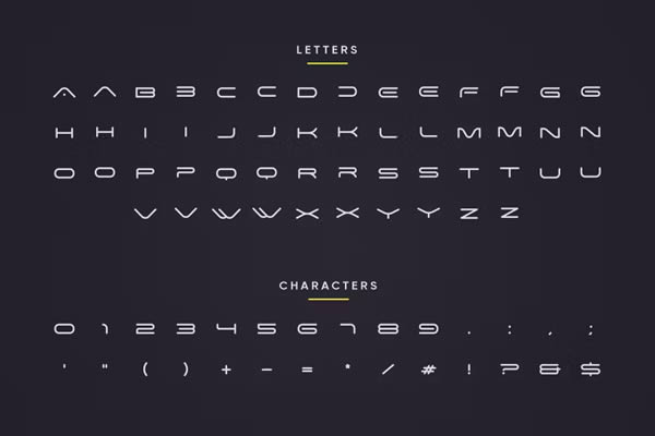
As the name suggests, this font is the quintessential "sci-fi" typeface. It is minimalist, precise, and clean. It comes in two variants, making it incredibly useful for creating cohesive hierarchies in UI design.
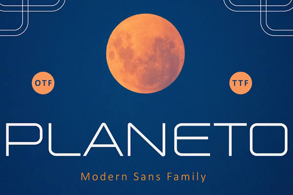
3. Planeto
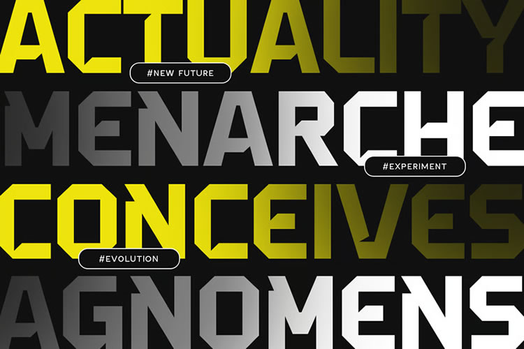
For those seeking a bolder, more structural impact, Planeto is a standout. Consisting of purely uppercase, geometric characters, its sharp angles evoke the feeling of advanced hardware. It is perfect for logo marks or high-impact headlines.
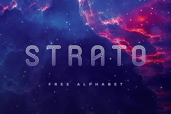
4. Strato: The Outline Specialist
Strato takes a unique approach by utilizing an outline-based structure. Its mix of rounded corners and smooth lines gives it a sophisticated, architectural feel that is difficult to replicate with solid fonts.
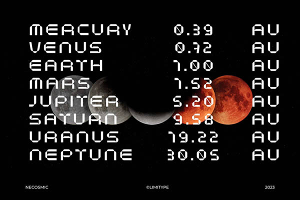
5. Necosmic
If your project requires an "otherworldly" aesthetic, look no further than Necosmic. Its elongated, cosmic-inspired lines feel like a transmission from a distant galaxy. It is highly recommended for branding that touches on the themes of space or high-concept technology.
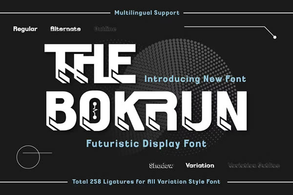
6. The Bokrun
Bokrun offers a versatile set of tools, including regular, outline, and shadow variants. Its angular, sharp design makes it particularly well-suited for gaming UIs, where clarity and an "edgy" aesthetic are paramount.
7. Great Futuristic Sans-Serif
This is a bold, modern display font. It is designed to represent power and innovation. It works best in large sizes, making it an excellent choice for cinematic posters or impactful digital advertisements.
8. Coder: The Minimalist’s Choice
Coder is built on the logic of code. It blends angular and rounded shapes to create a digital, precise look. It is an excellent choice for software documentation, tech blogs, or any interface-heavy project.
9. Lombok
Lombok is a favorite among professional logo designers. Its sharp, geometric lines are incredibly clean, making it highly scalable. Note: The light version is available for personal use, allowing designers to experiment with its elegant aesthetic.
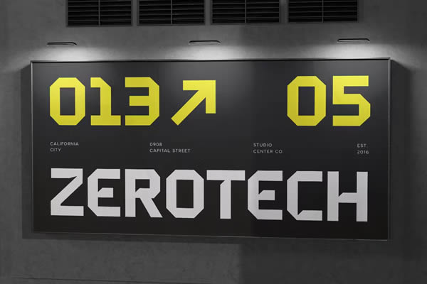
10. Venera
Venera provides a rare level of flexibility for a free font, with weights ranging from light to heavy. This allows for a full, consistent design system across different mediums, from print to mobile.
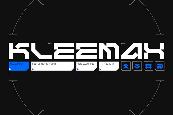
11. Kleemax
For those drawn to the "cyberpunk" aesthetic, Kleemax is essential. Its combination of bold, sharp angles and smooth curves captures the chaotic yet precise energy of modern high-tech design.
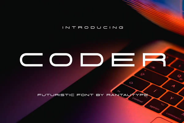
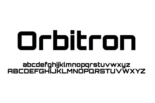
12. Orbitron
A staple in the design community, Orbitron is a classic for a reason. Its clean, geometric shapes and multiple weights (light, medium, bold, black) make it an incredibly reliable choice for any space-age or technical branding project.
13. Angular
Dystopian and bold, Angular is not for the faint of heart. Its sharp lines are designed to make a statement. If your project needs to feel edgy and high-stakes, this is the typeface for the job.
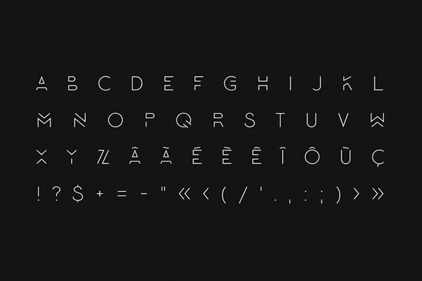
14. Stifly
Stifly blends the retro charm of pixelation with a modern blocky structure. It is a fantastic choice for bold, loud headlines that need to capture attention in a busy digital feed.
15. Potra
Potra is an all-caps font that feels remarkably elegant. Its rounded, geometric design provides a smooth, futuristic look that is highly readable across both print and digital platforms.
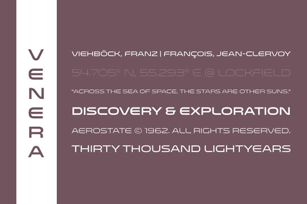
16. Monoton
Monoton offers a unique, looping aesthetic. It sits at the intersection of retro-futurism and modern display design, making it perfect for creative projects that need a distinct, rhythmic visual hook.
17. Mars
Blocky, heavy, and undeniably bold, Mars is a display font that commands authority. Because of its complexity, it is best reserved for strong, impactful headings where legibility is secondary to style.
18. Space
Space captures the order and form of futuristic engineering. By utilizing large block elements and curved edges, it mimics the aesthetics of high-tech machinery and spacecraft.
19. Exo
Exo is a versatile, geometric sans-serif that excels in readability. Its precise lines make it a workhorse for modern digital interfaces, proving that a font can be both "futuristic" and highly functional.
Conclusion: Crafting the Future
The choice of typography is an invitation for the viewer to engage with your vision of the future. By selecting from these professionally curated, futuristic fonts, you are not just choosing a style—you are setting the standard for how your work is perceived. Whether you are building a brand identity for a tech startup, designing a UI for an immersive game, or creating a bold advertisement, the right typeface will act as the cornerstone of your creative project.
In a world that is constantly moving forward, ensure your communication is not left behind. Embrace the geometric, the minimalist, and the innovative. Let your words look as advanced as the ideas they represent.

 Lina Irawan
 Pevita Pearce
 Ammar Sabilarrohman
 Suro Senen
 Jia Lissa
 Evan Lee Salim
 Ali Ikhwan