
 Asro
Asro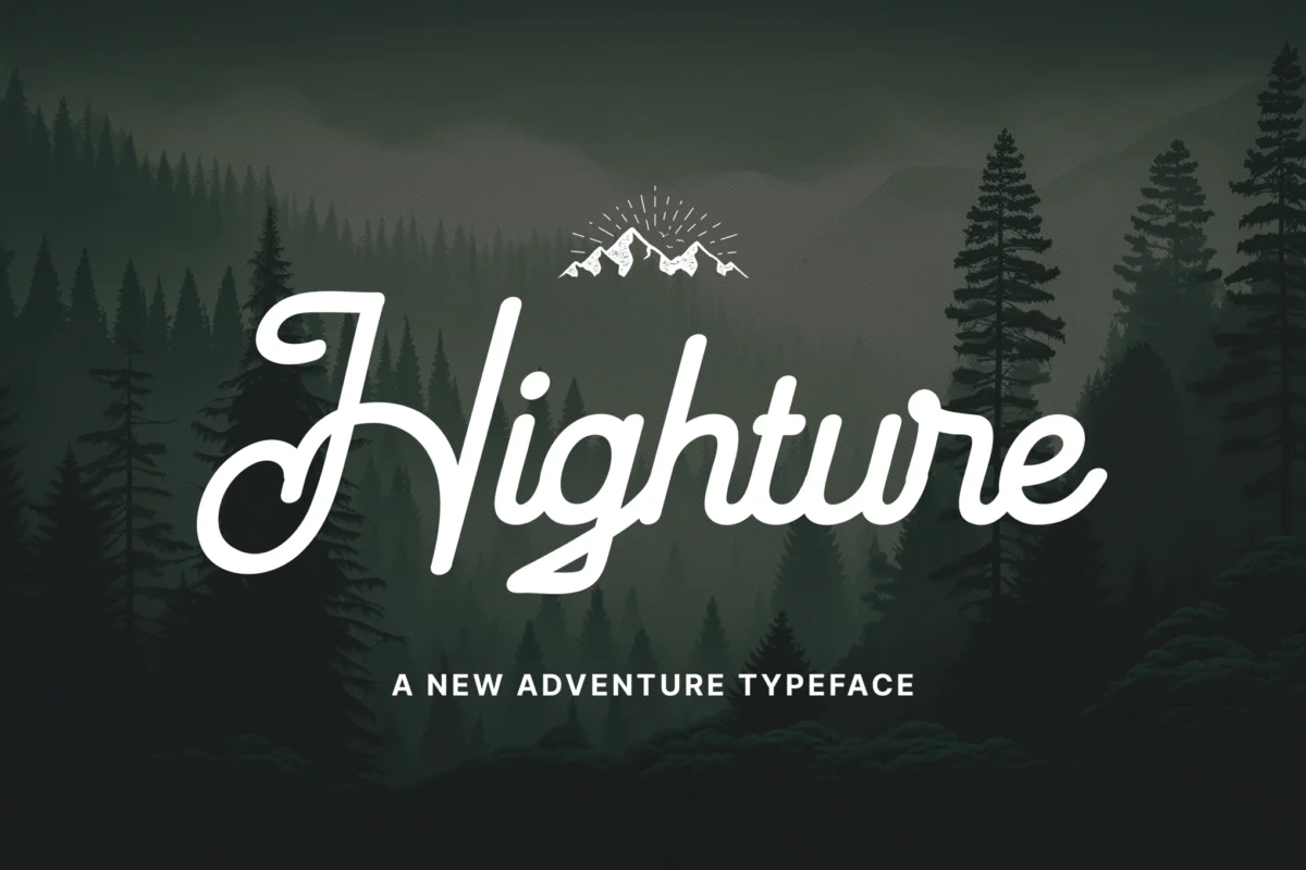
In the world of visual communication, typography acts as the silent ambassador of a brand’s ethos. For the outdoor industry—a sector valued at billions and driven by a consumer desire for escape, ruggedness, and authenticity—the font choice is not merely an aesthetic decision; it is a narrative tool. Recently, "mountain-themed" fonts have surged in popularity, transforming from a niche aesthetic for local hiking clubs into a dominant force in global branding, from craft brewery labels to high-end expedition apparel.

The Evolution of Rugged Typography
The visual language of the outdoors has deep roots in 20th-century expedition photography and vintage cartography. Historically, outdoor branding relied on sturdy, slab-serif fonts that mimicked the lettering found on government-issued topographic maps and wilderness signage.
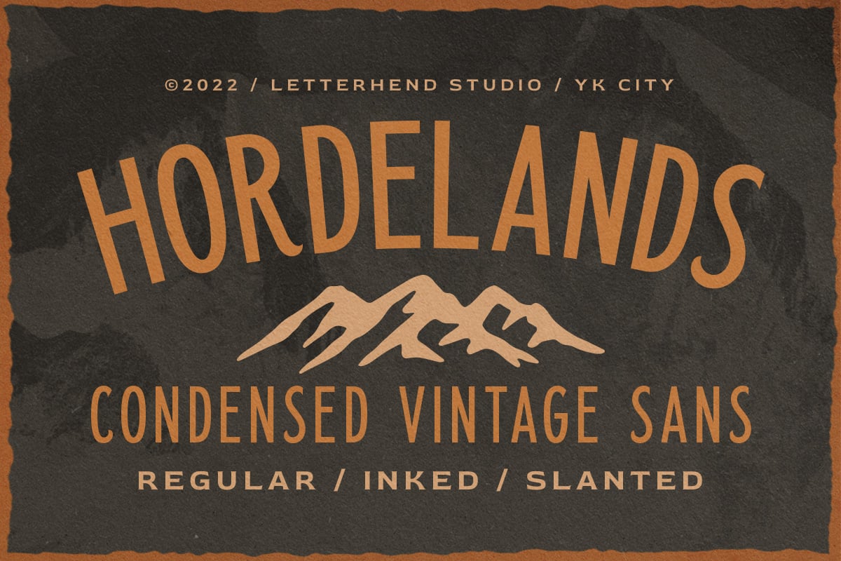
As the "outdoor lifestyle" became a mainstream aesthetic, designers began to pivot toward typography that captured the raw, unpolished energy of the wilderness. This evolution was accelerated by the rise of "heritage branding," where companies sought to evoke the nostalgia of mid-century exploration. Today, mountain-themed fonts—defined by their sharp, angular geometries, weathered textures, and bold, condensed silhouettes—serve as a bridge between the grit of the backcountry and the refined demands of modern graphic design.
Supporting Data: Why "Wild" Fonts Work
The psychological impact of typography is well-documented in design science. Research suggests that fonts with jagged edges or high-contrast, "hand-drawn" qualities trigger associations with durability and manual labor.
- Trust and Reliability: Bold, sans-serif mountain fonts are often perceived as "stable," a crucial attribute for gear manufacturers who want their products associated with safety and reliability in extreme conditions.
- The "Adventure" Trigger: Serif-based scripts or textured display fonts function as semiotic markers for nostalgia, connecting the consumer to a pre-digital era of discovery and exploration.
- Market Versatility: Data from creative marketplaces indicates a 40% year-over-year increase in searches for "rugged," "outdoor," and "adventure" font styles, signaling a broader cultural shift toward slow-living and nature-centric branding.
Curated Selection: The Best Mountain-Themed Typefaces
The current market offers a wide array of options for designers looking to capture the spirit of the peaks.
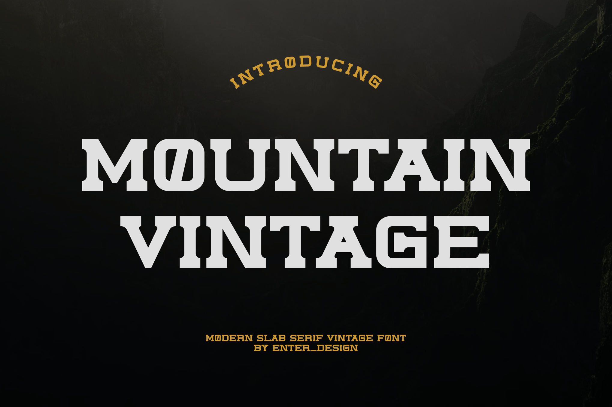
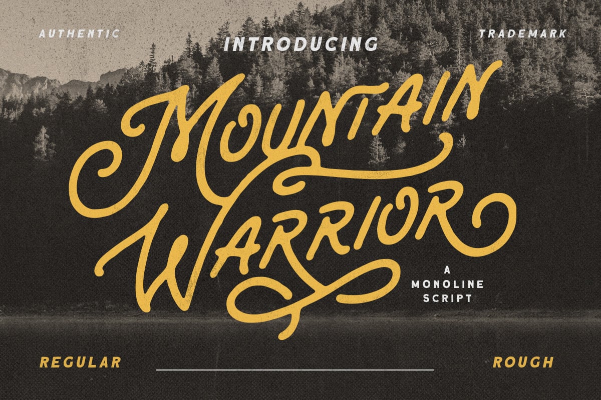
1. Mountain Vintage – The Classic Expedition Standard
Mountain Vintage remains the gold standard for those seeking an authentic, mid-century look. With its bold construction, it excels in high-stakes branding projects like esports teams or outdoor gear logos. Its OTF and TTF versatility makes it a reliable workhorse for designers who need a font that feels like it belongs on a vintage climbing helmet.
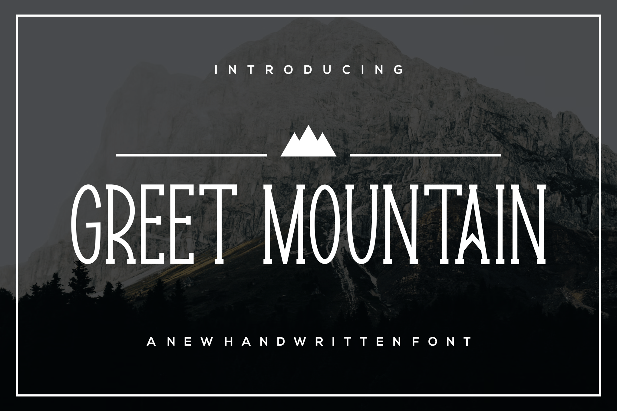
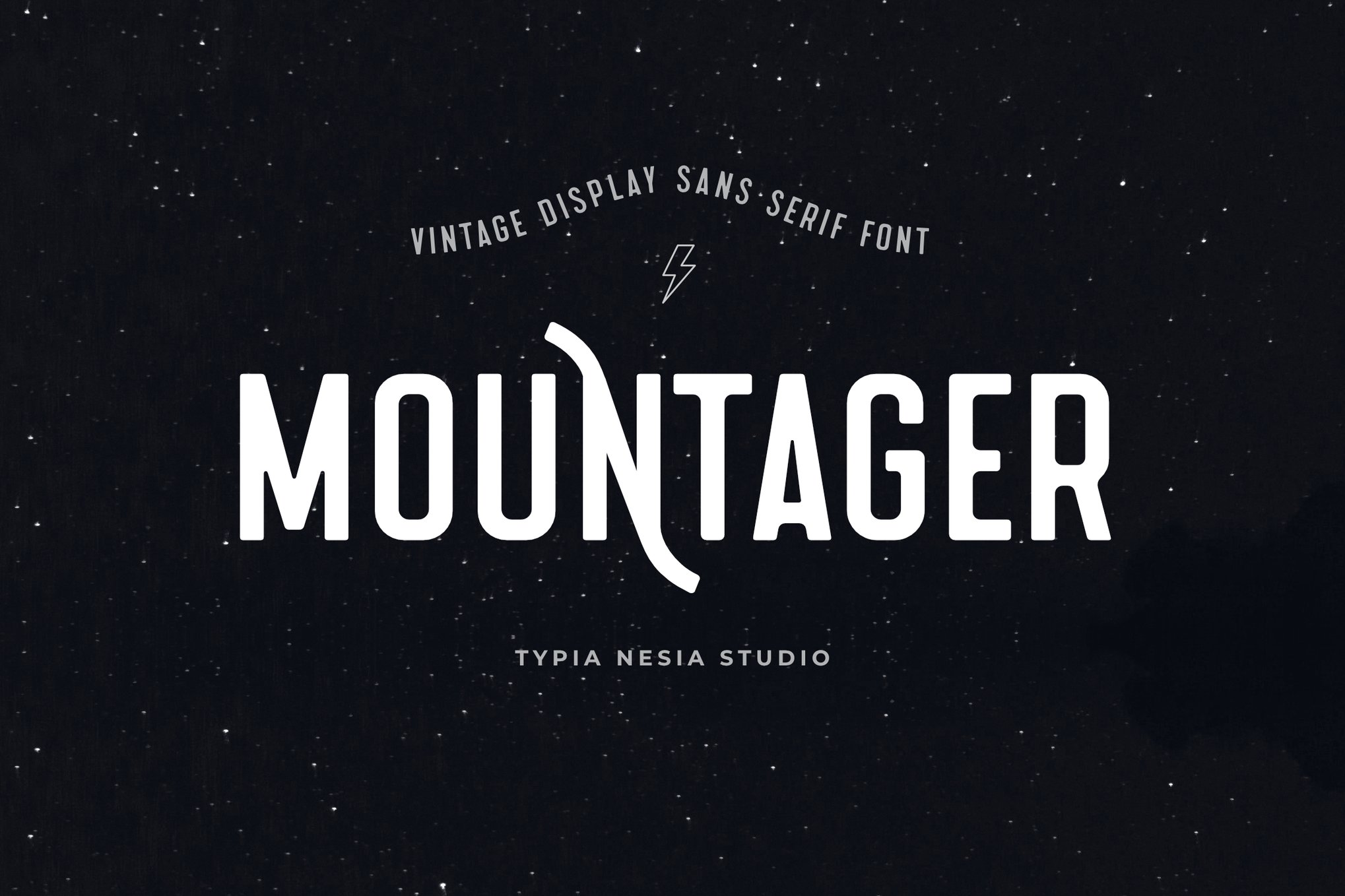
2. Greet Mountain – The Modern Condensed Choice
For projects where vertical space is at a premium, Greet Mountain provides a modern, condensed solution. It strips away the excess, offering a clean yet aggressive look that performs exceptionally well on apparel, particularly t-shirts and technical gear, where legibility at a distance is paramount.
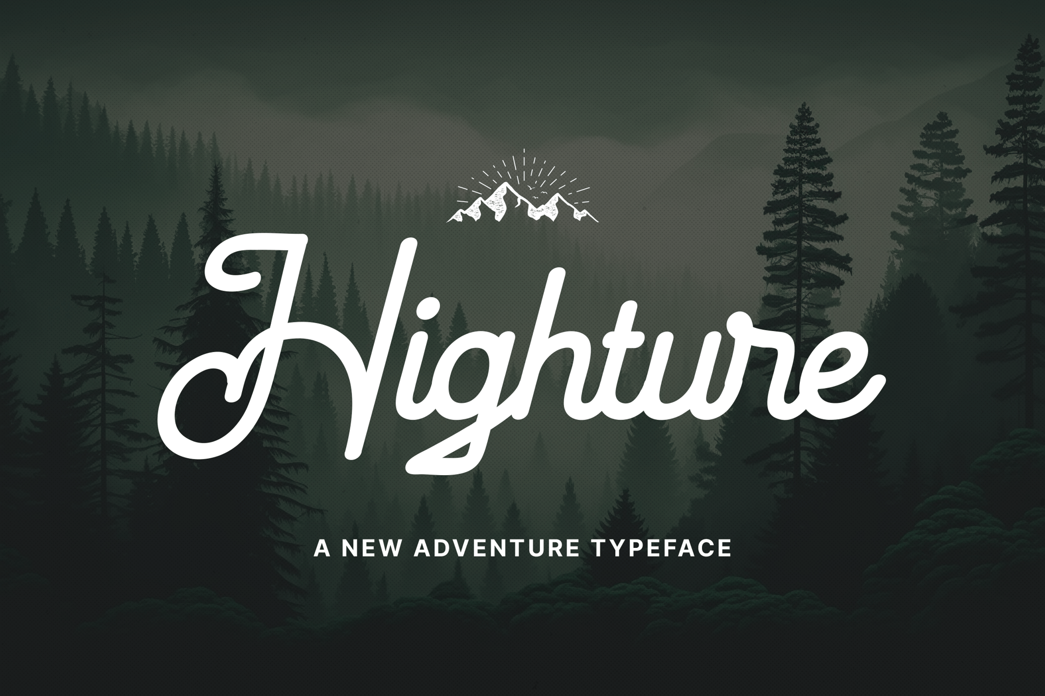
3. Highture – The Elegant Script
Not every outdoor design requires a "rugged" look. Highture bridges the gap between the wild and the refined. Its handwritten, flowing script suggests the personal touch of a travel log or a field journal, making it an excellent choice for lifestyle brands and eco-conscious boutique labels.
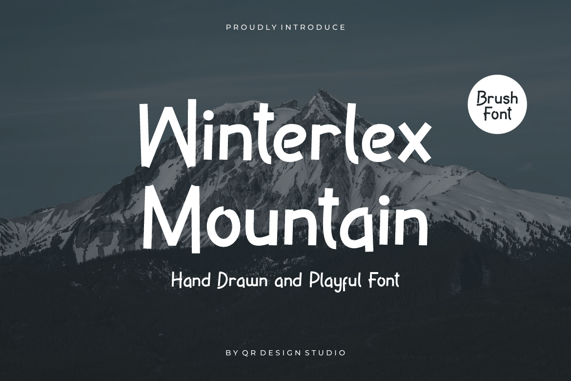
4. Winterlex Mountain – The Brush-Driven Aesthetic
Winterlex is defined by its textured, brush-like quality. It is designed to look as if it were painted onto a trail marker or a wooden cabin sign. Its popularity in kids’ outdoor programs and holiday-themed marketing highlights its ability to balance "rugged" with "approachable."
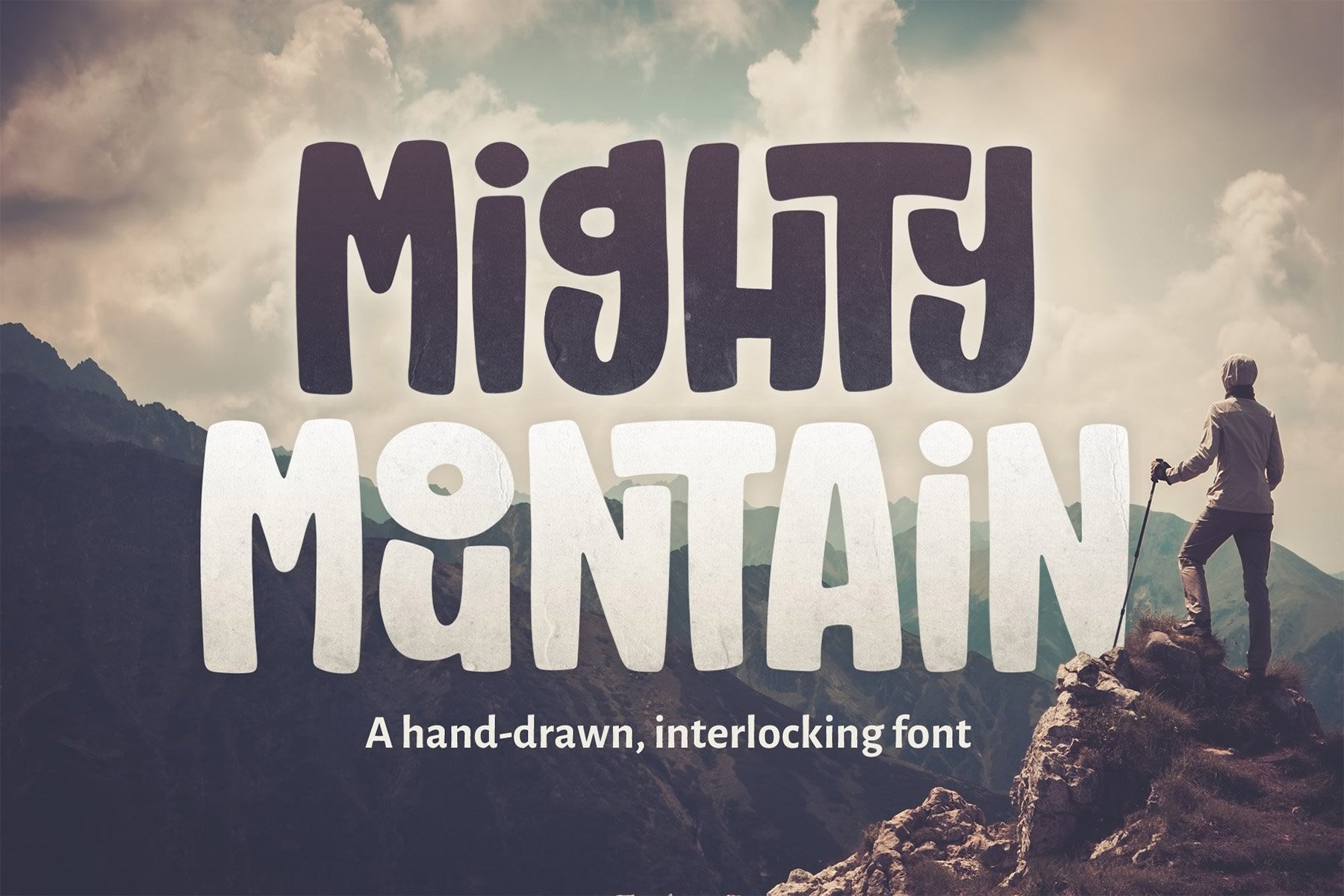
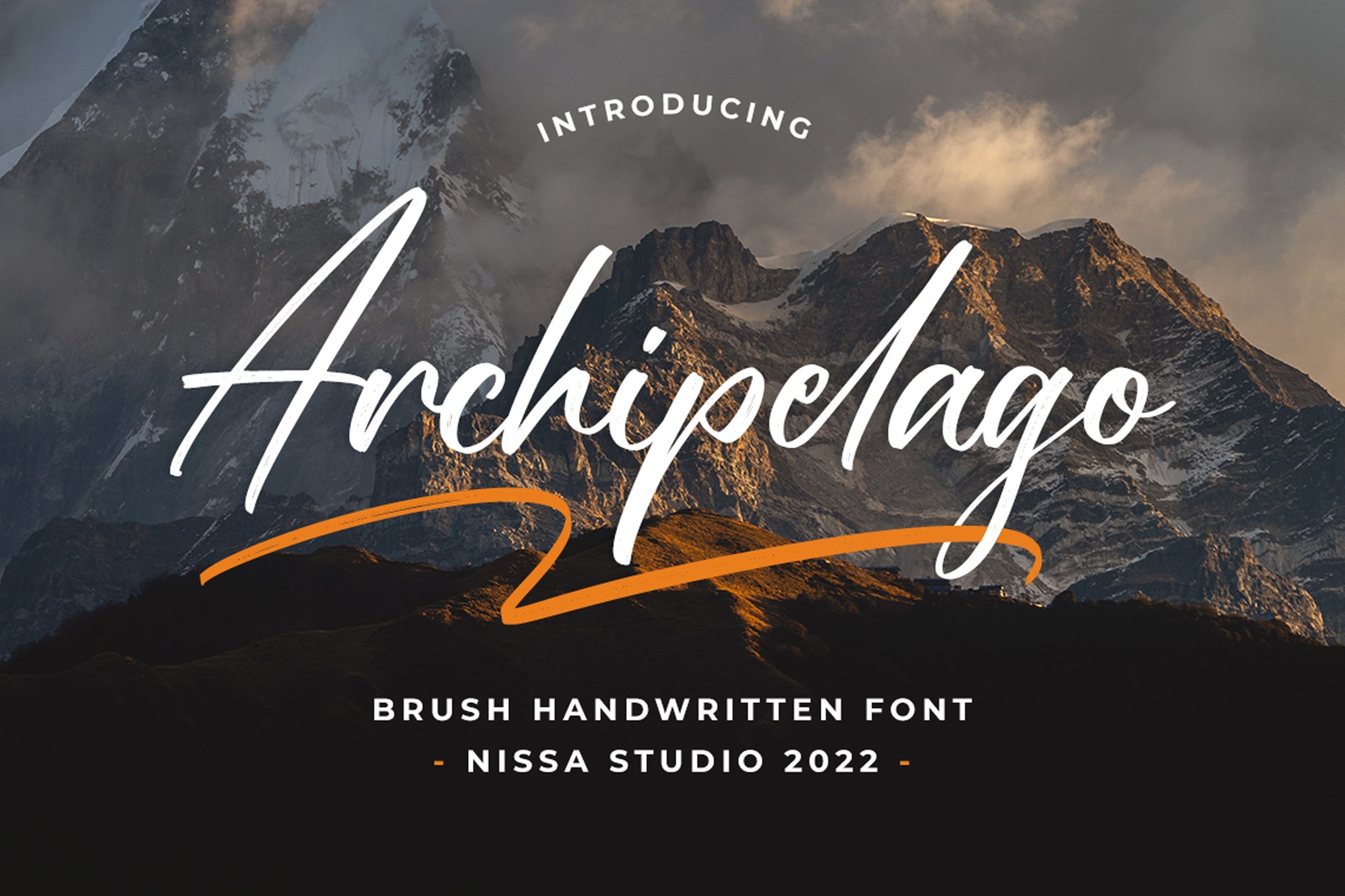
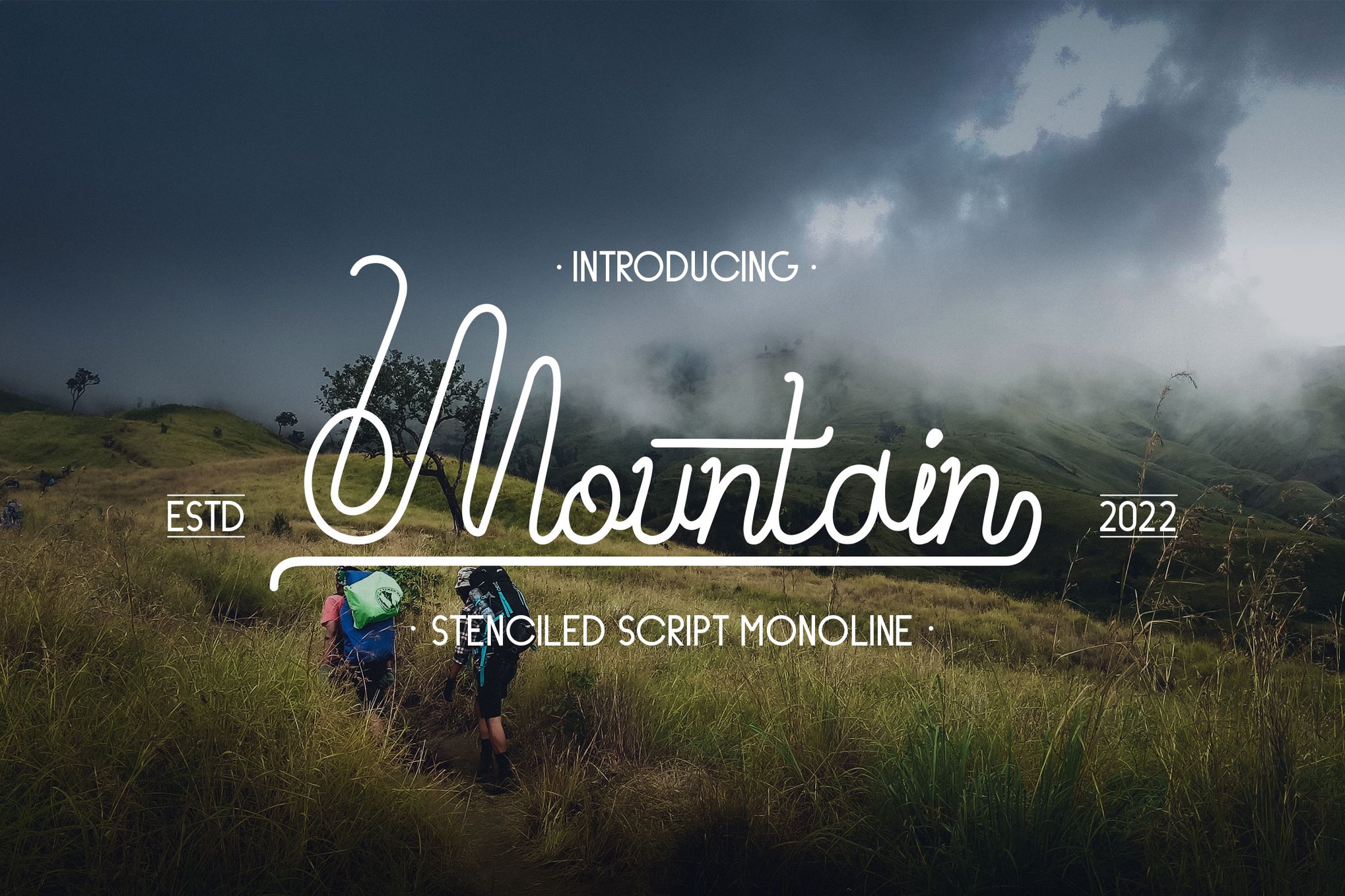
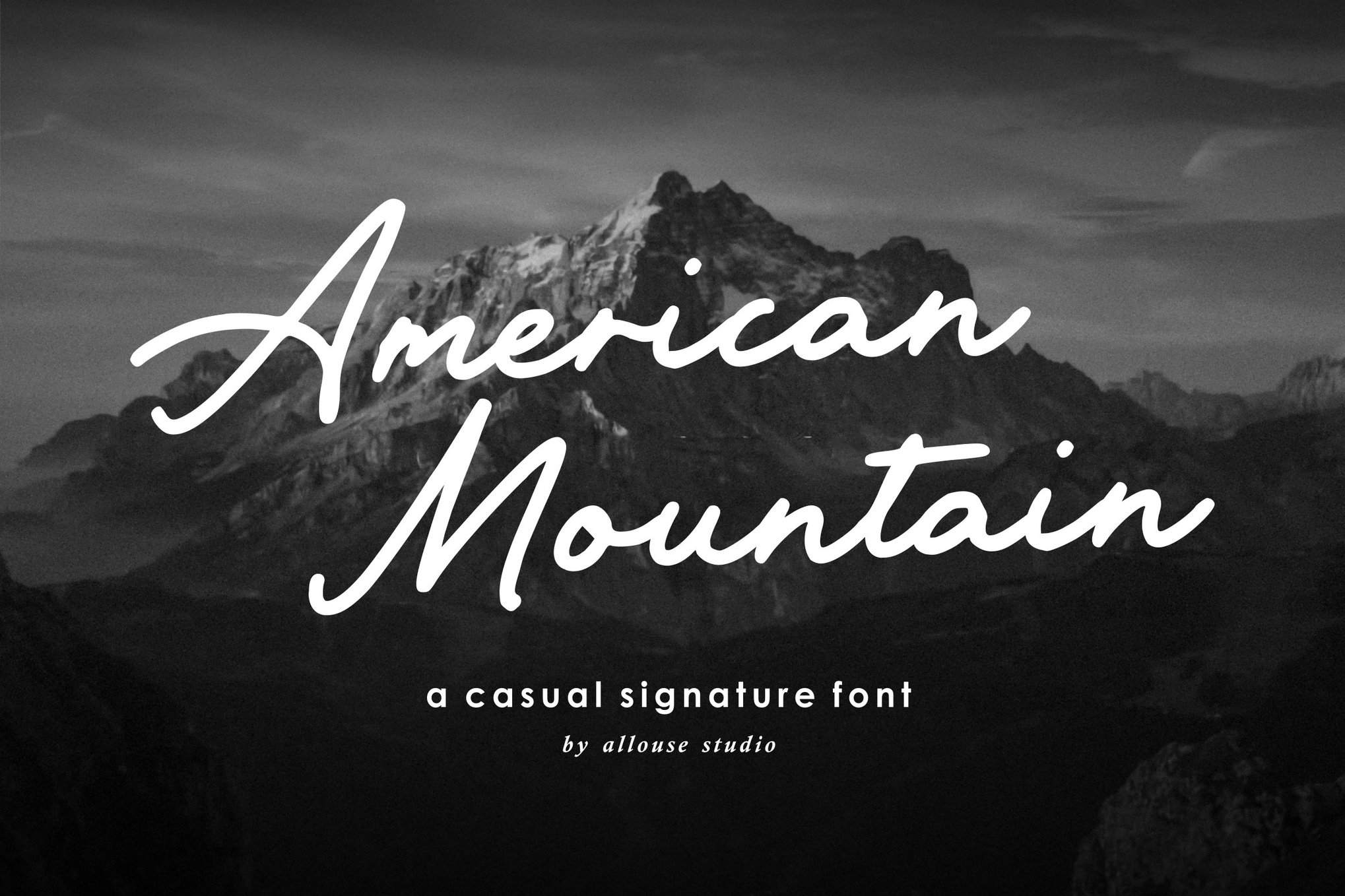
5. Archipelago and Mountain Signature
These fonts represent the softer side of the mountain aesthetic. Utilizing complex ligatures and swashes, they mimic the elegance of a handwritten signature. They are the preferred choice for high-end travel photography branding, where the typography needs to complement, rather than compete with, breathtaking landscape imagery.
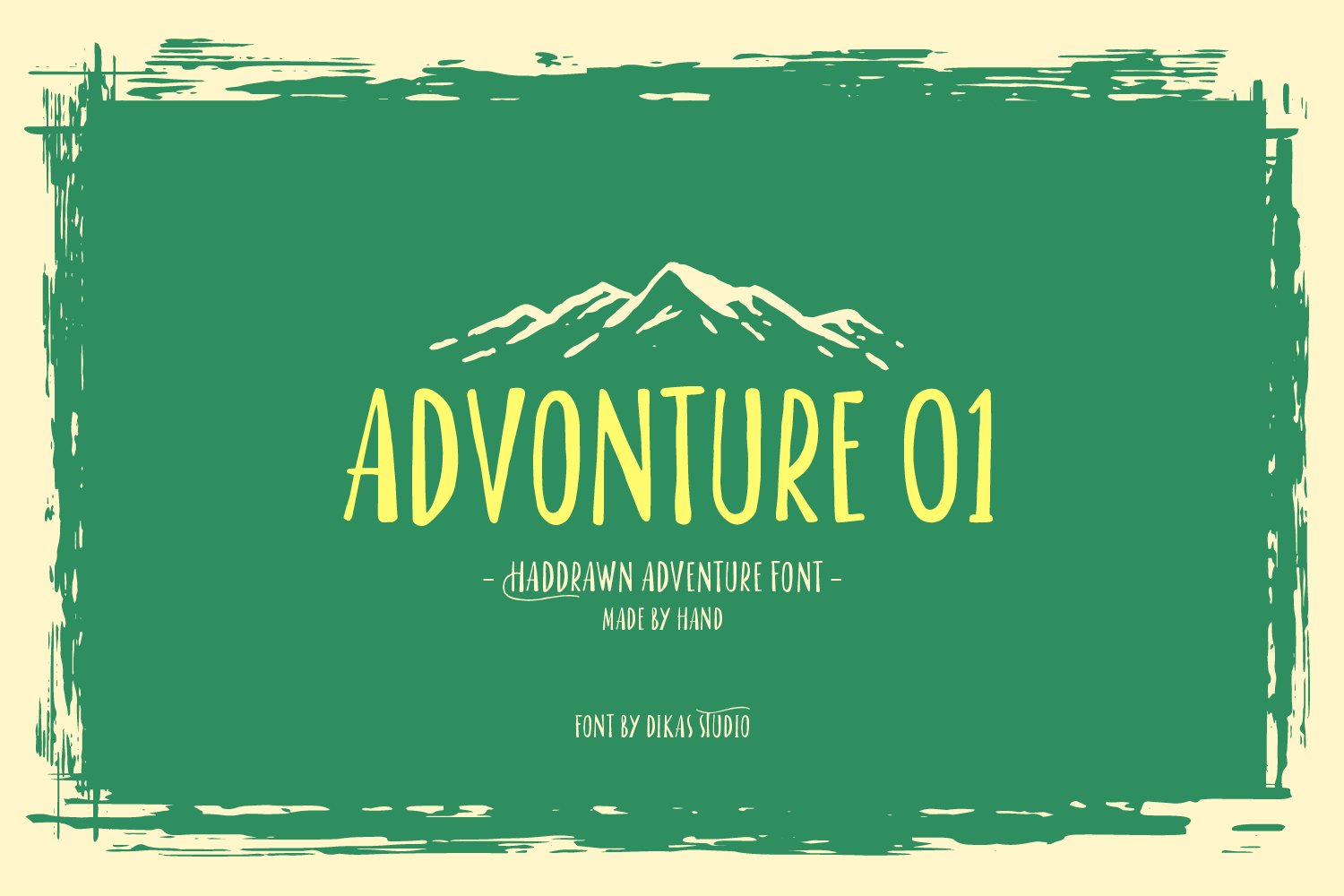
6. The "Mighty" and "Resenger" Collections
For designers who need high-impact, display-ready typography, fonts like Mighty Mountain and Resenger offer high-contrast, bold aesthetics. Their hand-drawn, sometimes interlocking, characteristics provide an "instant brand" feel, perfect for packaging, labels, and badges.
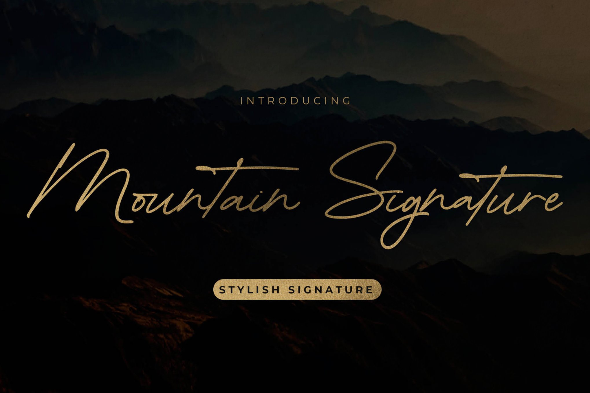
Implications for Brand Identity
The shift toward mountain-themed typography is not a passing fad; it is a response to a global consumer base that is increasingly urbanized and disconnected from nature. By utilizing these fonts, companies can "borrow" the traits of the wilderness—resilience, freedom, and timelessness—and infuse them into their identity.
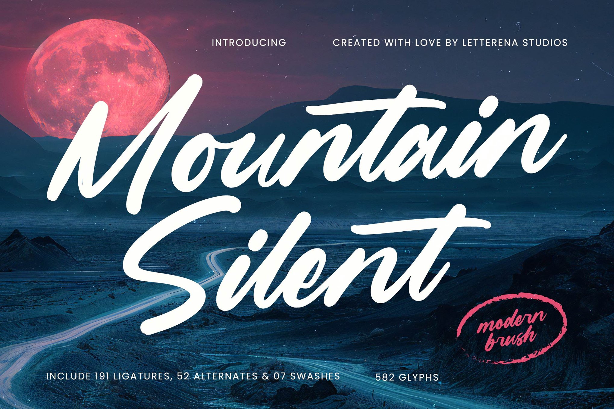
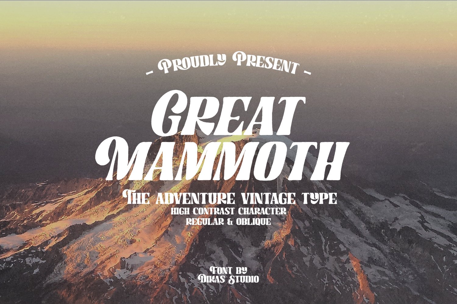
However, the implication for designers is one of caution: with the saturation of "rugged" fonts, the key to success is in the pairing. A font like Great Mammoth may carry the weight of a rugged history, but it requires clean, minimalist supporting elements to avoid looking cluttered. The most successful brands are those that use these typefaces to anchor their identity without losing the contemporary edge required to survive in a competitive marketplace.
Accessible Exploration: Free Alternatives
For those starting their design journey, the digital landscape is rich with high-quality, free resources:
- Mountain Brush: Best for those who want a raw, unrefined look. It is a fantastic entry point for posters and social media graphics that require an organic feel.
- Grandfather: A masterclass in brush script. Its thick, warm texture makes it perfect for local brewery branding or artisan outdoor goods.
- Banaue: Offers an energetic flow that captures the feeling of movement—ideal for dynamic social media campaigns.
- Mountain Waterclean: For those who find standard "rugged" fonts too aggressive, this offers a cleaner, more sophisticated take on the outdoor theme.
Looking Ahead: The Future of Wilderness Typography
As we look to the future, the trend in mountain-themed typography is moving toward "Variable Fonts." These allow designers to adjust the weight, width, and slant of a font to suit different screen resolutions and physical applications—from a smartwatch display to a giant billboard in the Rockies.
Furthermore, we are seeing an increased interest in "eco-typography," where the aesthetic of the font is combined with sustainable design practices. The fonts of tomorrow will likely continue to lean on the rugged, outdoor influences of the past, but they will be optimized for a world that demands high performance, digital compatibility, and a deeper connection to the planet.
Whether you are a seasoned art director or a small business owner launching a local outdoor gear line, the right font is waiting. It is the one that speaks to the explorer in all of us—the one that invites the audience to look up, step out, and find their own mountain.


 Lina Irawan
 Pevita Pearce
 Suro Senen
 Jia Lissa
 Evan Lee Salim

 Ali Ikhwan
 Lina Hope