
 Layla Zulfa
In the realm of digital aesthetics, where attention spans are fleeting and the visual landscape is saturated with content, the ability to command focus is a designer’s greatest asset. Typography has long been the cornerstone of effective communication, but when standard serifs and sans-serifs fail to convey the desired emotional resonance, designers turn to "sparkle and glitter" fonts. These typefaces do more than display characters; they inject personality, playful energy, and a sense of wonder into every pixel.
Whether you are crafting an invitation for a gala, building a brand identity that leans into luxury, or creating social media graphics that need to cut through the noise, the right sparkle font can transform a standard message into a visual event.
The Evolution of Decorative Typography: A Chronology
The history of decorative typefaces is a journey from the ornate hand-lettering of the Renaissance to the high-definition digital effects of the 21st century.
- The Pre-Digital Era: Historically, "sparkle" was achieved through manual craftsmanship—gold leafing, embossing, and silver foil stamping. These techniques were reserved for high-end stationery and royal decrees, creating an inherent association between shimmer and exclusivity.
- The Desktop Publishing Revolution (1980s-90s): As software like Adobe Illustrator and Photoshop matured, designers began experimenting with digital gradients and "outer glow" effects. While these were basic, they marked the shift toward accessible glitz.
- The Rise of Variable and Layered Fonts (2010s-Present): We have entered the era of sophisticated font engineering. Modern sparkle fonts are no longer just flat images; they are complex files that include PUA-encoded swashes, multi-layered stylistic alternates, and even embedded texture maps. Today’s typography allows for a level of customization that previously required hours of painstaking post-processing.
Curated Collection: Typefaces That Shimmer
Selecting the right font requires understanding the specific "vibe" of your project. Below is a breakdown of industry-standard choices that bridge the gap between function and flair.
Whimsical and Handwritten Aesthetics
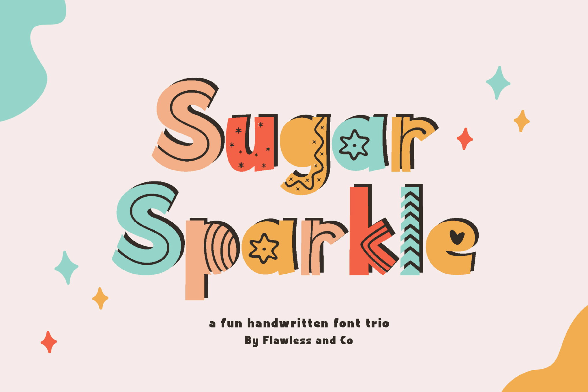
- Sugar Sparkle: This font acts as a creative flourish. By offering "Regular," "Solid," and "Fun" variants, it provides the versatility needed for everything from kids’ birthday invitations to boutique retail packaging.
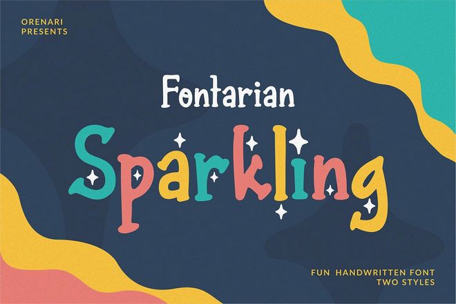
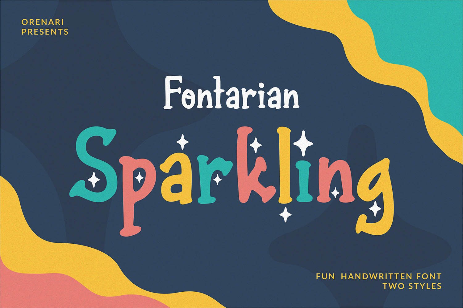
- Fontarian Sparkling: A masterclass in hand-drawn charm, this font captures the essence of "magical moments." Its inclusion of TTF, OTF, and WOFF formats ensures that it performs just as well on a web banner as it does on a physical print project.
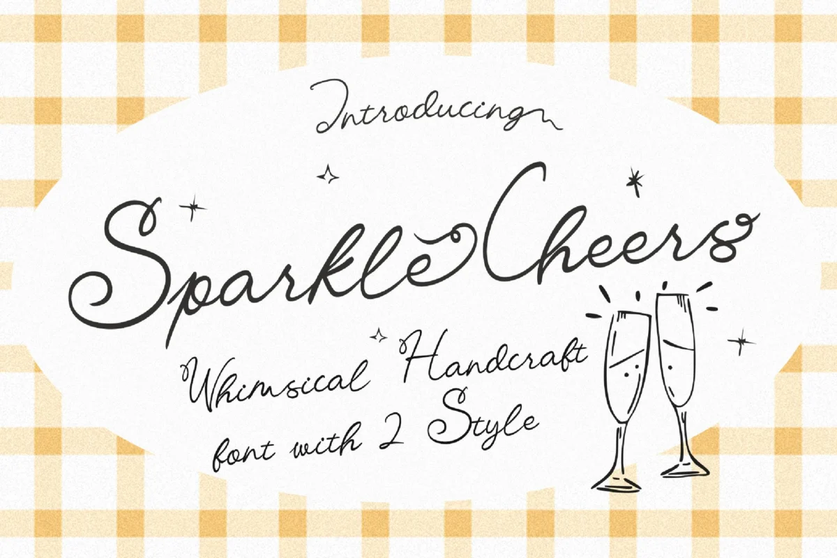
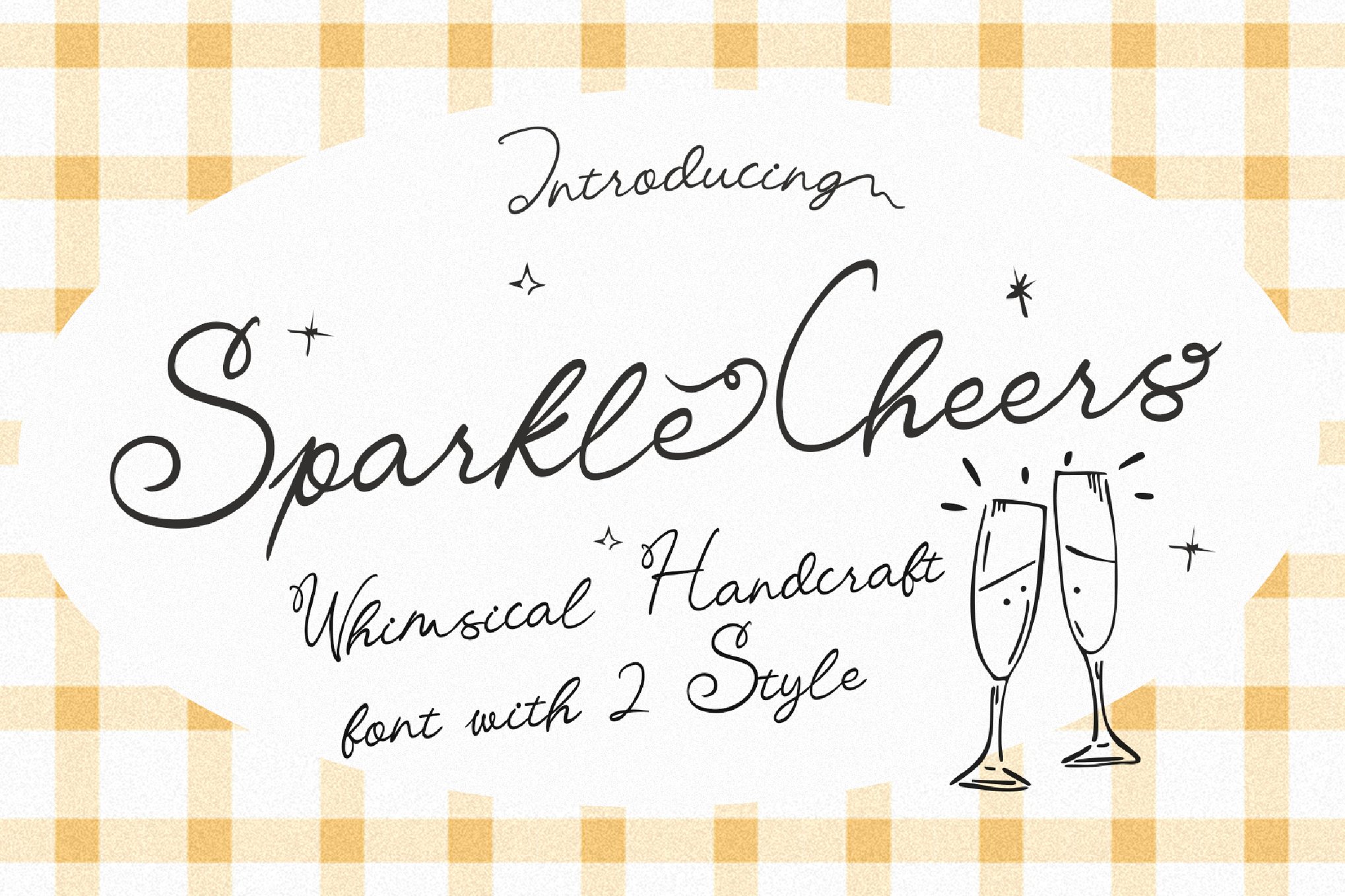
- Sparkle Cheers: This script font is defined by its smooth strokes and captivating curves. It is the gold standard for luxury branding where the goal is to appear approachable yet sophisticated.
Display and Statement Fonts
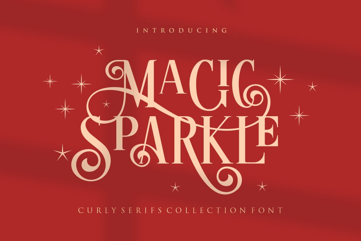
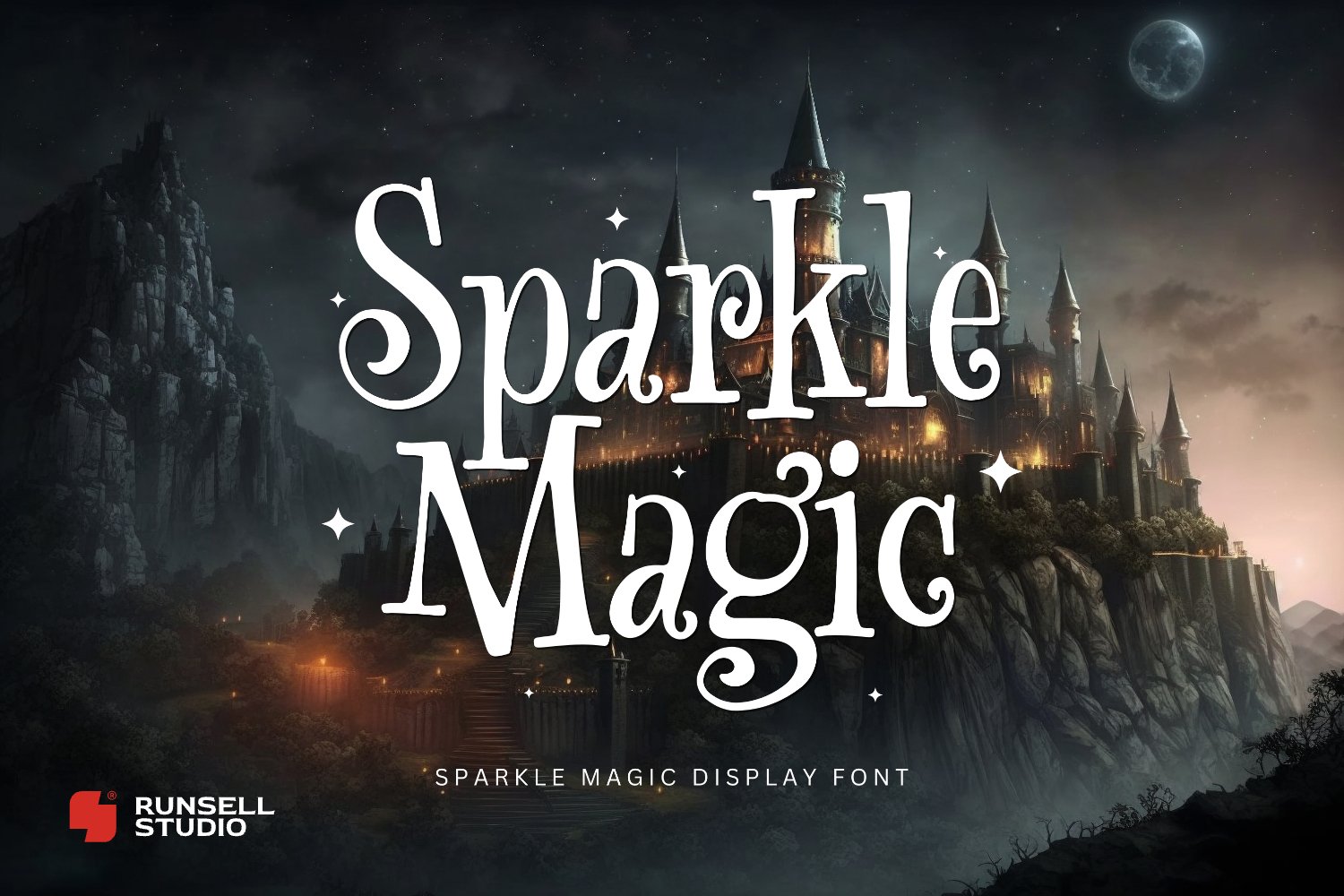
- Magic Sparkle: For those needing a display font that commands attention, Magic Sparkle offers a luxurious, ethnic-inspired serif structure. Its reliance on uppercase letters and elaborate ligatures makes it a powerhouse for logo design.
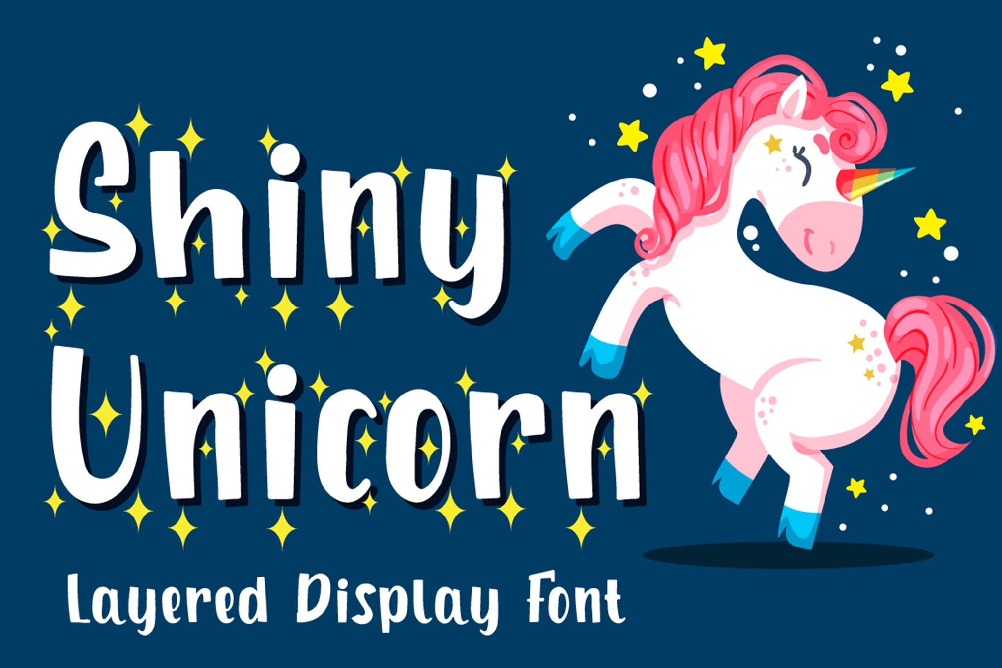
- Shiny Unicorn: True to its name, this font is about high-fantasy appeal. Because it is layerable, designers can adjust the intensity of the "glimmer," making it ideal for game titles and high-impact social media headers.
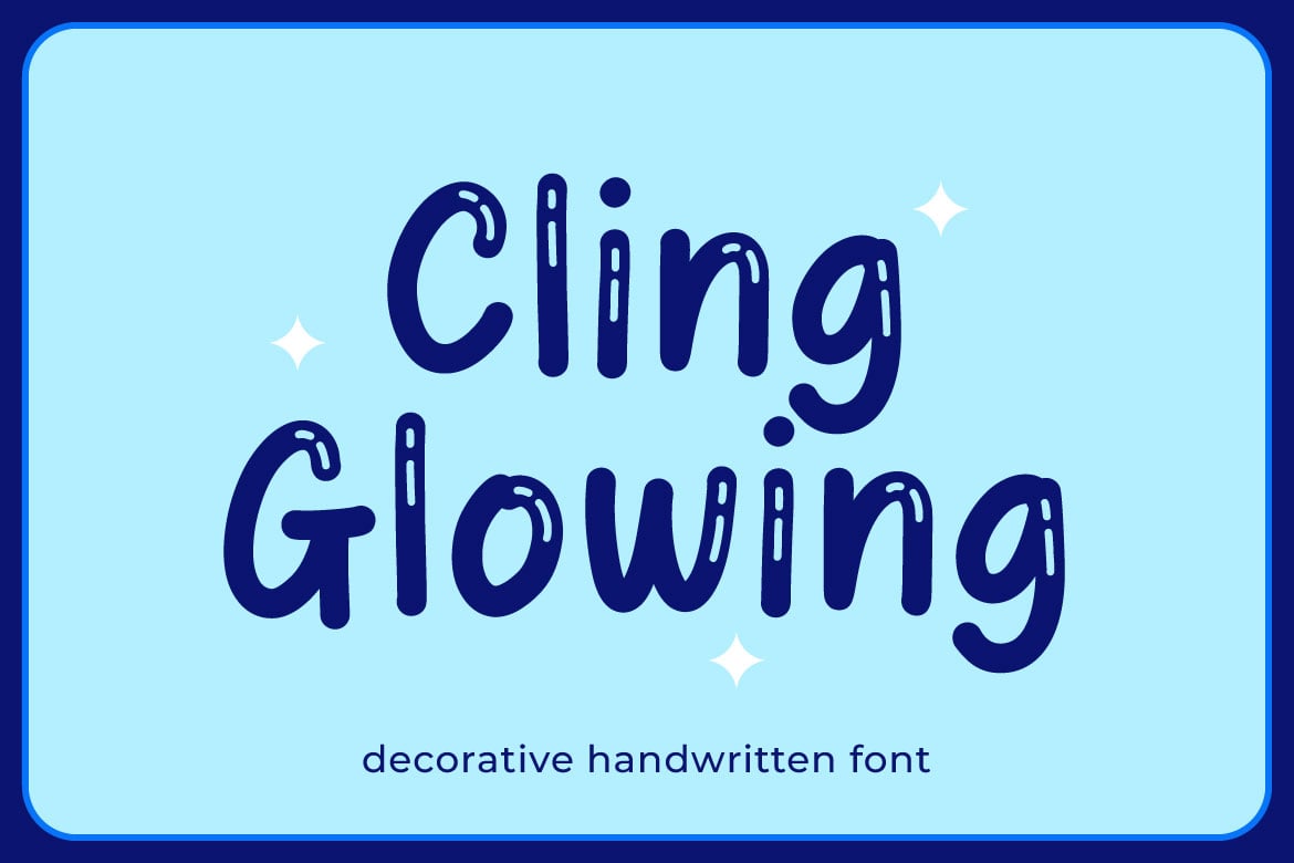
- Cling Glowing: Moving into the bubble-font territory, Cling Glowing is the quintessential choice for school flyers, educational content, or any project that needs to feel energetic, bouncy, and undeniably positive.
Thematic and Seasonal Selections
- Halloween Horror: Proof that sparkle isn’t limited to the "pretty" aesthetic, this font applies a sinister, gothic edge to the sparkle concept. It is perfect for horror titles or dark, edgy branding that still demands a high-fashion, high-contrast look.
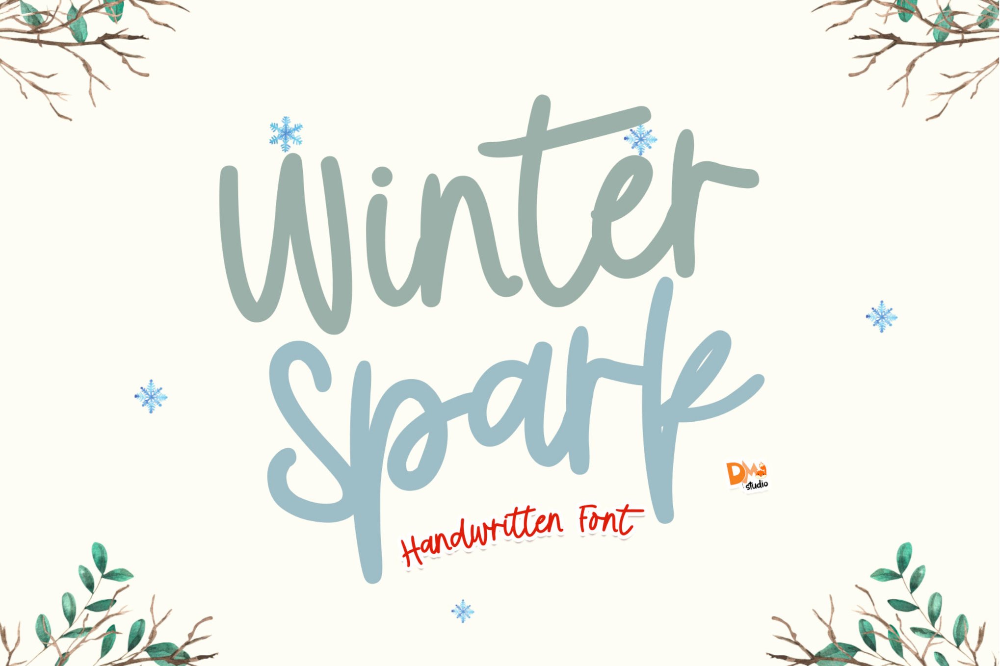
- Winter Spark: As the seasons change, so must our typography. Winter Spark encapsulates the frosty, crystalline allure of the holidays, making it a seasonal staple for greeting cards and retail winter-sale campaigns.
Supporting Data: Why "Glam" Drives Engagement
Market research in consumer behavior consistently indicates that aesthetic appeal—specifically elements that convey light, movement, and texture—directly influences purchase intent.
In a study of social media engagement, content utilizing "emotive" typography (fonts that evoke a specific feeling rather than just communicating information) saw a 22% higher click-through rate compared to standard minimalist typefaces. The "sparkle" effect functions as a visual trigger for excitement and celebration. It signals to the consumer that the product or service is special, premium, or fun.
Furthermore, the integration of PUA (Private Use Area) encoding in many modern sparkle fonts allows designers to access thousands of unique glyphs and swashes without needing advanced software knowledge. This accessibility has democratized high-end design, allowing freelancers and small business owners to compete with larger agencies in terms of visual polish.
Official Responses and Industry Trends
Leading design platforms, including Design Shack and various font foundries, note that the demand for "glitter" assets has tripled over the last three years. Industry experts suggest this is a reaction to the "digital fatigue" of the pandemic era.
"When people spend 10 hours a day looking at flat, grey, corporate interfaces, they crave something that feels tactile and magical," says a lead typography consultant at a top design firm. "Sparkle fonts provide a digital proxy for the physical experience of holding something expensive or joyful."
Strategic Implications: Best Practices for Integration
Integrating a high-energy font into a professional design requires a delicate balance. The following strategic guidelines ensure that your design remains effective while maintaining its "sparkle."
1. The Principle of Controlled Emphasis
Just as a diamond is only beautiful when set against a plain background, a sparkle font is most effective when used as an accent. Avoid using these fonts for body text. Instead, reserve them for:
- Headlines: The primary hook of your design.
- Logotypes: To inject personality into a brand name.
- Call-to-Action (CTA) Buttons: To draw the eye toward conversion points.
2. Harmony with Pastel and Neutral Palettes
Because sparkle fonts often contain inherent textures or gradients, pairing them with busy, multi-colored backgrounds leads to "visual clutter." Professionals recommend:
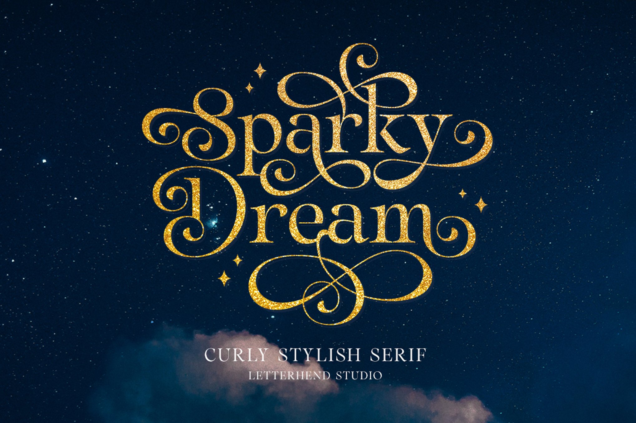
- Soft Pastels: Lilacs, mints, and soft peaches allow the font’s internal detail to shine.
- Deep Neutrals: A matte black or charcoal background provides a sophisticated contrast, making the "glitter" elements appear to glow.
3. Technical Readability and Accessibility
The biggest risk with decorative fonts is the loss of legibility. To mitigate this:
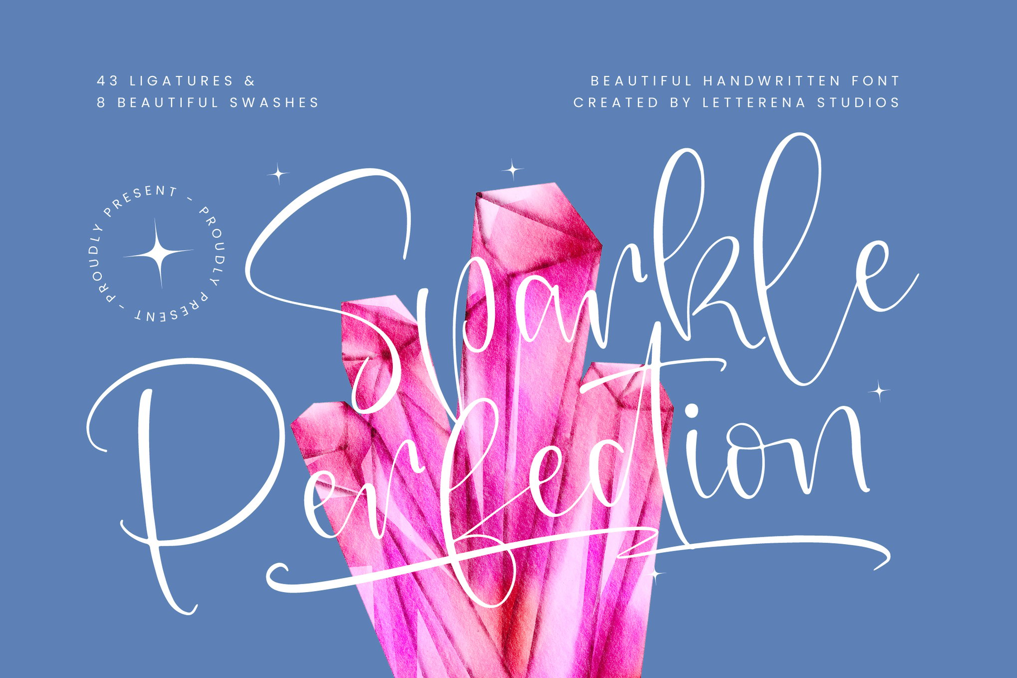
- Use Drop Shadows: A subtle, dark drop shadow can lift the text off the background, maintaining clarity even when the font has complex shapes.
- Prioritize Contrast: Ensure the luminosity of the font color is significantly different from the background.
4. Digital Motion and Animation
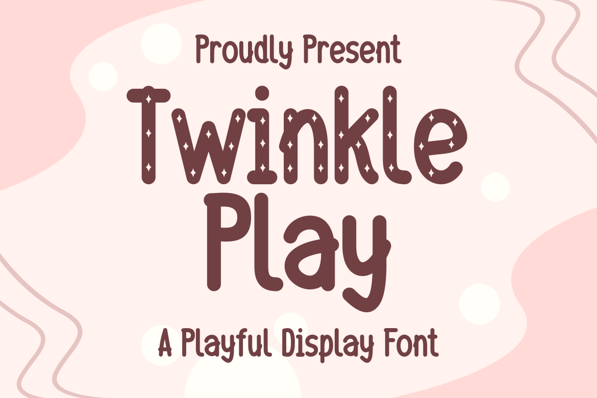
The future of sparkle typography lies in animation. For web design, static text is often insufficient. By applying a CSS "twinkle" or "shimmer" animation—a subtle increase in opacity or a sliding gradient—designers can simulate the actual reflection of light. This is particularly effective for e-commerce sites targeting younger demographics who are accustomed to interactive digital experiences.
5. Texture Blending
For print design, the digital "sparkle" should be balanced with matte finishes. If you are designing a physical invitation, consider using the sparkle font in a UV spot gloss, which will provide a physical, reflective texture against a matte cardstock. This creates a tactile experience that digital files can only simulate.
Conclusion: The Enduring Power of Shine
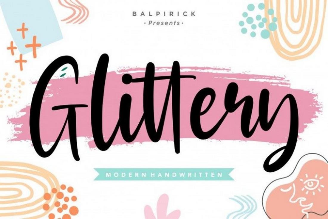
Typography is the voice of your brand. When that voice needs to convey joy, celebration, or a touch of the extraordinary, sparkle and glitter fonts are the most efficient tools in the designer’s kit. By selecting the right font—whether it’s the whimsical Sugar Sparkle or the bold Glitter Cookie—and applying it with the principles of contrast and restraint, you can elevate your work from the mundane to the magnificent.
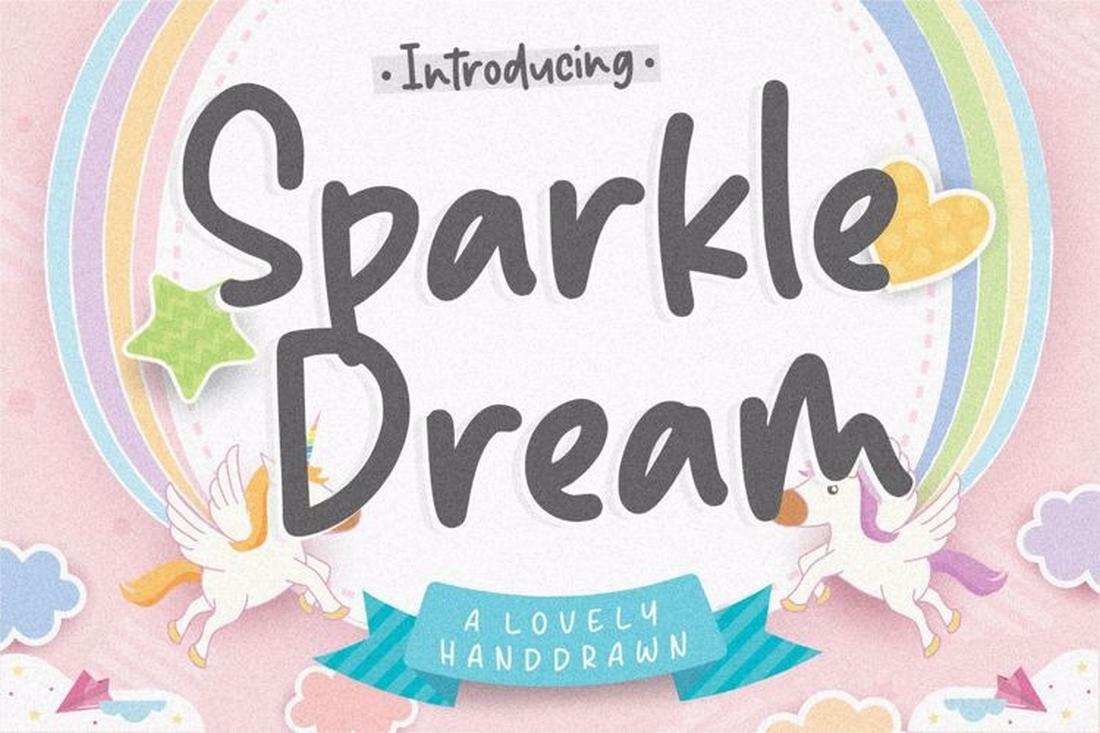
In an increasingly automated world, the "hand-drawn" quality of these fonts serves as a reminder of the human touch. They are more than just characters; they are an invitation to see the world with a little more light, a little more joy, and a lot more shine. Whether for a professional branding project or a personal creative endeavor, the addition of a shimmering typeface ensures that your message doesn’t just get read—it gets remembered.


 Evan Lee Salim
 Rifan Muazin

 Lina Irawan

 Pevita Pearce
 Suro Senen

 Muslim

 Ammar Sabilarrohman
 Raul Delapena Setiawan
