
 Ammar Sabilarrohman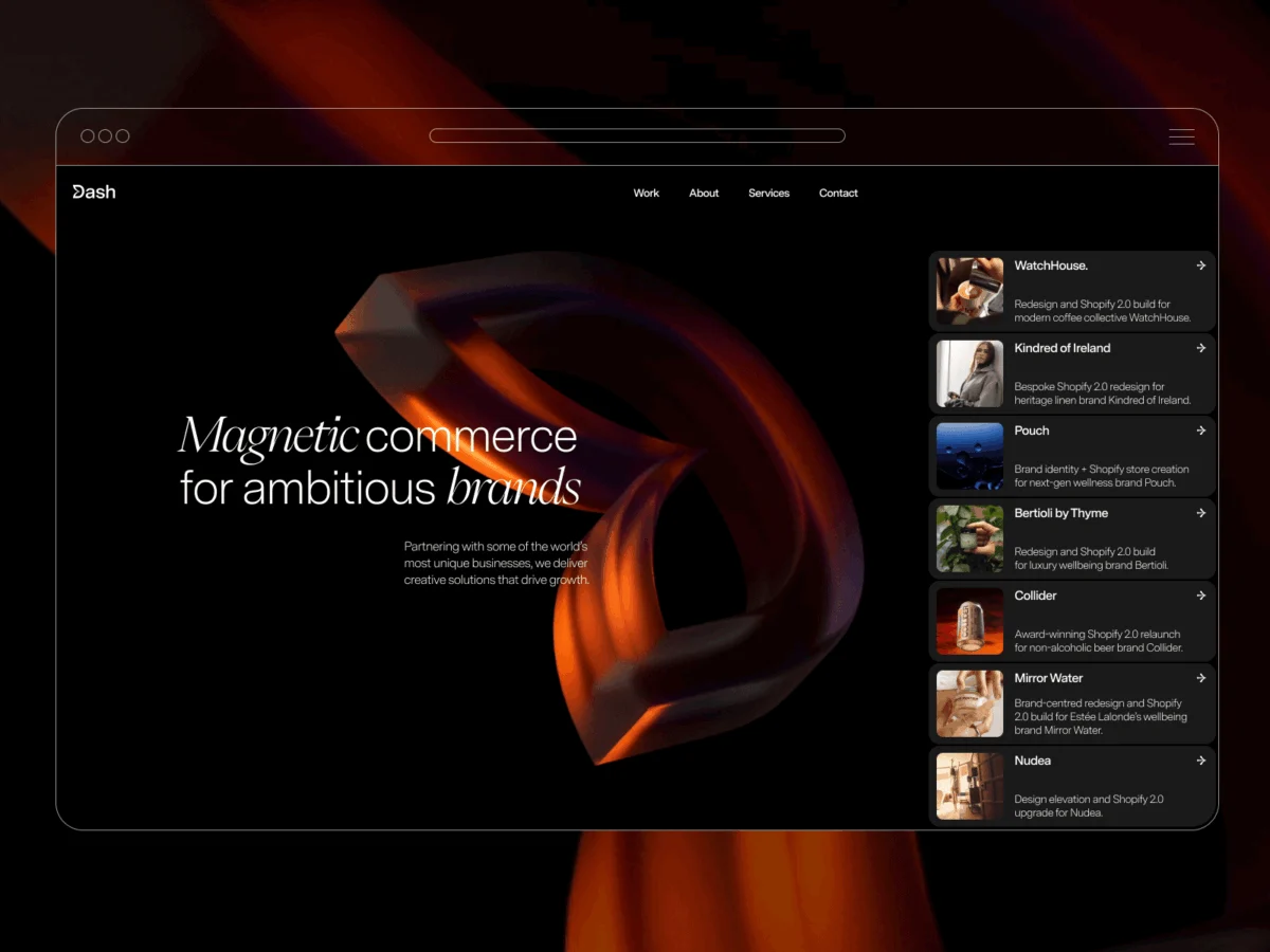
In the rapidly evolving landscape of digital design, the challenge for any agency is to move beyond mere aesthetics. A website should not just be a digital brochure; it should be an experiential environment that embodies the core identity of the business. For Dash Creative, a recent comprehensive rebrand was not simply an exercise in changing color palettes or typography—it was a deep dive into the philosophy of "Magnetic Commerce."
The resulting digital overhaul serves as a masterclass in blending high-level conceptual branding with cutting-edge technical execution. By prioritizing interactive physics and user-centric motion, Dash Creative has transformed its online presence into a living, breathing demonstration of its own professional capabilities.
Main Facts: Defining "Magnetic Commerce"
The core objective of the Dash Creative rebrand was to bridge the gap between abstract branding and tangible digital utility. The team sought a concept that defined their work: the ability of a great digital experience to act as a gravitational force, drawing users into a brand narrative.
This concept manifests physically in the new logo. Designers reimagined the letter ‘D’ with an inward-pulling curvature, mimicking the force of a magnet. This emblem became the "North Star" for the entire project, dictating every subsequent design choice, from the micro-interactions on the homepage to the overarching UI patterns.
The agency’s commitment to this philosophy led them to adopt a "constrained design" approach. By adhering to strict brand guidelines, the team avoided the common trap of feature creep, instead opting for a highly considered, tactile aesthetic that draws inspiration from the familiarity and fluidity of iOS interface design.

A Chronology of the Rebrand
The transition from concept to live deployment was a multi-month endeavor, characterized by a deliberate, iterative process.
Phase 1: Conceptualization and Prototyping
The initial months were dedicated to distilling the "Magnetic Commerce" concept. Once the logo was finalized as a rotating 3D asset, the team identified the potential for cursor interaction. They hypothesized that if the logo itself was "magnetic," the cursor should act as the pole, creating a physical pull upon hover. This discovery was the catalyst for the site’s motion language.
Phase 2: Design and Systems Thinking
Utilizing Figma, the team built a systematic design language. By focusing on type, spacing, and modular components, they maintained a cohesive look that avoided the visual clutter often found in experimental portfolios. The decision to model project cards after iOS notifications provided a bridge between user familiarity and the brand’s unique, tactile identity.
Phase 3: Technical Execution
The final stretch was defined by technical integration. The team leveraged a hybrid stack: Webflow for the structural foundation and CMS, GSAP for complex animation sequencing, and custom WebGL for the hero background. The refinement of these animations—ensuring they felt organic rather than programmed—was where the bulk of the development time was invested.
Supporting Data: The Technical Stack
Dash Creative’s architecture is a testament to the power of combining "no-code" efficiency with custom high-performance shaders.

The WebGL Hero Background
The most striking element of the site is the hero background: a fullscreen video surface that distorts in response to cursor movement. Unlike standard ripple effects, this implementation uses a fragment shader to remap texture coordinates.
The shader logic relies on a damped sine function that propagates distortion in the direction of the cursor’s movement, creating a sense of momentum and persistence. The team exposed several key variables—including radius, amplitude, frequency, and speed—to fine-tune the interaction, ensuring the movement felt heavy and physical rather than light or glitchy.
Performance Optimization
To maintain a high frame rate, the implementation avoids heavy scene graphs or post-processing pipelines. Instead, the rendering loop is kept lightweight:
- Video Integration: The video element is hidden and used as a raw texture source.
- Frame Control: Rendering begins only after
video.readyState >= 2, preventing synchronization errors. - Coordinate Remapping: The distortion is calculated using a single fullscreen quad, minimizing GPU overhead.
Official Perspectives: The Philosophy of Restraint
In discussions regarding the project, the Dash Creative team emphasized that the primary challenge was knowing when to stop. "Small adjustments to timing, easing, and copy often had more impact than introducing new effects," one lead developer noted.
This philosophy of "visual restraint" was vital. The team specifically avoided hard-edged "spotlight" effects, opting for soft falloffs and vertical damping. By limiting the wave’s spread, they ensured the distortion complemented the typography rather than competing with it for user attention.

The team also provided insight into their workflow, noting that using Webflow as their primary build tool served a dual purpose. It allowed them to maintain a complex, animation-heavy site while simultaneously providing a live, high-performance proof-of-concept for prospective clients who may be wary of the limitations of "website builders."
Implications for the Digital Industry
The Dash Creative rebrand highlights several critical trends in modern web design that hold broader implications for the industry.
1. The Death of the "Static" Portfolio
The industry is moving toward environments that are reactive. As seen in the Dash project, users now expect interfaces that mirror the physical laws of the real world—momentum, friction, and resistance. This signals a shift toward developers needing to understand basic physics-based math to create compelling UI.
2. Constraints as Creative Catalysts
The team’s decision to follow strict iOS-inspired guidelines proves that boundaries do not hinder creativity; they focus it. In a market saturated with "all-singing, all-dancing" websites, a restrained, systematic approach can actually be more disruptive and memorable.
3. The "Touch" Gap
Perhaps the most significant takeaway from the agency’s internal reflection is the challenge of device parity. As the team noted, the experience shifts significantly on touch-screen devices compared to desktop environments where a cursor is present. This serves as a warning for future digital projects: interaction design should be "mobile-first" in its conceptual logic, rather than retrofitted as an afterthought.

4. Integration of 3D and Video
The use of custom WebGL to manipulate live video textures is a growing trend that elevates the standard "hero video." By moving away from static video backgrounds, agencies are creating "living surfaces" that feel responsive to the user’s presence, bridging the gap between passive viewing and active engagement.
Conclusion
Dash Creative’s rebrand is more than a successful aesthetic overhaul; it is a strategic repositioning that aligns their technical capabilities with their brand identity. By turning their homepage into a sandbox for "Magnetic Commerce," they have successfully demonstrated that the most effective digital interactions are those that feel natural, considered, and inextricably linked to the core brand concept.
As the industry continues to push the boundaries of what is possible in the browser, Dash Creative’s journey provides a clear roadmap: define the concept, build a rigid system to support it, and refine the motion until it feels less like a line of code and more like an extension of the user’s intent. In doing so, they have not only improved their own site but have set a high bar for what clients should expect from modern digital design partners.

 Lina Irawan
 Pevita Pearce
 Suro Senen
 Jia Lissa
 Evan Lee Salim

 Ali Ikhwan