
 Evan Lee Salim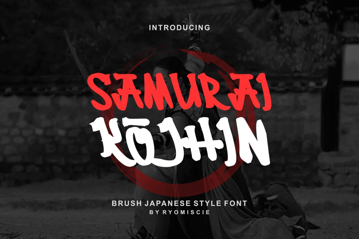
In the world of graphic design, few visual motifs carry as much weight, history, and raw emotional power as the aesthetic of the Japanese samurai. Characterized by aggressive brushwork, razor-sharp geometric precision, and an inherent sense of stoic discipline, samurai-inspired typography has evolved from a niche cultural curiosity into a dominant force in modern branding, cinematic titling, and digital entertainment.
Whether for a high-octane esports logo or an elegant, minimalist restaurant menu, these fonts bridge the gap between feudal history and contemporary visual communication. This article explores the cultural significance, technical evolution, and the definitive collection of typefaces currently defining this genre.
The Cultural Significance of the Samurai Aesthetic
The samurai—the legendary warrior class of pre-modern Japan—represented a unique intersection of artistic refinement and lethal efficiency. Their ethos, known as Bushido, emphasized balance, precision, and the "way of the sword." When typographers attempt to capture this spirit, they are not merely creating letters; they are attempting to codify a cultural philosophy into a digital asset.
The popularity of these fonts is no accident. In an increasingly digital, sanitized world, designers are constantly seeking textures that feel "human." The brush-style samurai font, which mimics the fluid yet deliberate motions of a fude (traditional Japanese brush), provides a tactile, organic quality that speaks to the craftsmanship of the past. By utilizing sharp letterforms that echo the geometry of a katana (samurai sword) or the calligraphic strokes of shodo (Japanese calligraphy), these fonts offer an immediate, visceral connection to a storied history.
Chronology: From Ancient Calligraphy to Digital Typefaces
To understand the current state of samurai-inspired fonts, one must look at the timeline of their development:
- Pre-1900s (The Era of Calligraphy): The foundation of the "samurai look" lies in the centuries of Japanese shodo. The emphasis was on flow, breath, and the speed of the brush. Every character was an individual work of art.
- 1950s–1980s (The Cinema Influence): With the international rise of Akira Kurosawa’s films, Western audiences were introduced to the cinematic power of Japanese aesthetics. Title cards in films like Seven Samurai and Yojimbo began to influence global advertising design.
- 1990s–2010s (The Digital Revolution): As vector software like Adobe Illustrator became accessible, designers began digitizing calligraphic strokes. This era saw the birth of the "faux-Japanese" font, which prioritized readability for Latin alphabets while retaining the look of East Asian scripts.
- 2020–Present (The Modern Era): Today’s samurai fonts are sophisticated, high-performance assets. They now feature advanced OpenType features, multilingual support, and a deeper, more accurate understanding of the cultural nuance behind the brush strokes.
Essential Samurai-Inspired Typefaces
The following collection represents the gold standard for designers looking to incorporate the spirit of the warrior into their work.
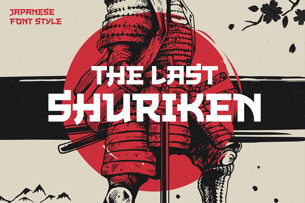
1. The Last Shuriken
Designed with a nod to modern food branding and the high-energy aesthetic of contemporary anime, The Last Shuriken is an all-caps powerhouse. Its uniform height makes it exceptionally versatile for posters and logos that require a punchy, aggressive presence. It stands as a prime example of how traditional themes are successfully adapted for modern, fast-paced media.
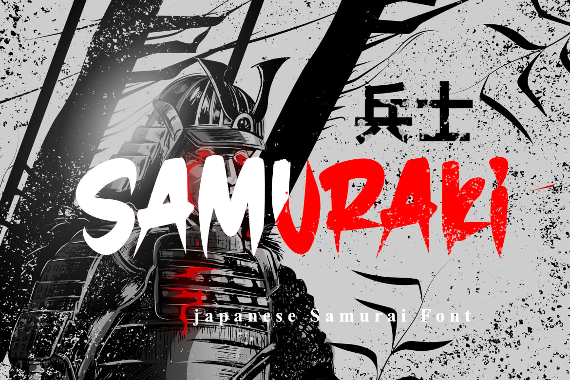
2. Samuraki
For those seeking authenticity, Samuraki is an essential addition to any font library. It manages to balance the rough, manual feel of ink-on-paper with the crispness required for professional print work. With full support for numbers and punctuation, it is one of the most practical choices for designers working on flyer design or editorial layouts.
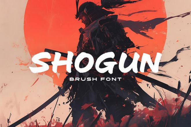
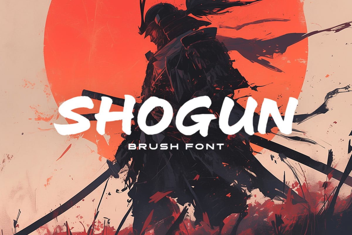
3. Shogun
Elegance meets strength in Shogun. This wide brush font is inspired by the aristocratic side of samurai culture. It feels less like a weapon and more like a badge of office. It is the perfect choice for projects that demand "Eastern sophistication" without resorting to over-the-top, aggressive styling.
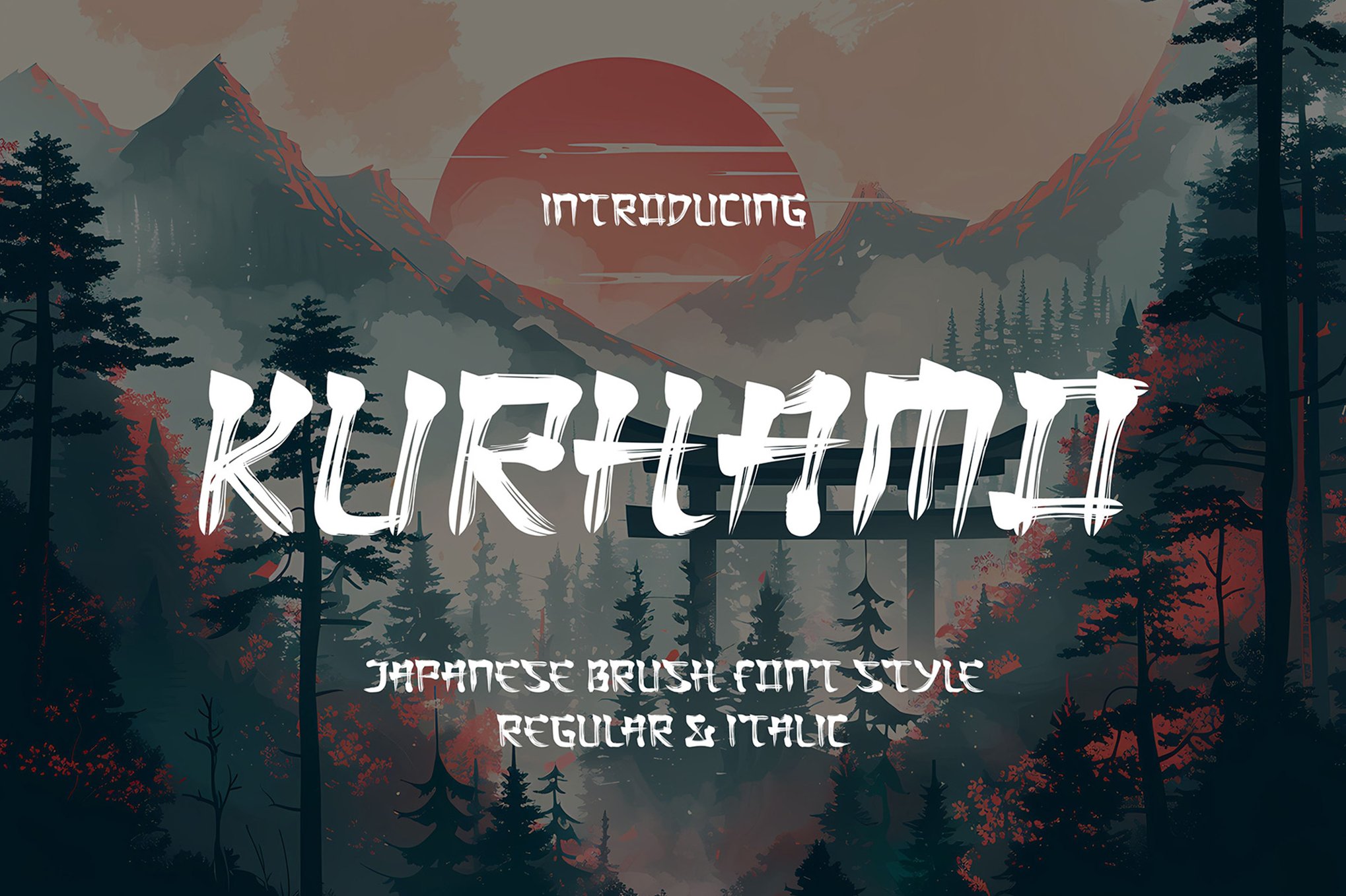
4. Kurhamo
Kurhamo is a masterclass in fluidity. By offering both Regular and Italic styles, it allows designers to play with the speed and momentum of the stroke. The italicized version, in particular, evokes the motion of a sword strike, making it a favorite for athletic branding and martial arts-focused projects.
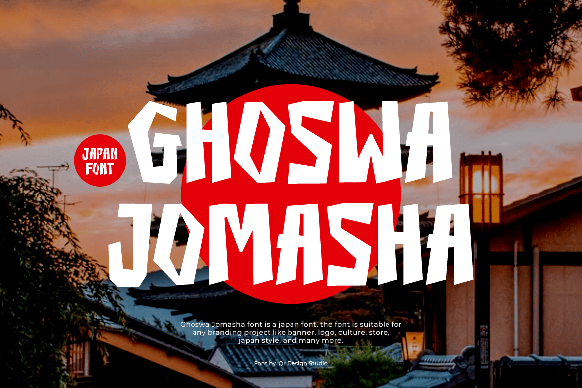
5. Ghoswa Jomasha
Sometimes, a design needs to be loud. Ghoswa Jomasha is a display font that acts as an anchor for branding projects. Its unique letterforms ensure that a logo or headline created with this typeface is instantly recognizable, even at a distance.
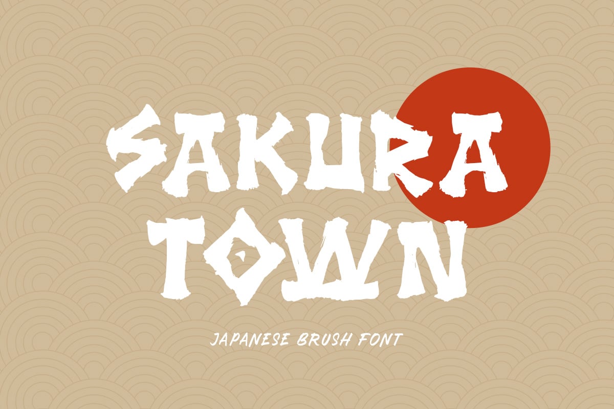
6. Sakura Town
While the name suggests the softness of cherry blossoms, the typeface itself is surprisingly dynamic. Sakura Town bridges the gap between the "warrior" and the "poet," making it ideal for packaging design where you need to project both strength and beauty.
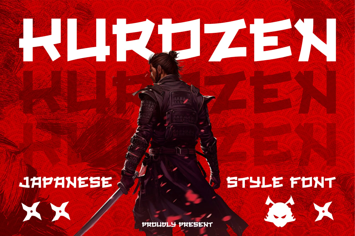
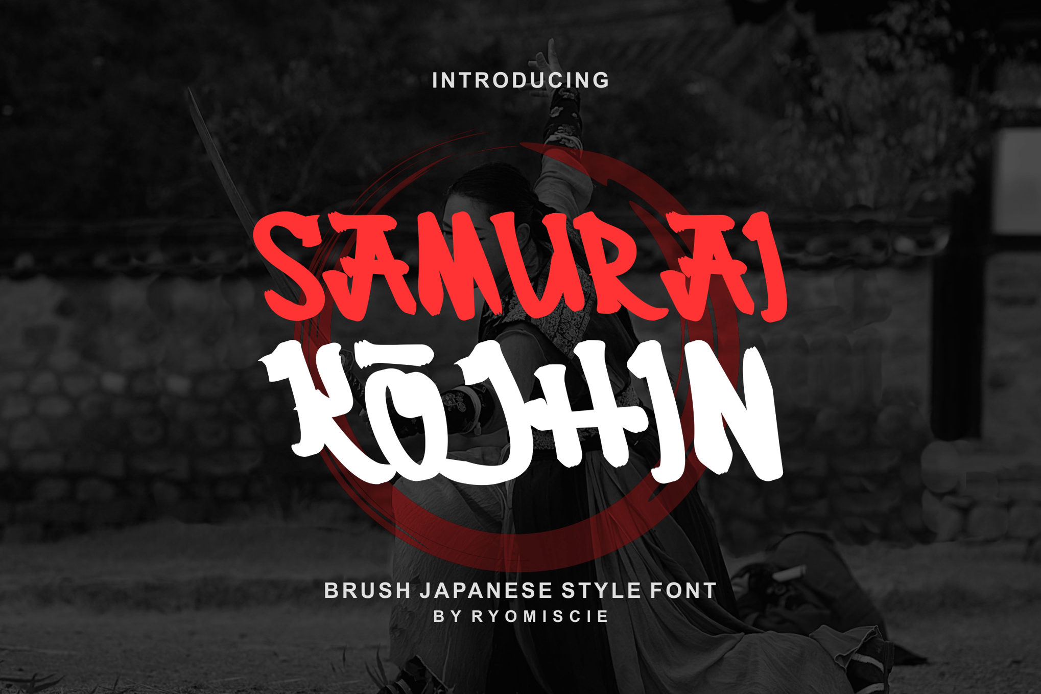
7. Samurai Kojhin
In the world of esports and digital gaming, Samurai Kojhin reigns supreme. It has the high-contrast, bold lines that pop on screen. Because it supports both uppercase and lowercase, it provides a level of layout flexibility that many other display fonts lack.
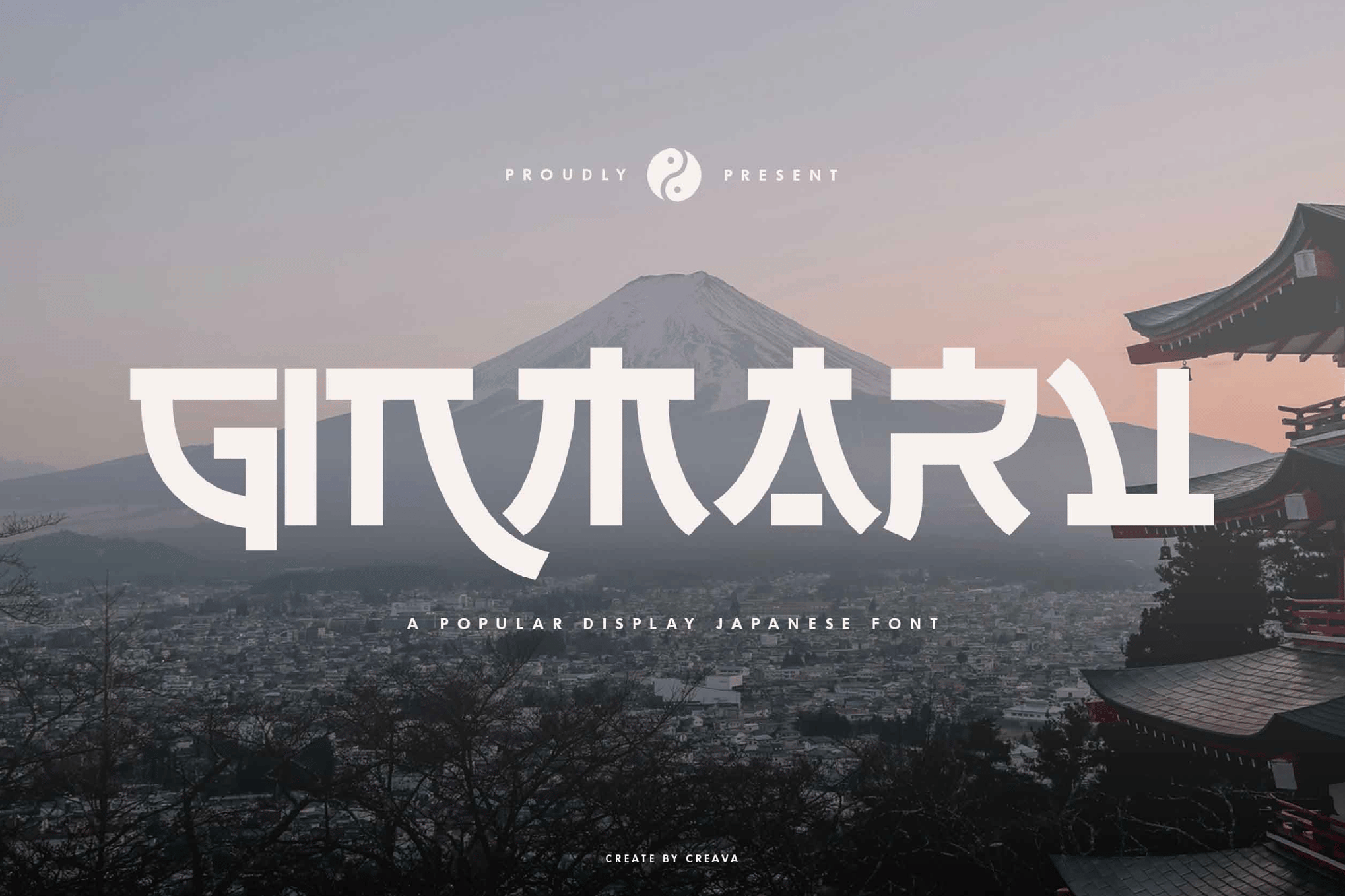
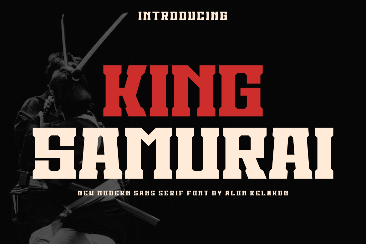
8. King Samurai
Modernity is the hallmark of King Samurai. This sans-serif approach to the samurai theme strips away the messy, "ink-splatter" aesthetic in favor of thick, monolithic strokes. It feels like the "industrialized" version of a warrior’s spirit, perfect for modern apparel or tech-heavy branding.
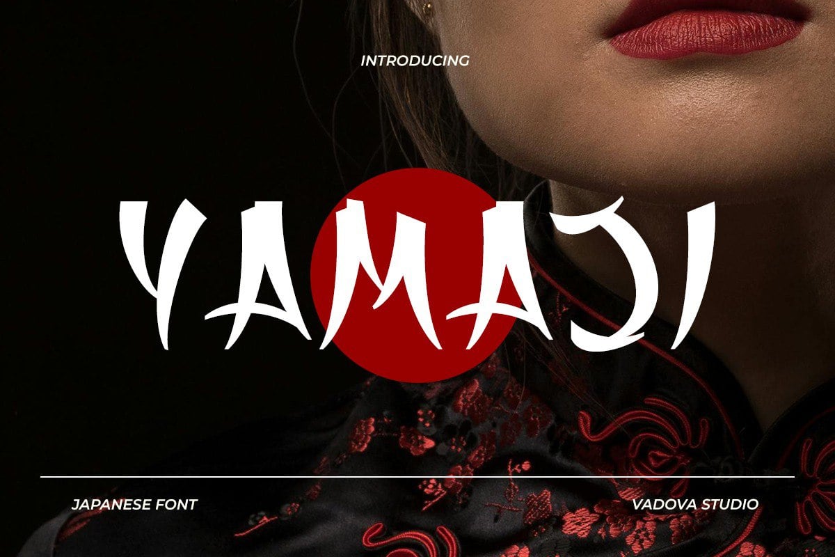
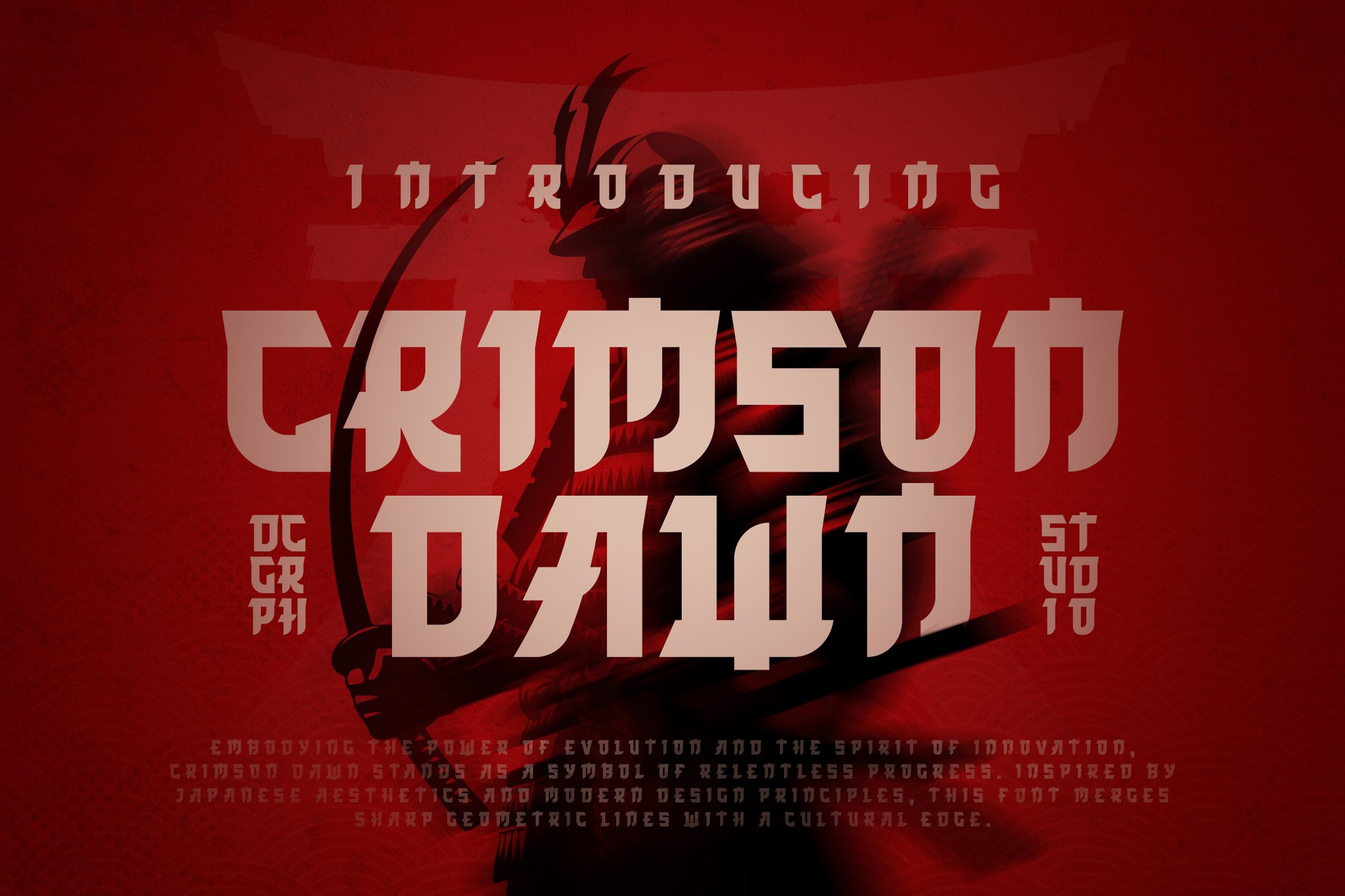
9. Crimson Dawn
Sharp, geometric, and disciplined—Crimson Dawn is designed for impact. It is the go-to typeface for event posters and cinematic titles where the goal is to create immediate tension and intrigue.
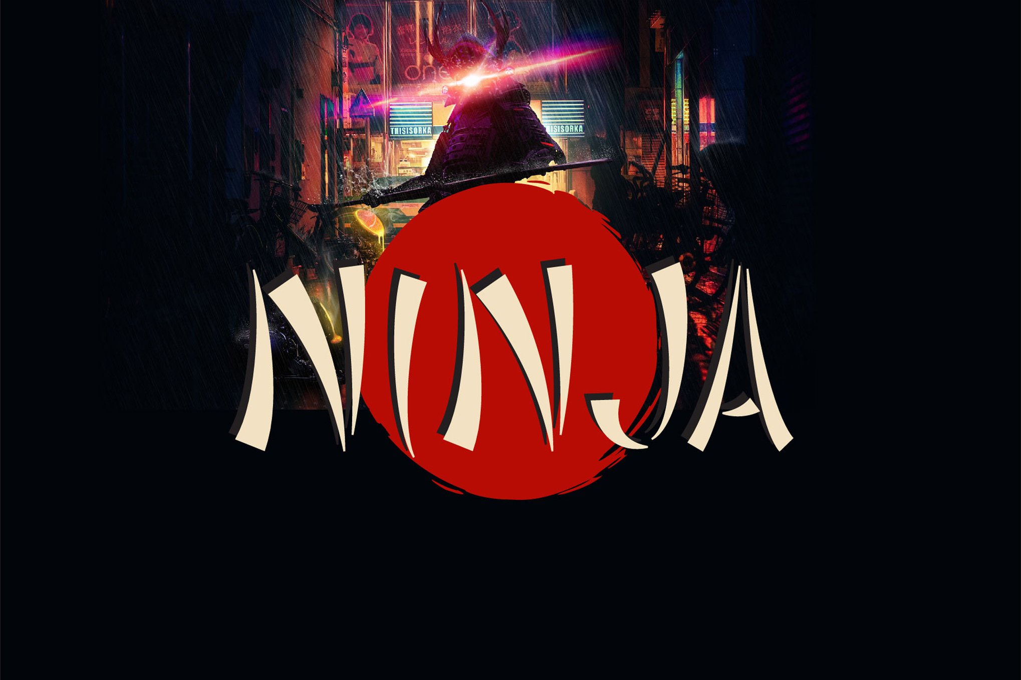
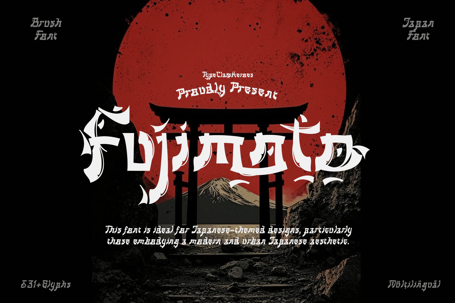
10. Fujimoto
Fujimoto is a technical marvel. By blending the Latin alphabet with the specific stroke contrast of Mincho (Japanese serif style), it creates a result that feels incredibly authentic to Japanese speakers while remaining legible to global audiences.
Supporting Data: Why Quality Matters
When choosing between premium and free fonts, designers must consider the technical limitations. Professional-grade samurai fonts (such as those listed above) offer:
- Kerning & Ligatures: Essential for ensuring that "brush-style" letters don’t collide or look awkward.
- Multilingual Support: The inclusion of extended Latin character sets is vital for global branding.
- OTF/WOFF Flexibility: Ensuring that the font renders correctly on both high-resolution print materials and mobile web browsers.
Implications for Future Design Trends
The rise of "samurai-chic" is not merely a passing trend; it is part of a larger move toward "Cultural Maximalism." As brands look to distinguish themselves in a crowded digital marketplace, they are turning toward specific, evocative historical aesthetics.
The implication for designers is clear: simply picking a "cool" font is no longer enough. The most successful branding projects in the coming years will be those that use these typography styles to tell a story. Whether it is the history of the katana or the discipline of the dojo, the font becomes the voice of the brand.
How to Utilize These Fonts Effectively
To get the most out of these typefaces, consider the following best practices:
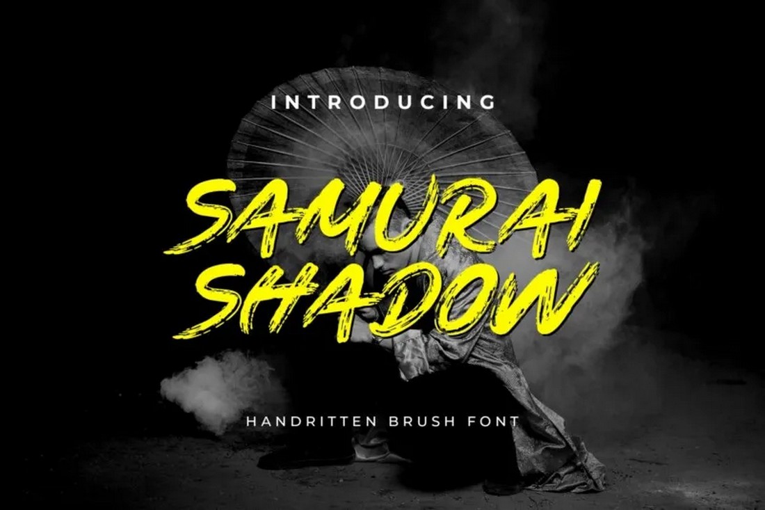
- Prioritize Contrast: These fonts are often bold. Pair them with a clean, understated sans-serif for body text to let the samurai-style display font shine.
- Use OpenType Features: Many of these fonts include "alternates." Swapping out a repetitive character can make the text look like a genuine, hand-painted piece of calligraphy rather than a digital asset.
- Mind the Spacing: Because these fonts often have varying line widths, pay close attention to tracking (letter spacing). Loosening the tracking slightly can often increase the "cinematic" feel of the design.
Conclusion: A Timeless Legacy
The samurai-inspired font is a bridge between two worlds. It honors the ancient traditions of the East while providing the tools necessary for the digital creator of the 21st century. As we look forward, we can expect to see these fonts continue to evolve, becoming even more integrated with our digital experiences.
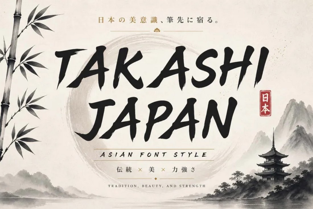
For the designer, the challenge remains the same as it was for the ancient calligraphers: to balance the wild energy of the brush with the precision of the blade. With the right selection from the collection above, you have the power to infuse your next project with the spirit, discipline, and undeniable strength of the samurai.

 Layla Zulfa
 Jia Lissa
 Ali Ikhwan
 Raul Delapena Setiawan
 Nana
Nana
 Muslim
 Asep Darmawan
 Neng Nana