
 Neng Nana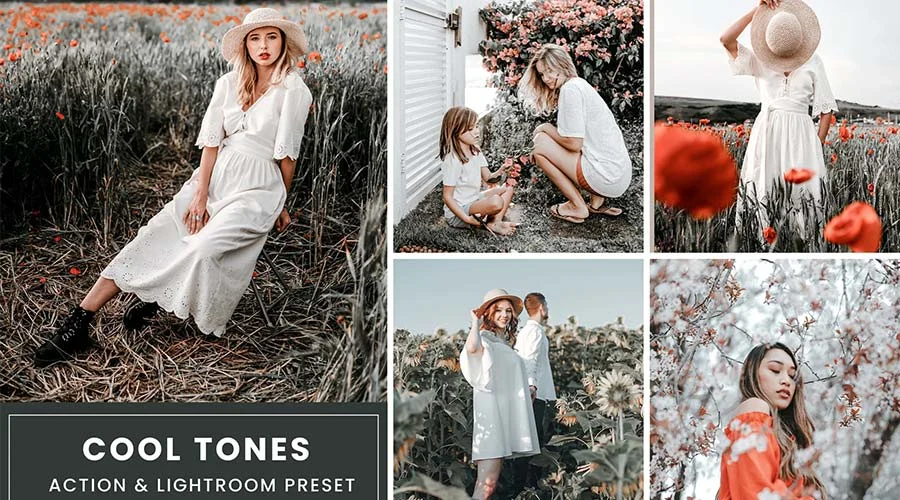
In the contemporary digital landscape, a photograph is rarely a finished product the moment the shutter clicks. Whether you are a professional portraitist, a landscape enthusiast, or a social media content creator, the "digital darkroom" is where the true narrative is forged. Among the most potent tools in a photographer’s arsenal today are Look-Up Tables (LUTs)—predefined mathematical formulas that transform the colors, curves, and white balance of an image to evoke specific moods and cinematic aesthetics.
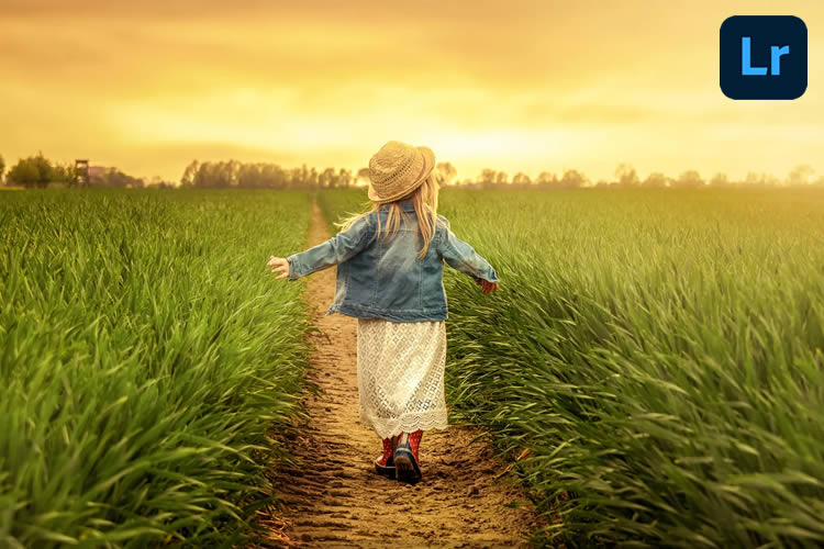
By leveraging Lightroom LUTs, designers and photographers can transcend the limitations of raw captures, injecting emotion, time, and atmosphere into their work with surgical precision. This guide explores the transformative power of these digital assets, detailing how they function, why they are essential, and how you can select the perfect set to define your visual signature.
The Evolution of Digital Color Grading: From Manual to Instant
Color grading was once the exclusive domain of high-end film laboratories and boutique post-production houses. Editors would spend hours meticulously adjusting curves, saturation, and hue luminance to achieve a specific "look." Today, the barrier to entry has evaporated.
Modern LUTs for Adobe Lightroom represent the democratization of professional color theory. By automating complex adjustments—such as shifting shadows into teal or warming highlights to mimic golden hour—these presets allow creators to focus on the story rather than the technical minutiae of color science. Beyond the aesthetic upgrade, the primary implication for the modern creative is time efficiency. In a fast-paced media economy, the ability to apply a high-end, consistent look across an entire portfolio in a single click is not just a luxury; it is a competitive necessity.

The Science and Strategy of Color Grading
To understand the impact of LUTs, one must understand what they do to an image’s data. A LUT acts as a transformation map. When applied, it instructs Lightroom to map specific input colors to new output values. This process goes far beyond simple filters; it involves complex manipulations of white balance, split toning, and selective color desaturation.
When choosing a collection, photographers must consider the "visual intent" of their project. Are you aiming for the nostalgic grain of a vintage film stock, or the sterile, high-contrast look of urban architecture? By aligning the LUT with the subject matter, the photographer can reinforce the underlying message of the image.

Curated Collections: A Deep Dive into Stylistic Categories
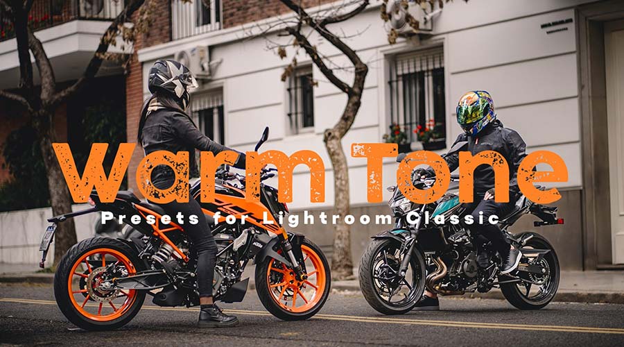
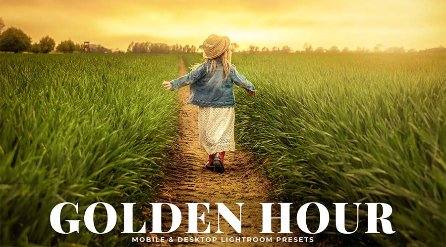
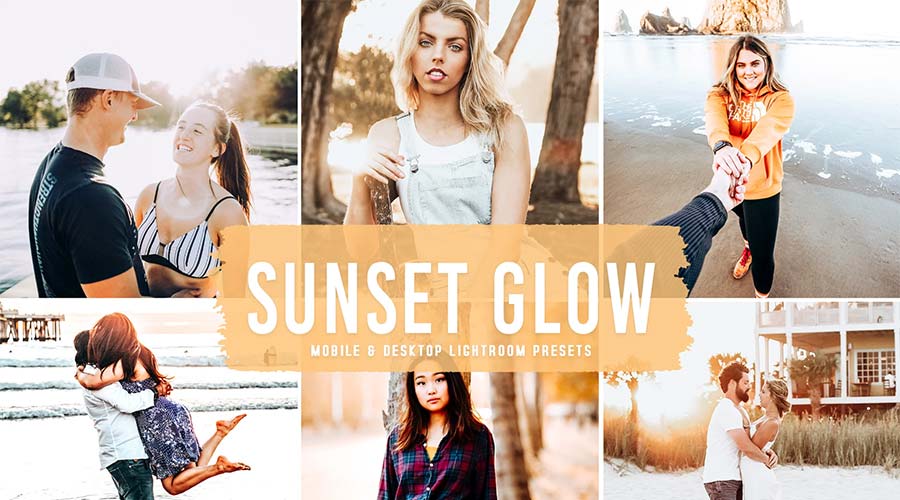
Warm Tone Lightroom Color Grading
Warmth is the most effective tool for inducing nostalgia or comfort. These LUTs are engineered to pull orange, red, and yellow tones forward. They are indispensable for sunset portraits, where you want to emphasize the "glow" of skin tones, or landscapes that require a sense of life and vitality.

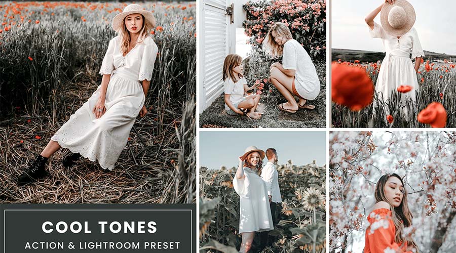
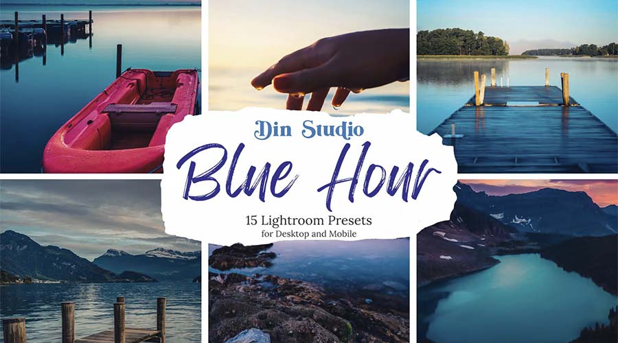
Cool Tone Color Grading
In contrast, cool tones—leaning into blues, teals, and cyans—provide a sense of detachment, professional cleanliness, or mystery. These are frequently employed in fashion photography and urban "street" aesthetics to make subjects stand out against warmer, cluttered backgrounds.
The Vintage Film Aesthetic
There is an enduring human connection to analog photography. The "Vintage Film" collection mimics the characteristic response of classic film stocks. By adjusting the black point to lift shadows and adding subtle shifts in the color channels, these LUTs recreate the "magic" of celluloid without the cost of chemical development.
Cinematic and Hollywood-Inspired Looks
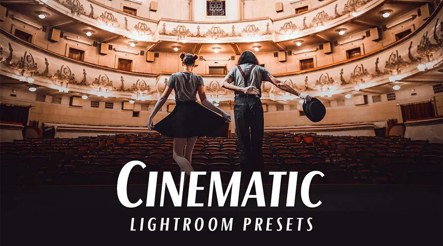
If your goal is to make your photography look like a high-budget feature film, cinematic LUTs are your go-to. These presets focus on color harmony—often utilizing complementary color schemes like orange and teal—to create a professional depth that immediately elevates a simple digital photo into a scene from a movie.

Muted and Desaturated Tones
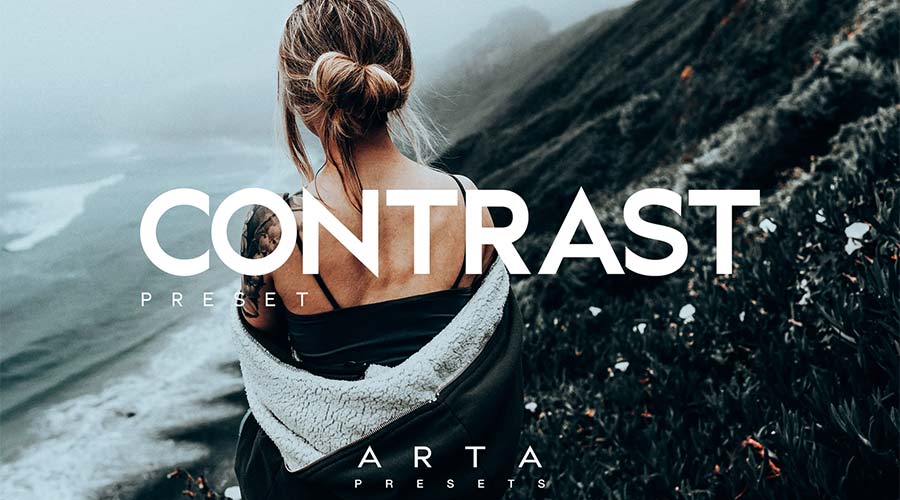
For storytelling that requires a serious, somber, or "lifestyle" tone, muted presets are ideal. By reducing the saturation and shifting the hues toward grays or deep greens, these LUTs allow the photographer to strip away distractions, focusing the viewer’s eye on texture and composition rather than vibrant color.
The Rich and Moody Collection
Inspired by the depth of a dark roast coffee or a stormy evening, these presets maximize dynamic range. They are perfect for photographers working in low-light environments, helping to bridge the gap between deep shadows and glowing highlights while maintaining rich, earthy tones.
Matte Finish Aesthetics
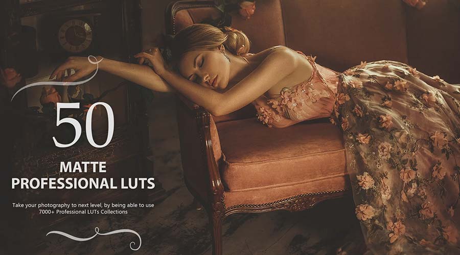
The matte look—characterized by crushed blacks and a slightly "faded" appearance—has become a hallmark of contemporary digital design. These presets remove the harsh "digital" edge from images, giving them a soft, organic finish that feels tactile and sophisticated.
Pastel and Airy Tones
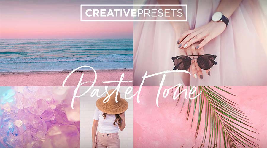
Ideal for wedding photography, spring editorial work, and lifestyle content, pastel LUTs soften the color palette. By lifting the highlights and shifting midtones toward soft pinks, blues, and yellows, these presets create an atmosphere of light, joy, and airiness.
Seasonal Transformations
Color grading also serves as a tool for temporal storytelling. Our collection includes specialized packs for the four seasons:
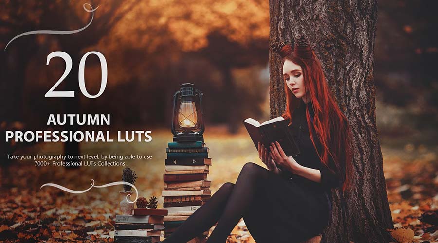
- Autumn: Leveraging deep oranges, browns, and crimsons to capture the transition of the forest.
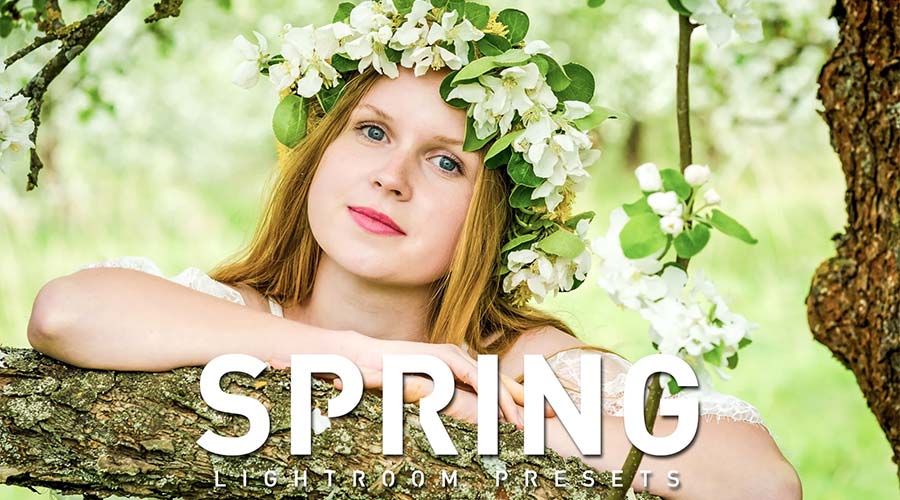
- Spring: Emphasizing lush greens and bright whites to denote growth and new beginnings.
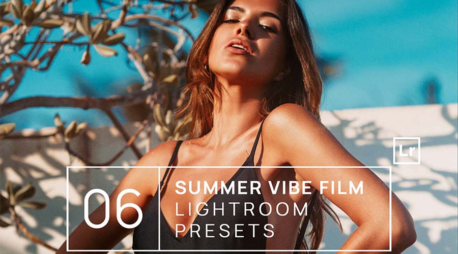
- Summer: Boosting vibrancy and warmth to capture the intensity of the midday sun.
- Winter: Focusing on sharp contrast, cool blue highlights, and desaturated shadows to convey the bite of the cold.
Advanced Techniques: Beyond the Initial Click
While LUTs are designed to be "one-click" solutions, the hallmark of a master photographer is the ability to customize. Once a LUT is applied, the "professional" approach involves fine-tuning the opacity and global adjustments.
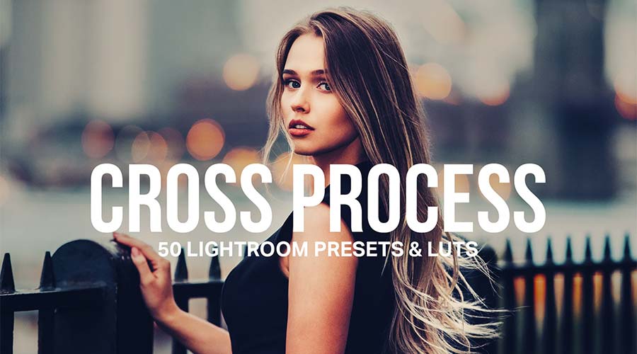
For instance, if a "Golden Hour" LUT is applied to an image that is already bright, the intensity might need to be dialed back using Lightroom’s "Amount" slider. Conversely, in a "Bleach Bypass" workflow, you might choose to increase the contrast manually after the LUT is applied to ensure the subject remains sharp against the desaturated background.

The Implications for Workflow Efficiency
The integration of these tools into a standard workflow significantly impacts the bottom line for freelance photographers. By reducing the time spent on individual photo adjustments, a photographer can take on more projects and deliver work to clients faster.

Furthermore, using a consistent set of LUTs allows for "visual branding." When a photographer uses a specific, signature color-grading style across their social media and portfolio, it creates a cohesive aesthetic that makes their work instantly recognizable. This is the foundation of building a professional reputation in a crowded digital space.
Conclusion: Finding Your Visual Voice
The journey of photography is one of constant experimentation. While the tools listed here provide a robust framework, the final decision rests with you. Whether you are aiming to replicate the moody, desaturated look of urban street photography or the soft, glowing warmth of a summer portrait, the right LUT serves as the catalyst.
We encourage you to experiment with these collections, apply them to your archive, and observe how they alter the emotional resonance of your work. For those just starting, our free collection of Lightroom LUTs provides an excellent entry point into the world of professional color grading. Remember, the best photo is not just captured; it is curated, refined, and brought to life through the intentional use of color.
As you move forward in your creative journey, treat these presets not as a replacement for your artistic vision, but as a scaffold. By combining your unique perspective with the power of modern color-grading technology, you will be well on your way to crafting images that are not just seen, but felt.

 Lina Irawan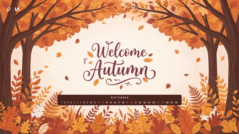
 Pevita Pearce
 Suro Senen
 Jia Lissa
 Evan Lee Salim
 Ali Ikhwan
 Lina Hope