
 Lina Hope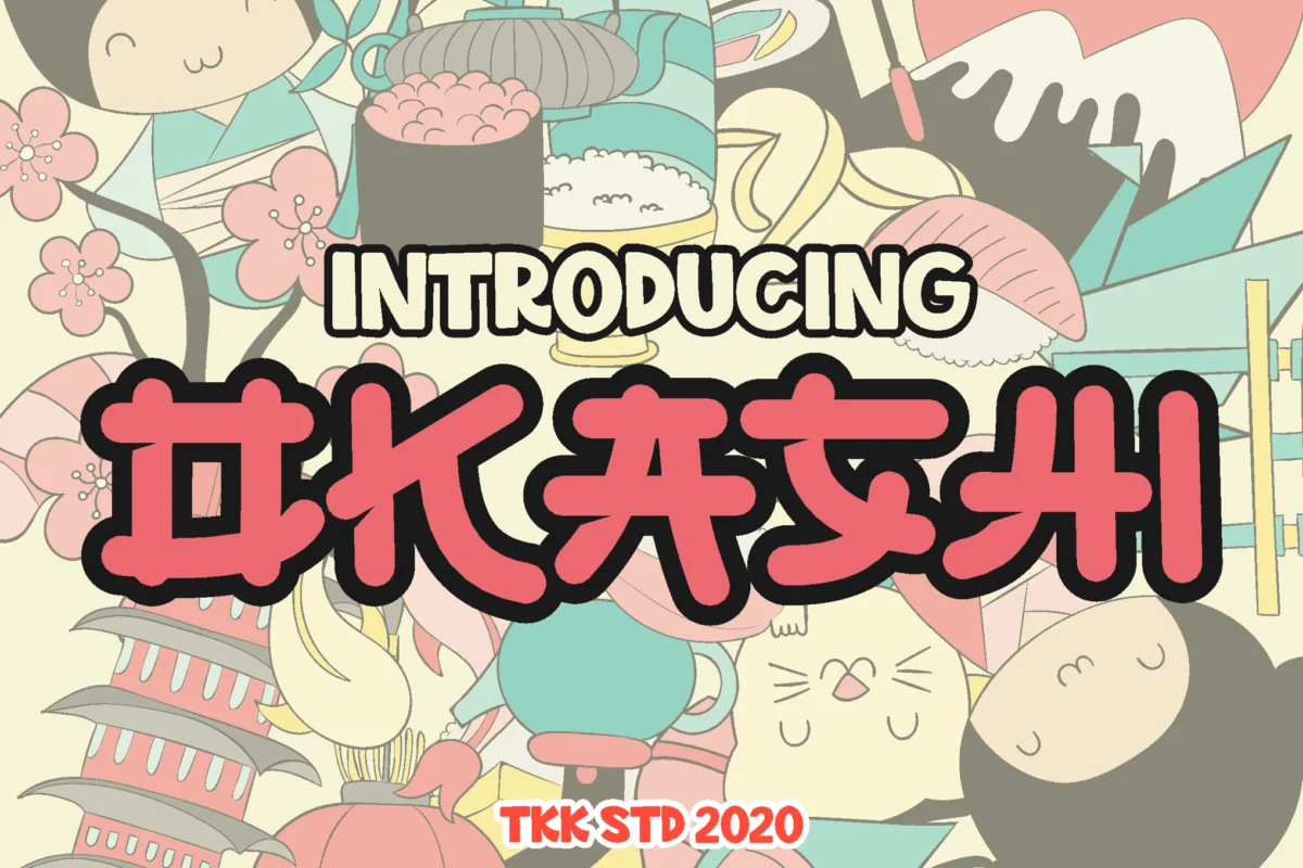
In the ever-evolving landscape of digital design, the "Kawaii" aesthetic has transcended its origins in Japanese pop culture to become a global design phenomenon. Derived from the Japanese word for "cute" or "lovable," this aesthetic is characterized by soft, rounded forms, pastel color palettes, and an inherent sense of playfulness. Central to this visual language are "Kawaii fonts"—typefaces meticulously engineered to evoke feelings of happiness, nostalgia, and childlike wonder.
Whether you are crafting a brand identity for a youth-oriented product, designing eye-catching social media content, or illustrating a whimsical children’s book, the right typography is the cornerstone of your project’s emotional impact. This article explores the evolution of the Kawaii font movement, provides a curated directory of premium and free typefaces, and analyzes the implications of using these emotive fonts in professional design.
The Genesis of the Kawaii Aesthetic
The cultural roots of "Kawaii" can be traced back to the 1970s in Japan, where a shift toward rounded, bubbly handwriting among teenage girls sparked a design revolution. This "Marui-ji" (round writing) style defied the rigid, traditional calligraphy of the era, representing a form of social rebellion and personal expression.
Over the decades, this aesthetic migrated from notebooks and personal letters to global media, influencing anime, manga, and eventually, the digital typography market. Today, Kawaii fonts serve as a bridge between the physical and digital worlds, allowing designers to inject personality into sterile interfaces and corporate marketing materials. By utilizing soft edges and bouncy baselines, these fonts communicate warmth, making them an indispensable tool in the designer’s toolkit.
Curated Selection: Premium Kawaii Fonts
The market for professional-grade Kawaii typography is robust, offering designers versatile assets that go beyond simple "cute" lettering. These fonts often feature advanced OpenType features, ligatures, and multilingual support, making them suitable for high-end branding.
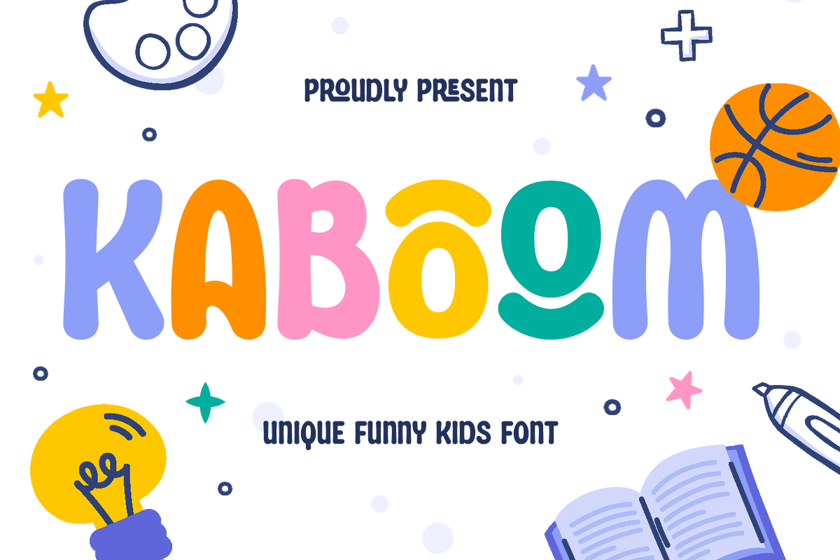
1. Kaboom: The Energetic Powerhouse
KABOOM is not just a font; it is an exclamation point. With its bold, chunky letterforms and rounded geometry, it exudes a high-octane energy perfect for game titles, animated sequences, or vibrant packaging. It remains remarkably legible even at smaller scales, proving that "cute" does not have to compromise on functionality.
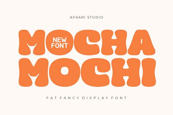
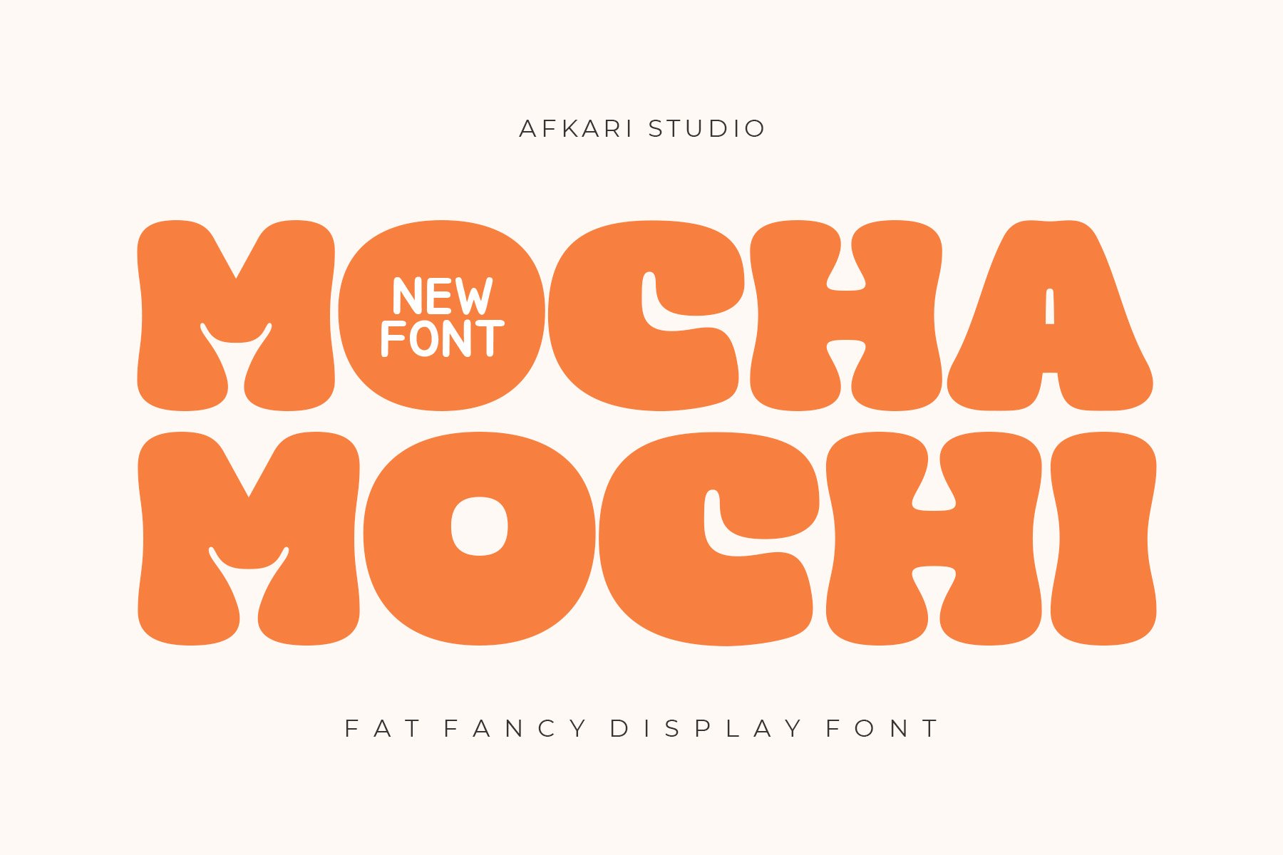
2. Mocha Mochi: The Soft Minimalism
Inspired by the tactile pleasure of Mochi and the warmth of a morning latte, Mocha Mochi is a masterclass in balance. Its fat, rounded strokes feel modern and approachable. It serves as an excellent choice for lifestyle branding or digital interfaces where you need to convey a premium, "cozy" feel.
3. Momotako and Kuwadi: The Playful Standard
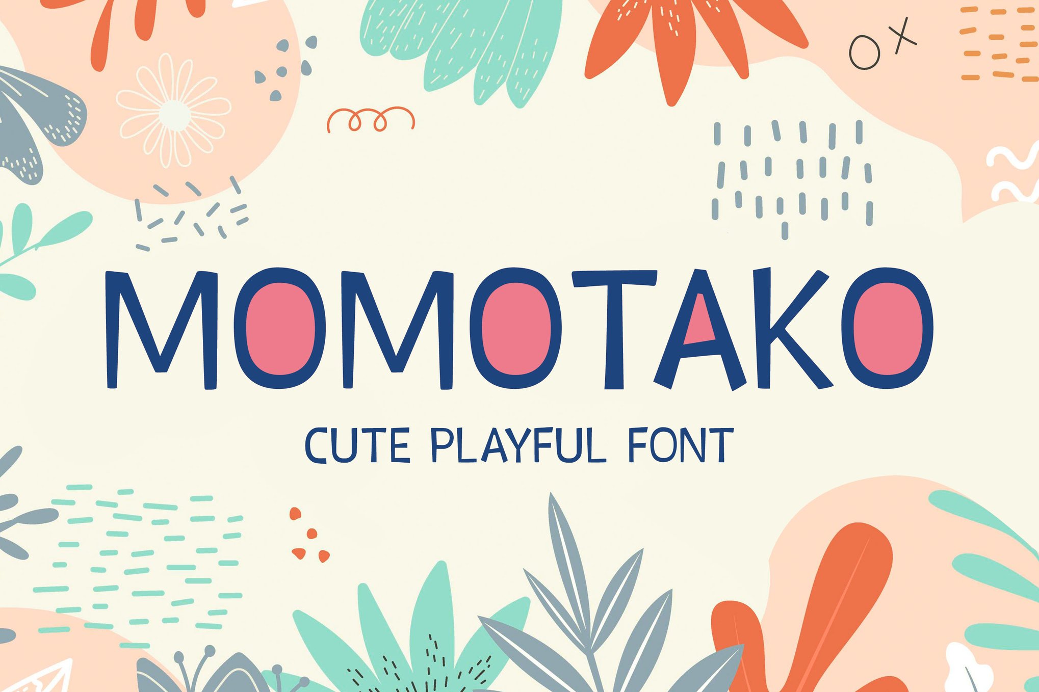
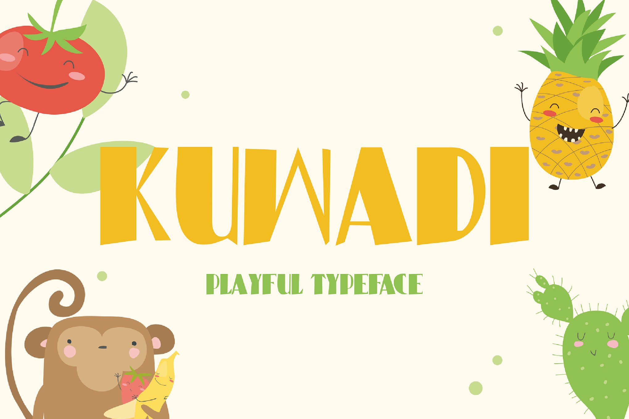
Both Momotako and Kuwadi capture the essence of childhood wonder. While Momotako is optimized for display usage, offering a crisp, clean aesthetic for posters and labels, Kuwadi leans into the "bubble" aesthetic with meticulous, organic curves that feel as though they were drawn by hand.
4. OKASHI and GAYANA: The Faux-Japanese Aesthetic
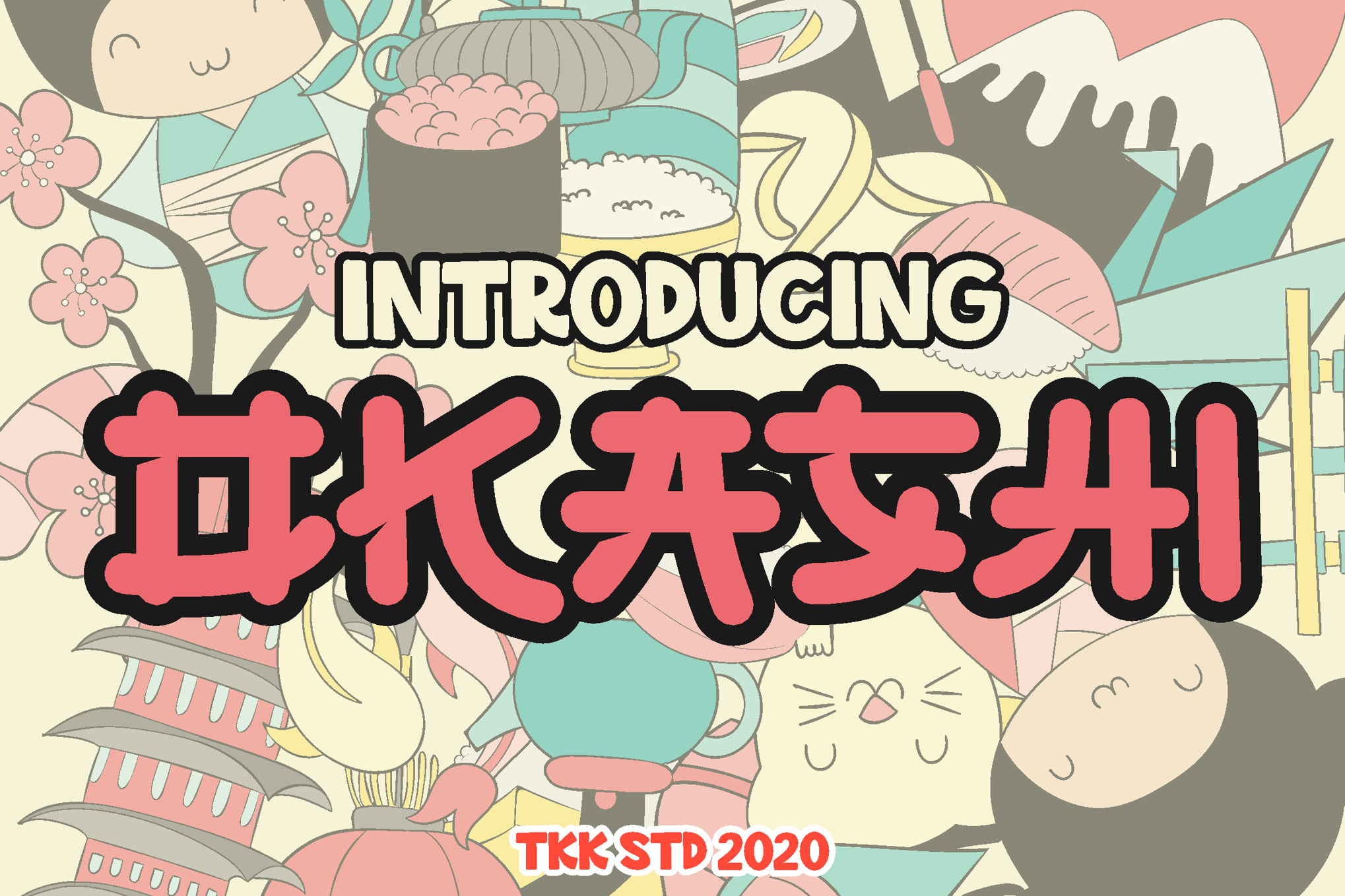
These fonts pay homage to the roots of the movement. OKASHI takes inspiration from Japanese snack packaging, utilizing a bouncy baseline that feels whimsical and approachable. GAYANA, conversely, blends traditional Japanese stylistic influences with modern sans-serif readability, making it a favorite for food branding and culinary-themed logotypes.
5. Specialized Display Fonts
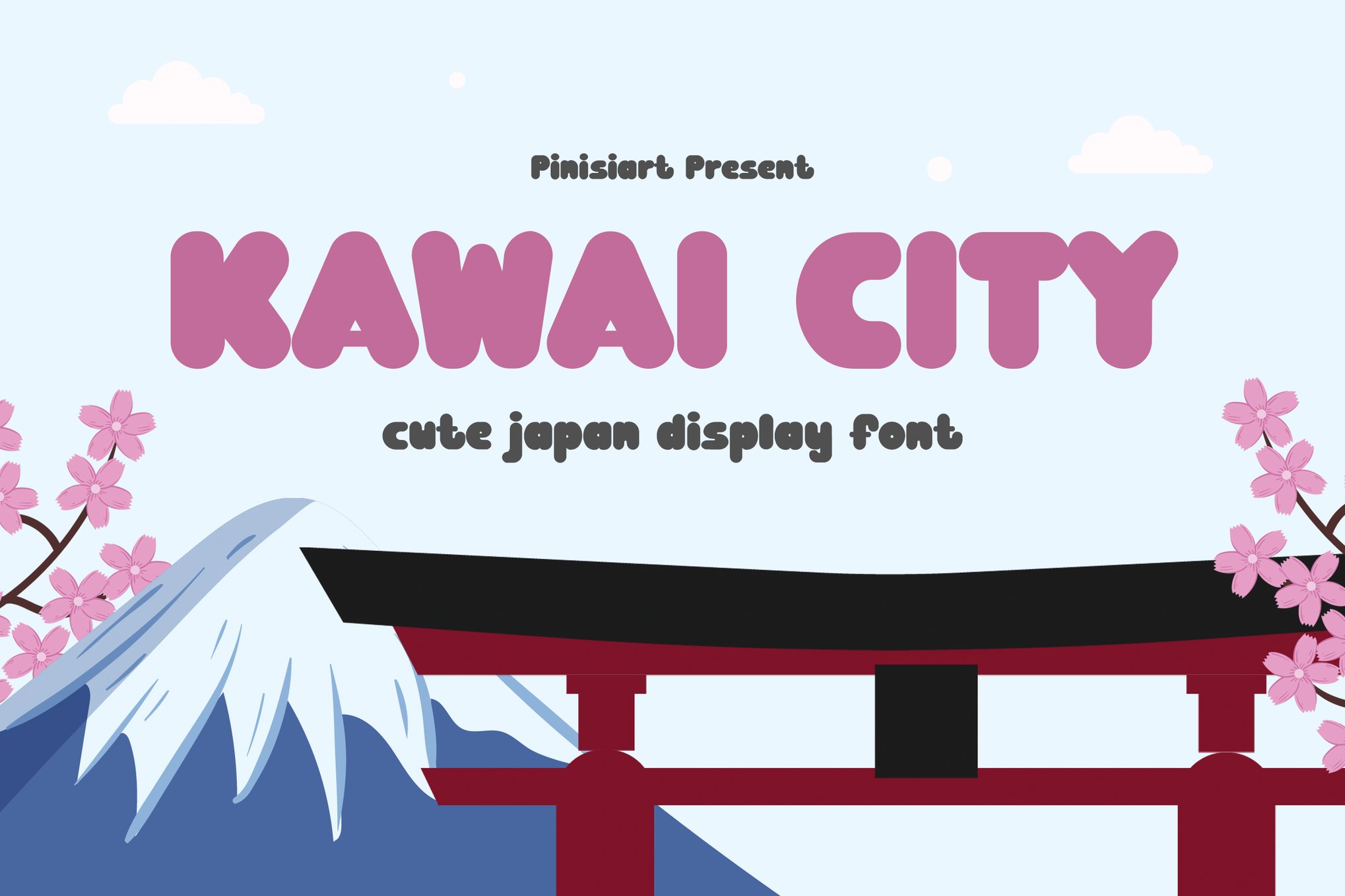
- Kawai City: A high-versatility display font that bridges the gap between gaming aesthetics and school-supply stationery.
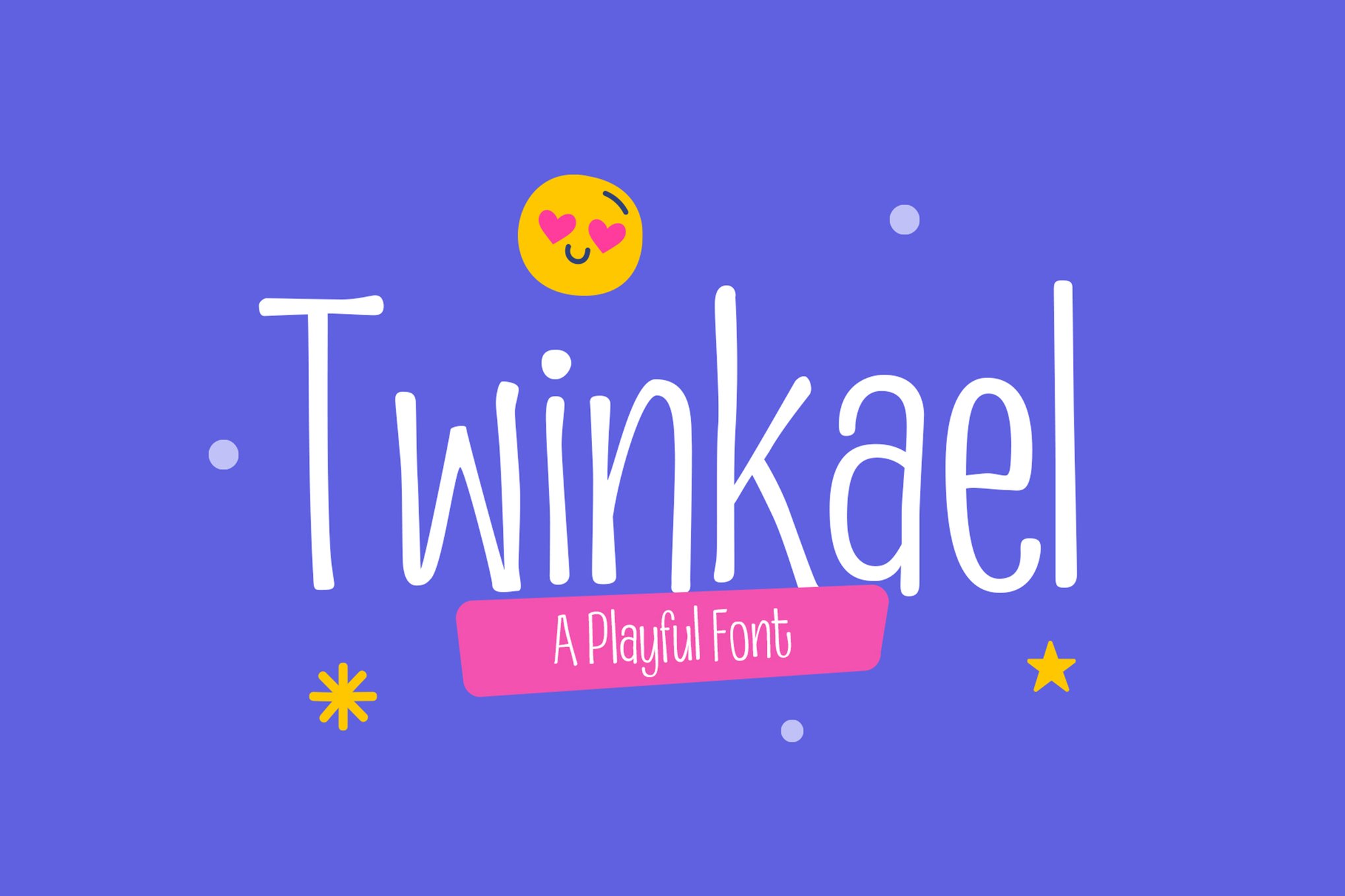
- Twinkael: Notable for its tall, slim characters that offer a sophisticated take on the "cute" genre.
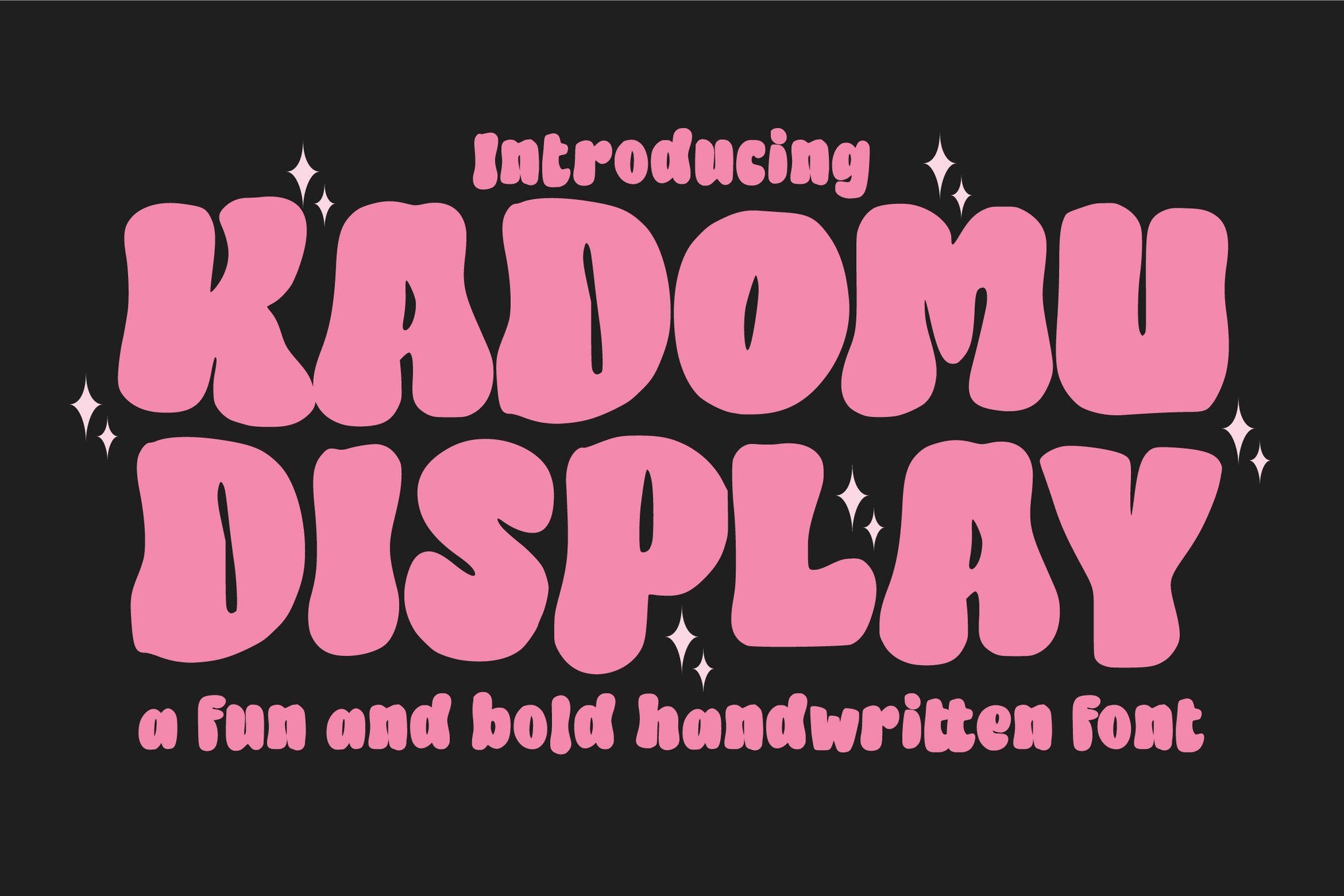
- Kadomu: A designer’s favorite for its inclusion of over 150 glyphs, including swashes and ligatures that allow for truly custom typographic compositions.
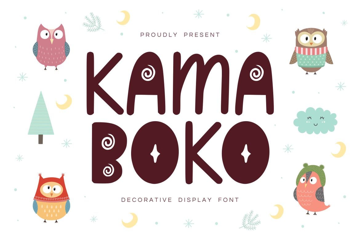
- Kamaboko: A decorative powerhouse that thrives on T-shirts and merchandise.
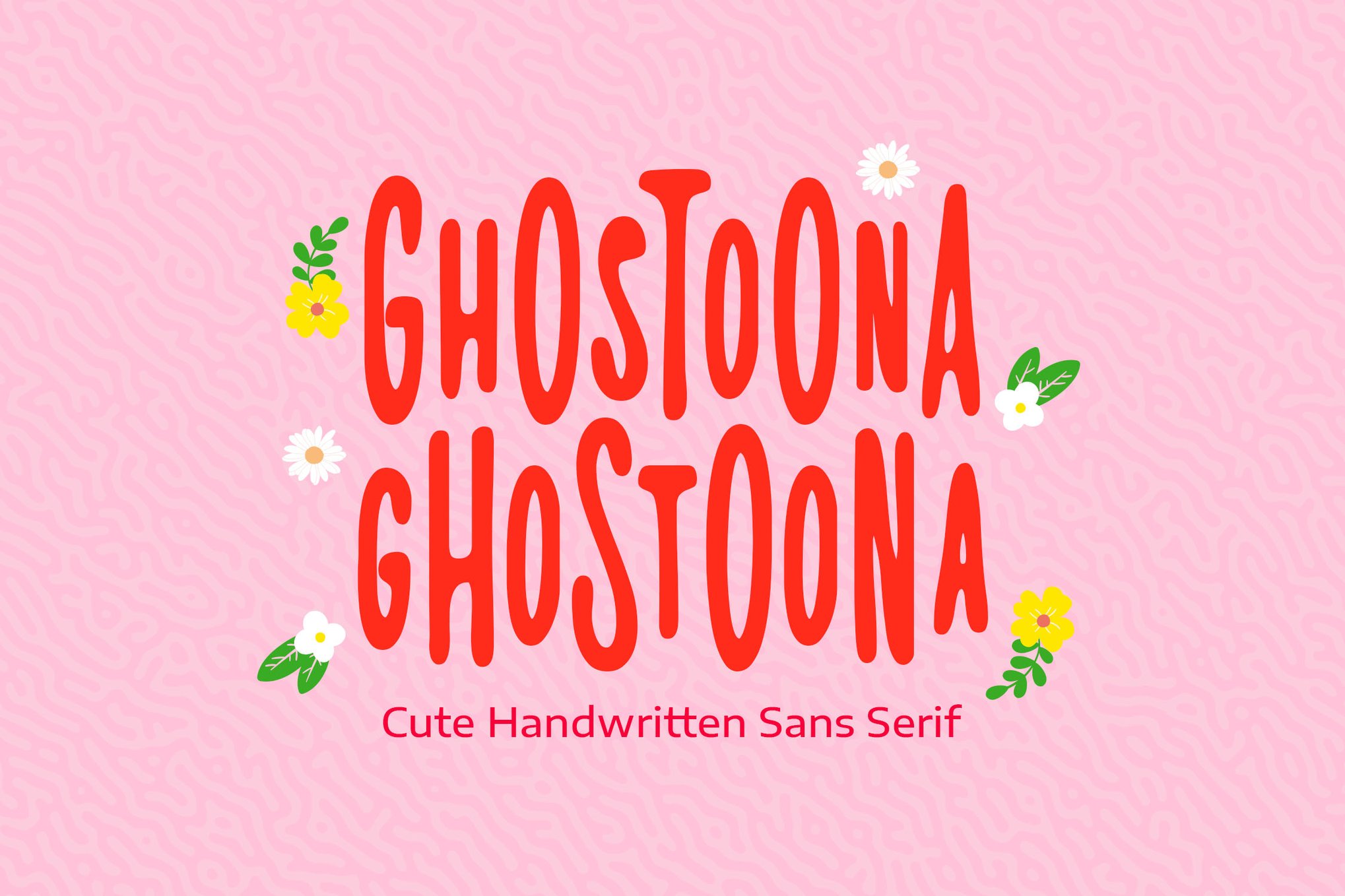
- Ghostoona: A marker-sans style that brings a rugged, handwritten charm to the typically "soft" world of Kawaii fonts.
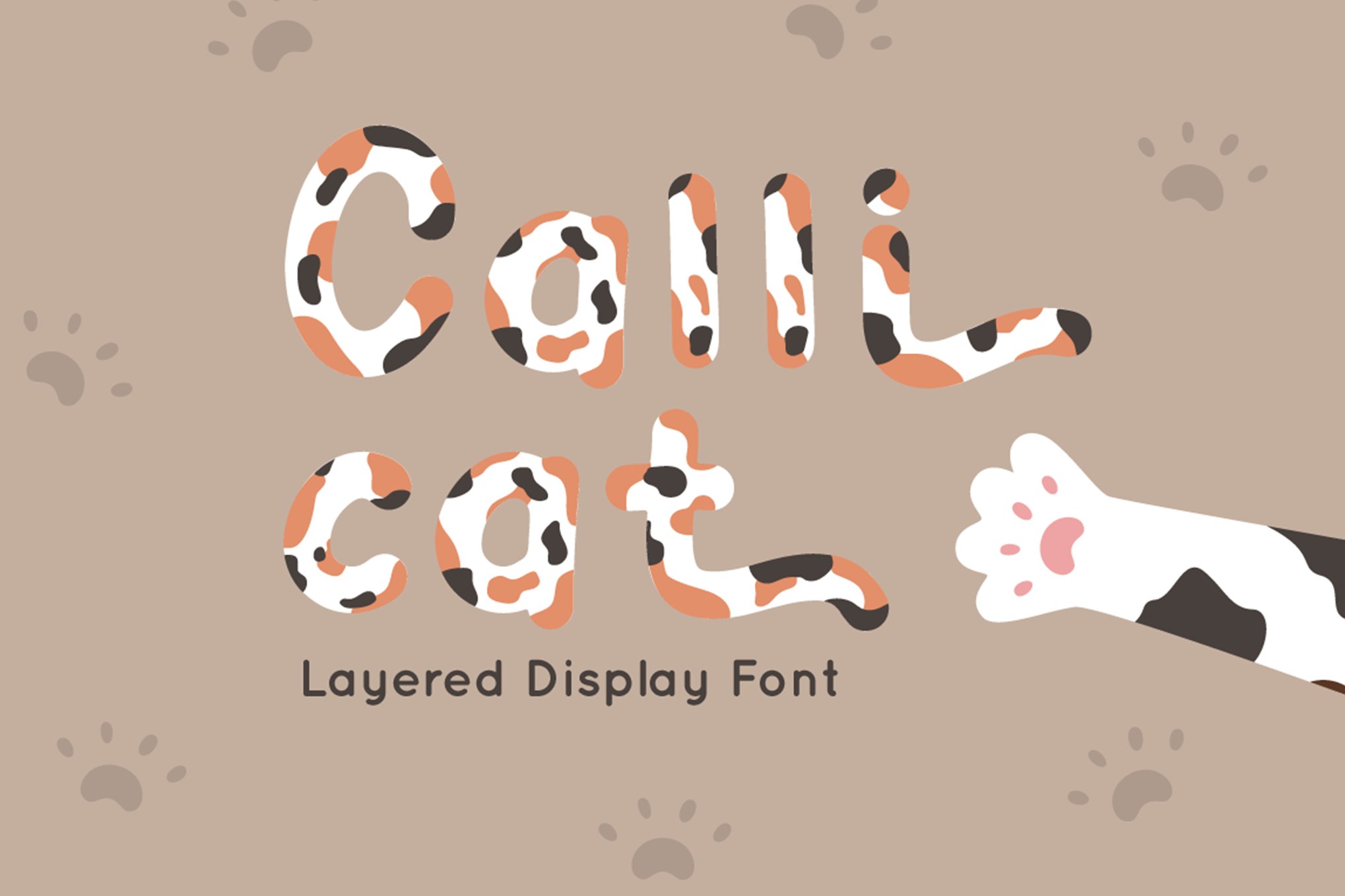
- Calli Cat: A layered font system that allows for multi-color depth, mimicking the patterns of Calico cats.
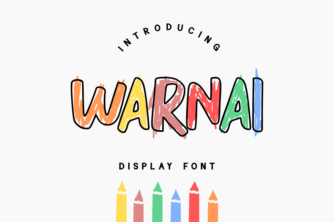
- WARNAI: A multi-style font offering classic, lined, and brush versions for maximum creative control.
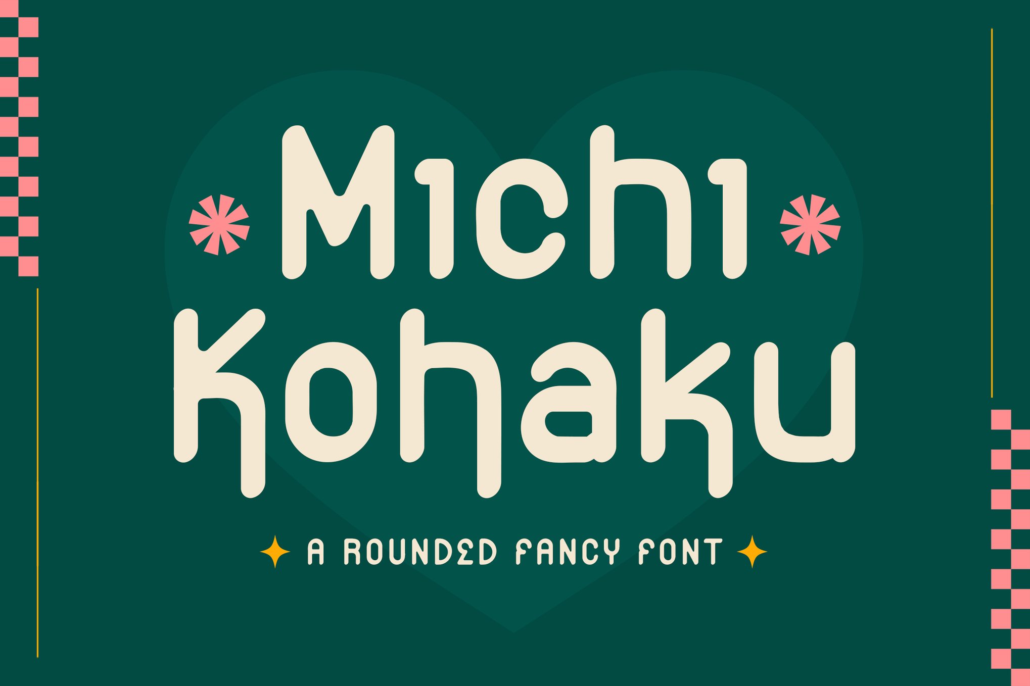
- Michi Kohaku: A blend of elegance and playfulness that functions well in formal invitations that require a lighthearted touch.
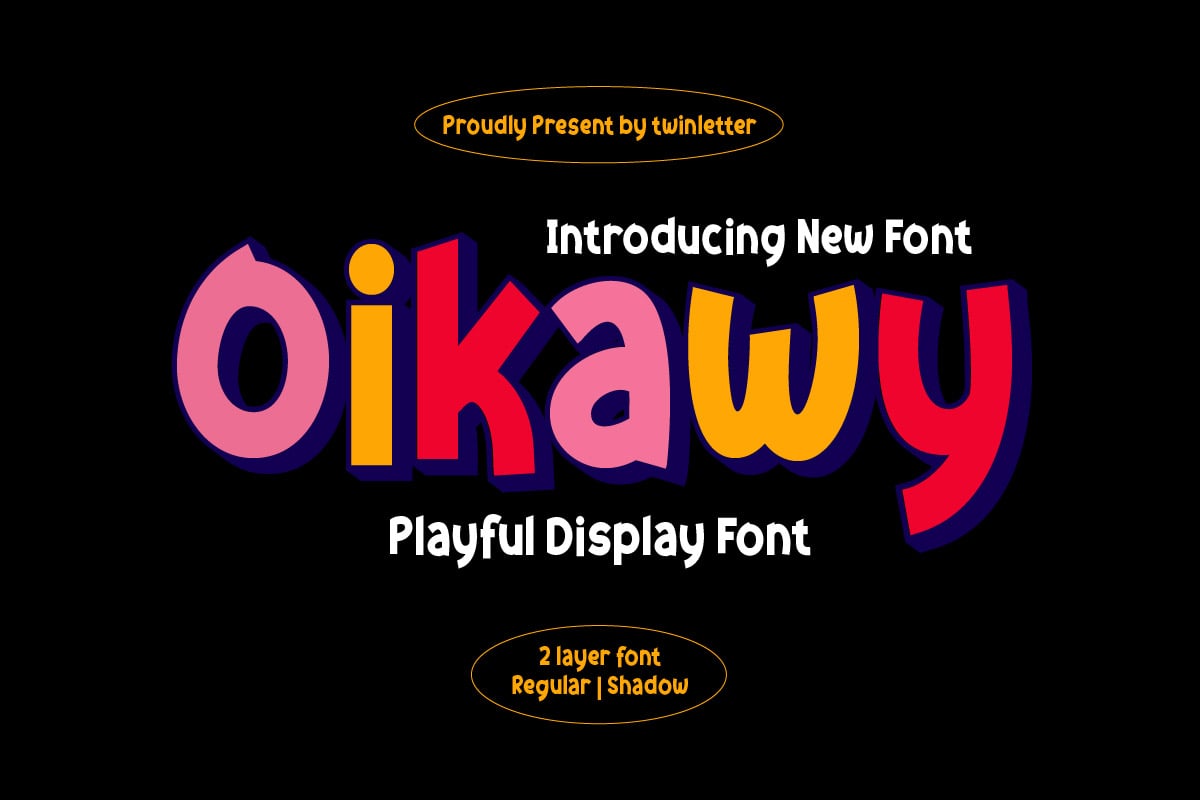
- Oikawy and Hirokuda: Both offer robust multilingual support, ensuring that your "cute" design can reach a global audience without losing its intended charm.
Supporting Data: Why "Cute" Sells
Psychological studies in "Product Semantics" suggest that rounded shapes—often referred to as "soft forms"—are perceived as more approachable, safe, and friendly than sharp, angular typefaces. This is the scientific basis for the success of Kawaii fonts.
In a digital space saturated with aggressive, high-contrast, and minimalist fonts, the use of a Kawaii-inspired typeface acts as a "pattern interrupt." It signals to the consumer that the brand is safe, trustworthy, and human-centric. Data from social media engagement metrics consistently show that posts utilizing playful, rounded typography receive higher levels of interaction, particularly among demographics aged 18–35, who grew up during the height of the digital Kawaii boom.
Free Alternatives: Accessible Design
Professional designers often require free-to-use alternatives for personal projects or rapid prototyping. The following fonts provide the same aesthetic quality as their paid counterparts:
- Free Kawaii Font Family: An excellent entry point for beginners. It features consistent, rounded geometry that works well for social media graphics.
- Mochibop: A font duo that combines a script and a sans-serif, perfect for those who want to create cohesive, professional-looking brand assets without the cost.
- BabyKawaii: The quintessential "child-like" font. It is highly effective for educational content and invitations.
- Kareo Star: A unique typeface that incorporates decorative elements directly into the letterforms, perfect for projects that need a "magical" or "sparkling" quality.
Implications for Modern Branding
The rise of Kawaii typography is not merely a passing trend; it reflects a broader shift in corporate communication. As companies move away from rigid, "corporate" identities, they are adopting "softer" personas to build emotional loyalty.
However, designers must be cautious. The "cute" aesthetic is highly contextual. While it is perfect for a boutique stationary store or an indie game, it may clash with the branding of a financial institution or a legal firm. The implication for modern design is clear: Typography must match the emotional intent of the brand. When used appropriately, Kawaii fonts can humanize a brand; when used incorrectly, they can undermine professional credibility.
Conclusion: Crafting with Personality
The world of Kawaii fonts is vast and varied, ranging from the bold and energetic to the soft and subtle. By carefully selecting a typeface that aligns with your project’s specific goals—whether that be to invoke joy, foster trust, or encourage play—you can elevate your designs from standard to memorable.
As we look toward the future of digital design, the demand for "human-centric" aesthetics will only grow. Kawaii fonts, with their inherent warmth and charm, are poised to remain at the forefront of this movement. Whether you choose a premium, feature-rich typeface or a high-quality free option, the goal remains the same: to create designs that aren’t just seen, but felt.
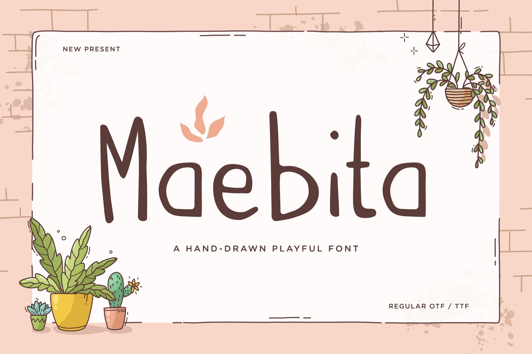
For the modern designer, the lesson is simple: never underestimate the power of a well-placed, rounded, and wonderfully cute character. In a world that often feels fast-paced and serious, a little bit of Kawaii-inspired joy is always in style.

 Reynand Wu
 Iffa Jayyana
 Laily UPN

 Rifan Muazin
 Suro Senen

 Lina Irawan