
 Ammar Sabilarrohman
In the landscape of modern visual communication, few aesthetic movements have transcended cultural boundaries as effectively as "Kawaii." Originating from the Japanese culture of cuteness, the term has evolved from a niche pop-culture fascination into a powerful design language. Central to this visual revolution are "Kawaii fonts"—typefaces characterized by their soft, rounded, and inherently optimistic letterforms. These fonts do more than just display text; they evoke an emotional response, grounding designs in a sense of joy, approachability, and nostalgic warmth.
The Evolution of the Kawaii Aesthetic in Typography
The history of Kawaii typography is deeply intertwined with the evolution of Japanese manga and stationery culture. During the 1970s and 80s, young women in Japan began adopting a rounded, bubbly style of handwriting known as marui-ji (round writing). This style was a rebellion against the rigid, formal structure of traditional calligraphy.
As digital design tools became more accessible in the late 90s and early 2000s, this hand-drawn aesthetic was formalized into digital font files. What began as a subcultural trend in Tokyo’s Harajuku district has since become a global design staple. Today, Kawaii fonts are no longer restricted to children’s products; they are sophisticated design assets used in high-end branding, mobile app interfaces, and social media campaigns to foster a connection with audiences through "cuddly" design principles.
Anatomy of a Kawaii Font: Why They Work
To understand why Kawaii fonts are so effective, one must analyze their structural composition. Most fonts in this category share specific visual traits:
- Low Contrast and Rounded Terminals: Sharp edges are minimized in favor of smooth, bulbous curves. This eliminates the "aggressiveness" often found in high-contrast serifs, making the text feel soft and approachable.
- Bouncy Baselines: Many Kawaii fonts utilize an irregular, "bouncy" baseline, where letters sit at varying heights. This mimics the imperfection of human handwriting, which the brain subconsciously interprets as authentic and friendly.
- Compact Proportion: These fonts often lean toward a "chunky" or "fat" aesthetic, which occupies space in a way that feels full, hearty, and generous.
- Whimsical Embellishments: Many of the best fonts in this category include built-in ligatures that mimic doodles, hearts, or stars, providing designers with an instant way to add personality without additional graphic elements.
Curated Selection: Premium Kawaii Typefaces
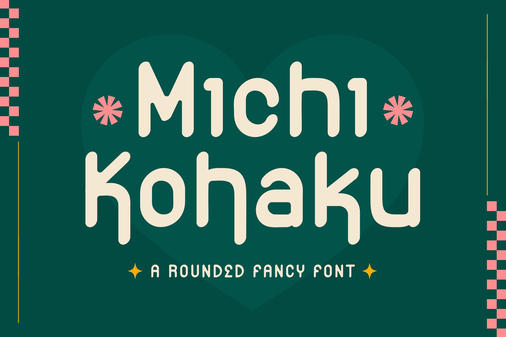
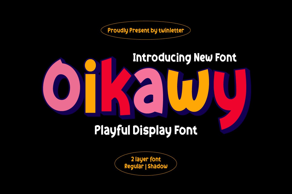
For designers seeking to infuse their projects with a touch of sweetness, the following premium fonts represent the pinnacle of the genre:
1. Kaboom – The Energetic Crowd-Pleaser
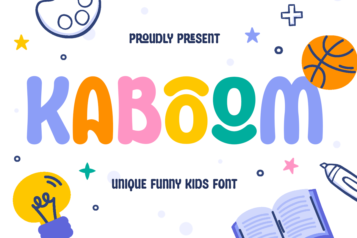
Kaboom is the embodiment of "happy" design. With its bold, thick strokes and exaggerated rounded edges, it is particularly effective for large-scale displays. Whether it is used for a game title or a product label for snacks, its legibility is as high as its personality.
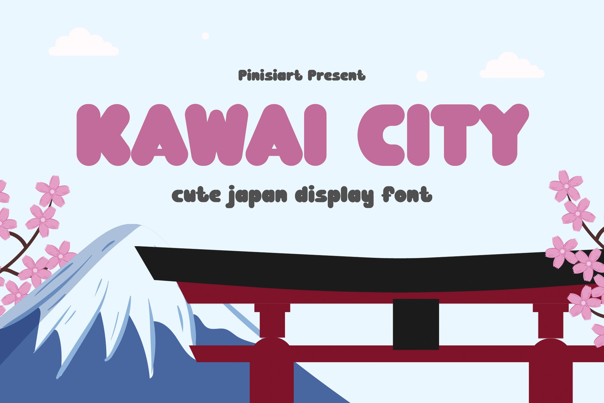
2. Mocha Mochi – The Comfort Choice
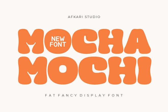
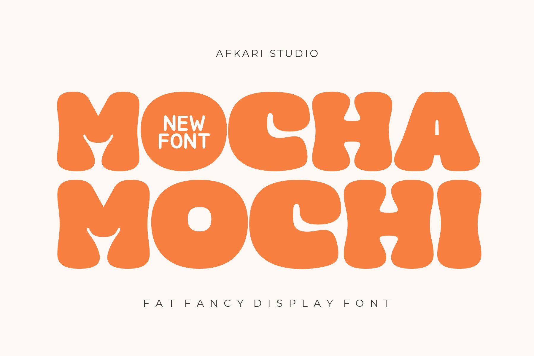
Drawing inspiration from the soft, doughy texture of Japanese Mochi and the warmth of a coffee shop, this font is a masterclass in display design. It is remarkably "fat" and balanced, providing a modern, premium feel that works exceptionally well in packaging design.
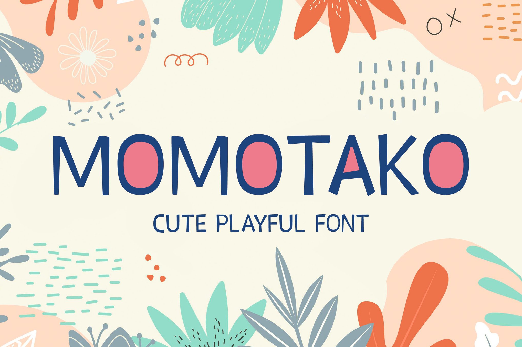
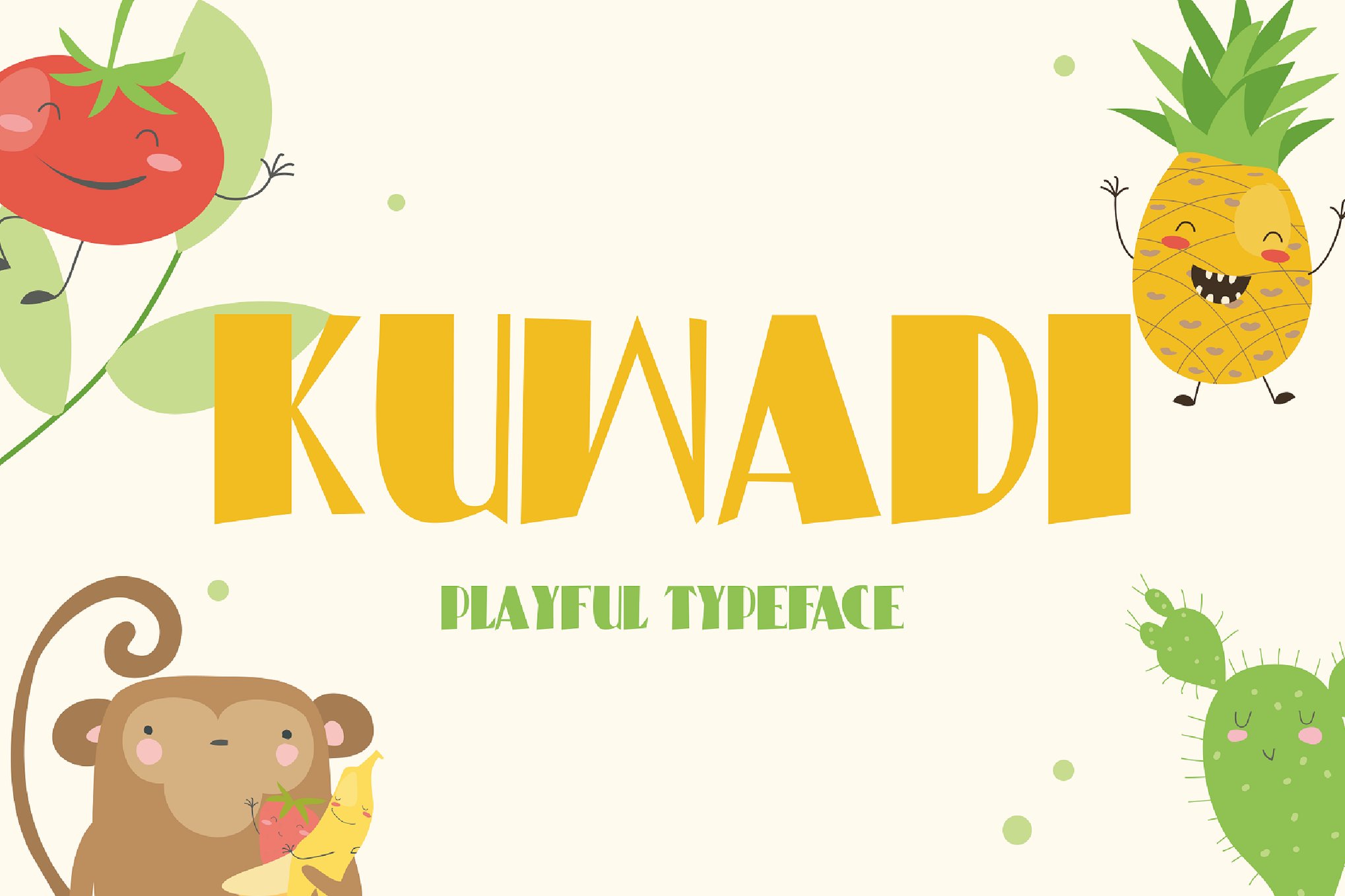
3. Momotako & Kuwadi – Playful and Bubbling
Both fonts serve as excellent examples of the "bubble-letter" trend. Kuwadi, in particular, is noted for its meticulously crafted curves, which make it ideal for educational materials, children’s books, or any application where readability for young eyes is a priority.
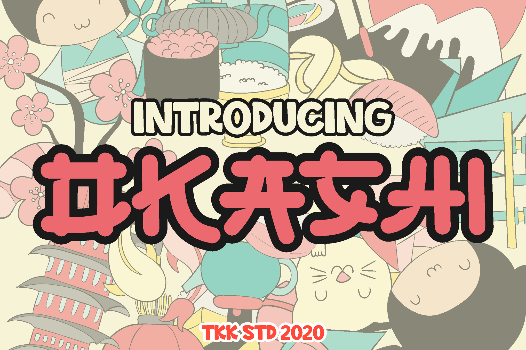
4. OKASHI & GAYANA – Faux-Japanese Influence
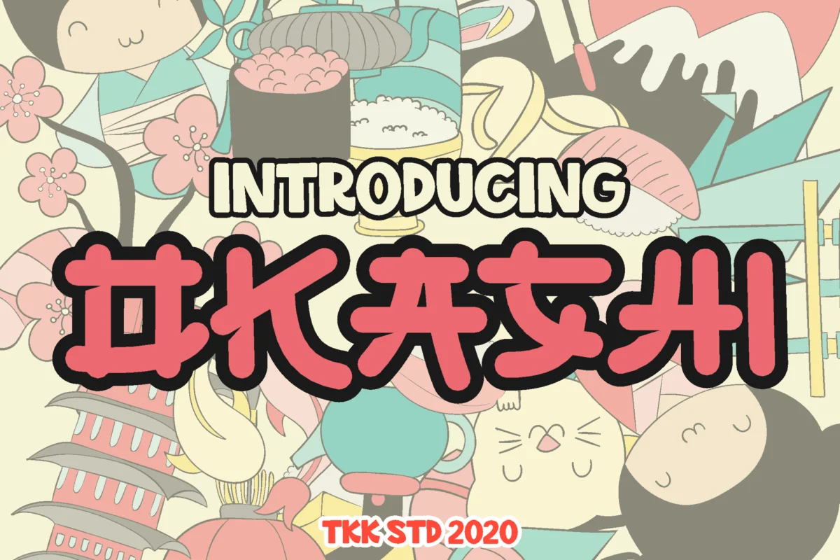
These fonts bridge the gap between Western typography and Japanese visual culture. They are "faux-Japanese," meaning they capture the essence of manga lettering and snack packaging labels while remaining fully readable for global audiences. They are indispensable for food branding and creative lifestyle blogs.
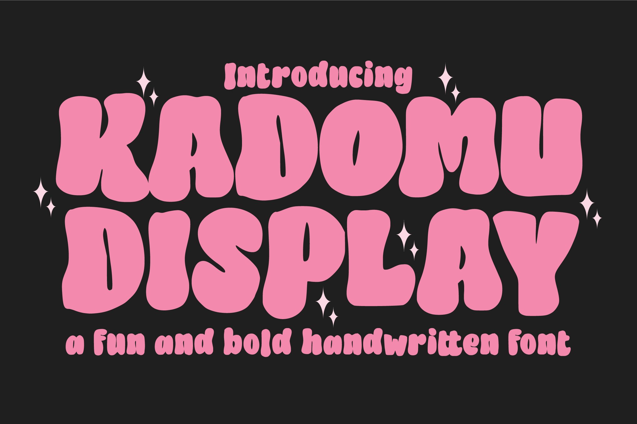
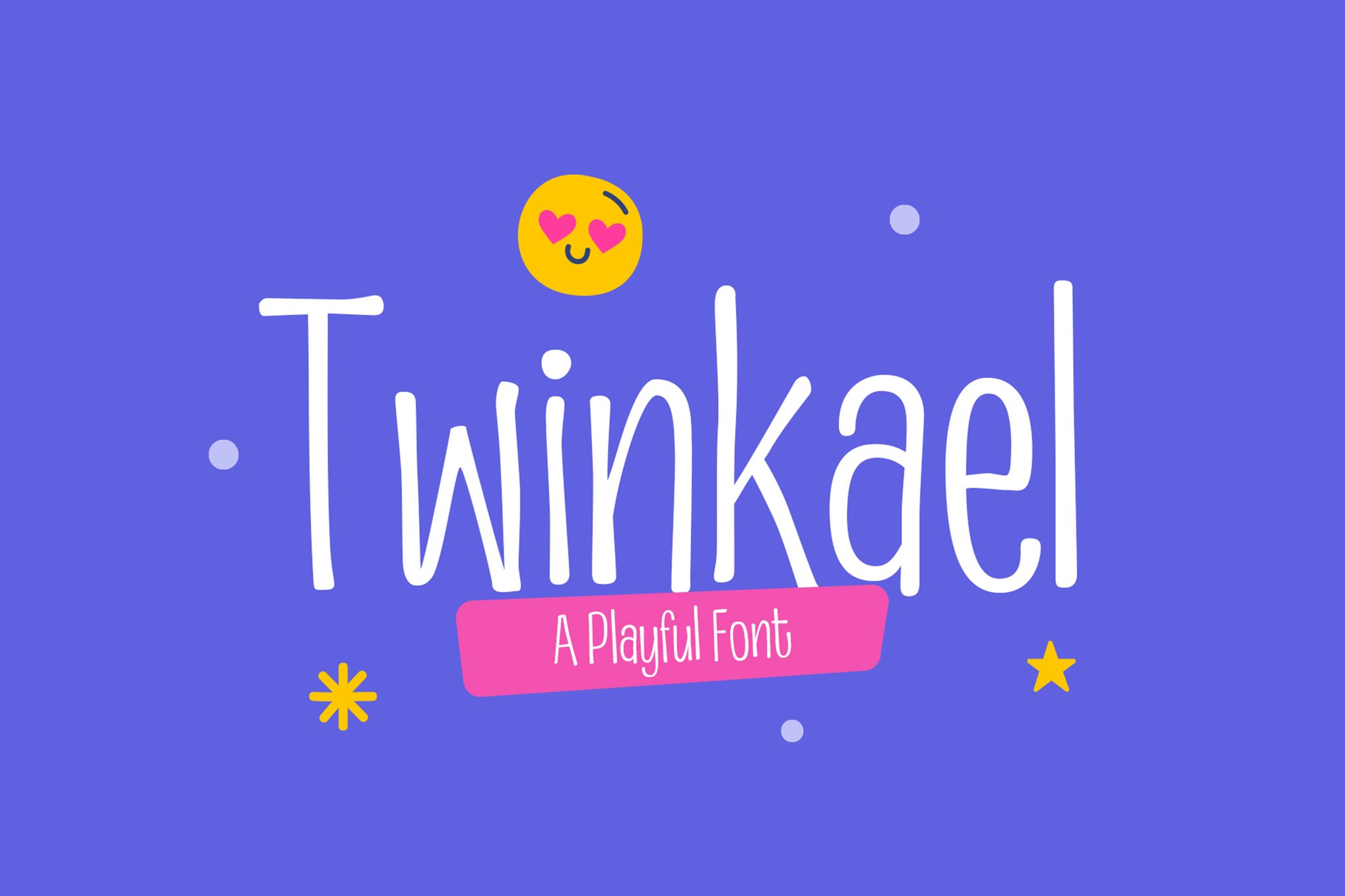
5. Twinkael & Kadomu – The Artistic Alternatives
For those who prefer a more "hand-drawn" look, these fonts offer a sophisticated take on the genre. With high-end OpenType features like swashes and ligatures, they allow designers to create custom-lettered looks that feel boutique and bespoke.
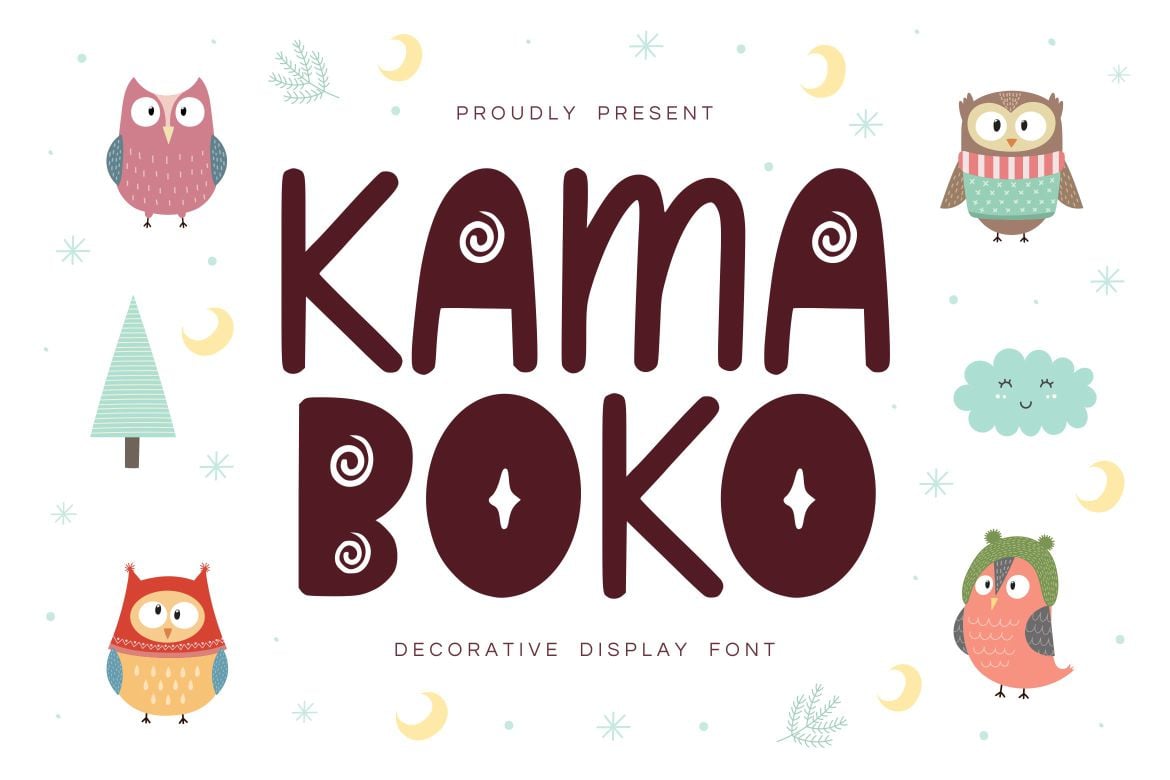
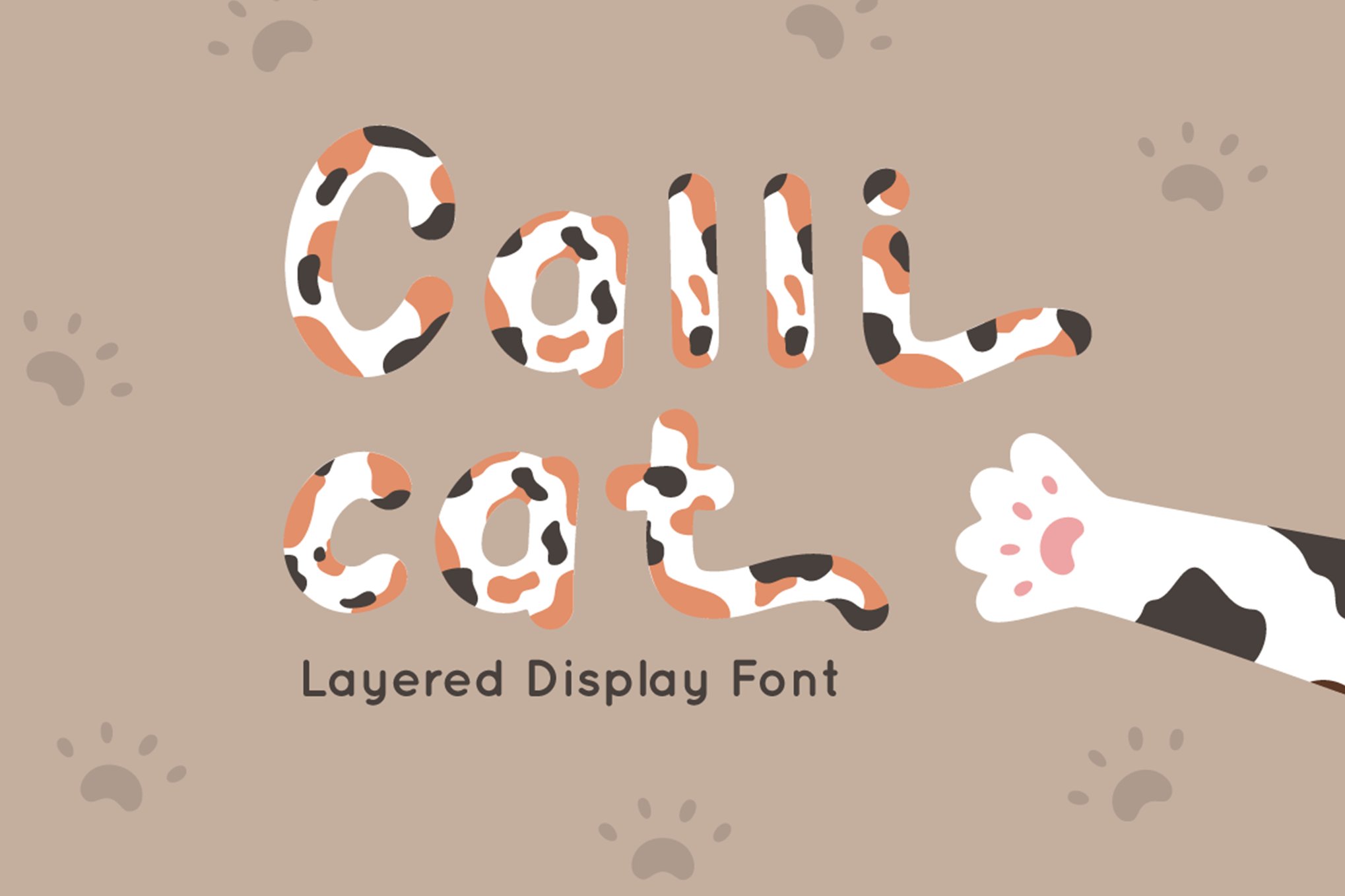
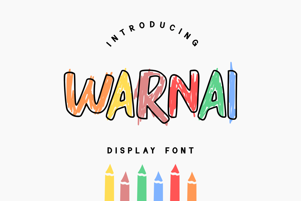
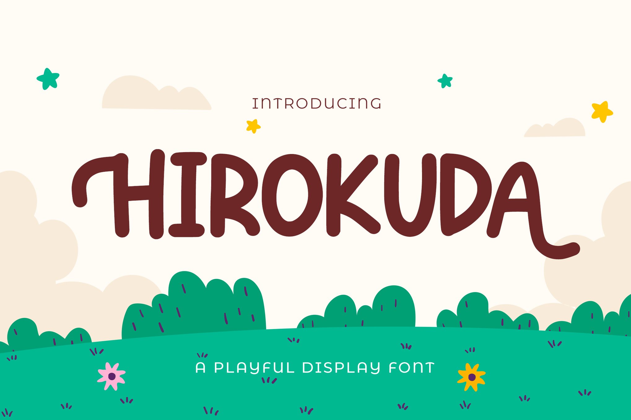
6. Specialized Display Options: Calli Cat, WARNAI, and HIROKUDA
These typefaces cater to specific design needs—such as layered effects (Calli Cat), multi-colored or stylized letterforms (WARNAI), or highly decorative, whimsical structures (HIROKUDA). They prove that "cute" does not have to mean "simplistic."
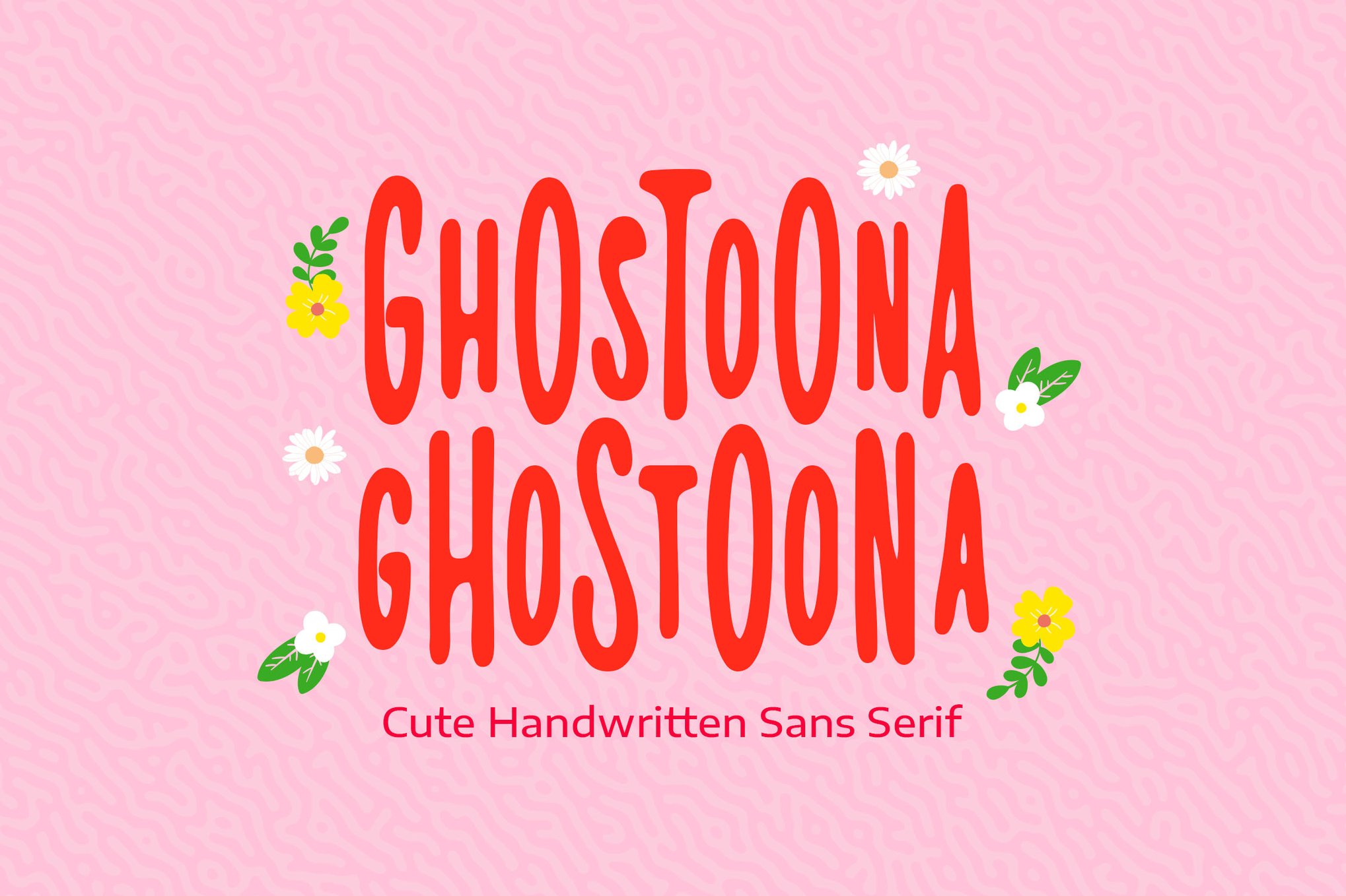
Integrating Kawaii Fonts: Best Practices
Integrating these fonts into a professional workflow requires a nuanced approach. Because Kawaii fonts are inherently "loud" in terms of personality, they are best used as display typefaces rather than for long-form body text.
Pairing Strategies
- The Contrast Rule: Pair a high-personality Kawaii font with a clean, neutral sans-serif (such as Montserrat or Open Sans). This ensures the "cutesy" element acts as an accent rather than overwhelming the content.
- Color Palettes: Kawaii typography thrives in a pastel-heavy environment. Soft pinks, mint greens, sky blues, and lavender work best to enhance the inherent "sweetness" of the letterforms.
- Layout Considerations: Use generous white space. Because these fonts are often rounded and thick, they need "room to breathe" on the page to prevent the design from feeling cluttered.
The Rise of Free-to-Use Kawaii Resources
The accessibility of this aesthetic has been bolstered by a wave of high-quality free fonts. Resources like the Free Kawaii Font Family, Mochibop, BabyKawaii, and Kareo Star have democratized the style.
- Mochibop stands out for its versatility; by providing a font duo, it allows for a cohesive hierarchy where a script style can be paired with a clean sans-serif, making it a perfect entry point for hobbyist designers and small business owners.
- Kareo Star is a testament to the "magical" side of the trend, incorporating subtle decorative elements that make it a favorite for social media influencers and sticker designers.
Implications for Brand Identity
The rise of the Kawaii aesthetic in mainstream branding—often referred to as "Brand Cuteness"—has significant implications for how businesses communicate. In an era where consumers are often overwhelmed by minimalist, cold, and corporate design, the use of a Kawaii-inspired font can act as a "disruptor."
It signals that a brand is:
- Approachable: It removes the barrier between the corporation and the customer.
- Optimistic: It aligns the brand with feelings of happiness and safety.
- Human-Centric: It prioritizes the user’s emotional experience over the traditional "authority" of a brand.
From a marketing perspective, this is a powerful tool. When a user sees a playful, rounded font on a delivery box or an app interface, it triggers a release of positive associations. It turns a mundane transaction into a delightful interaction.
Conclusion: The Future of "Cute" Design
The Kawaii font movement is not merely a passing fad; it is a fundamental shift in how we perceive the relationship between typography and psychology. As technology allows for more complex, variable, and animated font files, we can expect Kawaii fonts to become even more interactive. Imagine a font that wiggles upon hover or changes color based on the user’s interaction—this is the logical next step for a genre that has always been about joy and engagement.
For the modern designer, the inclusion of a few well-chosen Kawaii fonts in a toolkit is essential. Whether you are building a brand identity for a startup, designing social media content, or creating a children’s book, the power of a "cute" font to capture attention and deliver a smile remains unmatched. Embrace the rounded, the bubbly, and the playful—your designs will be better for it.

 Nila Kartika Wati
 Iffa Jayyana

 Basiran
 Nana Wu
 Nana
 Siti Muinah

 Reynand Wu
