Reynand Wu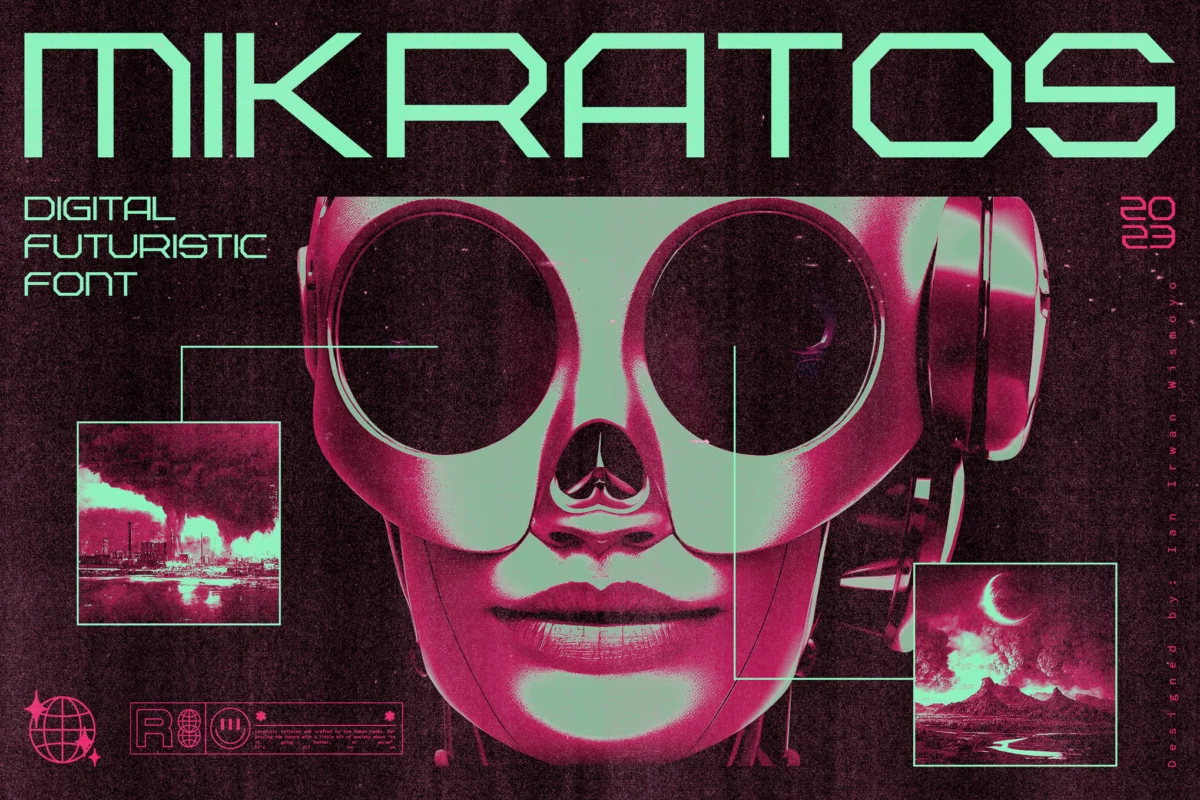
Every fictional world—from the neon-drenched rain of a cyberpunk megalopolis to the brutalist, windowless halls of a totalitarian regime—relies on a fundamental visual language to establish its reality. While narrative and world-building lay the foundation, it is the subtle, often overlooked art of typography that breathes life into the environment. A well-chosen typeface does more than present text; it broadcasts the ideological, technological, and atmospheric state of a society.
For designers and world-builders, the right font is the difference between a generic sci-fi concept and a visceral, lived-in dystopian nightmare. The following analysis explores the aesthetic evolution of dystopian typography, the industry standards for crafting "dark future" visuals, and a curated list of typefaces that capture the essence of systemic collapse, technological alienation, and human resistance.
The Semiotics of Dystopia: A Chronology of Visual Language
The visual language of dystopia has evolved significantly over the last century, mirroring our changing anxieties about the future.
The Early Era: Industrial Oppression
In the mid-20th century, dystopia was defined by the industrial and the bureaucratic. Inspired by the grim reality of mid-century authoritarianism, fonts used in literature and film (like the classic 1984 interpretations) leaned toward heavy, geometric, and slab-serif typefaces. These fonts were designed to feel like propaganda—stamped, rigid, and unyielding.
The Cyberpunk Revolution
The 1980s and 90s, catalyzed by the rise of home computing and the aesthetics of Blade Runner and Akira, introduced the "glitch" and the "neon." Typography shifted from the static to the kinetic. We began seeing typefaces that mimicked low-resolution digital screens, flickering monitors, and the fragmented, layered aesthetic of high-tech slums.
The Modern Minimalist Dystopia
Today, our vision of the future has become increasingly sleek. We see "Corporate Dystopia"—the white-walled, sterile, and hyper-minimalist environments found in modern science fiction. This has birthed a wave of ultra-thin, geometric, and high-tech fonts that suggest a future where humanity has been optimized out of the equation.
The Anatomy of a Dystopian Font
When designers set out to create a typeface that feels "dystopian," they generally rely on three pillars of design theory:
- Angular Structuralism: By removing the soft curves of traditional typography, designers evoke a sense of machine-led coldness. Angular structures suggest a world where efficiency outweighs human comfort.
- Glitch and Fragmentation: In a world of malfunctioning technology, text often appears corrupted. Using scan lines, missing pixels, or distorted baselines creates an immediate sense of instability and decay.
- Industrial/Military Influence: Stencil-like cuts, heavy weights, and mono-spaced alignments mimic the labeling found on military hardware or containment zones, instantly grounding a design in a world of authority and containment.
Curated Selection: Premium Dystopian Typefaces
For those looking to build their own immersive worlds, the following fonts represent the pinnacle of modern dystopian design.
Foderic: The Futuristic Standard
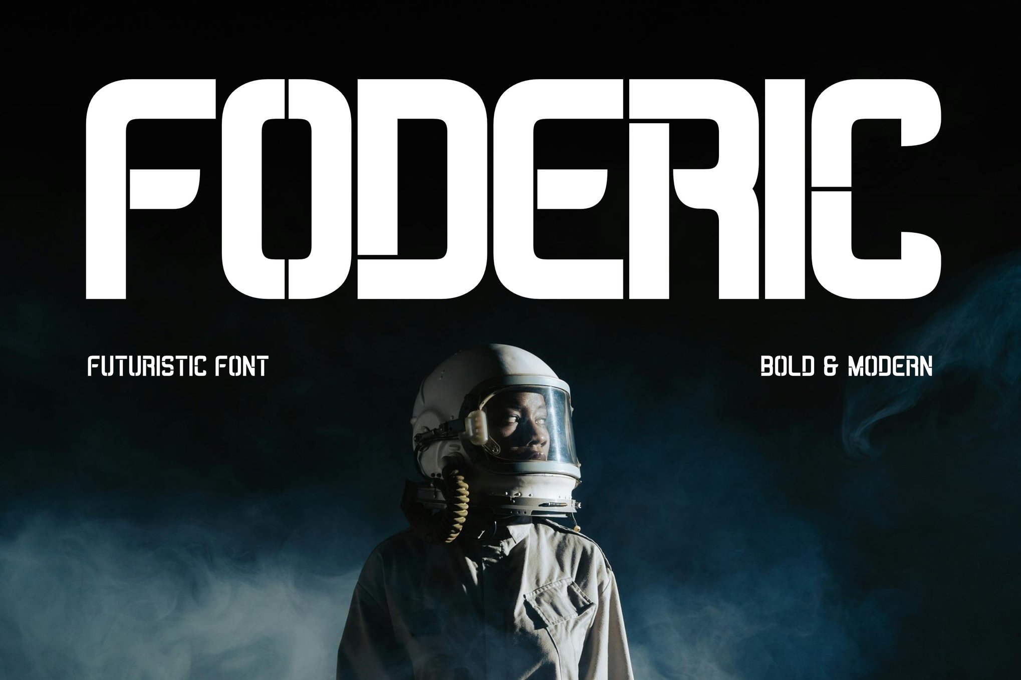
Foderic is a multifunctional powerhouse. With its bold, edgy aesthetic, it feels like the signage of a future city’s transit hub. It provides both uppercase and lowercase support, making it versatile for everything from UI elements to high-impact poster headlines.
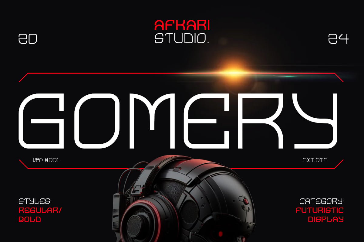
Gomery: Geometric Sophistication
Gomery stands out for its blend of clean, geometric lines and unsettling curves. It is the perfect choice for a "high-tech" corporation’s branding in a futuristic thriller. It includes unique ligatures that make it feel like a custom-coded system language.
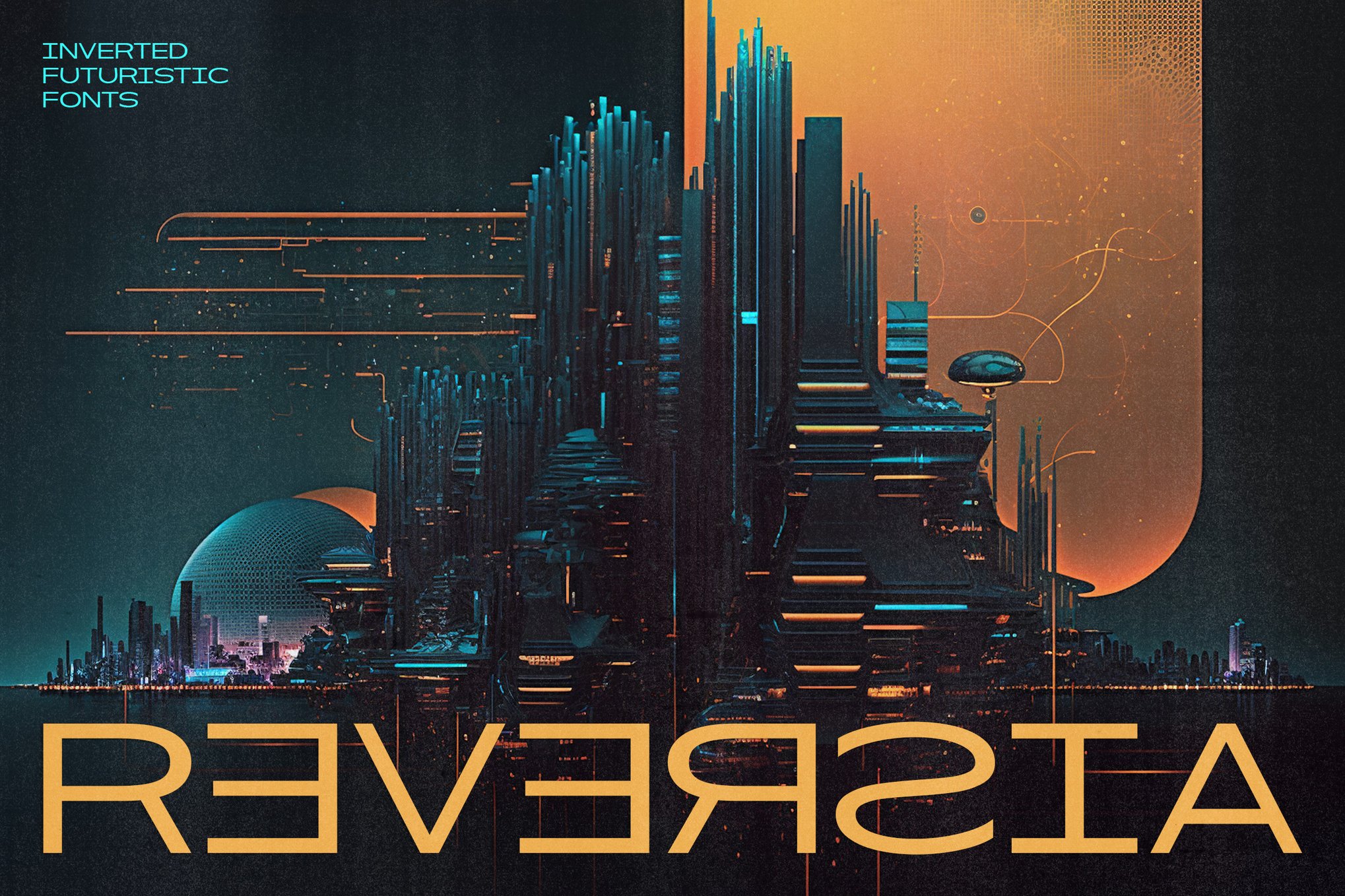
Reversia: The Anti-Traditionalist
Reversia is an expanded, futuristic font that defies standard typography norms. Its wide, brave strokes are perfect for designers looking to "buck tradition." It is particularly effective for branding projects that require a sense of monumental, intimidating scale.
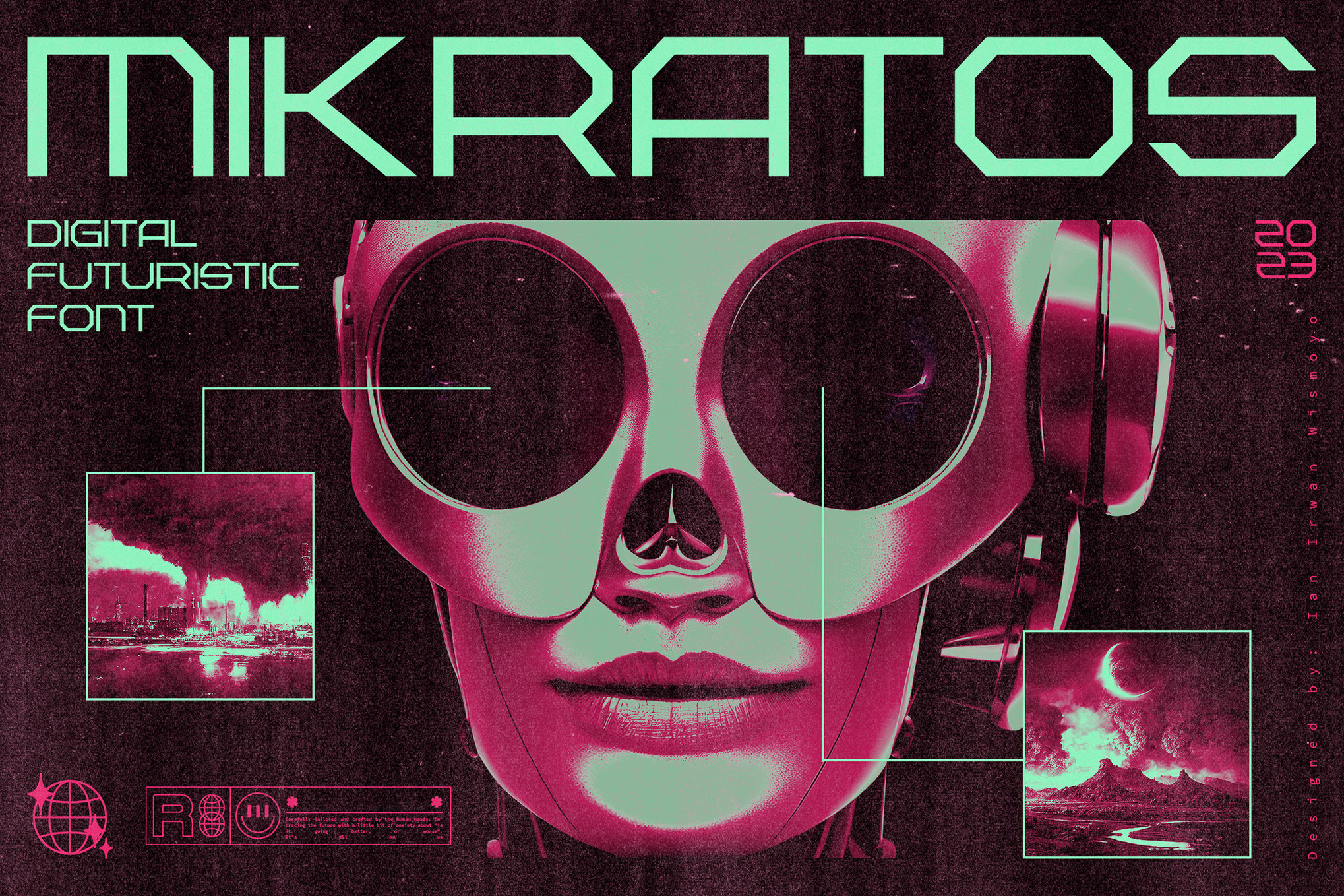
Mikratos: The Digital Interface
Mikratos bridges the gap between retro-futurism and contemporary design. Inspired by the interfaces of classic sci-fi, it is a go-to for designers creating album art or merchandise for gaming-adjacent projects. It feels like the digital heartbeat of a dying machine.
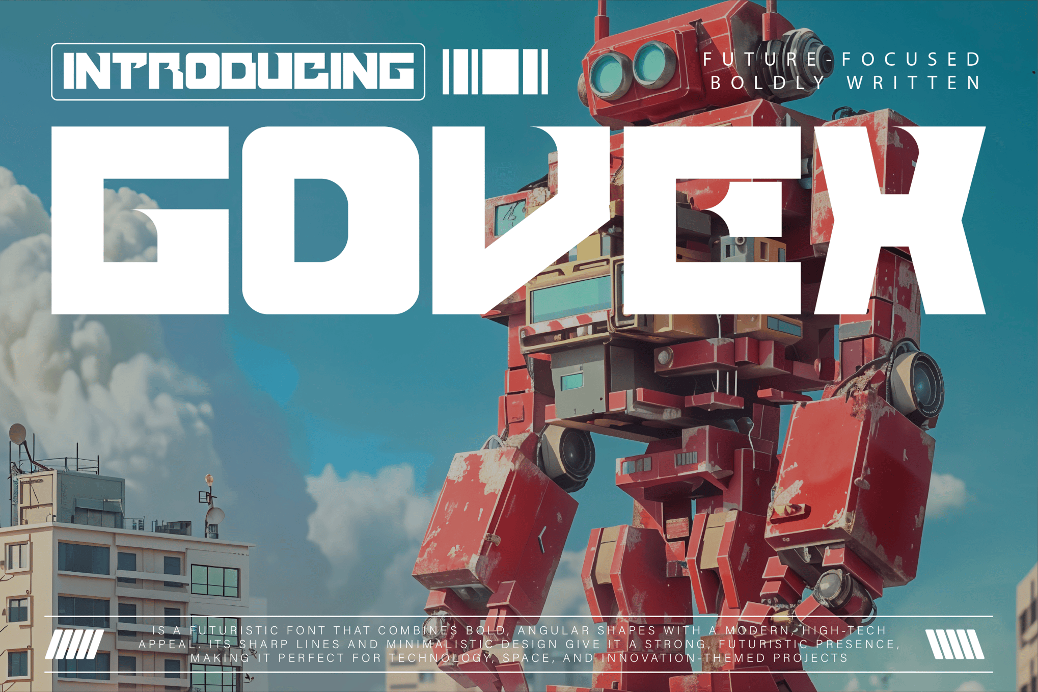
Govex: Minimalist Precision
Govex is defined by its sharp, angular minimalism. It is ideal for projects focused on space exploration or advanced AI. Because it comes with a wide array of formats (TTF, OTF, WOFF), it is a reliable workhorse for web designers working on tech-startup themes.
Digital Anarchy: The Raw Aesthetic
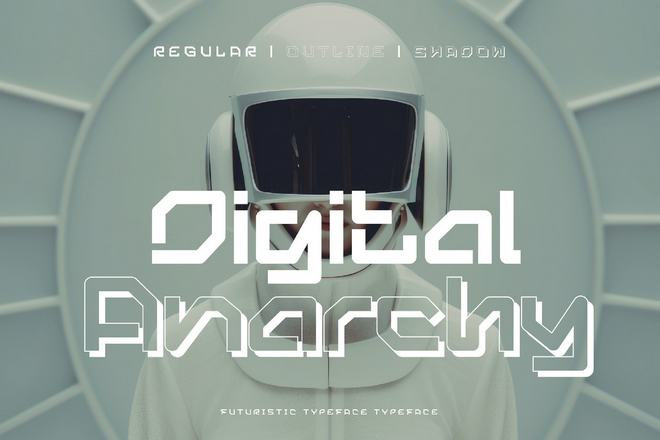
As the name suggests, Digital Anarchy is for the resistance. With its razor-sharp edges, it screams of underground rebellion. It is the ideal choice for zines, protest art, or any design meant to disrupt the status quo.
Gestralda: Compact Power
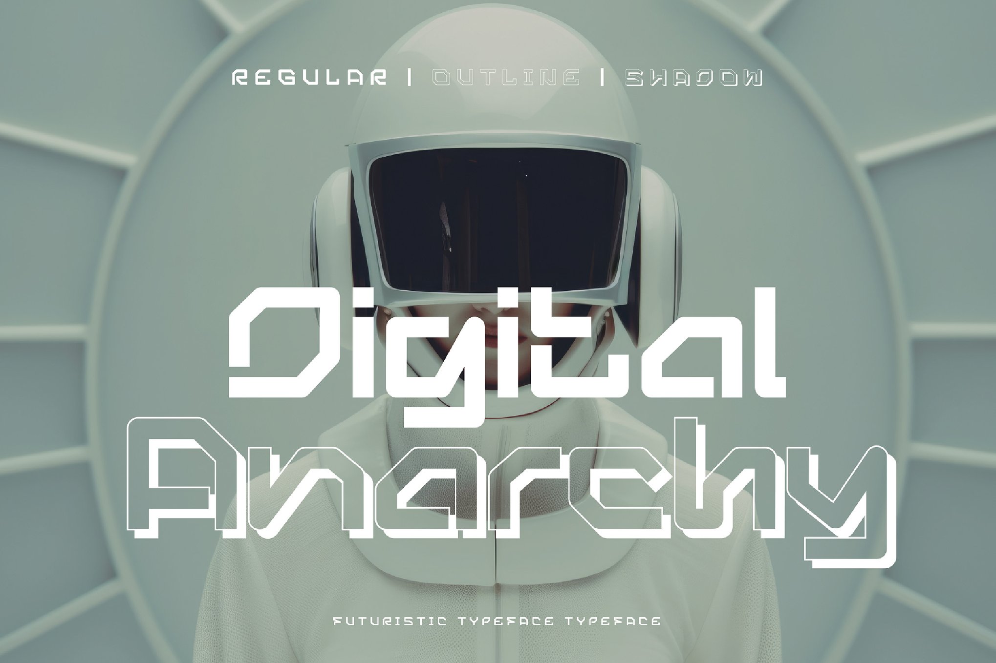
Gestralda was designed specifically to maximize impact in small spaces. Its dense, sci-fi-inspired forms make it an excellent choice for logos and esports branding, where clarity is required even when the text is shrunk down to fit a mobile screen.
Necosmic: The Outer Space Odyssey
Necosmic is the quintessential font for deep-space horror or exploration. It carries a sense of profound isolation, making it ideal for book covers or cinematic titles that deal with the unknown reaches of the universe.
BERGAN: The Cyberpunk Staple
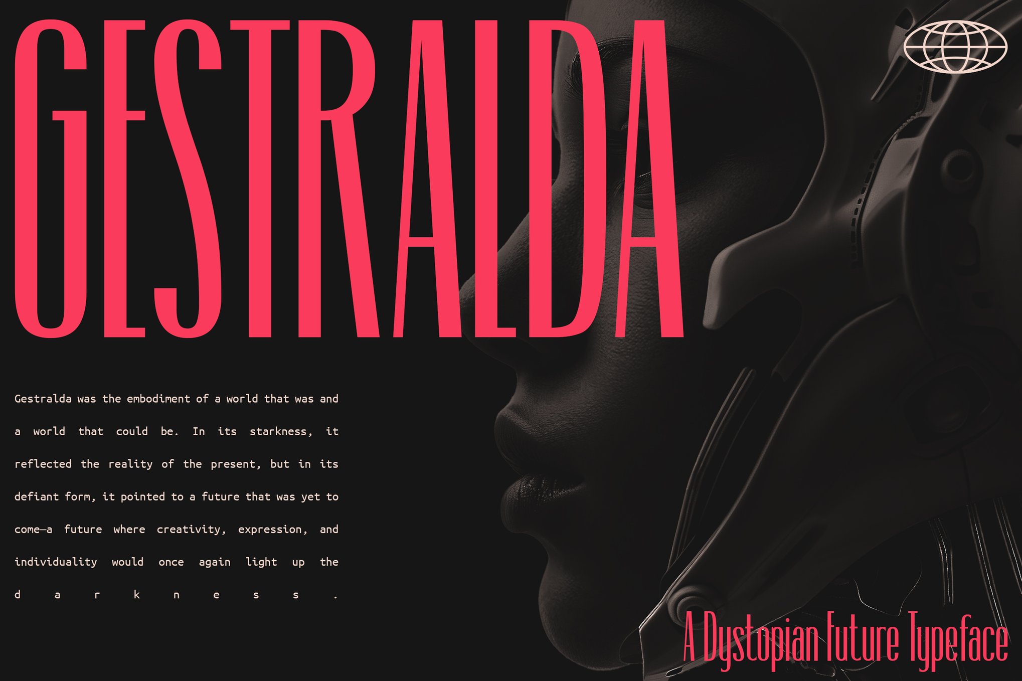
BERGAN is a must-have for any cyberpunk enthusiast. With three distinct styles—Regular, Outline, and Slant—it offers the modularity needed for complex layout design. Its 113 unique glyphs provide enough variation to avoid repetitive, "canned" looks.
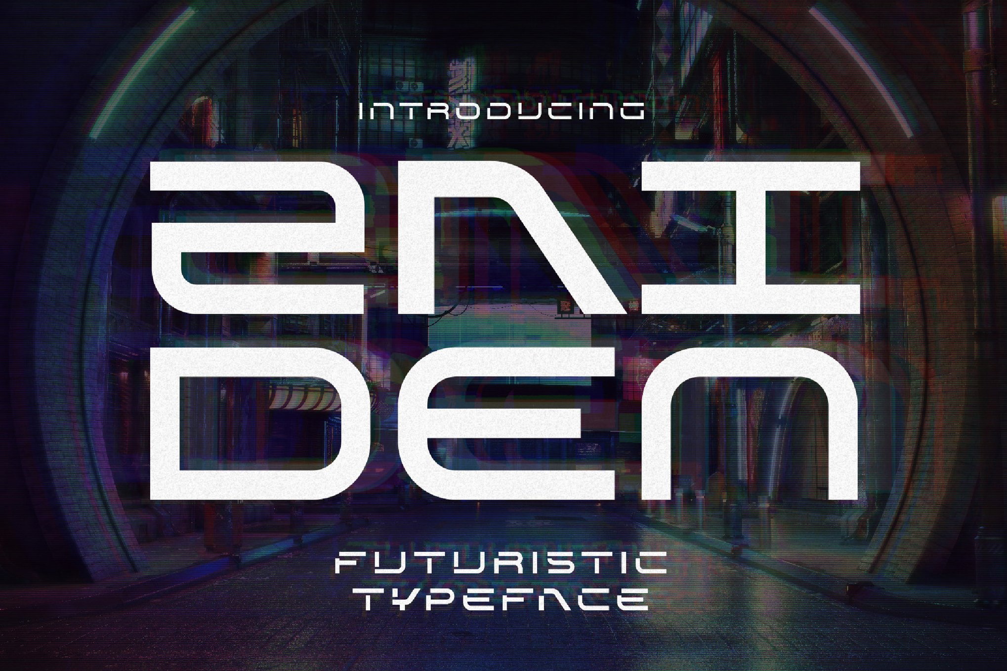
Zaiden: The Display Specialist
Zaiden is a masterclass in display typography. Its minimalist, all-caps aesthetic draws heavily from video game UI. It is particularly effective for titles that need to feel like they are being projected onto a wall in a neon-drenched back alley.
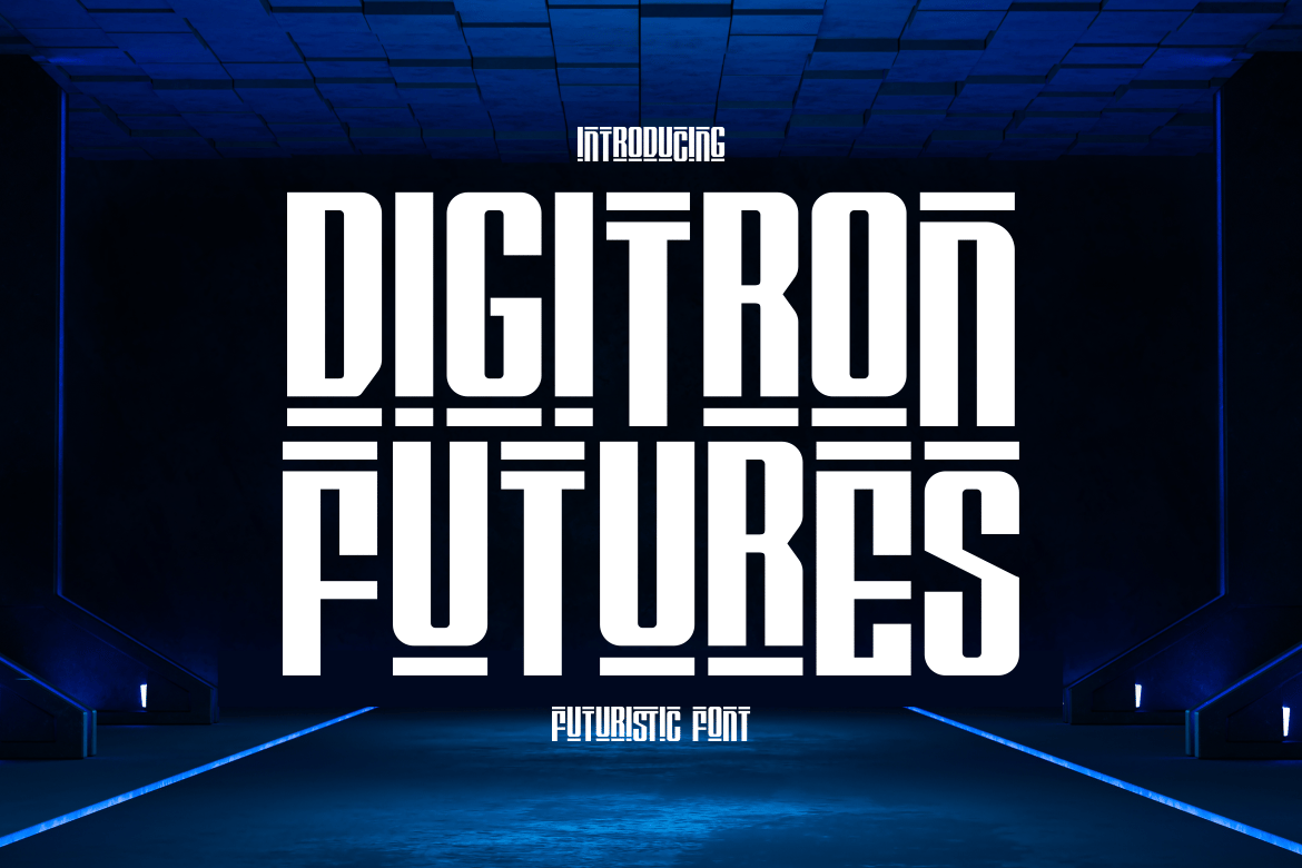
Digitron Futures: The Tech-Noir Choice
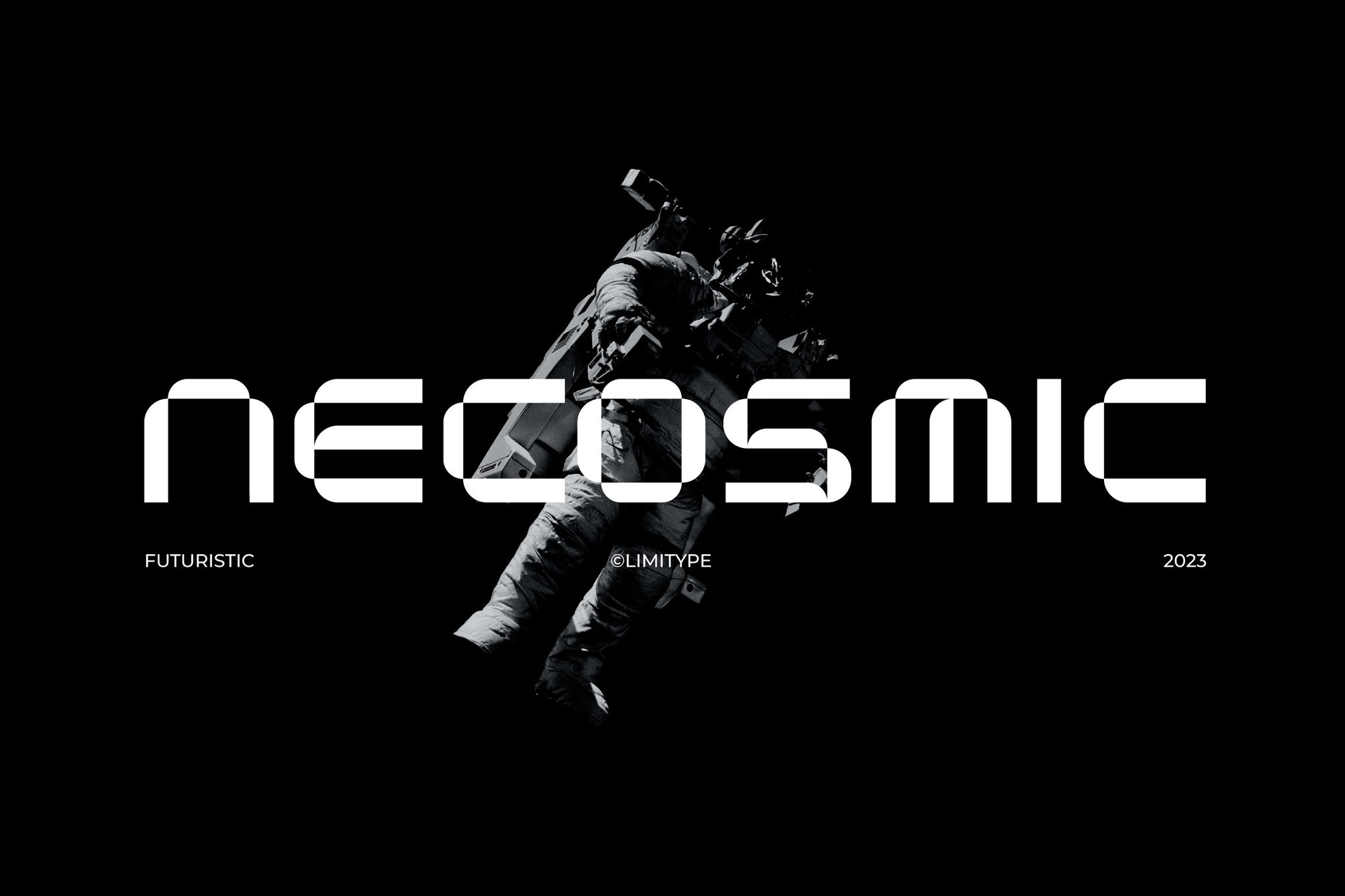
Digitron Futures uses meticulous geometric lines to create a "tech" feel. It is a sophisticated, high-impact font that works exceptionally well on magazine covers or in films where the aesthetic needs to feel expensive and cold.
Fear Robot: The Grit of Reality
Fear Robot channels the raw, gritty energy of a post-apocalyptic world. Its sleek yet ominous lines make it perfect for projects that need to convey a sense of looming, mechanical threat.
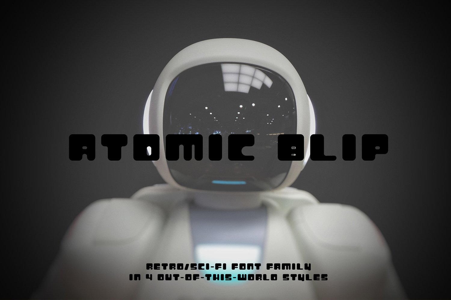
Atomic Blip: Retro-Futurism Reimagined
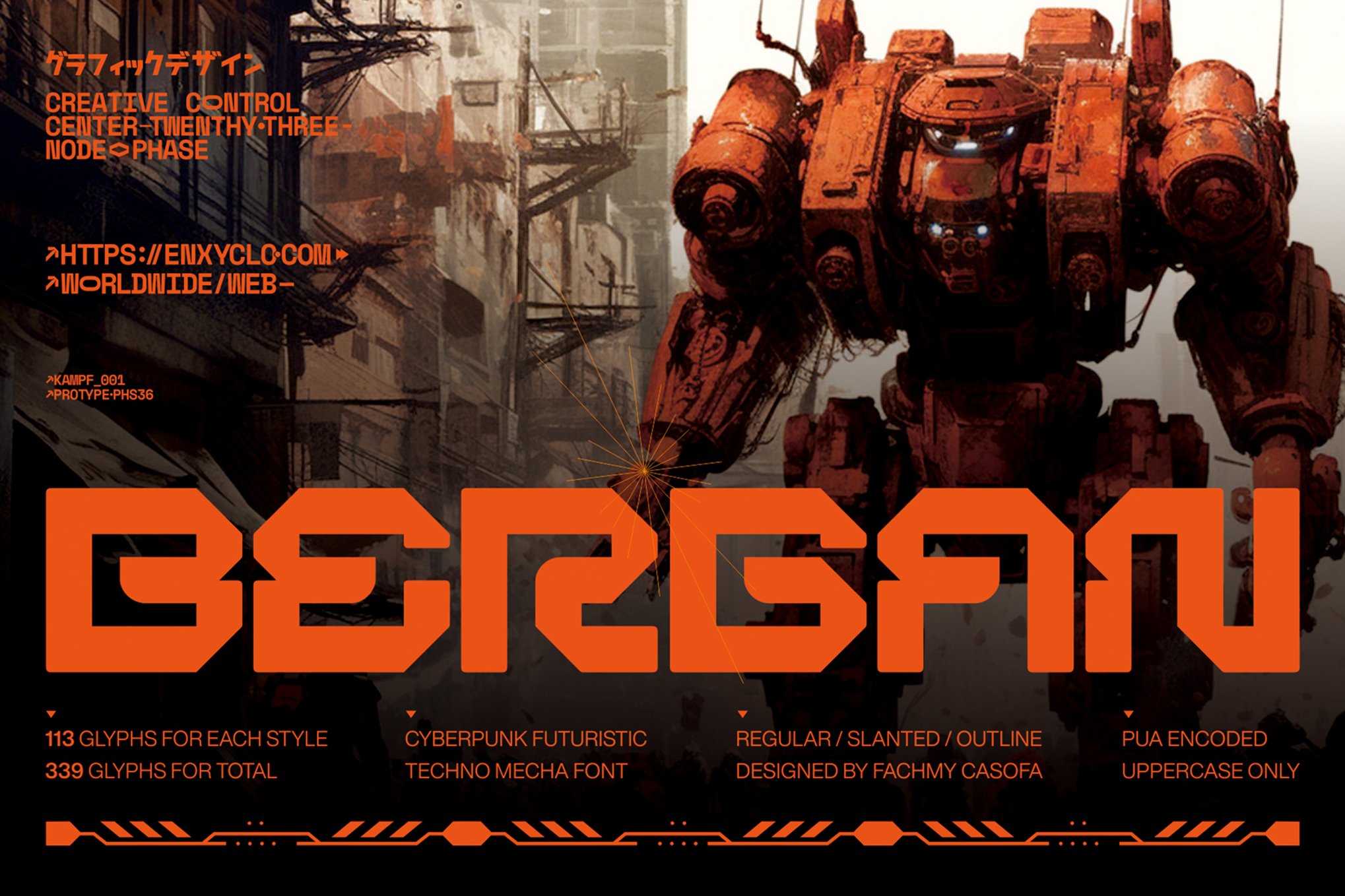
Atomic Blip is unique for its inclusion of four distinct styles: rounded, square, dashed, and outlined. This allows for complex, layered design work that mimics the look of old, decaying computers or long-abandoned technology.
Aeruno and Neothopia: The Modern Contenders
Both Aeruno and Neothopia represent the "new wave" of dystopian fonts—clean, legible, yet deeply unsettling in their precision. They are the perfect choices for modern architectural renderings or futuristic fashion branding.
Andmorey: The Multi-Style Powerhouse
With 360 glyphs, Andmorey is arguably the most comprehensive font on this list. Its ability to transition from regular to slant makes it incredibly useful for hierarchy-heavy designs like long-form websites or large-scale print advertisements.
VAMOS: Cryptocurrency and High-Tech
VAMOS is a high-contrast, modern font that feels like it belongs on a digital currency ledger or a high-security document. It is specifically designed for headlines that need to command attention.
Stardock: The Minimalist’s Dream
Stardock rounds out the premium selection as a clean, fresh, and minimalist choice. It is the most versatile font here, fitting perfectly into AI-focused branding or space-agency concepts.
Supporting Data: Free Resources for the Aspiring World-Builder
For those just beginning their journey into design, the barrier to entry remains low thanks to a thriving community of open-source designers. While these fonts are often free for personal use, they capture the same spirit of rebellion and technological dread:
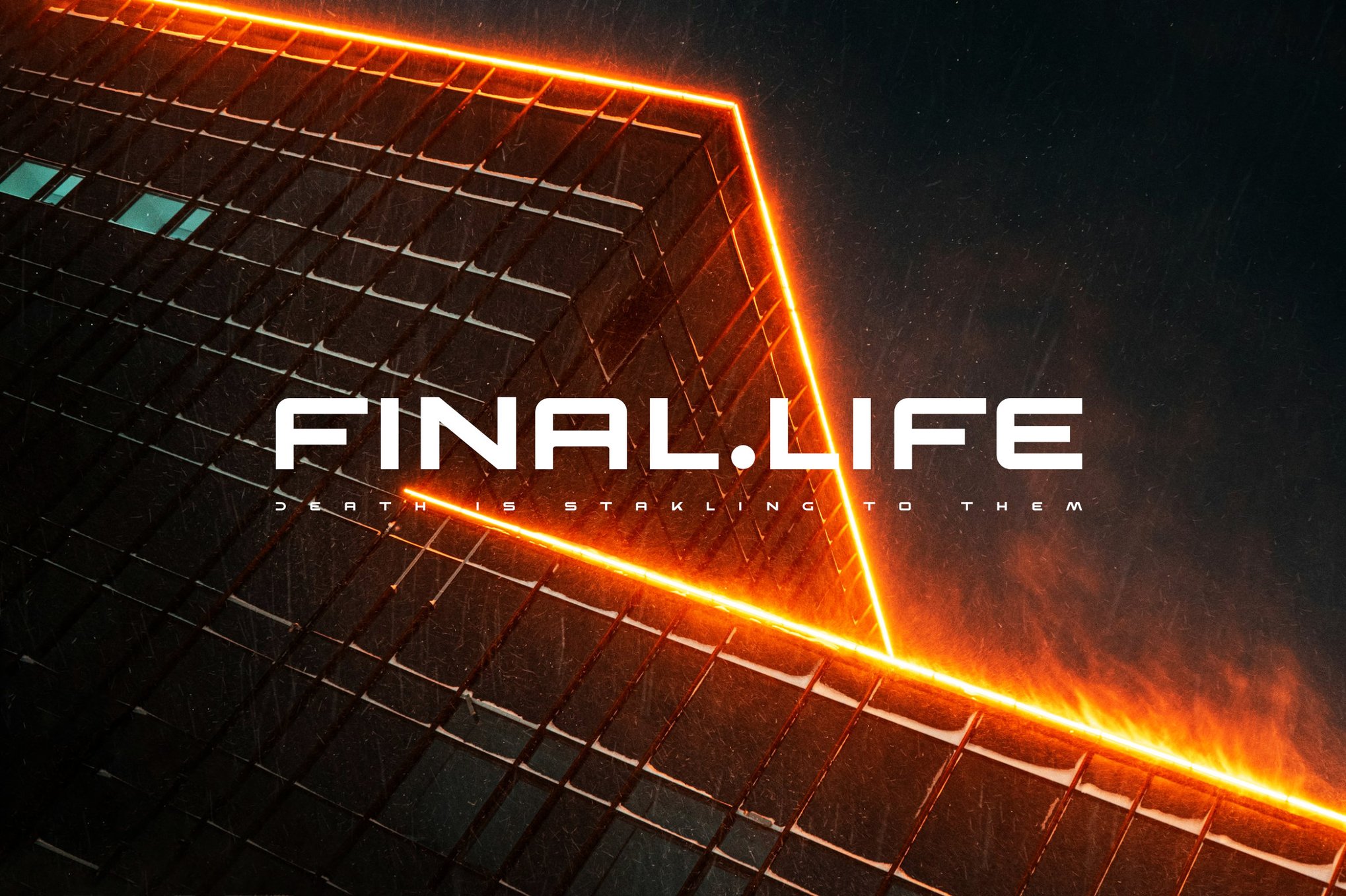
- Navex: Excellent for sharp, industrial-inspired headers.
- Death Craft: The go-to for a gritty, desolate, and post-apocalyptic vibe.
- Cybloc: A perfect blend of geometry and "worn" detail, ideal for game UI.
- Qwenser: A bold, heavy-weight display font that demands to be read.
Implications for Design and Branding
The rise of these dystopian-coded typefaces has profound implications for modern branding. We are seeing a shift where even non-dystopian companies are adopting "future-proof" fonts. Tech startups, in particular, are moving away from friendly, rounded sans-serifs and toward the cold, sharp, and angular forms once reserved for sci-fi movies.
This trend suggests a cultural pivot: we are no longer looking at the future with optimistic, soft edges. Instead, we are embracing a world that is fast, automated, and potentially unstable. By using these fonts, brands are communicating a sense of technical prowess and an awareness of the "new world" we are collectively entering.
Conclusion: Crafting the Future
The visual language of our future is being written in the font files of today. Whether you are building a fictional world for a film, designing a website for an AI startup, or simply exploring the aesthetic boundaries of graphic design, the selection of a typeface is a critical, narrative-defining act.
A dystopian font is never just a font; it is a warning, an invitation, and a piece of history from a future that has yet to arrive. Choose wisely, for the letters you select will define the world you build.

 Asep Darmawan
 Raul Delapena Setiawan
 Lina Irawan
 Nana
Nana
 Rifan Muazin
 Ali Ikhwan
 Evan Lee Salim