
 Muslim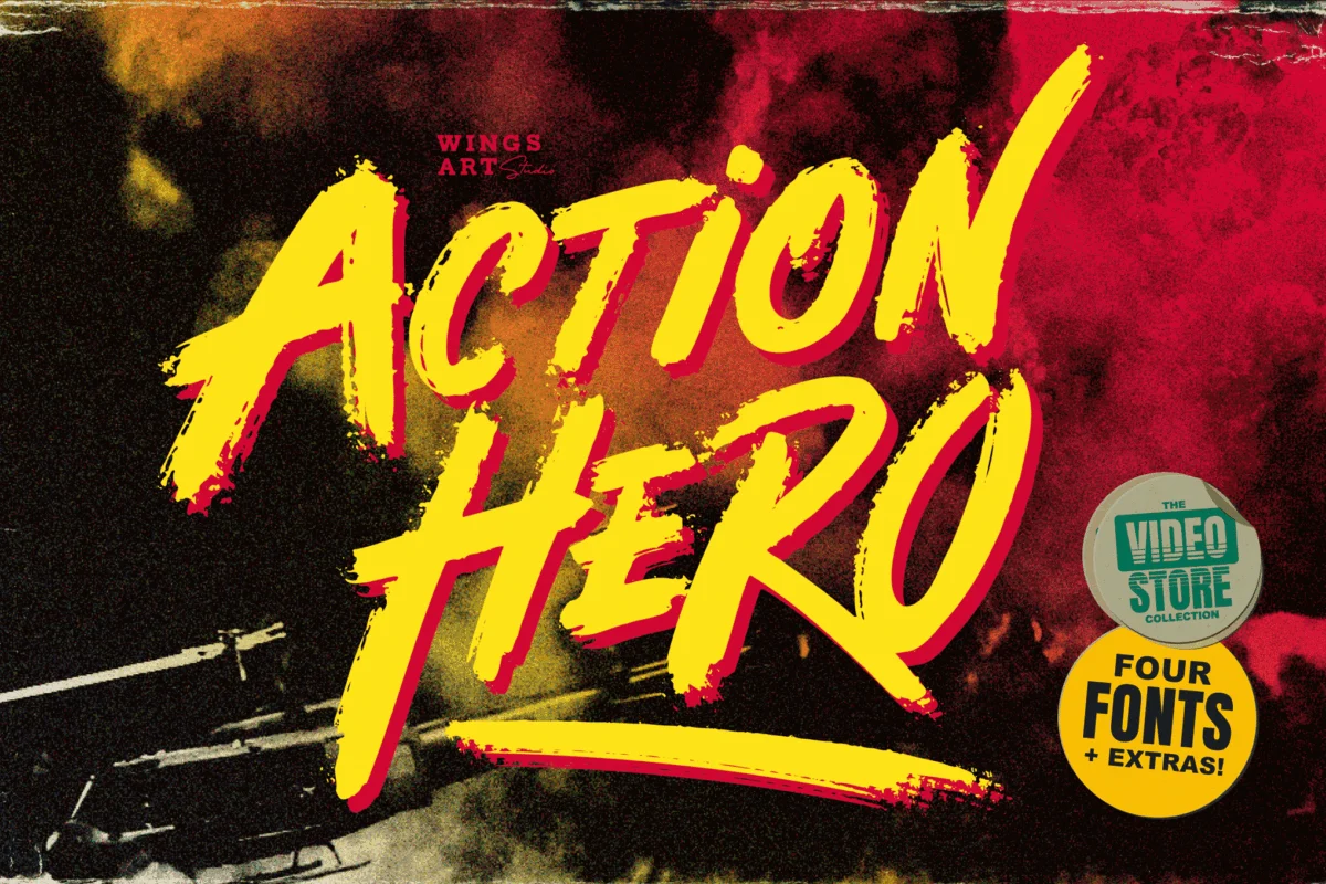
In the competitive landscape of digital design, the difference between a project that fades into the background and one that commands attention often comes down to typography. For designers tasked with conveying speed, adrenaline, and raw power, "action fonts" have emerged as the primary tool of choice. These typefaces are not merely aesthetic; they are functional engines of visual communication, meticulously crafted to trigger psychological responses associated with intensity, velocity, and excitement.
Whether you are designing a movie poster, a high-stakes esports tournament banner, or a campaign for a fitness brand, the right typeface does the heavy lifting, setting the tone before a single word is read. This article explores the evolution of action typography, the science behind its impact, and a comprehensive guide to the best fonts currently dominating the industry.
The Evolution of High-Intensity Typography: A Chronology
The roots of modern action typography can be traced back to the mid-20th century, though their application has shifted drastically alongside technological advancements.
The Golden Age of Print (1970s–1980s)
During this era, typography was defined by manual grit. The "Grindhouse" cinema movement of the 70s popularized rough, hand-drawn, and heavily stylized lettering. These fonts were designed to look like they had been spray-painted or etched onto concrete, reflecting the raw, visceral nature of the films they promoted. By the 1980s, the "Action Hero" aesthetic took over. Think of the iconic, thick-stroked block lettering on Die Hard or Rambo posters—fonts that utilized heavy weights and metallic gradients to signal indestructibility.
The Digital Acceleration (1990s–2010s)
As graphic design moved from the drafting table to the desktop, typography became more precise. The 90s saw a surge in "speed" fonts—typefaces with sharp, italicized, and aerodynamic shapes designed to mimic the blurring effect of motion. This was driven by the rise of extreme sports, such as skateboarding and motocross, which required a "faster" look to match the energy of the subculture.
The Modern Era (2020–Present)
Today, action fonts have entered a phase of "Hybrid Dynamism." We see a fusion of futuristic, sci-fi-inspired geometry with the legibility of classic sports branding. With the rise of gaming culture, social media branding, and digital streaming, these fonts are now optimized for both high-resolution print and small-screen mobile displays, ensuring that the "action" carries across every pixel.
The Science of Impact: Why Certain Shapes Command Attention
The effectiveness of an action font isn’t accidental. It is based on cognitive principles of visual perception. Designers rely on three primary pillars to create a sense of motion:
- Obliquity (Slant): Human eyes naturally associate a forward-leaning (italicized) angle with movement. By slanting the axis of a character, designers force the brain to perceive the letter as though it is leaning into a turn or accelerating.
- Stroke Contrast and Thickness: Heavy, bold strokes suggest mass and durability. Conversely, thin, sharp "slicing" cuts within a letterform simulate aerodynamic resistance, mimicking the look of an object cutting through air.
- Kinetic Kerning: By tightening the spacing between letters (kerning), designers create a visual "friction" that pulls the eye across the word, creating a rapid, rhythmic reading experience that mirrors the pace of an action sequence.
Curated Selection: The Best Action Fonts for Your Toolkit
To help you achieve that high-octane look, we have categorized the top fonts currently defining the market.
1. The 80s & 90s Nostalgia Pack
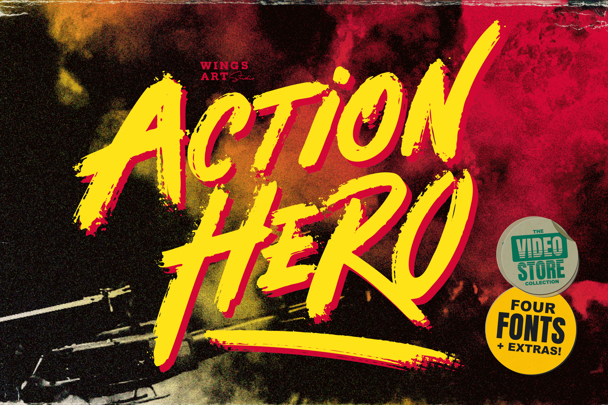
- Action Hero: A quintessential brush-style font that captures the retro-grit of classic VHS-era cinema. It is perfect for projects that require a nostalgic but aggressive punch.
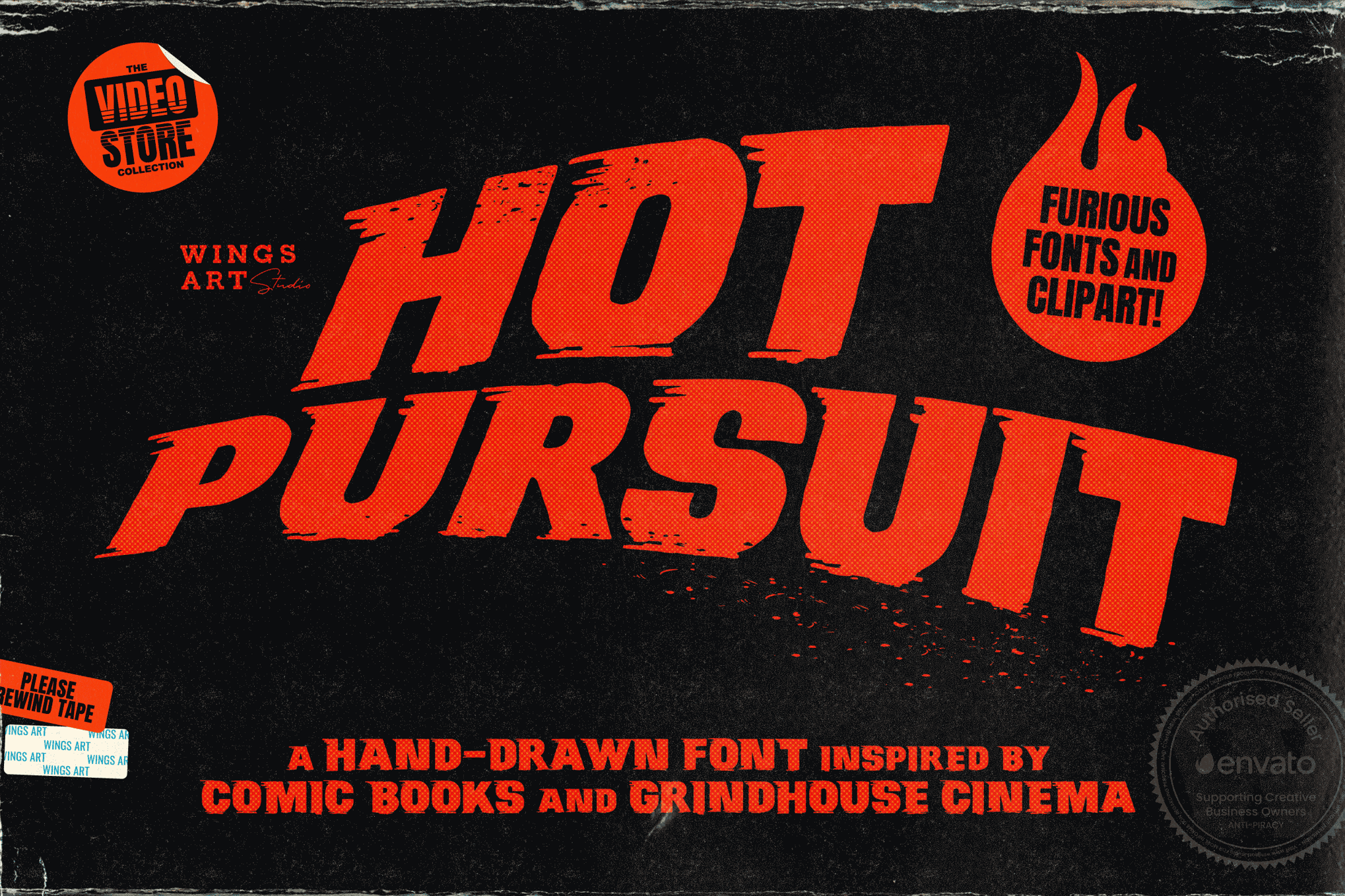
- Hot Pursuit: Drawing inspiration from 70s chase movies, this hand-drawn font offers a "Grindhouse" aesthetic. Its inclusion of comic-inspired symbols makes it a favorite for stylized editorial design.
2. High-Speed Racing & Motorsport Styles
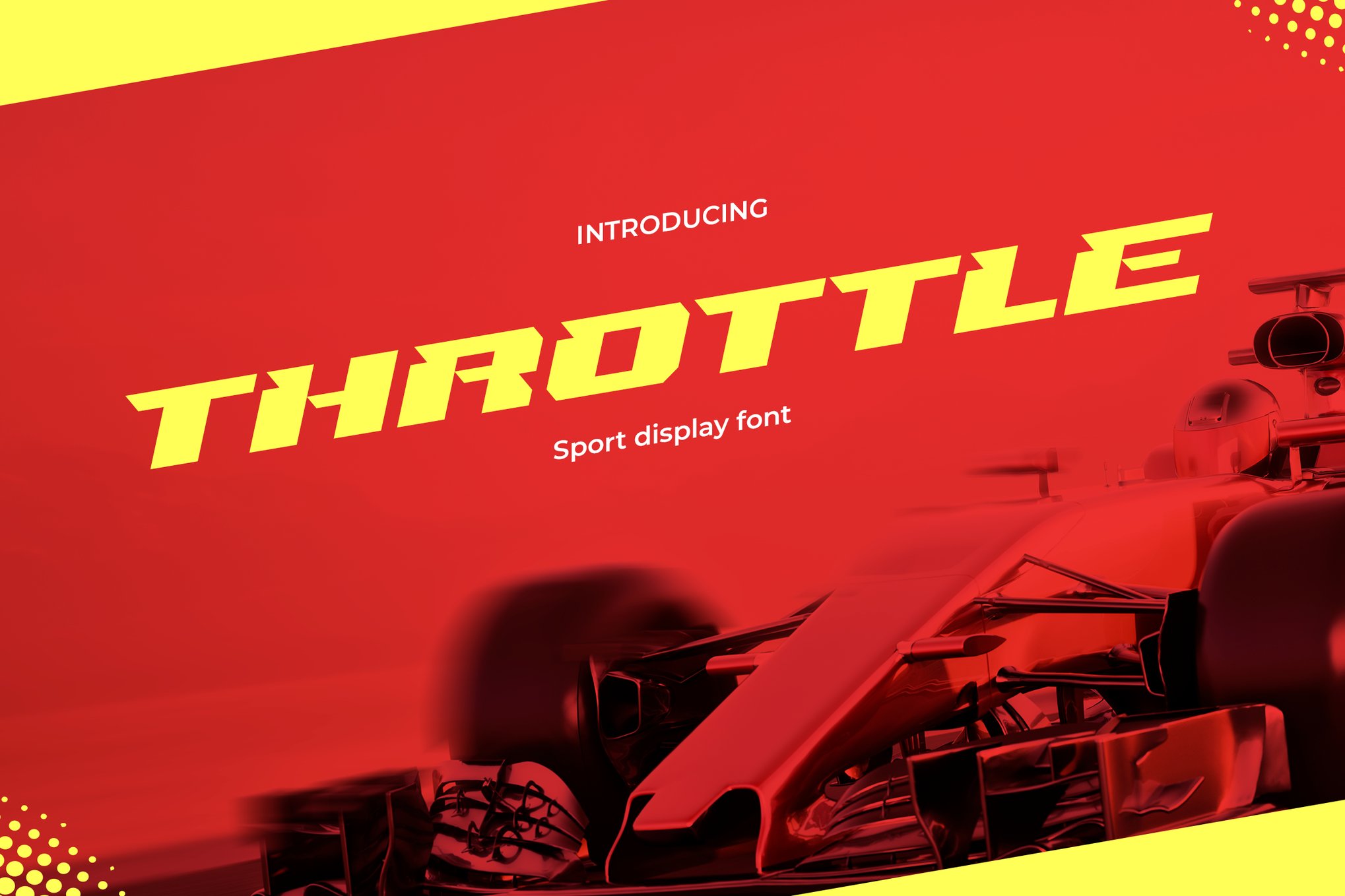
- Throttle: A modern, futuristic masterpiece. Its sleek, aerodynamic lines are designed specifically to be read at "high speed," making it perfect for racing game interfaces.
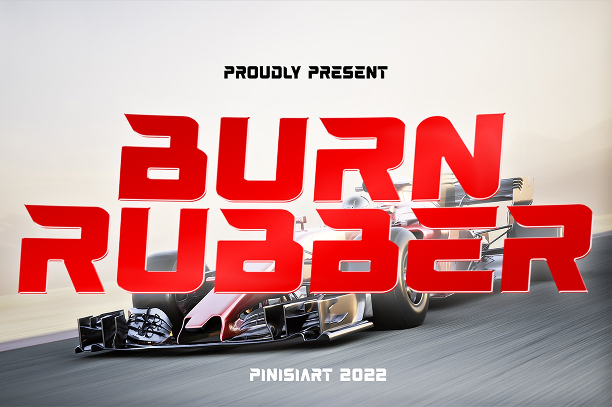
- BURN RUBBER: A heavy-duty, all-caps display font. As the name suggests, it is built for impact, featuring blocky, solid forms that suggest power and raw engine torque.
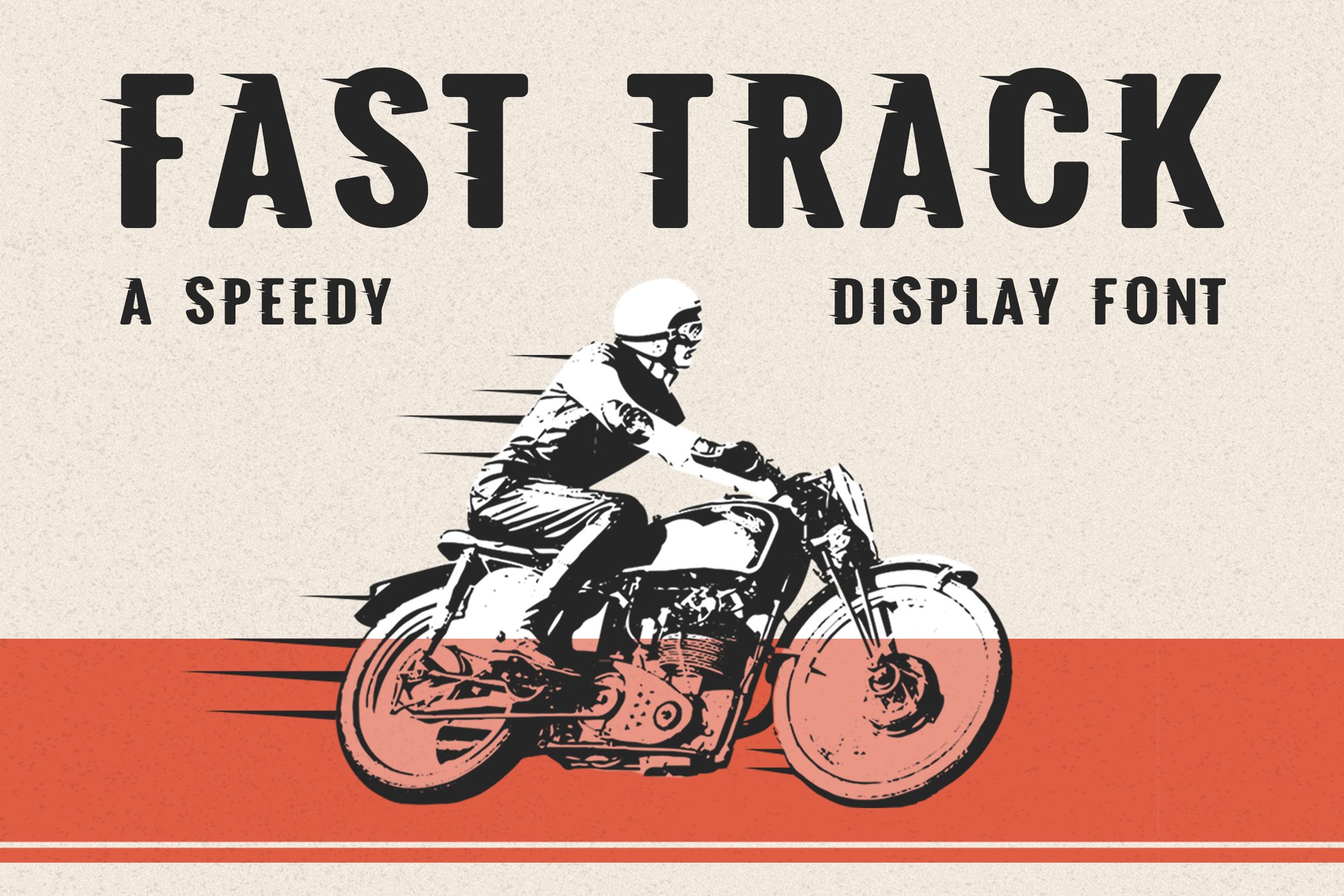
- Fast Track: Designed with speed in mind, this font is the industry standard for automotive branding, offering a clean yet aggressive silhouette that works well on everything from apparel to digital banners.
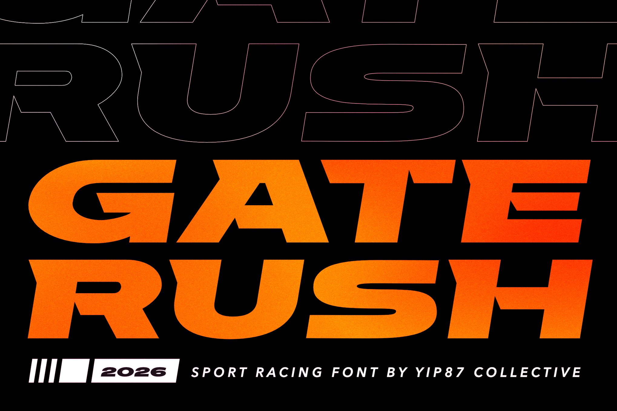
- Gate Rush: Its slightly oblique stance makes it look like it’s constantly in motion. It is specifically tailored for motorsports, where the brand needs to feel fast even when standing still.
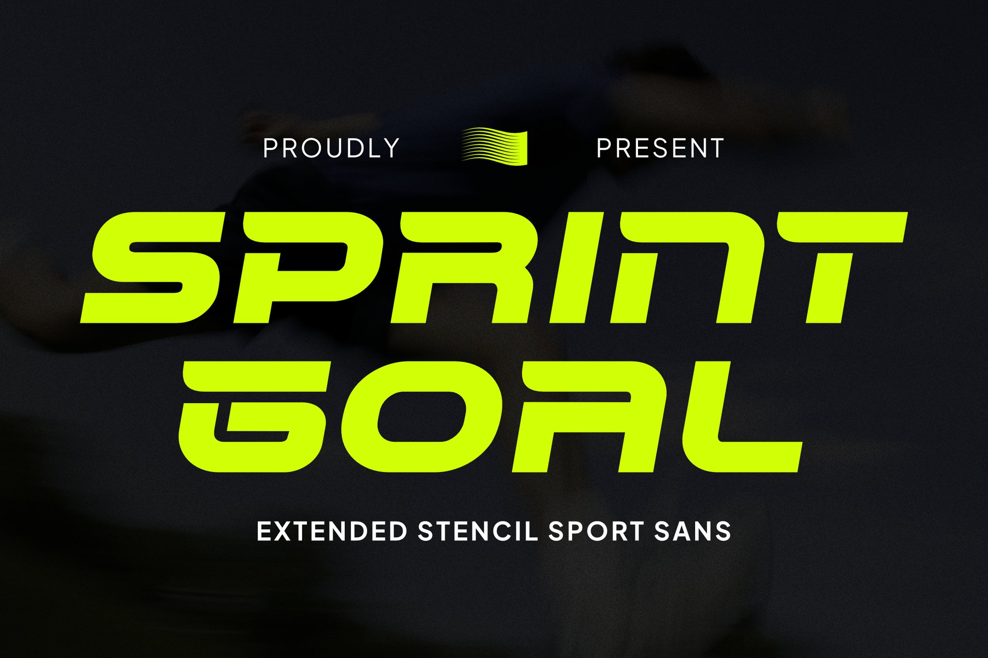
- Sprint Goal: This font emphasizes the italicized aesthetic, providing a sharp, competitive look that is highly effective for sports-themed posters and athletic event signage.
3. Modern Sports & Athletic Branding
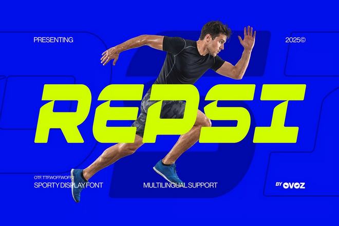
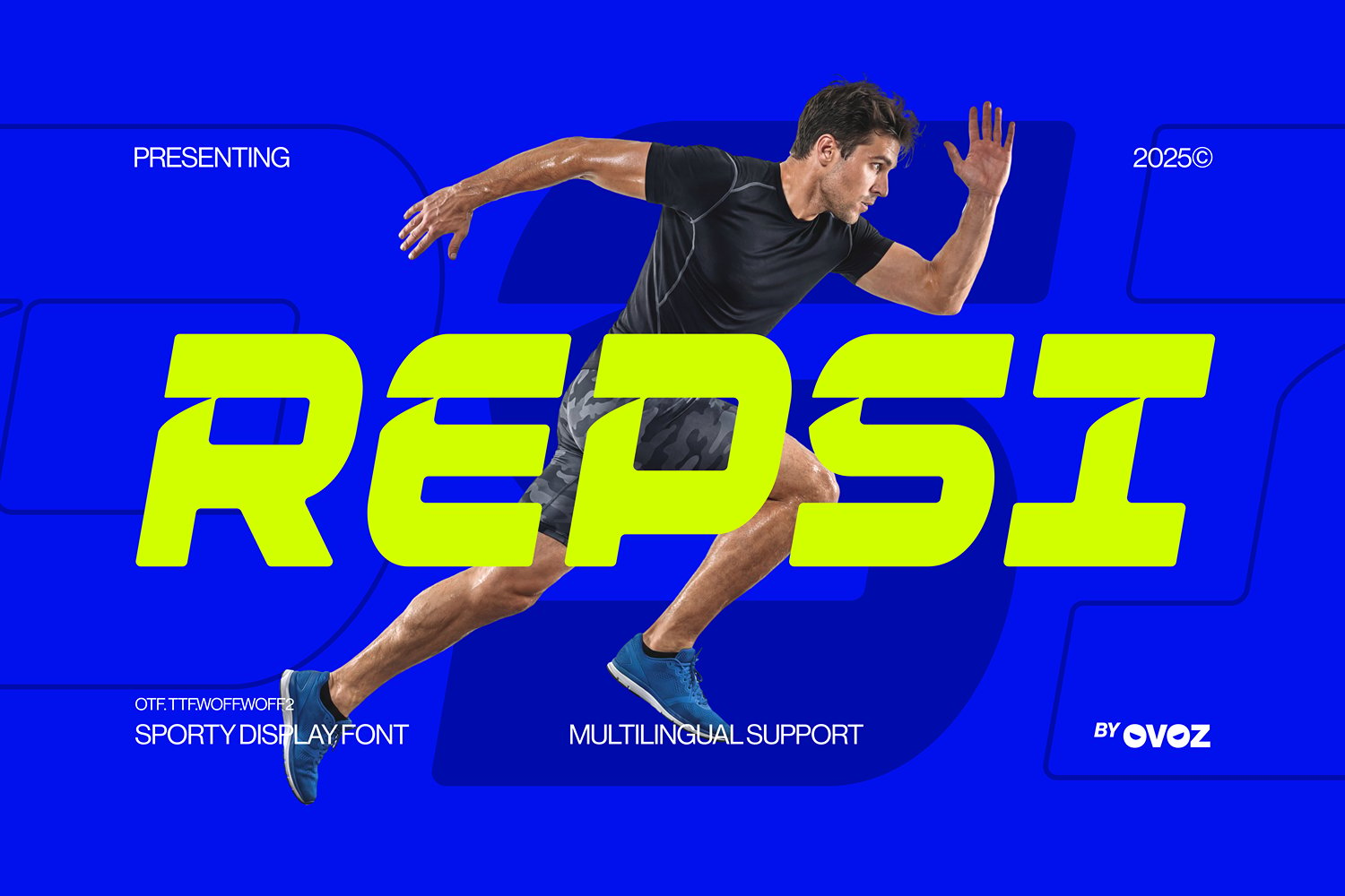
- REPSI: A prime example of "aerodynamic typography." Its forward-leaning cuts are perfect for gym, fitness, and football branding where precision and speed are key brand pillars.
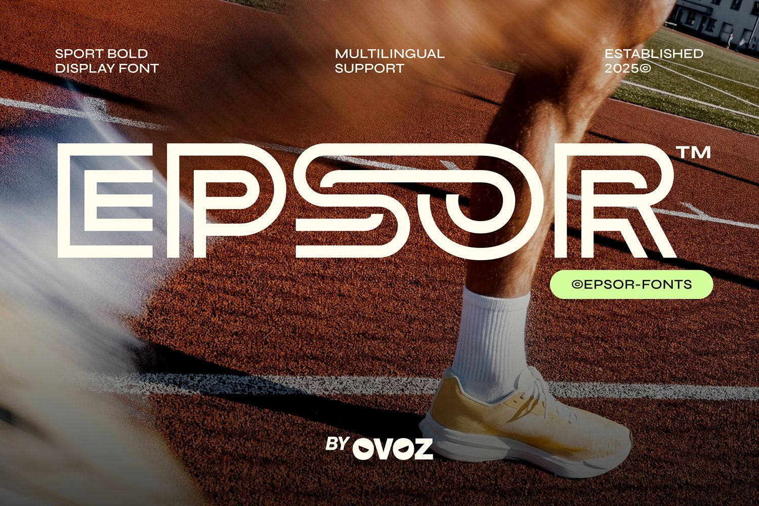
- Epsor: Utilizing clean, futuristic geometry, Epsor brings a sense of modern athletic professionalism. It is the go-to for branding that wants to feel "new age" and high-tech.
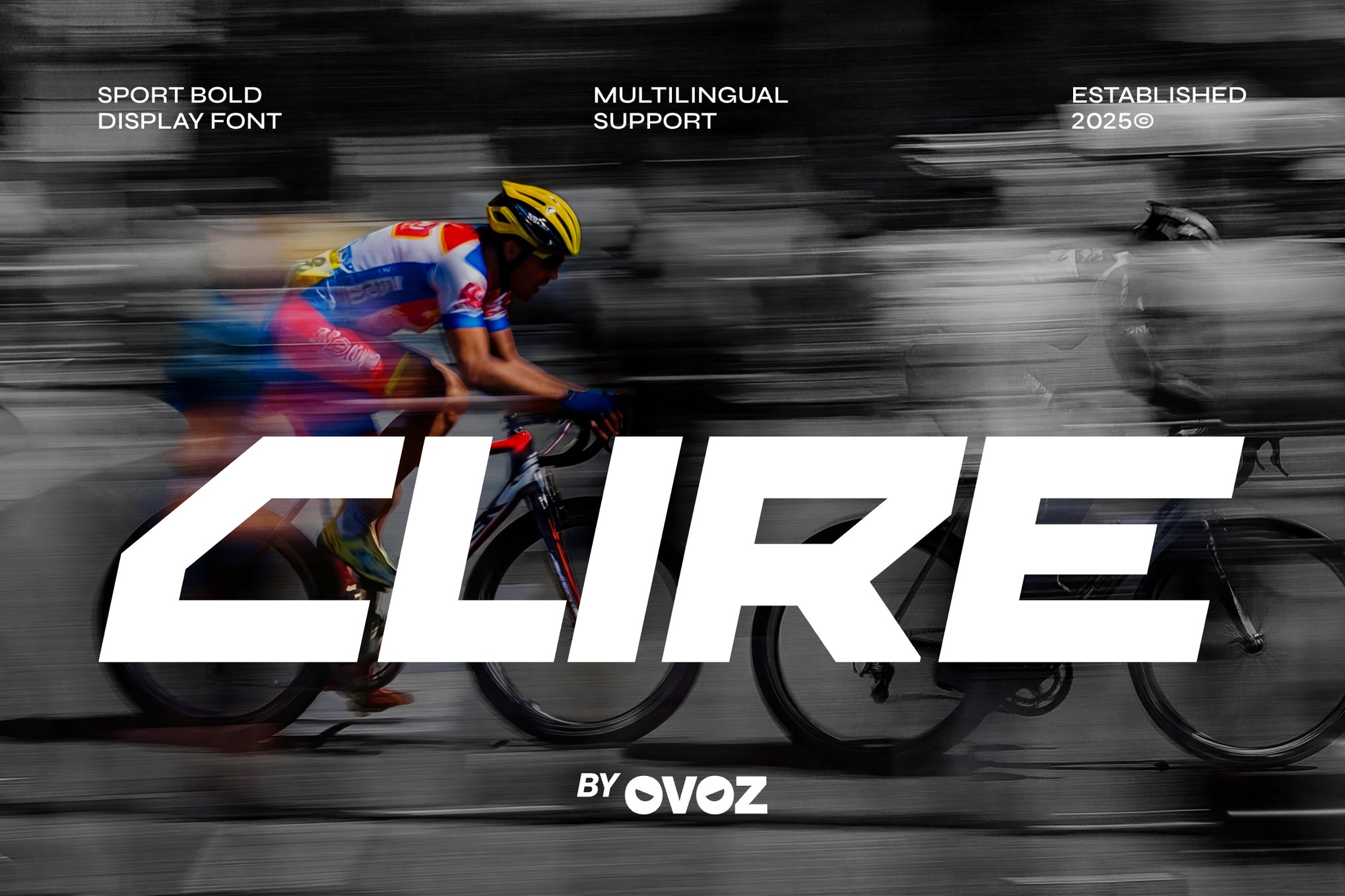
- Clire: If your project needs to feel competitive and sharp, Clire’s compressed structure offers a sleek, high-impact presence that works wonders in fitness campaigns.
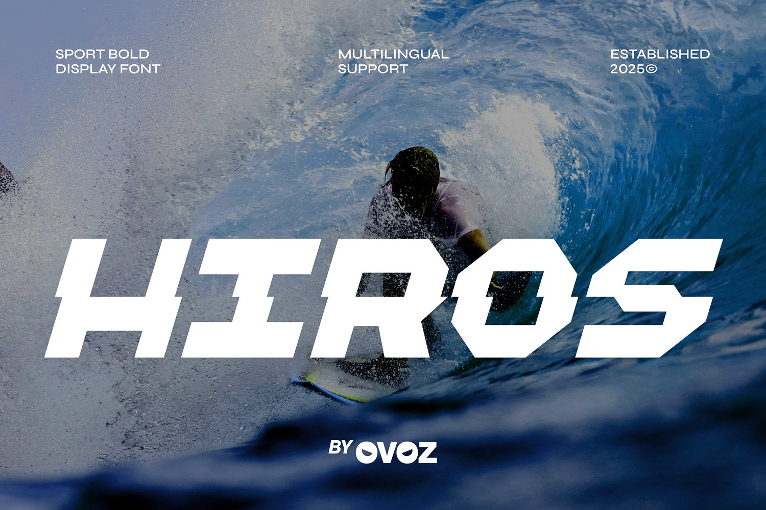
- Hiros: Known for its aggressive geometric cuts, this font is ideal for race posters. It communicates precision and a "winning mindset" through its sharp, high-speed silhouettes.
- MAXDRIVE: Combining industrial, blocky terminals with tight kerning, MAXDRIVE is a powerhouse for esports and digital promotions. It conveys a "digital-first" sense of intensity.
- Raga: A futuristic, geometric powerhouse. Raga excels in streetwear and esports, where bold, striking headlines are required to grab attention in crowded feeds.
- 234 Sec: With unique ligatures that allow for creative text manipulation, this font is for designers who want a bespoke, custom-lettered look for their sports headlines.
- SpeedBeast: A rare find that blends modern calligraphy with action-themed weight. It is perfect for those who want an aggressive font that doesn’t lose the human touch.
Supporting Data: The ROI of Impactful Typography
Data from recent branding studies suggests that font choice significantly impacts viewer retention. According to a 2023 design metrics report, advertisements using "dynamic, high-impact typography" saw a 22% higher engagement rate in the "Action/Adventure" and "Sports" categories compared to those using standard sans-serif typefaces.
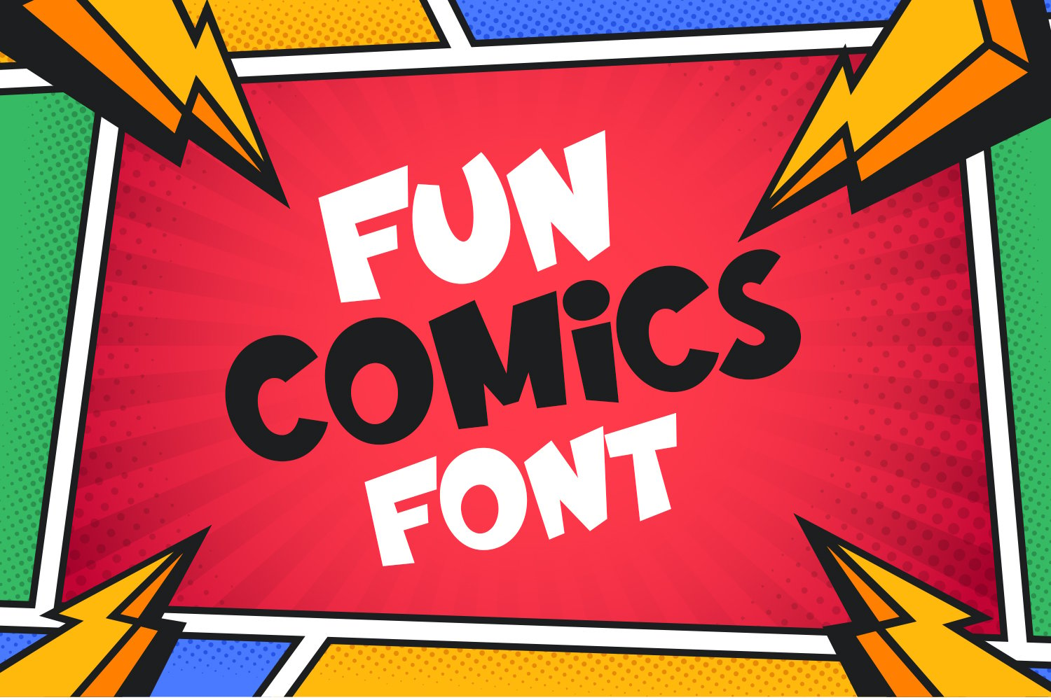
The psychological takeaway is clear: when the medium (the font) matches the message (the action), the audience is more likely to associate the product with the intended emotion. For example, a sports energy drink using a "slow, elegant serif" font would experience a cognitive dissonance that reduces brand trust, whereas using a font like Throttle or REPSI reinforces the brand’s promise of speed and energy.
Official Industry Perspective: The Designer’s Role
Leading typography experts argue that the role of the action font is shifting from mere decoration to structural design.
"In the past, fonts were chosen after the layout was finished," says Sarah Jenkins, a lead brand strategist. "Today, we start with the typeface. The letterforms themselves define the grid. If you are designing for a racing brand, the font is the brand. You aren’t just writing a word; you are building a symbol of velocity."
Many agencies are now commissioning custom, "action-tuned" typefaces to ensure their brand stands out in the saturated market of digital content. The consensus is that while free fonts provide an excellent starting point, the future of competitive branding lies in variable fonts that allow for adjustable weight and slant to suit different digital platforms.
Implications: The Future of Action Fonts
As we look toward the future, we can expect action fonts to become more interactive. With the rise of Augmented Reality (AR) and Motion Graphics, the "action" in these fonts will no longer be implied—it will be kinetic. Designers are already experimenting with variable fonts that physically "stretch" or "blur" as the viewer scrolls down a webpage, effectively bringing the typography to life.
Furthermore, as the barrier to entry for professional design software lowers, the market will likely see a surge in "DIY-professional" fonts—sets that come with pre-built mockups, textures, and ligatures, allowing even small-scale creators to produce work that rivals major motion picture marketing.
Final Thoughts
Choosing an action font is an exercise in balancing legibility with intensity. The key is not to over-stylize to the point of unreadability, but to find that "sweet spot" where the shape of the letters reinforces the message of your design. Whether you are using Flerix for a free, high-impact project or opting for a premium typeface like SpeedBeast for a high-end branding campaign, remember: your font is the first impression. Make it move. Make it bold. Make it impossible to ignore.

 Sagoh
Sagoh
 Asep Darmawan
 Raul Delapena Setiawan
 Reynand Wu

 Azzam Bilal Chamdy
 Ali Ikhwan