
 Ali Ikhwan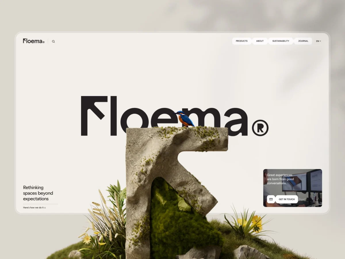
In an era where the boundary between the physical and digital landscape is increasingly blurred, Floema—a premier designer and manufacturer of sustainable urban furniture and signage—has set a new benchmark for B2B brand architecture. By prioritizing tactile materiality and digital storytelling, the company has successfully transitioned from a traditional manufacturing entity into a global leader, positioning itself alongside Europe’s most elite product manufacturers.
This transformation, helmed by the renowned Portuguese creative studio Bürocratik, represents more than a mere website redesign. It is a comprehensive overhaul of brand identity, product cataloging, and digital strategy that redefines how sustainable design is communicated to urban planners, architects, and public space developers.
The Foundation: A Two-Year Odyssey of Brand Evolution
The collaboration between Floema and Bürocratik spanned over two years, a duration that highlights the depth of the undertaking. The project was divided into two distinct phases. The first year focused on the foundational pillars: rebranding, restructuring the company’s extensive product catalog, and redefining the brand’s visual language. The second year brought these elements into the digital realm, culminating in the launch of Floema.com—a platform designed to serve as both an exhaustive product database and a poetic narrative of the company’s philosophy: "Spaces for people. Made for life."
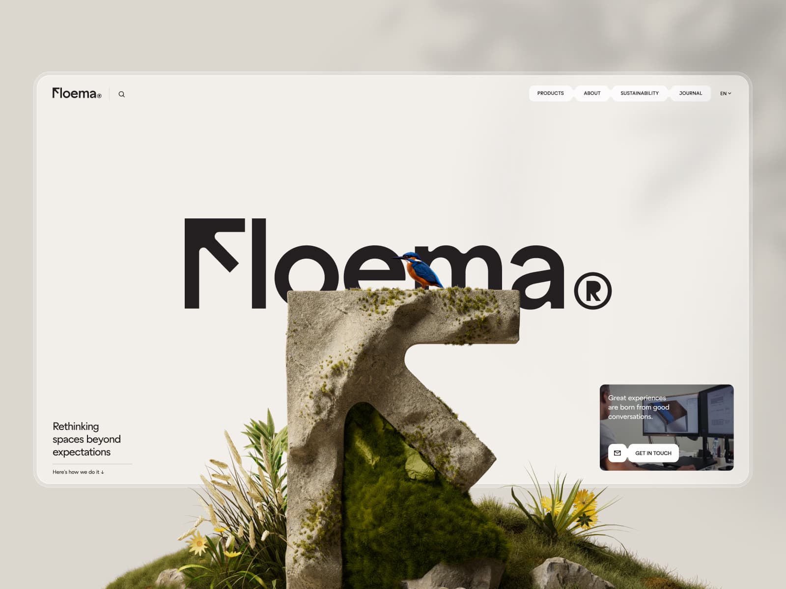
The ambition was clear from the outset: Floema did not want to treat sustainability as a hollow marketing buzzword. Instead, the design team aimed to let sustainability emerge naturally through the products themselves—their materials, their manufacturing constraints, and the environments they inhabit.
Chronology of Craft: From CNC Constraints to Digital Identity
The branding process was rooted deeply in Floema’s legacy as a signage manufacturer. The guiding principle for the new identity was "direction."
The "F" Logo: A Study in Intent
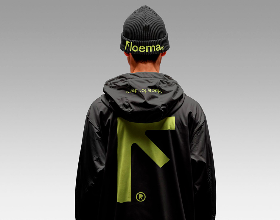
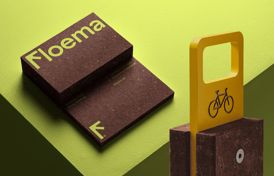
The design of the new logo was a rigorous exercise in restraint. Built around the letter "F," the logo incorporates a subtle twist that functions as a directional arrow. While initially met with skepticism by stakeholders who questioned its legibility, the design proved its worth once integrated into the wider brand ecosystem. It points upward with intent, grounding the brand in its heritage while signaling a forward-thinking trajectory.
Typography and the "CNC" Aesthetic
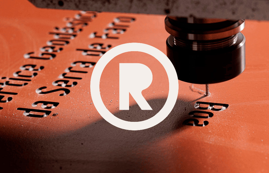
Typography was selected to mirror the physical realities of Floema’s production line. Conventional, rigid grotesques were rejected in favor of La Bolde Vita’s Zimula. This typeface features prominent rounded ink traps, a design choice that mimics the limitations and behaviors of CNC-cut metal, recycled plastics, and laminates. By embracing these "production constraints" as aesthetic virtues, the brand feels authentic and cohesive. In a final, daring detail, the designers removed the "R" counter—the inner shape of the letter—to reflect the raw, stripped-back nature of industrial manufacturing.
Materiality as Language
To ensure the brand was as tactile as the furniture it produces, the designers curated a physical catalog that mirrored the digital experience. Business cards were printed on Gmund Beer Ale—a paper made from hops, malt, and pulp—which shares a visual and textural affinity with the recycled plastics used in Floema’s street furniture. Brochures utilized Fedrigoni Materica, a paper with a mineral-like finish, further reinforcing the brand’s connection to the earth and the urban environment.
The Digital Experience: 3D Innovation and Web Performance
At the heart of the new digital platform is a product-first experience. To handle over 230 individual product SKUs, the team had to solve the "content vs. performance" dilemma.
Interactive 3D at Scale
Every product in the Floema catalog is presented via high-fidelity 3D renders. On the product detail pages, these assets become fully interactive, allowing B2B professionals to examine materials and technical specifications from every angle. This required a massive optimization process. Using tools like glTF Transform, Meshoptimizer, and Draco, the team reduced 20MB+ models into lightweight, web-ready assets without sacrificing visual integrity.
The technical brilliance extends to the rendering engine. Instead of baking shadows into the models, the studio utilized a custom implementation of PCSS (Percentage-Closer Soft Shadows) to generate shadows from the geometry in real-time. By caching these calculations once a model stops moving, the site achieves high-end, cinematic lighting effects without the heavy processing costs that usually bog down mobile browsers.
The Role of AI in Creative Direction
The team did not shy away from the "elephant in the room": the use of Artificial Intelligence. AI was deployed as a force multiplier during the visual exploration phase, specifically in the sculptural interpretation of the "F" logo and the creation of seasonal variants for the brand’s "About" page.
Perhaps most charming is the integration of a Kingfisher and an Owl into the website’s "About" section. Created via AI and refined through human art direction, these birds act as ambient, living elements that react to scroll interactions. This infusion of organic, unpredictable life into a technical B2B site transforms a standard corporate page into a digital sanctuary.
Supporting Data: Technical Integration
The project’s success is underpinned by a robust technical stack:
- Framework: Vue/Nuxt.js
- Headless CMS: Sanity
- Hosting: Vercel
- Animation/Interactivity: Lenis (smooth scrolling), GSAP, Rive, and Three.js (WebGL).
- Data Integration: Zoho for wishlist and lead management.
Official Response: The Philosophy of the "Foundation First"
Reflecting on the process, the creative leads at Bürocratik emphasized a fundamental truth in digital design: "Sort the foundations before the design. Every single time." By building the brand and the website as a singular, unified process, the team avoided the common pitfall of treating a website as a "skin" built on top of a disconnected brand.

"Design decisions became clearer, content found its place naturally, and the website feels like an extension of the brand," the studio noted. This methodology provided the client with complete autonomy over content, allowing Floema to update their massive catalog without sacrificing the integrity of the design.
Implications: A New Standard for B2B Digital Presence
The implications of this project for the B2B sector are profound. Historically, B2B websites have been viewed as utilitarian tools—cluttered, dry, and purely transactional. Floema proves that digital experiences for high-end manufacturing can be emotive, immersive, and technically ambitious.
By balancing the needs of professionals seeking technical specifications with a narrative that honors nature and sustainable manufacturing, Floema has turned its website into a competitive advantage. It is no longer just a catalog; it is a brand manifesto that lives, breathes, and evolves with the seasons.

The Future of the Brand
As Floema continues to shape public spaces across Europe, the digital platform stands ready to grow with them. The modular nature of the CMS and the scalability of the 3D asset library mean that as new products are introduced, they can be seamlessly integrated into the existing ecosystem.
For Bürocratik, the project stands as a testament to their two-decade-long career. As they continue to push the boundaries of digital craft, their work with Floema serves as a case study in how to marry heavy industry with high-end digital artistry.
Conclusion: Crafting for the Long Term
Floema is a project that validates the importance of "doing things properly." In a market saturated with ephemeral trends and disposable design, the focus on materiality, longevity, and intentional digital interaction marks a return to the values of true craftsmanship.
As the digital world continues to expand, the lesson from Floema is clear: when strategy, craft, and execution are aligned at the highest level, the result is not just a website—it is a legacy. For those interested in the deeper story behind the studio that made this possible, Bürocratik’s recent publication, 18 FKN Years with Büro, offers further insight into the philosophy that made this project a reality.
For now, Floema stands as a beacon for what is possible when a manufacturer decides that their digital presence should be as durable, thoughtful, and expertly crafted as the furniture they place in our public parks and city squares. "Spaces for people. Made for life"—a promise that, through this transformation, is now etched into the very code of the brand.

 Lina Irawan

 Ammar Sabilarrohman
 Nana Wu
 Suro Senen
 Jia Lissa