
 Reynand Wu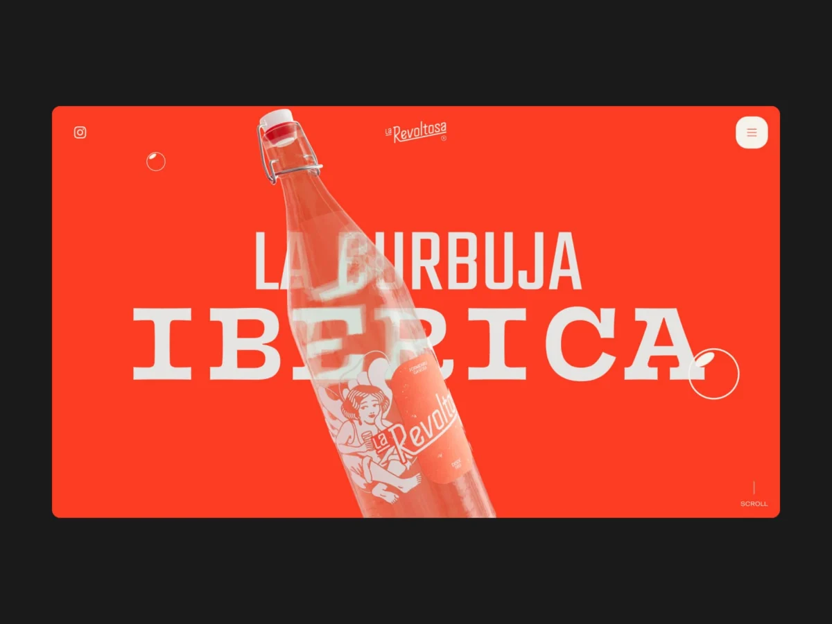
Introduction: The Resurrection of a Spanish Icon
In the landscape of Spanish consumer goods, few things are as evocative as the local soda fountain or the clink of glass bottles at a neighborhood bar. For decades, La Revoltosa—a brand born in 1953—was a staple of family gatherings and Spanish social life. However, like many heritage brands, it eventually found itself dormant, resting in the collective memory of the older generation while fading from the view of modern consumers.
When Refrescos del Atlántico tasked the Madrid-based branding and design studio waka with the brand’s revival, the challenge was not to invent a new entity, but to breathe new life into an existing soul. The objective was to maintain the brand’s authenticity while catapulting it into the digital age. The result is a digital masterclass in "scrollytelling," where a website ceases to be a static brochure and becomes a living, breathing character.
Chronology of a Rebrand
The transformation of La Revoltosa was a holistic process that spanned from the physical product to the digital interface.
- 1953 – 2000s: The formative years of La Revoltosa, establishing its roots in Spanish bar culture.
- The Dormant Period: The brand retreats from the spotlight, becoming a legacy name without active modern engagement.
- The Brief: Refrescos del Atlántico approaches waka. The mandate is clear: keep the essence, lose the dust, and reclaim relevance.
- Development Phase: waka takes full creative control, opting to recover the brand’s 1970s visual identity rather than creating a generic modern logo.
- Production: The studio shifts focus to in-house production, utilizing local talent and community members to avoid the artificiality of stock imagery.
- Launch: The digital platform goes live, followed by a roadmap of physical cultural activations across the Madrid region.
The Concept: A Website That Talks Back
The digital strategy for La Revoltosa was predicated on a rejection of industry norms. The team at waka observed that the food and beverage sector often relies on third-person "About Us" pages, sterile product carousels, and generic imagery of people toasting with drinks.
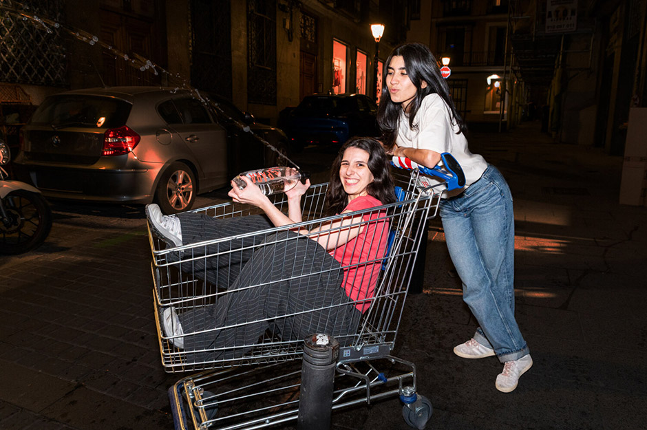
"The website doesn’t introduce the brand; the brand introduces itself," explains the team at waka. By adopting a first-person narrative, the site treats the user not as a consumer, but as a guest at a bar. The user scrolls through "chapters" of the brand’s life, progressing in tone and personality. The brand’s philosophy, “a nuestra manera” (our own way), is the heartbeat of the site. It is a bold, conversational approach that creates an immediate, intimate connection, transforming a visit to a URL into a social encounter.
Behind the Curtain: Technical Engineering and Performance
The project required a sophisticated "plumbing" system to handle the heavy, immersive 3D elements while maintaining a manageable backend for the client.
The Stack
The site operates on a custom, headless-style monolith WordPress architecture, avoiding the bloat of pre-built themes. To ensure the client could manage content—such as products, copy, and campaign imagery—without technical support, waka prioritized a modular component system based on BEMIT methodology.
WebGL and the 3D Challenge
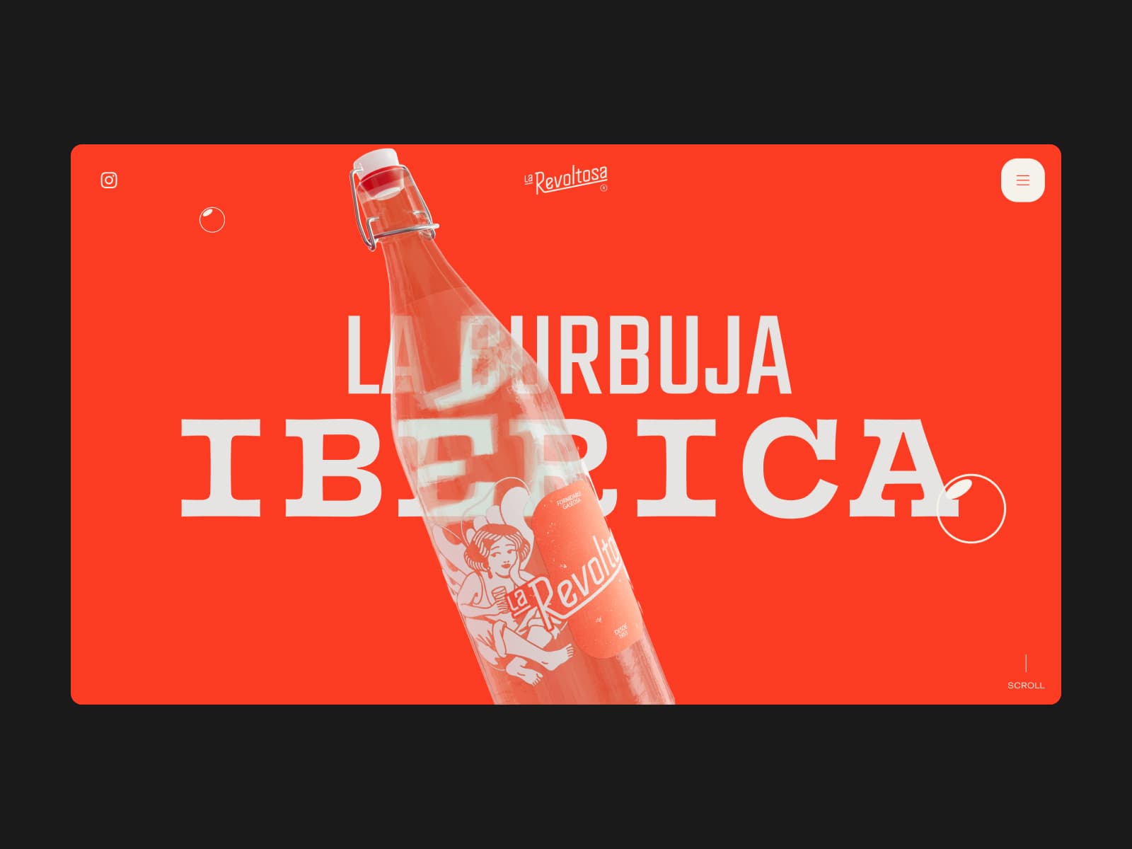
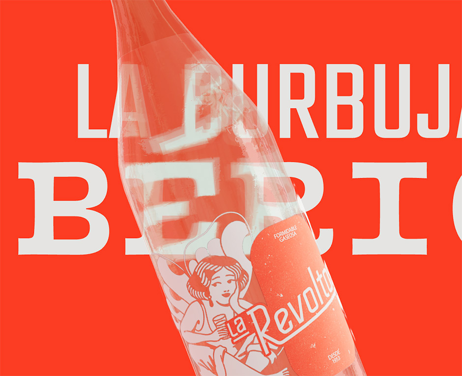
The crown jewel of the technical build is the integration of Three.js. This was waka’s first foray into WebGL, and they leaned into the complexity. The hero section features a 3D bottle with complex Refraction Indices (IOR). To ensure the hero typography distorts behind the bottle—a visually stunning effect—the text was rendered directly inside the Three.js scene as independent geometry.
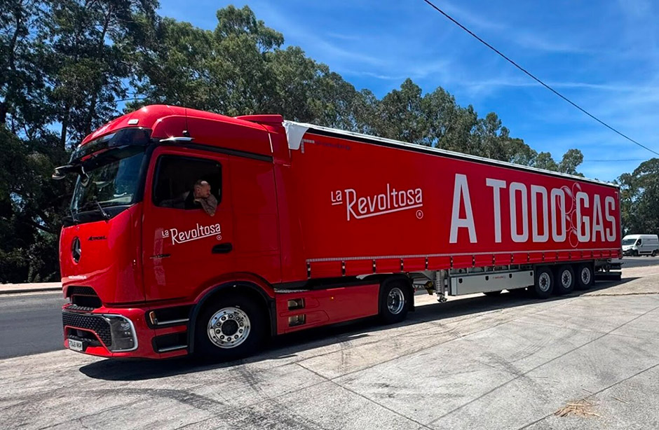
The Performance Battle
Performance optimization was a constant tug-of-war. The studio faced three primary technical hurdles:
- 3D Geometry: Managing complex materials and light reflections on mobile devices required aggressive polygon reduction and smart texture reuse.
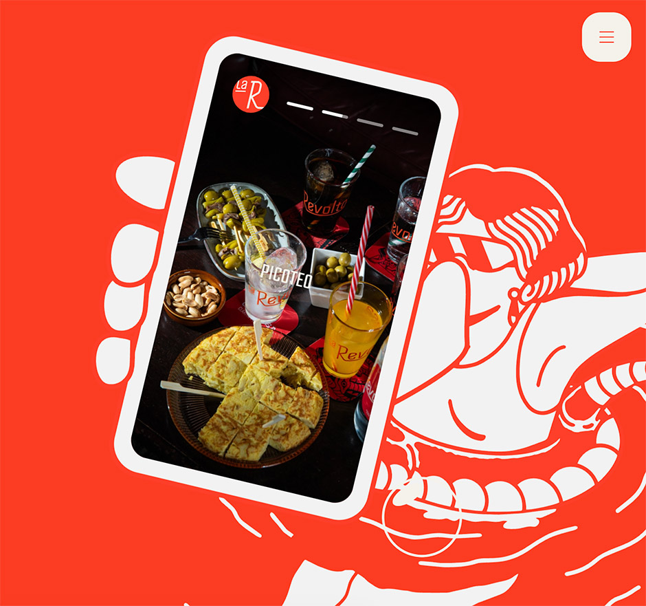
- DOM Synchronization: Scaling an SVG overlay while keeping a mobile-phone element perfectly synced over a looping video required frame-by-frame mathematical precision.
- Memory Management: To ensure a fluid experience on mid-range devices, the team implemented progressive loading, pulling only the necessary assets into memory at any given time.
While achieving a locked 60fps on every device is a Herculean task, the result is a polished, fluid, and highly optimized experience that defies the limitations of browser-based 3D.
Product Pages: Each Flavor as Its Own World
The "Mis Bebidas" (My Drinks) section represents the project’s most creative extreme. Instead of a standard grid, each product is treated as an individual character with its own distinct world.
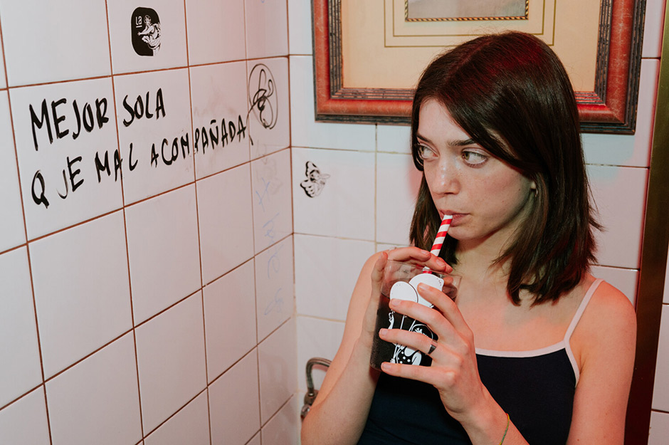
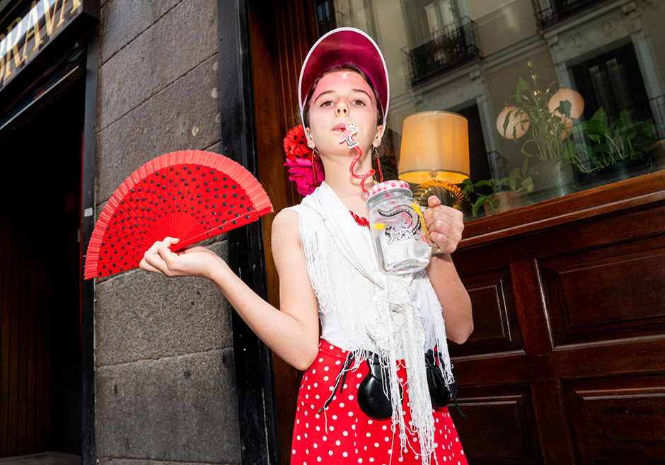
When a user selects a flavor, the entire environment shifts: the background illustration, the color palette, and the copy transform instantly. The soda is accompanied by a butterfly motif; the seltzer by a dragon; the tonic by a crocodile. Each flavor has its own attitude—the tonic is "bitter, with a wink," while the soda prefers to be "alone rather than in bad company." This narrative layering transforms a simple product catalog into an interactive storybook.
Official Perspective: In-House Authenticity
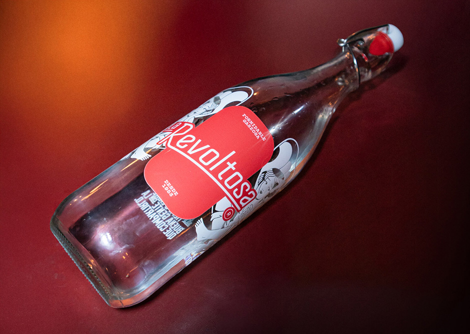
A standout element of this project is the refusal to outsource key creative components. Every piece of the La Revoltosa puzzle—from the iconography and 1970s-inspired logo to the packaging and web development—was produced in-house at waka.
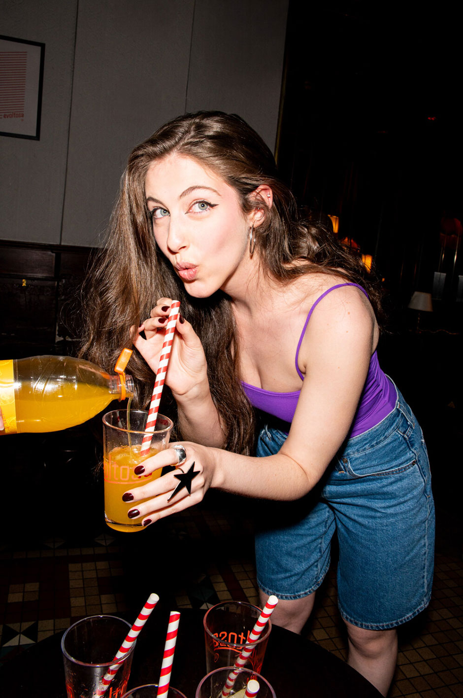
The collaboration with illustrator and tattoo artist Gonzalo (GL6RIA) provided the brand with a unique aesthetic that bridges the gap between traditional Spanish tattoo art and modern, rebellious design. Furthermore, the video content featured on the homepage relies entirely on the agency’s team and the client’s actual friends. By avoiding professional models, waka maintained the "rough affection" and familiarity that is central to the brand’s identity.
Implications for the Industry
The La Revoltosa case study signals a shift in how legacy brands should approach digital transformation. By prioritizing narrative-driven UX over functional simplicity, waka has proven that even traditional products can command a premium digital experience.
The project proves that "digital transformation" is not just about moving from paper to screen, but about translating the sensory experience of a brand into code. For other heritage brands, the lesson is clear: if you have a story, tell it in your own voice, and don’t be afraid to push the technical boundaries to make that voice heard.
Looking Forward: From Screen to Street
The digital launch is merely the prologue. The next phase of the La Revoltosa relaunch involves physical "festive cultural events" across Madrid. These gatherings, featuring live performances and local artists, are designed to take the rebellious spirit of the brand from the browser and place it directly into the hands of the community.
As the brand moves into this multi-channel future, it stands as a testament to the power of design to not only revive a company but to re-anchor it in the cultural zeitgeist. With the website serving as the digital foundation, La Revoltosa is no longer a relic of 1953—it is a contemporary participant in the modern Spanish social scene.
Technical Snapshot
- Frameworks: WordPress (Custom Monolith), GSAP (Animations), Lenis (Scrolling).
- Key Libraries: Three.js (3D Rendering), Emitter.js (Event-driven architecture).
- Methodology: BEMIT for modular component management.
- Creative Assets: Custom in-house illustrations by GL6RIA, restored 1970s logo, and original video production.
To explore the project in full, visit larevoltosa.es.

 Lina Irawan

 Ammar Sabilarrohman
 Nana Wu
 Suro Senen
 Jia Lissa