
 Reynand Wu
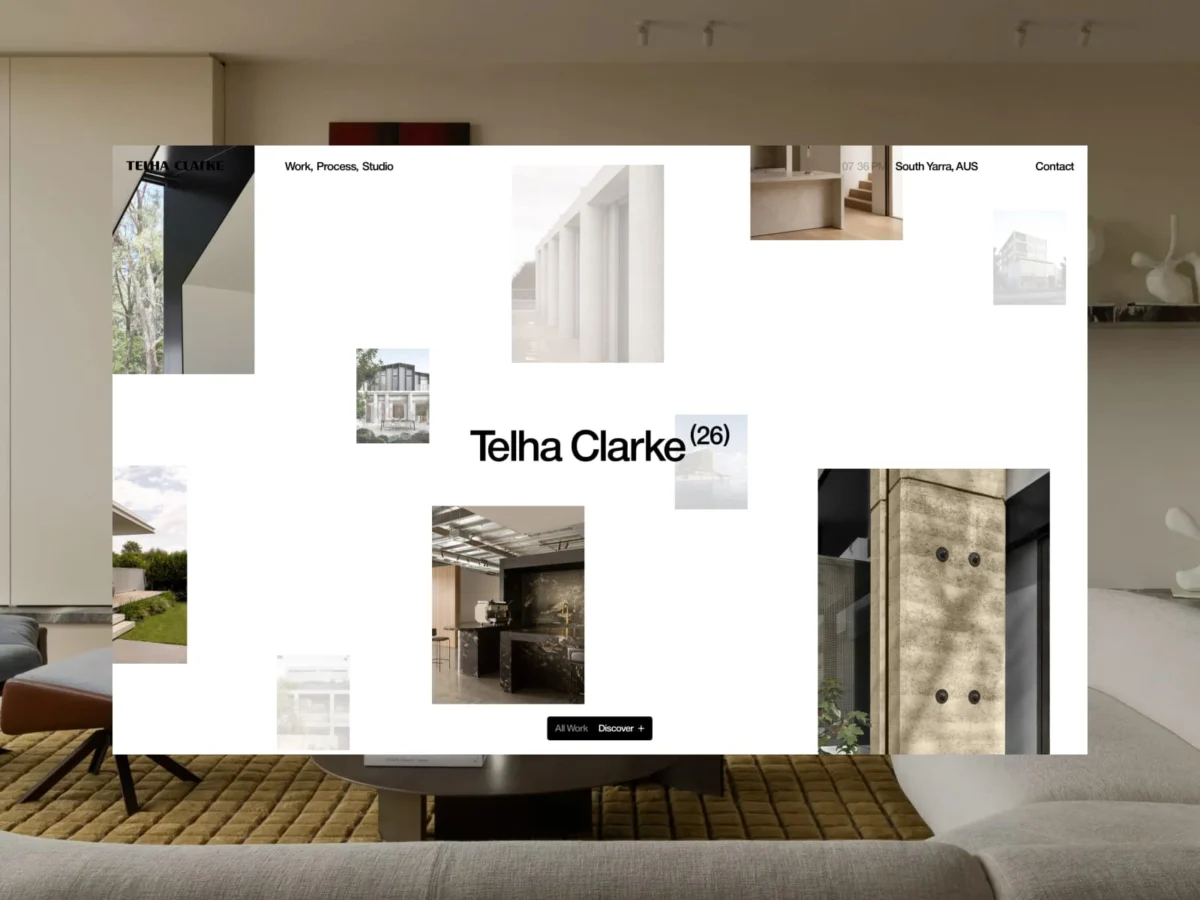
In the saturated landscape of digital architecture portfolios, where minimal layouts, oversized typography, and rigid, predictable grids have become the default "visual language," standing out is no longer a matter of adding features—it is a study in subtraction. When the design duo Gregory Lalle and Thomas Monavon were commissioned to redevelop the digital identity for the architecture firm Telha Clarke, they faced a central paradox: how to build a website that feels original without resorting to the visual excess that threatens to overshadow the very work it is meant to showcase.
The result is a masterclass in "intelligent simplicity." By prioritizing architectural intent over interface vanity, the team has created a digital space where the browser acts not as a frame, but as an extension of the studio’s physical work.
The Architecture of the Interface: Main Facts
The redesign of the Telha Clarke website represents a departure from conventional web design tropes. Rather than overwhelming the visitor with complex interactions or decorative flair, the project focuses on three core pillars:
- Content-Led Layouts: The interface dynamically responds to the work, ensuring the project imagery and narratives drive the rhythm of the user journey.
- Unified Interaction: The elimination of fragmented navigation in favor of a singular, adaptive widget that serves as the primary Call-to-Action (CTA) and navigational anchor.
- Meaningful Motion: Animations were engineered not as visual distractions, but as navigational tools that guide the user with the same precision found in architectural blueprints.
The project, which has already garnered significant attention within the design community—including a featured spot on Awwwards—serves as a case study for how digital studios can solve the problem of "sameness" in luxury and professional service branding.
Chronology of a Digital Transformation
The collaboration between Gregory & Thomas and Telha Clarke began with a fundamental question regarding the studio’s identity. The architects, Tim Clarke and Stuart Telha, required a digital presence that matched the caliber of their physical projects.
Phase 1: Deconstruction
The initial phase involved auditing existing architectural websites. The design team identified a recurring issue: many sites were suffering from "visual fatigue." By using the same industry-standard templates, firms were inadvertently commodifying their own work. The team decided to strip back the UI to its barest essentials.
Phase 2: Defining the Motion Language
The motion design was conceptualized to reflect the duality of the two founders. The site’s loader—a two-step animation revealing the wordmark—was the first technical milestone. It served as a symbolic representation of the partnership and set the tone for the site’s overall "deliberate pace," emphasizing the craftsmanship inherent in their physical builds.
Phase 3: The Widget Integration
The team experimented with several navigation models before settling on a single, animated interactive widget. This component acts as the "connective tissue" of the site, facilitating everything from page transitions to information disclosure. This shift was critical; it allowed the interface to remain "quiet" while providing the user with constant, contextual guidance.
Supporting Data: Interaction and Engagement Metrics
While the aesthetic success of the project is evident in its visual execution, the functional metrics reveal the effectiveness of the design choices.
- Reduced Cognitive Load: By utilizing a single interaction system (the widget), the team reduced the number of decision points required by the user, leading to a more intuitive flow.
- Scroll-Driven Storytelling: The implementation of scrollytelling—where transitions are triggered by the user’s reading pace—has shown a measurable increase in time-on-page compared to traditional paginated galleries.
- Fluid Transitions: The motion system was calibrated to ensure that even on high-latency connections, the transitions between the "highlighted works" and the "deep-dive" grid remained smooth. This is supported by a backend architecture designed to prioritize image loading without sacrificing the "architectural" feel of the transitions.
Official Perspectives: The Philosophy of Less
The creators, Gregory and Thomas, have been vocal about their design philosophy. According to the team, the primary challenge was "knowing what to leave out."
"For Telha Clarke, we believed the real differentiator wasn’t the interface itself, but the quality of the work being presented," the team noted in their project brief. "Rather than designing a website that competes with the projects for attention, we built an experience that allows the projects to become the primary narrative."
The collaboration also involved external creative partners to ensure the brand identity was cohesive. Nicolas Garcia of Studio Paack provided brand identity support, while Emeric Desgranges contributed custom 3D scenes. This multi-disciplinary approach ensured that the digital experience was not merely a website, but an extension of the Telha Clarke brand, effectively translating their physical architectural philosophy into a digital lexicon.
Implications: The Future of Architectural Portfolios
The Telha Clarke project arrives at a pivotal moment for digital design. As generative AI and standardized website builders make it easier to create "professional" sites, the bar for true, high-end digital craftsmanship has shifted.
A New Standard for "Intelligent" UI
The implications of this project are significant for the architectural sector:
- Motion as Navigation: The use of motion as a functional tool rather than an aesthetic garnish is likely to become the new benchmark. By making transitions feel like a physical experience—smooth, weighted, and purposeful—studios can better convey the "feel" of their architecture.
- The Death of the "Generic" Gallery: The success of the Telha Clarke site suggests that clients are moving away from the "grid-of-images" model toward narrative-driven, scrollytelling experiences. This forces architects to treat their website as a curated story rather than a static catalog.
- The Power of the Single Interaction: The "single widget" approach proves that simplicity is not the absence of functionality, but the consolidation of it. Future digital designs will likely focus on reducing the UI footprint to allow the content to dominate the screen real estate.
Final Thoughts: A Reflection on Design
This project serves as a poignant reminder that in the digital age, the most complex task is to achieve clarity. By treating animation as a language and the interface as a silent partner, Gregory & Thomas have successfully moved the needle on what an architectural portfolio can be.
As they stated, "Less interface does not mean less experience." In a world of noise, the Telha Clarke website stands out precisely because it knows how to be quiet. It is an experience that does not shout for attention; instead, it invites the user to explore, reflect, and appreciate the architectural craft at the heart of the studio. For the next generation of digital designers, the path forward is clear: focus on the rhythm, respect the content, and never let the digital frame become more interesting than the art it contains.

 Sagoh
 Asep Darmawan

 Nana
 Evan Lee Salim
 Layla Zulfa
