
 Layla Zulfa
In the ever-evolving landscape of digital aesthetics, few movements have captured the global imagination quite like the Japanese phenomenon of kawaii—a culture of cuteness that prioritizes playfulness, warmth, and an unapologetic sense of joy. As designers strive to create more approachable and human-centric brand identities, "Kawaii fonts" have emerged as essential tools for communication. These typefaces, characterized by their bubbly letterforms, rounded edges, and soft, approachable aesthetics, are no longer relegated to niche children’s products; they are now staples in high-end character branding, social media marketing, and interactive digital design.
This article explores the evolution, application, and strategic importance of the kawaii typeface movement, profiling the top selections available to designers today and examining how these fonts are reshaping the way we perceive brand personality.
The Evolution of Kawaii Aesthetics in Typography
The term kawaii—literally translating to "lovable" or "cute"—originated in 1970s Japan, initially as a form of handwriting among teenage girls who sought to break away from the rigid, traditional Japanese scripts. By incorporating circles, hearts, and stars into their writing, they established a visual language that felt intimate, rebellious, and deeply endearing.
Over the decades, this hand-lettered rebellion transitioned into the professional design sphere. Today, the "Kawaii font" genre is a curated category of typefaces that replicate this hand-drawn, bouncy, and soft energy. The technical shift from traditional calligraphy to digital display fonts has allowed for a massive expansion in the variety of these typefaces, moving from simple rounded sans-serifs to complex, layered, and decorative display fonts that retain that quintessential charm.
Strategic Design Implications: Why Cuteness Sells
In a digital economy defined by "scrolling fatigue," brands are increasingly utilizing design elements that induce a positive emotional response. Studies in visual psychology suggest that rounded, soft-edged shapes are perceived by the human brain as "safer" and more approachable than sharp, angular, or high-contrast serif fonts.
When a brand chooses a kawaii-inspired font, it is making a deliberate decision to lower the barrier between the product and the consumer. By utilizing pastel-ready forms and playful embellishments, designers can evoke feelings of nostalgia, comfort, and happiness. This is particularly effective in sectors such as:
- Stationery and Paper Goods: Where the tactile nature of the product aligns with the organic flow of the font.
- Character Branding: Where the font acts as an extension of a mascot’s personality.
- Food and Beverage: Especially for snacks and desserts, where the font mimics the "sweetness" of the product itself.
Curated Selection: Premium Kawaii Typefaces
For designers looking to infuse their projects with a touch of whimsy, the following fonts represent the gold standard of the current kawaii movement.
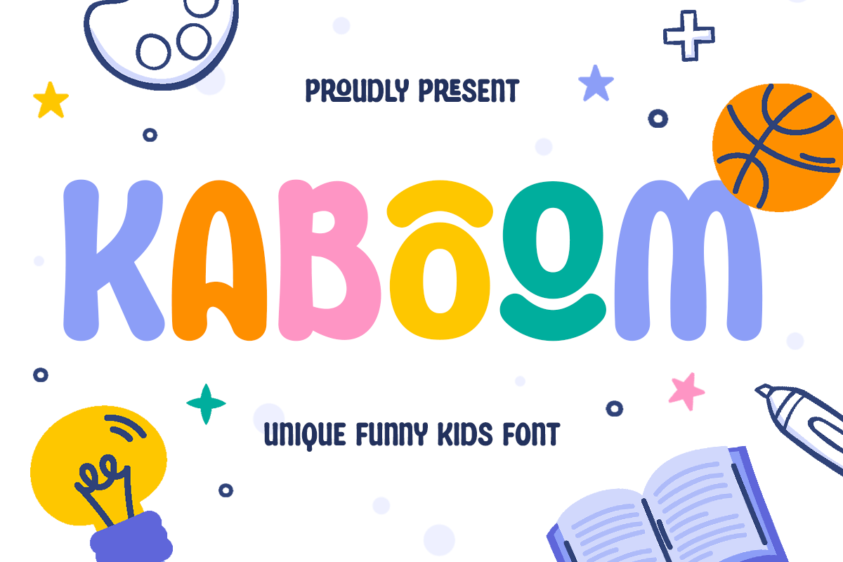
Kaboom – Energetic and Joyous
KABOOM is perhaps the most dynamic entry in this list. It is an energetic, high-impact font that refuses to be ignored. Unlike more delicate kawaii fonts, Kaboom leans into the "chunky" aesthetic. It is perfect for game titles, animated film credits, or any branding that requires a high level of "pop" without losing its inherent friendliness.
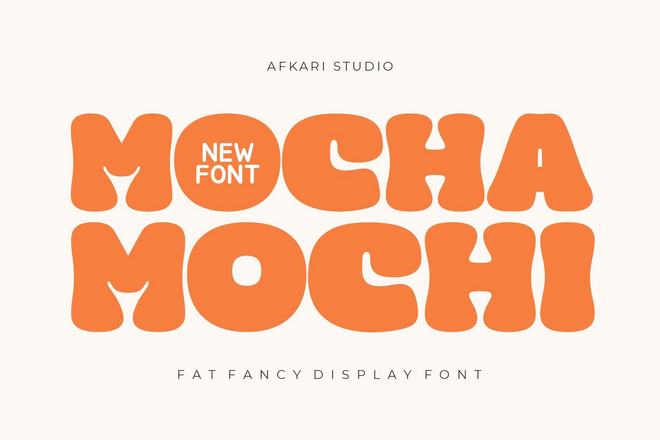
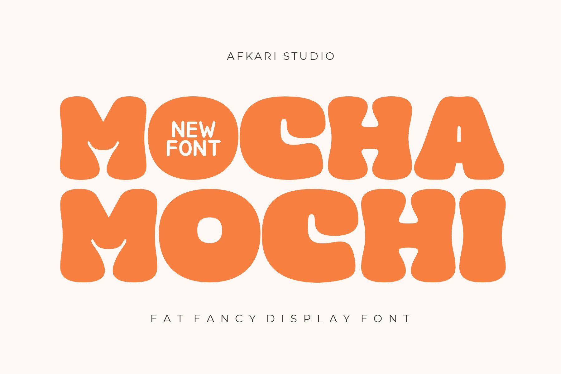
Mocha Mochi – The Comfort Choice
Drawing its name and inspiration from the soothing intersection of coffee culture and traditional Japanese desserts, Mocha Mochi is defined by its extreme roundness. It offers a "fat" display style that works exceptionally well on packaging labels. Its design language is soft and pillowy, making it an excellent choice for lifestyle brands that want to convey comfort and reliability.
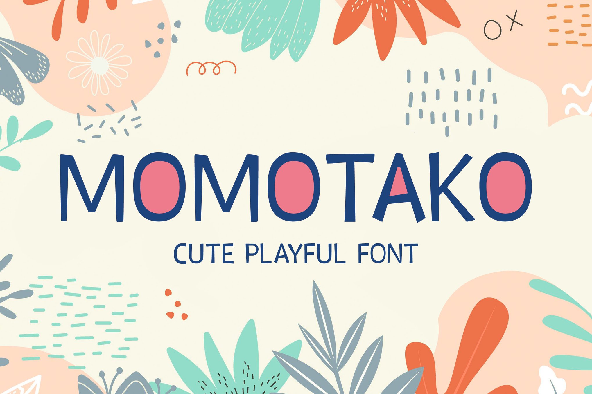
Momotako – The All-Rounder
Momotako stands out for its versatility. While many display fonts are limited to short headers, Momotako is balanced enough to be used in posters, social media infographics, and even web-based headers. It includes a robust set of standard glyphs, ensuring that the designer is not restricted by language or character limitations.
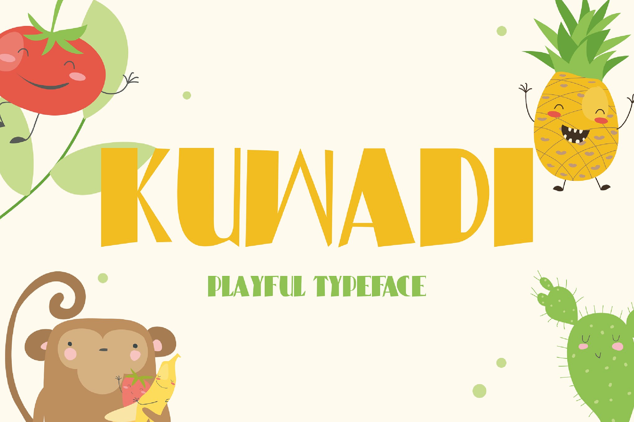
Kuwadi – Capturing Childhood Wonder
Kuwadi is meticulously crafted to mimic the organic imperfections of a child’s pen stroke. Its curves are not mathematically perfect, but rather intentionally rounded to suggest warmth and accessibility. It is the preferred choice for educational materials, children’s book covers, and party invitations where a "handmade" feel is paramount.
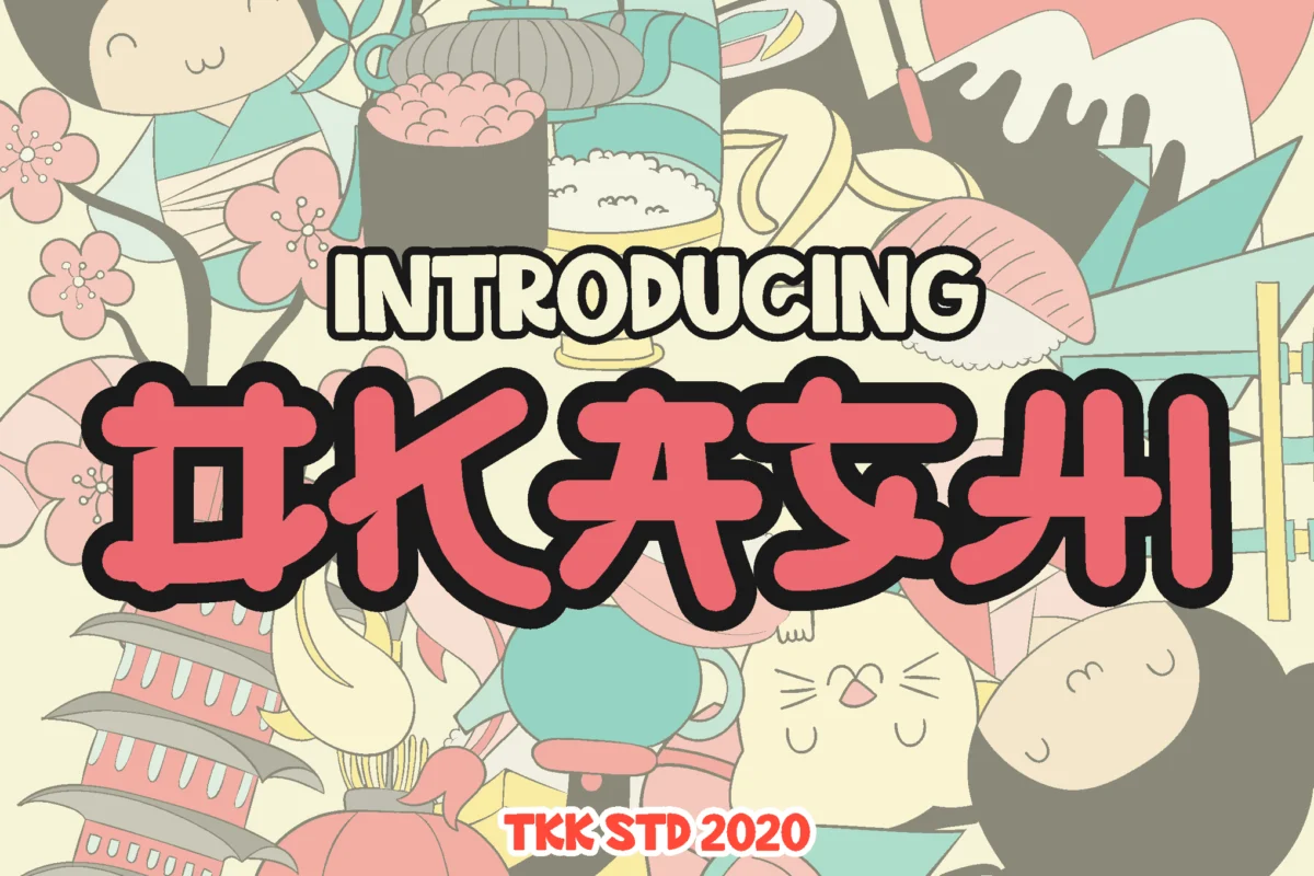
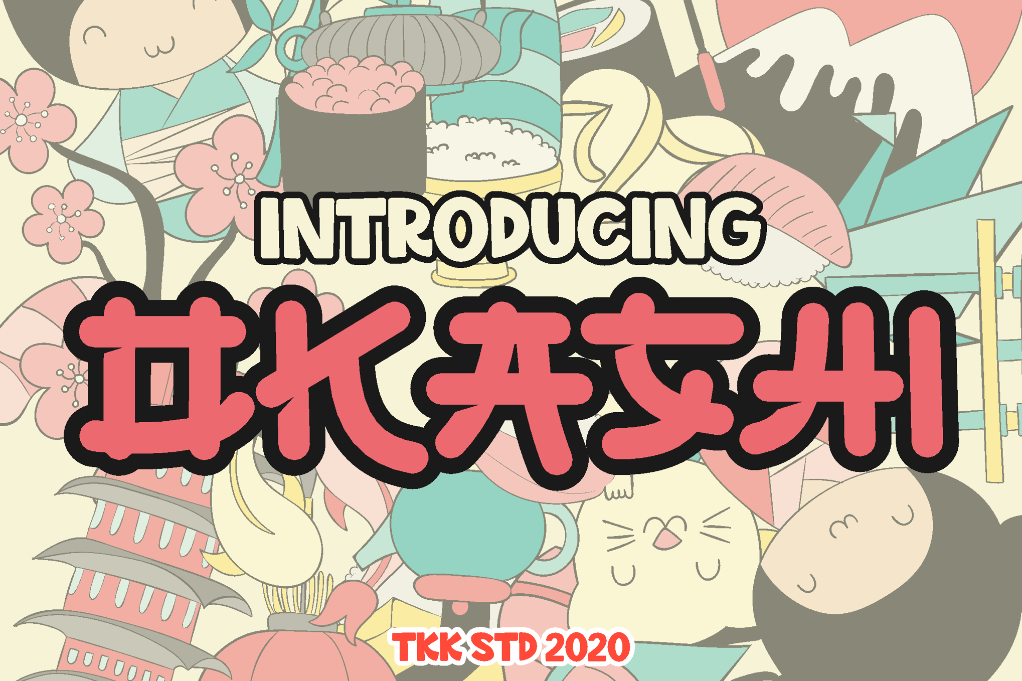
OKASHI – Faux Japanese Charm
OKASHI serves as a bridge between Western typography and Japanese visual culture. It is a "faux-Japanese" font, meaning it takes cues from the structure of Japanese snack packaging and manga lettering. It features a distinct "bouncy" baseline, which gives the text a rhythmic quality that is visually engaging and inherently fun.
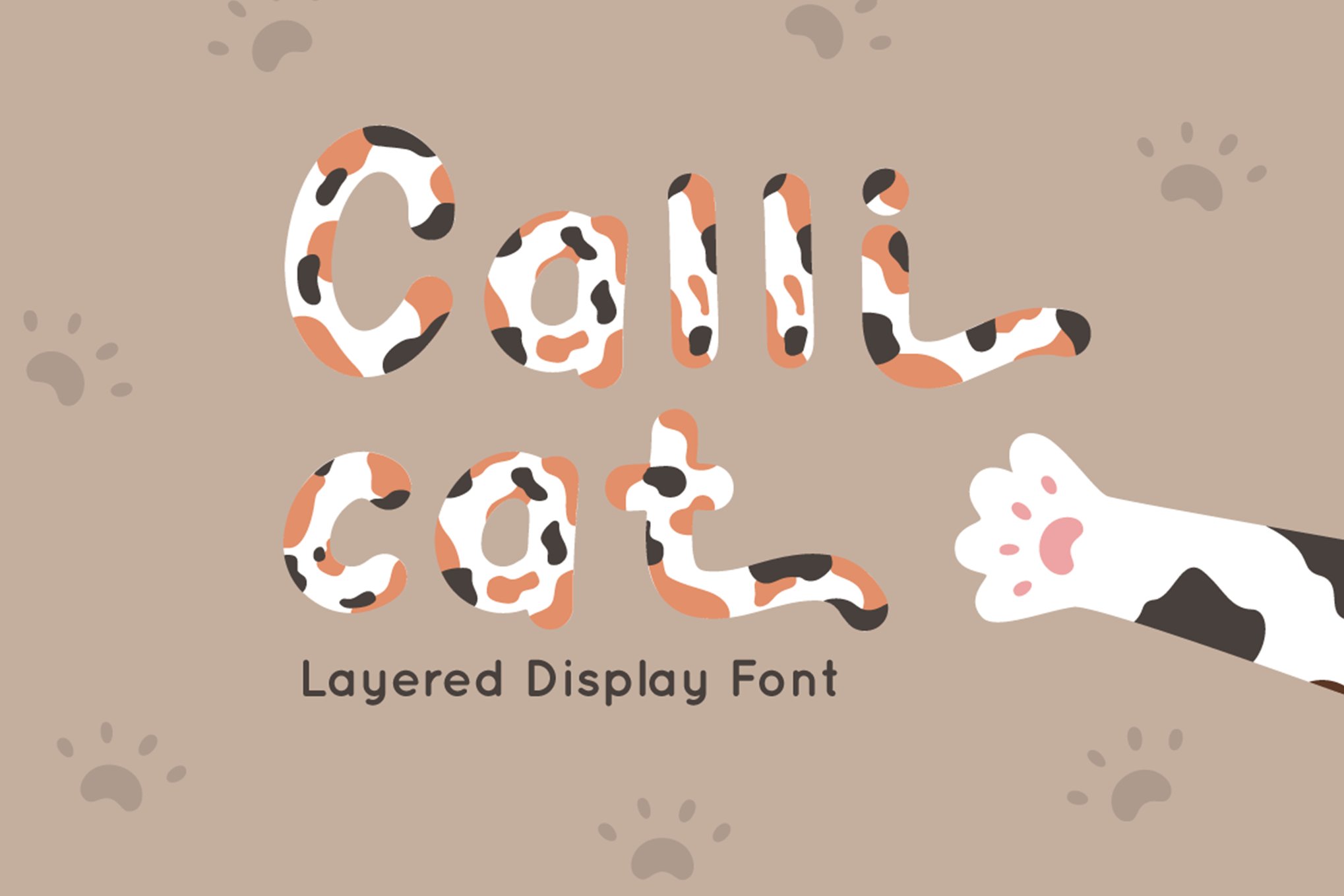
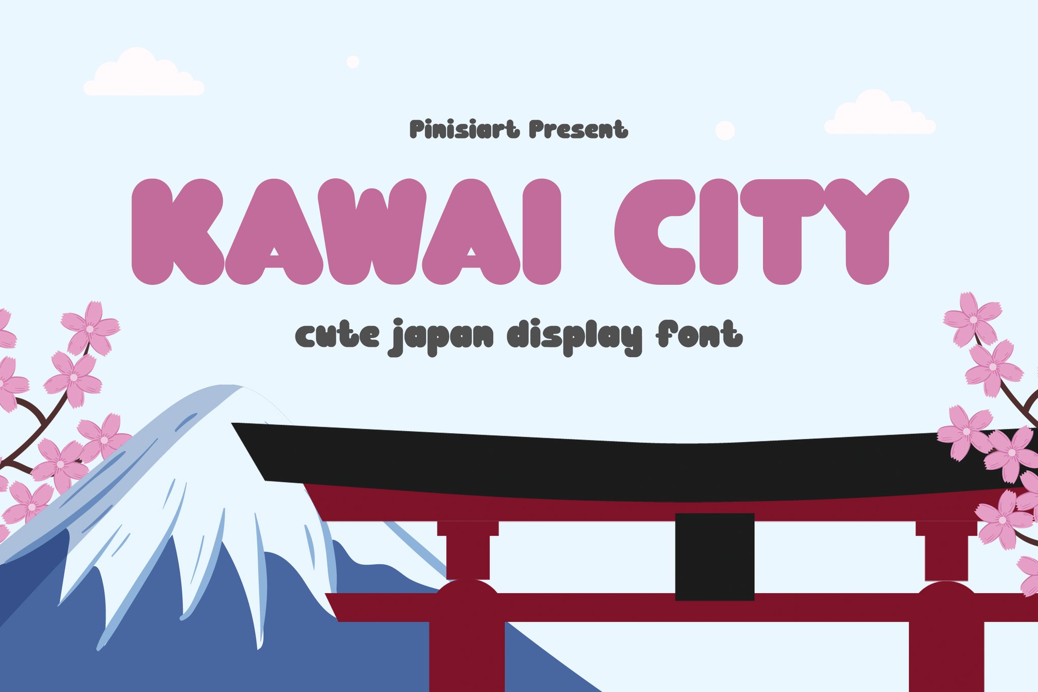
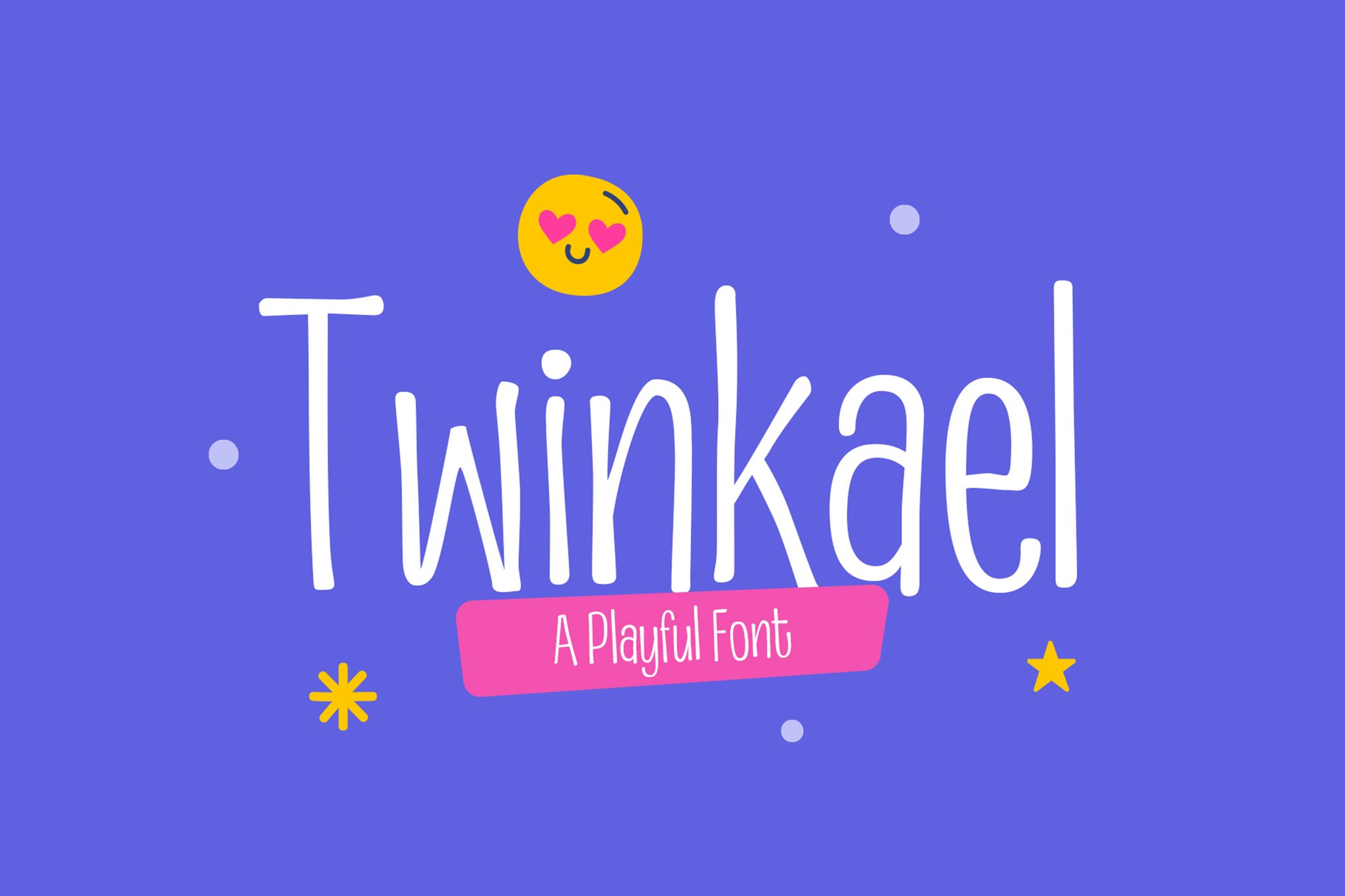
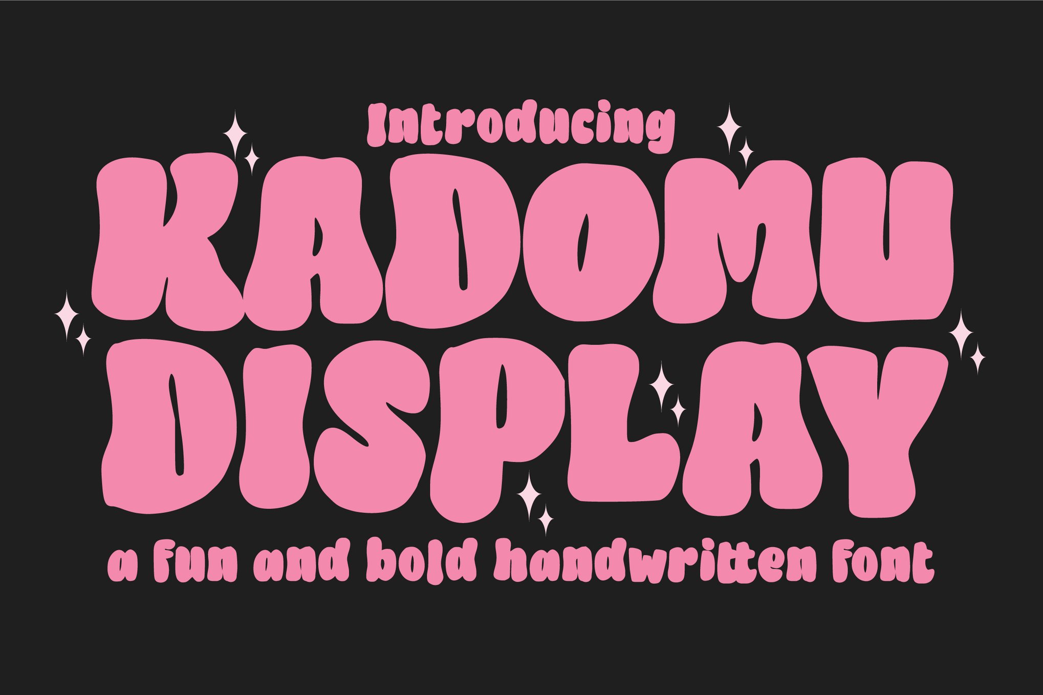
Kawai City, Twinkael, and Kadomu
- Kawai City: A highly functional display font that comes in multiple formats (OTF, TTF, WOFF). It is designed for the modern digital era, ensuring it renders perfectly on screen for social media covers and online gaming interfaces.
- Twinkael: Notable for its tall, slim characters. It offers a more sophisticated take on the kawaii aesthetic, suitable for brands that want to appear "cute" but still "chic."
- Kadomu: With over 150 glyphs and advanced OpenType features like ligatures and stylistic sets, Kadomu is the professional’s choice for custom typography work. It allows for a level of customization that most display fonts lack.
Exploring Free Resources: Accessibility in Design
The democratization of design tools has led to a surge in high-quality free assets. For independent creators, students, and small startups, the following free fonts provide the same aesthetic impact as their premium counterparts:
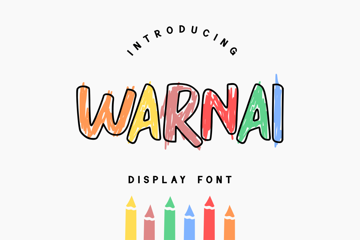
- Free Kawaii Font Family: This collection is the benchmark for entry-level designers. Its simple, rounded forms are highly legible, making it a safe choice for social media graphics where clarity is just as important as charm.
- Mochibop: A font duo that pairs a bubbly script with a clean sans-serif. The value here is in the pairing; it provides a complete design solution for a logo or a greeting card in one download.
- BabyKawaii: This font leans into the "soft" aspect of the aesthetic. Its rhythm is gentle, making it perfect for baby-related products or wellness-oriented brand identities.
- Kareo Star: By integrating subtle star-shaped elements into its letterforms, Kareo Star adds a touch of magic. It is an excellent choice for seasonal projects or event marketing where a "sparkle" effect is desired.
Technical Considerations: The Practical Side of Kawaii
While the visual appeal of these fonts is undeniable, designers must be aware of the technical limitations often associated with display typefaces.
1. Scaling and Readability
Many kawaii fonts feature rounded, bulbous letters that can lose their distinctiveness when scaled down to small sizes (such as in body text). Designers should restrict the use of these fonts to headlines, titles, or short, punchy phrases. When paired with a clean, neutral sans-serif body font, the design achieves a balanced hierarchy.
2. File Formats and Compatibility
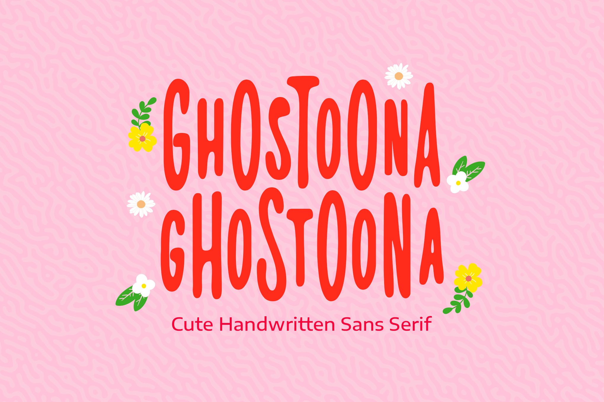
Professional projects demand cross-platform compatibility. Fonts like Kawai City and Ghostoona are favored by professionals because they provide OTF, TTF, and WOFF formats. Ensuring that a font includes WOFF support is critical for web design, as it ensures the typeface loads quickly and renders correctly across all major web browsers.
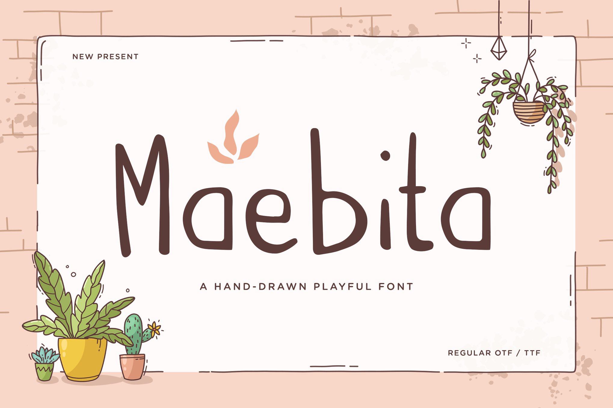
3. OpenType Features
When purchasing or selecting a font, designers should look for those that include "stylistic sets" and "ligatures." These features allow the font to change the shape of characters depending on the letters that surround them, resulting in a more natural, fluid look that avoids the repetitive nature of standard system fonts.
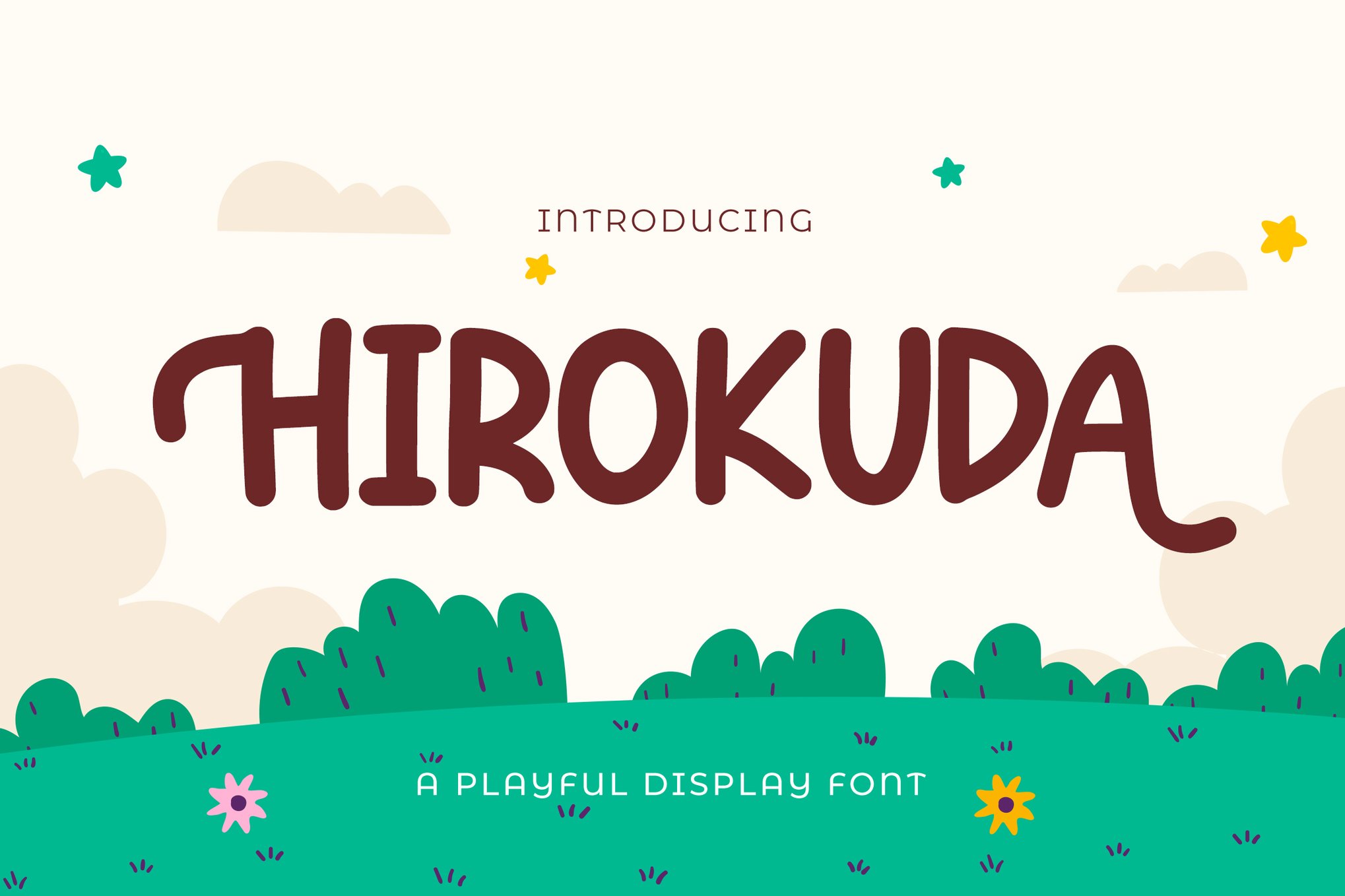
Future Trends: Where is the Kawaii Movement Heading?
As we move further into the 2020s, the kawaii aesthetic is evolving from "simple cute" to "retro-modern." We are seeing an influx of 90s-inspired kawaii fonts—typefaces that combine the rounded edges of the early 2000s with the vibrant, neon, and layered color palettes of current graphic trends.
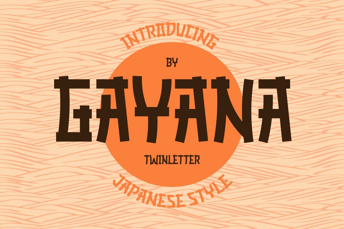
Furthermore, the rise of motion design means that many of these fonts are being optimized for animation. We are beginning to see "variable" kawaii fonts that allow designers to adjust the "bounciness" or "roundness" of the letters in real-time, providing unprecedented control over the brand’s personality.
Conclusion
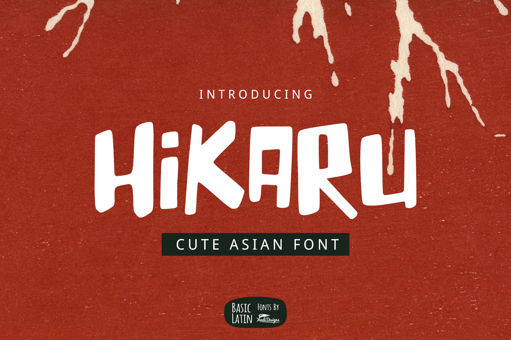
Kawaii fonts are far more than a passing trend; they are a vital component of the designer’s toolkit in an increasingly digital world. By harnessing the psychological power of rounded shapes and playful, organic forms, designers can create visual experiences that are not only memorable but genuinely heartwarming.
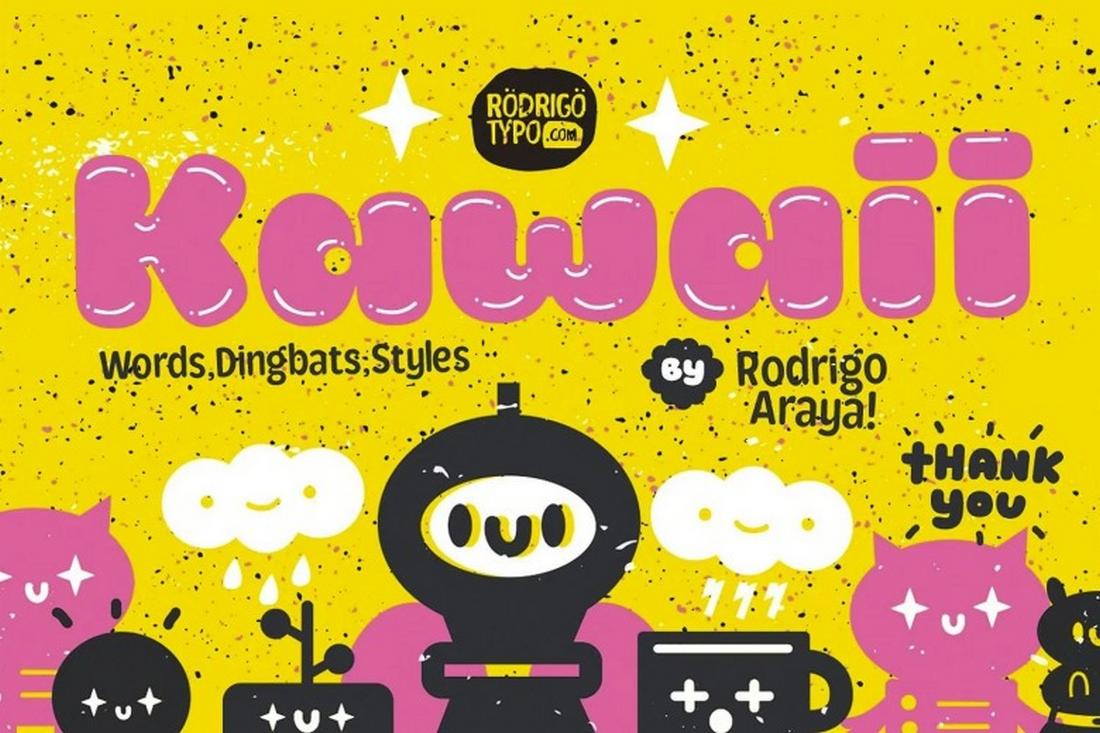
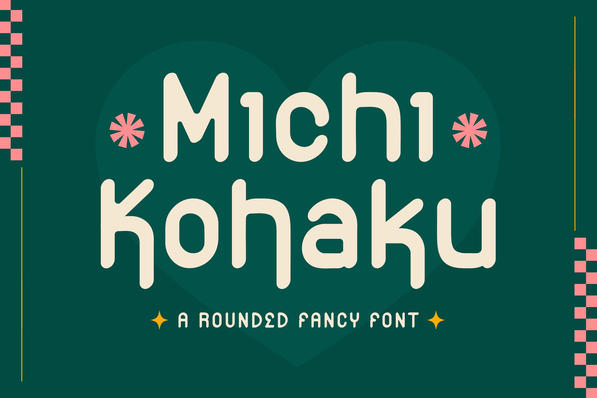
Whether you are designing a logo for a new startup, creating an invitation for a special event, or refreshing your social media presence, incorporating a thoughtfully chosen kawaii typeface can provide that essential spark of joy. From the high-energy impact of Kaboom to the elegant whimsy of Michi Kohaku, there is a typeface in this category for every creative need. Embrace the charm, explore the versatility, and let your designs speak with a voice that is, above all else, delightfully, irresistibly cute.

 Sagoh

 Asep Darmawan

 Raul Delapena Setiawan
 Reynand Wu

 Azzam Bilal Chamdy

 Ali Ikhwan
