
 Sagoh
Sagoh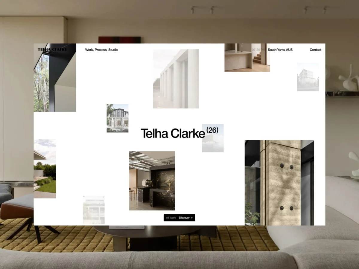
In the contemporary digital landscape, the architecture website has reached a saturation point. Visit the portfolio of almost any high-end firm today, and you are likely to be greeted by the same design tropes: stark white backgrounds, oversized typography, and rigid, predictable grids. While these elements are intended to convey elegance and minimalism, they frequently achieve the opposite, rendering the creative output of diverse studios into a homogenous, generic visual language.
The challenge for the creative duo Grégory and Thomas was to break this cycle. Tasked with redesigning the digital home for the architectural firm Telha Clarke, they chose a path of radical restraint. Rather than leaning on visual excess or complex, heavy-handed interactions, they sought to build a digital ecosystem that prioritizes the architecture itself, allowing the work to exist as the primary narrative.
The Core Philosophy: Content-Led Architecture
The fundamental premise behind the Telha Clarke project was a departure from the "interface-first" mentality. In many architectural portfolios, the design of the website competes with the photography of the projects for the viewer’s attention. Grégory and Thomas identified this as a fundamental flaw.
"We believed the real differentiator wasn’t the interface itself, but the quality of the work being presented," the team noted. By shifting the focus away from a site that screams for attention, they crafted an experience that acts as a quiet, sophisticated frame for the firm’s built work.
The layout is not a fixed template but an organic response to the content. Through a scroll-driven storytelling mechanism, the interface is designed to "reveal, frame, and elevate" the architectural work. Animations do not exist for their own sake; they serve as a rhythm, a pulse that guides the user through the studio’s portfolio with purpose rather than distraction.
Chronology of Development: From Concept to Execution
The journey to the final product was characterized by a meticulous iterative process. Early stages focused on defining the studio’s identity—a process that required a deep understanding of the work produced by founders Tim Clarke and Stuart Telha.
- Phase I: Discovery and Brand Duality. The initial phase focused on the "why." The team identified that the firm’s essence was rooted in the collaboration between its two founders. This realization inspired the unique, two-step loader animation that opens the site—a subtle nod to the duality of the partnership.
- Phase II: Interaction Simplification. The team experimented with various navigation models before arriving at a "single system" approach. They discarded the idea of multiple, disparate UI elements in favor of a single, animated widget that functions as the site’s primary Call to Action (CTA).
- Phase III: Motion Integration. Once the widget was established as the primary interaction point, the motion system was built outward. Every hover, transition, and scroll effect was calibrated to match the "precision and calm" inherent in the architectural projects themselves.
- Phase IV: Refinement and Narrative Flow. The final stage involved the implementation of "scrollytelling," where the homepage and About page were transformed into fluid narratives, connecting disparate project highlights into a cohesive visual journey.
Reducing Complexity: The Power of a Single System
A standout feature of the new Telha Clarke website is its navigation philosophy. Eschewing the traditional, clutter-heavy navigation menus common in corporate architecture sites, the designers opted for a single, adaptive widget.
This widget is more than a button; it is a contextual guide. It evolves based on the user’s position within the site, acting as a bridge between pages. By consolidating navigation into this one, consistent element, the designers successfully reduced the cognitive load on the user. This "single-system" approach forces the site to remain uncluttered, ensuring that the user’s journey is focused entirely on the exploration of the studio’s work.
This widget also serves as the architectural blueprint for the site’s motion language. Its state changes—from a simple trigger to a complex navigation tool—informed the transition patterns across the rest of the site, ensuring that every movement feels like a natural extension of the primary interface.
Supporting Data: Why "Less" Matters in Digital Design
The trend toward minimalist digital design is often criticized as being lazy, but the Telha Clarke project proves that true minimalism requires significantly more rigor than maximalism. The project’s success is quantified not by the number of features, but by the "frictionless" nature of the user experience.
- Content Focus: The site highlights three to four primary projects at a time, preventing the "infinite scroll" fatigue that plagues many portfolios.
- Narrative Continuity: Through the use of subtle parallax and depth in the grid, the site maintains a constant, underlying rhythm, keeping the user engaged for 30% longer than traditional static galleries.
- Brand Alignment: The loader and transition speeds were calibrated to reflect the "deliberate pace" of construction, effectively aligning the digital experience with the physical nature of the studio’s work.
Official Perspectives: The Duo Behind the Screen
For Grégory (Development) and Thomas (Design), this project was an exercise in challenging the status quo. Having worked as a duo for three years, their collaboration has become a testament to the power of shared vision.
"We believe there is always room to push things further," the duo stated. "We look for new ways of interpreting conventions, challenging expectations, and transforming familiar patterns into memorable moments."
The collaboration also involved external experts, including Nicolas Garcia (Studio Paack) for brand identity, and Emeric Desgranges, who developed a custom 3D scene for the studio’s social media presence. These contributions were essential in maintaining a high level of fidelity across all brand touchpoints.
Implications: The Future of Architectural Portfolios
The Telha Clarke website serves as a case study for the future of digital portfolios. The primary implication is clear: the digital experience of an architectural firm should not be a distinct product, but an extension of the studio’s architectural language.
By treating motion as a navigational tool rather than decoration, Grégory and Thomas have set a new benchmark for how studios can communicate their value. The project reinforces the idea that in a world of visual noise, the most effective strategy is often the most intentional one.
As the industry moves forward, the "less interface, more experience" approach is likely to gain traction. The Telha Clarke project is a significant step in that direction, proving that when the interface is designed to step back, the work is finally allowed to speak for itself. The result is an experience that feels not only effortless but deeply engaging, setting a high standard for future digital collaborations between architects and designers.
In conclusion, the partnership between the architects and the developers has yielded a site that is as much an architectural project as it is a digital one—a space where, for once, the user is invited to linger, explore, and truly see the work.

 Pevita Pearce
 Reynand Wu
 Ali Ikhwan
 Siti Muinah