
 Nila Kartika Wati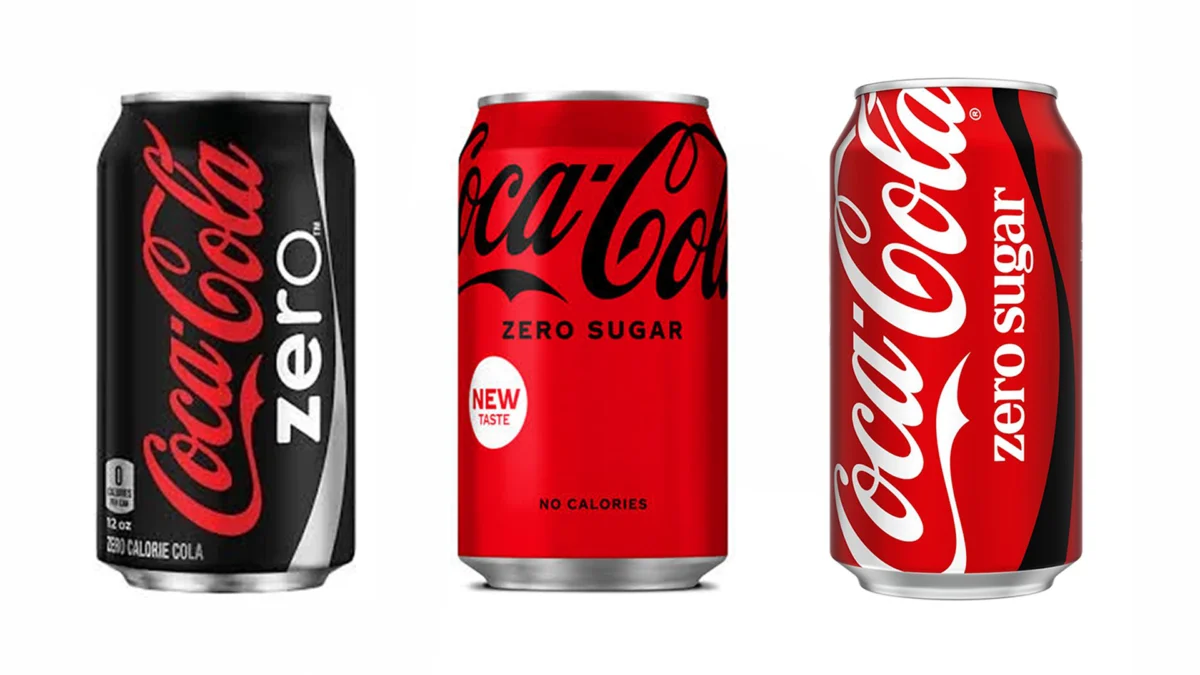
When Coca-Cola announced its major visual identity overhaul back in July, the design world was abuzz with talk of "brand purity" and the return to the company’s iconic red heritage. The goal, according to the beverage giant, was to make the product look "more Coca-Cola." However, as the new packaging has rolled out into global markets, a different, more contentious conversation has emerged. What was intended as a masterclass in brand unification has, for many consumers and service industry workers, become a logistical nightmare that raises significant questions about the intersection of modern minimalist design and user experience (UX).
The Evolution of the Redesign: A Chronology of Visual Identity
To understand the current controversy, one must look at how Coca-Cola has managed its "Zero Sugar" portfolio over the last two decades. Launched in 2005, Coca-Cola Zero was initially marketed as a bold alternative to the flagship product, defined by its stark, all-black can. This high-contrast packaging was deliberate; it served as a visual "stop sign" for consumers, ensuring that those looking for a zero-calorie option wouldn’t accidentally grab the sugar-laden original.
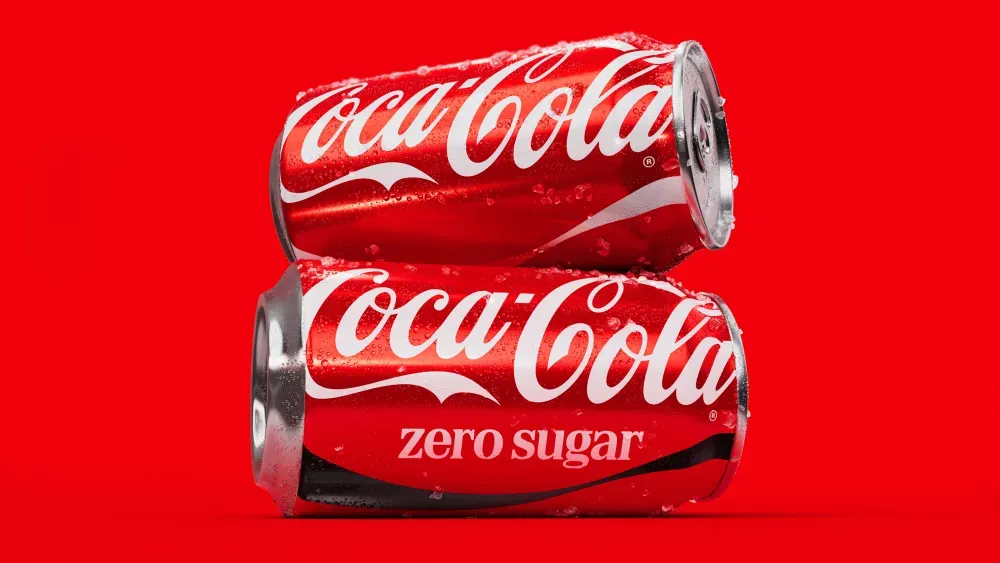
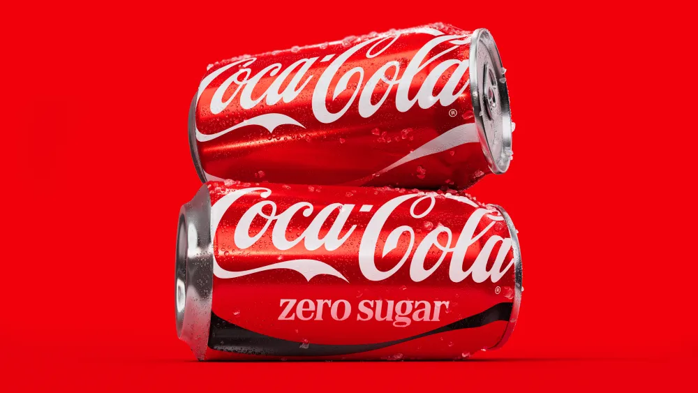
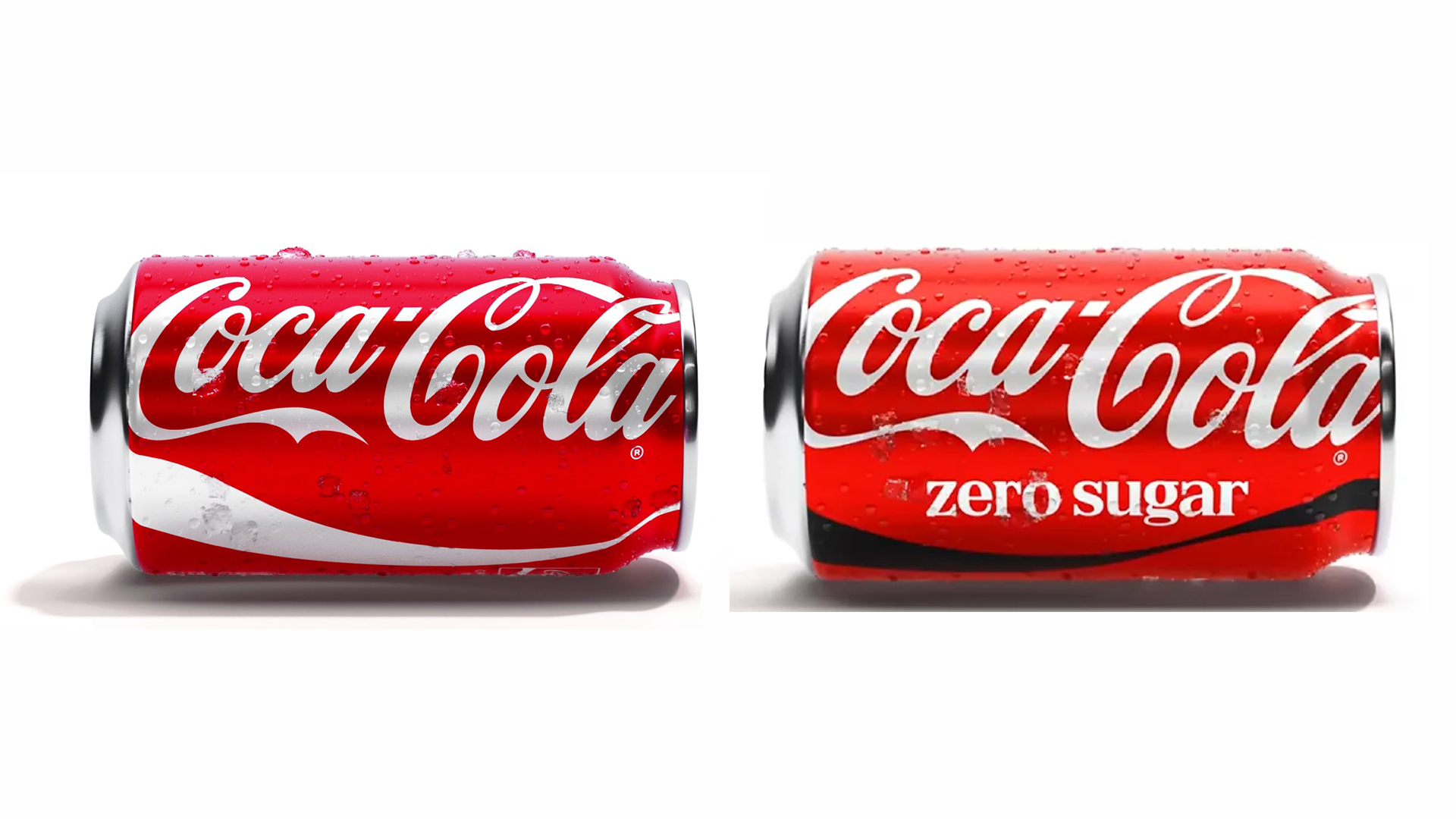
In 2016, the brand underwent a significant shift, rebranding to "Coca-Cola Zero Sugar" and softening the aesthetic. The black can remained, but the branding began to lean closer to the core red identity. The most recent 2024 iteration, however, has pushed this convergence to its logical, and perhaps extreme, conclusion. The iconic black packaging has been largely stripped away, replaced by the signature red, leaving only a thin black ribbon or subtle lettering to distinguish the sugar-free variety from the classic soda.
For the Coca-Cola Company, this shift was framed as an effort to simplify the consumer journey. By bringing all variants under one "single brand" banner, they aimed to create a more consistent, harmonious shelf presence. "With one seamless visual identity, we can deliver one recognizable brand experience to consumers," the company stated in its official press release at the time of the rollout. But in the real world, the "seamless experience" is hitting a snag.
The Human Cost: Practical Implications in the Service Industry
The friction caused by this design change is most visible in fast-paced environments. A viral TikTok video posted by an Australian flight attendant recently brought this issue to the forefront of public discourse. In the footage, the attendant lamented the difficulty of distinguishing between the two cans while working in a high-pressure, cramped cabin environment.
"I’ve lost count of how many wrong Cokes I’ve handed out this week," she remarked, illustrating the frustration of service workers who rely on color-coded visual cues to perform their duties efficiently. Her video, which garnered thousands of likes and a flood of comments, acts as a microcosm for a much broader frustration.
The issue is not merely one of professional inconvenience; it is a matter of public health. For a significant portion of the population, the difference between a standard Coke and a Zero Sugar version is not a matter of taste preference, but a medical necessity. The comment sections of social media platforms have been inundated with users voicing genuine alarm.
"I’m allergic to an ingredient in Coke Zero but can have regular Coke. Why would they think this is a good idea?" one user queried. Another, who identifies as diabetic, wrote, "I RELY on that black lettering for Zero. Why on earth would they do that?" These concerns highlight a critical failure in the design process: the prioritization of brand uniformity over the accessibility and safety of the end-user.
Design Theory vs. Real-World Application
From a pure design perspective, the logic behind the change is sound. Branding experts often argue that distinct packaging for sub-brands can lead to "brand dilution," where the consumer sees the sub-brand as a separate entity rather than part of the core family. By unifying the look, Coca-Cola is reinforcing the idea that "Coke is Coke," regardless of the sugar content.
However, in the field of User Experience (UX) design, the "affordance" of an object—how its physical form tells you how to use it—is paramount. In this case, the color red has been synonymous with standard sugar-filled Coca-Cola for over a century. By co-opting that primary color for the Zero Sugar line, the designers have effectively removed a crucial cognitive shortcut. Consumers who have been trained for years to associate black cans with sugar-free drinks are now being asked to recalibrate their brains, a process that is prone to error during routine, rapid-fire shopping or ordering.
The "Conspiracy" of the Transition: A Long-Term Strategy?
As the controversy grows, so does speculation regarding the company’s long-term motives. On forums like Reddit, some consumers have proposed a theory that the blurring of visual lines is intentional—a "nudge" tactic designed to ease the public away from sugary sodas.
As governments worldwide introduce "sugar taxes" and stricter nutritional labeling laws, beverage companies are under increasing pressure to reformulate or pivot their portfolios toward low- or no-sugar options. By making the Zero Sugar can look almost identical to the standard version, critics argue that Coca-Cola is attempting to normalize the zero-sugar variety as the default, potentially paving the way for a future where high-sugar, high-fructose corn syrup sodas are either phased out or relegated to a niche status.
While this remains speculative, it is not without precedent in the CPG (Consumer Packaged Goods) sector. Many companies use packaging refreshes to shift consumer behavior slowly over time. However, Coca-Cola has maintained that it has no intention of phasing out the original, and has even doubled down on regional variations, such as the sugar-cane-based formulas popular in Mexico and parts of Europe, as compared to the high-fructose corn syrup standard in the United States.
The Verdict: Can Design Be Both Unified and Functional?
The current backlash presents a classic branding dilemma: can a company achieve total visual consistency without sacrificing the intuitive navigation that consumers expect?
The answer likely lies in the middle ground of inclusive design. If Coca-Cola’s goal is truly to "deliver a recognizable brand experience," they must acknowledge that the "experience" includes the ability to identify a product quickly and safely. Future iterations of the packaging might benefit from higher-contrast elements—perhaps a bolder, more distinct use of typography or a more prominent color-blocking system that doesn’t rely solely on the current, subtle ribbon design.
For now, the situation serves as a cautionary tale for global brands. In the pursuit of aesthetic perfection and "brand equity," companies must be wary of ignoring the functional needs of the people who actually purchase and consume their products. When a design choice becomes a point of confusion for the customer, it ceases to be a triumph of branding and becomes a failure of communication.
Ultimately, the market will decide. If sales figures for the sugar-free variety drop due to customer frustration, or if the number of complaints regarding accidental consumption continues to climb, we may see a quiet pivot in a future design update. Until then, consumers are left to scan the fine print, a task that seems increasingly at odds with the "quick grab-and-go" nature of the soft drink industry. As the design world continues to debate the merits of the new look, one thing is clear: when it comes to the world’s most famous soft drink, the smallest visual detail can have the biggest impact.


 Sagoh
Sagoh
 Pevita Pearce
 Reynand Wu
 Ali Ikhwan
 Siti Muinah