
 Nana Muazin
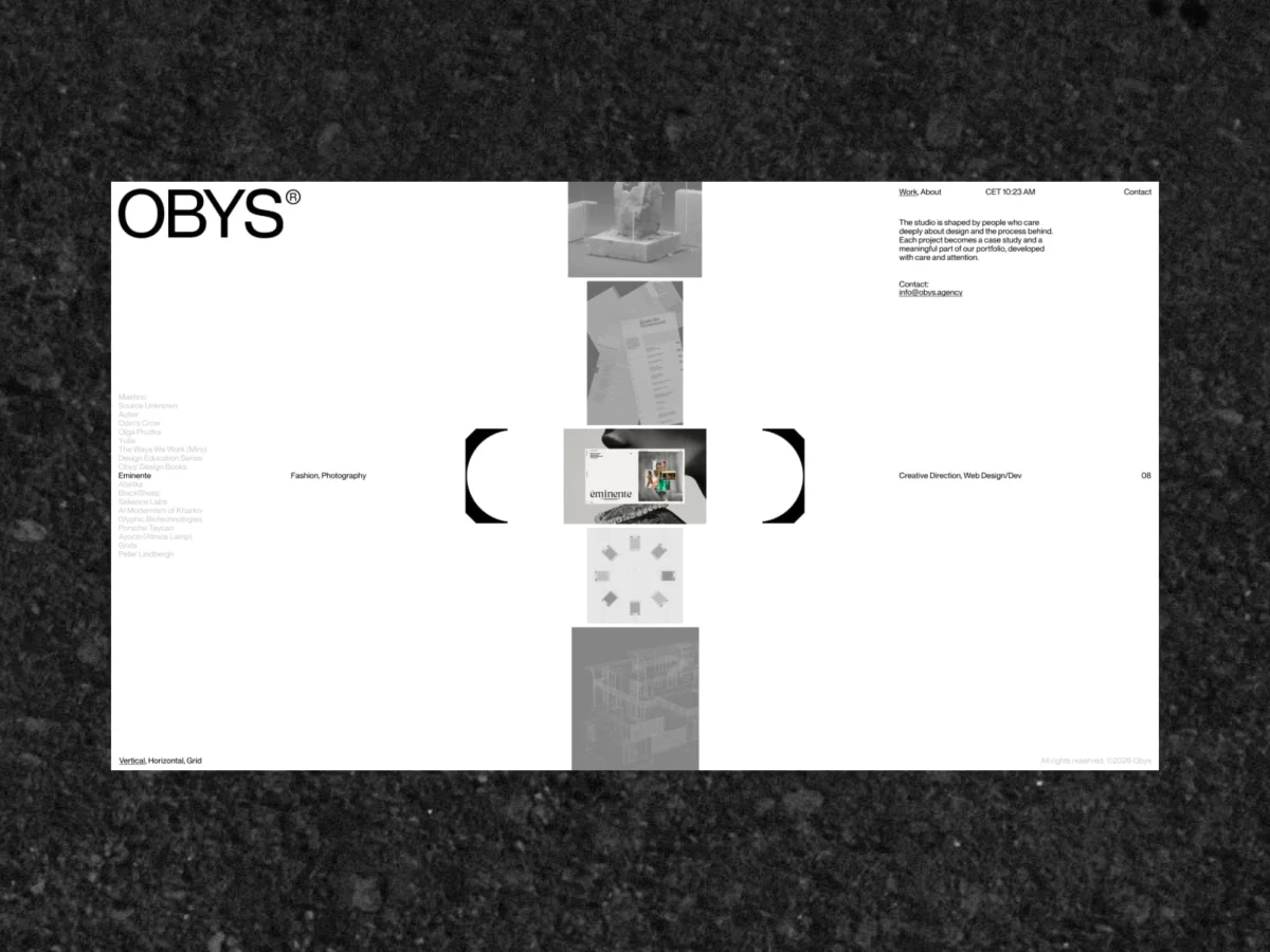
After seven years of relentless creative output—spanning hundreds of projects, diverse global markets, and an ever-evolving design philosophy—the studio known as Obys reached a critical inflection point. The digital face of the studio, once a cutting-edge representation of their capabilities, had become a relic of their past. As the team’s standards sharpened and their design language matured, a disconnect emerged: their website no longer spoke the same language as their current work.
The result is a total reimagining of the Obys digital presence. This is not merely a "refresh" or a visual skin-deep makeover; it is a fundamental architectural and philosophical pivot designed to present a clearer, more consistent, and highly intentional version of the studio.
Main Facts: A Philosophy of Subtraction
The core premise of the new Obys website is rooted in the "less is more" ethos. In an era where digital agencies often feel compelled to display every accolade, case study, and experimental scrap, Obys took a courageous path of radical curation. By stripping away the archive of awards and peripheral documentation, the studio has created a focused, high-impact environment that centers entirely on the work itself.
- Custom Typography: The foundation of the identity, the OTF Obys NG neo-grotesque, serves as the heartbeat of the brand.
- Architectural Philosophy: The website is treated as a "space" rather than a gallery, where the logo acts as an active participant in navigation.
- Technical Sovereignty: Built from the ground up without reliance on bloated frameworks, utilizing a custom codebase powered by Bun and TypeScript.
- Strategic Minimalism: A conscious decision to exclude legacy data in favor of a contemporary, refined portfolio.
The Chronology: From Typography to Architecture
The journey toward the new Obys began long before a single line of code was written or a wireframe was drafted.
Phase 1: The Typographic Foundation
Designers often treat typography as a secondary layer of branding, but for Obys, it was the genesis. The team realized that to reflect their current design maturity, they needed a voice of their own. The development of OTF Obys NG was an exercise in precision. As a neo-grotesque, the font was designed to balance utility with personality—a difficult duality to master. It was this font that defined the rhythm, hierarchy, and spatial relationship of the entire new brand identity.
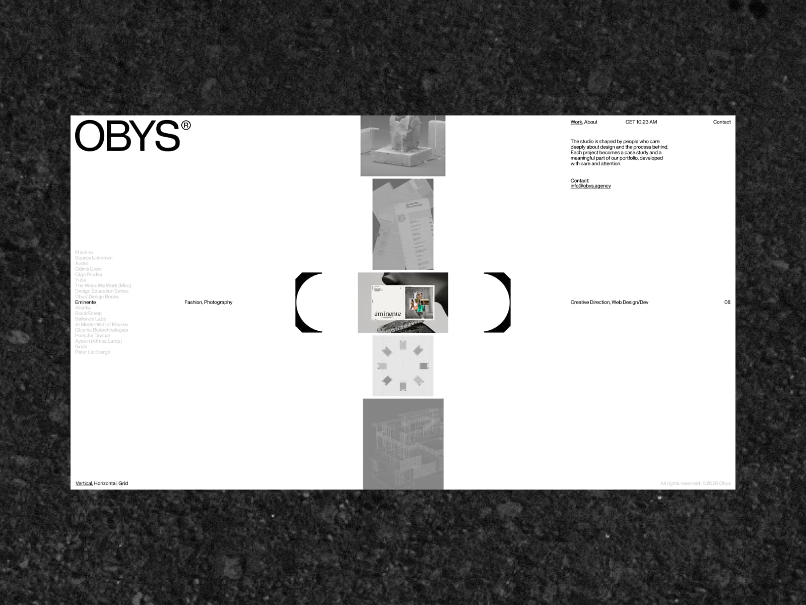
Phase 2: Refinement of Identity
With the typeface secured, the team revisited their logo. Eschewing a total redesign, they chose to refine the existing mark. The goal was to preserve the studio’s brand equity—the familiarity built over seven years—while aligning the logo’s weight and geometry with the newfound clarity of their typography. The logo evolved from a static icon into a dynamic, shifting element that navigates the user through the site.
Phase 3: The Build and Deployment
The final phase saw the integration of the visual identity into a robust digital environment. By mid-2026, the studio transitioned from a sprawling, archive-heavy site to the current, minimalist structure, ensuring that every transition and animation served a functional purpose rather than a decorative one.
Supporting Data: Engineering the Experience
A critical component of this redesign is the underlying technology. Obys opted to move away from industry-standard "everything-heavy" frameworks, choosing instead a lean, high-performance stack that prioritizes control.
- The Engine: By utilizing Bun as both the HTTP server and bundler, the studio achieved significant performance gains.
- Rendering: The team made a bold choice to utilize React purely as a server-side templating engine. By eliminating client-side rendering, they reduced overhead, ensuring lightning-fast load times and a seamless user experience.
- Animation Logic: Moving away from heavy animation libraries, Obys built an in-house system utilizing
RequestAnimationFrameand the Web Animation API. This gives the studio granular control over the "motion language" of the site—ensuring that every pixel move is deliberate. - Data Management: Strapi serves as the headless CMS, keeping the content management layer distinct from the presentation layer, maintaining the lightweight nature of the CSS-driven front end.
Official Responses: The Philosophy of Silence
When asked about the challenge of removing years of archived work, the team behind Obys emphasized the difficulty of "choosing what matters."
"Sometimes clarity comes not from adding more, but from having the confidence to leave things out," noted a studio representative. This perspective acts as a cornerstone for the new site. By intentionally leaving out the noise of awards and secondary project layers, they have forced the visitor to engage with the work that defines the present-day studio.
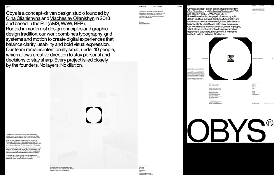
The motion language of the site—the shift from dark to light modes and the fluid transitions—is explicitly designed to avoid "decorative" motion. "It’s not just about looking good," the studio explains. "Motion helps explain the idea and keeps the experience consistent." This approach frames the website not as a marketing brochure, but as an extension of the studio’s actual creative practice.
Implications: The Future of Studio Branding
The Obys redesign sends a ripple through the design industry. It challenges the conventional wisdom that a creative agency’s website must act as a chronological museum of its own history.
The Shift Toward "Brand-as-Space"
By transforming the logo into an active element that adapts to the environment, Obys is pushing the boundaries of interactive branding. The website functions as an immersive, singular space. This shift from "viewing a page" to "navigating a space" is likely to influence how other boutique design firms structure their online presence.
The Return to Technical Sovereignty
The decision to build with a custom stack rather than relying on popular but heavy front-end frameworks is a significant statement. It suggests a movement back toward "digital craftsmanship," where developers and designers prioritize the integrity of the code and the efficiency of the delivery. For Obys, the technology is not just a delivery vehicle; it is part of the brand’s promise of quality and precision.
The Maturity of the Studio
For Obys, being named Awwwards Studio of the Year 2023 was a catalyst for introspection rather than an excuse to rest on their laurels. The new website is a declaration of maturity. It indicates that the studio is no longer seeking to prove its existence through volume, but rather through the quality and consistency of its output.
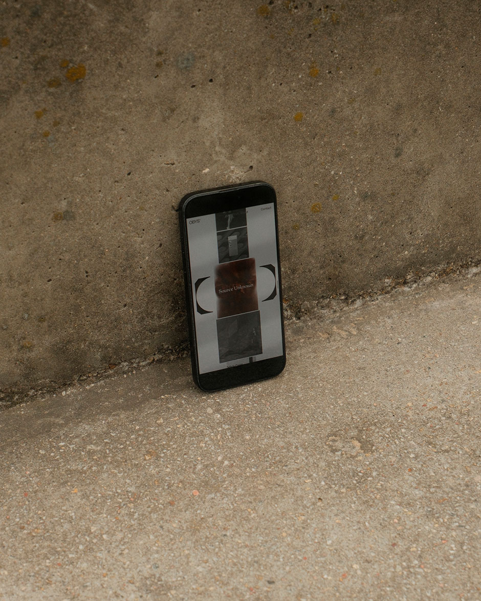
By stripping the site down to its essentials, Obys has done more than update their portfolio; they have articulated a new standard for what a design studio can be in a cluttered digital landscape. They have proven that in a world of infinite digital noise, the loudest statement is often the one made through intentional silence and surgical precision.
As the studio continues to evolve, this new platform stands ready—not as a finished product, but as a flexible, evolving vessel for future creative experiments. It is a testament to the fact that while projects come and go, a studio’s identity is defined by the principles it refuses to compromise.


 Evan Lee Salim
 Rifan Muazin

 Lina Irawan

 Pevita Pearce
 Suro Senen

 Muslim

 Ammar Sabilarrohman

 Raul Delapena Setiawan
