
 Jia Lissa
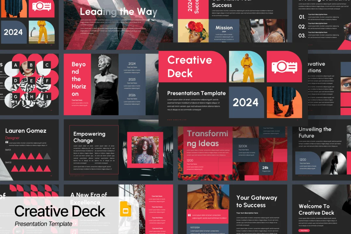
In the modern professional landscape, a presentation is far more than a mere vehicle for data or bullet points; it is a critical instrument of persuasion. Whether you are walking a venture capitalist through a high-stakes pitch deck, presenting a quarterly business review to stakeholders, or delivering an educational seminar, the visual medium you choose acts as the silent ambassador for your ideas. Generic, "out-of-the-box" slide designs often fade into the background, failing to capture the audience’s attention or, worse, undermining the credibility of the presenter.
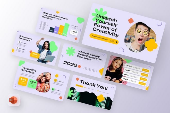
To leave a lasting impression, one must look beyond the default themes. This guide explores the intersection of aesthetic innovation and professional utility, highlighting a curated collection of unique PowerPoint templates designed to ensure your message is not just heard, but remembered.
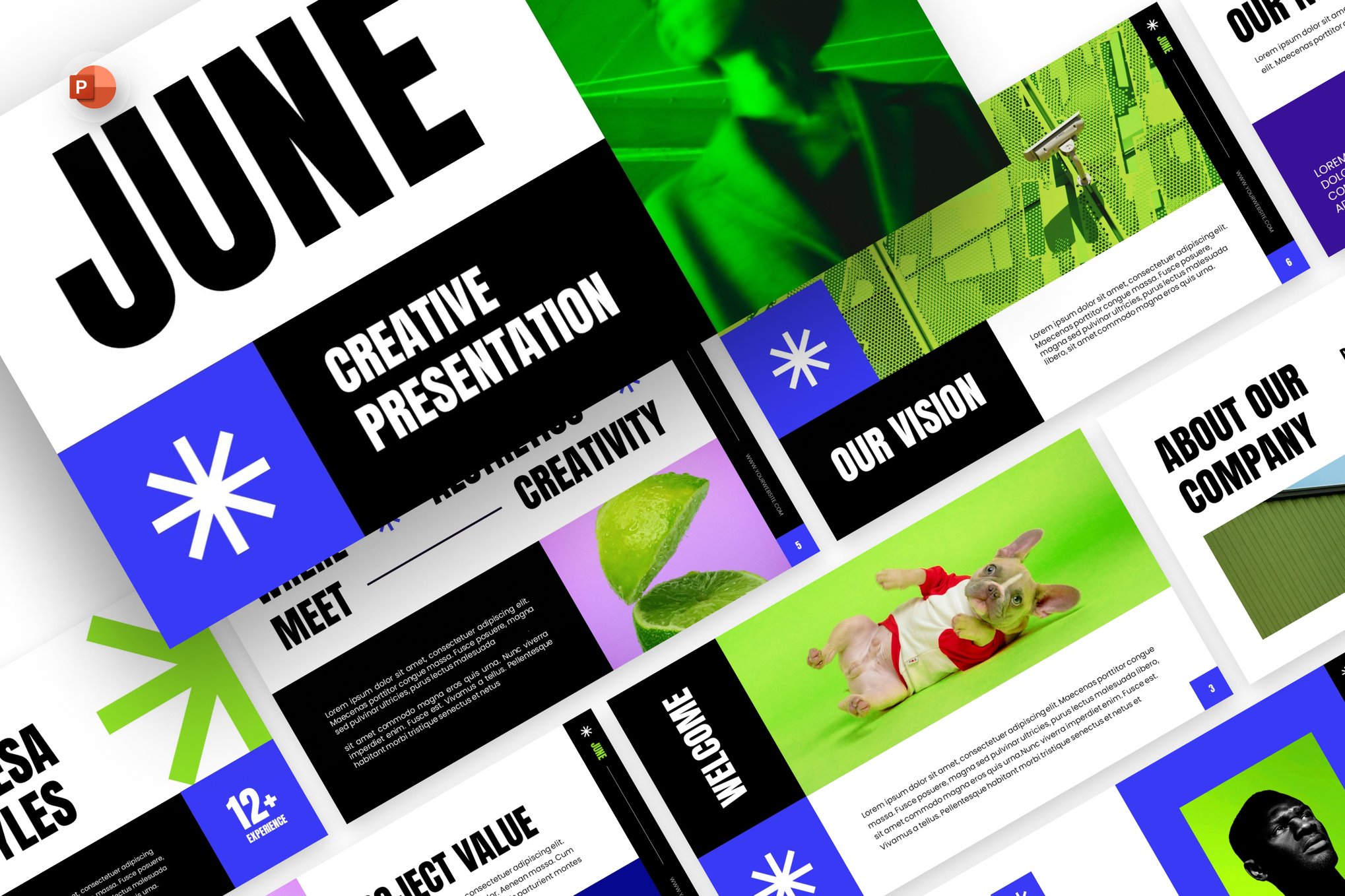
The Evolution of Visual Communication
The shift toward design-heavy presentations has been driven by the "attention economy." In an era of endless digital noise, the human brain is conditioned to filter out mundane visual stimuli. Consequently, the standard, text-heavy slides of the early 2000s have become obsolete.
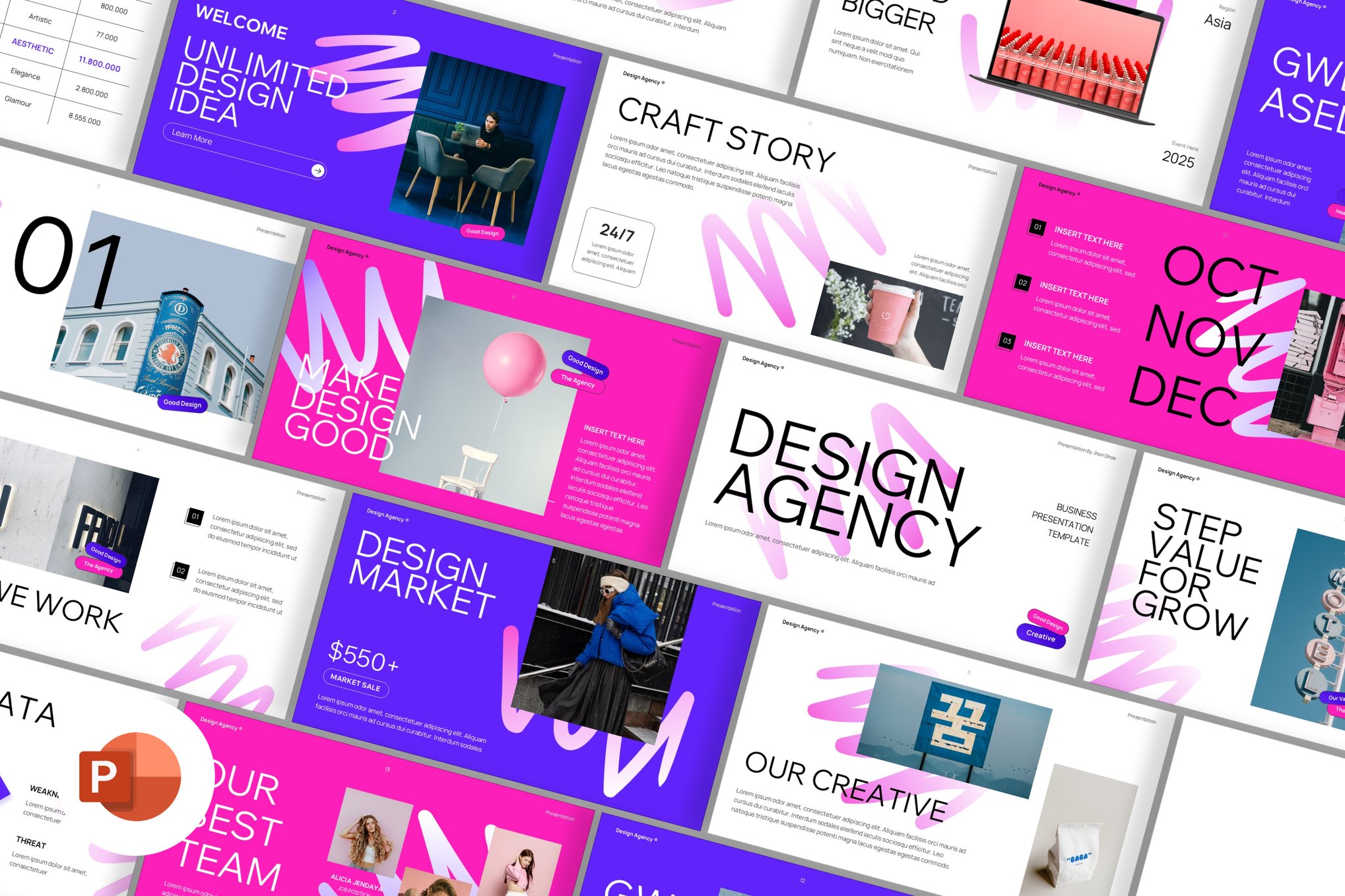
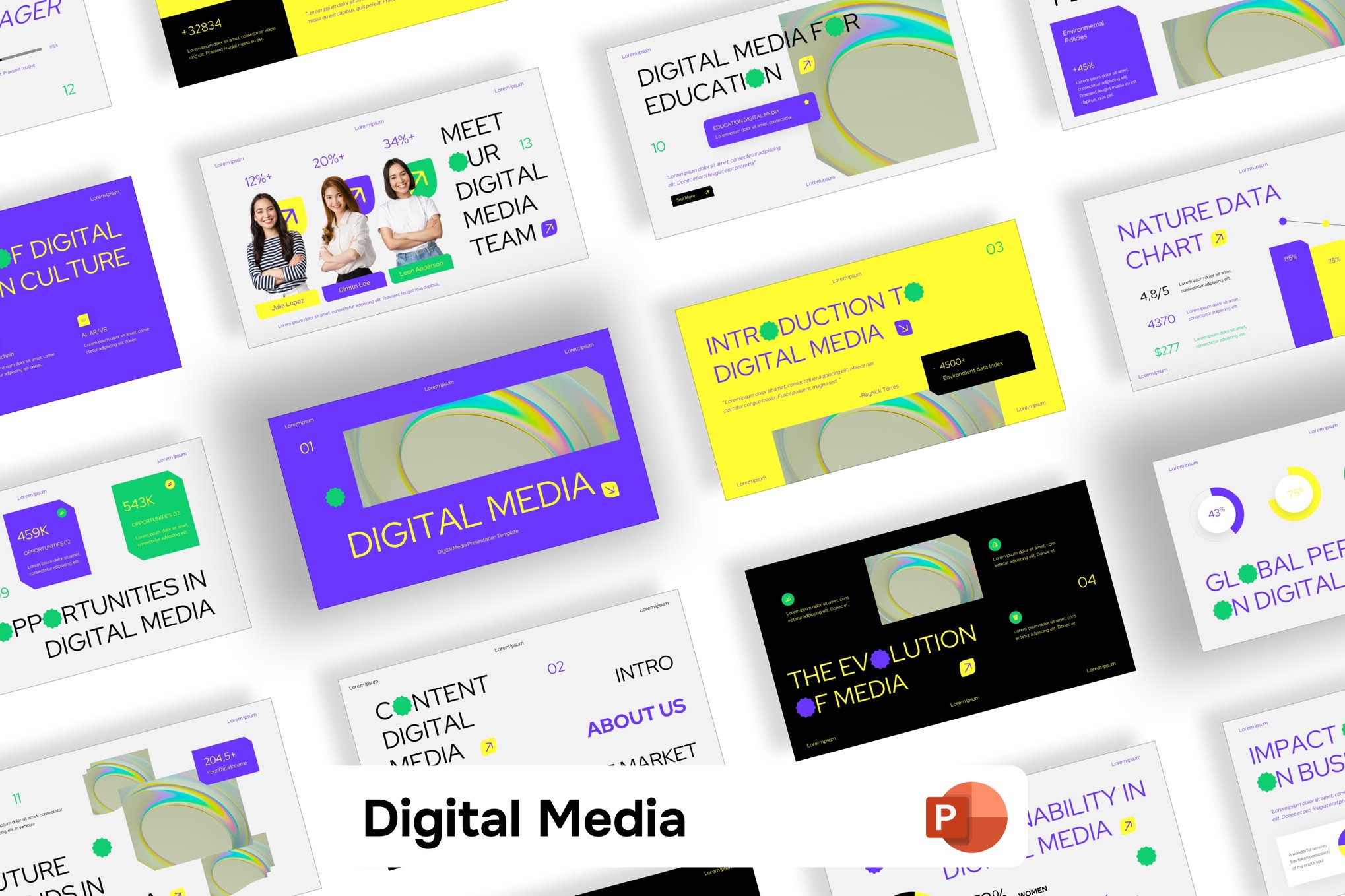
Modern design philosophy now dictates that a slide should act as a visual anchor—a complementary element that reinforces the spoken word rather than distracting from it. The templates discussed here leverage bold typography, sophisticated color grading, and unconventional layouts to facilitate better storytelling. They move away from the rigid, sterile grids of the past, opting instead for organic shapes, high-resolution imagery, and intuitive data visualization.
Chronology of Presentation Trends
To understand why these specific templates are currently in vogue, one must look at the recent trajectory of digital design:
- The Minimalist Era (2015–2018): Dominated by whitespace and flat icons, this era focused on stripping away "clutter." While clean, it often resulted in bland, forgettable presentations.
- The Data-Visualization Shift (2019–2021): As businesses became more data-driven, templates began to emphasize complex infographics and nested charts, often at the expense of visual elegance.
- The Creative-Fluidity Movement (2022–Present): We are currently in a period that favors "Neobrutalism," vibrant gradients, and fluid motion. The focus has returned to personality, brand storytelling, and emotional resonance. The templates below represent the pinnacle of this current design cycle.
Supporting Data: Why Design Matters
Research consistently demonstrates that high-quality design correlates with improved audience retention. According to studies on cognitive load, audiences process visual information 60,000 times faster than text. Furthermore, a study by Social Science Research Network found that presentations with high-quality visual aids are 43% more persuasive than those without. When you invest in a professionally crafted template, you aren’t just buying a aesthetic; you are investing in the efficacy of your communication.
A Curated Selection of Premium Templates
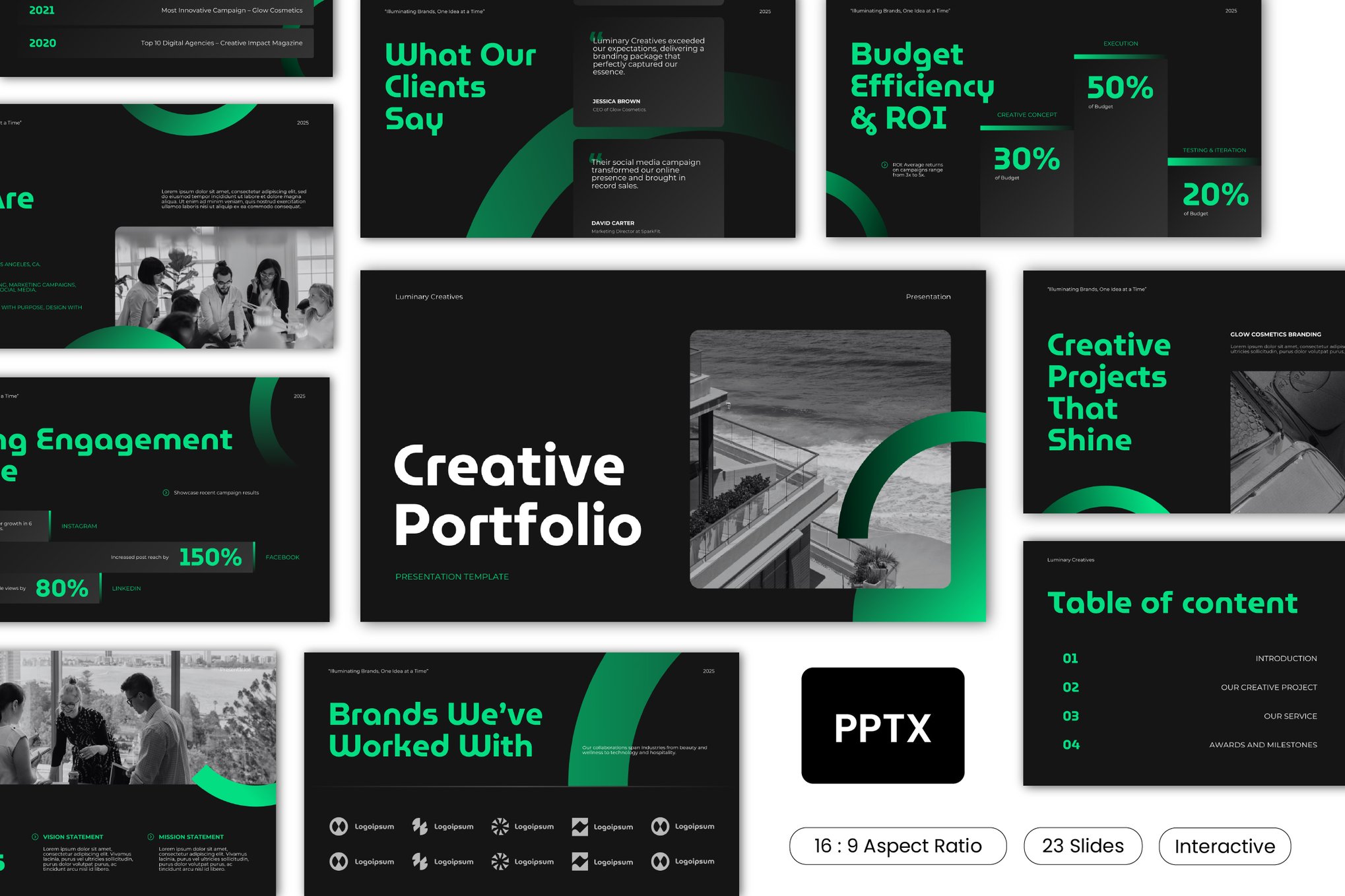
The following templates represent a diverse range of styles, from the minimalist to the avant-garde.
1. Agency-Focused Aesthetics
- Unique PowerPoint Template for Agencies: A perfect equilibrium between corporate formality and creative flair. Featuring 25 unique widescreen slides, this template is built for those who need to communicate structural complexity without losing their creative edge.
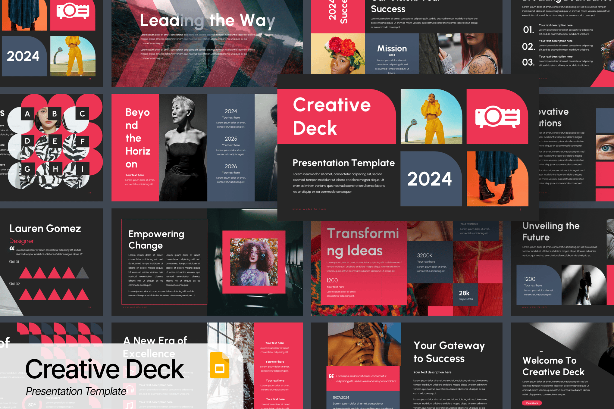
- Creative Design Agency PowerPoint Template: For the branding studio, this template offers a dynamic interface. It is highly customizable, allowing agencies to swap out brand colors and fonts seamlessly to match their client’s identity.
2. High-Impact Visuals
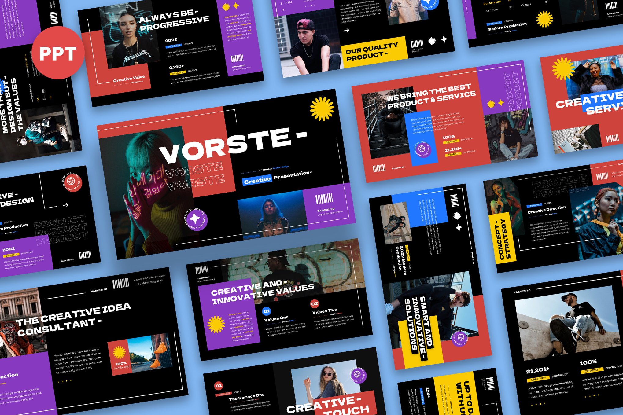
- Vorste – Unique PowerPoint Template: Available in striking Neon, Tosca, and Red, this template is designed to cut through the monotony of a boardroom. Its 30 slides are fully editable, making it a favorite for those who want a "high-fashion" look for their business portfolio.
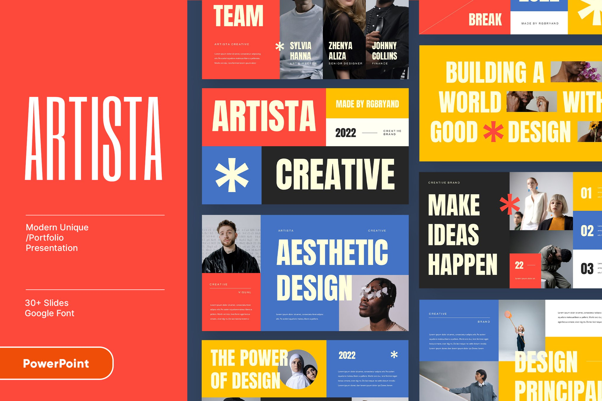
- ARTISTA – Unique Colorful Template: Vibrancy is the key here. ARTISTA is designed for those who want to use color as a tool to segment information and maintain audience engagement throughout a long report.
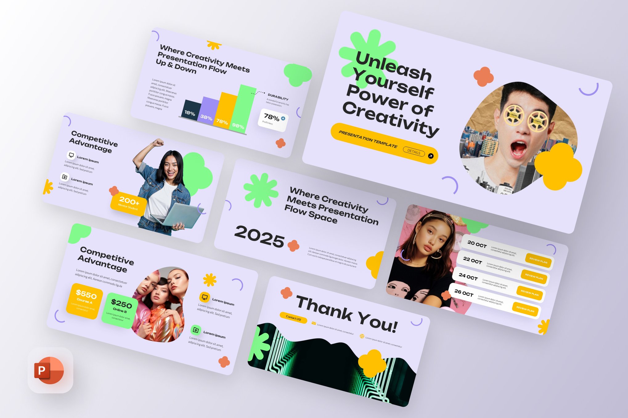
- Creative Morph: This template utilizes geometric blobs and fluid lines to create a "modern, tech-forward" look. It is the gold standard for influencer marketing decks or product launches where energy is paramount.
3. Professional and Corporate Utility
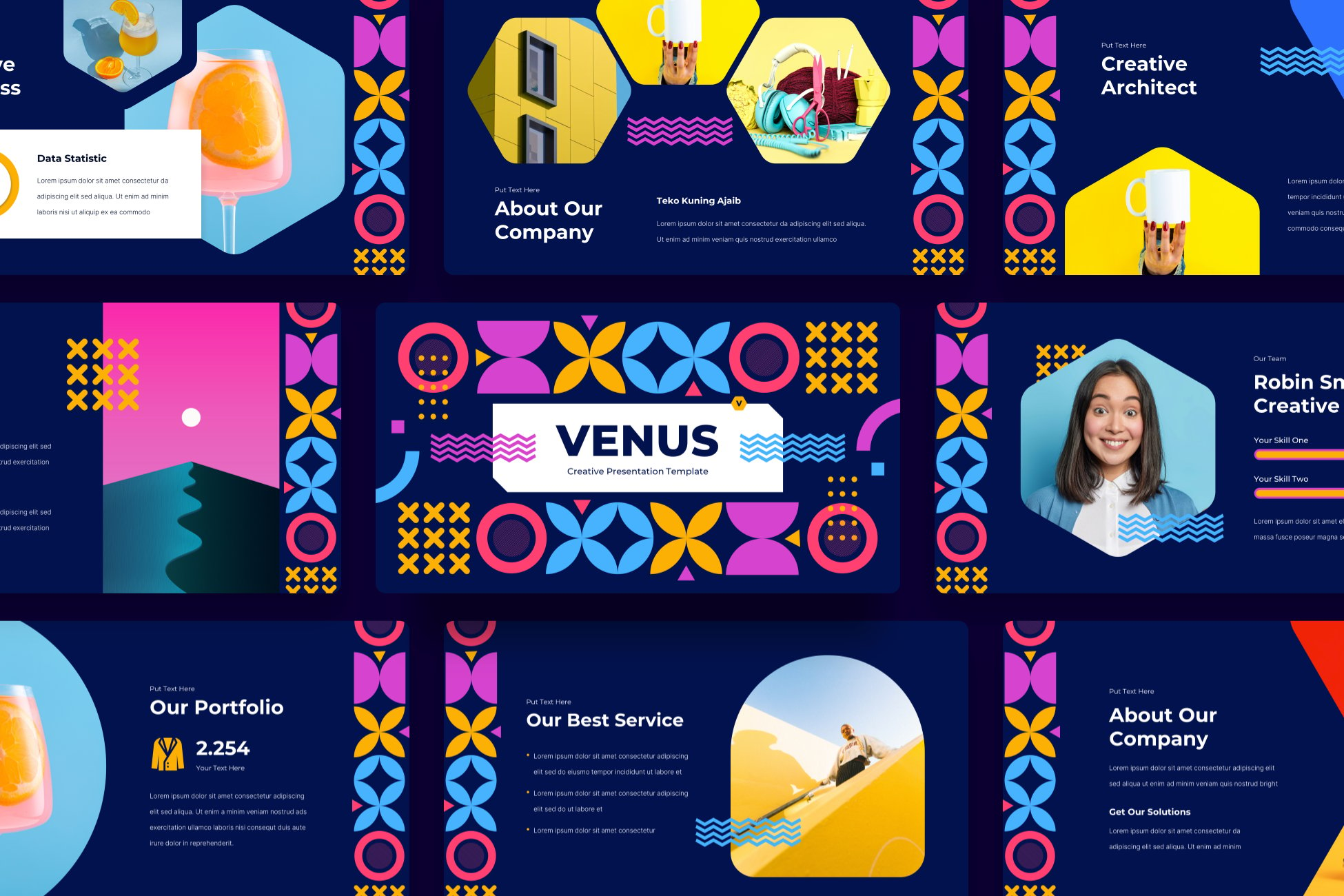
- Venus – Trendy Unique PowerPoint Template: Venus bridges the gap between high-end design and ease of use. Its drag-and-drop functionality ensures that you don’t need to be a graphic designer to achieve a polished, high-end look.
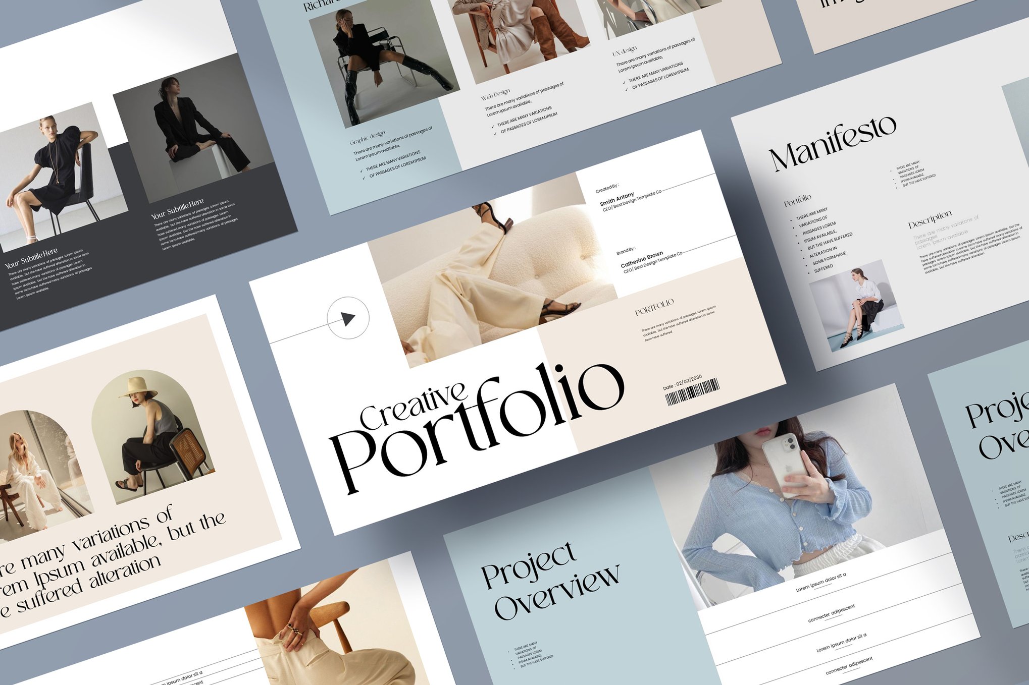
- Bold & Unique Portfolio: When the goal is to showcase work, the frame must be as strong as the picture. This template includes 3D infographics and icons that make technical project overviews feel tactile and impressive.
- Unique Pitch Deck: Specifically engineered for the startup ecosystem, this template provides a logical flow for presenting innovative ideas, market analysis, and revenue models.
4. Specialized Industry Solutions
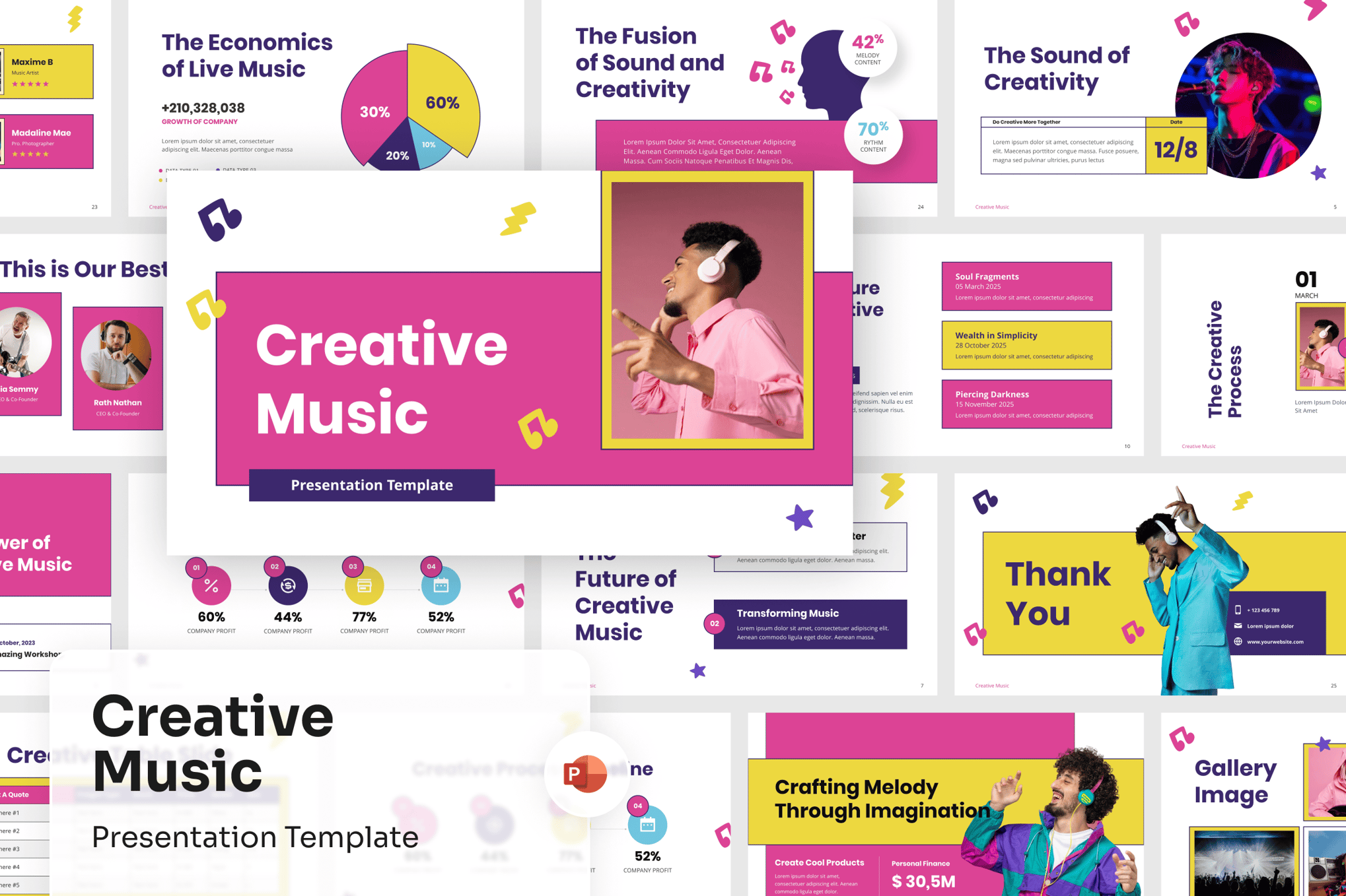
- Music Presentation Template: Designed with an immersive, holistic experience in mind. It is ideal for creative industries where the rhythm and "feel" of the presentation are just as important as the facts.
- Diversity & Inclusion Presentation: This template focuses on accessibility and empathetic design. It uses clear, welcoming imagery and well-structured typography to discuss sensitive and critical corporate topics.
- Roover – Graffiti PowerPoint Template: A bold choice for the creative professional. It uses an edgy, street-art aesthetic to grab attention immediately, proving that "professional" does not have to mean "stuffy."
The Rise of Free, High-Quality Design
It is a common misconception that one must pay a premium to access professional-grade design. The "Free Template" market has exploded in quality. Platforms like Slidesgo now offer templates that rival their paid counterparts in terms of technical sophistication.
- Aqua Marketing: A masterclass in watercolor-inspired, organic design.
- UI Design Template: Specifically built for those in the tech sector who need to showcase software workflows or wireframes.
- Coding Workshop: A tech-heavy, data-rich template perfect for developers, hackathons, or educational tutorials.
- Economic Meeting: This template proves that even dry, numbers-heavy presentations can benefit from creative, illustrative storytelling.
Implications for Future Presentations
As we look to the future, the implications of these design trends are clear: the barrier to entry for high-quality, professional presentation design has collapsed. In the past, creating a "unique" presentation required a graphic design team and a significant budget. Today, it requires only a critical eye and the right template.
The implications for the average professional are profound:
- Leveling the Playing Field: Smaller startups can now present with the same visual polish as multinational corporations.
- Increased Expectations: As these designs become the standard, the "default" PowerPoint templates will become increasingly detrimental to a presenter’s reputation.
- The Rise of Storytelling: With the burden of "making it look good" removed by these templates, presenters are free to focus on the most important aspect of their work: the narrative.
Official Responses and Best Practices
Industry experts often stress that while a template provides the structure, the content remains king. The best advice for those utilizing these templates is as follows:
- Limit Text: Use the template’s layout to emphasize visual hierarchy. If you have too much text, you aren’t using a template; you are using a document.
- Consistency is Key: Stick to the color palette provided by the template. These palettes are usually professionally curated to ensure contrast and readability.
- Customize, Don’t Copy: While these templates are ready-to-use, the best presentations are those that feel personal. Use the "master slide" functions to tweak elements to fit your specific brand voice.
Conclusion
The quest for the "perfect" presentation is a journey of balancing style with substance. By selecting a template that aligns with your message—whether it is the rebellious spirit of the Neobrutalism template or the clean, corporate reliability of the Unique Company Profile—you are doing more than just choosing a theme. You are setting the stage for your message to land with maximum impact.
In a world where attention is the most valuable currency, your choice of design is not a minor detail—it is the deciding factor in whether your audience stays engaged or checks their watch. Choose wisely, customize boldly, and let your presentation reflect the quality of your ideas.

 Sagoh
 Asep Darmawan

 Raul Delapena Setiawan

 Reynand Wu



 Azzam Bilal Chamdy

 Ali Ikhwan
