
 Laily UPN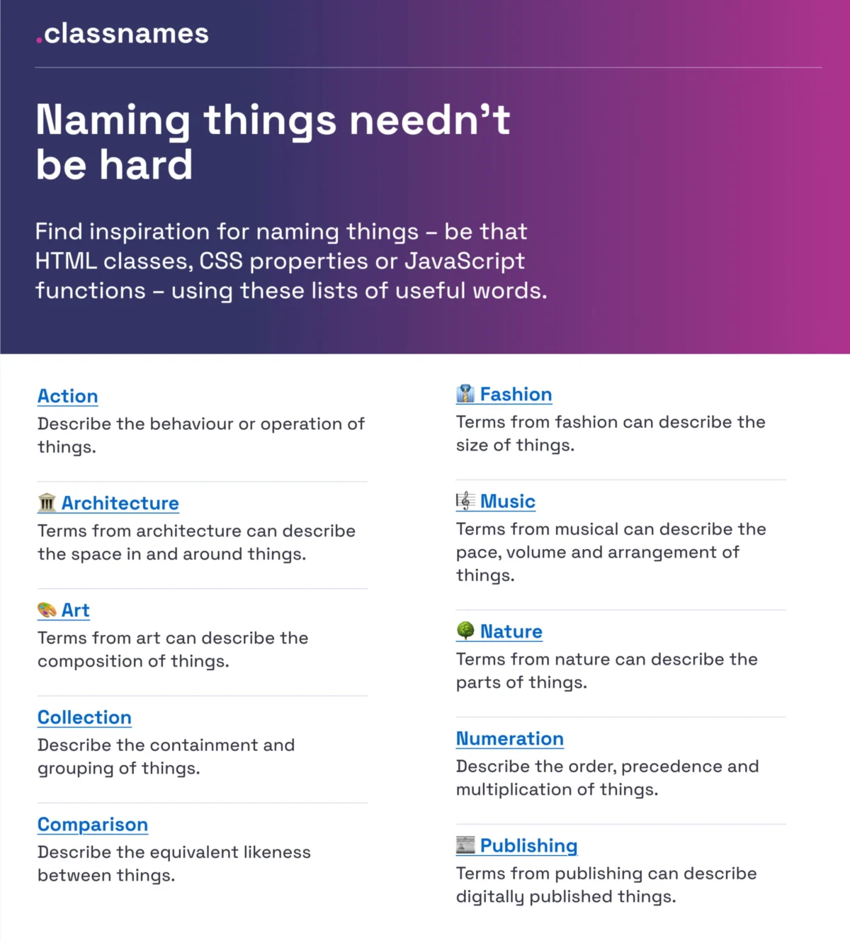
In the world of digital product development, naming is often treated as an afterthought—a quick, casual decision made during a sprint. Yet, the language we choose to label our UI components, design tokens, and CSS variables acts as the foundational architecture of our communication. When naming fails, the cost is not merely aesthetic; it manifests as technical debt, fragmented team communication, and poor user adoption.
The Cognitive Cost of Ambiguity
The language we use does more than identify; it shapes how we think and, crucially, how we collaborate. In cross-functional teams, the "dialect" of a designer often clashes with that of a developer or a product manager. When a button is called "PrimaryAction" in the codebase, "SubmitBtn" in the design file, and "The Blue Thing" in a meeting, the resulting friction is inevitable.

Naming is notoriously difficult because it requires a balance between two extremes. If names are too generic (e.g., box1, wrapper_alt), they lose all semantic meaning, becoming opaque to new team members. If they are too specific (e.g., blue-submit-button-large), they become rigid, preventing the component from being reused in other contexts. Achieving the "Goldilocks zone"—a name that is both descriptive and flexible—is the hallmark of a mature design system.
A Chronology of Naming Evolution
The evolution of design systems has forced the industry to move away from ad-hoc naming toward rigorous, taxonomic structures.

- The Early Days: Naming was largely driven by visual properties (e.g.,
red-text,big-margin). This created immense fragility; if the brand color changed, every instance ofred-textin the CSS became a lie. - The Semantic Shift: Designers began moving toward functional naming (e.g.,
error-text,spacing-large). This improved maintainability but often lacked a global taxonomy. - The Tokenization Era: With the rise of design tokens (the values that define the design system), the industry shifted toward multi-layered taxonomies. Names now often reflect a hierarchy:
[Category] - [Component] - [Property] - [State]. This shift allows for multi-brand, multi-theme systems, as seen in the sophisticated architectures managed by global firms like Intuit and Vodafone.
The Toolkit: Resources for Better Naming
To move beyond the "blank page" syndrome, several open-source projects have emerged to provide structure and inspiration.
1. Linguistic Inspiration: Classnames
For those struggling to find the right term for a function or a layout block, Classnames is an invaluable resource. Rather than just offering synonyms, it provides thematically grouped lists. Need a name for a complex, layered interface? You can pull from architecture, music, or theater terminology. This helps teams break away from the "container/wrapper/box" cycle and find names that carry actual weight.

2. Standardizing the Palette: Color Parrot
Color naming is a perennial pain point. How do you distinguish between 50 shades of grey? Color Parrot offers a massive, community-sourced repository of over 30,000 unique color names. By using standardized, recognizable names for your hex values, you reduce the "which blue?" confusion that plagues design handoffs.
3. Structural Clarity: Good Practices in Design
Javier Cuello’s naming guidelines offer a masterclass in professional nomenclature. His core argument is simple: a good name is logical, short, meaningful, and—crucially—not related to visual properties. By stripping away physical descriptions (like "blue" or "bold"), you ensure that your design tokens remain robust even if the UI undergoes a complete visual refresh.

Scaling Systems: Lessons from Industry Leaders
The challenge of scaling naming reaches its peak in enterprise-level design systems. The case study of Intuit’s flexible design token taxonomy provides a blueprint for managing multiple brands (Mailchimp, QuickBooks, TurboTax) under a single umbrella. Their system proves that a successful taxonomy must separate "primitive" tokens (the raw values) from "semantic" tokens (the intent).
Similarly, the Vodafone UK Variables Taxonomy Map serves as a gold standard for managing complex, multi-themed systems. By mapping tokens from the brand level down to the page level, they ensure that developers and designers are always speaking the same language, regardless of which product they are building for.

Implications for User Adoption
Naming is not just an internal concern; it has profound implications for the end user. As noted by UX expert Erin Gannon in her guide, "What Do We Call This Thing?", poor feature adoption is often a failure of language.
If a feature is named "Synchronized Data Integration," the average user will likely ignore it. If the same feature is named "Auto-Save," the value proposition is immediate. To improve adoption:
- Use the User’s Language: Observe how users describe their own pain points during discovery sessions.
- Focus on Outcomes: Name features based on the job-to-be-done, not the underlying technology.
- Test for Discovery: A feature is only as good as its findability. If users cannot parse the name of a button or a menu item, they will simply click elsewhere.
Strategies for Implementation
For teams looking to overhaul their current naming conventions, the transition must be handled with care.
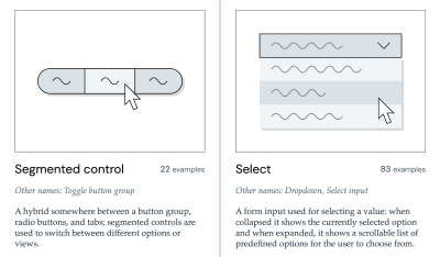
- Audit and Inventory: Start by creating an inventory of all existing tokens, classes, and component names. The Component Gallery is a vital resource here, allowing you to see how other established design systems name common UI elements.
- Adopt a Standard: Utilize tools like the Design Token Naming Guide to build a consistent structure. Whether you adopt the BEM (Block, Element, Modifier) methodology or a more token-centric approach, the most important rule is consistency.
- The "Naming Backlog": When conflicts arise, do not force an immediate fix. Log the naming confusion in a backlog and address it during a scheduled cleanup sprint. Rapid, reactive changes often introduce more errors than they solve.
Official Perspectives and Best Practices
Industry leaders emphasize that the "right" name is the one that is understood by the entire organization. When we speak different "dialects"—designers using one set of terms, developers using another, and product owners using a third—we invite error.

The consensus among design system architects is clear: Prioritize intent over description. Instead of naming a variable gray-500, name it border-subtle. This subtle change in philosophy ensures that if your brand’s "gray" changes to "blue," your code doesn’t need a massive, error-prone refactor.
Conclusion: The Path Forward
Naming is the invisible thread that holds a digital product together. While it may seem trivial compared to the complexities of animation, state management, or responsive layout, it is the most critical element of long-term maintainability. By adopting standardized taxonomies, leveraging community-driven resources, and centering our language on the user’s experience, we can eliminate the "dialect" friction that causes so much unnecessary frustration.

As we continue to build more complex and accessible web environments, the responsibility to name things with clarity is a professional imperative. Whether you are naming a simple icon or a complex, multi-brand design token system, remember: the words you choose today will dictate the efficiency of your team for years to come. Choose them wisely.


 Reynand Wu
 Iffa Jayyana


 Rifan Muazin
 Suro Senen
 Lina Hope
 Lina Irawan