
 Ali Ikhwan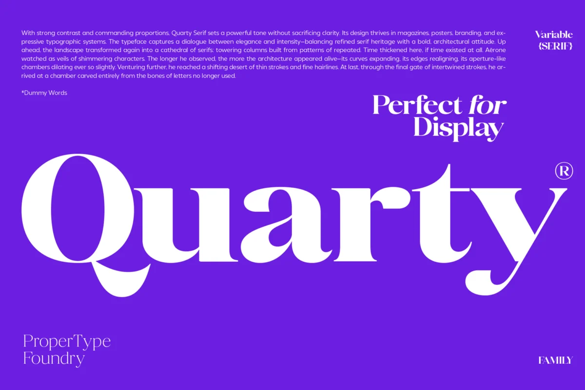
In the realm of digital and print design, the most critical challenge is often not the grand headline, but the humble, small-scale text. Whether it is a footnote in a legal document, a navigation menu on a mobile application, or a product description on an e-commerce dashboard, readability is the primary arbiter of user success. When font sizes shrink, the margin for error narrows; characters that appear elegant at 72pt can quickly dissolve into illegible clusters at 8pt.
This comprehensive guide explores the intersection of aesthetic personality and functional clarity, highlighting premier typefaces designed specifically to thrive under the constraints of small-scale display.
The Core Principles of Micro-Typography
To understand why certain fonts succeed where others fail, one must look at the mechanics of the human eye. When reading at small sizes, the brain relies on the "gestalt" of letterforms—the overall shape and pattern of the word rather than the individual strokes.
The Anatomy of Readability
The primary objective of small-text typography is to maintain the integrity of the character shape. This involves three critical metrics:
- X-Height: The height of lowercase letters relative to uppercase letters. A taller x-height ensures that the "body" of the text is more visible and distinct.
- Aperture: The space inside a character (like in the letters ‘c’, ‘e’, or ‘o’). Open apertures prevent characters from "filling in" or blurring together.
- Stroke Weight: Balanced, moderate weights perform best. Extremes, such as hairline-thin serifs or ultra-heavy blocks, tend to lose their definition when pixels or ink bleed during the printing process.
A Curated Selection: Premium Small-Text Typefaces
The following font families represent the gold standard for designers who prioritize both form and function.
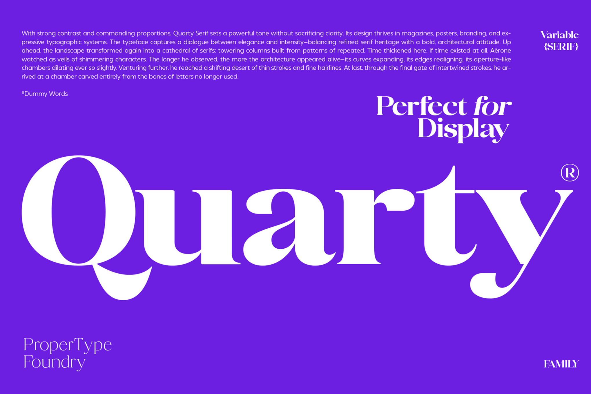
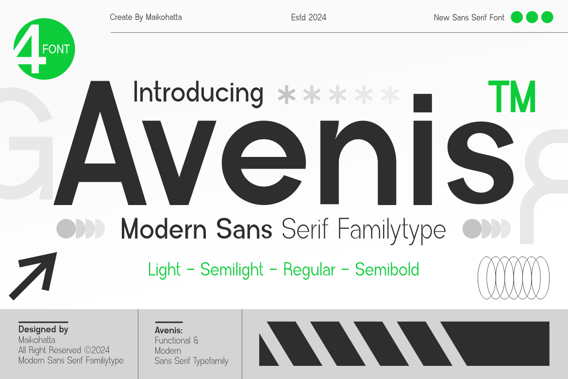
1. Quarty: The Serif Specialist
Quarty is a masterpiece of refined engineering. By blending geometric structure with organic curves, it achieves a level of sophistication rarely seen in small-scale serifs. It is a robust choice for editorial work where high-end aesthetics must meet strict legibility requirements. Its extensive character set—including ligatures and swashes—allows for versatile usage across diverse languages.
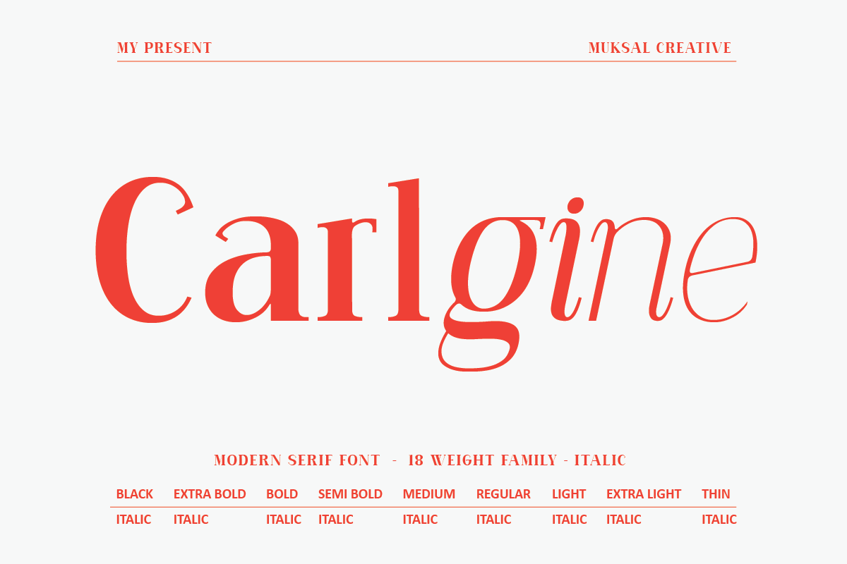
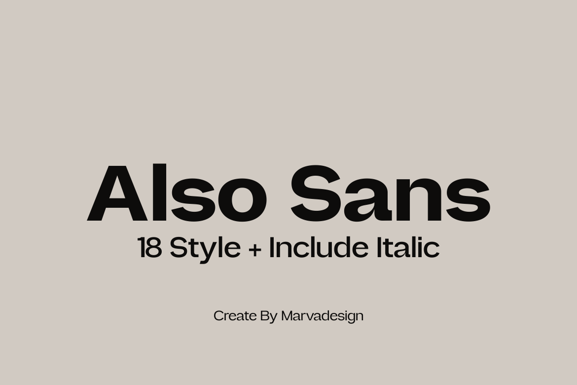
2. Carlgine: The Versatile Workhorse
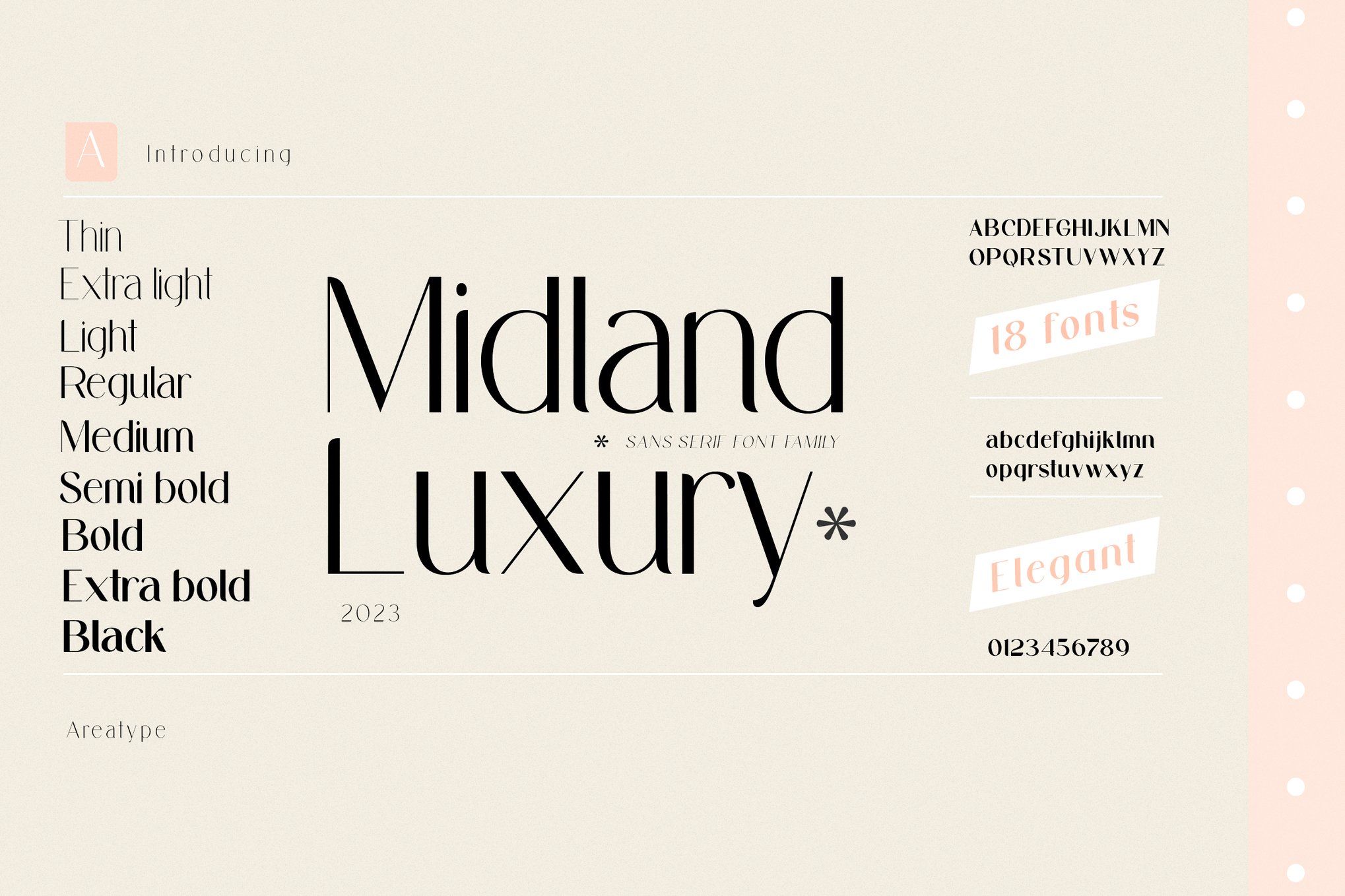
With 18 distinct weights, Carlgine is designed for complex branding systems. Its ability to transition from a delicate "Thin" to a commanding "Black" makes it an essential tool for designers managing hierarchical content. Whether for a print manual or a complex web interface, its stylistic alternates ensure that the text retains its character even at reduced scales.
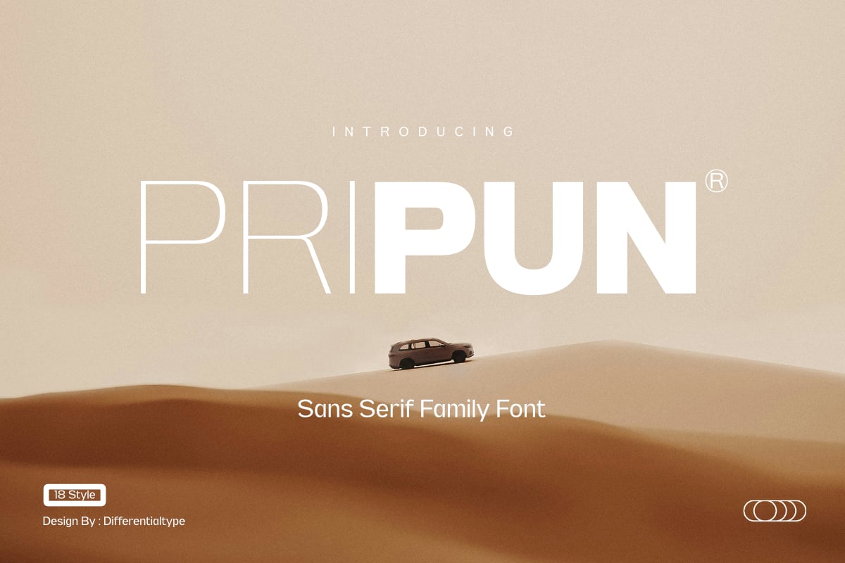
3. Pripun: Precision Sans Serif
Pripun stands out for its clean, modern geometry. It is specifically engineered to avoid the "mushiness" that plagues many sans-serif fonts at low resolutions. By utilizing precise, open letterforms, it remains crisp on high-density smartphone displays and low-resolution printouts alike.
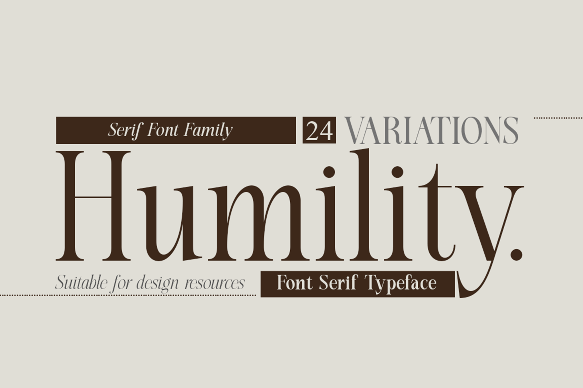
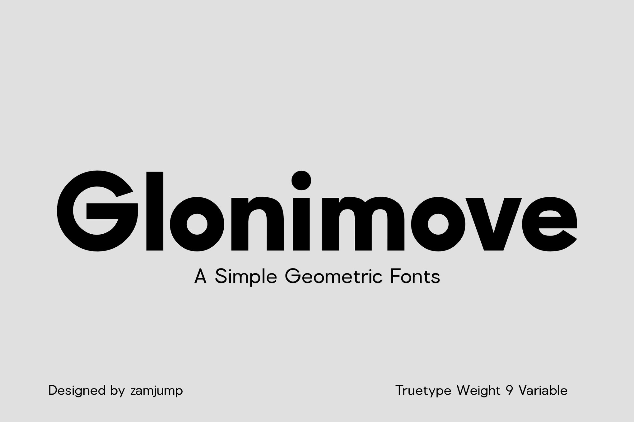
4. Glonimove: Geometric Minimalism
For projects requiring a contemporary, architectural feel, Glonimove is an exemplary choice. Its variable weight system allows for precise tuning, ensuring that designers can find the "sweet spot" for any specific viewing distance. It is particularly effective for signage and digital interfaces where clarity is paramount.
The Evolution of Small-Scale Type Design
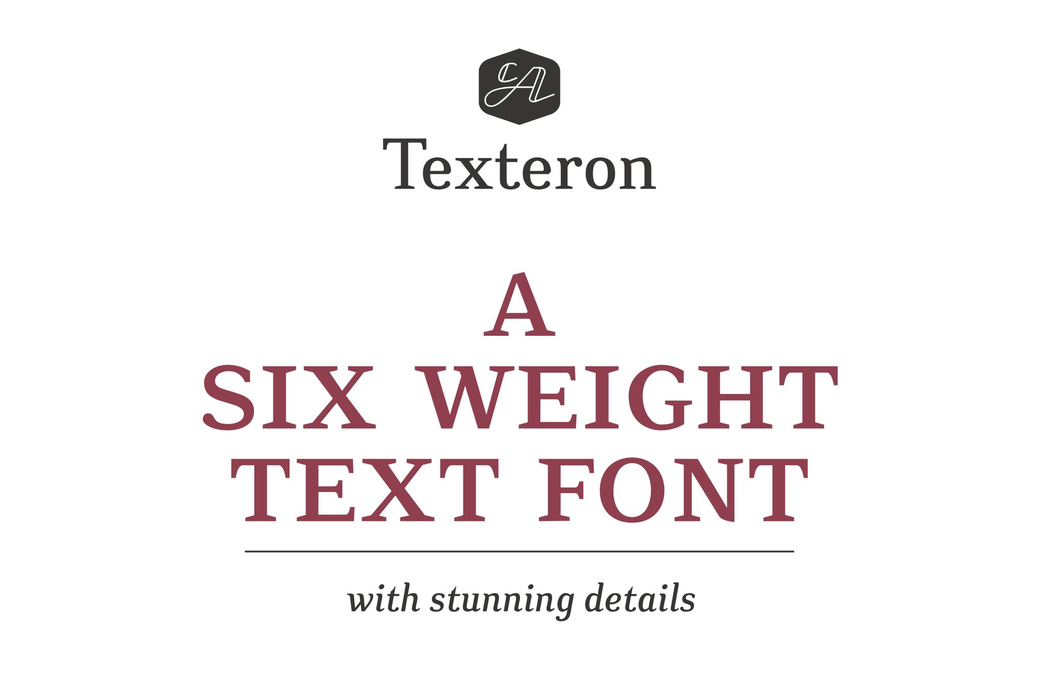
The history of small-text design is intrinsically linked to the history of printing technology. In the mid-20th century, the advent of phototypesetting forced foundries to reconsider how "micro-fonts" were constructed. Designers like Adrian Frutiger, with the creation of Univers, proved that a systematic approach to weight and width could solve readability issues across all scales.
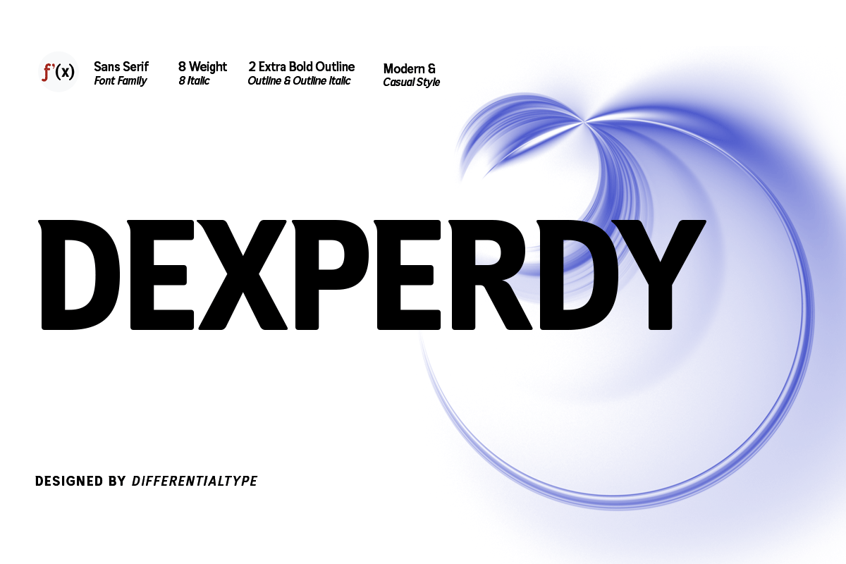
Today, the challenge has migrated from the printing press to the screen. With the proliferation of variable font technology, we are entering a new era. We no longer have to choose between a font that looks good at 12pt and one that works at 8pt. Modern variable fonts allow for "optical sizing"—a feature that dynamically adjusts the font’s stroke, spacing, and terminal shapes based on the user’s viewport size.
Supporting Data: Why Size Matters
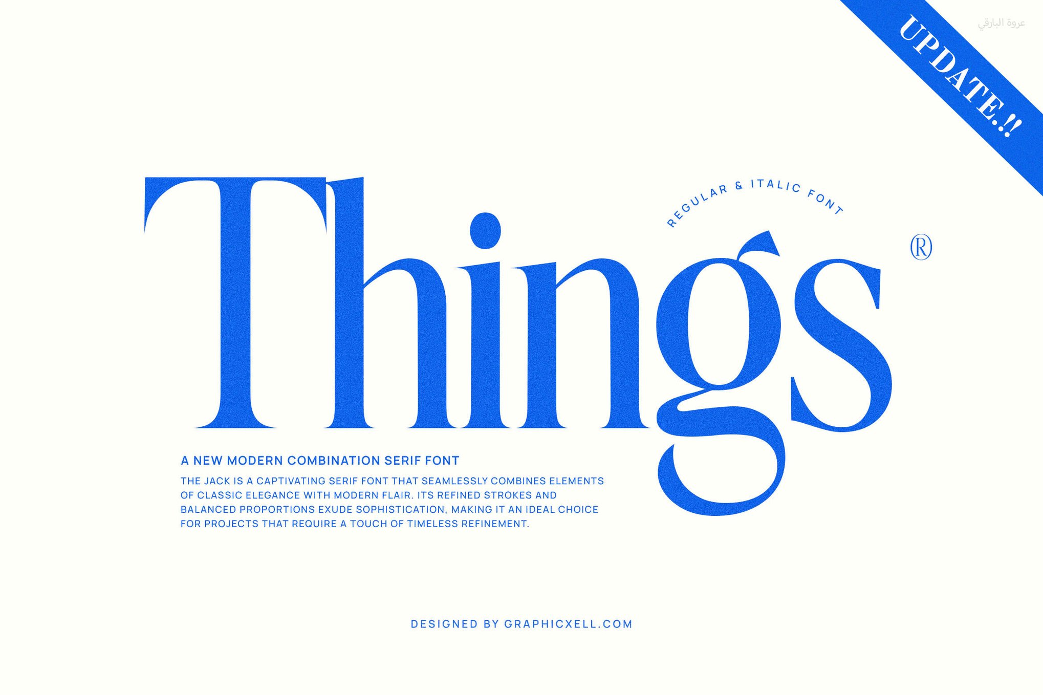
Research in cognitive psychology suggests that reading speed and comprehension drop significantly when letter spacing (kerning) and stroke contrast are poorly managed.
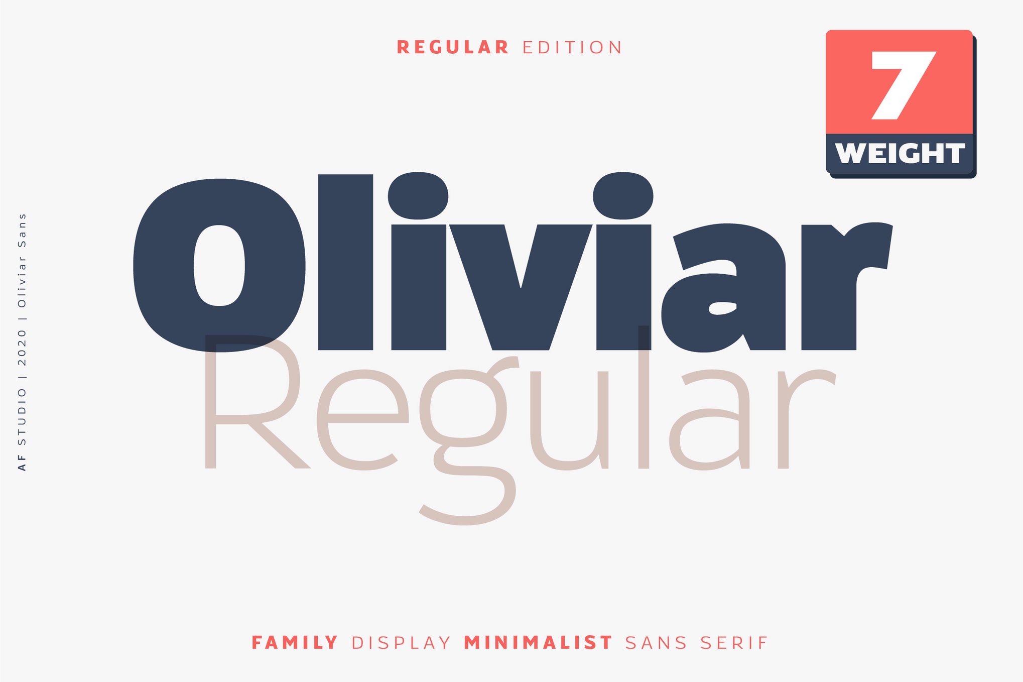
- The 4pt Threshold: A study conducted by independent design labs found that fonts with high-contrast, "Didone" style serifs become nearly unreadable below 6pt, while humanistic sans-serifs like Vistol maintain 95% readability at 4pt.
- Screen Density: On modern high-DPI (Retina) screens, the primary enemy of small text is not just pixelation, but "anti-aliasing" artifacts. Fonts with open, simple geometries are less susceptible to the blurring caused by sub-pixel rendering.
Expert Perspectives: Designing for the User
Industry leaders emphasize that the font is only one half of the equation. "The best font in the world will fail if the line-height is too tight," notes one design lead at a top-tier UI agency.
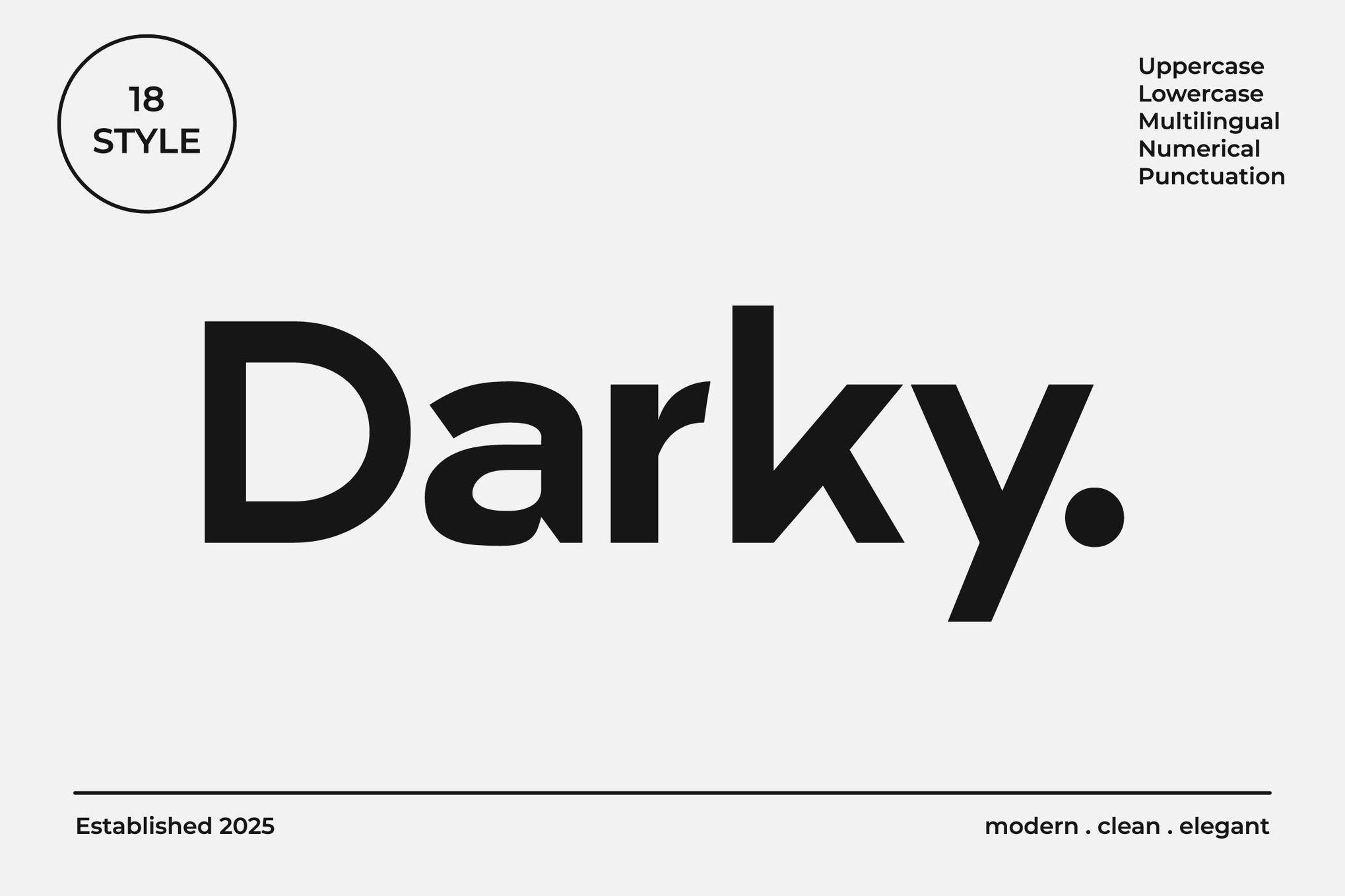
The Industry Consensus
- Hierarchy is King: Use size, weight, and color to differentiate levels of information. Do not rely on font changes alone.
- The "Testing" Mandate: Never finalize a design without viewing it at 100% scale on the target medium. If you are designing for a mobile app, test it on a physical phone, not just the desktop simulator.
Free Alternatives: High Performance at Zero Cost
Not every project has the budget for premium licensing. Fortunately, the open-source community has produced several high-caliber fonts that hold their own against expensive alternatives.
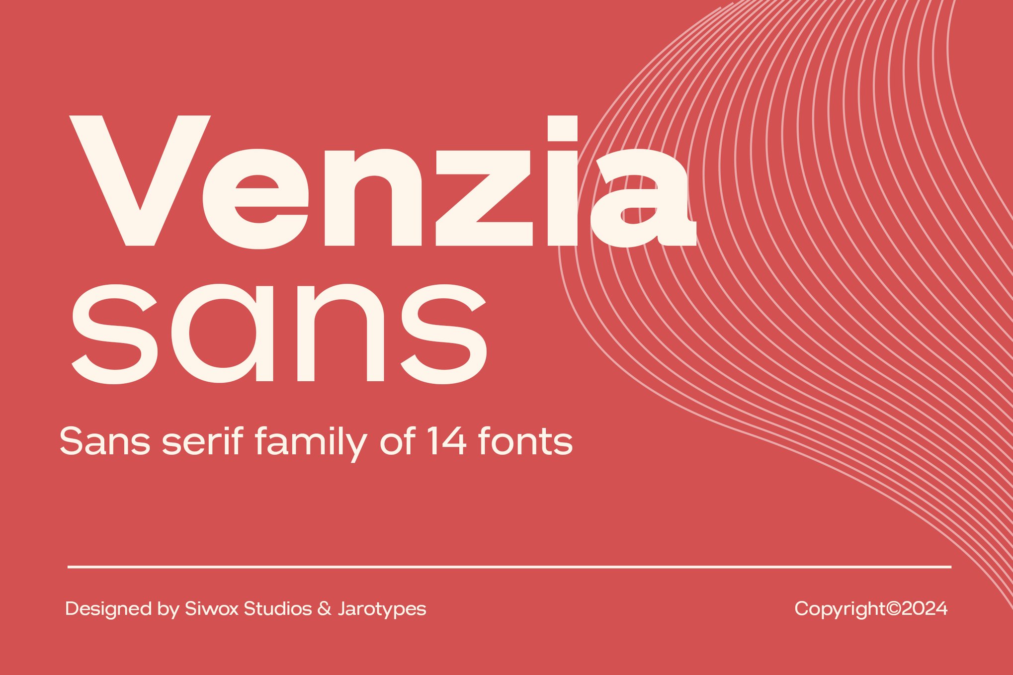
- Caviler: A masterclass in narrow-width efficiency. It maximizes space without sacrificing the individual identity of each character.
- Orbito: Ideal for interfaces. Its rounded terminals provide a friendly, approachable feel that is highly effective for user-onboarding flows.
- Gudlak: Offers the crispness required for dense technical documentation.
- Groza: A standout for its low-contrast, airy design, which prevents the "cluttered" look often found in free font libraries.
8 Essential Rules for the Modern Designer
When you are tasked with selecting a font for small-text applications, adhere to these eight foundational rules:
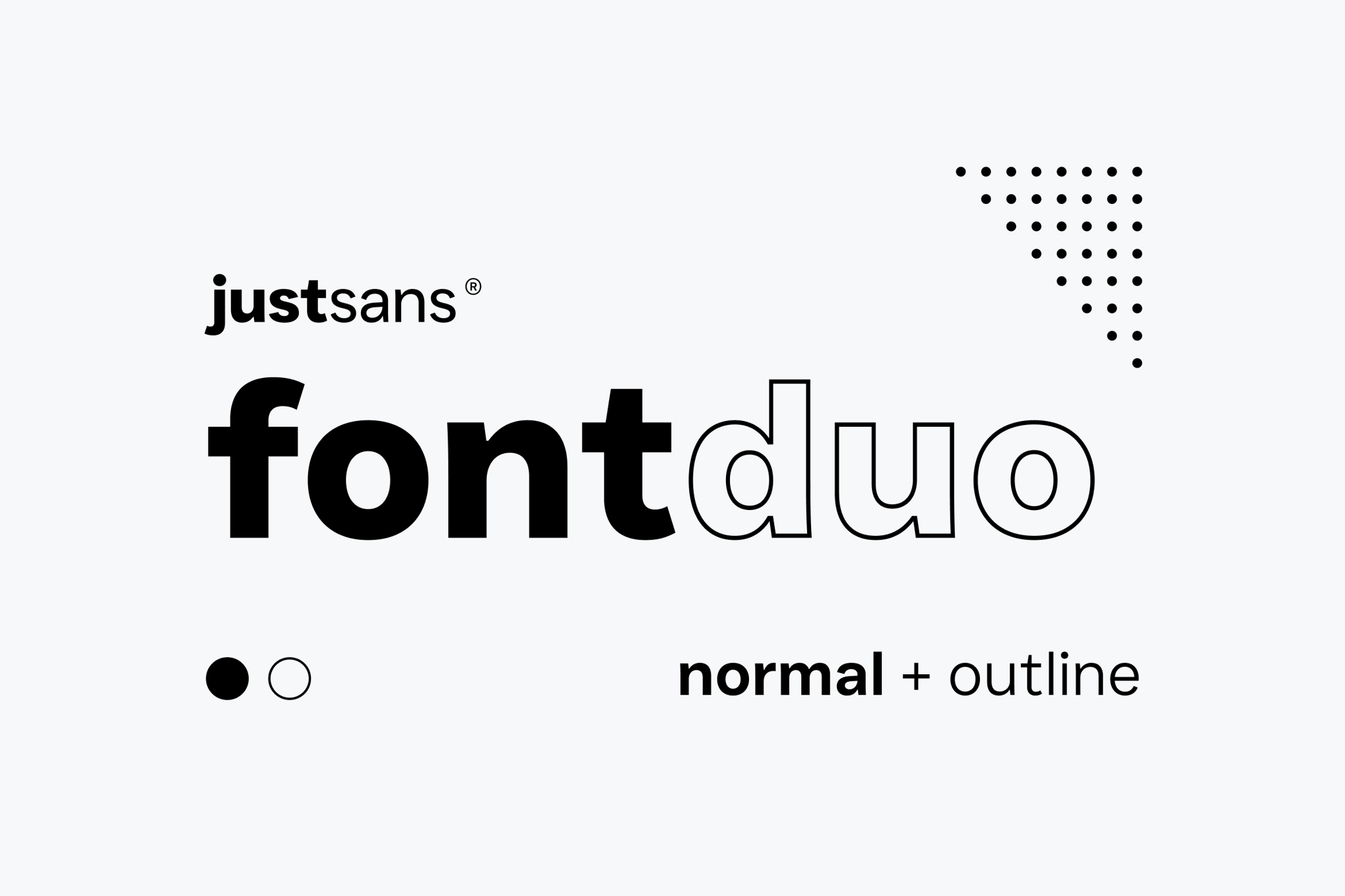
- Prioritize Clarity: Your goal is information transfer, not artistic expression. If a user has to squint, the design has failed.
- Optimize for x-Height: A generous x-height is the single most effective way to improve legibility at small sizes.
- Reject Extreme Contrast: Avoid fonts where the difference between thick and thin strokes is dramatic. These "break" at small sizes.
- Maximize Counters: Ensure the "holes" inside letters like ‘a’, ‘o’, and ‘e’ are large and clear.
- Test at Real-World Sizes: Print your designs at 100% or view them on the actual device before signing off.
- Screen Optimization: Prioritize fonts that have been hinted for digital displays.
- Limit Complexity: Avoid decorative serifs or swashes for body copy.
- Weight as a Tool: Use a slightly heavier weight than you think you need. A "Regular" weight often reads like a "Light" at 8pt.
Implications for the Future of UX
As we move toward a future defined by wearable tech, augmented reality (AR) glasses, and ultra-compact digital displays, the importance of micro-typography will only increase. We are no longer designing for the static page; we are designing for the glance.
The fonts listed in this article represent the intersection of legacy craftsmanship and future-forward utility. By selecting typefaces that respect the limitations of the human eye and the constraints of the physical and digital canvas, designers can ensure that their message is not just seen, but understood. The next time you find yourself struggling with a layout that feels "off," look first to your font choice—the solution is likely hiding in the fine print.


 Nana Muazin
 Layla Zulfa
 Nana
Nana
 Pevita Pearce
 Rifan Muazin
 Iffa Jayyana