
 Layla Zulfa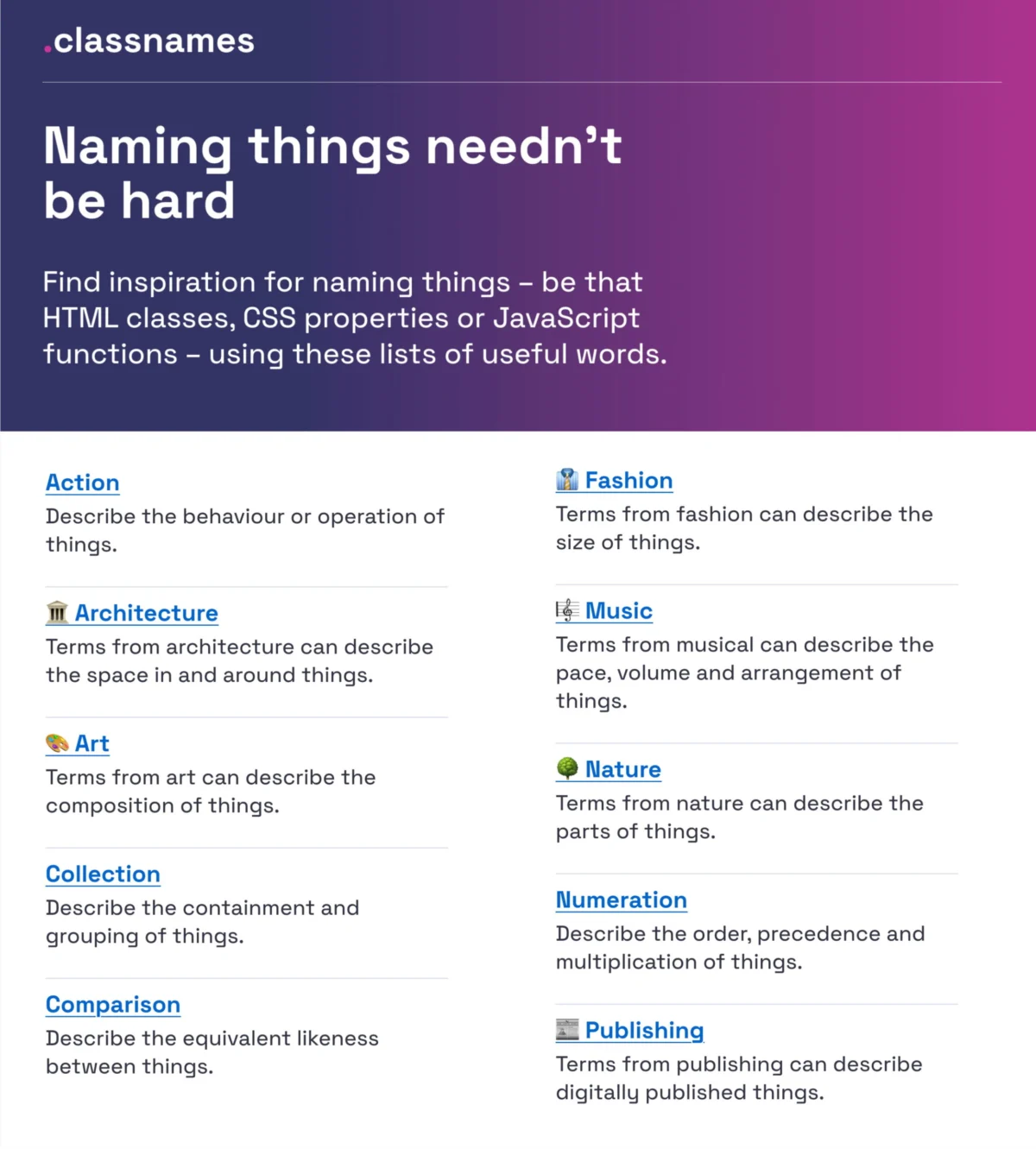
Naming is one of the most deceptively complex challenges in the digital product lifecycle. It is the bridge between intent and implementation; the language we choose not only shapes how we perceive our products but dictates the efficiency of the collaboration between designers, developers, and stakeholders. When naming conventions are ambiguous, we find ourselves trapped in a cycle of confusion regarding colors, icons, UI components, and feature sets—ultimately leading to poorly maintained design tokens, messy HTML classes, and fragile variables.
In this deep dive, we explore why naming is a foundational architectural concern, provide a roadmap for standardizing your taxonomy, and highlight the industry-standard resources that can help you move from chaotic, ad-hoc labeling to a scalable, unified design language.

The Core Philosophy of Naming: Main Facts
At its heart, a name is a functional tool. Whether it is a CSS class, a variable in a design system, or the label of a feature in a user interface, a name must satisfy two primary criteria: clarity and consistency.
Naming failures typically fall into two categories:

- Over-genericity: When names are too vague (e.g.,
container-1orblue-light), they lose meaning as the codebase grows. - Over-specificity: When names are too rigid (e.g.,
login-button-blue-bold), they defy the principles of reusability, forcing developers to create redundant code rather than leveraging existing, flexible components.
Effective naming requires a departure from visual-first thinking. Instead of naming an element based on how it looks (e.g., large-red-box), systems should prioritize the intent or the role of the element (e.g., error-message-banner).
A Chronology of Naming Evolution
The evolution of naming in digital products has moved from "Wild West" coding practices to highly structured, token-based taxonomies.

- The Early Web (Pre-2010s): Naming was largely manual and idiosyncratic. Developers used arbitrary naming conventions, often relying on global styles that led to the infamous "CSS specificity wars."
- The Component Revolution (2010–2015): The rise of frameworks like Bootstrap and early modular CSS (OOCSS, BEM) forced the industry to adopt more predictable naming patterns. This was the era where we learned to define components as distinct, repeatable units.
- The Design Token Era (2016–Present): With the advent of sophisticated design systems (like those at Salesforce, Intuit, and Shopify), naming has evolved into a taxonomy of "Design Tokens." We no longer just name buttons; we name the atoms, molecules, and organisms that build our entire ecosystem, ensuring that a "primary action color" remains consistent across a web app, a native mobile app, and a marketing email.
Supporting Data: Resources and Best Practices
To achieve consistency, one must look toward established, battle-tested methodologies. Below are the key resources that define modern naming standards.
1. The Power of "Classnames"
If you find yourself stuck in a creative rut while naming CSS properties or JavaScript functions, Classnames is an essential resource. It provides thematically grouped lists of words that encourage developers to think beyond traditional technical labels. By categorizing words into themes—ranging from nature and architecture to music and fashion—teams can create naming hierarchies that are both descriptive and memorable.

2. Mastering Color Taxonomies
Color naming is notorious for being subjective. What one designer calls "Midnight Blue," a developer might identify as #1A237E. To solve this, Color Parrot offers a massive, community-vetted repository of over 30,000 unique color names. By using a standardized dictionary for colors, teams can eliminate the "is this blue or purple?" debate entirely.
3. Guidelines for Layers and Groups
Javier Cuello’s naming best practices offer a masterclass in organizational structure. Cuello argues that an effective name should be:

- Logical: Following a predictable structure.
- Concise: Avoiding unnecessary fluff.
- Meaningful: Clearly describing the function of the layer or component.
- Visual-agnostic: Removing references to transient stylistic properties.
4. Designing for Scale: The Intuit Model
For complex organizations managing multiple brands, the challenge is creating a token taxonomy that is flexible yet robust. The team at Intuit—which oversees diverse products like Mailchimp and QuickBooks—pioneered a flexible design token taxonomy. Their case study serves as a blueprint for any company needing to support multi-brand environments without sacrificing system integrity.
Official Responses and Industry Standards
The industry is currently gravitating toward the use of Design Token Taxonomies. These systems allow teams to map primitive values (like raw hex codes) to semantic values (like action-background-primary).
The Vodafone UK Design System serves as a modern gold standard. By breaking down the anatomy of a token into a well-orchestrated system of collections—ranging from brand primitives to page-specific semantics—they have enabled a workflow where the name of the token tells the developer exactly where and why it is being used.
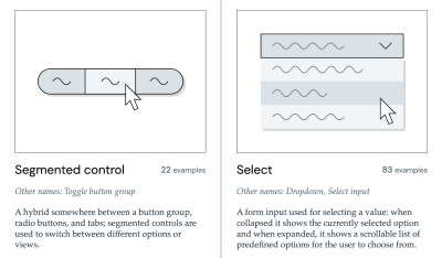
Furthermore, tools like The Component Gallery provide empirical evidence of how top-tier companies name their UI components. Before you invent a new name for an accordion or a modal, checking this repository can help align your product with established user mental models, which is crucial for accessibility and usability.

Implications: Why Naming Affects Business Outcomes
Naming is not just a developer concern; it is a business performance metric.
- Feature Adoption: As Erin Gannon notes in her guide, What Do We Call This Thing?, features often fail due to poor discoverability. If a user cannot understand the name of a feature, they will not use it. Effective naming should prioritize the "Job-to-be-Done" framework—using the user’s language, not the developer’s jargon.
- Team Velocity: When developers, designers, and product managers speak different "dialects," time is lost in translation. A shared, documented taxonomy acts as a lingua franca, reducing friction and minimizing the time spent on "naming meetings."
- Technical Debt: Ambiguous naming creates "legacy baggage." When components are named poorly, they are difficult to deprecate or update, leading to a brittle codebase that slows down future innovation.
Conclusion: Establishing Your Own Taxonomy
If you are currently struggling with naming, start by auditing your existing components. Are your names descriptive of what the item is, or how it looks? If it’s the latter, it’s time for a refactor.

Utilize tools like the Design Token Naming Guide to build a structured hierarchy that includes categories, states, and roles. Remember that the "right" name is simply the one that is understood by everyone on your team.
As you embark on this journey, keep in mind that naming is an iterative process. You will not get it perfect on the first try, and that is okay. Maintain a "naming backlog" to track conflicts and refine your taxonomy as your product grows. By treating your language as a core part of your design system, you ensure that your product remains scalable, accessible, and, most importantly, easy for your users to understand.

The web is a collaborative space, and by sharing our naming conventions and structures, we collectively improve the quality of the digital world. Stay curious, keep building, and remember: clarity is the ultimate luxury in design.


 Nana Muazin
 Jia Lissa
 Nana
Nana
 Pevita Pearce
 Rifan Muazin

 Iffa Jayyana