
 Jia Lissa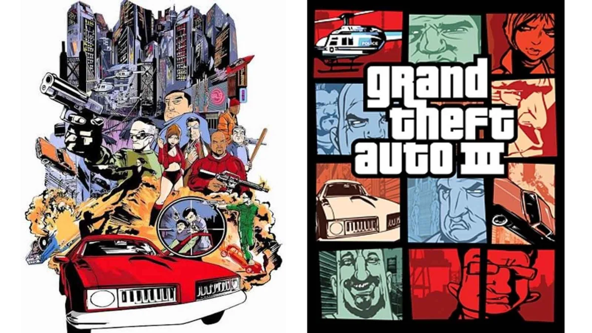
The cover art for Grand Theft Auto 6 is more than just a promotional image; it is a cultural touchstone. Even before a viewer registers the specific characters or the neon-drenched backdrop of a modernized Vice City, the visual language is unmistakable. A fragmented, multi-panel grid overflowing with police cruisers, high-stakes heists, and the grit of urban criminal life—it is the signature aesthetic that has defined the Grand Theft Auto (GTA) franchise for a quarter of a century.
Yet, this iconic design, now synonymous with the biggest entertainment property on the planet, was never part of the original creative vision. It was the result of a desperate, eleventh-hour scramble, born from the shadow of the September 11 terrorist attacks.
A City in Mourning: The Discarded Vision
To understand the gravity of the change, one must look back to the development cycle of Grand Theft Auto 3 in 2001. Rockstar Games had originally conceptualized a cover that leaned into the cinematic, action-oriented trends of the era. The planned artwork featured a dramatic, singular scene: a bridge exploding in the distance, helicopters hovering over the cityscape, and police officers firing into the air.
It was designed to look like a blockbuster movie poster—a perfect fit for a game that was essentially an interactive crime film. However, the events of September 11, 2001, fundamentally altered the cultural landscape of the United States. In the immediate aftermath of the attacks, the imagery of collapsing infrastructure and law enforcement in a state of chaos became deeply sensitive, if not outright traumatic, for the public.
Rockstar faced a precarious dilemma. With the game scheduled for release in October 2001, the team had almost no time to pivot. They were forced to scrap the original artwork entirely, recognizing that the "movie poster" aesthetic had become unintentionally evocative of the very real-world tragedy that had just occurred.
The Two-Evening Miracle: A Creative Pivot
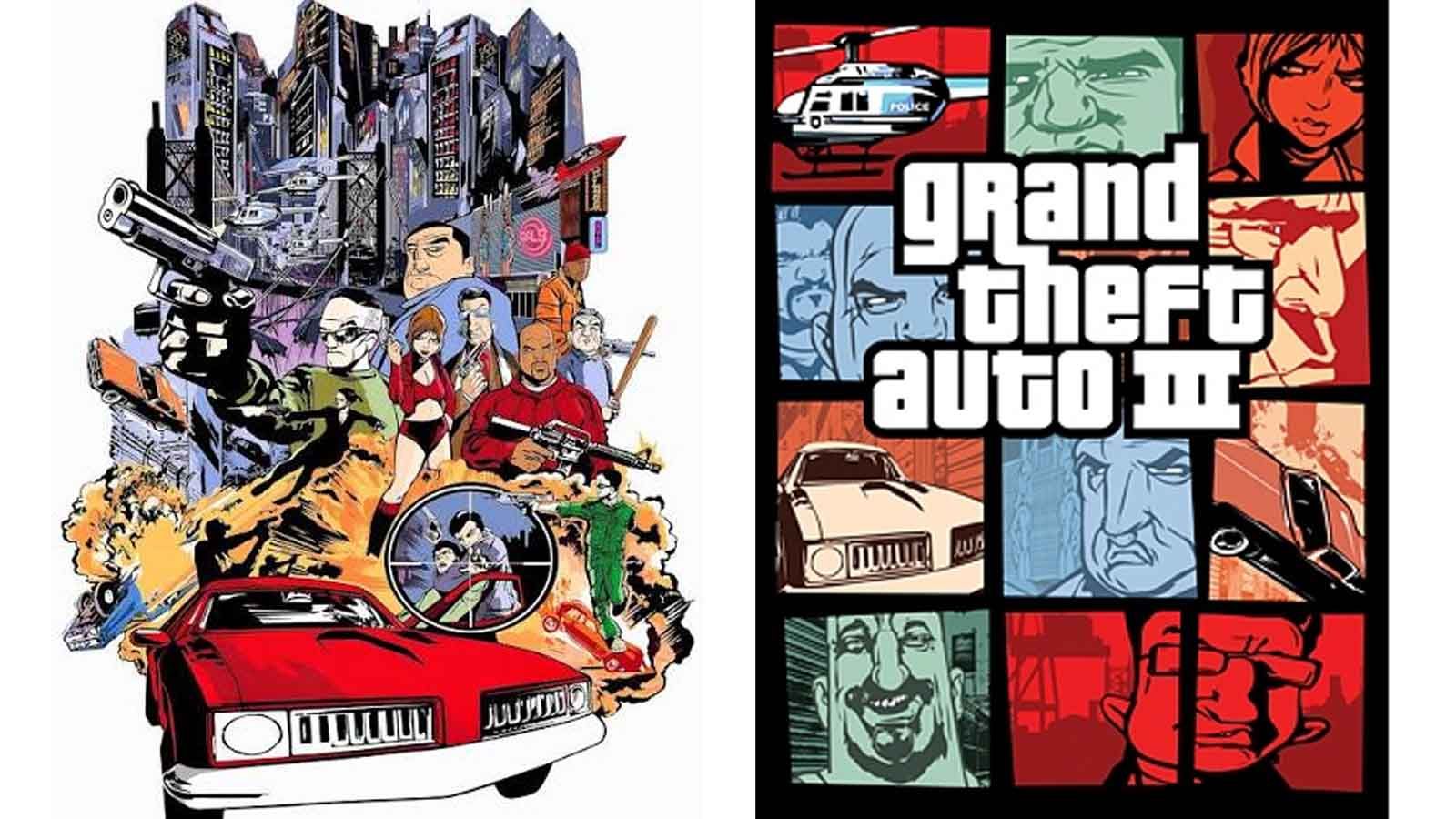
The shift to the now-famous "grid" design is often attributed to the frantic pace of the development team. Rockstar co-founder Dan Houser has famously stated in recent interviews that the iconic template was produced by Stephen Bliss in roughly two evenings. This anecdote has become part of the Rockstar mythos—a testament to the company’s ability to "fail forward" under immense pressure.
However, the reality of the creative process is rarely so linear. Stephen Bliss, the artist behind the transition, has offered a slightly more nuanced perspective. While Houser’s "two evenings" account highlights the speed of the final execution, records suggest the logistical shift was a more laborious process. Bliss has indicated he was given approximately one week to produce the replacement, noting that the original, discarded artwork had been in production for six months.
Regardless of the exact timeframe, the result was a masterclass in visual adaptation. By breaking the image into smaller, digestible vignettes—a woman holding a gun, a car chase, a helicopter, a character’s face—the new cover shifted the focus from a singular, potentially sensitive narrative scene to a collection of gameplay elements. It turned the box art into a scrapbook of criminal activity, emphasizing the "sandbox" nature of the game rather than a specific, potentially inflammatory moment.
Chronology of the Aesthetic
The transition from the "Movie Poster" style to the "Grid System" occurred in late 2001, but its impact on the gaming industry was immediate and lasting.
- September 2001: Following the 9/11 attacks, Rockstar executives decide that the original, action-heavy GTA 3 cover art is inappropriate for the national mood.
- October 2001: The game releases with the new, grid-based cover art in North America. The original, more cinematic artwork is retained for the European market, creating an accidental collector’s divergence.
- 2002–2003: Grand Theft Auto: Vice City launches. The grid template is refined. It becomes clear that this is no longer a stop-gap measure, but a deliberate branding choice.
- 2004: Grand Theft Auto: San Andreas cements the style. The grid becomes a "family look," with the logo and the panel layout becoming as recognizable as the Pepsi or Nike logos.
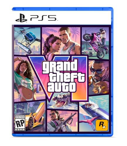
- 2013–2025: The aesthetic survives the transition from the PlayStation 2 era to the 4K, ray-tracing capabilities of the modern generation. From GTA V to the upcoming GTA 6, the template remains consistent, providing a visual through-line across decades of technological advancement.
The "Fear City" Connection and Beyond
The evolution of this art style was not just about hiding a sensitive image; it was about defining a brand. Stephen Bliss, the man tasked with the redesign, has gone on to have a storied career in digital art, famously working on projects like Fear City. His ability to synthesize complex, chaotic themes into a coherent visual language became the bedrock of Rockstar’s marketing strategy.
The genius of the grid layout lies in its modularity. It allows Rockstar to present a dense, multifaceted world without cluttering the viewer’s eye. Each panel represents a different pillar of the gameplay experience: the vehicle, the protagonist, the threat, the environment, and the atmosphere. By keeping these elements in separate boxes, the composition feels organized despite the inherent chaos of the subject matter.
Official Responses and Industry Implications
Rockstar Games has rarely commented extensively on the 9/11 origins of their art style beyond the anecdotes shared by Dan Houser. However, the decision to keep the grid system for every subsequent title serves as a silent, official endorsement of the design’s success.

Industry analysts often point to the GTA cover art as a primary example of "visual branding." In a market saturated with generic "hero-shot" covers (where a protagonist stands in the center looking stoic), the GTA grid is instantly identifiable from across a retail aisle. It is a design system that scales. It works on a small mobile screen, a physical game case, and a massive digital storefront banner.
Furthermore, the existence of the "European Version" of GTA 3—which features the original, discarded art—has turned that specific edition into a relic of gaming history. For collectors, it represents the "what if" of the series. It serves as a physical reminder that the Grand Theft Auto we know today was shaped by an unprecedented moment of global crisis.
The Implications of Continuity
As we approach the release of Grand Theft Auto 6 on November 19, the decision to maintain the grid design carries significant weight. It suggests that, despite the massive leaps in engine power and narrative complexity, Rockstar wants the player to feel the same sense of familiarity they felt in 2001.
The design is a bridge between generations. A player who picked up GTA 3 in 2001 and a player picking up GTA 6 in 2026 are engaging with the same visual syntax. This continuity is a powerful tool for customer retention. It signals that while the world of GTA has evolved, the core spirit—the satire, the crime, the freedom—remains consistent.
Conclusion: A Design Born of Necessity
Great design often emerges from constraint. Had the events of September 11 not forced a rethink of Grand Theft Auto 3’s marketing, we might have seen a franchise that pivoted toward the more standard, cinematic cover trends of the early 2000s. We might have lost the visual shorthand that has helped make Grand Theft Auto the most successful entertainment franchise in history.
Instead, a rush-job redesign became the template for an entire industry’s approach to box art. It proved that in the world of high-stakes game development, the most iconic results often come from the moments where the original plan is thrown in the bin. The grid is not just a container for characters; it is a monument to a pivotal moment in both gaming and history, proving that even in the face of tragedy, the creative process can find a way to forge something lasting.
As fans eagerly await the launch of GTA 6 on PlayStation 5 and Xbox Series X/S, the familiar arrangement of panels will serve as a promise: the chaos of the city is waiting, and despite all the changes in the world, some things remain as reliably iconic as they were twenty-five years ago.


 Nana Muazin
 Layla Zulfa
 Nana
Nana
 Pevita Pearce
 Rifan Muazin

 Iffa Jayyana