
 Layla Zulfa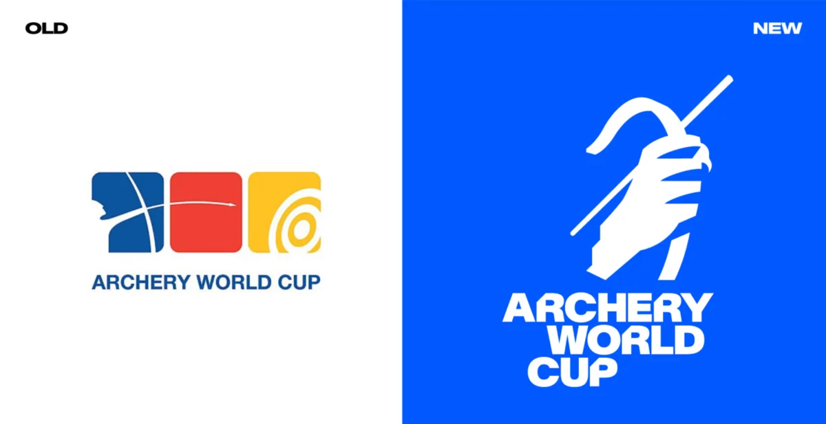
In the high-stakes world of competitive sports branding, a logo redesign is often met with the same trepidation as a last-second penalty kick. From the recent, divisive proposals for Newcastle United to the global scrutiny faced by the FIFA World Cup 2026 emblem, design updates are rarely met with universal acclaim. Yet, occasionally, a brand identity emerges that manages to strike the perfect balance between tradition and innovation. The recent comprehensive rebrand of the Archery World Cup by the design studio Arecibo is a masterclass in how to modernize a legacy competition without losing its soul.
By swapping out dated, corporate-style graphics for a dynamic, motion-focused identity, Arecibo has successfully repositioned archery not merely as a test of static precision, but as a high-octane narrative experience.
The Evolution of the Archery Identity
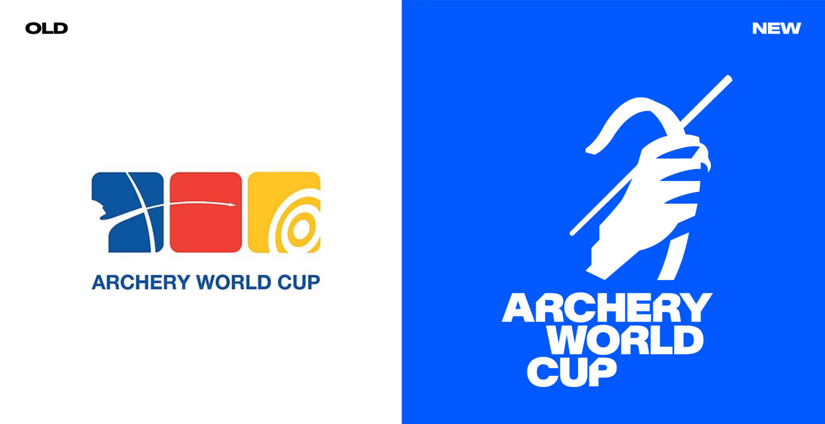
To understand the magnitude of this change, one must look at the previous iteration. The legacy logo—a series of tricolour rounded squares intended to evoke a target face—had become an outlier in the modern sporting landscape. It lacked the visual gravity required for a global tournament, feeling disconnected from the sleek, high-definition aesthetic of contemporary sports broadcasting.
Beyond the aesthetic concerns, there was a systemic issue. The brand lacked a unified set of design rules, leading to inconsistent applications across international venues. As World Archery noted, the previous identity failed to communicate the prestige of the tournament; it lacked the "trophy-level" gravitas that fans associate with world-class athletic achievement.
The 20th-anniversary celebration of the Archery World Cup provided the perfect catalyst for change. As the competition prepared for its final in Saltillo, Mexico, held this past September, the new identity began its rollout, signaling a departure from the static past toward a future of motion and narrative.
The Strategy: "Can’t Miss"
The core philosophy driving Arecibo’s design process was distilled into two words: "Can’t Miss." This phrase serves a dual purpose: it refers to the archer’s requirement for absolute precision, and the spectator’s experience of a show so compelling that they cannot look away.
Graham Anderson, the lead designer at Arecibo, argued that the real drama in archery isn’t found in the archer’s inhuman, mechanical consistency, but in the rare moments of vulnerability—the "miss." By shifting the emphasis from pure sporting metrics to the spectator’s emotional journey, the design studio sought to humanize the competition.
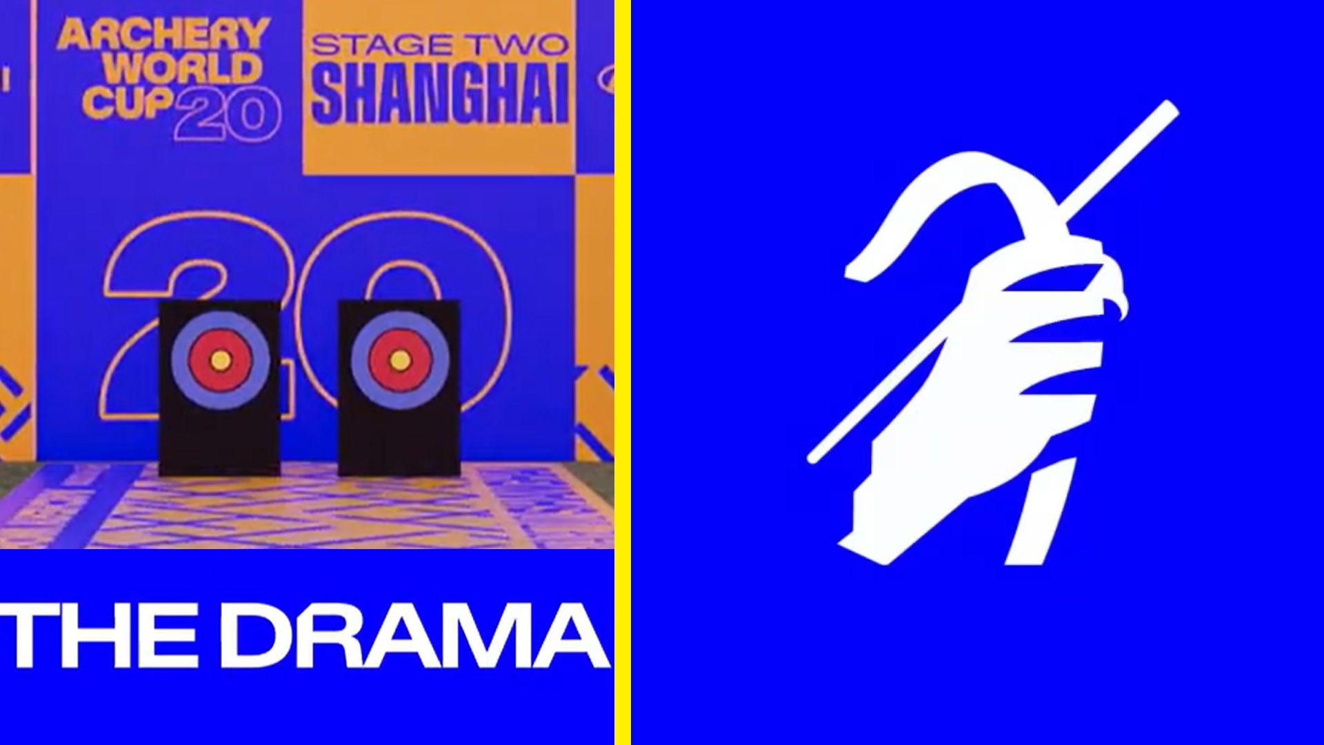
"The key move is introducing more opportunities for narrative and intrigue while still honouring the precision and skill of the sport," Anderson explained. "Narrative could be pulled from its global stages, characterful athletes, emotional intensity, and sporting excellence. Every stage, every shot, every story matters."
Chronology of the Rebrand
The transition began long before the final event in Saltillo. The process involved a complete audit of World Archery’s existing assets to determine why the brand felt fragmented.
- The Diagnostic Phase: Arecibo identified the disconnect between the high-intensity nature of the sport and the "corporate, static" logo.
- The Conceptual Phase: The "Can’t Miss" framework was established as a filter for all future design decisions. Every asset—from social media graphics to physical stadium signage—had to answer: Does this show what’s at stake? Does it reinforce our values?
- The Design Development: The studio moved away from the literal "target" imagery. Instead, they focused on the trophy itself, designing a stylized icon with a 45-degree angle. The inclusion of a stepped shape at the end of the arm serves as a versatile visual device, allowing for scalability across digital and physical mediums.
- The Deployment: The branding was unveiled during the 20th anniversary year, culminating in the September 12–13 finals.
The Anatomy of the New Aesthetic
The new identity is defined by three pillars: the icon, the typeface, and the color system.
The Iconography
The new logo captures the prestige of the World Cup trophy through abstraction. By avoiding a literal photograph or illustration of the prize, Arecibo created a symbol that is timeless. The 45-degree angle integrated into the icon provides a sense of directional momentum, suggesting the trajectory of an arrow in flight.
The Custom Typeface: AWC Baikal
In collaboration with the Lausanne-based foundry Newglyph, the team developed a custom variable typeface titled "AWC Baikal." This typeface is a technical triumph. It spans from condensed light to extended bold, offering immense flexibility. Notably, the angles found within the logo were integrated into the characters of the typeface, creating a subtle, cohesive visual link that ensures the brand feels unified, even when the logo is not present.
The Modular Color System
Recognizing that the Archery World Cup visits diverse locations, Arecibo implemented a dual-color strategy. A core palette of deep blues provides the foundation, ensuring brand recognition. However, for individual host cities, the system allows for a broader, more expressive color palette. This modularity ensures that while every event feels unique to its host, it remains undeniably part of the World Archery ecosystem.
Supporting Data and Technical Implementation
One of the most significant challenges in modern sports branding is ensuring that a visual identity functions across different environments—from the giant screens at a stadium to a user’s mobile device.
Arecibo’s solution was the creation of a "modular kit." This includes:
- Squared Grid Templates: Scalable frames that define where brand elements and sponsor logos sit. This ensures that sponsor visibility—critical for the sport’s revenue—is maintained without cluttering the visual field.
- Defined Hierarchy: Simple, clear rules for layout mean that local organizers can set up the venue branding without needing a professional graphic designer on-site.
- Motion Graphics Templates: Arecibo built an After Effects library of templates. These allow for dynamic, professional-grade broadcast motion graphics that can be edited by non-designers. This ensures that the professional look of the brand is maintained throughout the entire broadcast, not just in the opening sequence.
Official Responses and Industry Implications
The design community has largely praised the shift, noting that it brings archery into the same league as elite sports leagues like the NBA or the Premier League. By treating the broadcast graphics and stadium signage as a "system" rather than a collection of disparate assets, World Archery has improved its commercial appeal.
For organizations looking to rebrand, the Archery World Cup project offers several key takeaways:
- Humanize the Sport: Focus on the narrative and the spectator’s emotion rather than the technical aspects of the game.
- Design for the User: Build systems that are easy for non-designers to use in the field. If a brand is too complex to implement, it will inevitably become inconsistent.
- Consistency is King: By utilizing a custom typeface and a rigid, yet flexible, grid system, the brand identity remains strong regardless of the medium.
Conclusion: A Target Well Hit
The rebrand of the Archery World Cup is more than a coat of paint; it is a strategic repositioning of the sport for a digital-first audience. By embracing a "Can’t Miss" philosophy, Arecibo has provided World Archery with the tools to tell a compelling story, capture the intensity of the competition, and present the sport with the prestige it deserves.
As the sport looks toward the future, the new identity ensures that whether the competition is in Saltillo, Paris, or beyond, the visual language will remain as sharp and focused as the athletes themselves. The lesson for the broader design industry is clear: when you simplify the rules and focus on the narrative, you don’t just create a better logo—you create a better experience.

 Sagoh
Sagoh
 Asep Darmawan
 Raul Delapena Setiawan
 Reynand Wu

 Azzam Bilal Chamdy
 Ali Ikhwan