
 Laily UPN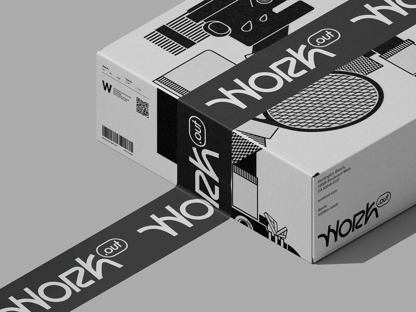
In the competitive landscape of modern athletic coaching and sports nutrition, visual identity is more than just an aesthetic choice; it is the cornerstone of brand authority. On June 26, 2026, the acclaimed creative agency My Name is Wendy Studio unveiled a comprehensive, high-energy rebranding project for "Work.out," a burgeoning sports coaching collective. This ambitious initiative transforms the company from a traditional service provider into a lifestyle-oriented powerhouse, blending bespoke character illustration with functional, high-end packaging design.

The collaboration represents a pivot toward a more human-centric marketing strategy, moving away from the cold, clinical imagery often associated with supplement brands and toward a dynamic, character-driven narrative.
Main Facts: A Holistic Rebrand
The "Work.out" project is a masterclass in multidisciplinary branding. The scope of work undertaken by My Name is Wendy Studio was exhaustive, touching upon every customer touchpoint to ensure a cohesive brand experience. The key components of the rebranding include:

- Logotype Development: A refreshed, modern wordmark that balances kinetic energy with professional stability.
- Character Design: A series of bespoke, stylized illustrations representing the five core professionals behind the Work.out coaching team. These characters serve as the "faces" of the brand, humanizing the technical expertise behind the coaching.
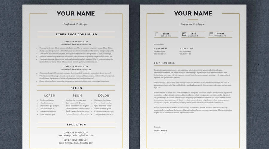
- Corporate Stationery: A complete overhaul of internal and external communication materials, including business cards, letterheads, and envelopes, all featuring a unified visual language.
- Packaging Architecture: The design of five distinct product lines, including specialized L-Glutamine and protein packs. The range encompasses specific formulations such as Drive+, Punch+, Avea+, Boost+, and Gh+.
- Motion Design: A series of advertising animations designed to showcase the brand’s beverage line, utilizing fluid, rhythmic motion to emphasize the "energy" and "vitality" the products promise.
The project utilizes a rich palette of digital tools, including Adobe Photoshop, Illustrator CC, and After Effects CC, alongside Blender 3D for structural packaging visualization and Affinity Designer for vector precision.

The Chronology of the Project
The development of the Work.out identity followed a rigorous creative process that spanned several months of ideation, execution, and final refinement.

Phase 1: Conceptualization and Character Development (Early 2026)
The studio began by interviewing the five professionals at the heart of Work.out. The goal was to identify the distinct personality traits of each coach and translate these into visual form. This resulted in a series of custom illustrations—featuring characters engaged in various athletic disciplines like basketball, hockey, and tennis—that serve as the emotional anchor for the brand.

Phase 2: Stationery and Identity Systems (March – April 2026)
With the visual language established, the studio focused on the tangible assets. The business cards and envelopes were designed to be tactile experiences, using high-quality finishes that communicate the premium nature of the coaching services.

Phase 3: Product Packaging Design (May 2026)
The most technically challenging phase involved the creation of packaging for the supplement line. Each of the five core products required a design that was both functional (clearly conveying ingredient benefits like L-Glutamine) and shelf-attractive. The studio employed 3D modeling to ensure that the cans and pouches maintained their structural integrity and visual impact.

Phase 4: Motion and Finalization (June 2026)
The final weeks were dedicated to the "Motion" aspect of the brand. The studio produced high-fidelity advertisements for the energy drink range, culminating in a launch date of June 26, 2026.

Supporting Data: Why Branding Matters in Sports Coaching
The move by Work.out reflects a broader trend in the sports and wellness industry. Data from industry analysts suggests that "Lifestyle Sports Coaching" is one of the fastest-growing sectors in the fitness economy, projected to grow by 12% annually through 2030.

For companies like Work.out, the challenge is differentiation. With an oversaturated market of independent trainers and supplement startups, the "My Name is Wendy" approach—which leans heavily on custom illustration and storytelling—provides a "defensibility moat."

Key Design Metrics
- Visual Recognition: By using a consistent character-led design, the brand reduces cognitive load for the consumer, allowing them to identify the "coaching style" or "supplement benefit" at a glance.
- Tactile Engagement: The stationery and wrapping paper designs are built on a "premium-first" premise, designed to increase customer retention and brand loyalty through the "unboxing" experience.
- Versatility: The branding system is designed to be responsive, scaling from a small business card to large-scale wall art in a gymnasium, ensuring that the visual impact remains consistent across physical and digital media.
Official Responses and Creative Philosophy
In a statement regarding the project, the creative team at My Name is Wendy Studio highlighted the importance of "movement" in their design philosophy.

"For Work.out, we didn’t want to just create a logo; we wanted to create a rhythm," said a spokesperson for the studio. "When you look at the energy drink cans, or the way the characters are illustrated, there is an inherent sense of action. We wanted the brand to feel like it was already in motion before the customer even opened the product. The five coaches are the soul of the company, and our character design project was intended to make them accessible and relatable to every client, from the professional athlete to the weekend warrior."

The team emphasized that the integration of 3D modeling and animation was essential in the current market, where social media and video-first advertising platforms demand content that pops off the screen.

Implications for the Industry
The Work.out rebranding project has several broader implications for the design and sports industries:

1. The Rise of "Human-Centric" Branding
The industry is moving away from abstract, geometric logos toward narrative-driven, character-based identities. By putting faces to the brand, Work.out is effectively building a "community of trust." Clients are no longer just buying a coaching session; they are joining a team.

2. The Convergence of Services and Goods
Work.out’s strategy of bundling coaching with proprietary supplement lines (like Drive+ and Punch+) is becoming the new gold standard for high-end fitness brands. By controlling the branding of the physical goods, the company creates a closed-loop ecosystem where the nutrition supports the training, and both reinforce the brand’s image.

3. High-End Motion as a Standard
The inclusion of professional motion design for a mid-sized coaching collective indicates that video-based marketing is no longer reserved for Fortune 500 companies. With tools like After Effects and Blender becoming more accessible, small agencies are now producing broadcast-quality content that rivals major sports nutrition conglomerates.

4. Sustainability and Materiality
The studio’s focus on the design of "wrapping paper" and "shipping boxes" signals a shift toward the "unboxing experience." In an era of e-commerce, the physical arrival of a package is the first tangible interaction a customer has with a brand. By investing in custom, high-quality packaging, Work.out is elevating the perceived value of their supplements.

Conclusion
The collaboration between My Name is Wendy Studio and Work.out is a definitive example of how creative direction can act as a catalyst for business growth. By synthesizing complex, multifaceted design needs into a singular, cohesive identity, the project ensures that Work.out is not just participating in the fitness market—it is leading the conversation.

As the brand moves into the latter half of 2026, the strength of this visual identity will be tested in the field. However, with a foundation built on clear, dynamic, and highly professional design, the company is well-positioned to scale its operations, attract new clientele, and solidify its status as a premier name in modern sports coaching. The "Work.out" brand is no longer just a service; it is a visual statement of intent, ambition, and athletic excellence.

 Sagoh
Sagoh
 Asep Darmawan
 Raul Delapena Setiawan
 Reynand Wu

 Azzam Bilal Chamdy
 Ali Ikhwan