
 Nana Wu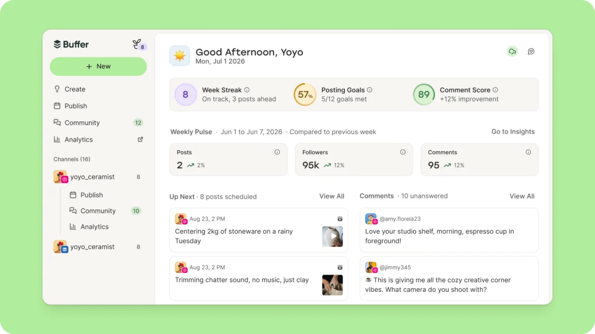
For years, the experience of logging into the Buffer app was akin to walking into a high-functioning factory floor without a guide. Users would sign up, complete a brief onboarding process, and find themselves immediately dropped into the "Publish" tab—a dense interface of calendars, queues, and configuration buttons. While this was a paradise for the seasoned social media manager, it presented a formidable barrier for the newcomer.
In a strategic pivot, Buffer has officially launched "Buffer Home," marking the platform’s most significant user experience (UX) overhaul since its visual redesign in March 2026. This move represents more than just a new coat of paint; it is a fundamental shift in how the company approaches product discovery, user activation, and long-term retention.
The Chronology of Change: From Checklists to Cohesion
The road to Buffer Home began with a recognition of the "Activation Problem." Over the past two years, Buffer’s product team focused heavily on retention, successfully implementing features like streaks, goal-setting, and personalized lifecycle emails. These initiatives significantly boosted engagement for established users. However, the initial hurdle—helping new signups reach their "a-ha!" moment—remained stubbornly high.
For over two years, the company relied on a standard welcome checklist to bridge this gap. While data indicated that the checklist provided a marginal lift in activation, it suffered from three critical flaws:
- Low Engagement: The checklist was dismissed by users more often than it was completed.
- Limited Scope: It only scratched the surface of the tool’s actual capabilities.
- One-Size-Fits-All Logic: It treated a solo creator, a high-volume marketing agency, and a developer building via the API as identical personas.
By early 2026, the team realized that "dropping new users into the existing user experience" was a failing strategy. The launch of Buffer Home serves as the corrective measure. By moving away from a static, universal checklist toward a dynamic landing page, Buffer aims to meet users exactly where they are in their social media journey.
Supporting Data and the Logic of the A/B Test
Buffer’s approach to this rollout is characterized by a "measure twice, cut once" philosophy. The new Home page is currently being deployed via a rigorous A/B testing framework. This is a deliberate choice; the leadership team maintains that they would rather verify the effectiveness of the new UX through real-world data than assume the design is inherently superior.
The underlying strategy is grounded in the observation that the modern SaaS product often suffers from "feature bloat." As Buffer’s surface area has expanded—covering analytics, community management, publishing, and team collaboration—every feature has historically lived behind its own siloed tab. This forced users to go on a "treasure hunt" for the tools they needed.
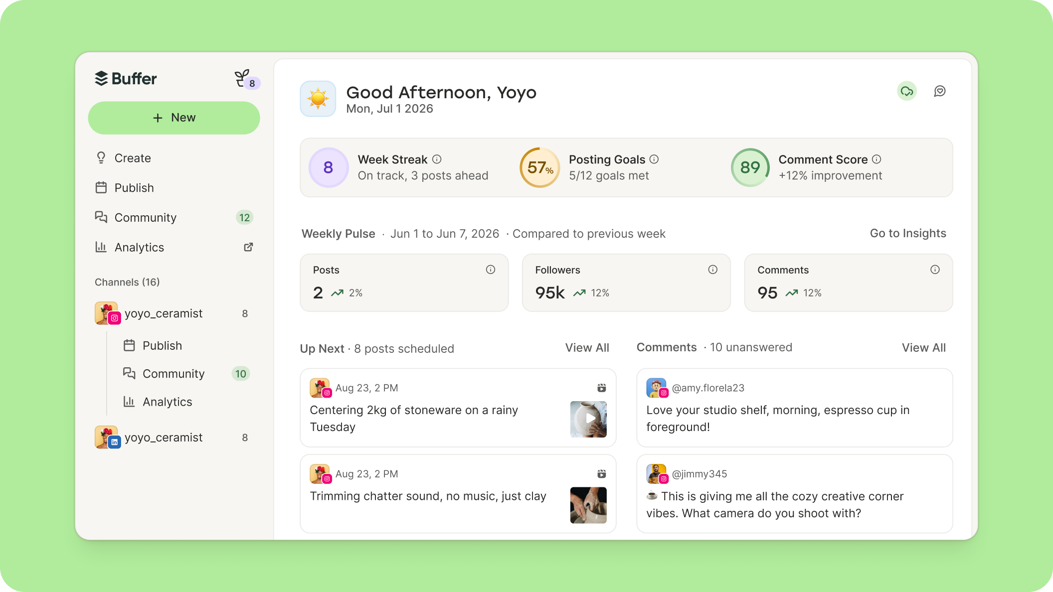
By consolidating high-value information onto a single landing page, Buffer is attempting to move from a "menu-based" discovery system to a "context-based" discovery system. For a new user, the landing page presents setup cards tailored to their specific self-identified needs. For the veteran, it acts as a high-level command center, summarizing the state of social channels, pending comments, and posting habits before they dive into the granular details of their calendar.
Official Perspective: An Interview with the Vision
In discussions regarding the launch, the rationale behind Buffer Home is presented as a commitment to simplicity in an increasingly complex landscape. The goal is not to add more buttons, but to "unlock" existing ones.
"Buffer Home introduces almost no new capability yet," a company representative noted. "Everything on the page—posts, comments, templates, goals—already existed. What has changed is the encounter. We are shifting from presenting fifteen doors and wishing the user luck, to progressively revealing the product based on where the user is in their journey."
This strategy acknowledges that for power users, the calendar is the product. However, for a user who signed up four minutes ago, the calendar is a blank, intimidating void. Buffer Home acts as a bridge, ensuring that the transition from a "new signup" to a "power user" is supported by a scaffold of relevant, actionable insights.
Implications: The Future of the Buffer Ecosystem
The launch of Home is a precursor to a wider, more ambitious roadmap for the remainder of 2026. The company is currently in the midst of overhauling its analytics and insights suite, deepening its "Community" engagement tools, and enhancing the collaborative workflows necessary for agency-level teams.
The "One-Click" Workflow
The most significant implication of this new architecture is the reduction of friction. Take, for instance, the workflow for a marketing agency contributor. Under the current, older system, acting on review feedback from an editor might require three to four clicks to locate the specific post and the associated notes. With the implementation of Home, the goal is to surface those review comments directly on the dashboard, allowing the contributor to address feedback with a single click.
The Strategy of Progressive Disclosure
This design philosophy, known as "progressive disclosure," is essential for tools that serve a wide spectrum of users. By not overwhelming the interface with team activity, deep insights, or content suggestions until they are relevant to the user’s specific context, Buffer hopes to increase the longevity of its user base.
"We have a long list of things Home could surface," the company states. "We left most of it out on purpose. We’d rather ship something we believe is valuable and learn from real usage than guess at the perfect page."
The Broader Context: Why Now?
The decision to build a "Home" page in 2026 is a reflection of the current maturity of the social media management market. When tools like Buffer first launched, the market was in a "feature-race" era—whoever had the most integrations or the most complex scheduling tools won.
Today, the market has shifted toward a "workflow-race" era. Users are overwhelmed by the number of tools they use daily. A platform that can act as a cohesive "operating system" for social media, rather than just a utility, is now the ultimate value proposition. Buffer’s transition is a strategic attempt to claim that title by reducing the cognitive load on the user.
Conclusion: A New Beginning
Buffer Home is an admission that, for a long time, the product was built for the people who already knew how to use it. By acknowledging the difficulty of the "onboarding cliff," the company is setting a new precedent for how it will develop its future features.
For those currently using the platform, the transition will be gradual. New users are already seeing the new interface, while legacy accounts will be transitioned in the coming weeks. The company has made it clear that this is a living document; they have invited the community to track the roadmap via their public Trello-style boards and have encouraged direct feedback on platforms like LinkedIn.
In a software landscape often characterized by constant, chaotic feature additions, Buffer’s focus on discovery and intentionality offers a breath of fresh air. By flipping the user experience from "here is everything" to "here is what you need right now," Buffer is betting that the key to growth isn’t just adding more power, but making that power accessible to everyone.
As the industry watches to see how this A/B test performs, one thing is clear: the era of the "empty queue" landing page is coming to an end. In its place is a, more personal, more purposeful, and more "at-home" experience.


 Azzam Bilal Chamdy
 Raul Delapena Setiawan
 Reynand Wu
 Sagoh
Sagoh


 Ali Ikhwan