
 Suro Senen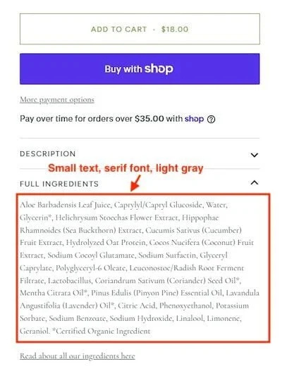
In the modern ecommerce landscape, the "desktop-first" mentality is no longer just a design oversight—it is a critical business failure. While merchants obsess over high-fidelity mockups on widescreen monitors, a massive segment of their customer base is encountering a fractured, frustrating, and ultimately abandoned shopping experience. The culprit is not malice or neglect; it is a profound disconnect between how store owners build their sites and how the modern "cold" visitor experiences them.
The Reality of the "Cold" Social Visitor
To understand the friction plaguing mobile commerce, one must first understand the journey of the modern shopper. Today’s consumer is frequently acquired through a viral TikTok clip, an Instagram Reel, or an influencer’s ephemeral story. This visitor is "cold." They have no brand loyalty, no saved login credentials, no pre-loaded cookies, and no existing cart history.
When a store owner views their site on a desktop, they are likely looking at a cached, personalized, and familiar environment. However, when a visitor clicks a link from a social app, they arrive in an incognito-like state. If the site greets them with a barrage of obstacles, they don’t persist. While a returning, loyal customer might grit their teeth and push through poor design, a cold social visitor will simply hit the "back" button and return to the comfort of the social app they came from.
Mobile Friction: The Anatomy of a Conversion Killer
The Pop-Up Plague
The digital equivalent of a salesperson rushing a customer the moment they step into a store is the immediate, full-screen pop-up. Shoppers arrive with intent, eager to see products, but are instead greeted by a gauntlet of interruptions: mandatory cookie consent banners, age verification gates, country selectors, and the omnipresent "Join our newsletter for 10% off" overlay.
For a user on a small mobile screen, this is not just annoying; it is an architectural barrier. If the cookie banner forces a user to toggle repeatedly just to maintain privacy, or if the email pop-up obscures the very product they clicked to see, the visitor’s journey ends before it begins.
The Fix: Merchants must embrace the concept of "deferred engagement." Configure email pop-ups to trigger only after a predetermined pause or once the user has engaged with the content by scrolling. A/B testing these intervals—or waiting until the second page load—can significantly lower bounce rates.

The "Nice on Figma" Trap
Designers often work on full-height, edge-to-edge canvases in tools like Figma, ignoring the "noisy" reality of a mobile device. A phone screen is not a clean canvas; it is cluttered with an address bar, a bottom navigation home indicator, and the iPhone’s Dynamic Island.
Elements that look perfectly placed in a design file often end up cut off, obscured, or rendered unclickable when combined on a real mobile device. When a sticky header, an "Add to Cart" bar, and a notification banner are all competing for screen real estate, the product image—the most important element—is pushed into a tiny sliver of the display. Designers must test their stacked components on physical devices, not just browser simulations, to ensure the actual "viewport" remains functional.
The Rise of Robot-First Design
There is a growing trend of building product pages for AI agents rather than human beings. This manifests as dense data blocks, microscopic font sizes, and pale gray, low-contrast serif typography. While this "data overload" approach might satisfy a Large Language Model (LLM) scraping the site, it is a disaster for a human trying to read an ingredients list or a sizing guide on a crowded subway.
Merchants are currently prioritizing backend SEO and AI-readability at the expense of human conversion. This is a false dichotomy; it is possible to provide structured data for AI while maintaining clean, legible typography for shoppers. Prioritizing the human eye is not optional—it is the baseline for commerce.
Beyond Safari: The In-App Browser Limitation
One of the most overlooked aspects of mobile commerce is that the vast majority of social traffic does not arrive via Safari or Chrome. It arrives through the "in-app browser" of Instagram, TikTok, or Facebook.
These environments are fundamentally different from standard mobile browsers. They are often stripped-down, lacking the robust autofill capabilities for passwords, shipping addresses, and payment credentials that users rely on in Chrome or Safari. When a checkout flow is optimized only for a standard browser, it often breaks inside the Instagram app. Scripts fail, sticky elements misfire, and the seamless "one-click" checkout becomes a laborious form-filling marathon.

The Tactile Shift: A Finger, Not a Cursor
The shift from a desktop mouse to a mobile touchscreen is not just a change in input; it is a change in behavior. Desktop shoppers browse; mobile shoppers explore through touch.
When a site disables "pinch-to-zoom" on product images, it effectively blinds the user. A shopper wanting to examine the stitching on a shirt or the fine print on a care label expects to interact with the image. If they cannot, they assume the site is low-quality. This hesitation is frequently misdiagnosed by analytics as a "price" or "trust" issue, when in reality, the user is simply unable to verify the product’s quality because the gallery is stuck in a desktop-mouse-click paradigm.
Supporting Data and Industry Implications
Recent industry studies suggest that mobile conversion rates are significantly lower than desktop, not because mobile users are less likely to buy, but because the "friction cost" is higher.
- Load Time Impact: A delay of even one second in mobile load time can result in a 7% reduction in conversions.
- The "Back" Button Threshold: Over 60% of social-referred traffic bounces within the first three seconds if the initial mobile view is cluttered or requires immediate interaction.
- Checkout Abandonment: In-app browsers show a 15% higher rate of abandonment at the payment stage compared to Safari/Chrome, largely due to the failure of integrated payment wallets (like Apple Pay or Shop Pay) to initialize correctly.
The Path Forward
To bridge this gap, merchants must stop viewing their mobile site as a "version" of their desktop site and start viewing it as the primary store.
- Conduct a "Cold" Audit: Open the site in an incognito window on a mobile phone—not a simulator. Navigate as a guest. Try to buy a product without logging in.
- Audit the "Sticky" Elements: Count the percentage of the screen taken up by non-content elements (headers, footers, pop-ups). If it’s over 20%, it’s too much.
- Test In-App Browsers: Specifically navigate to your store from within the TikTok and Instagram apps. Does the checkout process trigger your payment integrations correctly?
- Prioritize Readability: If a human cannot read your product description in a dimly lit room, your font is too small.
The future of ecommerce is mobile, but it is not "mobile-friendly"—it is "mobile-native." Those who continue to design for the desktop while ignoring the thumb-driven, high-friction, in-app world of the modern social shopper will find themselves increasingly invisible in an crowded, competitive marketplace. The "friction" you ignore today is the revenue you lose tomorrow.


 Rifan Muazin
 Azzam Bilal Chamdy
 Laily UPN
 Iffa Jayyana


 Lina Hope
 Lina Irawan