
 Jia Lissa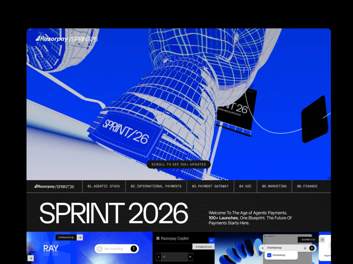
In the hyper-competitive world of financial technology, the unwritten rulebook for product launches is rigid: prioritize trust, showcase the dashboard immediately, feature a pricing table, and ensure the hero section speaks directly to ROI. It is a playbook designed to minimize friction and maximize conversion.
Razorpay, the Indian fintech giant, decided to discard that rulebook entirely.
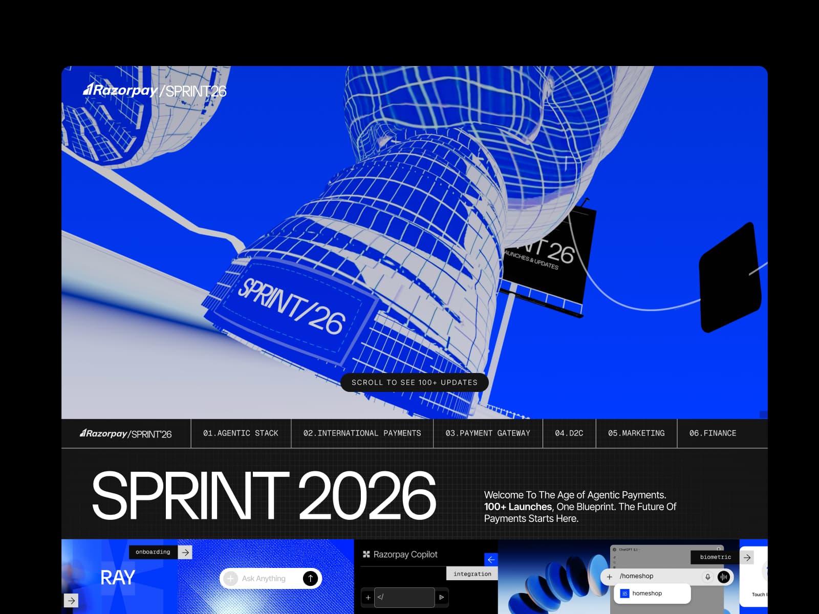
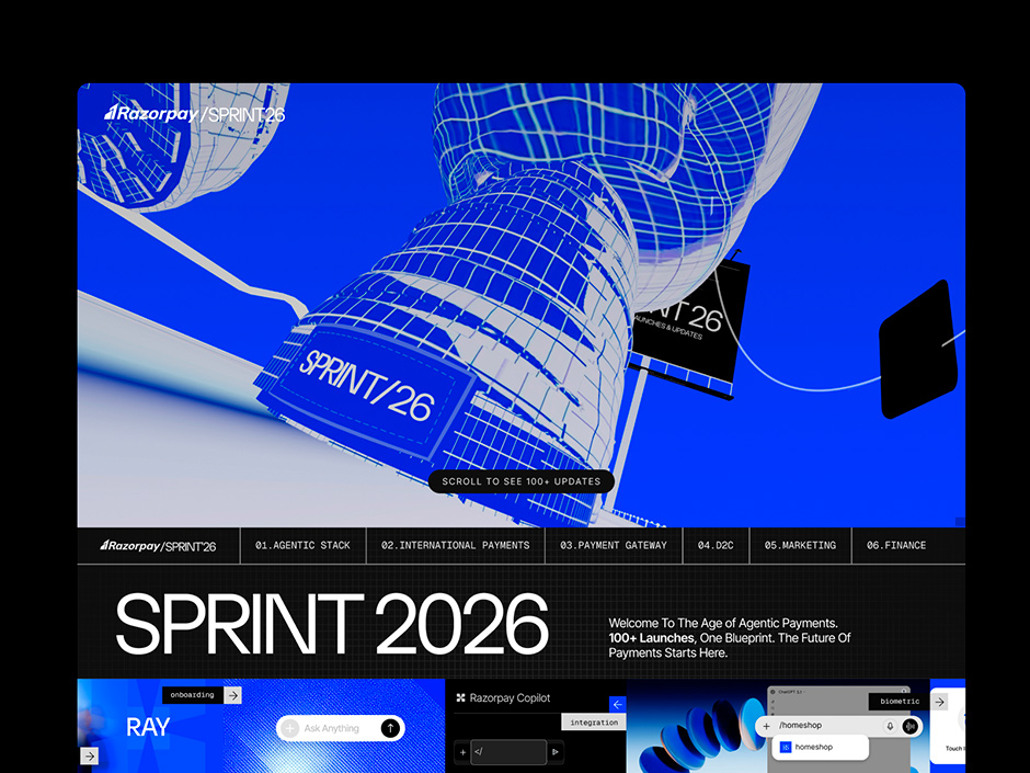
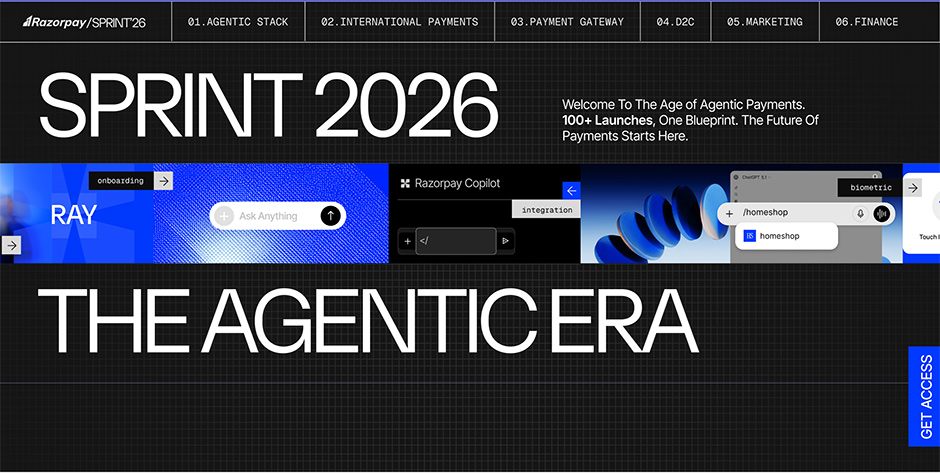
With the launch of Sprint26, their annual flagship product showcase, the company replaced sterile landing pages and feature grids with an immersive, narrative-driven digital experience. The first thing a user sees upon landing on the site is not a payment gateway interface or a corporate mission statement—it is a giant, hyper-realistic sneaker floating in a digital void. This audacious choice signals a fundamental shift in how B2B companies are choosing to communicate innovation.
The Chronology of a Design Rebellion
The conceptual journey of Sprint26 began with a singular, daunting challenge: how to communicate over 100 distinct product updates across six diverse verticals—Agentic Stack, International Payments, Payment Gateway, D2C, Marketing, and Business Banking—without overwhelming the audience or diluting the impact of the innovations.
Phase 1: The Metaphorical Foundation
Early in the planning process, the design team identified that traditional "listicle" formats were insufficient for the magnitude of these updates. The breakthrough came from the core theme of the launch itself: Agentic Payments.
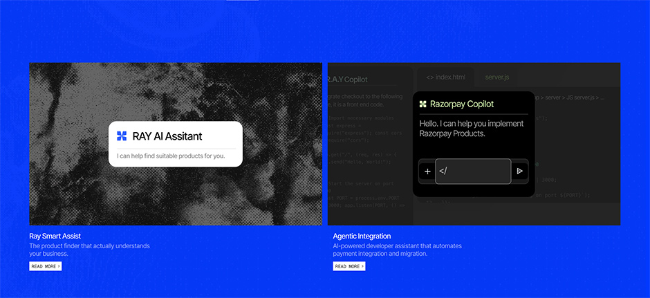
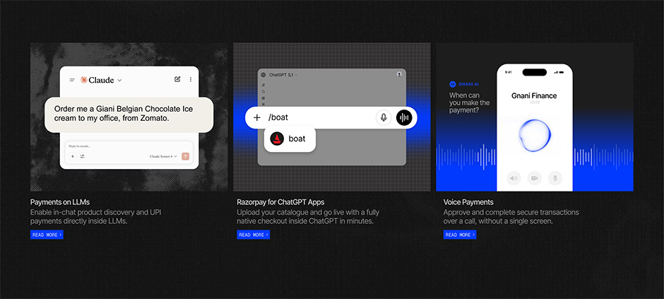
As Razorpay pivoted toward a future where AI-led commerce allows customers to browse, deliberate, and transact entirely within conversational interfaces like LLMs and voice agents, the design team asked a provocative question: What if the website acted as the very environment it was describing?
Phase 2: The "Shopper’s Journey"
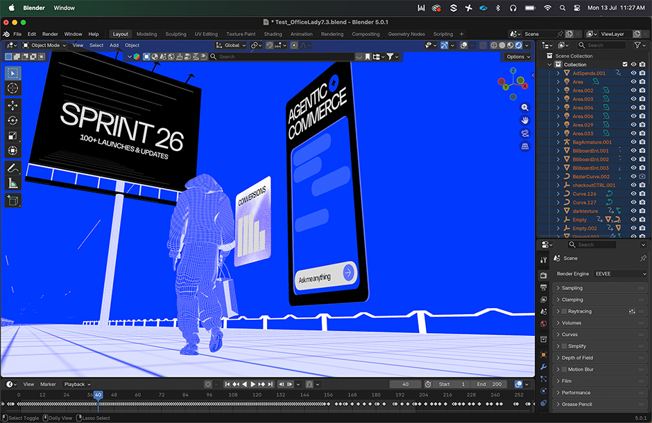
By mid-development, the team moved away from static web design toward a "walkthrough" architecture. The giant sneaker became the anchor of a narrative journey. As the user scrolls, a digital avatar appears—a shopper—who navigates through a cityscape constructed of Razorpay’s new infrastructure. With every scroll, the shopper’s bag fills with products, mirroring the user’s journey through the six product verticals. This turned a technical release into a cohesive, continuous story.
Phase 3: Technical Execution and "Designer-Builders"
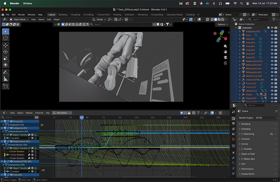
The project was executed entirely in-house by the Communication Design team. Departing from the industry-standard workflow of "design-to-development handoffs," the team utilized tools like Webflow, Rive, and Three.js to build the experience themselves. This eradicated the "translation loss" that typically occurs when designers explain their vision to developers. By the time the site was ready for the public, the design team had spent two months transforming their initial sketches into a high-performance, WebAssembly-driven experience.
Supporting Data and Technical Architecture
The audacity of the site’s aesthetic is backed by a sophisticated, high-performance tech stack. Despite its visual complexity, the site maintains rapid load times and smooth interactions through a deliberate, monochromatic design system.
- The Palette: The experience is built on a stark, minimalist foundation of near-black (#151515) and electric blue (#0039FF). This restraint allows the 100+ animated interactions to carry weight without visual clutter.
- The Interaction Engine: The team utilized Rive to build over 100 scroll and click triggers. Unlike traditional CSS animations, these are state-machine-based, meaning they respond dynamically to user input rather than merely playing on a loop.
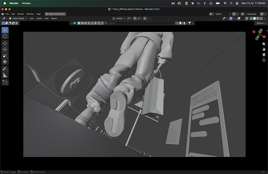
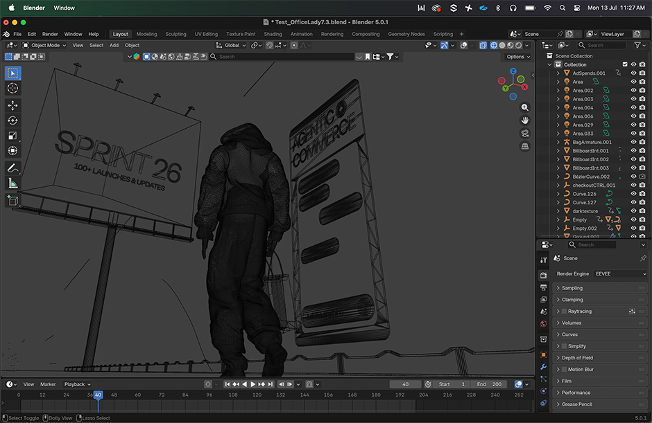
- Spatial Dynamics: The site employs Three.js and WebGL to handle the complex spatial transitions and 3D assets, which were modeled in Blender Studio.
- The Workflow: The project leveraged AI as a production partner rather than a shortcut. Claude was used for content architecture and logic mapping, while ChatGPT assisted in iterative research.
This technical discipline proves that "extraordinary" does not have to mean "inefficient." By utilizing WebAssembly-compiled animations, the team ensured the site remained performant despite the heavy reliance on 3D elements and complex state-driven interactions.
Official Perspectives: The Philosophy of the "Blueprint"
The design team at Razorpay emphasizes that the "giant shoe" was not a marketing stunt, but a thesis statement. By opening with a fashion object, they challenged the B2B sector’s obsession with "trust signaling" through boring imagery.
"The days of the sterile payment gateway website are over," a project lead noted. "The future of commerce is ambient and autonomous. If Nike is selling products through ChatGPT, our interface must reflect that reality."
By adopting a "Modern Blueprint" aesthetic—characterized by technical precision, architectural line work, and strict hierarchical structure—the team aimed to signal to enterprise partners that behind the creative storytelling lies a bedrock of engineering stability. They argue that when the surrounding visual noise is reduced, the user’s focus becomes more intentional. In this context, the bold design is actually a tool for clarity, not obfuscation.
Implications for the Fintech Landscape
The success of Sprint26 serves as a case study for the evolution of corporate digital strategy in several key ways:
1. The Death of the "Hand-off"
The most significant organizational shift demonstrated by this project is the integration of the "Designer-Builder." By allowing designers to own the implementation in Webflow, Razorpay eliminated the compromise inherent in traditional development cycles. This suggests that in the coming years, the most innovative tech companies will favor multidisciplinary "generalist" teams over fragmented departments.
2. Narrative Over Utility
Fintech has long operated under the assumption that utility is the only thing that matters to a B2B buyer. Razorpay has countered this by proving that buyers—who are, after all, human—respond better to narrative-driven experiences. When the information is presented as a "walkthrough" rather than a "database," the brand equity of the company increases, as they are no longer just a service provider, but a visionary in the space.
3. Raising the Creative Benchmark
Before Sprint26, the industry standard for a product launch was a hero image, a list of features, and a "Request a Demo" button. Razorpay has effectively set a new "global stage" standard. Competitors who continue to rely on traditional, static grids now face the risk of appearing archaic. The move has forced a re-evaluation of what a product launch can be: not just a brochure, but a digital experience that mirrors the quality of the product itself.
Conclusion: Beyond the Shoe
The giant shoe, hanging in the space of the Sprint26 landing page, is ultimately a metaphor for the team’s refusal to settle for "good enough." By choosing to lead with an unconventional, daring visual, Razorpay successfully communicated that their internal culture is as forward-thinking as their product roadmap.
In a world where AI is commoditizing code and automating basic UI, the value of a brand now lies in its ability to craft a story that feels inevitable. With Sprint26, Razorpay has not only launched 100 products; they have launched a new standard for how fintech brands should exist in the digital age. They proved that if you want to change the future of commerce, you cannot do it by speaking the language of the past.


 Nana Muazin
 Layla Zulfa
 Nana
Nana
 Pevita Pearce
 Rifan Muazin
 Iffa Jayyana