
 Nana Wu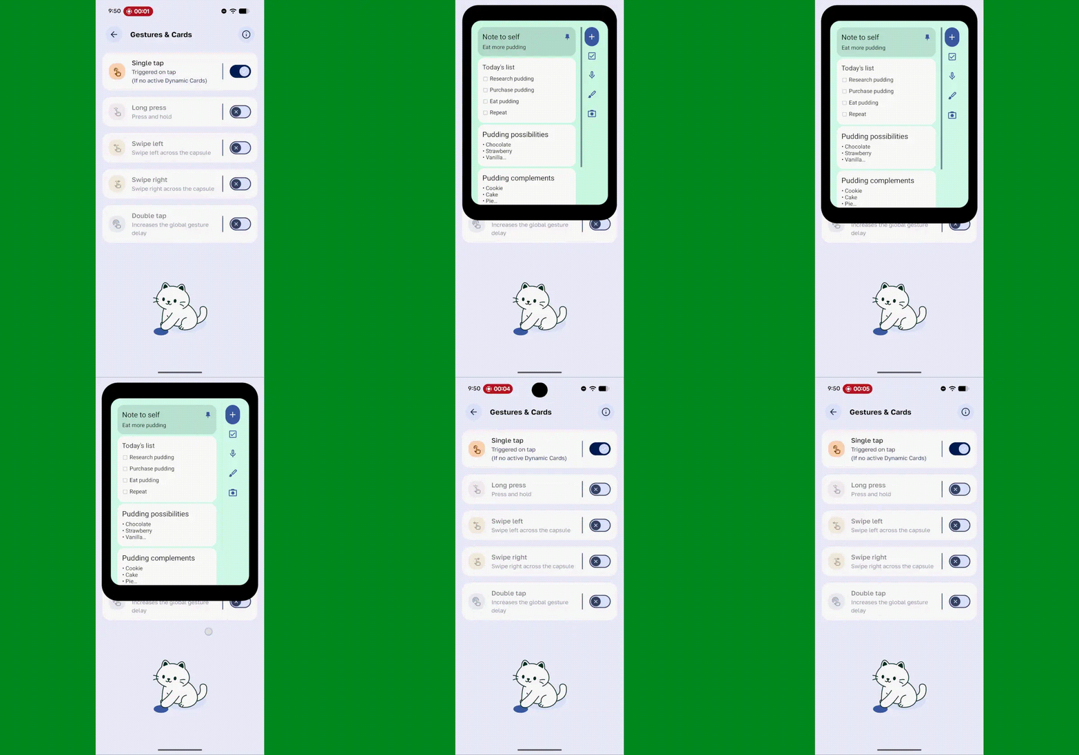
For years, the Android ecosystem has prided itself on its versatility, particularly regarding the home screen. Widgets—those bite-sized windows into our applications—have long been the hallmark of Android’s customizability. Yet, there has always been an inherent structural limitation: widgets are tethered to the home screen. If you are deep within an email thread, navigating a complex spreadsheet, or immersed in a video call, accessing that information requires a disruptive context switch. You must minimize your current task, navigate to the home screen, parse the information, and then return to your work.
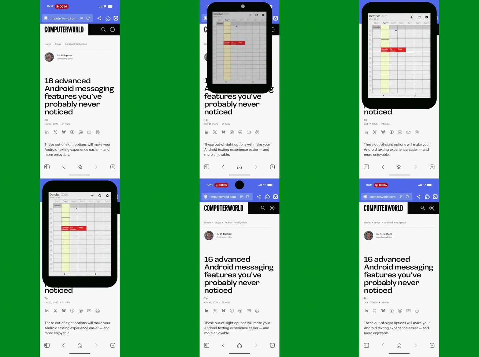
This friction is the enemy of productivity. However, a clever new utility app, Material Capsule, is fundamentally changing the paradigm by transforming the often-underutilized camera cutout (the "hole-punch" or "notch" area) into an interactive, universal launchpad for your widgets. By repurposing this display real estate, power users can now summon their calendars, notes, or search tools from any screen, regardless of the application currently in use.

The Core Innovation: Turning Dead Space into a Command Center
The fundamental philosophy behind this development is simple: information should be available where it is most pertinent, not just where the operating system dictates it must live. While Apple popularized the "Dynamic Island" as a notification-centric hub, the Android community has been iterating on similar concepts for some time, such as dynamicSpot and Touch the Notch.
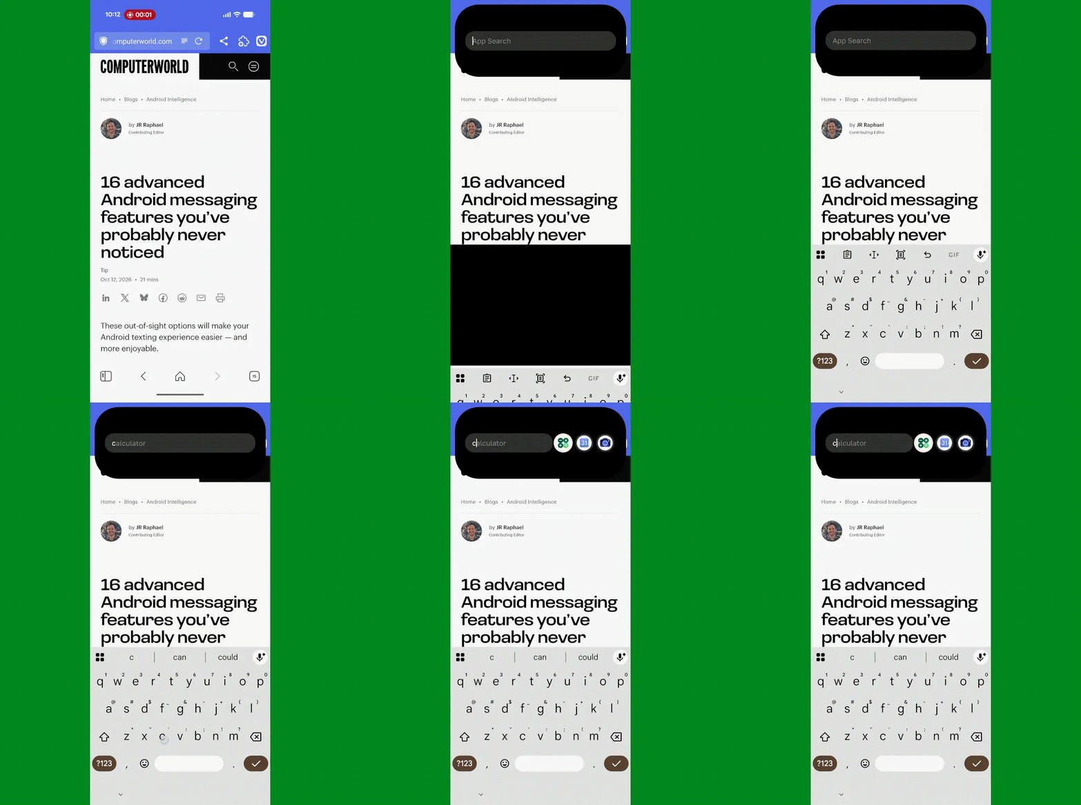
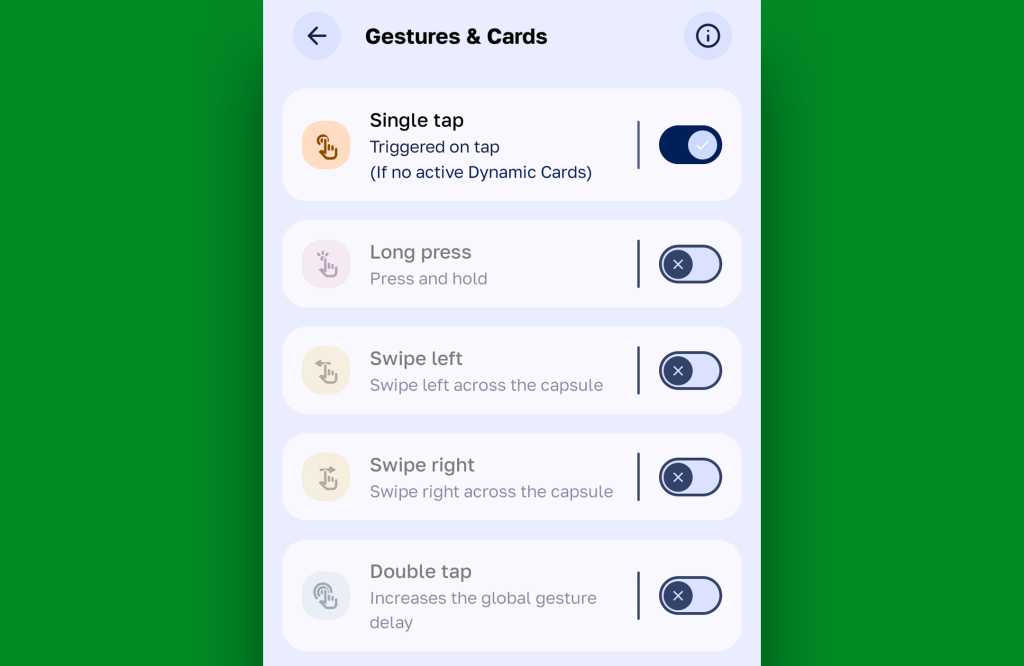
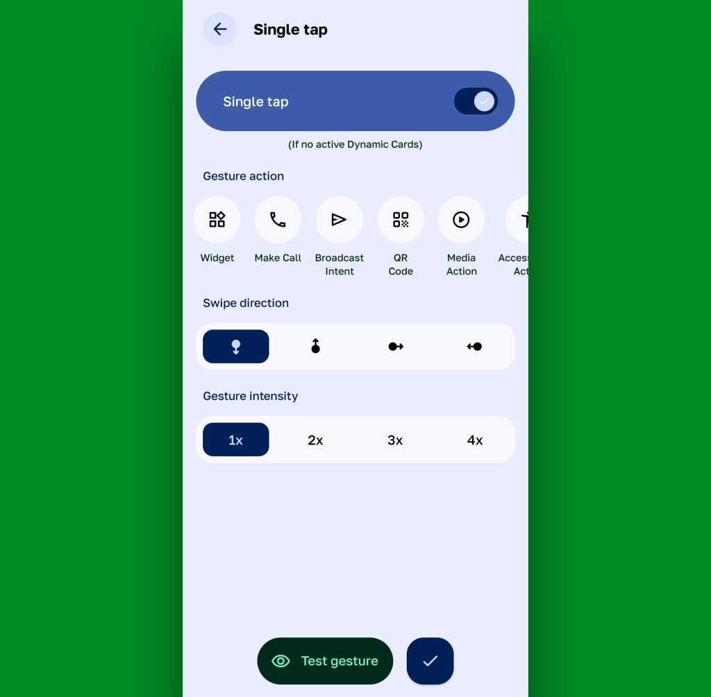
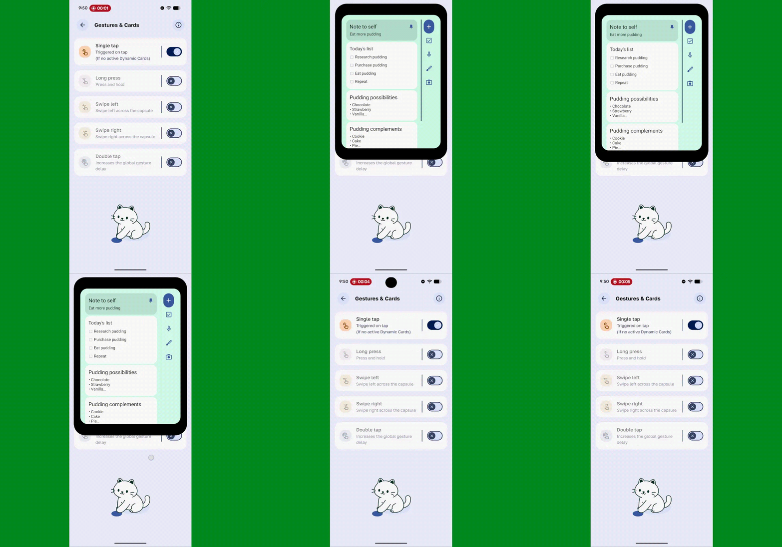
Material Capsule, however, differentiates itself by moving beyond simple notifications. It treats the status bar area as a persistent, high-utility overlay. By mapping specific gestures—single taps, double taps, long presses, or swipes—to custom actions, users can effectively "pin" a widget to their status bar. When triggered, the widget expands directly from the camera cutout, creating a seamless, floating layer of information that does not require leaving the current app.
Chronology of Development: From Static Status Bars to Dynamic Islands
To understand the significance of this shift, one must look at the evolution of the Android status bar over the last decade.
- 2014–2018: The Era of Static Indicators. During this period, the status bar was strictly informational. It displayed battery percentage, time, and notification icons. Users had no agency over this space; it was a read-only strip at the top of the display.
- 2019–2022: The Advent of Overlay Tools. As front-facing cameras moved from top bezels to in-display cutouts, developers began experimenting with "notification light" apps that used the pixels surrounding the camera to mimic LED notifications. This was the first major step in reclaiming the "dead space" around the lens.
- 2023–2025: The Rise of Dynamic Interactivity. Influenced by the broader industry trend of "Live Activities" and dynamic islands, developers began building tools that could render more complex UI elements—like media controllers or timer countdowns—directly in the notch area.
- Late 2026: The "Widget-Anywhere" Breakthrough. With the release and optimization of Material Capsule, we have arrived at the current state: the ability to execute, view, and interact with complex, interactive widgets from the top of the screen while remaining in a "full-screen" productive state.
Supporting Data: Why Contextual Access Matters
Research into user interface (UI) design and human-computer interaction (HCI) consistently highlights the "cognitive tax" associated with multitasking on mobile devices. When a user navigates away from an app to check a calendar, they encounter a "re-entry cost"—the time and mental effort required to re-orient themselves once they return to the original task.
Industry metrics regarding mobile productivity suggest that:
- Context Switching Overhead: The average user loses approximately 4 to 8 seconds every time they navigate away from a primary task to check a secondary source of information.
- Frequency of Interruption: On average, a professional user checks their calendar or task list roughly 15 to 20 times per workday.
- Efficiency Gains: By eliminating the need to return to the home screen, a user can reclaim roughly 90 to 120 seconds of "lost time" per hour. Over an eight-hour workday, this translates to over 15 minutes of reclaimed focus time.
These numbers illustrate that while a "widget-anywhere" approach might seem like a cosmetic or niche "tweak," it represents a legitimate optimization of the mobile workflow.
Official Perspectives and Security Considerations
While third-party developers are pushing the boundaries of what is possible within the Android UI, it is important to address the security and performance implications of such tools.
Because apps like Material Capsule require "Accessibility Service" permissions to draw over other applications and detect taps in specific regions of the screen, users must exercise caution. From a security standpoint, granting these permissions allows the app to monitor interactions across the entire device. Developers of these tools generally advocate for transparent, open-source practices to maintain user trust.
From a performance perspective, there is a minor impact on battery life. The app must remain active in the background to listen for gesture inputs. However, modern Android battery management (specifically the Doze mode and background process limitations) has become sophisticated enough that the power draw is negligible for most modern devices with substantial RAM and efficient processors.
Implications for Future Android Design
The popularity of tools like Material Capsule signals a clear demand for more fluid, less rigid user interfaces. If the goal of a smartphone is to provide immediate, actionable information, then the home-screen-only widget model is inherently flawed.
1. The Death of the "One-Size-Fits-All" UI
We are moving toward a future where the OS interface is no longer a static grid of icons. Instead, the UI is becoming modular. Expect future versions of Android (or specialized launchers) to potentially adopt a "floating" or "contextual" widget approach natively, effectively incorporating the "Dynamic Island" functionality at the system level.
2. The Shift Toward "Glanceable" Computing
The industry is collectively moving toward the concept of "glanceable" information. Whether through smartwatches, foldable secondary screens, or these new notch-based widgets, the objective is to minimize the time a user spends staring at their phone. By surfacing the most important 10% of a widget’s data—the appointment time, the next task, or a quick search bar—at the top of the display, we reduce the likelihood of "rabbit-hole" browsing, where a user opens their phone to check a calendar and ends up spending ten minutes on social media.
3. Developer Responsibility
With the rise of these tools, app developers must now consider "compact" versions of their widgets. A massive, 4×4 calendar widget is useless in a status-bar-sized container. Developers who prioritize responsive, scalable widget design will find their apps being used far more frequently in these new, restricted-space environments.
How to Get Started: A Practical Guide
Setting up your own on-demand widget center is a low-barrier, high-reward process. For those looking to implement this, the steps are straightforward:
- Download and Configure: Install Material Capsule from the Google Play Store.
- Grant Permissions: Enable the necessary Accessibility and "Draw over other apps" permissions. This is critical for the app to detect your taps on the camera cutout.
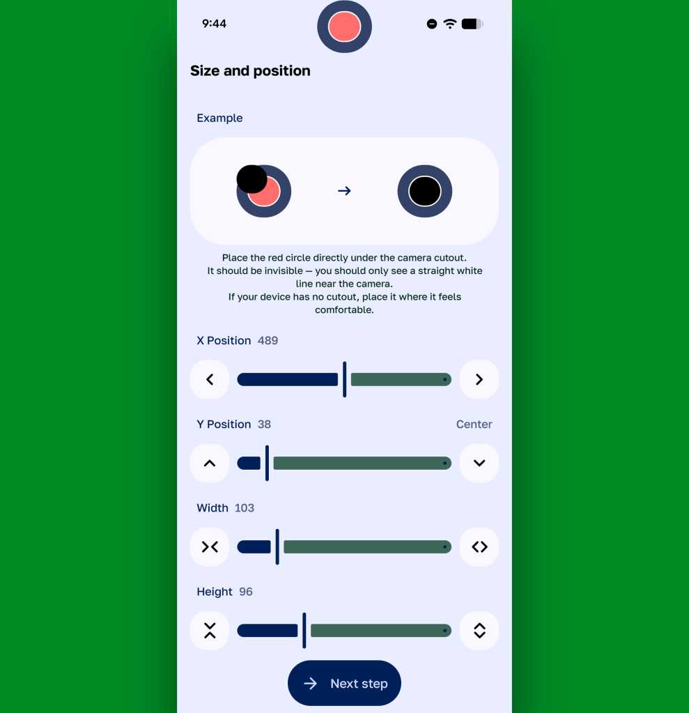
- Define the Cutout: Use the app’s calibration tools to align the virtual button with your device’s physical camera cutout. This ensures that the widget appears precisely where you expect it to.
- Map Your Gestures: This is where the magic happens. Navigate to the "Gestures & Cards" settings.
- Single Tap: Best for a quick search or a frequently used app.
- Long Press: Ideal for larger, complex widgets like your full-week calendar.
- Double Tap: Perfect for system-level controls, such as a flashlight or screen brightness.
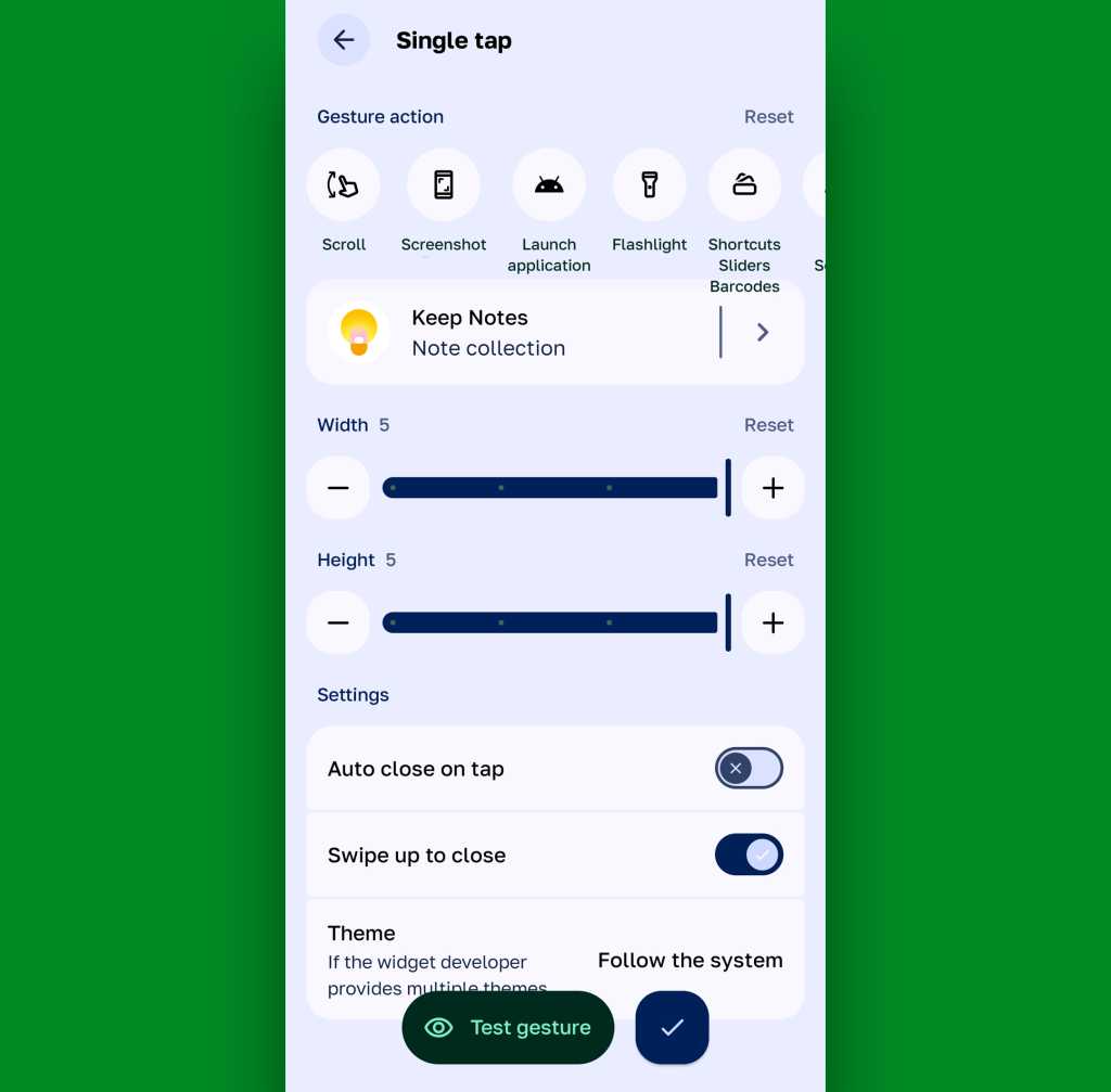
- Test and Refine: Once configured, test the widgets in various environments (e.g., inside an email app, while watching a video). Adjust the widget sizing within the app’s settings to ensure they do not obstruct critical interface elements.
Final Thoughts: A Smarter Way to Work
The ability to summon a widget from the top of your screen is more than a novelty; it is a fundamental shift in how we interact with our mobile devices. It turns the phone from a collection of silos—where apps are locked away in their own little boxes—into a unified, fluid workspace.
As we continue to demand more efficiency from our technology, the "hidden" areas of our hardware are proving to be the next frontier of innovation. By embracing these tools, we are not just customizing our phones; we are reclaiming our focus and streamlining our digital lives. Whether you are a professional managing a chaotic calendar or a casual user wanting a faster way to search, this "widget-anywhere" approach is an essential upgrade for any power user’s toolkit.

 Ali Ikhwan
 Nana
Nana
 Asro
Asro
 Jia Lissa
 Neng Nana
 Dwi Wanna
 Siti Muinah