
 Nana Muazin
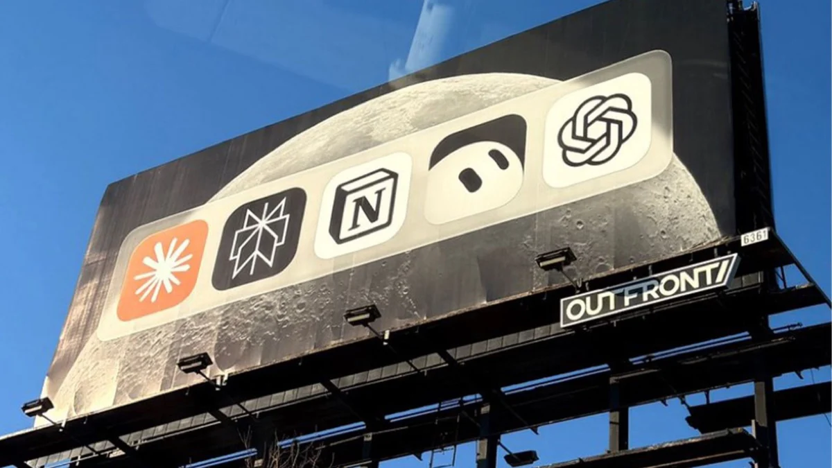
In the high-stakes theater of modern advertising, where brands typically scream for attention with high-contrast color palettes, aggressive calls to action, and exhaustive feature lists, the artificial intelligence sector has largely settled into a visual rut. A quick scan of the industry reveals a sea of nebulous, star-burst-inspired gradients and sterile, geometric iconography. However, Notion, the productivity-software-turned-AI-powerhouse, has recently shattered this template with a billboard campaign so minimalist it borders on the cryptic.
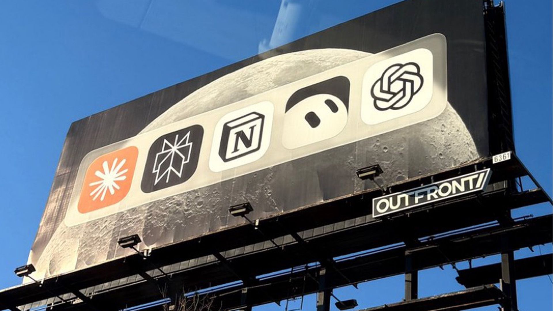
The campaign, which has ignited fierce debate across social media platforms like X (formerly Twitter) and Reddit, features a simple, unadorned lineup of industry-leading AI logos. Positioned shoulder-to-shoulder with titans like OpenAI’s ChatGPT, Anthropic’s Claude, Perplexity, and xAI’s Grok, Notion’s own letterblock logo stands as one among many. In an industry defined by cutthroat competition, the choice to highlight one’s rivals alongside oneself is not just unconventional—it is a masterclass in psychological branding.
The Anatomy of the Campaign: A Visual Breakdown
The billboard, currently making waves in high-traffic urban centers, is devoid of text, slogans, or URLs. It presents a horizontal, rhythmic arrangement of icons representing the most prominent players in the Large Language Model (LLM) ecosystem.
By refusing to provide a "hook," Notion has forced the public to engage with the advertisement on their own terms. The lack of copy creates an immediate, visceral reaction: confusion, followed by curiosity, followed by analysis. Is this an endorsement of the competition? Is it a "who’s who" of the AI landscape? Or is it a defiant statement of parity, suggesting that while other companies are fighting for dominance, Notion has already cemented itself as an indispensable part of the user’s workflow?
Chronology of the Disruption
The campaign’s rollout began in late October 2026, catching commuters and design enthusiasts off guard. Within hours of the first images appearing on social media, the discourse shifted from identifying the logos to dissecting the "why" behind the move.
- Phase One: The Mystery: Initially, many observers were unaware that the billboard was a paid placement by Notion. The lack of branding beyond the logo itself led many to speculate that the display was either a third-party aggregator or an industry-wide PSA.
- Phase Two: The Realization: As the association between the billboard’s visual identity and Notion’s marketing team was confirmed, the tone of the conversation shifted from confusion to critical appraisal.
- Phase Three: The Viral Feedback Loop: The campaign gained significant traction through "hot takes" on X. The discourse moved beyond design circles into the broader tech community, effectively turning the billboard into a piece of interactive, real-world digital performance art.
- Phase Four: The Consolidation of Sentiment: By the second week of the campaign, the initial shock had transformed into a debate regarding the efficacy of "negative space" in advertising—a hallmark of high-confidence marketing.
Why Minimalism Works in a Noisy Market
The decision to adopt a minimalist strategy is particularly poignant given the current saturation of the AI market. As noted by design critics, the "AI aesthetic" has become increasingly homogenized. Most companies rely on complex, abstract logos meant to evoke "intelligence" or "neural networks."
Notion’s identity—a simple, bold, monochromatic lettermark—is an anomaly in this landscape. By placing its simple, grounded logo in a lineup of more ornate competitors, Notion leverages the "Von Restorff Effect," a psychological principle stating that an item that stands out like a sore thumb is more likely to be remembered than an item that blends in. In this lineup, Notion doesn’t look like a "competitor"; it looks like the platform that organizes the others.
The Implications of "Gutsy" Marketing
The strategy behind this campaign represents a significant shift in how tech companies perceive their audience. Gone are the days when companies could rely on long-form explanations of utility. In an era of infinite scroll and short attention spans, Notion is banking on the idea that context is content.
The Argument for "Super Cool"
Proponents of the campaign argue that this is the height of corporate confidence. By positioning themselves as part of the "AI fabric" rather than a standalone tool, Notion reinforces its status as an "operating system for work." The silence of the billboard suggests that the product is so ubiquitous that it requires no explanation.
The Argument for "Super Dumb"
Critics, conversely, argue that the ad is fundamentally flawed because it fails to capture the casual observer. If a person walking past the billboard doesn’t recognize the logos, the advertisement is effectively meaningless. To this cohort, the lack of a call to action or a value proposition represents a waste of premium advertising real estate.
The Intersection of Design and Industry Standing
This campaign serves as a case study for why design choices are rarely just aesthetic—they are strategic. When a brand chooses to associate itself with its competition, it is making a claim about its own maturity.
In the early stages of a tech revolution, companies often spend millions attempting to differentiate themselves as "the one true solution." As the market matures, the brands that succeed are often those that integrate into a wider ecosystem. By including Claude, Perplexity, and ChatGPT on the same board, Notion is implicitly telling the consumer: "We know you use these tools. We are the place where they all come together."
Official Responses and Industry Reaction
While Notion has remained largely silent regarding the specific strategic goals of the campaign, the silence itself has become the primary communication tool. Industry analysts suggest that this is a deliberate "less is more" approach.
Marketing experts have pointed to this campaign as a potential turning point for tech advertising. "We are seeing a move away from feature-dumping toward brand-building," says one industry analyst. "Notion isn’t selling a specific feature like ‘better summaries’ or ‘faster generation.’ They are selling their place in the modern workflow."
The controversy has also highlighted the divide between traditional marketing metrics—which prioritize reach and conversion—and modern brand-awareness metrics, which prioritize "share of voice" and cultural relevance. Notion’s billboard has undoubtedly achieved the latter.
Looking Ahead: The Future of AI Advertising
As we move further into the decade, the competition for the user’s attention in the AI space will only intensify. If Notion’s campaign is any indicator, the next generation of marketing will rely less on explaining "how" a tool works and more on defining "who" the brand is in relation to the broader ecosystem.
The risk, of course, is that the message remains too subtle. If a brand becomes too abstract, it risks alienating the very audience it intends to capture. However, for a company like Notion, which has spent years building a loyal user base of power users and creative professionals, this bold, mysterious move is likely to pay dividends in brand equity.
Final Thoughts: The Bravery of Being Simple
Notion’s billboard is a reminder that in a crowded, high-tech landscape, the most radical thing a company can do is remain simple. By stripping away the jargon, the claims of superiority, and the frantic attempts to capture every passing eye, Notion has created something that transcends traditional advertising.
Whether you view it as an arrogant display of confidence or a brilliant piece of minimalist design, one thing is clear: you are looking at it. And in the world of modern advertising, being seen is half the battle. As the debate continues, Notion remains in the center of the frame—both on the billboard and in the industry conversation—proving that sometimes, the loudest statement you can make is to say nothing at all.

 Pevita Pearce
 Nila Kartika Wati
 Azzam Bilal Chamdy

 Raul Delapena Setiawan

 Lina Irawan
